Posts Tagged 'DIY'


Make This: Sound Prints

Have you ever wondered what a painting might sound like if you could listen to it? With conductive ink, a Makey Makey, and some basic software, you can add a new level of interactivity to your artwork through the use of sound! In this guide, I’ll show you how to make a print that will make sounds when you touch it. These sounds are completely reprogrammable and can be changed on the fly, giving you lots of possibilities for what you can create.

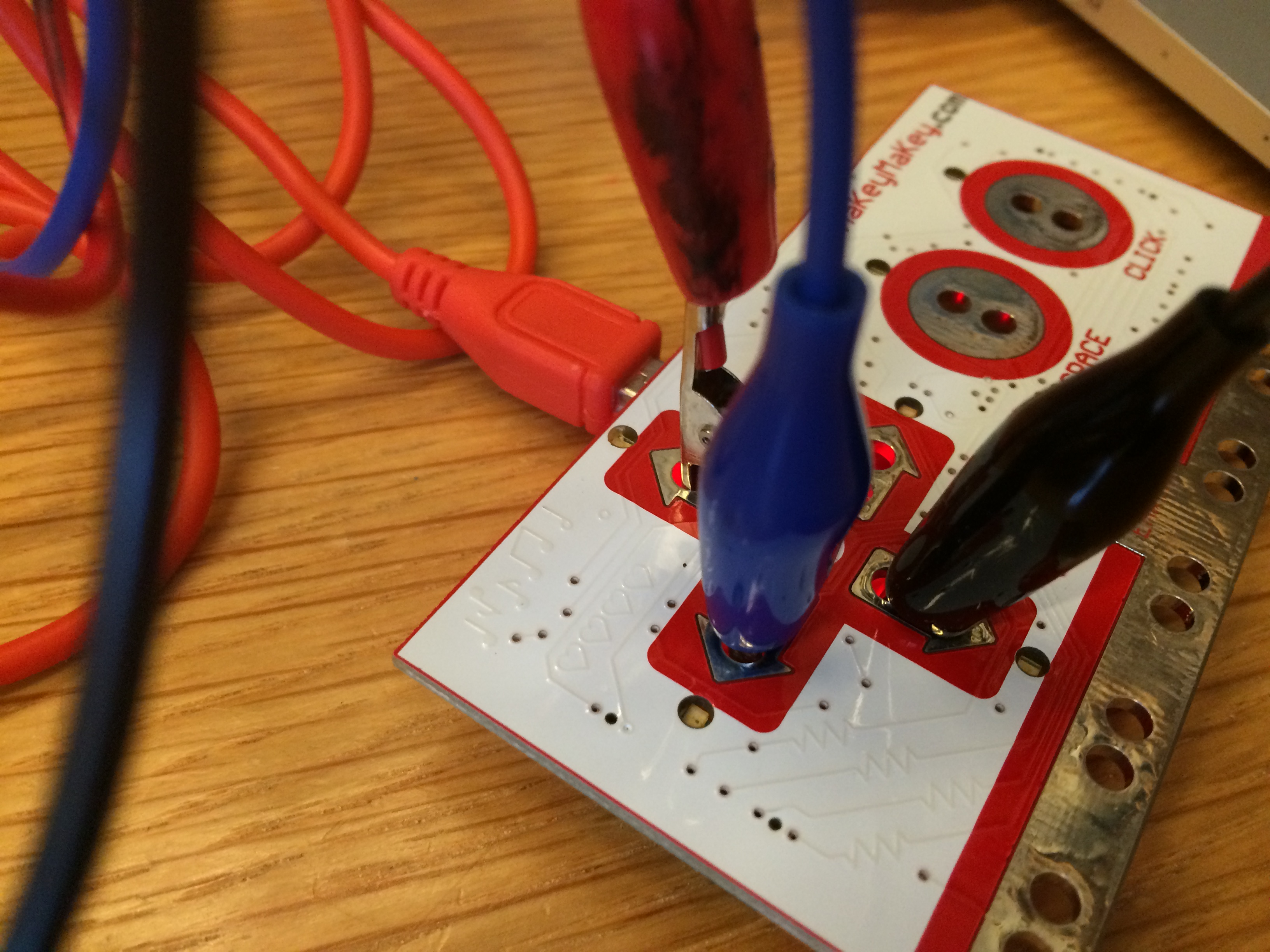
A Makey Makey is an interface that connects to your computer which allows you to create your own tactile inputs that will take the place of certain keys on your keyboard.
IMG_2684

The Makey Makey can be connected to different conductive materials to replace your keyboard’s arrow keys, space bar, mouse button, and more

For the purpose of this project, you’ll be using conductive ink to create three interactive areas on your work of art that will be hooked up to the Makey Makey and act in place of the arrow keys on your computer. We’ll then use Soundplant to map different sounds to those keys, which will allow those areas to play a sound when touched.

Supplies:

  • Copy paper for making a stencil
  • Exacto knife
  • Cutting mat
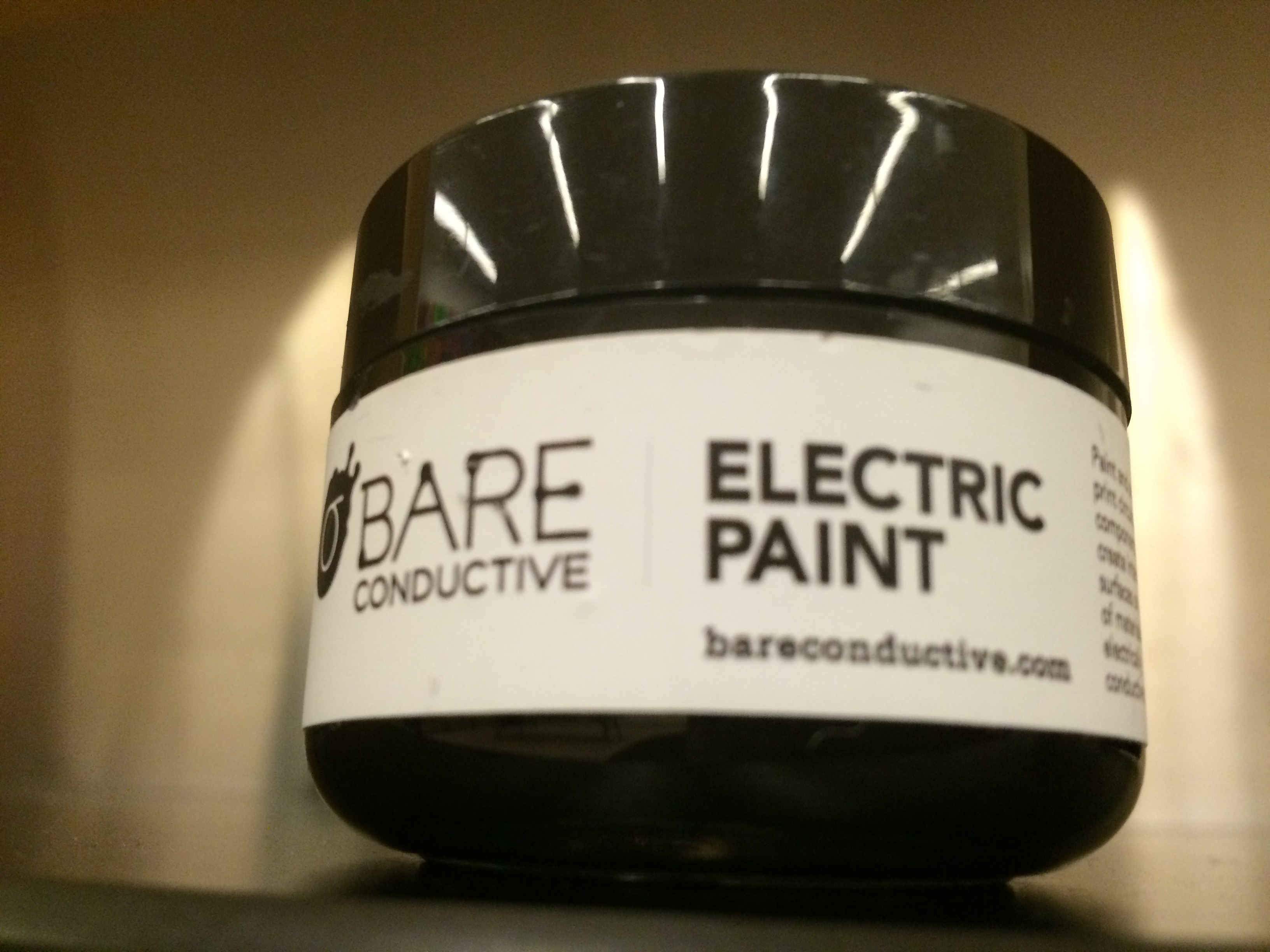
  • Conductive ink
  • Screen printing screen
  • Squeegee
  • Heavy printing paper
  • Copper tape (optional)
  • Makey Makey kit ($45; MakeyMakey.com)
  • Soundplant software
  • Computer

Step 1: Screen print your image with the conductive ink. 

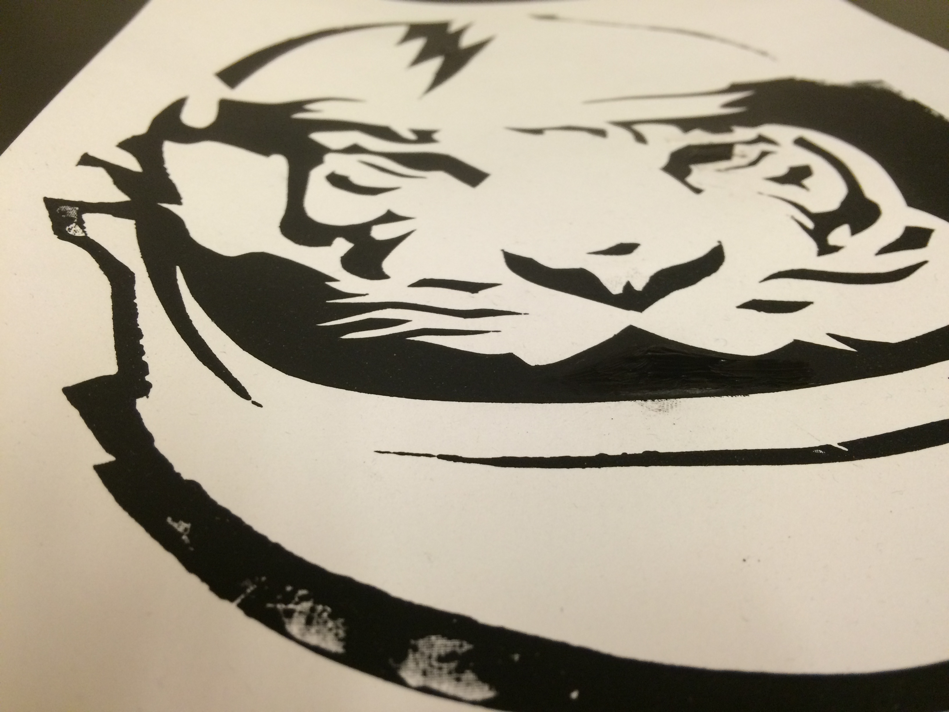
I like the paper stencil method, but use whatever technique you like best. For help on printmaking with stencils, check out my past post on screen printing. Let your print dry fully before proceeding. IMG_2673 IMG_2674 IMG_2676
Step 2: Connect your print to the Makey Makey. 

Again, for the purpose of this post, I’m choosing three areas on my print that will activate the Makey Makey when they are touched. You can connect them directly to the device using alligator clips (included in the kit). Remember to connect the clips to the proper inputs on the Makey Makey–in this case, the left, right, and up arrows.

IMG_2686

Step 3: Upload some sounds. 

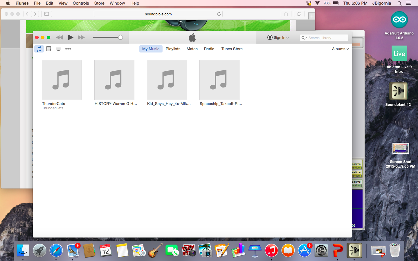
I found a bunch of sounds for this project using free online sound libraries and saved them as mp3 flies on my computer. The Soundplant site has some good suggestions for libraries to use. I tried to look for sounds that would complement my print in a weird or unexpected way.
Screen Shot 2015-03-12 at 6.06.10 PM

Step 4: Map your sounds to the keyboard using Soundplant.

Open up Soundplant and assign one sound file to each of the left, right, and up arrow keys by dragging the file onto the software’s virtual keyboard. Soundplant even offers some basic editing tools, allowing you to adjust the length of your sound clip, add various effects, and more!
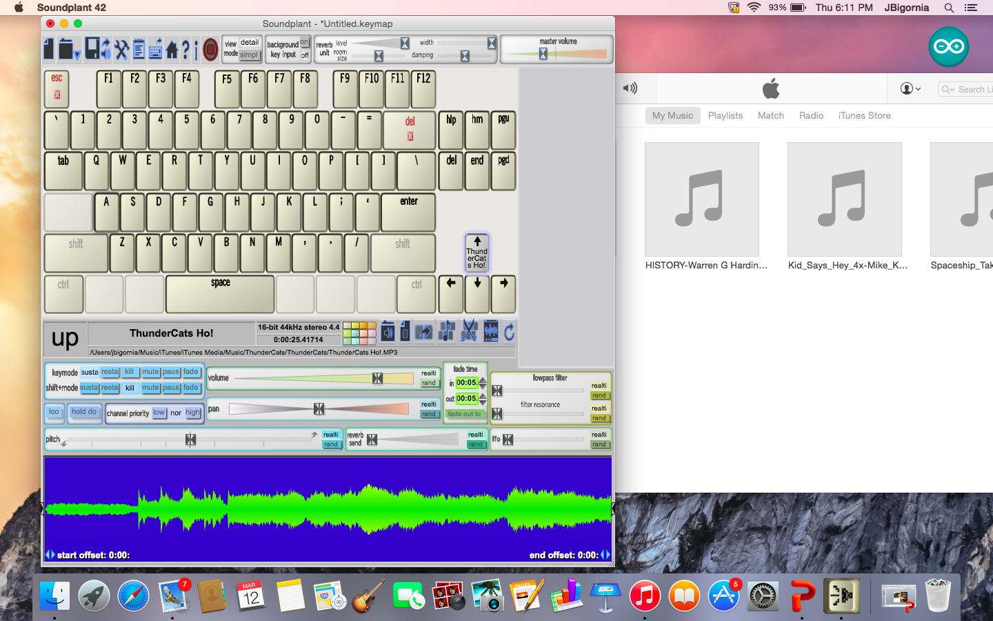
Screen Shot 2015-03-12 at 6.11.02 PM

Step 5: Connect the Makey Makey to the computer and play!

Plug the Makey Makey into your computer’s USB port. Be sure to also connect an extra alligator clip and wire to the space marked “Earth” at the bottom of the board. Hold the metal part of the alligator clip at the other end of the wire between your fingers and touch the interactive areas of your print with your other hand. Your computer should play the sounds you mapped to the different areas! You should also see the playback of your clip on the computer. If you’re having trouble getting it to work, make sure the volume is up on your computer, that all your connections are correct, and most importantly, that you are connected to the Makey Makey as well.
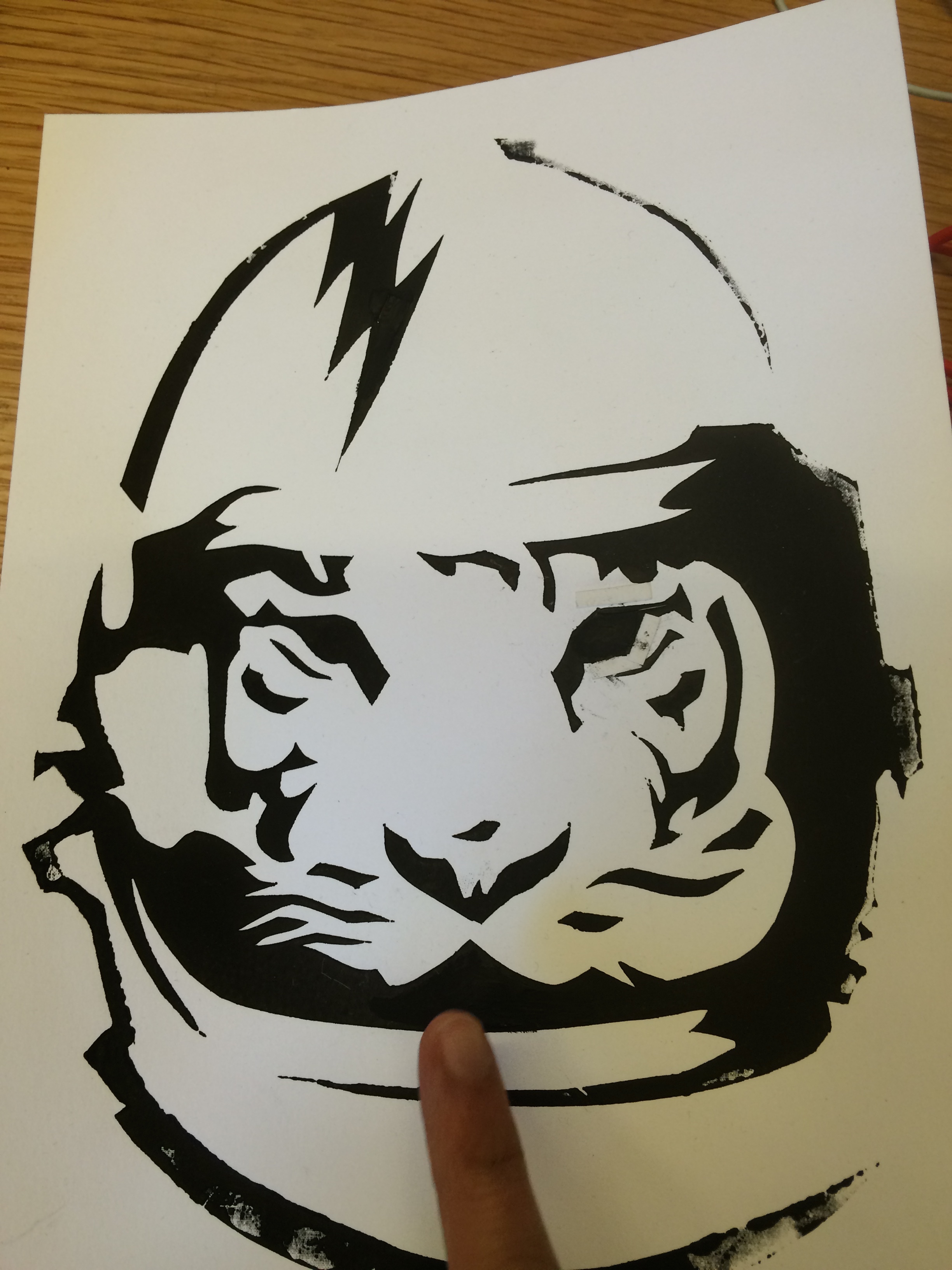
IMG_2687

The fun part of this project is that the sounds you choose can totally change the way people experience your artwork. A set of funny, quirky sounds will provoke a very different response from the viewer versus ones that are dark and foreboding. And because the Makey Makey will work with most conductive materials, you can create interactive sculptures, installations, and more! Additional project ideas can be found on the Makey Makey website.

JC Bigornia
C3 Program Coordinator
Paper Peonies and Tissue Tulips: Build Your Own Beautiful Bouquet!

With last week’s opening of Bouquets: French Still-Life Painting from Chardin to Matisse, you might say we’re all abuzz with excitement here at the Museum. Although fall is just arriving, all we can think of are these beautiful blooms!

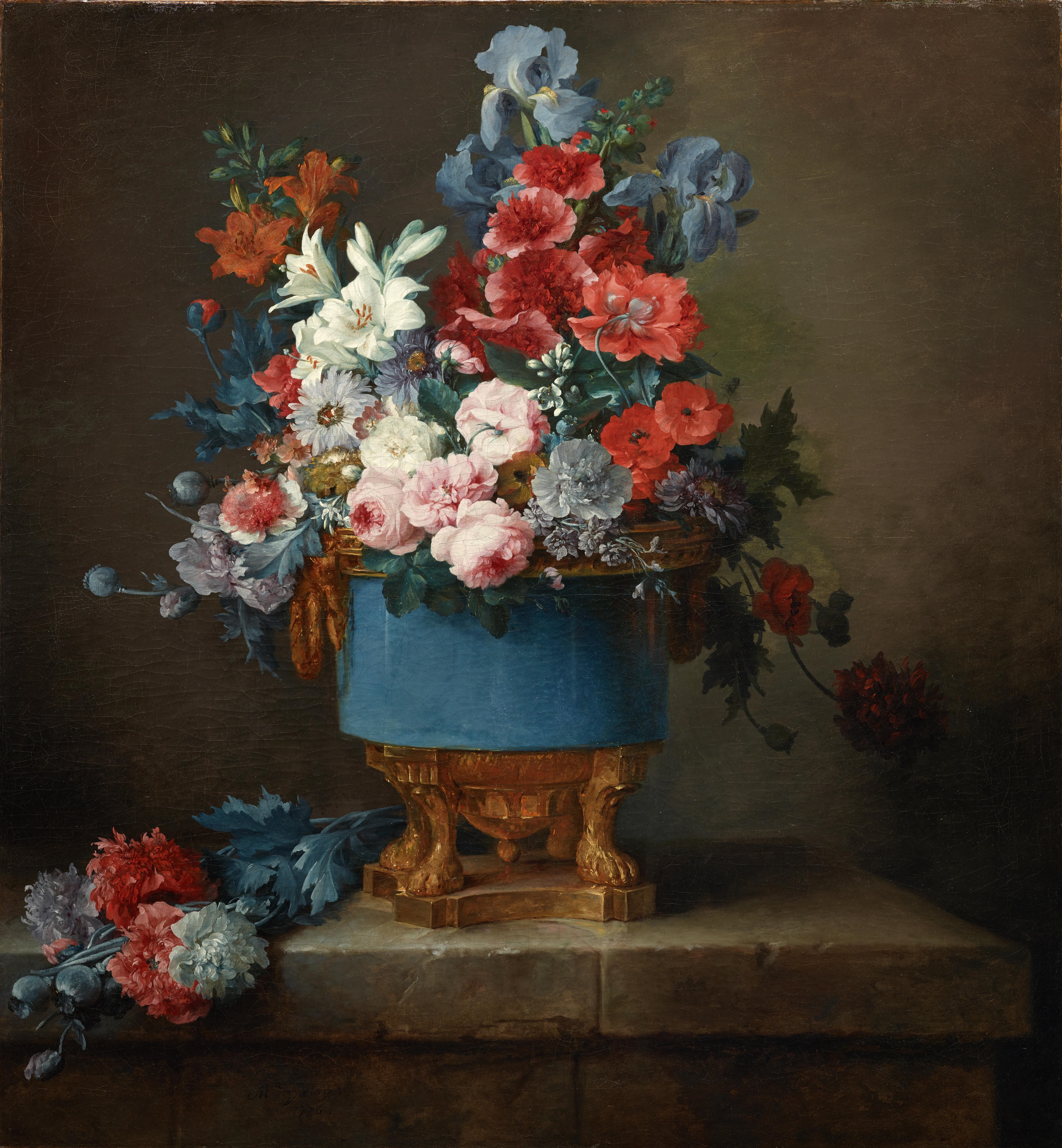
It’s easier than you might think to recreate some of your floral favorites at home. Try modeling your bouquet after one you might have seen or put together the posy of your wildest dreams. I took my inspiration from the DMA’s own Bouquet of Flowers in a Blue Porcelain Vase.

Bouquet of Flowers in a Blue Porcelain Vase (1776), Anne Vallayer-Coster

Anne Vallayer-Coster, Bouquet of Flowers in a Blue Porcelain Vase, 1776, Dallas Museum of Art, Foundation for the Arts Collection, Mrs. John B. O’Hara Fund and gift of Michael L. Rosenberg

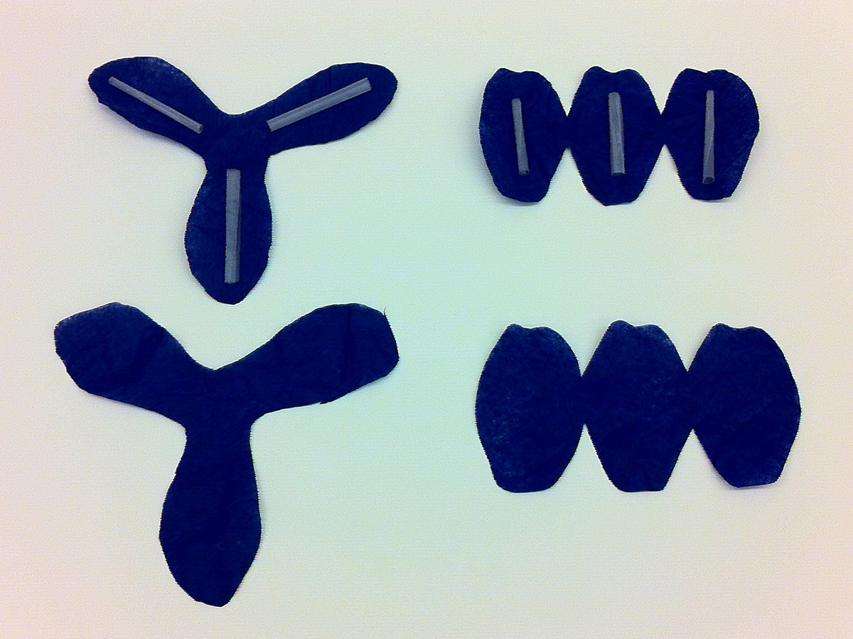
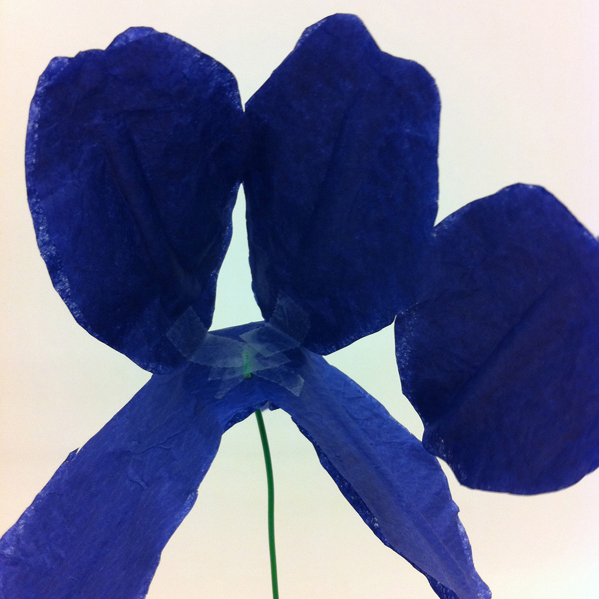
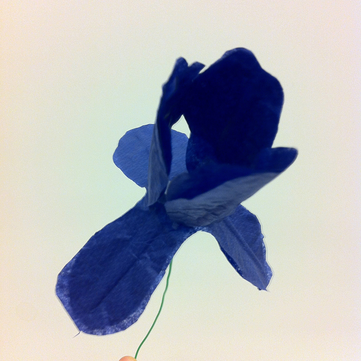
There are some great tutorials online for making your own paper flowers. Martha Stewart Weddings can show you how to make some really lovely, delicate flowers here, and the Rust and Sunshine blog (here) has easy to follow instructions to make a variety of blooms with a little bit of inventive folding. With the help of these tutorials, I made carnations, roses, and star lilies. I couldn’t find a tutorial I liked for making irises, so I designed my own! You can print off this template and follow the directions below to make them too.

A quick note before we get started: for some flowers (particularly irises and lilies, whose petals you want to stand up a little bit), you might find that a sturdier paper works better for you. This is the perfect time and place to experiment! I liked the unified look of having all my flowers made out of tissue paper, but it’s your bouquet, so you’re the boss.

What you’ll need to make irises:

  • Tissue paper in a variety of colors – blue, purple, and yellow are pretty common for irises, though they come in a number of other colors as well
  • Pipe cleaners or art wire (for the stems)
  • Scissors
  • Clear tape
  • Optional: paint, glitter, glue, markers, colored tape, vase

If you opted to use something like card stock instead of tissue paper, cut out only one each of Iris A and Iris B and skip ahead to Step 4. If you’re using tissue paper like me, you’ll need to take an extra step or two to give the petals a little structure, so start here.

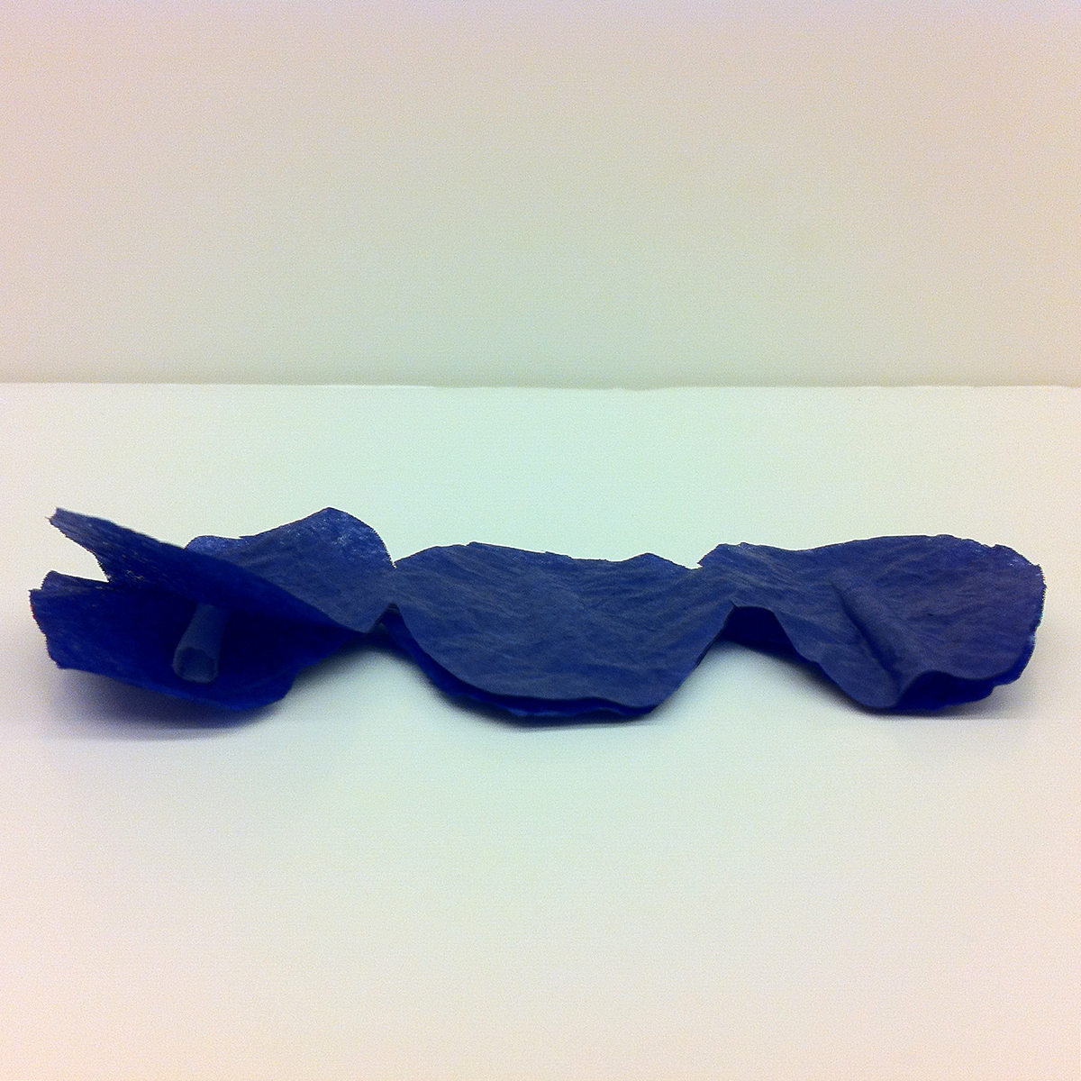
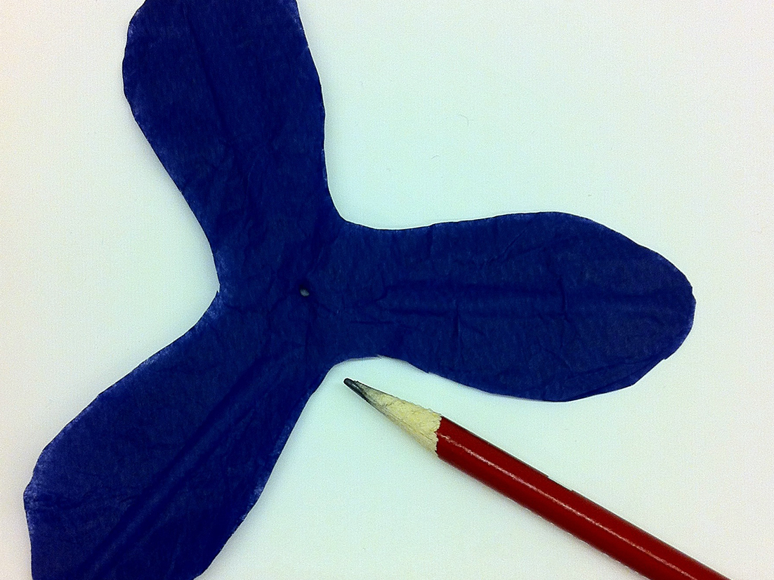
1. Trace and cut out two each of Iris A and Iris B in your tissue paper of choice. Double-layering the tissue paper will help beef up the flower.

2. Roll six pieces of tape – one for each pair of petals – in on themselves, sticky side out. Lay one tape roll lengthwise along each petal of one set of Iris A and Iris B. Make sure you don’t cover up the very center of Iris B! This will make Step 4 a little easier.

3. Match up the second set of Iris A and Iris B with the first and press down, sandwiching the rolls of tape between the two layers of tissue paper.

4. With the point of a pen or pencil, poke a small hole right through the center of your Iris B cutout or tissue paper and tape sandwich. This is why you didn’t want to block the very middle with tape in Step 2! Be careful not to press too strongly – you don’t want to accidentally rip your flower base in half.

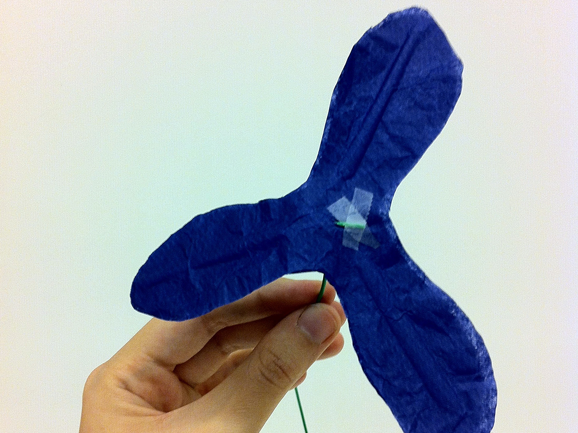
5. Make an L-shaped bend in the end of your wire or pipe cleaner and thread it through the hole you just made in Iris B. Adjust so that the bend end lies flat on Iris B and the remaining wire/pipe cleaner extends downwards in a straight line. Secure with tape.

6. Using three narrow pieces of tape, attach the bases of Iris A’s petals to the spots marked in the template with dashed lines. I suggest doing this so the tape pieces end up on the interior of the flowerand aren’t visible.

7. Finally, embellish with whatever extras strike your fancy – paint, markers, glitter, you name it – and arrange your completed iris with your other flower creations in a vase.

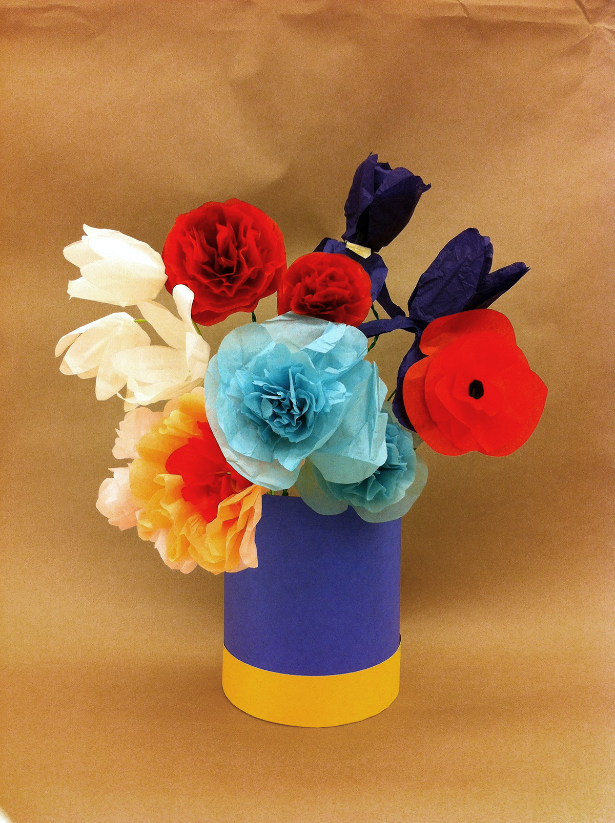
Bouquet of (Paper!) Flowers in a Blue Vase (2014), Jennifer Sheppard

Jennifer Sheppard, Bouquet of Paper Flowers in a Blue Vase, 2014

Voila! You now have a beautiful bouquet that needs no water…in fact, you probably shouldn’t have water anywhere near your nice new paper flowers, unless soggy is the look you’re going for! So skip that annoying watering step and enjoy these low maintenance blooms — and our blooming exhibition!

Jennifer Sheppard
McDermott Intern for Family and Access Teaching

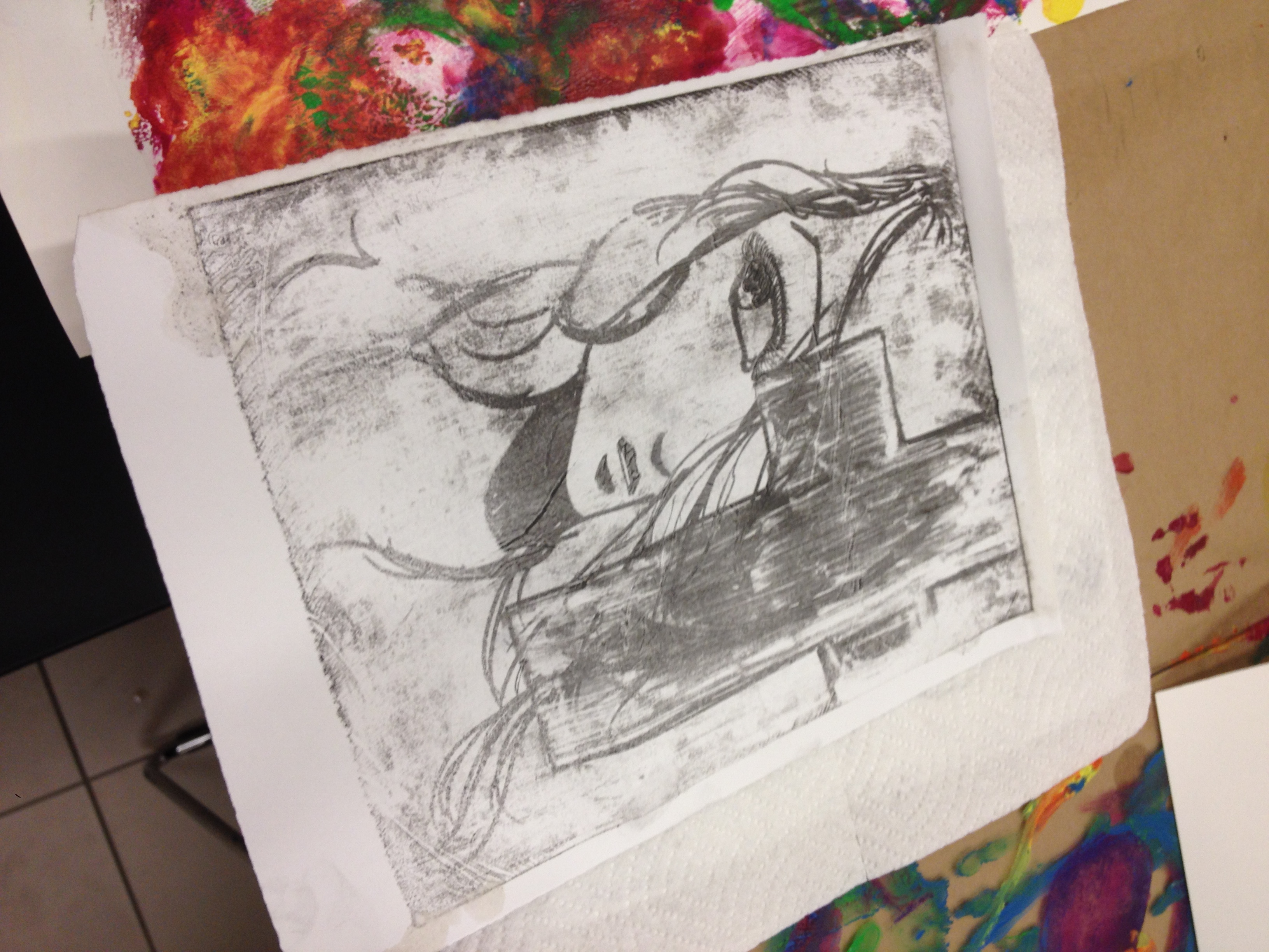
Make This: Etching with Cola

Coke Etching

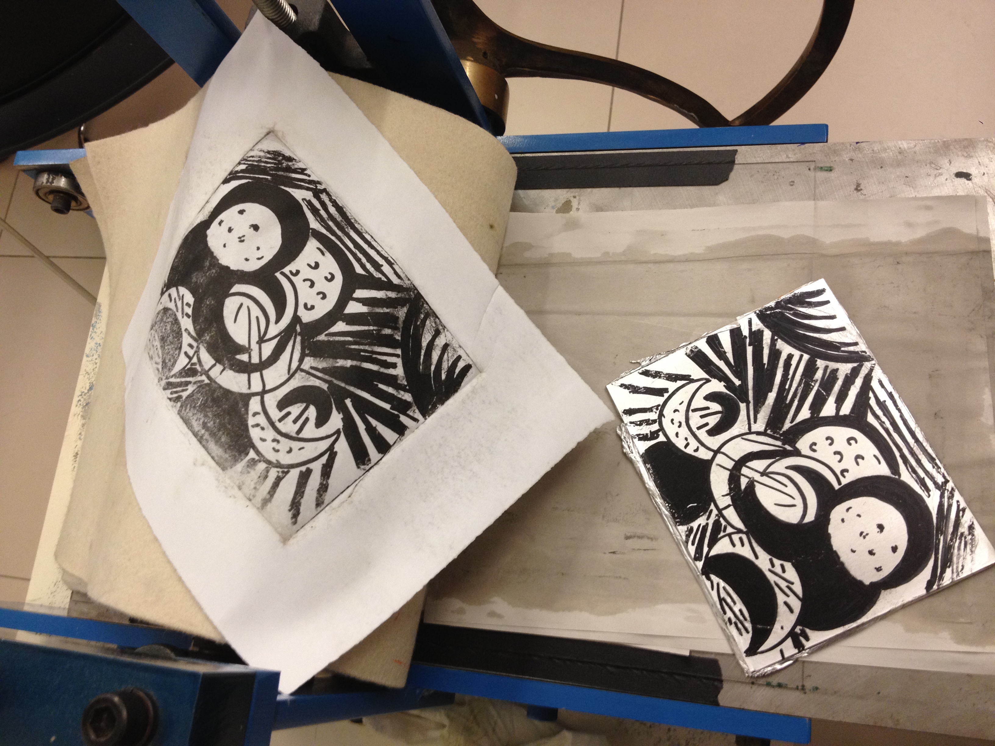
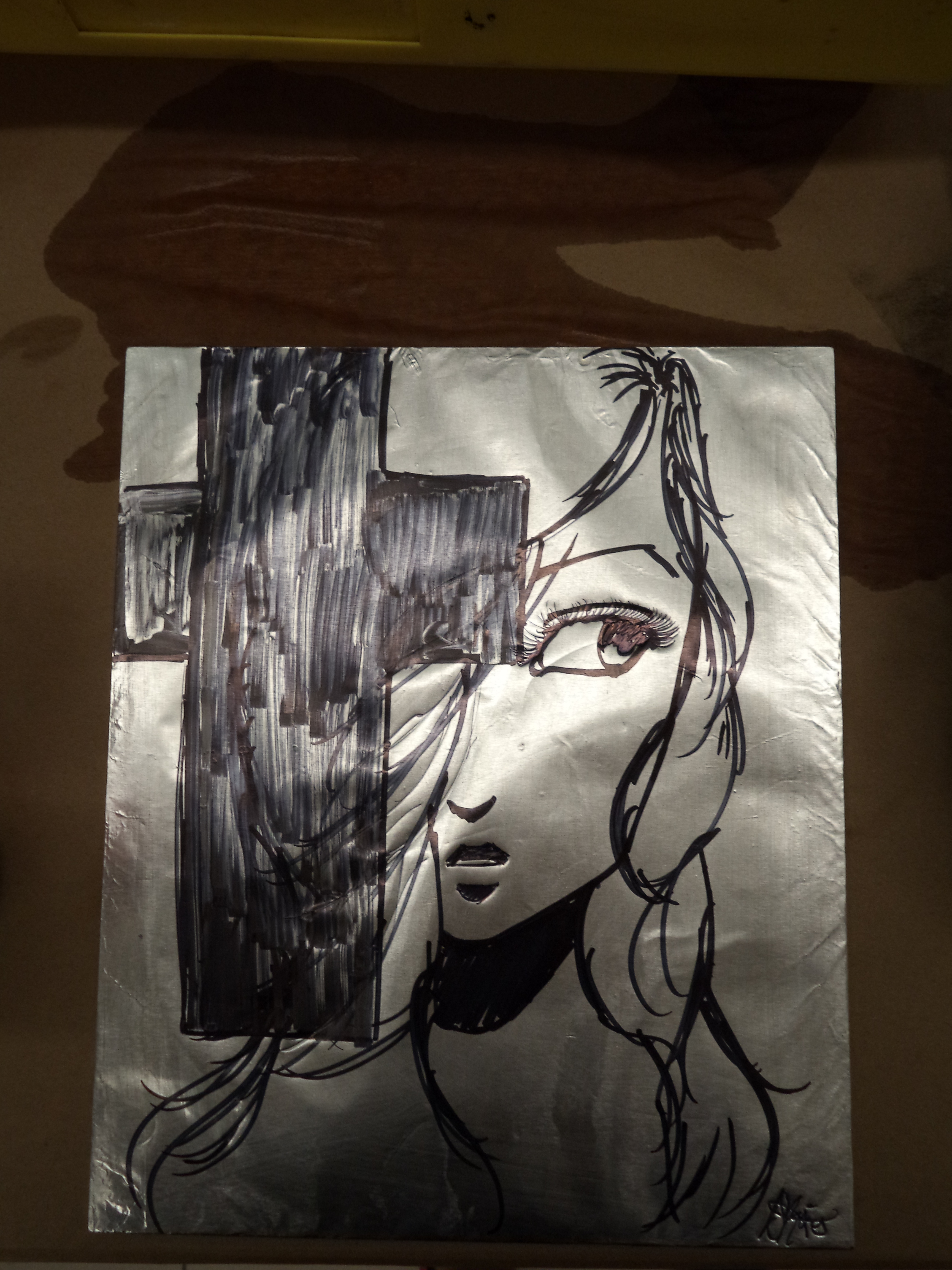
Example of a “coke” etching

Printmaking is one of my favorite mediums. There’s something satisfying and magical about transferring an image you created onto another surface. Plus, there are so many fun and experimental ways to do it that make learning new techniques a joy and not a chore. I especially love finding alternative methods to techniques that may otherwise be cost-prohibitive for the at-home printmaker–namely, intaglio and lithography.

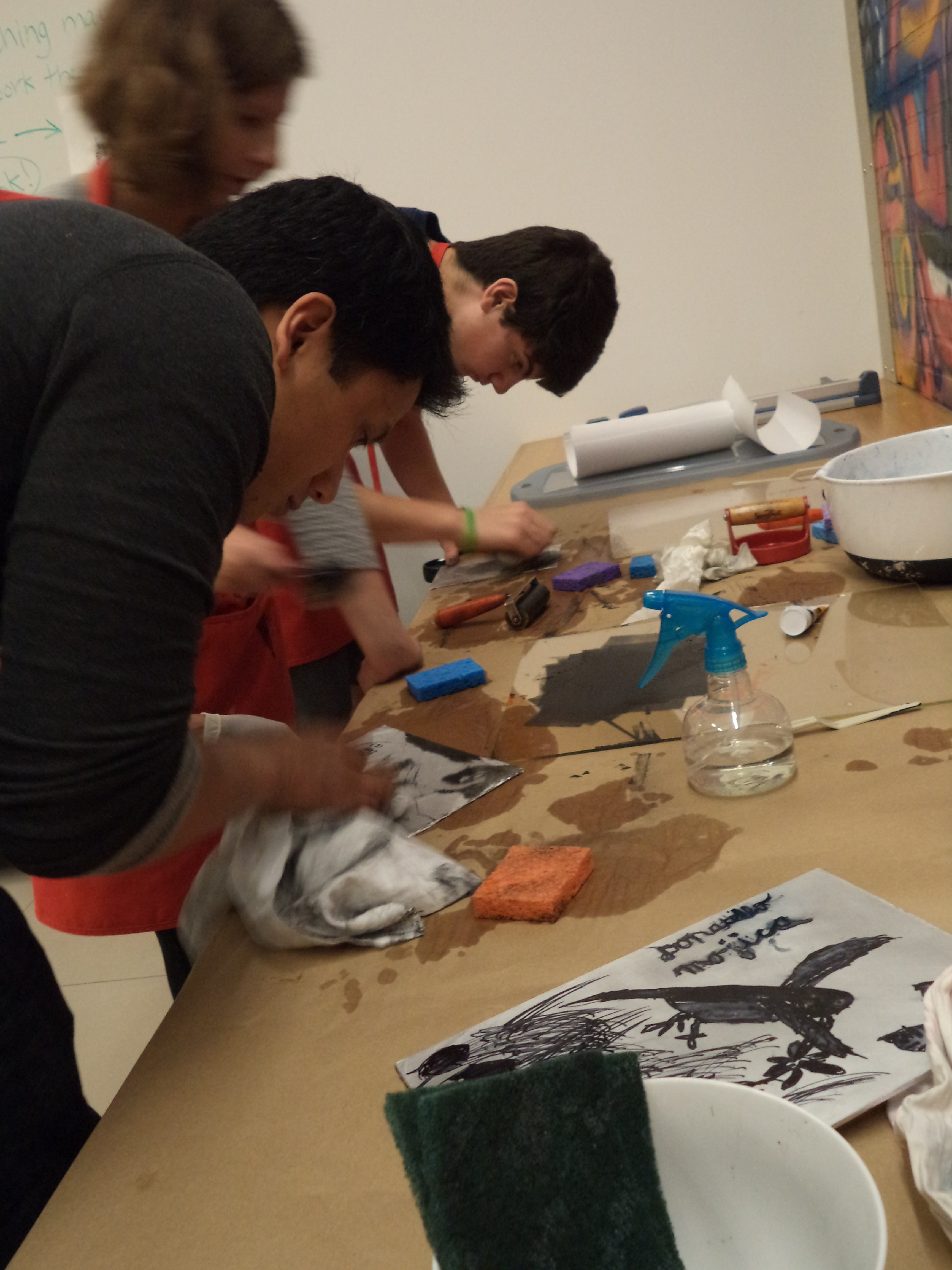
This idea of alternative processes was the basis of April’s Urban Armor workshop for teens. One of the techniques I taught was a version of lithography appropriately dubbed “kitchen lithography” because most of the supplies can be found in your pantry. Popularized by Emilie Aizier, there are lots of tutorials on how to do it on various internet sites. Finding a perfect guide is hard because the process is finicky and everyone does it in a slightly different way. It’s definitely something to experiment with on your own, but I’ll share what gave me the most consistent results.

If you’ve never tried lithography before, it basically consists of creating a master image on a plate (usually metal or stone); in this case, cola is used to etch the image into aluminum foil (it contains phosphoric acid–yum!). Printing from the plate works on the principle that water and oil repel each other: the plate is first coated with water, which doesn’t stick to the etched image because of the gum arabic in the cola. Oil-based ink is then rolled onto the plate, which sticks to the image but is repelled everywhere else by the water.

Several months back, the DMA hosted the wonderful exhibition Posters of Paris: Toulouse-Lautrec and His Contemporaries that not only featured fantastic lithograph posters from the late 1800s, but highlighted many of the tools and steps involved in lithography.

What you need:

  • Small sheet of plexiglas
  • Heavy duty aluminum foil
  • Tape
  • Sharpie permanent marker
  • Scrubber pad/steel wool
  • Vegetable oil
  • White vinegar
  • Cola (I used Coke)
  • Sponge and bowl of water
  • Lithography ink (NOT water-based)
  • Latex gloves
  • Printing brayer
  • Printing baren or large spoon
  • Heavy drawing paper
  • Spray bottle
  • LOTS of paper towels

Steps:

Prepare your plate

  • Cut a piece of foil slightly larger than your sheet of plexi. Carefully smooth it down so it’s nice and flat; try to avoid creating any folds or wrinkles.
  • Fold the edges of the foil around the plexiglas and tape them down to the back.
  • Use your sponge to wet the surface of the foil with a little water, then sand it lightly with your scrubber until it’s dull and no longer super shiny.
  • Wipe the surface down with white vinegar to clean off the plate.
???????????????????????????????

Sharpie image on plate

Draw and etch your image

  • When the surface of your plate is dry, draw an image on it with a Sharpie permanent marker. If you are adding text, remember to write backwards (your print will be a mirror image of your plate).
  • After you’re finished with your drawing, make a cola bath for your plate: fill a shallow pan (big enough to accommodate the plate) with about 1/4″ of soda. Then place your plate in the cola drawing-side down.
  • Let your plate soak in the cola bath for 10 minutes or longer.
  • Remove the plate and rinse it in the sink, gently trying to remove as much of the Sharpie drawing as you can.
  • Dry off your plate, then buff the surface using a small amount of vegetable oil and a paper towel. This should help remove the last bits of marker. Even though you may not be able to “see” your drawing any more, don’t panic!  The cola should have etched it into the foil, creating a “ghost” image.

Ink your plate and print

  • Load your brayer with ink: spread a small amount of ink on a paper plate, then roll it out with your brayer until the entire surface is coated evenly with ink. Set the brayer aside.
  • Set your plate face-up on the counter. Wipe down the entire surface with a wet sponge.
???????????????????????????????

Inking

  • Roll the brayer across your plate. You should notice the ink start to stick to your ghost drawing. It may take a few passes of alternating between wiping your plate with water and inking it to ink the entire plate.
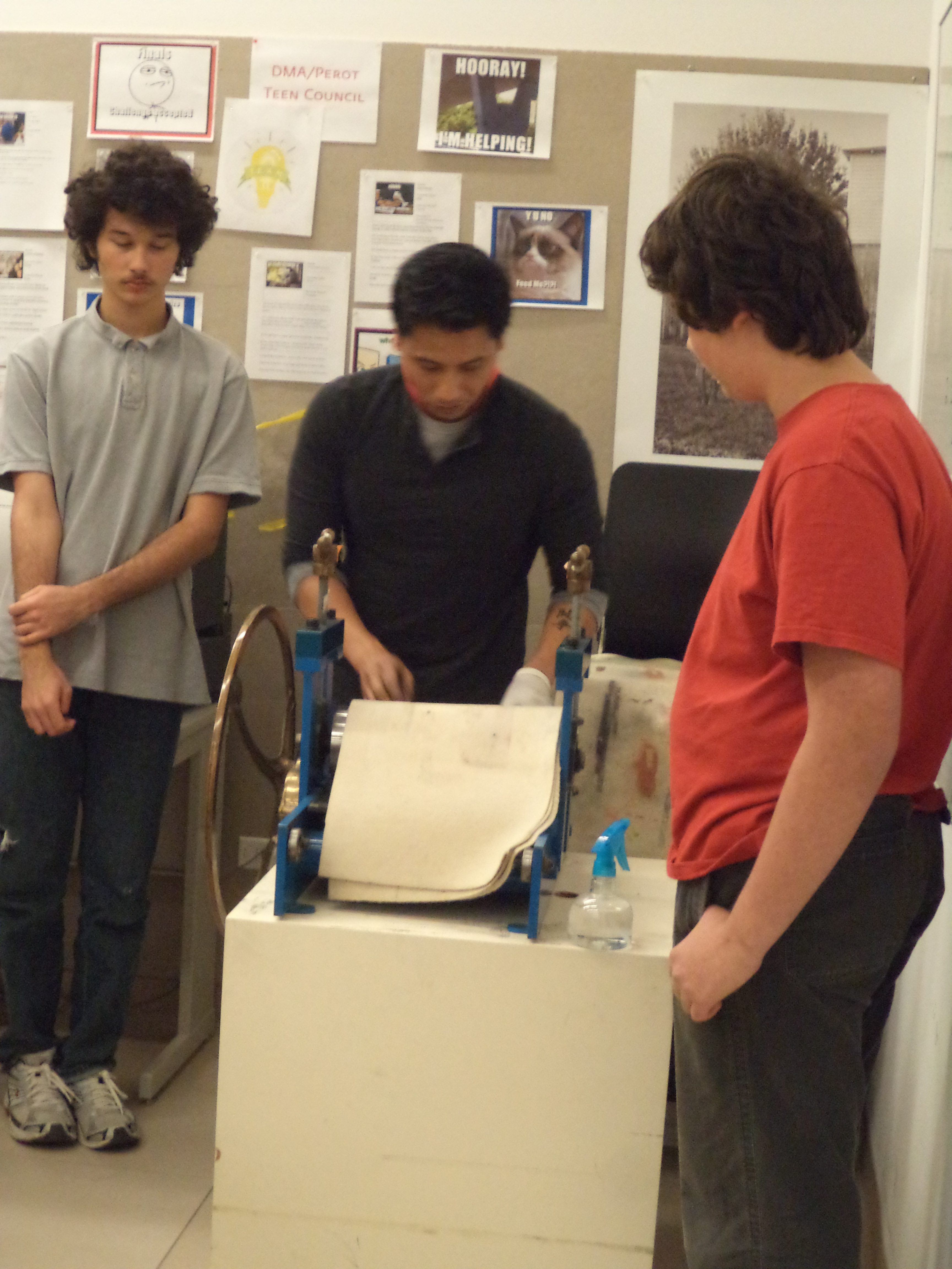
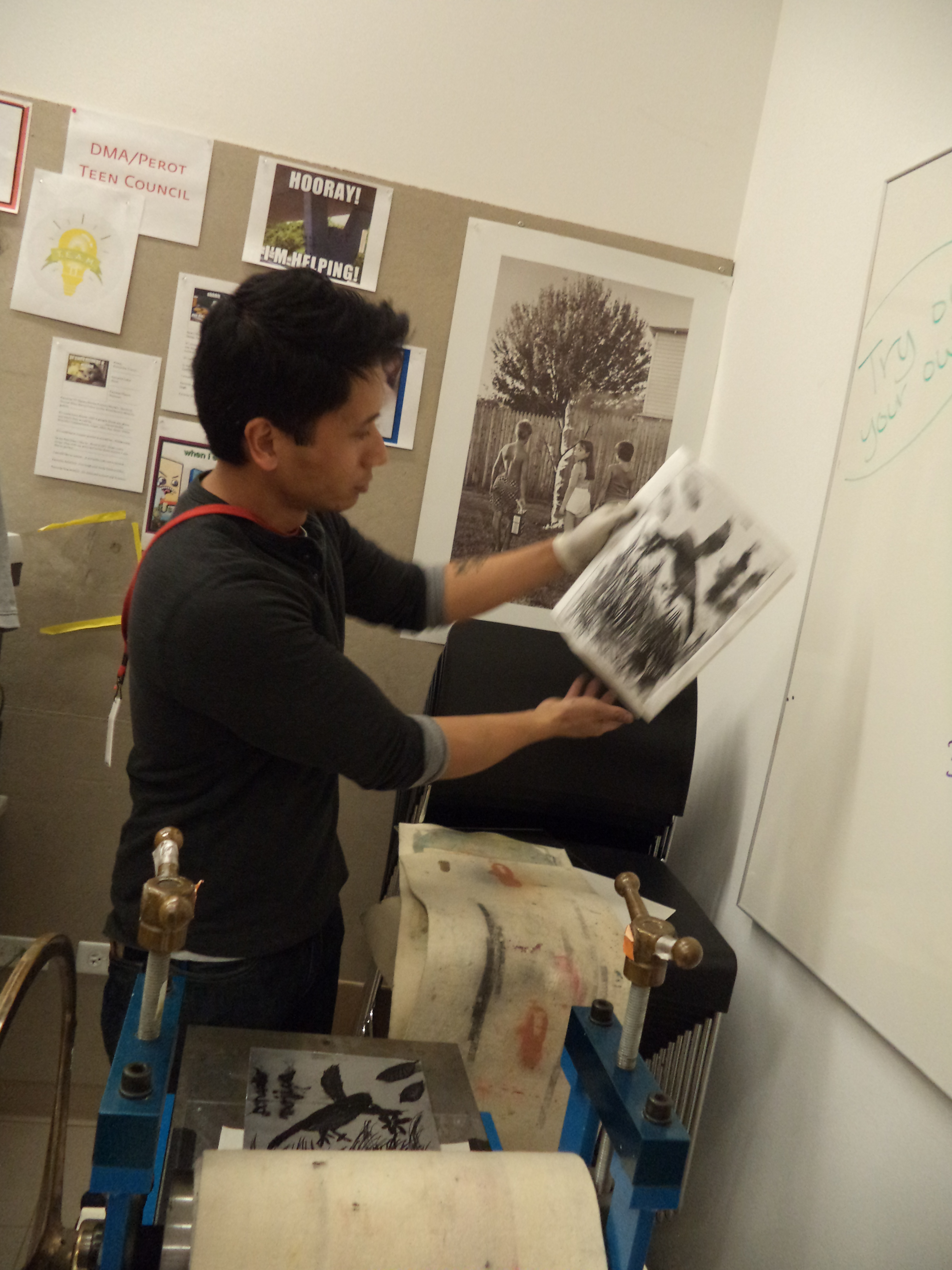
  • Spray your drawing paper evenly with water and place it on top of your plate. Rub the back of your paper with a baren or the back of a spoon. If you have access to a printing press, that would be ideal.
  • Carefully peel back the paper and leave it to dry.
???????????????????????????????

Printing

???????????????????????????????

Printing

Coke Etching 2

DSC01836

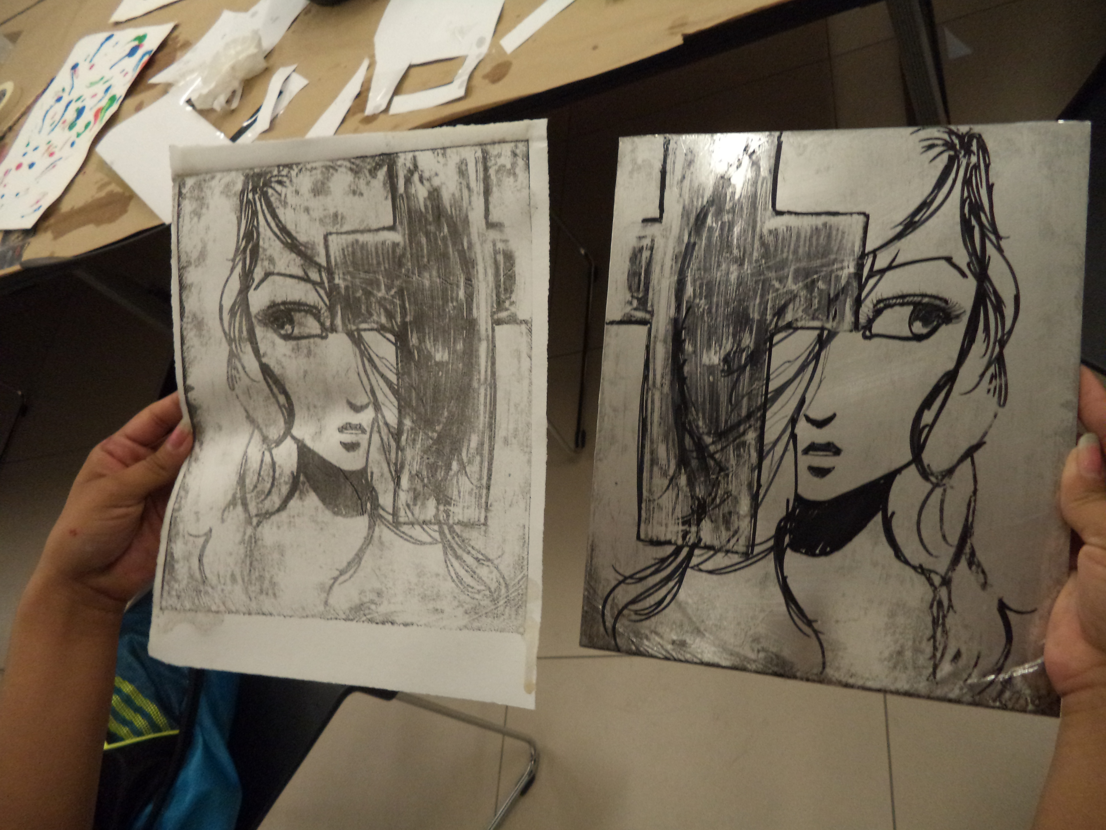
Finished print side-by-side with original plate

As I said earlier, there are many variations on this technique that you can experiment with. People have drawn their image into the foil with grease/litho crayons, touche, even Murphy’s Oil Soap! Each of these options would be fun to try out and should give you different results.

To me, the trickiest part is inking the plate–I ruined the first two that I tried to print during that stage. I found that I didn’t use enough water when I was wetting my plate and the ink ended up sticking to everything instead of just my drawing. The nice thing is that it’s really easy to make a new one–just crumple up the old one and try again!

JC Bigornia
C3 Program Coordinator
DIY String Art Tutorial

Last weekend, the Dallas Museum of Art teamed up with the Perot Museum of Nature and Science for our Art + Science Festival. Visitors enjoyed activities ranging from light graffiti to digital microscope observations to a film about artists and scientists who devote their lives to origami.

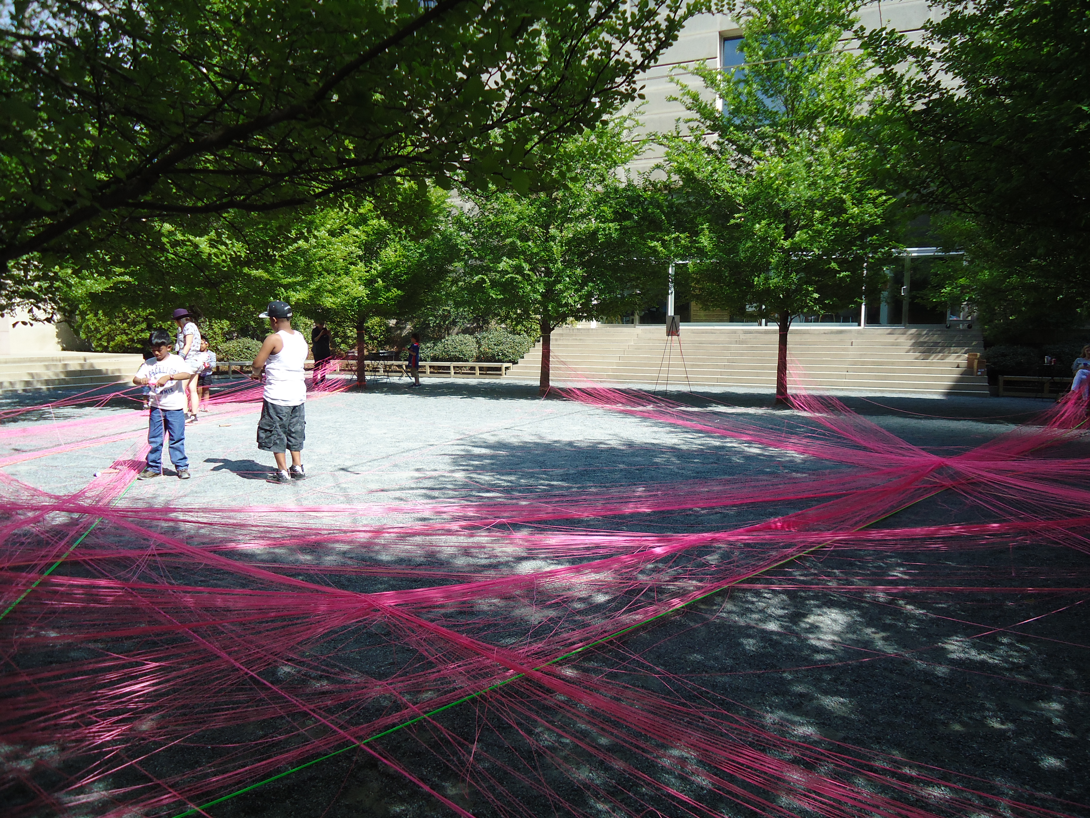
If you ventured to the DMA’s Fleischner Courtyard during the festival, you probably noticed a colorful creation of string being woven through the trees. That’s because guest artist Amie Adelman was leading a workshop which involved visitors helping her create a sculpture of geometric lines and angles using just the courtyard’s trees and string as supplies.

026

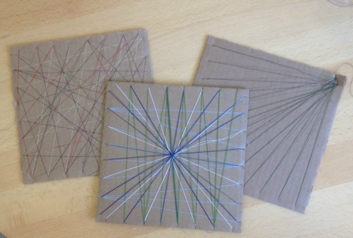
Although it may be difficult to create a work of art on your own as immense as the one that graced the DMA’s courtyard last weekend, there’s a simple way to create your own string art with supplies that you can find in your own home:

What you need:

  • Cardboard square (our example is 8″ X 8″)
  • Pencil
  • Ruler
  • Exacto knife
  • Scissors
  • Thread

Step 1

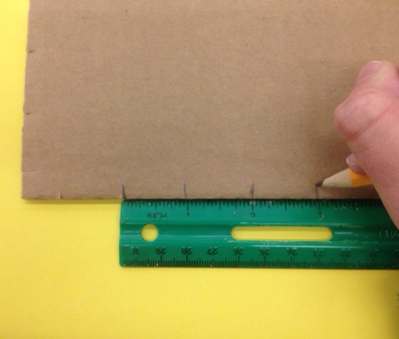
Using a ruler as a guide, make small marks with a pencil on all four sides of your cardboard square that are one inch apart from each other.

stringart1

Step 2

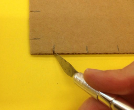
Once you have drawn marks on all four sides of your cardboard square, score the marks all the way through the cardboard with an exacto knife.

stringart2

Step 3

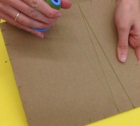
After all pencil marks are scored, wrap your cardboard square with thread. Make sure that the thread is wrapped tight enough through the scored marks that they do not easily slip out. This will also keep you from having to knot the thread when you’re finished creating your design.

Think about the different geometric designs that you want to make with the thread. The more layers of thread that you add to your cardboard, the thicker and more visible it will appear when you’re finished.

stringart4

Step 4

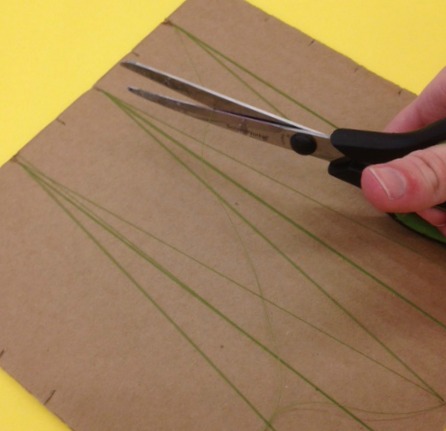
Once you’re through using your thread of choice, cut the thread on the back of your string art creation.

stringart5

Step 5

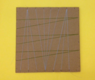
Optional: Keep adding more colors of thread to your design. If you choose to add more colors, repeat steps 3 and 4 for each color of thread that you add.

stringart6

There are a lot of different geometric designs that you can create with string art! Share what colors and designs you decide to incorporate into your own string art creation in the comments!

stringart8

Amy Elms
McDermott Intern for Visitor Engagement

DIY Photo Transfer

Spring is (finally) here, which means that many of us in the education department are gearing up for Summer Art Camps! The best part of teaching a summer camp is getting to experiment and explore with materials to devise fun and engaging art projects. Jessica Fuentes and I are teaching a summer photography camp for 6-8 year olds, called Developing an Eye for Art. In this camp we are going above and beyond the simple point and shoot aspect of photography, and urging our students to explore this artistic medium through many different avenues. A favorite exploratory activity of mine is photo transfer, because it is a fairly straightforward project that invites loads of experimentation.

5

What you need:

  • Photograph to transfer (higher contrast photos are best)
  • Light colored piece of wood (5×7″ is what I used)
  • Matte gel medium (found in the acrylic paints section of art & craft stores)
  • Scissors
  • Paint brush (can be foam or bristle)
  • Mod Podge (I used matte finish)
  • Access to a laser printer or copy machine

Step 1

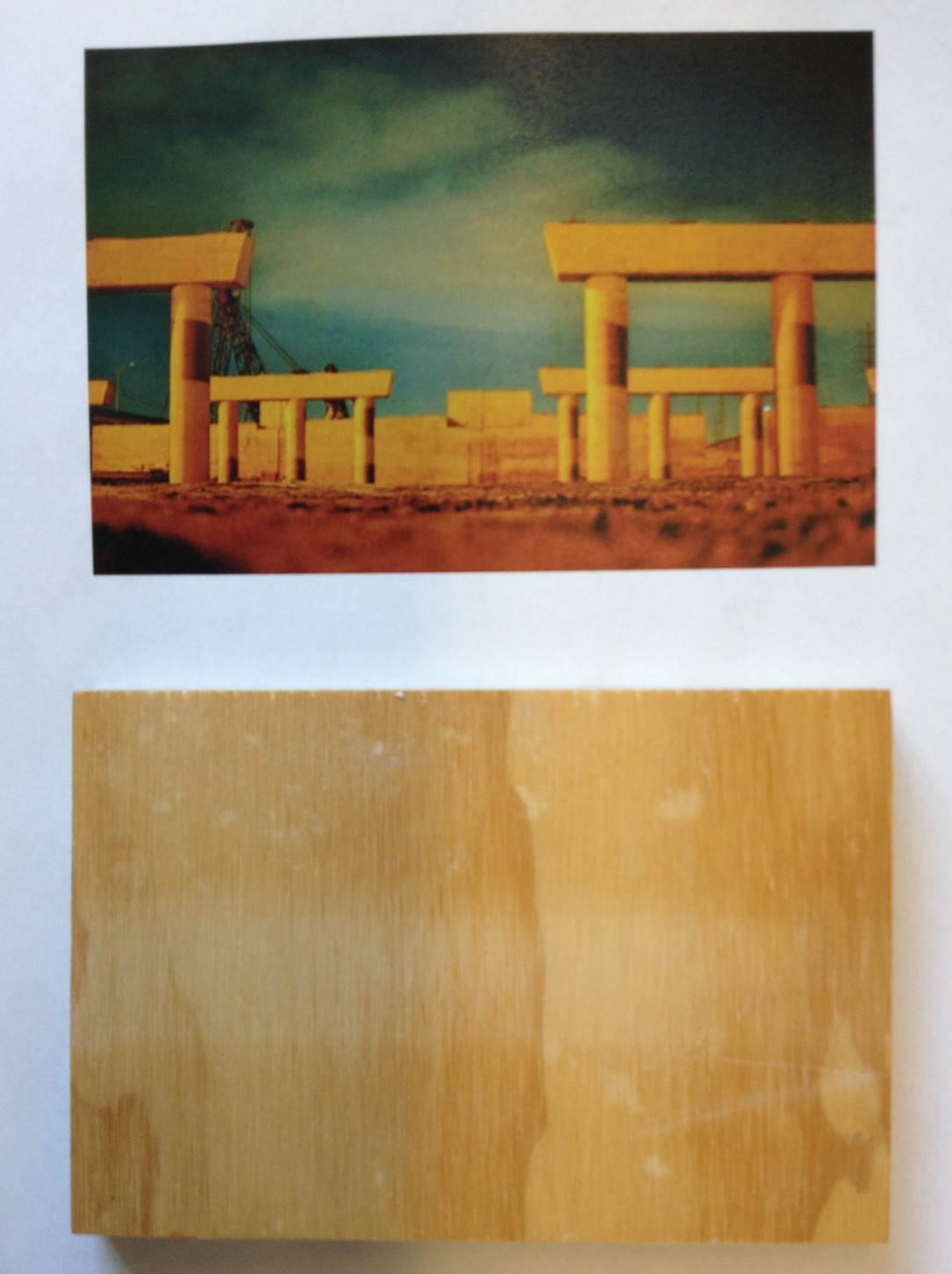
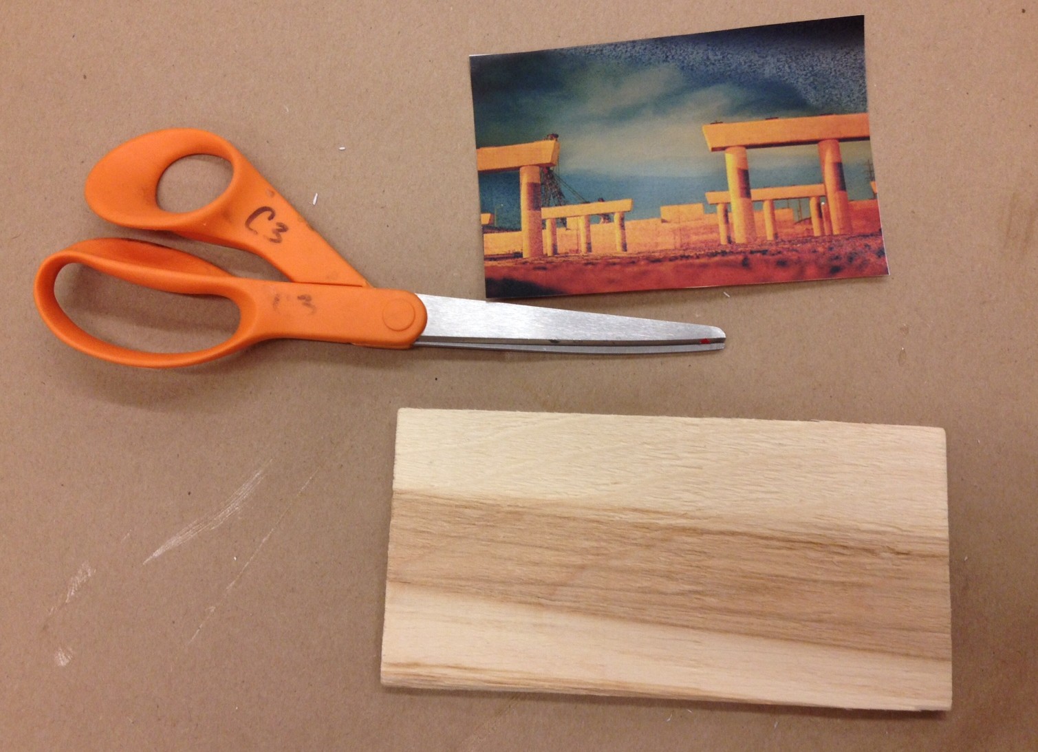
Print your chosen photograph from a laser printer, or make a copy of the image on a photocopier. Do not use an ink jet printer, as it will smudge the image. Make sure the printed or copied image is the same size (or smaller) than your piece of wood.photo (5)

Step 2

Cut out the laser print-out of your image, making sure you do not leave a border around the image.

scissors

Step 3

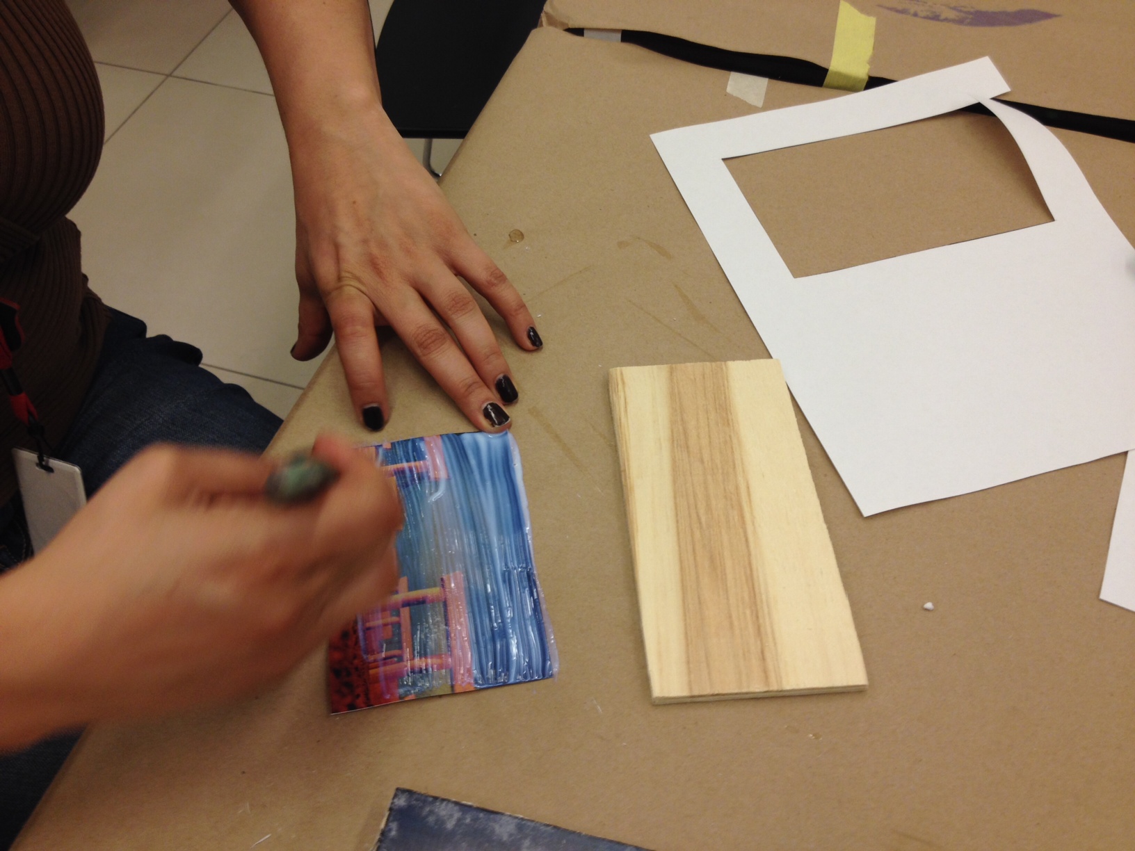
Use a foam or bristle brush to place a thin layer of matte gel medium directly onto your image, which will make the image opaque white.

Brush gel medium directly onto image.

Step 4

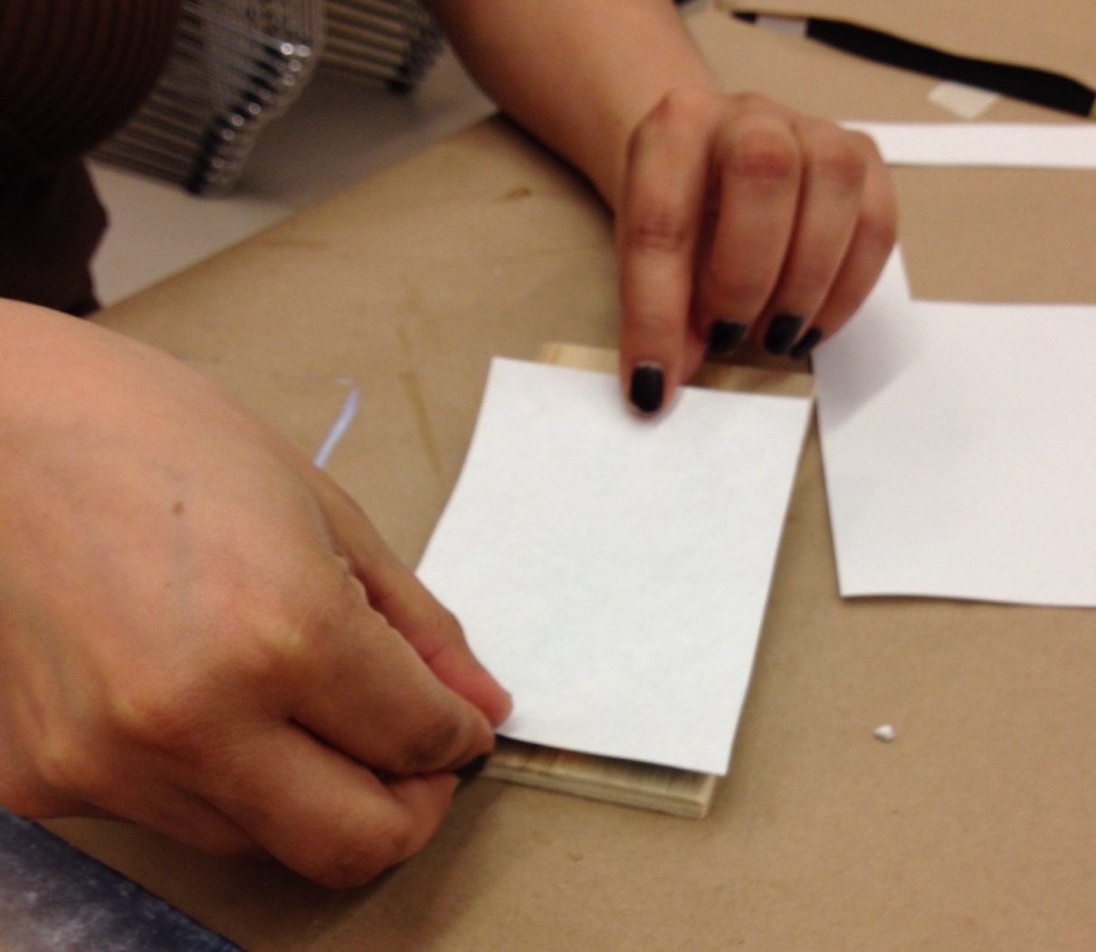
Before the gel medium dries, place your image face down on your piece of wood. Be careful with placement as you will not be able to move the photograph once it dries.

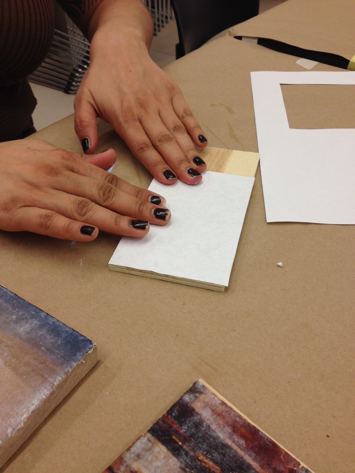
Once your image is in place, smooth out and flatten any air bubbles underneath your photo. You can use your fingers or anything with a stiff edge (like a ruler) to smooth out any bumpy places. Make sure not to push too hard and rip your image.sandwich

Step 5

Let your photo transfer sit and dry for at least 8 hours.

Step 6

After your photo transfer has dried, get a wet rag and lay it on top of the image, making sure to get the paper nice and soaked. Next, use your fingers or a rag to carefully rub off the fuzzy white paper fibers, revealing your lovely photo underneath.

It is best to let the transfer dry in-between paper rubbings, to make sure that all the bits of paper are removed. This make take time and multiple drying and re-wetting sessions. Be patient 🙂

smush

Step 7

Once your photo transfer is dry and to your liking, brush a layer (or two) of Mod Podge on top of the image to seal the work.

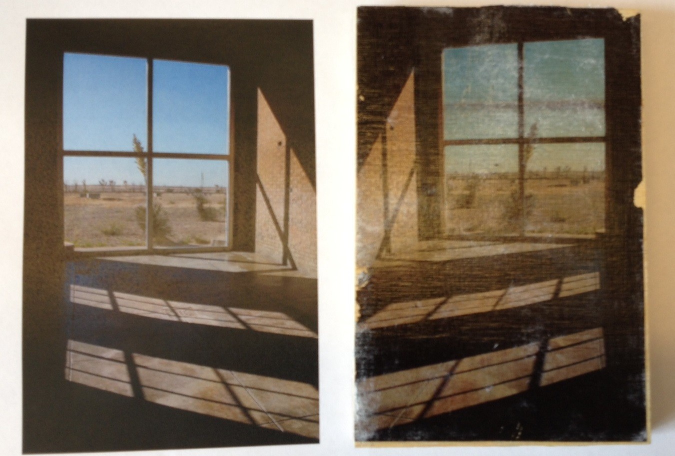
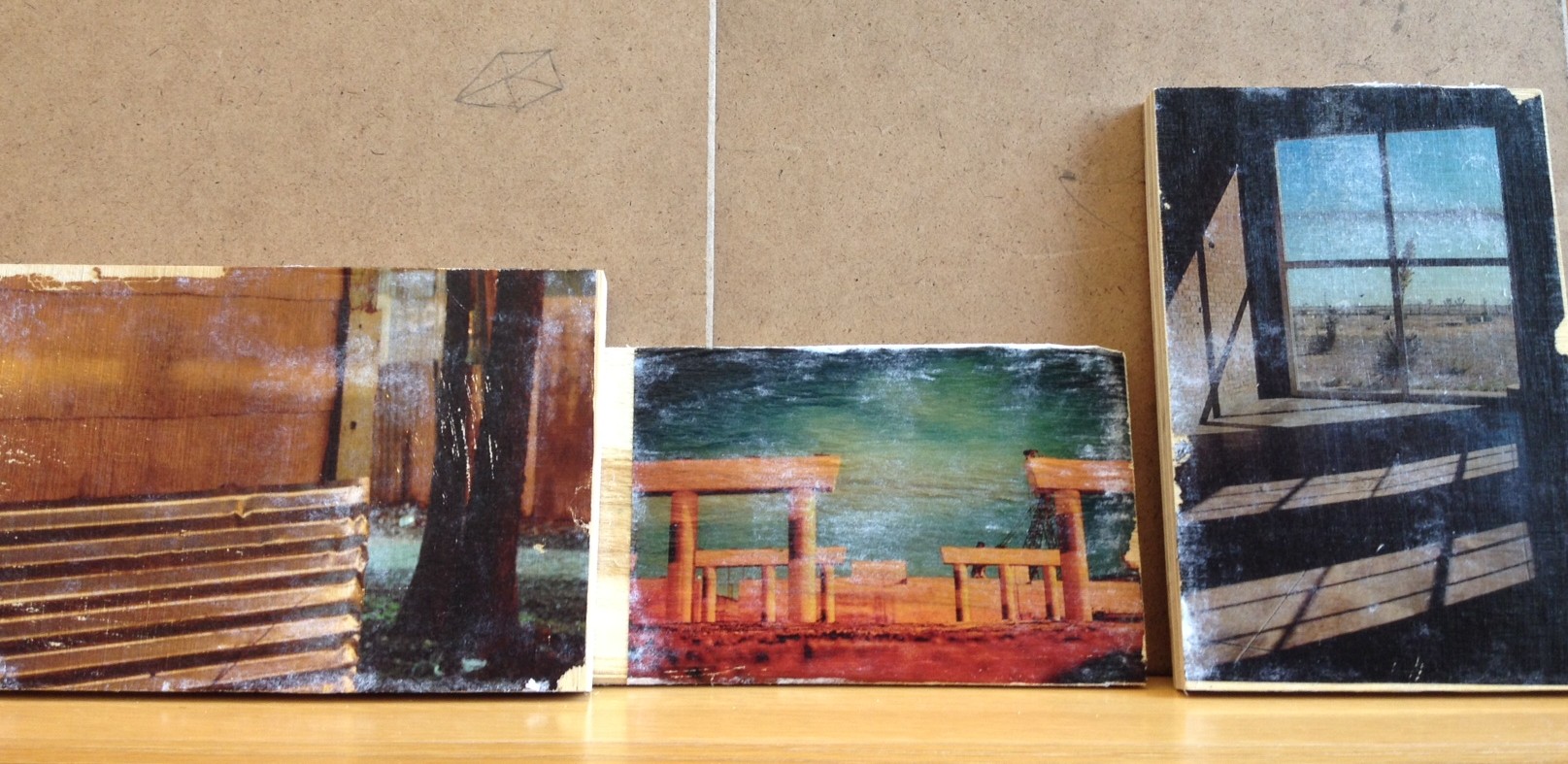
That’s it! Your photo transfer is done and ready to be shown off! This simple project can be modified to give a more or less distressed look to the finished work, experiment and see what you can do!

Finished transfers.

Finished transfers.

Danielle Schulz
Teaching Specialist

Close to Chuck Close: A DMA DIY

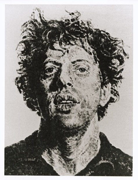
After attending the Philip Glass and Tim Fein concert at the Winspear Opera House this past Monday night, I was excited to discover that the DMA’s collection includes a lithograph of the composer, completed by his long-time friend Chuck Close. Close is known for his innovative approaches to representing the human face. All of his works explore this theme, depicting his subjects, generally friends and family members, in intimate, large-scale portraits of their shoulders and head. His portraits begin as photographs, which he then carefully transfers to a canvas. Close has experimented with various techniques and materials, including finger-painting, graphite, conté-crayon, pastel, oil and watercolor.

Chuck Close, Phil/Fingerprint, 1981, lithograph, Dallas Museum of Art, Mr. and Mrs. Jake L. Hamon Fund

Chuck Close, Phil/Fingerprint, 1981, lithograph, Dallas Museum of Art, Mr. and Mrs. Jake L. Hamon Fund, (c) Chuck Close

Over the course of their four-decade-long relationship, Phil has been the subject of many of Close’s most iconic works; in fact, his image has been used more than any other subject. According to an article published by W magazine in 2007, Close estimates that he has repurposed a 1968 photograph of Glass “150 times or something.” Glass returned the favor in 2005, unveiling a striking and beautiful composition entitled “A Musical Portrait of Chuck Close,” intended to encapsulate the artist’s persona and work. The DMA’s Close work is a 50’’ by 38’’ lithograph of a fingerprint Close completed in 1981. I have always admired Chuck Close’s work, and I recently began to explore my own talents for photorealism. I decided to experiment with Close’s gridwork series, having read that Close used this approach “to break things down into a manageable and solvable problem.” For me, as an amateur artist, this statement provided the confidence I needed to begin my project. Follow my progress below to create your own Close-inspired work.

Step 1: Choose a photograph
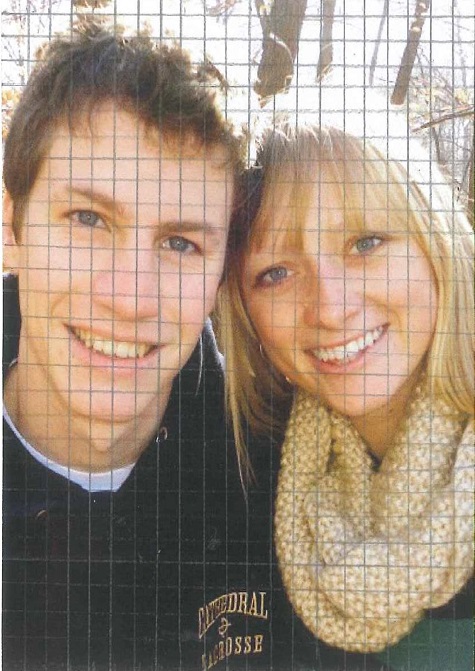
As mentioned, all of Close’s portraits depict only the subject’s shoulders and head. This tight cropping helps to focus the piece and also encourages closer consideration of the subject’s individual features. I chose the photograph below for my image.
1

Step 2: Crop your image
While this project works best with an up-close photograph, do not hesitate to crop or enlarge an existing photograph. Since I knew this artwork would be given as a gift, I chose an image with two subjects, rather than one. After cropping, however, my photograph becomes a manageable project.
2

Step 3: Divide your image into a grid
Measure the length of your photograph. You want to make sure that the length and width of the photograph is evenly divisible by the size of each unit. For instance, my photograph is 14.5 cm by 10.5 cm so I chose to use 1/2 cm as my base unit. Use a ruler to divide your photograph into units of equal size. I recommend using a pencil so that you can correct a line if need be; graphite also shows up better than other mediums on glossy photograph paper.

Hint: The larger you make your squares, the less time your project will take. Larger squares will make for a more abstract image and smaller will create a more precise, accurate image.
3

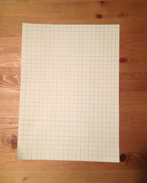
Step 4: Transfer your grid to your canvas or paper
To determine the size of your project, first decide on the size of your new base unit. For my project, I transferred the 1/2 cm units from my photograph to 1 cm on my drawing paper. In total, my final project will be approximately 8.5 by 11 inches. Be sure to consider your dimensions carefully, especially if you plan to frame your final composition.
4

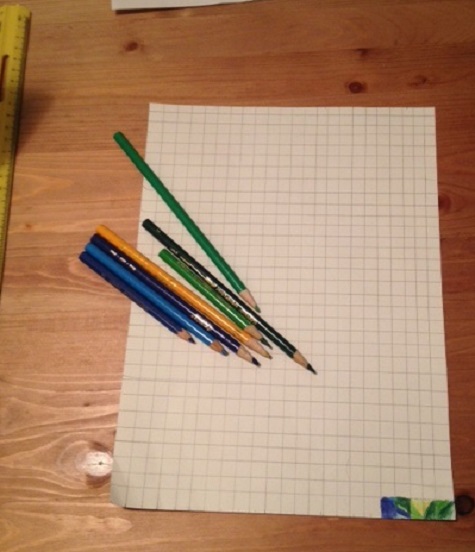
Step 4: Start your drawing!
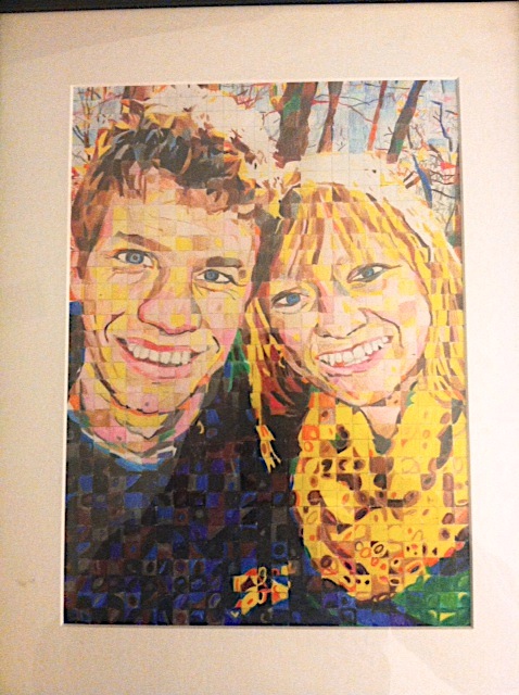
I used colored pencil and drawing paper for my project. These materials are easy and user-friendly. If you are familiar with another medium, feel free to use it. After all, Chuck Close likes to experiment, too!

When selecting your colors, you can opt for accuracy or choose a unique theme or palette of your own. This decision may also affect the style of your portrait. You can use the lines to help you create an accurate, photorealistic transfer of your photograph; or you can use a more interpretive, abstract coloration (see Phil above). I chose the latter process. For this process, color each square as an individual unit, independent of the units around it. Don’t worry, it will all add up in the end!

It is easiest to begin in a corner and then work your way up, row by row. You may also want to start with something easy, like the shoulders or clothes before attempting to work on the face. Be patient. You do not want to rush and accidently transfer the wrong section of your photograph. If you get lost, count your square units to get you back on track.
5

Step 5: Don’t give up
Depending on the number of squares in your artwork, this may be a long process. My picture took me about 16 hours to complete. If you are frustrated, step away and come back to your work tomorrow.

This activity can also be simplified for children. You can choose a simpler subject and/or divide the paper into larger squares. Either way, it is a good way to encourage “close-looking” and practice experimenting with colors.

Step 6: Step back, appreciate your work, and put a frame on it
Great work! I hope you enjoyed this project. If you made an artwork of your own or used this activity in your classroom, please share your creations with us below! Also, if you have suggestions on how we can improve this project, we would value your feedback.

Hint: Adding a frame or border to your artwork can really enhance the overall effect!

6

Hayley Prihoda is the McDermott Education Intern, Gallery and Community Teaching, at the DMA.

DIY Treasure Jars

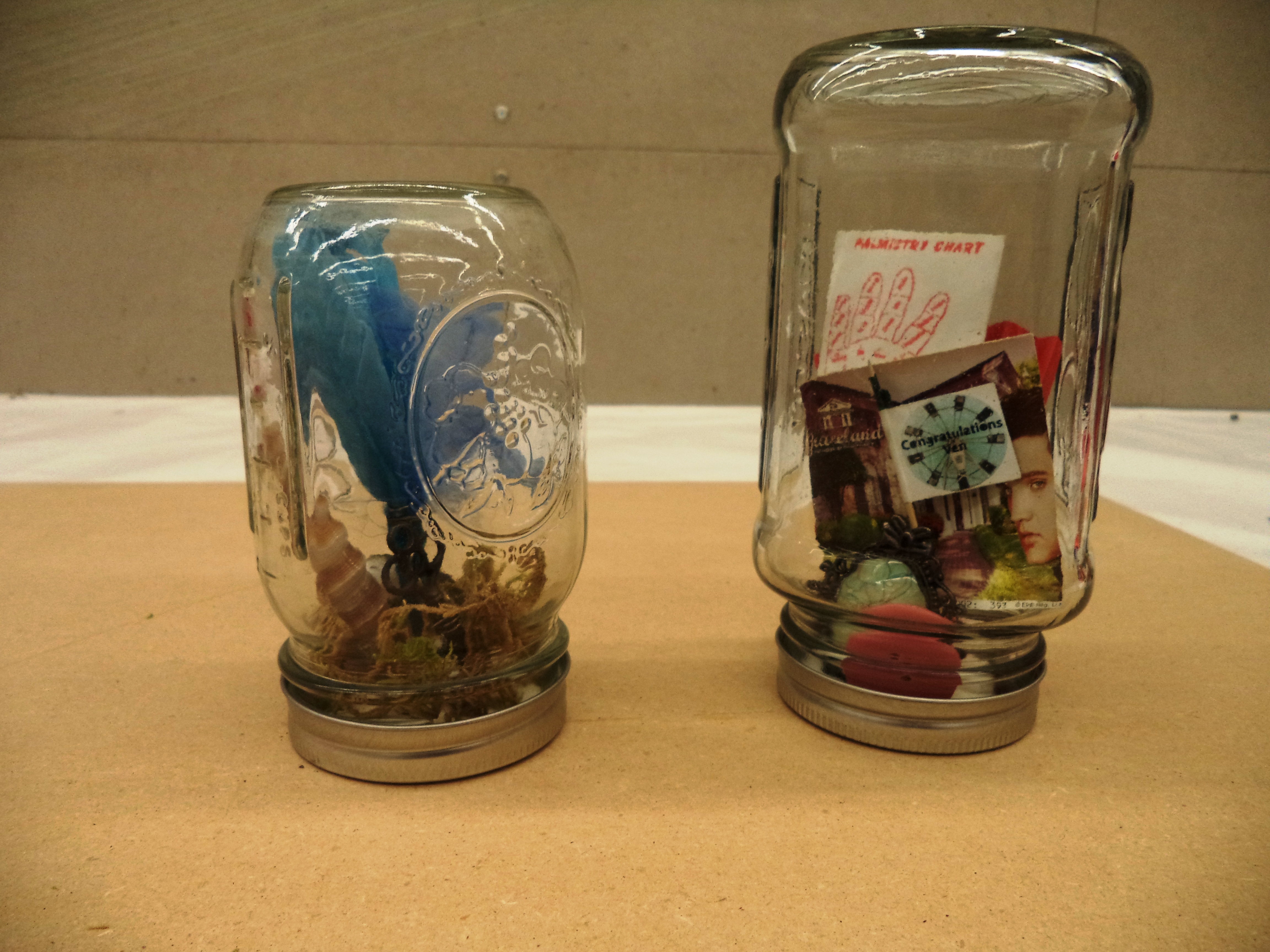
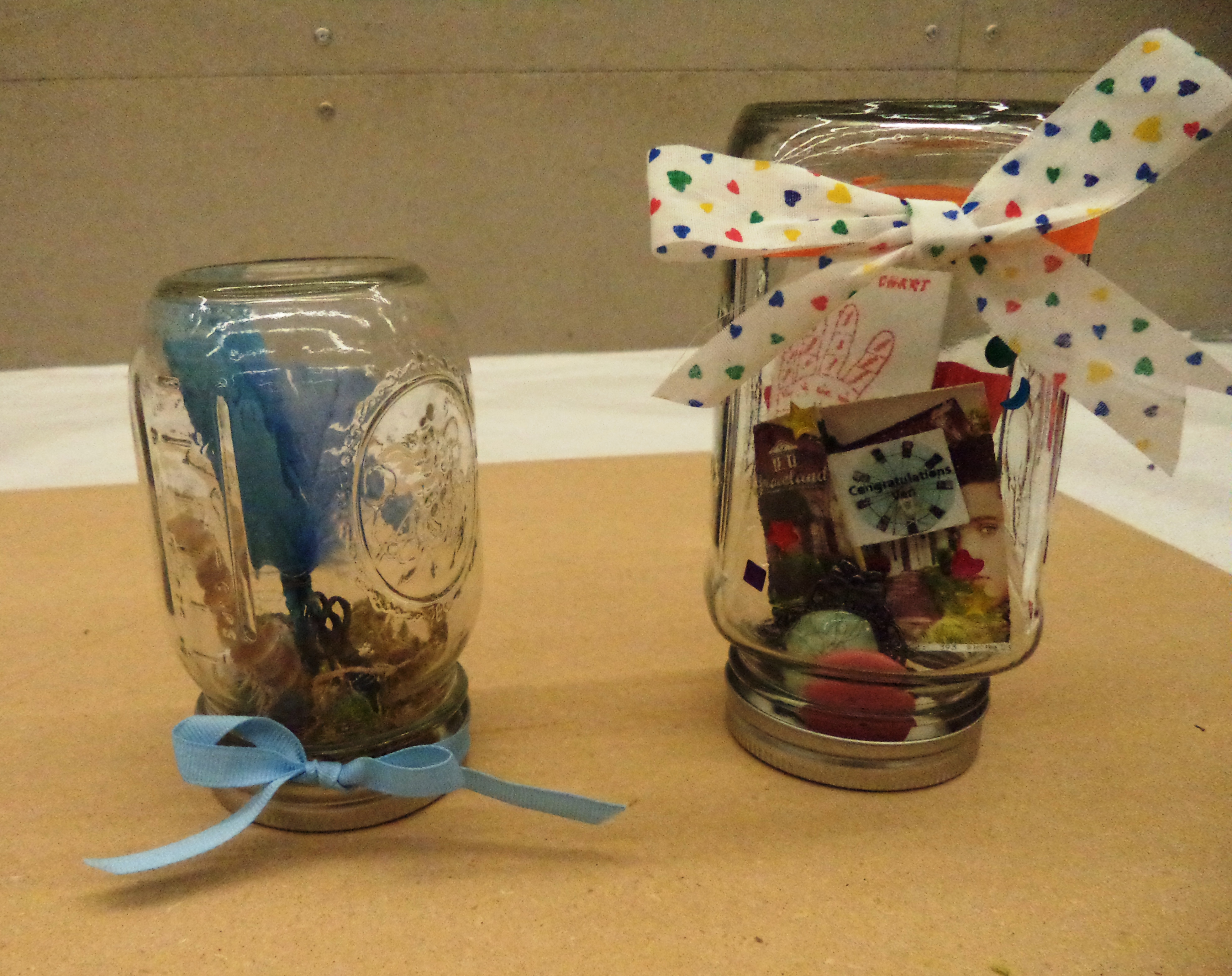
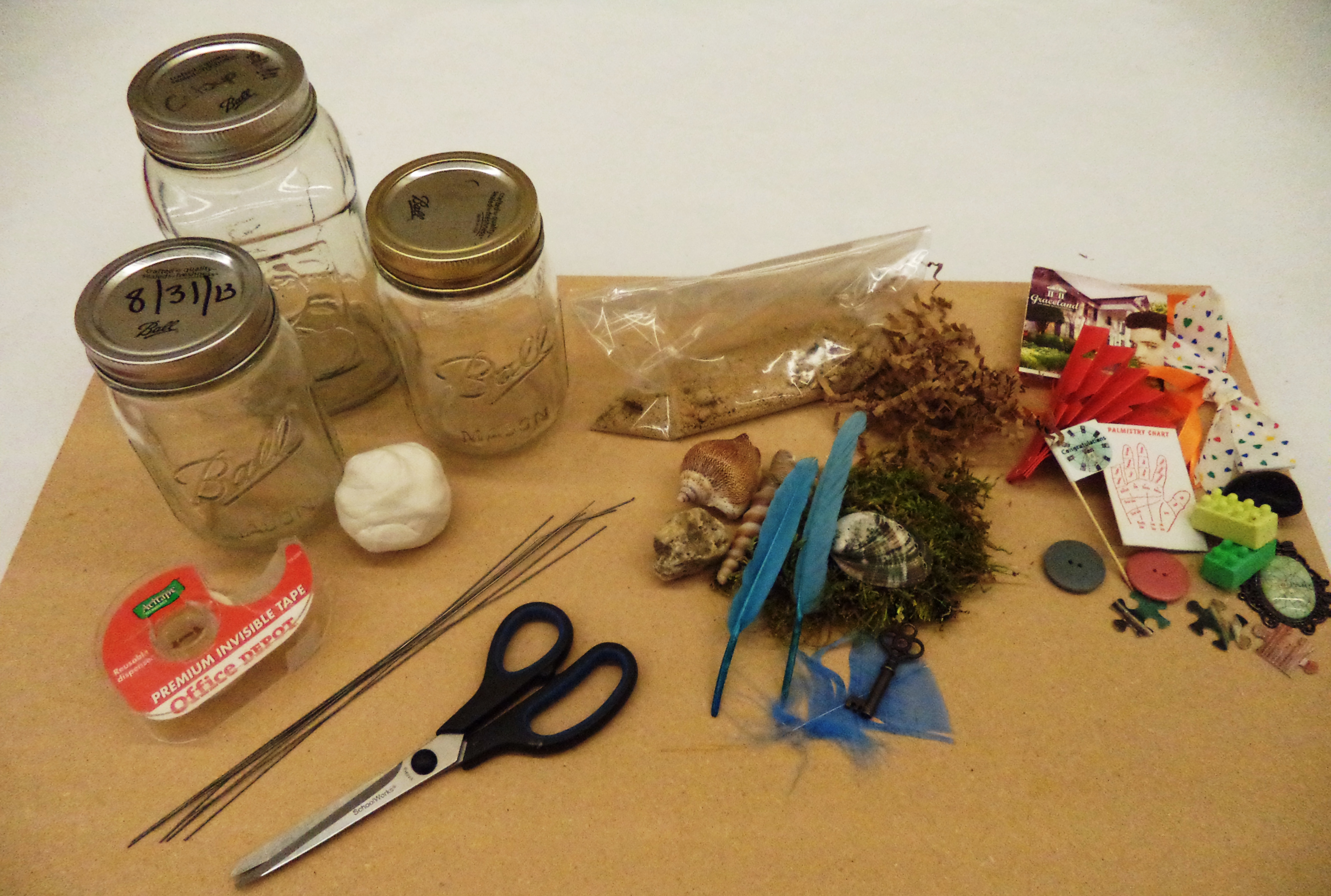
I love collecting treasures–sparkly buttons, keys, postcards, rocks, shells, ticket stubs…and the list goes on! However, at a certain point, I run out of room for these special mementos and they end up scattered about my living space. I discovered that treasure jars help to both organize and beautifully display my favorite objects. These adorable jars can be used to decorate your home or office and they make excellent gifts as well. It’s a fast, easy, and fun project, perfect for kids too!

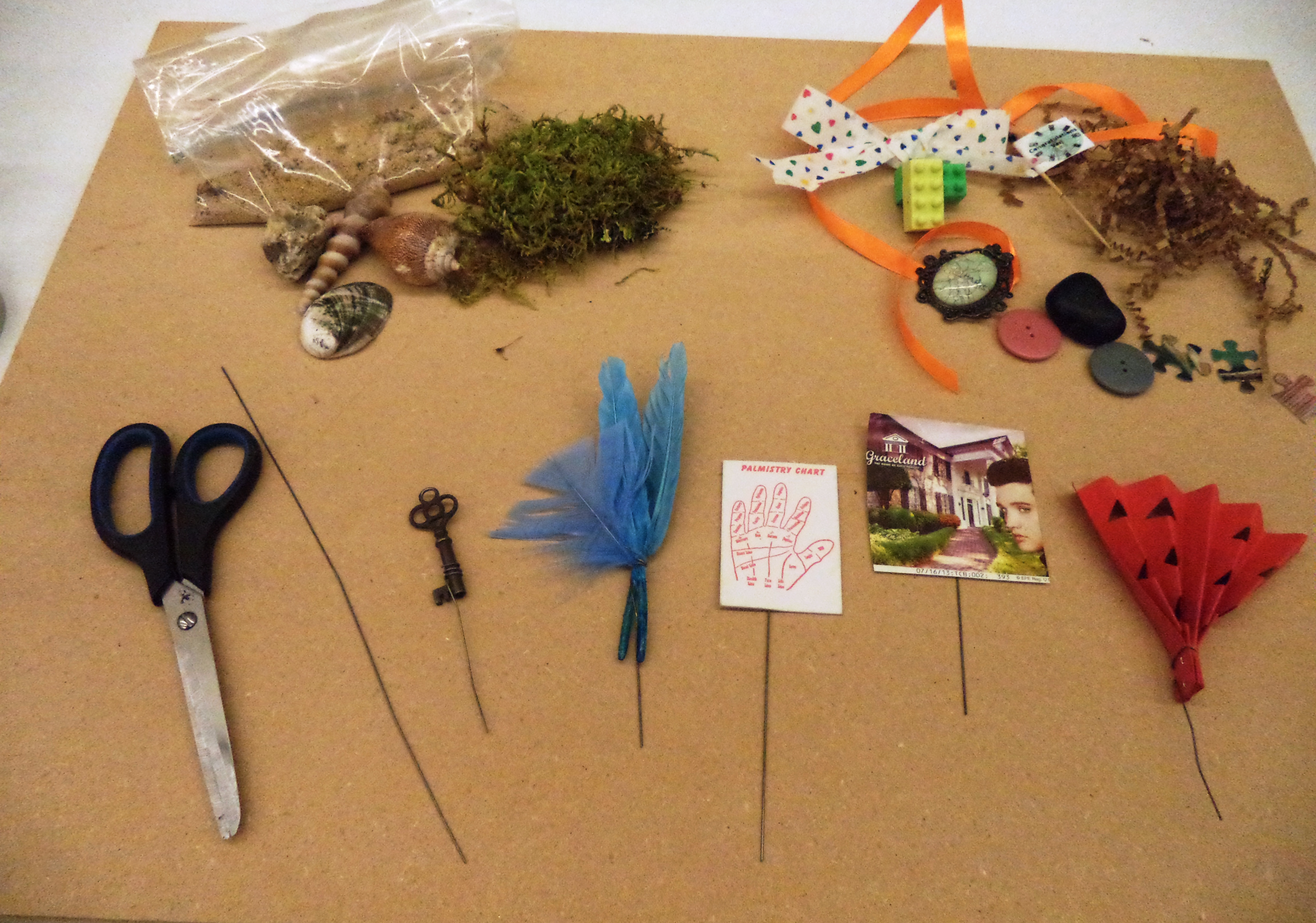
What You Need:

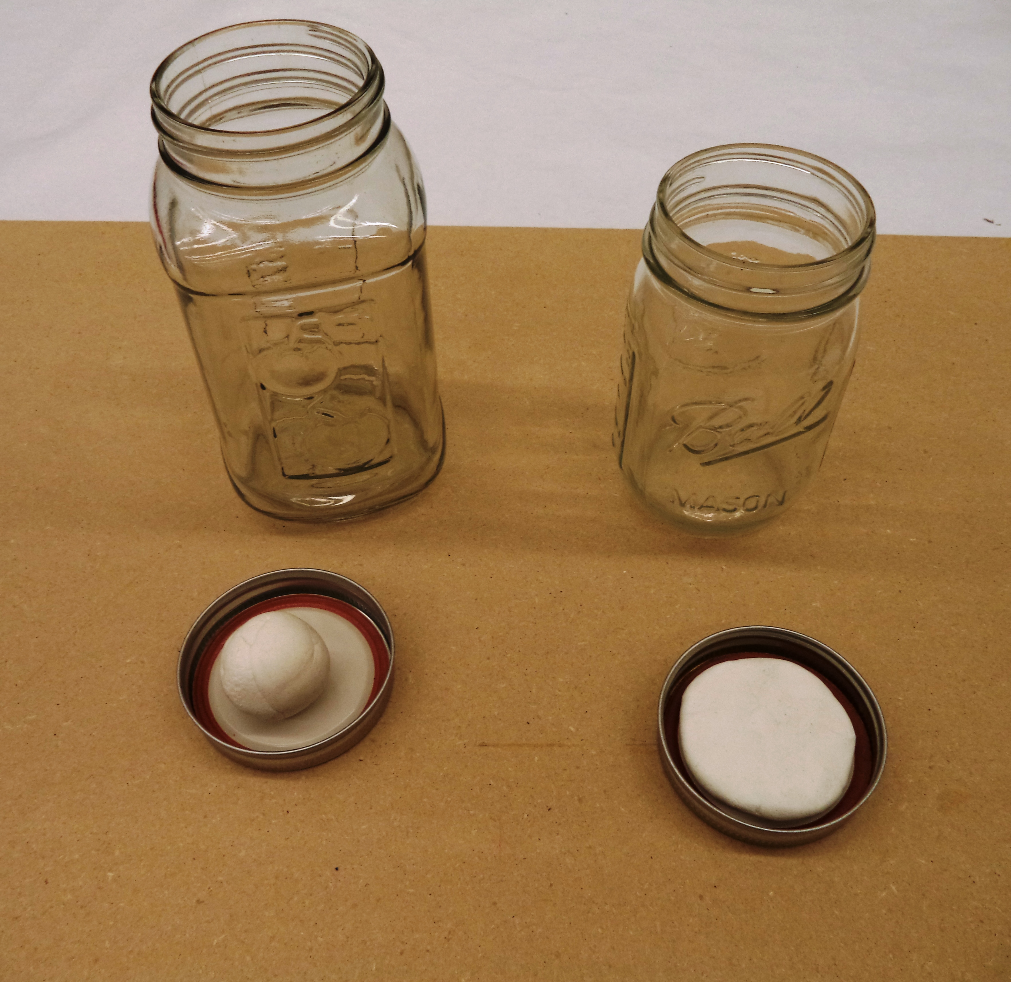
  • Mason jars (or any glass jars with lids)
  • Found objects able to fit inside the jar
  • Modeling clay
  • Floral wire
  • Scissors
  • Clear tape

???????????????????????????????

Step 1

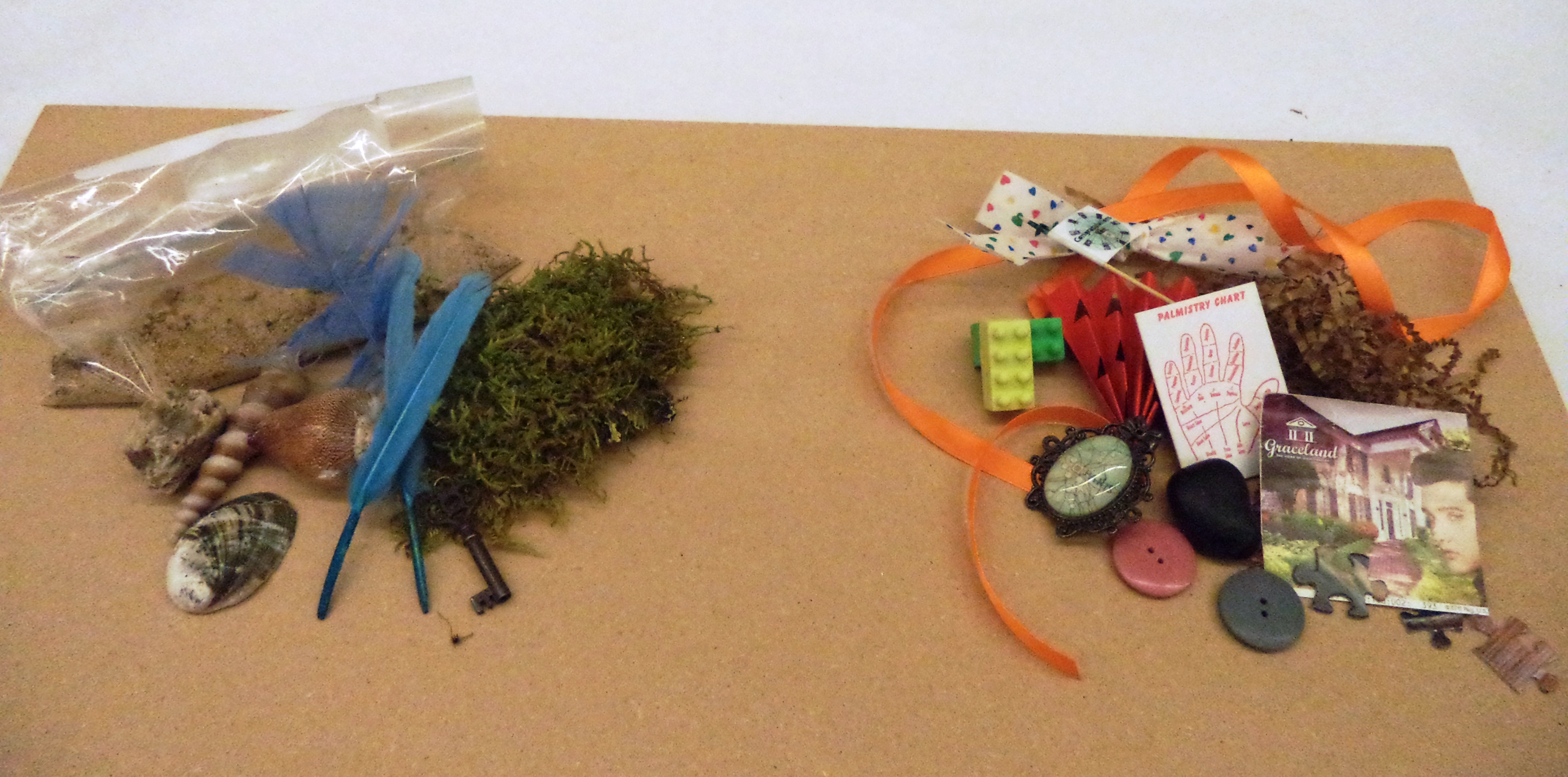
Choose your special treasures and divide them up into small groups. You can divide them by theme, by color, by the time or place you received them–whatever you like.

???????????????????????????????

Step 2

Adhere paper and other delicate treasures to a piece of floral wire with clear tape. You can also wrap them if the object allows (children may need help with this).

???????????????????????????????

Step 3

Gather as many mason jars as you would like to use, making sure they are clean and dry. Remove the lid and press modeling clay firmly into the center, making sure to leave a little bit of space on the outer edge so that the lid is able to be screwed on.

???????????????????????????????

Step 4

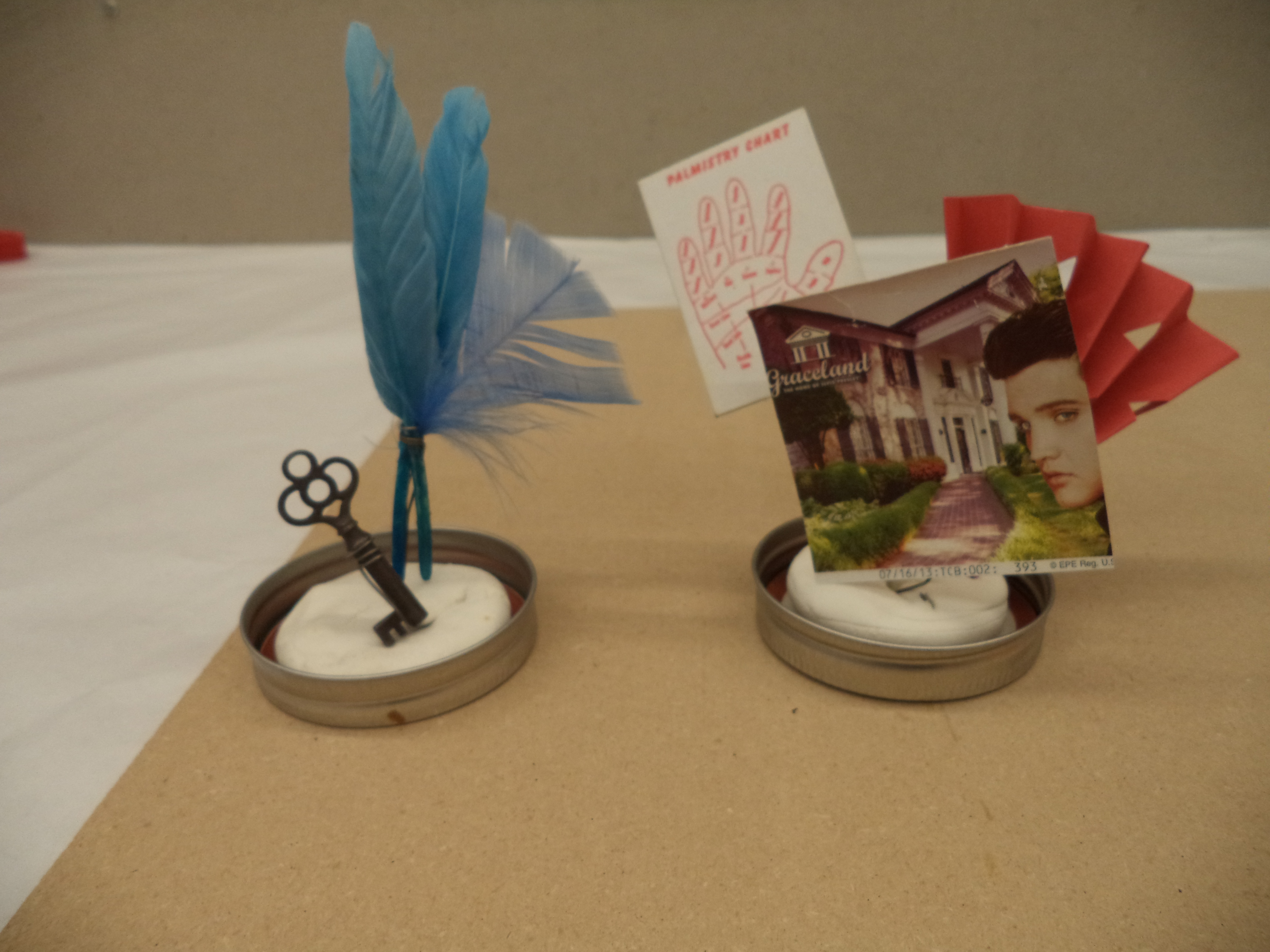
Press your items on floral wire into the clay.

172

Step 5

Press any other objects you would like to use into the clay, again making sure not to block the outer edge of the lid.

???????????????????????????????

Step 6

This part is a bit tricky! Turn your jar upside down and guide your items inside. Slowly screw on the lid.

???????????????????????????????

Step 7

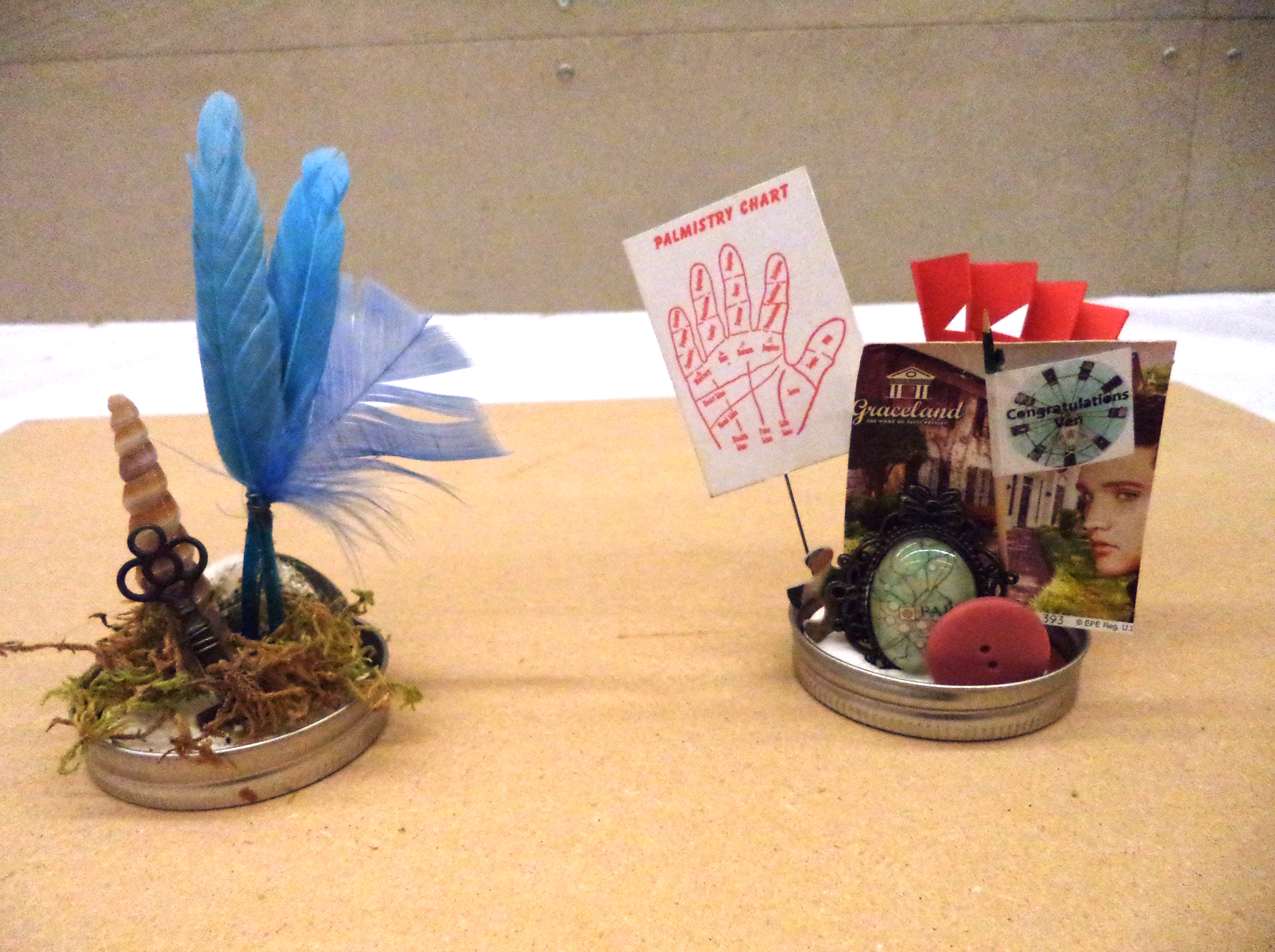
Decorate the outside of the jar with stickers, ribbons, or other materials. Voila! You’ve just made your very own treasure jar!

???????????????????????????????

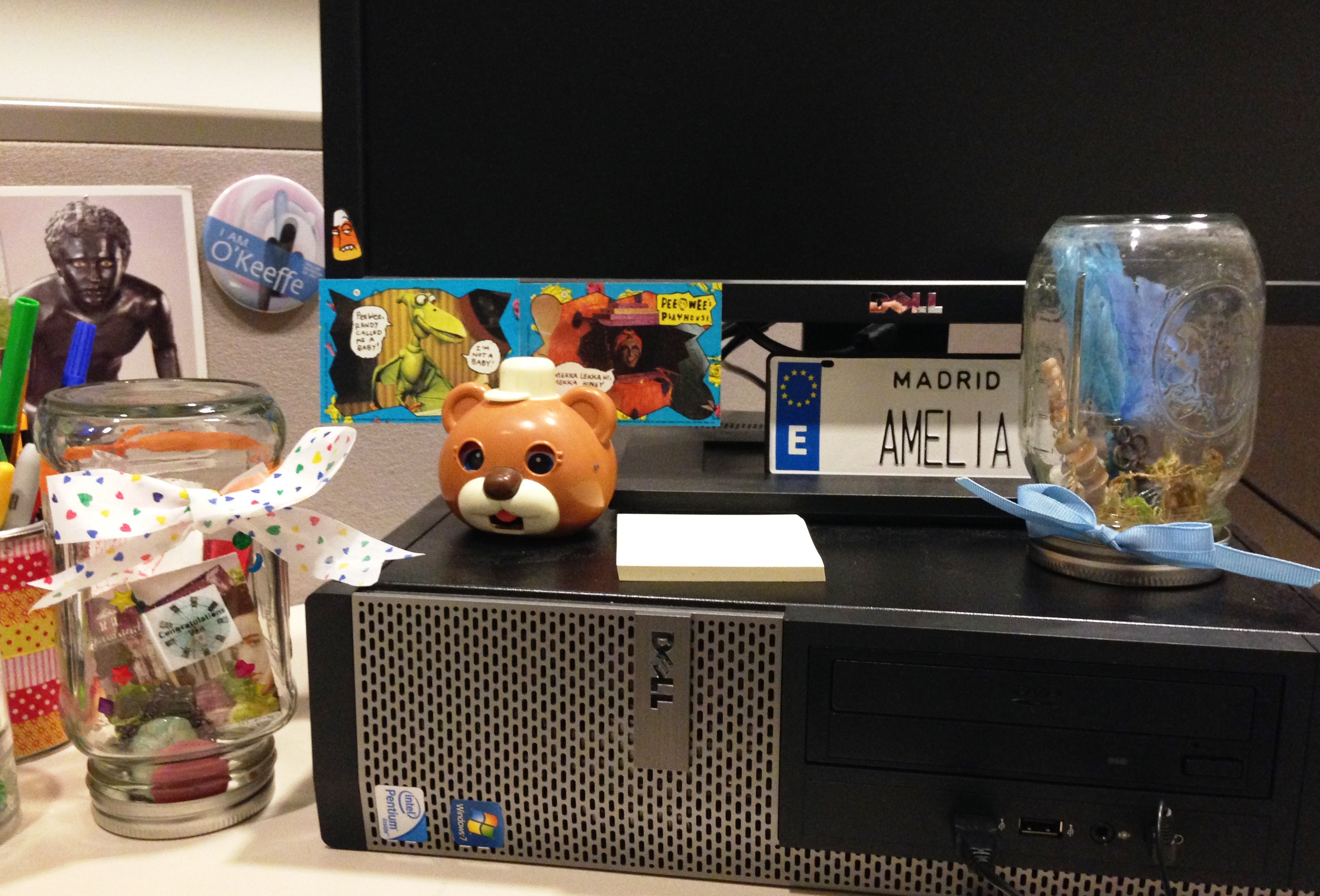
Use your treasure jars however you like! I used mine to decorate my desk at the DMA–they bring a pop of color and remind me of the magic behind each object.

620

Amelia Wood
McDermott Intern for Family and Access Teaching

The DIY Teleprompter

At the DMA, we have a studio set up for video production, and we’ve recently started using a teleprompter for many of our announcement-based videos. Using a teleprompter makes it easy for the video subject to read his or her lines and still look into the camera, giving the video a natural feel and flow.

The first time we needed a teleprompter, it was a last-minute request, and we didn’t have time to order one (not to mention they are extremely costly!). So a trip to Home Depot, a cardboard box, a pair of scissors, and an iPad app later and we had a working DIY teleprompter.

How a Teleprompter Works

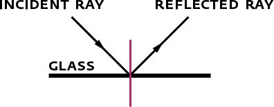
Angle of Incidence Equals Angle of Reflection

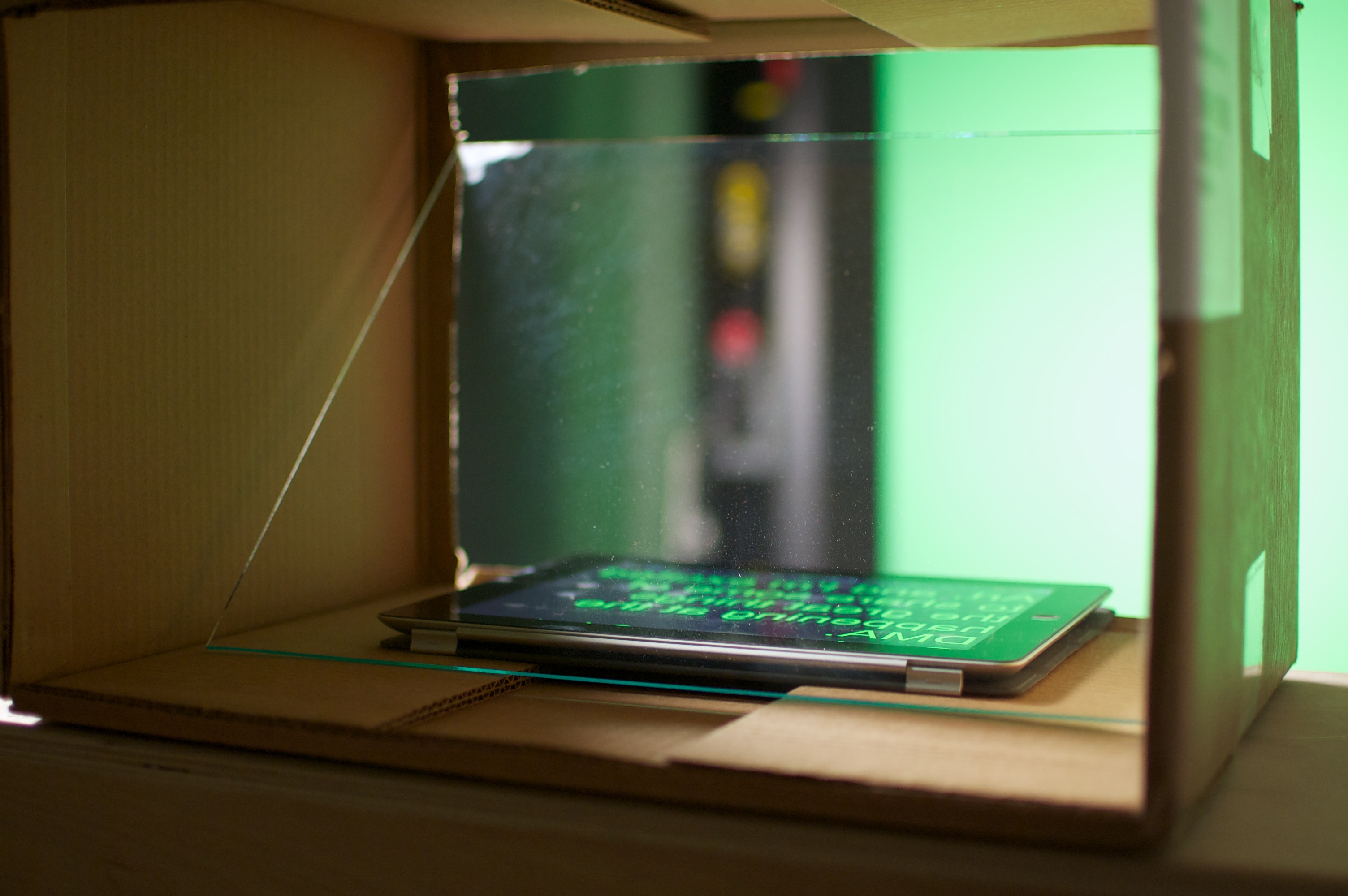
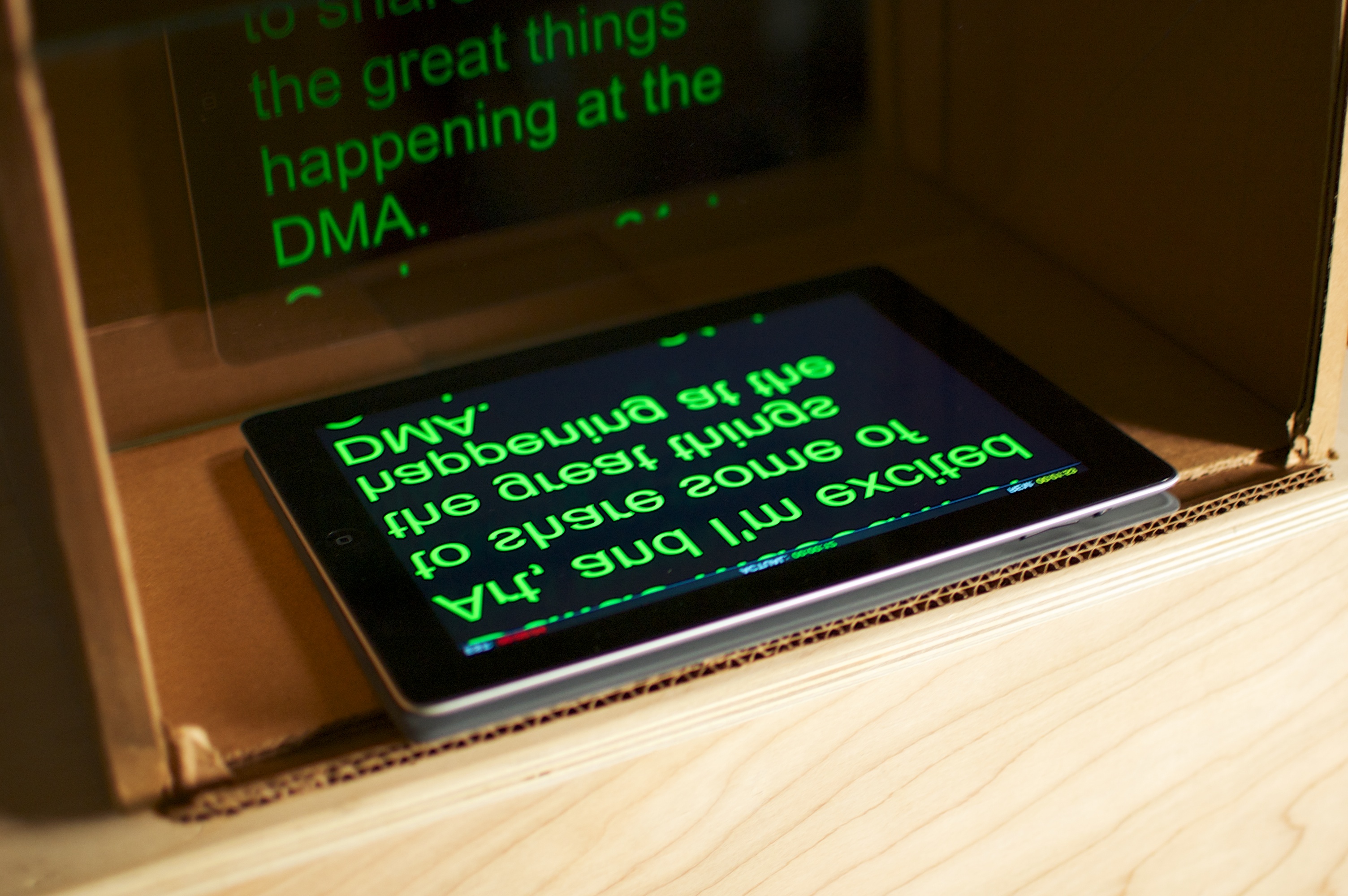
A teleprompter works by using a bit of optical illusion. A piece of glass is placed at a 45-degree angle in front of the camera lens. A computer screen (in our case, an iPad) is placed under the glass. The text is reflected off the glass and is readable by the actor while the camera does not pick up this reflection.

In terms of physics, this is based on the fact that the angle of incidence is equal to the angle of reflection. This means that if light strikes a surface (in our case the glass) it reflects off the opposite direction, but at the same angle as it was hit. So as long as the screen is on a flat surface, and the glass is at eye level to the actor, the actor will see the text but the camera will not, since its not on the same angle of incidence. This also relates to the Fresnel Effect (pronounced fray-nel), which is the observation that the amount of light visible is dependent on the viewing angle.

The material you use will also have an effect on the quality you get. Real glass works much better than Plexiglas. You also need to get the thinnest piece of glass possible. If the glass is too thick, the actor will see two reflections and the text will appear blurry. The actor will see reflections on the front of the glass and also the back. The glass I used here is 3/32 inch thick, which works great.

Setting Up the Teleprompter

DIY Teleprompter

First you have to get something to hold your glass at a 45-degree angle. I used a simple cardboard shipping box and cut both sides to just under the width of the glass. This will hold it in place and allow room for adjustment. A more permanent solution would be to build a wooden box with slots to hold your glass, but try the cardboard first so you’ll get a feel for how the glass needs to sit.

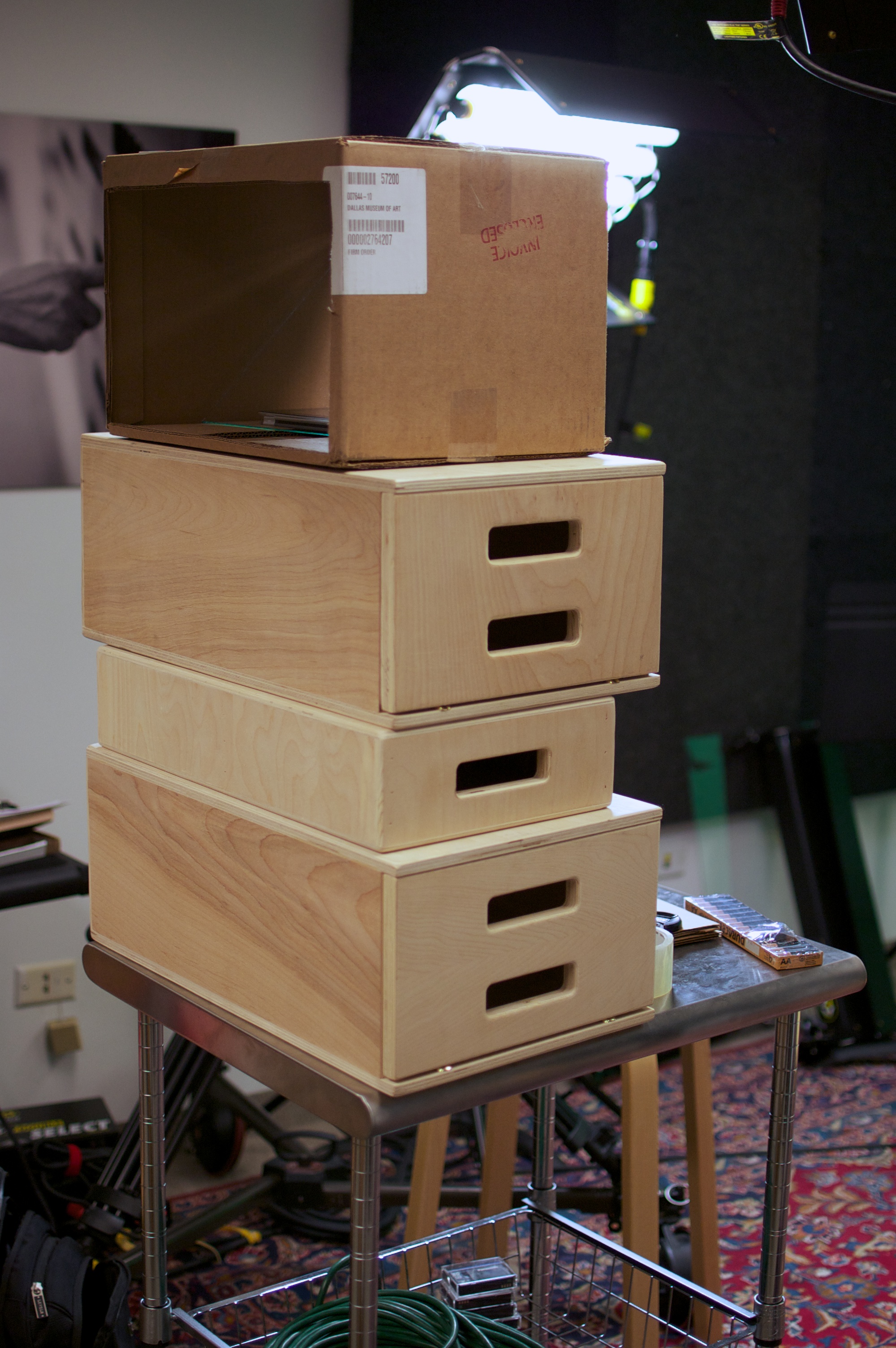
The next thing you’ll want to do is get the reflecting glass to the height of the actor. This isn’t that difficult, but do this first and it will save you a headache later. I have a rolling kitchen cart, and I’ve used some apple boxes to get the height up to eye level. You’ll need to experiment a little and have some extra “shims” on hand if there is a height difference with your actor.

DIY Teleprompter

Go ahead and set up the iPad app, and place the iPad in the bottom of the box facing up—remember you’ll need to tell it to mirror the whole display since it’s being reflected. The app I’m using, Teleprompter+, lists this as a setting. When you start the script, it will mirror all of the text for you automatically.

Set the camera up on the other side of the glass. Once the subject is in focus and you start recording, you’ll want to use a piece of dark cloth to cover the back of the camera. I actually use my sport coat, which has a dark lining. This will block out any back-lighting, so the actor only sees the text. Before you start recording, make sure your subject knows where the lens is so he or she can make a mental mark of where to place his or her eyes. You are ready to record.

The iPad App—Teleprompter+

One thing that’s really nice about Teleprompter+ is that it allows you to set up your iPhone to control the text scrolling on the iPad on either a wireless or bluetooth connection. This allows the subject to scroll the text with the iPhone off-camera. In newscast setups, this is usually done with massive pieces of equipment and is controlled by a teleprompter operator. This setup using a separate operator often drives talent crazy because this person needs to be really good at the pacing and understanding where the eyes are. It’s an art to get this right. By using the iPhone app to control the iPad, we eliminate this need, and if your talent is good at this it works much more smoothly.
Final Touches

I’ve given you all of the technical explanation and instructions for putting a teleprompter together, but I would be remiss if I didn’t say that the lynchpin for success is the talent you have in front of the camera. Reading pre-written text and making it sound natural is an art unto itself. News anchors all use teleprompters and you can tell the difference those who are dynamic and interesting and those who sound like they are reading.
The other skill that is extremely important is knowing how to “read” off a teleprompter. Naturally when we read our eyes drift around to collect information to give to our brain. Unfortunately this motion is clearly visible when using a teleprompter. The talent must have a clear understanding of where the lens is and where his or her eyes should be. Moving the camera back further seems like a good way to make eye motion less obvious, but then it is harder for the talent to see and read.

The subject of most of our teleprompter usage has been our director, Max Anderson, who has had considerable television and teleprompter experience in the past. This makes the whole thing go very quickly, and we can get everything in one or two takes. If you’re dealing with someone who doesn’t have this experience, you’ll want to build in some rehearsal time.

DIY Teleprompter

So it doesn’t look as nice as the ones used on news sets or at press conferences, but those could run you close to $5,000. Here are the costs for our DIY Teleprompter:

11 x 14-inch piece of 3/32-inch-thick glass: $3.28
Cardboard box: Free
Apple boxes and cart: Free (already had them lying around)
Teleprompter+ app: $14.99

Total costs: $18.27 + tax

Ted Forbes is the Multimedia Producer at the Dallas Museum of Art.

Do-It-Yourself Stickley

“When we come to make things ourselves . . . we should not only find more pleasure in making them but we shall take more pleasure in possessing them.” —Gustav Stickley, The Craftsman, March 1905

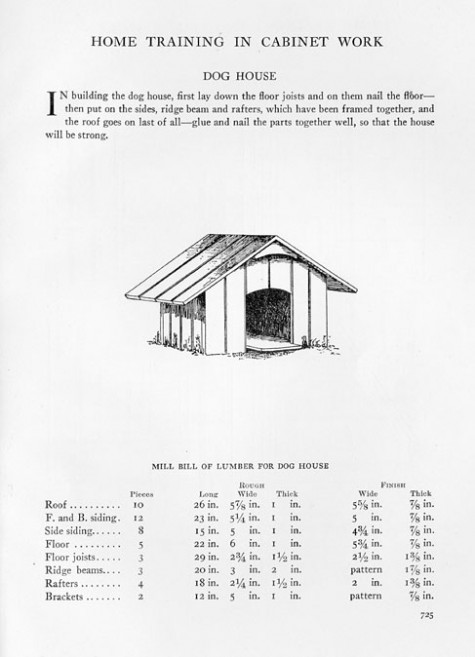
Early 20th-century designer and businessman Gustav Stickley believed in the do-it-yourself movement. His magazine, The Craftsman, provided readers with step-by-step instructions on making household objects such as side tables, clocks, embroidered pillows, and even birdhouses.

In just a few months, the Dallas Museum of Art will host the exhibition Gustav Stickley and the American Arts & Crafts Movement. We’re inviting people to produce objects inspired by Stickley’s designs, document their process, and share their experience with the DMA. These videos and photographs will be displayed in the exhibition’s education space. Our deadline is January 5. Learn more about the DIY Stickley project on the DMA website.

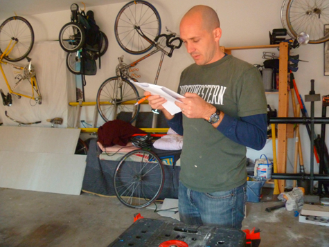
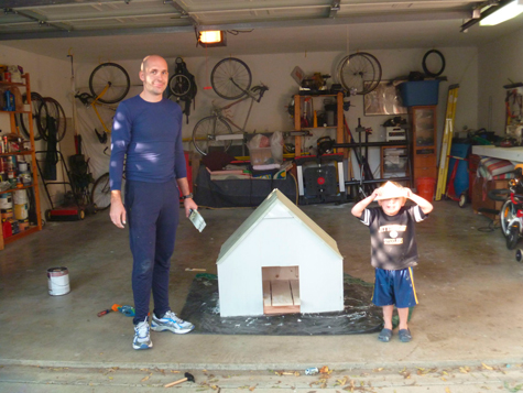
A few weeks ago, my husband, John, and I thought it would be fun to take up Stickley’s challenge and make one of his simpler designs with our kids, Aiden and Rowan.

After some debate, we decided to make the doghouse for our two dogs, Sampson and Beasley.

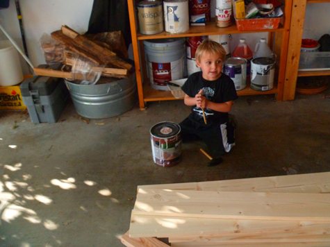
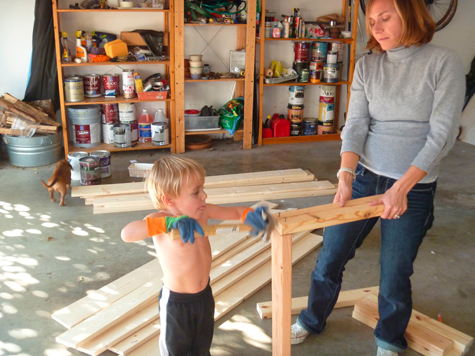
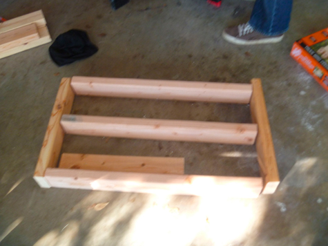
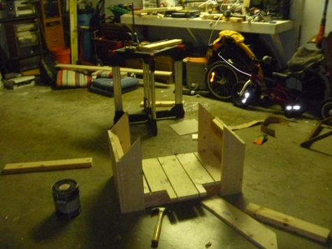
Building the structure moved along pretty quickly thanks to John and Aiden. By the end of day one, we had framed the structure and attached the walls and floors.


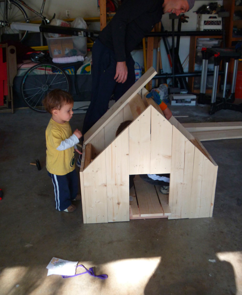
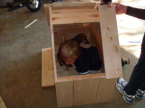
Day two included attaching the roof, painting, and trying to get the dogs to go inside the doghouse.

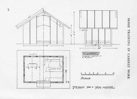
Apart from adjusting the measurements and the paint, we stayed close to Stickley’s original design. This was a fun weekend project for our family and a great way to make Stickley’s designs come to life in the 21st century.


Gustav Stickley and the American Arts & Crafts Movement will be on view at the Dallas Museum of Art from February 13 through May 8, 2011. To learn more about the do-it-yourself Stickley project and discover how you can participate, visit the DMA website.

Guest blogger Laura Bruck was formerly Manager of Gallery Interpretation at the Dallas Museum of Art and is currently an education consultant.


Archives

Flickr Photo Stream

Categories