After attending the Philip Glass and Tim Fein concert at the Winspear Opera House this past Monday night, I was excited to discover that the DMA’s collection includes a lithograph of the composer, completed by his long-time friend Chuck Close. Close is known for his innovative approaches to representing the human face. All of his works explore this theme, depicting his subjects, generally friends and family members, in intimate, large-scale portraits of their shoulders and head. His portraits begin as photographs, which he then carefully transfers to a canvas. Close has experimented with various techniques and materials, including finger-painting, graphite, conté-crayon, pastel, oil and watercolor.
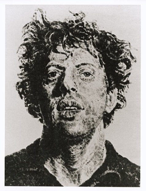
Chuck Close, Phil/Fingerprint, 1981, lithograph, Dallas Museum of Art, Mr. and Mrs. Jake L. Hamon Fund, (c) Chuck Close
Over the course of their four-decade-long relationship, Phil has been the subject of many of Close’s most iconic works; in fact, his image has been used more than any other subject. According to an article published by W magazine in 2007, Close estimates that he has repurposed a 1968 photograph of Glass “150 times or something.” Glass returned the favor in 2005, unveiling a striking and beautiful composition entitled “A Musical Portrait of Chuck Close,” intended to encapsulate the artist’s persona and work. The DMA’s Close work is a 50’’ by 38’’ lithograph of a fingerprint Close completed in 1981. I have always admired Chuck Close’s work, and I recently began to explore my own talents for photorealism. I decided to experiment with Close’s gridwork series, having read that Close used this approach “to break things down into a manageable and solvable problem.” For me, as an amateur artist, this statement provided the confidence I needed to begin my project. Follow my progress below to create your own Close-inspired work.
Step 1: Choose a photograph
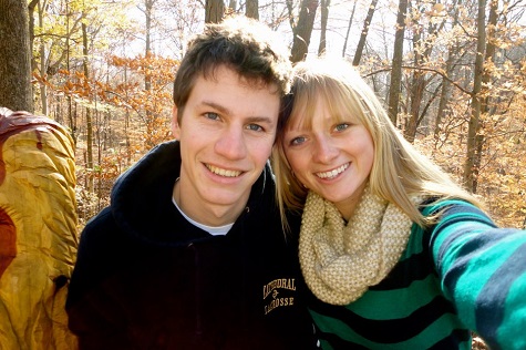
As mentioned, all of Close’s portraits depict only the subject’s shoulders and head. This tight cropping helps to focus the piece and also encourages closer consideration of the subject’s individual features. I chose the photograph below for my image.
Step 2: Crop your image
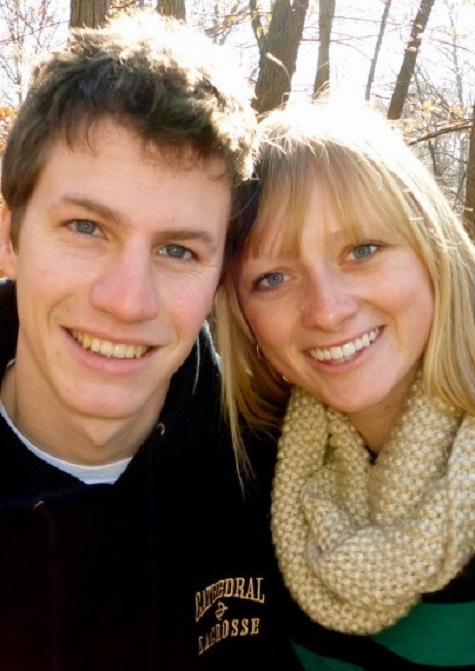
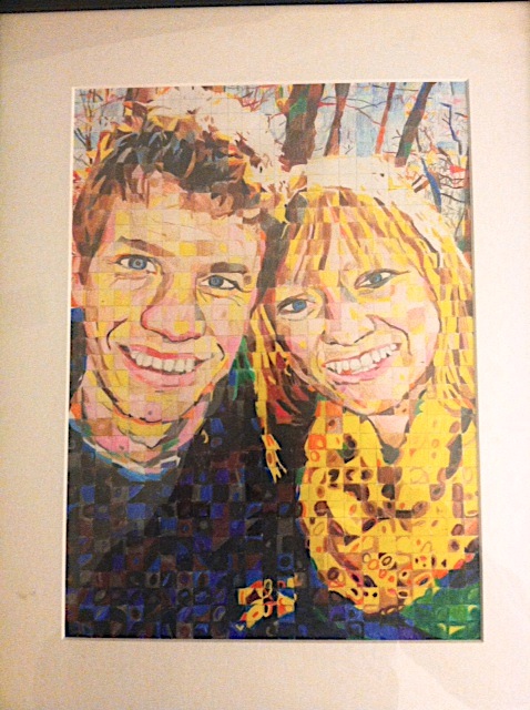
While this project works best with an up-close photograph, do not hesitate to crop or enlarge an existing photograph. Since I knew this artwork would be given as a gift, I chose an image with two subjects, rather than one. After cropping, however, my photograph becomes a manageable project.
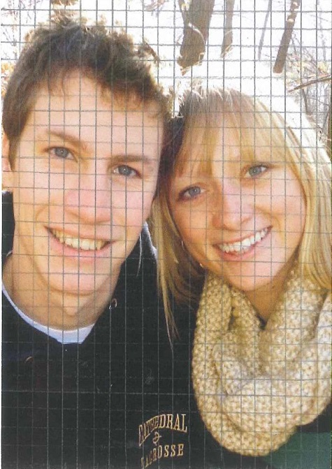
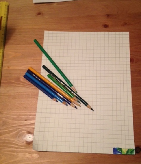
Step 3: Divide your image into a grid
Measure the length of your photograph. You want to make sure that the length and width of the photograph is evenly divisible by the size of each unit. For instance, my photograph is 14.5 cm by 10.5 cm so I chose to use 1/2 cm as my base unit. Use a ruler to divide your photograph into units of equal size. I recommend using a pencil so that you can correct a line if need be; graphite also shows up better than other mediums on glossy photograph paper.
Hint: The larger you make your squares, the less time your project will take. Larger squares will make for a more abstract image and smaller will create a more precise, accurate image.
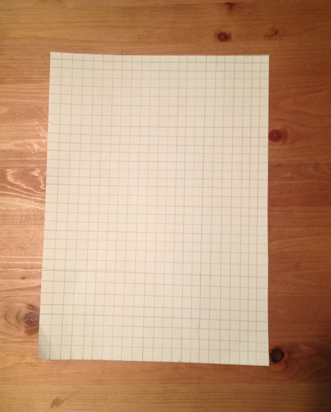
Step 4: Transfer your grid to your canvas or paper
To determine the size of your project, first decide on the size of your new base unit. For my project, I transferred the 1/2 cm units from my photograph to 1 cm on my drawing paper. In total, my final project will be approximately 8.5 by 11 inches. Be sure to consider your dimensions carefully, especially if you plan to frame your final composition.
Step 4: Start your drawing!
I used colored pencil and drawing paper for my project. These materials are easy and user-friendly. If you are familiar with another medium, feel free to use it. After all, Chuck Close likes to experiment, too!
When selecting your colors, you can opt for accuracy or choose a unique theme or palette of your own. This decision may also affect the style of your portrait. You can use the lines to help you create an accurate, photorealistic transfer of your photograph; or you can use a more interpretive, abstract coloration (see Phil above). I chose the latter process. For this process, color each square as an individual unit, independent of the units around it. Don’t worry, it will all add up in the end!
It is easiest to begin in a corner and then work your way up, row by row. You may also want to start with something easy, like the shoulders or clothes before attempting to work on the face. Be patient. You do not want to rush and accidently transfer the wrong section of your photograph. If you get lost, count your square units to get you back on track.
Step 5: Don’t give up
Depending on the number of squares in your artwork, this may be a long process. My picture took me about 16 hours to complete. If you are frustrated, step away and come back to your work tomorrow.
This activity can also be simplified for children. You can choose a simpler subject and/or divide the paper into larger squares. Either way, it is a good way to encourage “close-looking” and practice experimenting with colors.
Step 6: Step back, appreciate your work, and put a frame on it
Great work! I hope you enjoyed this project. If you made an artwork of your own or used this activity in your classroom, please share your creations with us below! Also, if you have suggestions on how we can improve this project, we would value your feedback.
Hint: Adding a frame or border to your artwork can really enhance the overall effect!
Hayley Prihoda is the McDermott Education Intern, Gallery and Community Teaching, at the DMA.