Posts Tagged 'painting'

When the Painting Meets the Frame

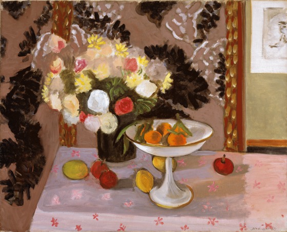
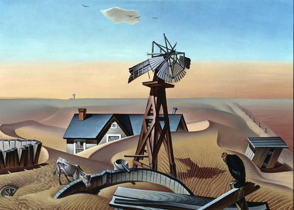
The centerpiece of Ida O’Keeffe: Escaping Georgia’s Shadow is her Highland Lighthouse series. Ida Ten Eyck O’Keeffe painted seven variations of the lighthouse in the early 1930s, using mostly related color palettes and experimenting with dynamic symmetry. The first, a realistic representation, is now lost, but the following six lighthouses she painted are all reunited here at the DMA in one room.

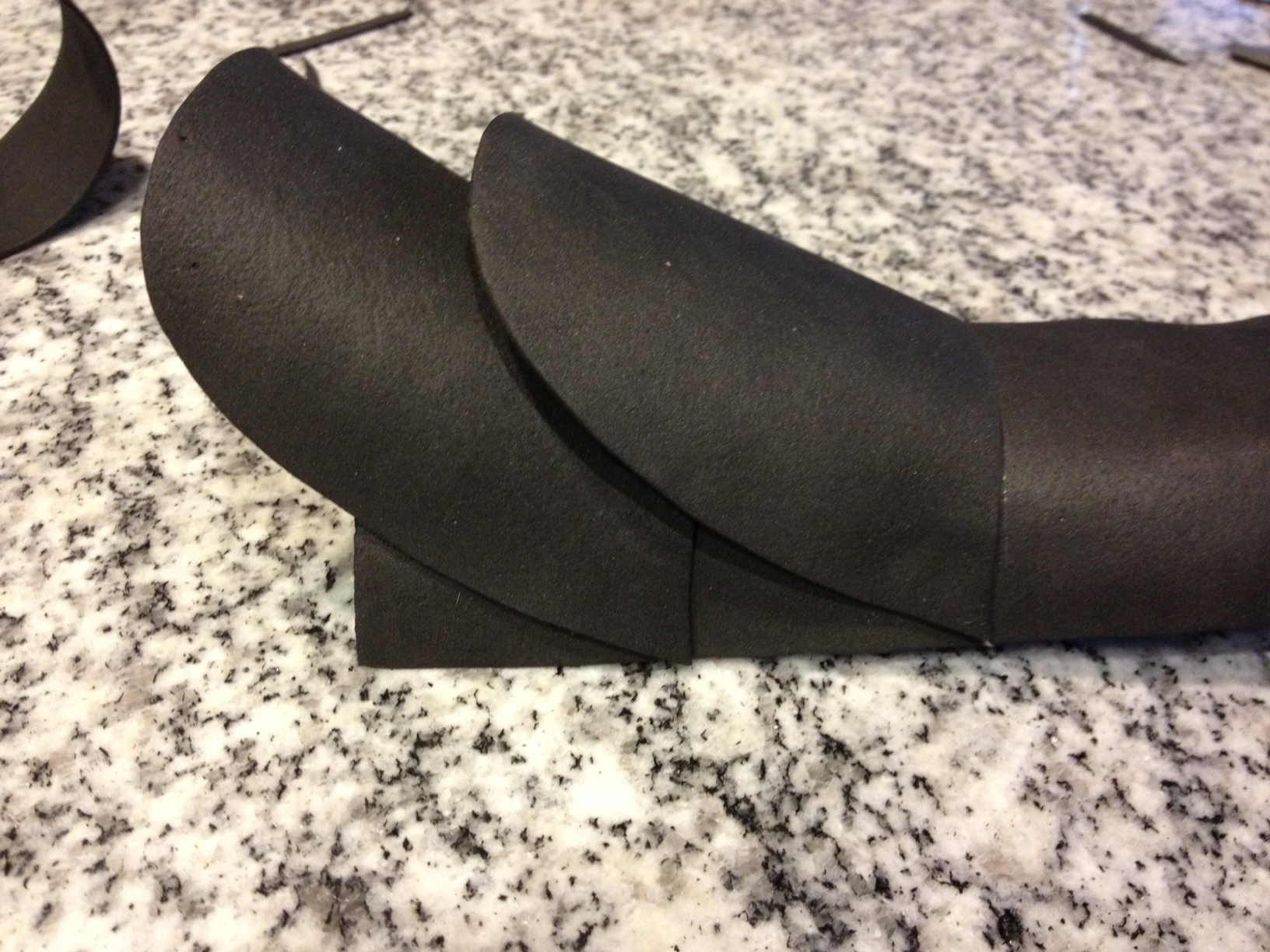
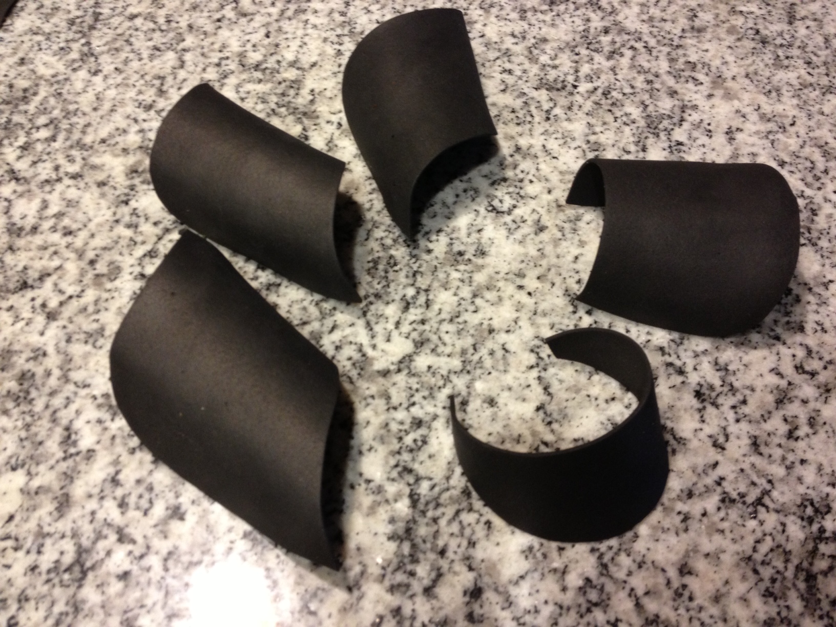
Five of the paintings have a “clam shell” frame. The sides of a clam shell frame slope inward toward the painting. Each side is half of an arch that peaks at the inner edge where the frame meets the canvas. These frames were all made by painter and frame maker George F. Of, who worked closely with Alfred Stieglitz’s 291 gallery. Thus, it is through her relationship with her sister Georgia and her brother-in-law Alfred Stieglitz that Ida came to know Of during the early years of her career.

Ida’s paintings are not the only example of close working relationships between artists and frame makers on view at the DMA. Artists often worked closely with particular frame makers and some were known to prefer certain styles of frames.

PG_2016_11_21_McD-framed_o4

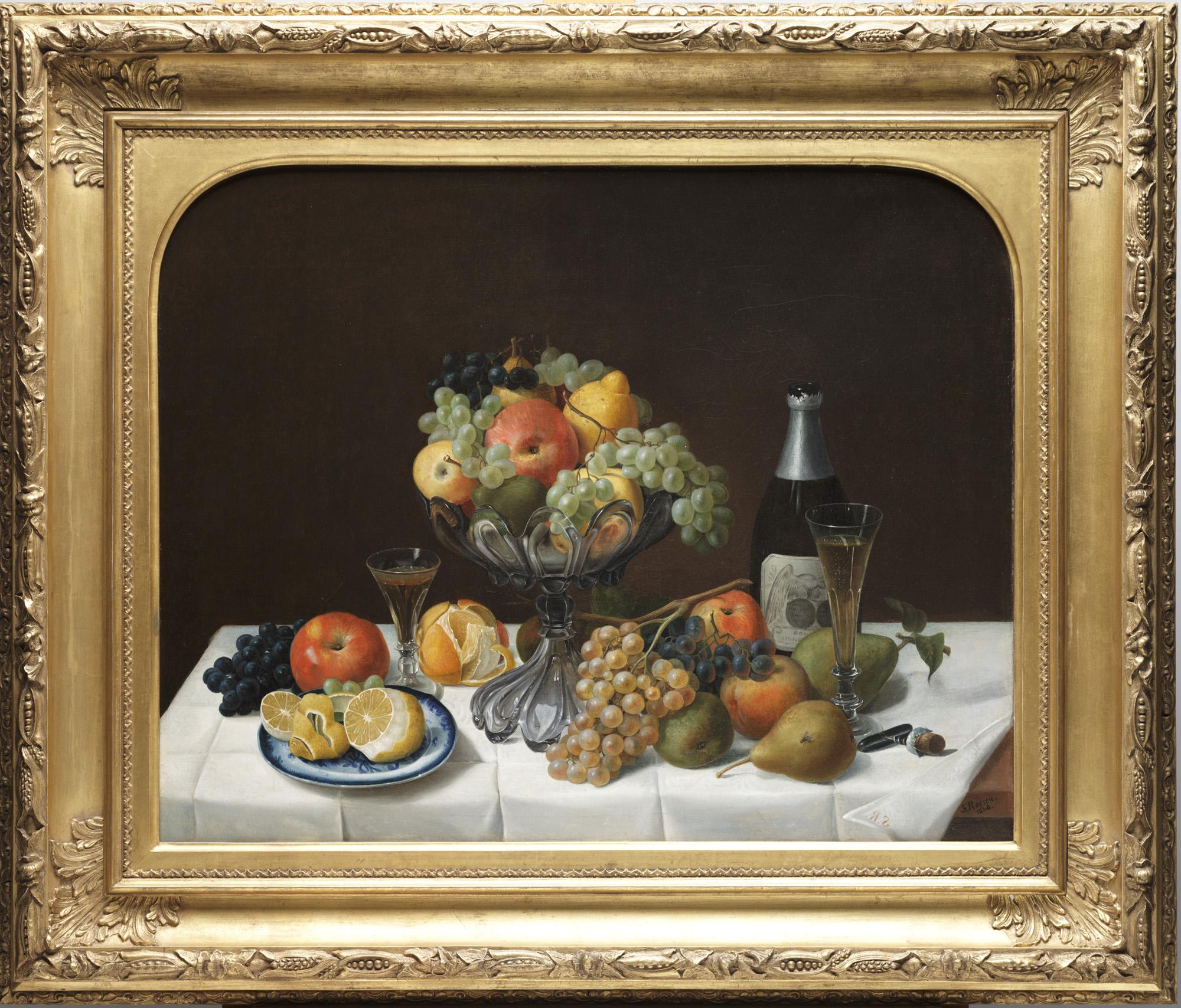
Maurice Prendergast, Merry-Go-Round, c. 1902-06, oil on canvas, Dallas Museum of Art, The Eugene and Margaret McDermott Art Fund, Inc.

On view in An Enduring Legacy, Maurice Prendergast’s painting Merry-Go-Round is in a frame that was probably not made by his brother Charles. Many other artists of his time mechanically reproduced patterns for their frames, but Charles designed and hand carved his frames. He considered himself an artist too. If he made a frame for Merry-Go-Round, it was long gone when it entered the McDermott’s collection. Margaret McDermott chose this frame to accentuate the style of the painting.

prendergast detail

The frame has both an inner and outer edge of roughly carved wood in ropelike patterns. Between these layers is an expanse of unvarnished wood with groups of scratches perpendicular to the painting’s edges. The unfinished quality of the wood frame complements the blank canvas that is visible throughout the painting where colors meet.
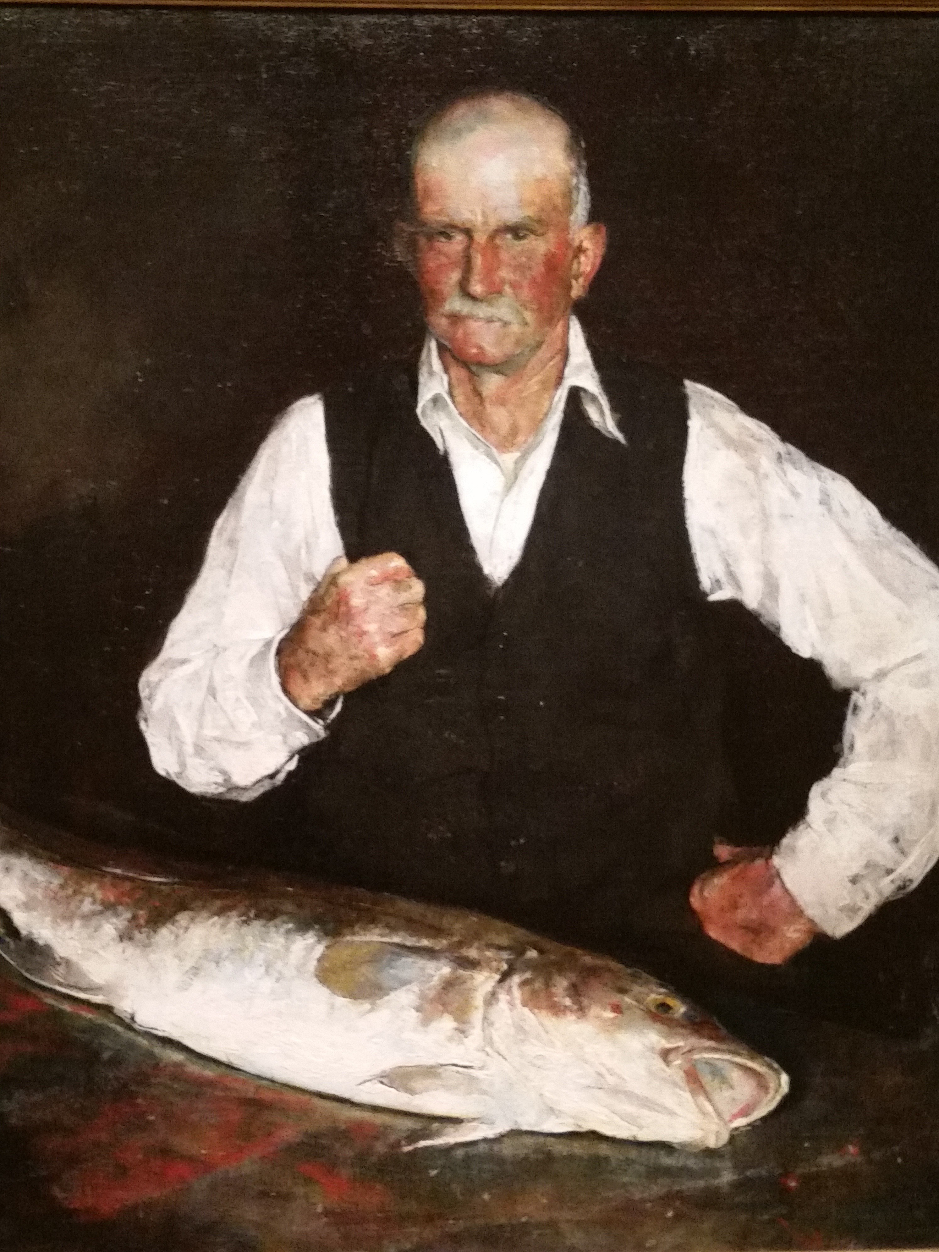
George Bellows’s portrait of his wife, Emma in a Purple Dress, is in a “Bellows frame.” Bellows favored frames by the New York frame maker M. Grieve Company. This particular water-gilded gold frame has three thin, curved ridges descending toward the painting within a squared outer frame. Its back is stamped with “Grieves Co.” The gilded, textured surface of the frame emphasizes the shining fabric of the sitter’s dress.

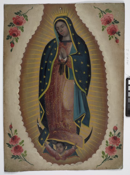
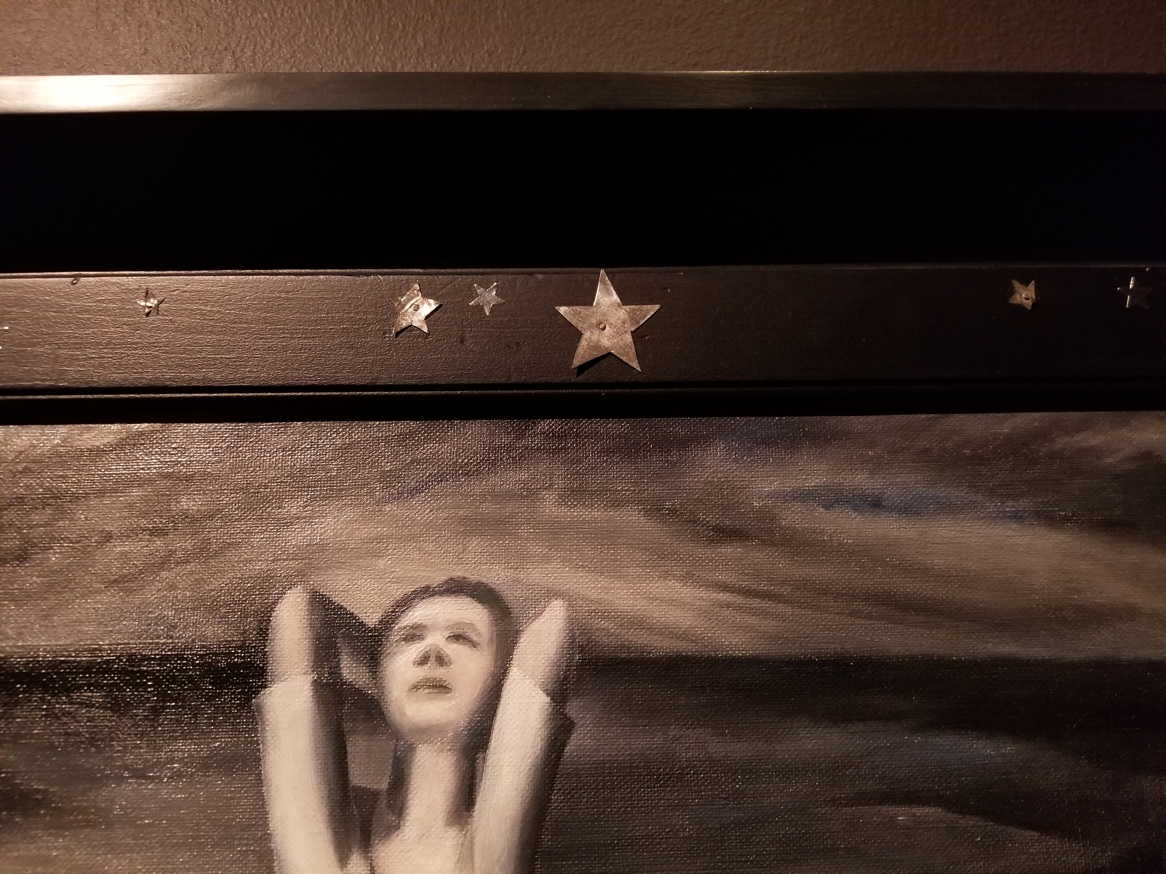
Reviews of Ida O’Keeffe’s New York shows sometimes mention her tendency to decorate her own frames, though few of them survive today. Ida most likely didn’t make the frame for Star Gazing in Texas, but she did decorate its upper molding with star-shaped foil stickers and five-point stars cut from tin.

These stars on the frame make it part of the composition. The title, Star Gazing in Texas, reinforces the relationship between painting and frame. During Ida’s lifetime, the painting was exhibited under several other titles—Dreaming in Moonlight; Spring Lethargy, Texas; and, possibly, Texas Hillbillies. The DMA’s Pauline Gill Sullivan Curator of American Art, Sue Canterbury, chose the title Star Gazing in Texas, which Ida used in an inventory of her paintings, because it captured the interconnectivity of the painting to its frame. The star-gazing woman looks outside her painted environment, making the frame part of her world as well as part of ours.

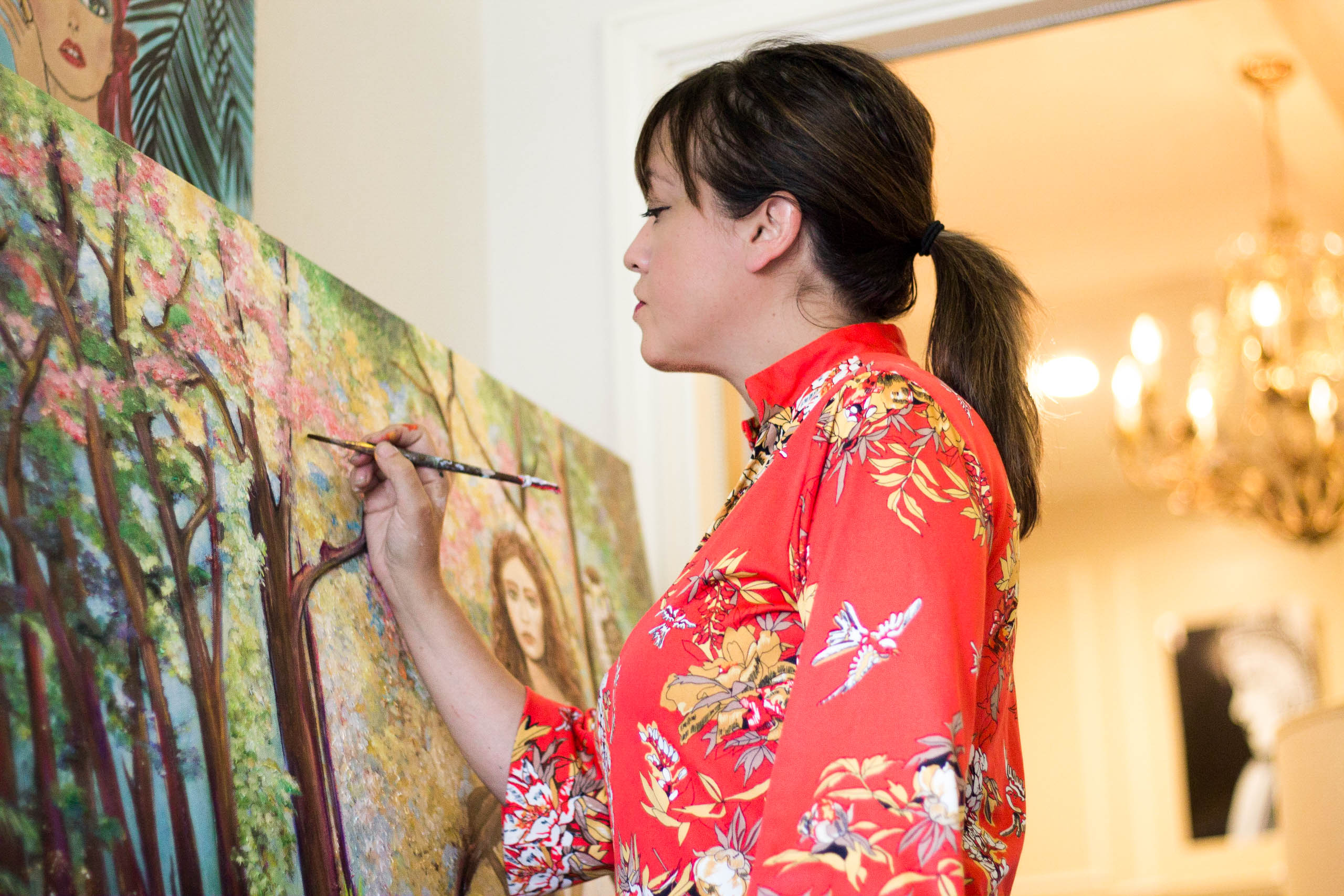
Rebecca Singerman is the McDermott Graduate Intern for American Art at the DMA.

Foxes and Fireflies: An Interview with Mel Remmers

When we found local artist Mel Remmers’s Instagram account, we were drawn to her distinct artistic style. With her wide-eyed, emotionally captivating portraiture, witty captions, and some sneak peek shots sprinkled into the mix, she reveals her work and process to her growing following in an engaging and down-to-earth way. Because we noticed elements of fashion, whimsicality, nature, and experimentation with textures and colors in her work, we were eager to invite her to a viewing of our Laura Owens exhibition. Inspired by Owens’s works, the paintings Remmers created welcome you into a fantasy world of their own.


Photo Credit: Stevie Hudspeth

Check out our interview with Remmers about her process:

Tell us about yourself as an artist.
In February 2015, I bought a child’s paint set from a grocery store. Seeking to find a creative therapy after battling cancer and needing emotional repair, I posted my first attempt at painting on Instagram and I was shocked and excited by such a positive response. I was hooked! This started Instagram becoming part of the creative process. As my following grew fast, I sold my first painting after four weeks, and as of November 2017 my 400th sold.

My paintings started out as fashion-inspired female figures, and in time I added motion to them. Now I paint portraiture that provokes a mood with either dark shadows or the expressions in the eyes. I am also fascinated by light and have focused periods with black-and-white paintings as well as ink. The majority of my paintings consist of multiple mediums and tools such as gold foil and others as I have discovered them. Hand-painted wallpaper with a nature-inspired theme has become my most requested commission and my new obsession.

What was your first impression of the Laura Owens exhibition?
As I walked into the exhibit, my eyes drew on the immense scale, the bold and playful works. Then as I moved closer I was lost in the details of unexpected elements, heavily sculpted paint textures, and her no-fear use of PINK.

What did you find most inspiring about this exhibition?
Most notably, the grand scale of her work. I have a strong desire to “Go Big”—paint on walls or just use a larger canvas than usual. This connection brought that buzz to continue on that path.

Another inspiring spark was the variance of her work. The abstract collages flowing to whimsical childlike characters of animals was a delightful scene.

I was also thrilled to see her unexpected three-dimensional elements and use of materials like felt, and her beehive painting where it looked like bees were buzzing above the canvas.

What was the painting process for your pieces like?
As I walked away from the exhibit, reflecting and imagining this collaboration, I knew to go with my gut response. Fireflies were my first whisper, and I wanted to play off the forest scene where you find animals peeping throughout the painting.

Since I usually do not plan or sketch, I started with the trees and then water emerged. All of this is evolving while I am filming to Instagram, and my specific music choices have come to set the mood of where I am in the process.

RemmersDMACollection Reflections-1

I am a fast painter so I wanted to be patient and take my time. That equaled four days of nine hours at a time, and that also included a second painting that I felt told more of the story. The water, with its intense color and light reflection of the first painting, became the continuation of the story in the second painting and introduced a new character, the glitter fox.

These paintings are made with acrylics, some oils, chalk, pastel, and ink, and the fireflies are made of tiny crystals and glitter glue.

MelRemmers ForestFinal 1

Remmers GlitterFox1

What elements or themes from Laura Owens’s work did you incorporate into your pieces?
My collaborative theme became nature. I wanted to bring a sense of belonging. I usually focus on a feminine theme, and now she became a living part of it. Her dress inspiration was taken from a large impasto glob from one of Laura’s abstracts that I found crazy good. So her dress looks like a dripping, thick waterfall floating into the water.

Do you have any other takeaways from this experience?
My takeaway is LIMITLESS. In a world where the trending word is “brand,” Laura Owens does not have a limit to her visions or exclusivity. She goes from sky high drawings of cats to a wild abstract collage. Laura’s work has calmed my doubts of risk taking, opened a larger vision, and given my creations a wider world to live in and explore. And, glitter glue IS a medium.

Hayley Caldwell is the Communications and Marketing Coordinator at the DMA.

Starting with a Blank Canvas: Preparing Steichen’s Rare Murals for Display

If you have wandered past the Barrel Vault Quadrant Galleries during the initial stages of the Edward Steichen: In Exaltation of Flowers conservation project, you likely saw a lot of beige—new stretchers, plain cotton-duck fabric, and backsides of paintings—and five women hammering, measuring, and stapling away. A handful of visitors have asked us what we are doing or if we are the artists, so we thought we should explain a bit about the initial and necessary steps in the conservation of these magnificent murals. While the most glamorous parts of conservation treatments are usually the final steps like inpainting and varnishing, the beginning of a project often includes a lot of preparatory work and a healthy amount of elbow grease, and it is just as important that we are precise in these first stages of treatment as we are in the final steps.

The seven large paintings that make up Steichen’s In Exaltation of Flowers were commissioned by Agnes and Eugene Meyer for their townhouse in Manhattan. Due to financial difficulties, however, the murals were never hung in their intended environment (read more of the history here). The paintings were shown as a set only once, in 1915 at the Knoedler Gallery in New York City, and have not been shown in a series since. Records indicate that two or three of the paintings were shown individually in exhibitions between 1915 and the present, and one painting arrived at the DMA already stretched. Aside from this, the paintings were stored rolled before coming to the DMA, accumulating dirt and dust for over 100 years.

Keara Teeter using a soft brush and vacuum attachment to remove dirt and dust from the reverse of a painting.

In order to help remove a century’s worth of grime, we vacuumed the reverse sides of each unstretched painting. This process is likely not what you are picturing; we don’t take the Dyson out of the closet and roll it over the canvas, wheels and all. Instead, we use a soft-bristle brush to sweep particulates into a vacuum attachment nozzle, with the vacuum on a low setting. When the painting is unstretched and on the (clean, paper-covered) floor, as these are, vacuuming can involve a bit of body contortion and a lot of ab muscles to ensure the nozzle and brush reach all areas of the canvas while the motor of the vacuum and our knees do not.

Six out of the seven paintings came to the DMA unstretched, and with their original stretchers nowhere to be found. Shiny new stretcher bars were ordered from Simon Liu, Inc. in New York, and it took all of our project interns to assemble six of these massive supports for the paintings.

Diana Hartman and Keara Teeter assembling a stretcher.

Once the stretchers were assembled, we created what is known as a loose lining. This involves attaching plain cotton-duck fabric to each stretcher, using canvas pliers and arm muscles to make sure each one is taut, and securing each one with staples. Later in the project, we will stretch Steichen’s paintings over these loose-lined stretchers, and the first layer of cotton-duck fabric will serve as a sort of bed for the paintings. Even though the canvases are in very good condition for being centenarians, they are somewhat weak where they have been folded over stretchers in the past, and the fibers have aged and become more brittle. The loose lining provides support and protection for the original canvas, and ensures that we do not have to pull hard on the original canvases to achieve planarity when they are stretched.

The next steps in our treatment will involve attaching edge linings to the original canvases, stretching the paintings over the loose linings, and performing some analysis with X-Ray Fluorescence in order to determine what elements are present. Stay tuned to learn more about these processes!

Pamela Johnson is a Conservation Intern at the DMA.


Friday Photos: April Showers Bring…

May flowers, of course! So we’re hoping that this stormy day is a good sign for the plants on our grounds in the upcoming month! In the meantime, we’ve been enjoying our flowers blooming in the galleries. Come to the DMA today to see these works of art that are sprouting with petals and leaves, without having to reset your perm!

Whitney Sirois
McDermott Graduate Intern for Gallery and Community Teaching

Amy’s Favorite Arms, Part 2: A Somewhat Touchy Subject

Cast as flashy accessory, great place for stickers

Cast as flashy accessory, great place for stickers

Several years ago, my Education colleague and fellow Amy, Amy Wolf, took a close look at paintings in our European collection, with an eye for really great arms. With good reason–there are a lot of great arms on the 2nd floor. And the gestures these arms make–whether of dramatic and grand introductions, or a tender and comforting touch–set the tone for the artwork and go a long way in telling it’s story. Arms are pretty important.

Which is something I’ve recently come to appreciate (big understatement) as I’ve longed for the returned use of my own favorite arm (the right one—sorry left one!) and all the things I desperately want to do now that it’s in a cast—snap, wave in a less hilarious way, get my jazz hand game back, open jars, have a signature that doesn’t look EKG-ish. So with arms on the brain, I decided to revisit this theme of arms in art and took my own stroll through the galleries to expand the reach and add to the legacy of Amy’s Favorite Arms photo posts with works from across the collection. Some of which are making me kind of jealous right now.

Images above are small details of larger artworks. All are best viewed in their totality and at arm’s length here at the Museum. 🙂

Amy Copeland
Manager of Go van Gogh and Community Teaching Programs

Friday Photos: Ready, Set, Get Messy!

This slideshow requires JavaScript.

This month in the Arturo’s Art & Me class, we are introducing preschoolers to the art of Kazuo Shiraga and Sadamasa Motonaga. The kids were thrilled to learn about artists who sought to break the “rules” of making art and couldn’t wait to try it themselves.

We were inspired by the Gutai group’s maxim of making art that has “never been done before” by painting with our feet, throwing paint-soaked pom poms onto canvas, and pouring paint down our papers. Messy? Yes! Fun? Absolutely!

Leah Hanson
Manager of Early Learning Programs

Art of the Written Word

If I had to name some things that I could not live without, books and art would be first on that list (along with tea, my family, and my cat, of course). These passions led to this blog post, which combines the two! During my time at the DMA, I constantly find similarities or connections between some of the works in the collection and books that I have read, so I wanted to take this opportunity to share a few of my favorites!

Standing Female Figure & The Poisonwood Bible

Those who enjoy our expansive collection of African art should consider reading The Poisonwood Bible by Barbara Kingsolver. The novel tells the story of the Prices, a missionary family who move to the Belgian Congo in 1954. The family is made up of Nathan, a Baptist missionary, his wife Orleanna, and their five daughters. Narrated in turns by each of the five women, The Poisonwood Bible tells of their initial reaction to the Congolese villagers to their acclimation over the following years. The Standing Female Figure is from the same region where the fictional Price family settled: the Democratic Republic of the Congo (known to the Price family in 1954 as the Belgian Congo). This piece depicts a coming-of-age ritual called butanda: this is represented by the arranged hair, the scarification, and beaded accessories. While this type of ritual does not occur in Kingsolver’s novel, the coming-of-age that we see in the statue is paralleled with the family’s acclimation to their life in Africa.

Lobster Pick & The Beautiful and the Damned

Those who enjoy the fancifulness and luxury of our American silver collection should turn to F. Scott Fitzgerald for their next novel. While many know Fitzgerald as the author of The Great Gatsby, his other novels should not be overlooked. I recommend The Beautiful and the Damned, which tells the story of Anthony Patch, a wealthy socialite living in New York in the 1910’s. The novel reflects a time of money and decadence, a period referenced with this lobster pick, part of our stunning silver collection.

Drouth Stricken Area & The Grapes of Wrath

What do author John Steinbeck and artist Alexander Hogue have in common? Both used their chosen profession to highlight the devastation caused by the Dust Bowl. Many people have heard of The Grapes of Wrath, a story of sharecroppers forced to move from their Oklahoma home due to the economic challenges that plagued the American Midwest in the 1930’s. Hogue tackles the same subject in his painting, Drouth Stricken Area, which almost reads as the aftermath of Steinbeck’s novel. Instead of depicting one family’s journey, Hogue’s painting shows a homestead that has been overtaken by dust and deserted by its owners.

Mountains Near Taos & Bless Me, Ultima

In Mountains Near Taos, artist Ernest Blumenschein offers the viewer a panoramic view of Taos, New Mexico. The jagged mountains tower over the small village in the foreground, which is the only sign that people inhabit this powerful landscape. It is this area in which Rudolfo Anaya’s novel Bless Me, Ultima, takes place. Set in New Mexico in the 1940’s, the novel is narrated by Antontio Marez y Luna. Tony shares with the reader his childhood memories and interactions with an important member of the community, Ultima. This is another coming-of age novel, which describes one child’s experience growing up in rural New Mexico (which can also be seen in Blumenschein’s painting). Bless me, Ultima has won many awards and is heralded as being the most widely read novel in the Chicano literary genre.

Those are just a few of my favorites – I encourage you to share any connections you have made between books and art! And of course, come visit us to take a closer look at some of these great artworks!

(PS: For anyone interested in the intersection of art and books, be sure to check out tomorrow’s Arts & Letters Live event featuring Peter Mendelsund, who designs book covers!)

Liz Bola
McDermott Graduate Intern for Gallery and Community Teaching

Thanksgiving Still-Lifes

Inspired by the DMA’s newest exhibition, Bouquets: French Still-Life Painting from Chardin to Matisse, I thought it would only be appropriate for my first Canvas blog post to incorporate still-lifes from our collection. So with Thanksgiving just behind us, I wanted to share some my favorite food-related still-lifes in our collection.

This 17th century still-life makes even the most wonderful Thanksgiving leftovers seem bland. Anyone care for some lobster?

Abraham Hendricksz Van Beyeren, Still Life with Landscape, 1650s, Dallas Museum of Art, The Karl and Esther Hoblitzelle Collection, gift of the Hoblitzelle Foundation

Abraham Hendricksz Van Beyeren, Still Life with Landscape, 1650s, Dallas Museum of Art, The Karl and Esther Hoblitzelle Collection, gift of the Hoblitzelle Foundation

After all of the yummy turkey, stuffing, casseroles and potatoes , how about some fruit (and maybe champagne) to lighten your leftover hangover?

Severin Roesen, Fruit Still Life with Champagne, 1848, Dallas Museum of Art, gift of the Pauline Allen Gill Foundation

Severin Roesen, Fruit Still Life with Champagne, 1848, Dallas Museum of Art, gift of the Pauline Allen Gill Foundation

The Friday after Thanksgiving is a wonderful holiday all on its own. I like to stay in, enjoy my friends’ and families’ company, relax and read the paper, and eat some yummy leftovers (maybe even a turnip or two!). It is the best part of the holiday weekend!

William Michael Harnett, Munich Still Life, 1882, Dallas Museum of Art, Dallas Art Association Purchase

William Michael Harnett, Munich Still Life, 1882, Dallas Museum of Art, Dallas Art Association Purchase

I hope you enjoyed the Thanksgiving holiday! And if you didn’t finish your Christmas shopping last weekend or you’re looking for a cyber Monday fix, don’t forget to check the Museum Store’s website to find many unique presents and local crafts!

Happy Holidays!

Madeleine Fitzgerald
Audience Relations Coordinator for Programming

Calling all Happy Campers!

Are you dreaming of lazy days at the swimming pool, sunburned noses, family vacation, and popsicles? We are! Summer is officially 95 days away, but we won’t be spending it at the neighborhood pool. For those of us who coordinate Family Programs at the DMA, summer means one thing—Summer Art Camp! And this year’s line-up of camps has something for every creative kid. Whether you are a junior shutterbug, fashionista, sculptor, painter, designer, musician, actor, or inventor, there’s a summer camp for you.

I have been teaching summer camps at the DMA for five years now, and I’m 95 percent serious when l tell my friends that I would gladly be a full-time summer camp teacher. I love spending an entire week with a group of kids, exploring the Museum’s galleries, getting messy in the studio, and having fun. Summer camp gives both teachers and campers permission to be a little goofy, experiment with materials in crazy ways, and give our creativity a good work-out. Camp is all about F-U-N (but we usually manage to learn something along the way too).

Some of my favorite summer camp memories so far include:

Here’s a sneak peek of just a few of the things you can do at Summer Art Camp this year:

This year’s camps will be held each week June 9-27 and July 7-August 15. Morning camps are 9:00 a.m.-noon and afternoon camps are 1:00-4:00 p.m. Tickets are on sale now!

For aspiring art and museum educators, Summer Art Camps also offer the opportunity for a summer internship at the DMA. Summer camp interns get hands-on experience as they assist summer camp teachers by facilitating gallery activities, art-making projects, games, and sensory explorations. With each camp, interns step into the role of art cheerleaders, skit-planning co-conspirators, the ultimate problem solvers, and mentors to the children. What better way to spend a summer? Applications are now being accepted. Find out how to apply here.

Spend some time with us this summer at the DMA, and you’re sure to be a happy camper!

Leah Hanson
Manager of Early Learning Programs

Go van Gogh-ing on a Colorful Classroom Adventure

The newest Go van Gogh program involves two things that are deeply exciting in my book: expanding outreach to a new audience and getting messy with paint!

Color My World is a one-hour outreach experience for elementary students in Special Education classrooms. The program was developed by Head of Family, Access, and School Experiences Amanda Blake, and it takes the best of what we do in Museum Access programs—creating multi-sensory activities for a range of abilities—and brings it out to schools.

Color My World is a colorful adventure in a variety of media. Students listen to a story, watch color-mixing experiments, discuss the color wheel, and paint two artworks using a variety of ordinary (and extraordinary!) painting tools. We explore and take inspiration for our color-mixing and painting techniques from artworks in the Museum’s collection.

Color My World is offered to mixed-age Special Education classes within Dallas city limits. Programs take place on selected Monday afternoons and may begin at or after 1:00 p.m. If you are interested in requesting a program for your Special Education classroom, please email me.

And then grab a smock, ready your palette, and let’s get to painting!

Amy Copeland
Manager of Go van Gogh and Community Teaching Programs


Archives

Flickr Photo Stream

Categories