Posts Tagged 'Design'

A Journey Through the Design of “My|gration”

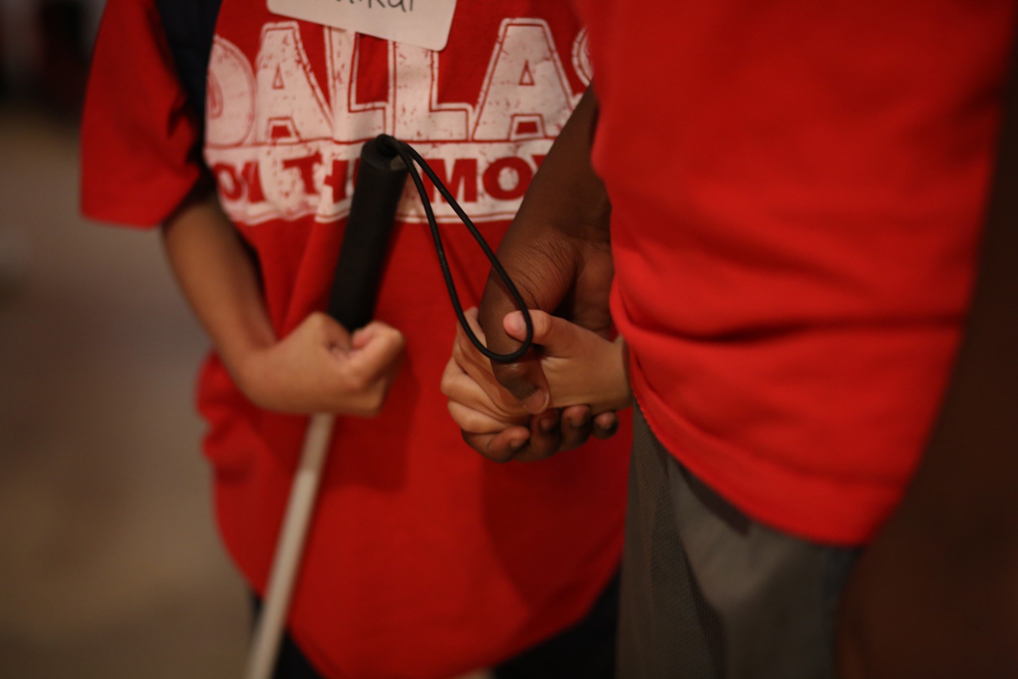
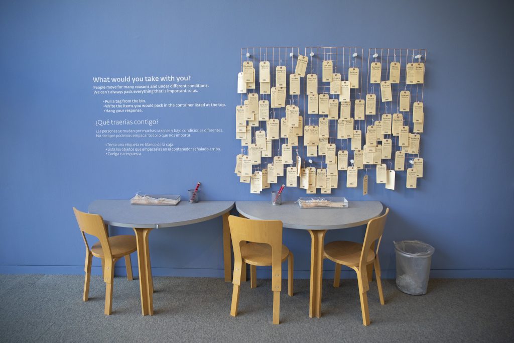
What items would you take with you if you had a few hours to prepare for a weeklong trip? If you’re like me, you might drag your suitcase down from the storage shelf in the garage and lay out a few outfit options with a pair of good walking shoes, the necessary toiletries, phone charger, and books. But let’s imagine for a moment that we didn’t have a few hours to prepare, and our weeklong trip was actually a permanent move. What items would you choose if you were leaving your home forever and you could only take what you could carry? What if your move wasn’t your decision, and it was forced upon you? Or maybe your move was your decision and you are hoping for a better life with more opportunities?

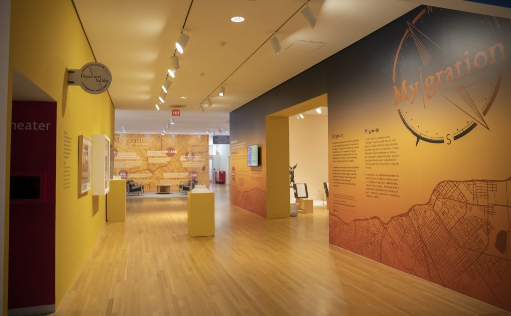
This is the heartbeat of the exhibition My|gration, which is a play on words describing the personal journey of migration experienced by our community and by artists throughout history. As a graphic designer at the Museum, I was very excited to have the opportunity to take the lead in designing the environmental graphics for this exhibition. Working closely with the Interpretation, Education, and Exhibition teams, we wanted to create an exhibition that encouraged the visitor to experience the world from another person’s perspective, and in particular how life and art are affected by immigration or displacement.

As we started designing, we thought about the natural journey of the earth as it travels around the sun, bringing us day and night, dusk and dawn. We mirrored that with the idea that many people take similar journeys throughout their lives, with periods of light and dark, clarity and ambiguity. These thoughts informed our earthy and atmospheric color palette.

I started to create graphic elements that would help tie this metaphorical journey with the physical journey of movement and migration. I illustrated a compass rose that represented the many directions life could take us, both
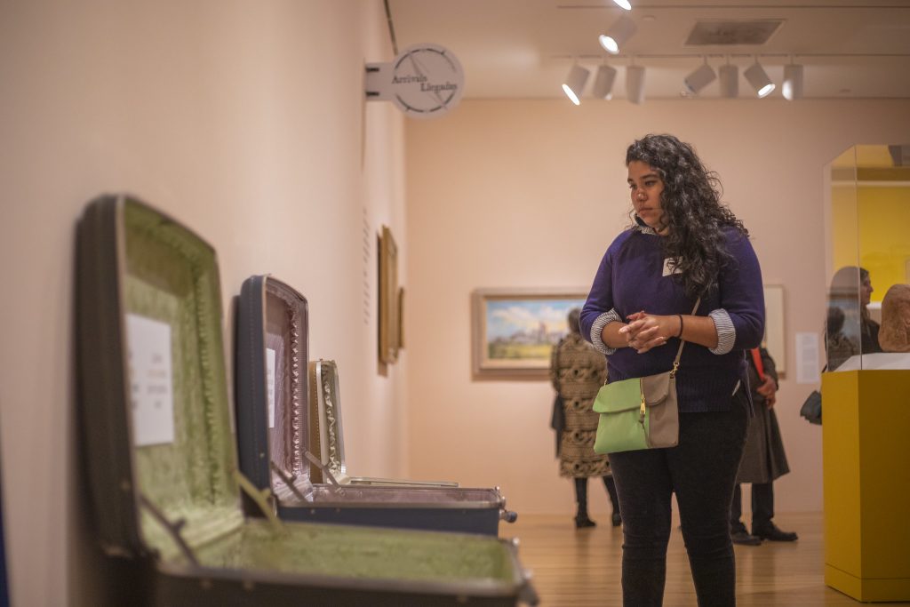
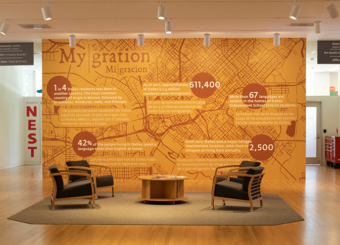
emotionally and physically. We used suitcases and luggage tags to suggest the idea of items you might journey with. Then I started working with an illustrated map of Dallas, zooming in and making it the color of earth—a rusty, warm bronze. I laid it out at the bottom of the entry walls with a sunset gradient fading into a starry night sky.

As a focal point of the exhibition, DMA Head of Interpretation Dr. Emily Schiller provided facts about Dallas’s immigrant population to highlight the diversity in our own community. I used the illustrated map of Dallas here as well in this bilingual infographic.

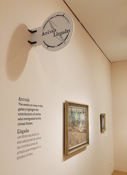
The exhibition space was organized into sections featuring artwork that fell into three categories: Arrivals (artists who immigrated to the US), Departures (artists who emigrated from the US), and In Transit (art reflecting our connected world). For these section headers, I designed circular blade signs that mimicked ones you might see on the road or at a train station while traveling.

The circle used for the blade signs repeats itself throughout the graphics in the space. I used it frequently to suggest multiple meanings: (1) the rose compass, (2) the “you are here” icon on a map, and (3) the metaphorical idea that circles are continuous, much like the personal journeys of our lives.

Brittany Lowe is a graphic designer at the DMA.

Empathy in Museum Design and Interpretation

Wow, what a weird world we are living in!

I want to start by saying how much we miss our visitors. We can’t wait to be able to return to the Museum so that we can continue to create the exhibitions and experiences we’ve all been dreaming about. In the meantime, I want to tell you a little bit about how the Design and Interpretation team at the DMA uses empathy to center our processes and thinking around you, our visitors.

Historically, museum design teams were trained to use an object-centered aesthetic approach, which prioritized object safety and making exhibitions pretty. Over the past 10 to 15 years, however, the way we think about design in a museum has changed. DMA designers place visitors at the center of our thinking and apply an experience- and needs-based approach.

Design and Interpretation is a visitor-centered department that cultivates meaningful communication and compelling experiences. Photo taken from a recent departmental retreat.

The DMA put this idea into practice by creating the department of Design and Interpretation in 2018. The idea was to create a collaborative creative team that places content and the visitor at the center of our processes of creating exhibitions and museum experiences. Our goal is to create rich, dynamic, and engaging experiences that our visitors can explore in deep and meaningful ways. Throughout our planning process, we consider how visitors will use, navigate, and interact with our spaces. Through visitor studies and evaluation, we research and learn about human behavior. We study subjects like environmental psychology, multiple learning types, and how people perceive and process information. We discuss differences in mobility and sensory sensitivity as we strive to be welcoming and accessible for all. We plan for families and groups of various sizes and types. And we have worked very hard toward our goal of providing inclusive experiences for broad audiences, such as creating bilingual and more accessible exhibition content, and working with our education team to expand our offerings that address special needs audiences. A recent example of this is when we provided noise-canceling headphones, “doodle” instructional signage, and braille booklets developed for the exhibition speechless: different by design.

Noise-canceling headphones and braille booklets were offered at the entrance of speechless: different by design.

Now, more than ever, this visitor-centered approach to design and interpretation is extremely important in how we are thinking about upcoming museum experiences. We are researching, learning, and planning for the evolving needs and behaviors of our visitors in the post-pandemic world. We are thinking about how we can address fears and how we can hold a space for complex feelings; we want to ensure that our facilities are prepared and our content remains relevant, relatable, and meaningful.

We understand that humans need ways to express, connect, and process the myriad of emotions elicited by the world in which we find ourselves, and we at the DMA are uniquely equipped to provide our visitors with tools and experiences that can help. Whether it is giving visitors encouragement to express ideas, feelings, and fears through independent activities, or creating experiences that allow our visitors to connect deeply and meaningfully with artists and artwork, we hope to meet the wide range of needs exposed by this global health crisis.

Jessica Harden is the Director of Design and Content Strategy at the DMA.

How the Florals Bloomed in “Flores Mexicanas”

Jaclyn Le and graphic installers place environmental wall graphics in Flores Mexicanas: Women in Modern Mexican Art.

My name is Jaclyn Le and I am the Senior Graphic Designer at the Dallas Museum of Art. My primary role here is to design the identity, graphics, and environmental graphic design of each special exhibition and permanent collection gallery, in both English and Spanish. Working closely with the Design and Interpretation team, the Exhibitions team, and each of our curators, my goal is to make sure the identities, graphics, and environmental design of each exhibition are aligned to the curator’s vision, and that they showcase the works and information in the best way possible.

I was extremely excited to work on the design for the exhibition Flores Mexicanas: Women in Modern Mexican Art, curated by Mark Castro, The Jorge Baldor Curator of Latin American Art. We wanted the design to feel approachable, elegant, and vibrant. The typography is a pairing of a bold style seen in Mexican prints from the early decades of the 20th century, paired with a fuller, more feminine typeface.

The hand-drawn floral pattern was inspired by Mexican lacquer ware from Olinalá. Our director, Agustín Arteaga, lent me a wonderful book full of different styles to look at, and I developed a monochromatic floral pattern illustrating common motifs I saw throughout the book. This floral pattern flanks both walls of the entrance to the exhibition, and weaves its way up and over the ceiling in the space right before the monumental painting Flores Mexicanas by Alfredo Ramos Martínez.

How to draw your own floral set as seen in Flores Mexicanas: Women in Modern Mexican Art.

You can watch this video tutorial to create your own floral set. Use any marker or drawing tool you have to create this. Here, I am using a Crayola Superfine tip marker.

1. Start by plotting three dots that will be the center of your flowers. You want to plot them with enough space in between—a triangle shape would be perfect for this.

2. Draw a ring around each of the three dots. These will be the bases of the flowers to draw petals around.

3. Start drawing the petals around each ring. I have 5-6 petals per flower here. It’s okay if they are not all equal in size—it will look better this way in the end!

4. Once all the petals of your three flowers are complete, draw 2-3 lines coming from the center ring to about halfway across each petal. This will give your flowers more depth and interest.

5. In the negative spaces between your three completed flowers, draw a few slightly curved lines. These will be the stems of your leaves. I have drawn 4 here.

6. Starting with the longest curved stem line, create a teardrop shape around the stem center. You can make these as wide or narrow as you’d like. Draw diagonal lines out from it to create the lines in the leaves. Do this for the other curved line stems from step 5, but save one of the stems for a fuller palm leaf drawing (in the next step).

7. For the palm leaf, create simple leaves by drawing small curved strokes of lines, starting from the top of the stem and working your way to the base. These curved leaf lines will gradually get bigger and bigger with each stroke, as you make your way to the base.

8. Complete your floral set by dropping in dots or circles in the spaces between the three flowers and leaves. Show us your creation by taking a picture and tagging #DMAatHome!

Jaclyn Le is the Senior Graphic Designer at the Dallas Museum of Art.

Some Assembly Required

Have you ever wandered through the galleries at the DMA and thought to yourself, “Hmm, I wonder how they got this huge sculpture up those steps?” or “Wow! I bet it was really hard to hang that giant painting!” If you have, this post is for you! In one of the DMA’s newest installations, Women + Design: New Works, there are several pieces that required significant effort on the part of the DMA’s Collections team to install. Check out these behind-the-scenes photos and fun facts from the installation process, and visit the Museum to see these works in person—and for FREE—now through Sunday, February 17, 2019, in the Mary Noel and Bill Lamont Gallery.

Iris 3
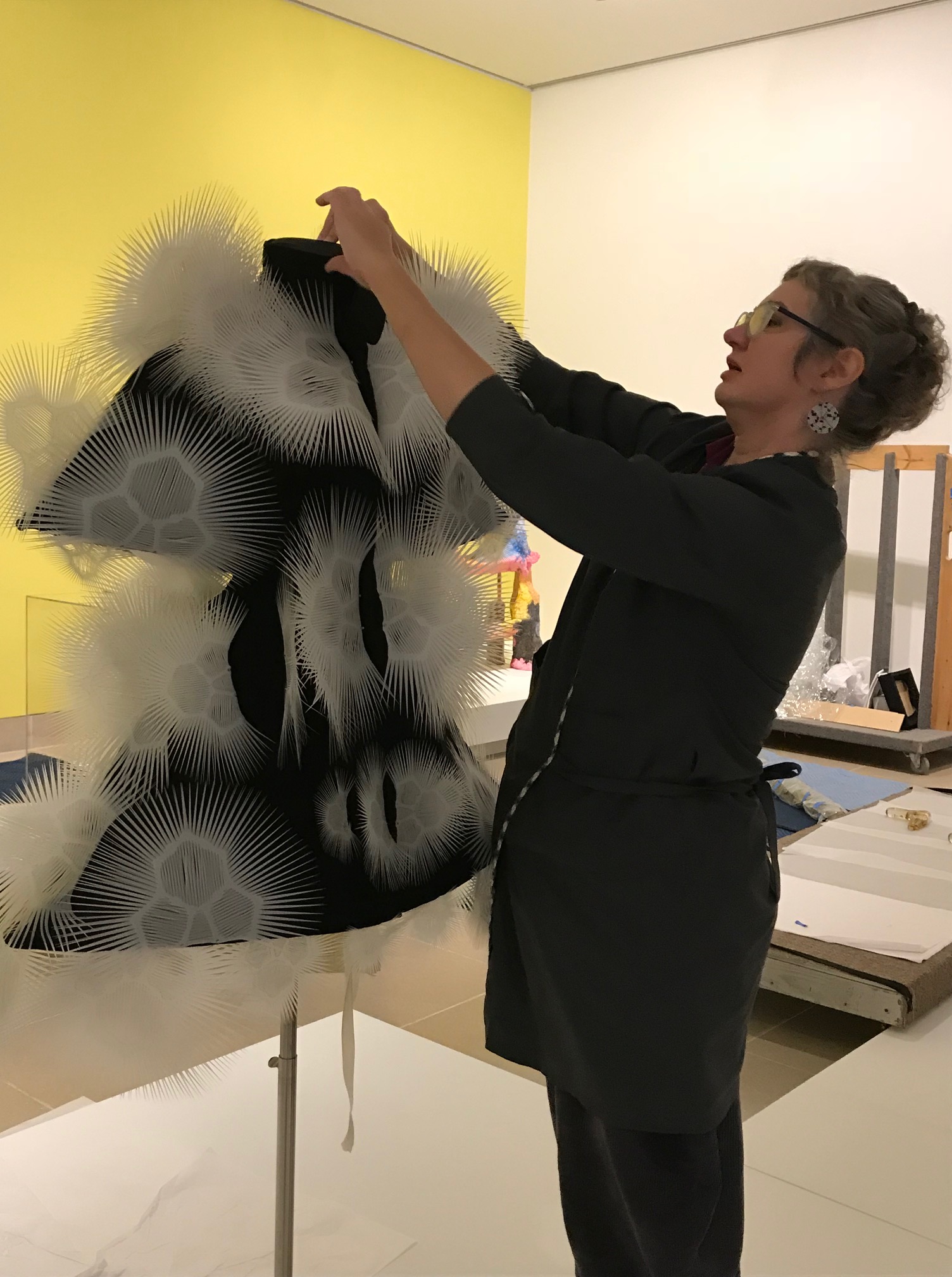
Objects Conservator Fran Baas adjusts the laser-cut polyester lace on Iris van Herpen’s Voltage Dress.

Najla 1
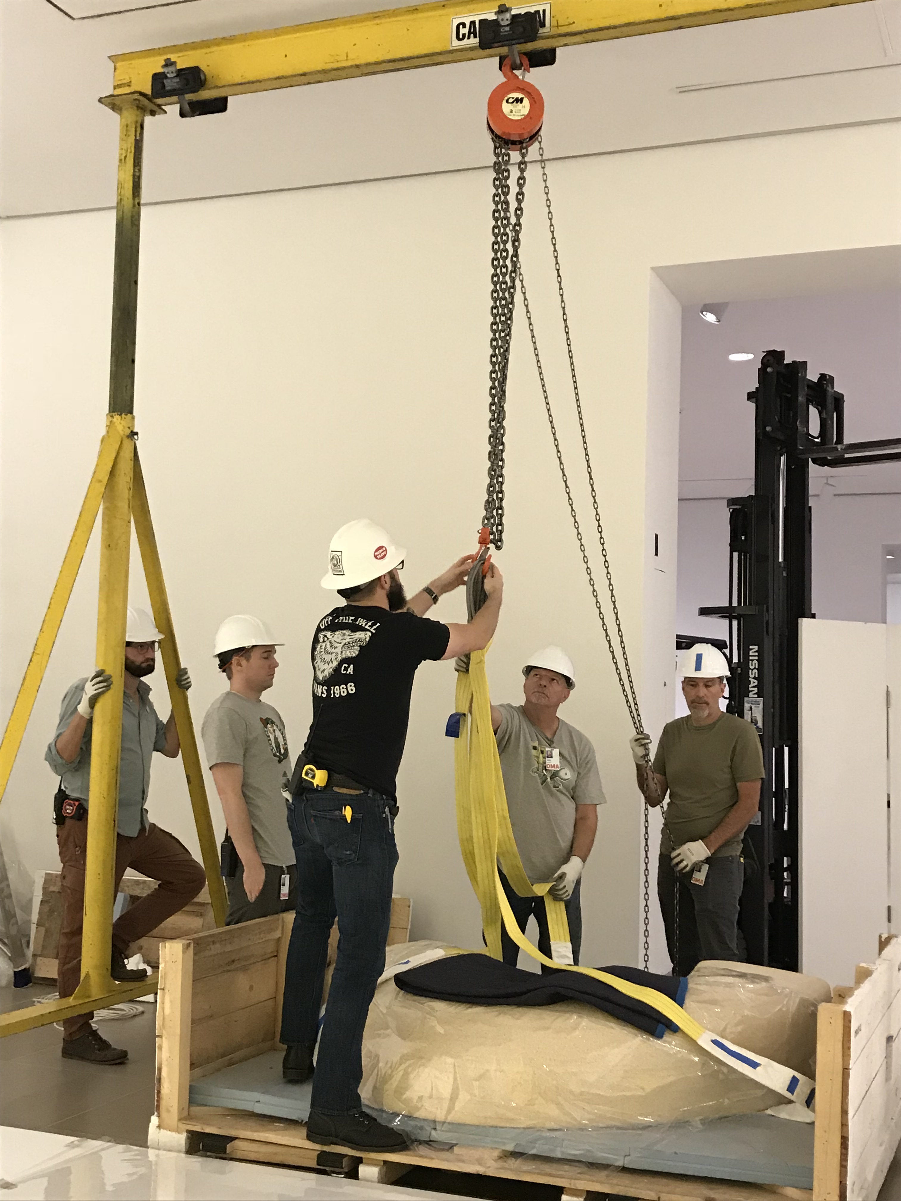
A team of preparators works on lowering the two pieces of Najla El Zein’s Seduction onto the platform. Each piece of the sculpture weighs approximately 1,500 pounds and needs to be moved with a gantry crane. The lower stone was placed first, and then the upper stone had to be carefully lowered onto it.

Mobile 1
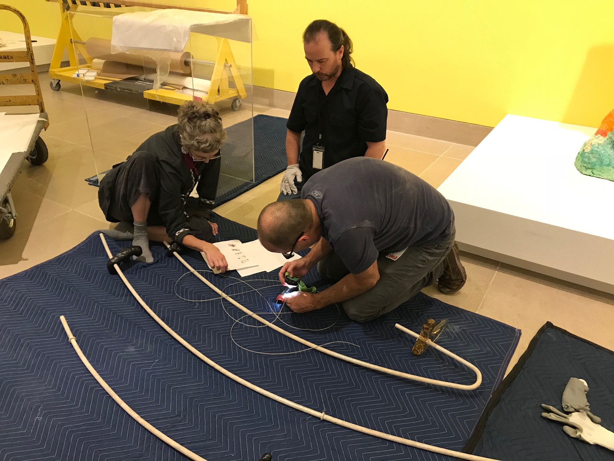
Fran Baas, Lance Lander, and Mike Hill review the instructions for assembling Faye Toogood’s Tools for Life Mobile 2. Because the components of the mobile are heavy, the team had to know exactly what to do to minimize unnecessary handling.

Mobile 2
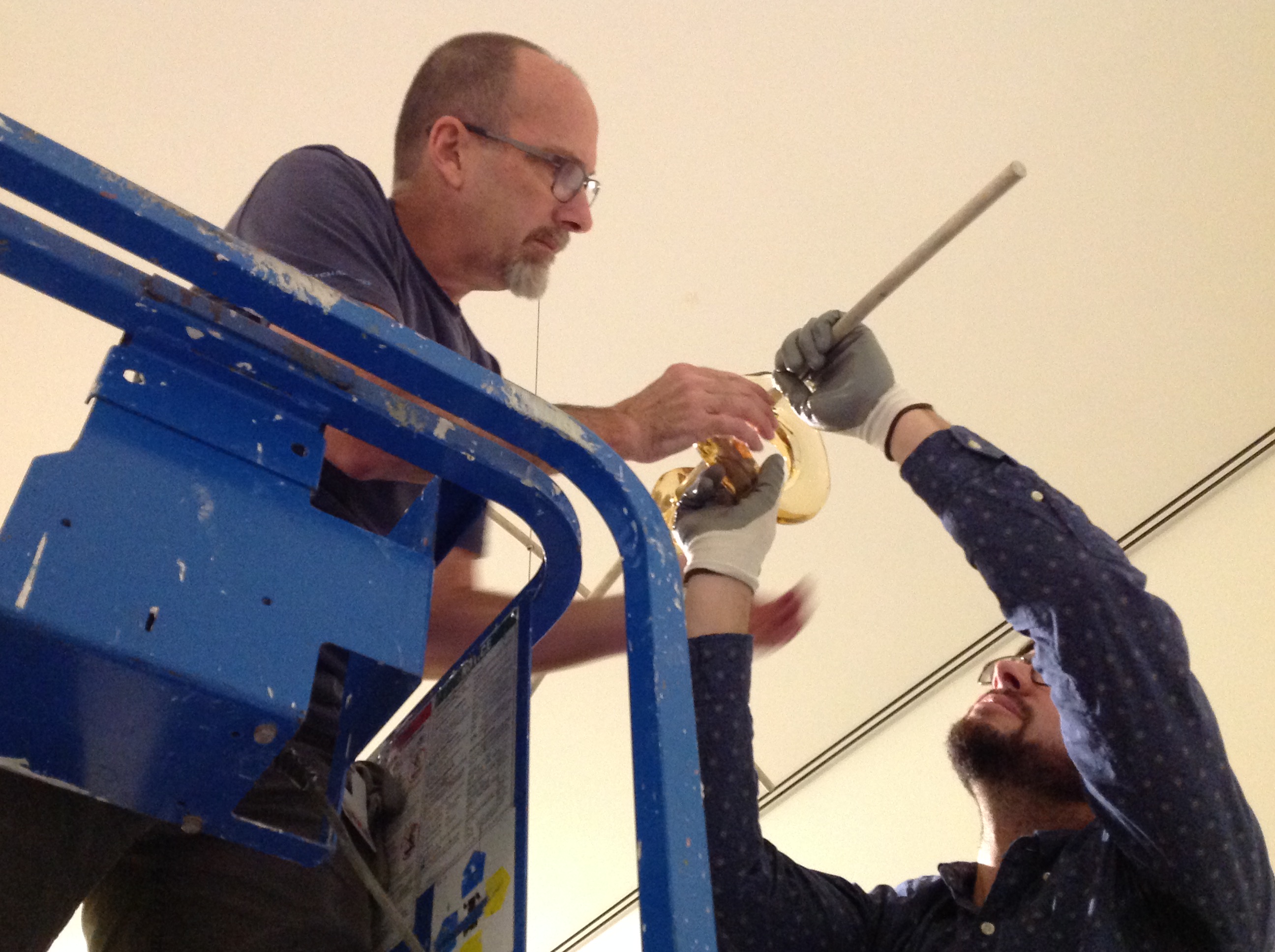
Mike Hill and John Lendvay work to assemble Tools for Life Mobile 2 as it hangs from the ceiling.

Doug
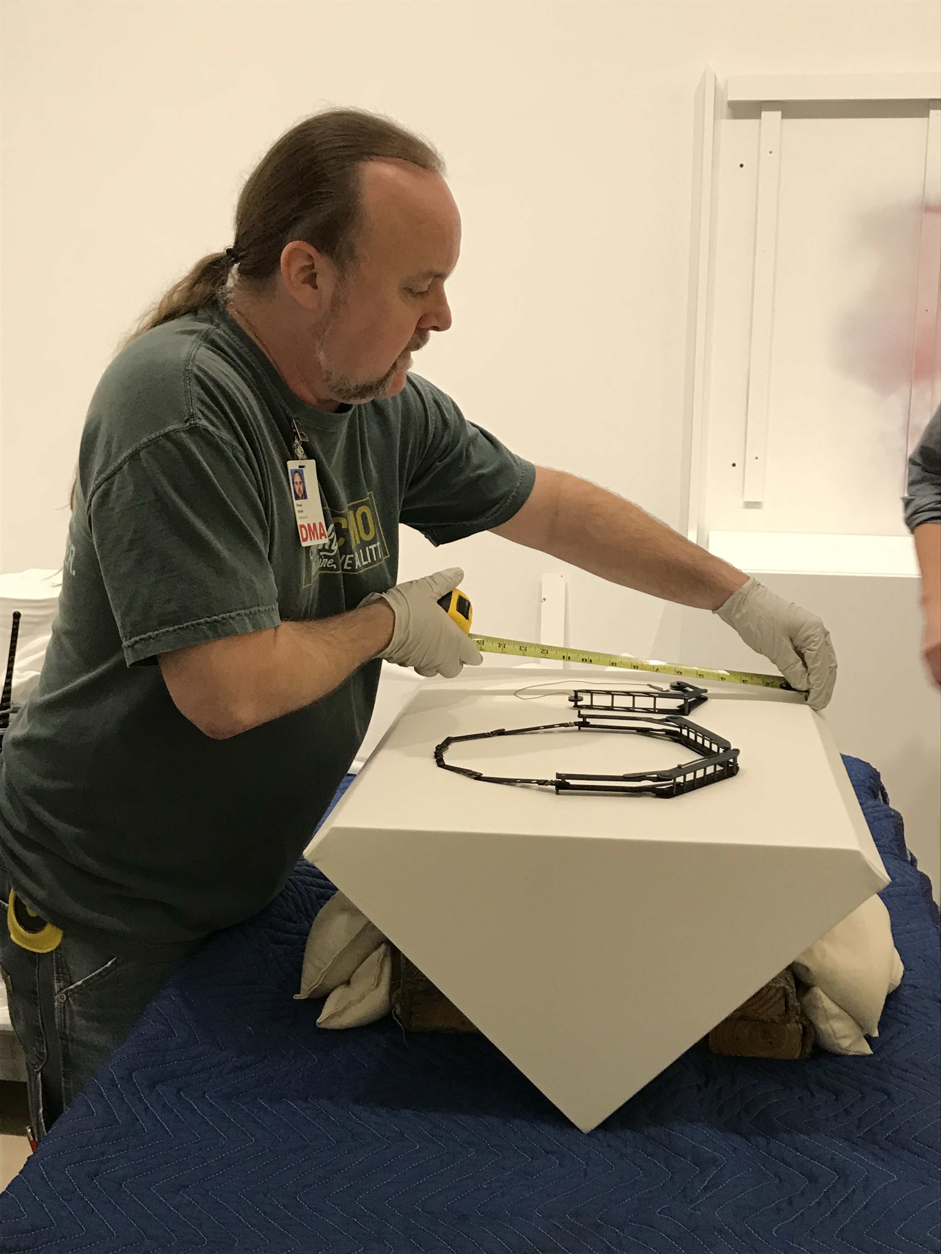
Doug Velek takes measurements for the two pieces of jewelry by Katie Collins. Prior to installing the work, the preparators made the wedges and lifts used to display the jewelry in the exhibition. After confirming that the necklaces were centered on the wedge, preparators used pins to secure them in place.

SS and RS
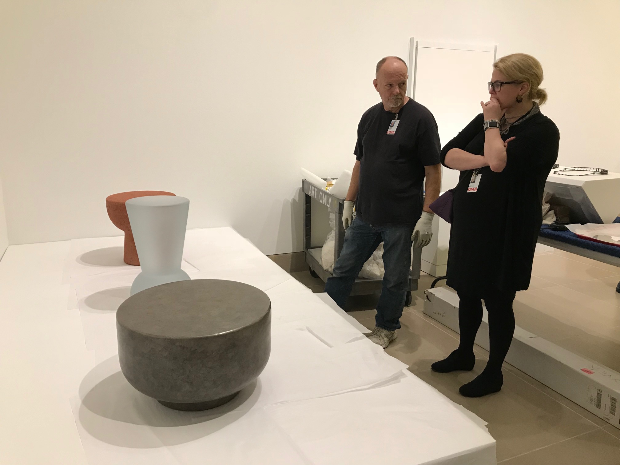
Curator Sarah Schleuning and preparator Russell Sublette discuss the placement of the three stools by Faye Toogood.

Katie Province is an Assistant Registrar for Collections and Exhibitions at the DMA.

Breaking Down Barriers

It may or may not surprise you to hear that one in five adults in the United States self-identifies as having a disability. At the DMA, we believe that limitations reside not in individuals, but in systematic barriers to participation, and that accessibility is a shared responsibility across the Museum. Collaboration between departments helps the DMA remove barriers to participation and continually broaden our definition of access.

One of the ways we approach accessibility is through individualized experiences for specific needs. But we also learned from visitors that they’d like the means to explore the Museum and its collection through unstructured, anytime activities and resources.

This month we are pleased to unveil the result of the most recent collaboration between our Education and Design departments: large-print booklets in the Center for Creative Connections Gallery.

When designing for the low-vision community, the proper treatment and application of design elements can significantly enhance readability. Simply enlarging standard-print documents does not result in effective large-print material. The font selection, size, and line spacing are just a few components that must be carefully selected and treated.

Sans serif geometric fonts such as Helvetica, Futura, and Gotham Rounded are ideal for large-print documents. Limiting the number of characters per line, creating a high visual color contrast between the background and text, and aligning to the left are further design decisions that help the low-vision community easily consume printed information.

While visitors with vision impairment were at the forefront of our mind during the design process, these design elements can help remove barriers for visitors with dyslexia and those who are English language learners as well.

We are excited to add these large-print booklets to our repertoire of accessible materials for visitors. Some of our previous projects include visual descriptions and sensory activities at the Pop-Up Art Spot. Creating opportunities and programs for visitors with vision impairments has long been an important facet of the DMA’s program offerings with Art Beyond Sight Awareness month in October and our summer touch tour for DISD students with visual impairments.

While many exciting accessibility projects are underway at the Museum, there is still much work to be done. As we evaluate and test the new large-print label format, we will seek to expand the booklets to other exhibition galleries in the future. We hope the introduction of the large-print label booklets will be a next step in exploring what we can do to better serve our audiences and expand accessibility throughout the Museum.

Emily Wiskera is the Manager of Access Programs and Jaclyn Le is the Exhibitions Graphic Designer at the DMA.

Friday Photos: Arturo’s Fixer Upper

Did you know that Arturo’s Nest (the Museum’s play space just for children 0-4 years old) is nine years old?! The first kids to step foot in this beloved space have long since outgrown it!

When the space opened in 2008, it was a new experiment for the Dallas Museum of Art, and a visible symbol that we love little kids here at the Museum. Since that time, this small room has had a BIG impact. It is one of the most visited spots in the Museum for children and families, and you can almost always hear squeals of laughter trickling out from the room.

A few weeks ago, we closed Arturo’s Nest to give it a much-deserved redesign. Chip & Joanna Gaines didn’t visit, but our crack team of designers, educators, and carpenters worked their own “fixer upper” magic and gave the Nest a whole new look.

Ready to see what we’ve done? How about we first take a look at where we’ve been.

Arturo’s Nest in 2008

Arturo’s Nest in 2010

And…drum roll please…Arturo’s Nest in 2017!

IMG_0895

IMG_0894

What do you think? One of my favorite parts of the design is that we see both a daytime and a nighttime view of Arturo’s home. And that fun polka dot carpet will make it so much more comfy for kids to sit down and play.

We’ll be adding even more features in the months to come, so be sure to come visit throughout the summer.

IMG_0896

Arturo can’t wait to see you!

Leah Hanson
Manager of Family and Early Learning Programs

Calling all Happy Campers!

Are you dreaming of lazy days at the swimming pool, sunburned noses, family vacation, and popsicles? We are! Summer is officially 95 days away, but we won’t be spending it at the neighborhood pool. For those of us who coordinate Family Programs at the DMA, summer means one thing—Summer Art Camp! And this year’s line-up of camps has something for every creative kid. Whether you are a junior shutterbug, fashionista, sculptor, painter, designer, musician, actor, or inventor, there’s a summer camp for you.

I have been teaching summer camps at the DMA for five years now, and I’m 95 percent serious when l tell my friends that I would gladly be a full-time summer camp teacher. I love spending an entire week with a group of kids, exploring the Museum’s galleries, getting messy in the studio, and having fun. Summer camp gives both teachers and campers permission to be a little goofy, experiment with materials in crazy ways, and give our creativity a good work-out. Camp is all about F-U-N (but we usually manage to learn something along the way too).

Some of my favorite summer camp memories so far include:

Here’s a sneak peek of just a few of the things you can do at Summer Art Camp this year:

This year’s camps will be held each week June 9-27 and July 7-August 15. Morning camps are 9:00 a.m.-noon and afternoon camps are 1:00-4:00 p.m. Tickets are on sale now!

For aspiring art and museum educators, Summer Art Camps also offer the opportunity for a summer internship at the DMA. Summer camp interns get hands-on experience as they assist summer camp teachers by facilitating gallery activities, art-making projects, games, and sensory explorations. With each camp, interns step into the role of art cheerleaders, skit-planning co-conspirators, the ultimate problem solvers, and mentors to the children. What better way to spend a summer? Applications are now being accepted. Find out how to apply here.

Spend some time with us this summer at the DMA, and you’re sure to be a happy camper!

Leah Hanson
Manager of Early Learning Programs

Art Is My Client

22s

Uncrated stopped by the design office and caught up with Becca Winti, Senior Graphic Designer, to learn more about her role here at the DMA. Rumor has it that she can do a perfect goat impression . . .

Describe your job in fifty words or less.
I provide design for print, environmental, and web-based communications for the Museum. Projects consist of brochures, invitations, ads, store product, way-finding signage, banners, billboards, DART bus graphics, and more. I carry the brand across all of the departments of the Museum to create a visual culture.

What might an average day entail?
I’m usually juggling anywhere from thirty to sixty jobs at one time, so my average day consists of a lot of multi-tasking! I go from working on a logo for a special exhibition to working on a vinyl “No Smoking” sign for our glass doors. Since I design print projects, I also attend many press checks. I work in a room with two other designers and an editor, which results in a lot of laughing and listening to music throughout the day. Never a dull moment!

How would you describe the best part of your job and its biggest challenges?
The best part of my job is that ART is my client! I also enjoy working with the different types of people that Museum life is filled with. Working as an in-house designer and creating collateral for different departments in the Museum that looks the same but feels different can be tricky. Each department wants to stand out. So the challenge is how to make them stand out but fit into our over-arching brand umbrella.

Growing up, what type of career did you envision yourself in? Did you think you’d work in an art museum?
I originally went to school to study architecture but soon realized that there is a lot of math and physics involved and that wasn’t going to work for me. So I made the migration to design communications. I didn’t realize that I could work for an art museum until I was about to graduate from college and saw representatives from the DMA at a student portfolio show that I attended. I worked for a design agency for a year or so straight out of school and then wanted to move on. I decided I would only stay in Dallas if I could work at the Dallas Museum of Art–and look what happened! I got my dream job and I‘ve been here for almost seven years.

What is your favorite work in the DMA’s collection?
It’s hard to have one favorite work. So I have a few. The first work that stands out in my mind is Buildings by Charles Demuth. I like anything that is architectural, and I love how vibrant the red is. I also really enjoy The Gentleman by Andrew Wyeth. The light that is captured is breathtaking. The work is dramatic but peaceful at the same time. Another favorite is Emma-O. He is so terrifying but that is what I love about him. The artist was successful in creating the King of Hells and evoking the emotion that you get from looking at him.

Is there a past exhibition that stands out in your mind as a favorite, or is there a particular upcoming show you’re looking forward to seeing?
Past exhibitions that have stood out for me (of course there isn’t just one) are Phil Collins: the world won’t listen, Take Your Time: Olafur Eliasson, Mark Bradford, The Fashion World of Jean Paul Gaultier: From the Sidewalk to the Catwalk, and Posters of Paris: Toulouse-Lautrec and His Contemporaries.

Friday Photos: Designing Exhibitions Workshop

Last Saturday, a dozen teachers explored exhibition design in a half-day teacher workshop, slipping in and out of the galleries before the crowds waiting for one last look at The Fashion World of Jean Paul Gaultier: From the Sidewalk to the Catwalk.  We were thrilled to have Jessica Harden, DMA Exhibition Design Coordinator, take us through various galleries she had designed. As we looked at the work, she enlightened us on the effect of design elements on visitor experience. It was especially exciting to hear Jessica explain her creative process for the Gaultier exhibition, which is full of imaginative elements, such as a satin-tufted display case and graffiti-filled walls!

The teachers spent the second part of the day designing mini exhibitions of works in the DMA’s collection. They considered lighting, wall color, interactive components, mood, and object and visitor safety, pinning their layouts and ideas to project boards. The teachers ended the day by sharing how their chosen design elements expressed the focus of their exhibitions. Here’s the breakdown of our Exhibition Re-design Project.

Enjoy these photos that capture some of our fun morning. Thanks to all the teachers who joined us on Saturday!

Andrea Severin

Coordinator of Teaching Programs

Form/Unformed: Goldilocks and the Chairs

This past December, the Tower Gallery on the fourth floor of the Museum became home to Form/Unformed: Design from 1960 to the Present.  This exhibition showcases over thirty works drawn largely from the Museum’s collections and reveals the ever-evolving formal aesthetics and ideas that have influenced design of the last fifty years.  Featuring everything from room dividers to candlesticks, the space pays homage to design powerhouses such as Verner Panton, Frank Gehry, Donald Judd, and Louise Campbell.  Though a broad array of objects appear in the exhibition, one cannot help but notice an overwhelming number of chairs

This slideshow requires JavaScript.

Like Goldilocks entering the three bears’ home, we are presented with a selection of chairs ranging across all shapes and sizes.  As our exhibitions currently have a heavy empahsis on design, with Gustav Stickley and the American Arts & Crafts Movement and Line and Form: Frank Lloyd Wright and the Wasmuth Portfolio, the Education staff began brainstorming how our society describes furniture and what appeals to us about various pieces.  In an effort to find the chair that is JUST RIGHT for you, here are some of the descriptors that may appear on any one of our wish lists for the perfect chair: organic, innovative, angular, minimal, sturdy, plush, colorful, weird, comfy, casual, simple, unique, futuristic, traditional, embellished, symmetrical, asymmetrical, functional, imaginative, elegant, versatile, compact, playful, practical, nostalgic, modern….As you can see, there are as many different ways to describe a chair as opinions on what qualities make the perfect chair!

What words describe your ideal chair?  Share with us in the comments section!

Form/Unformed: Design from 1960 to the Present will run through January of 2012 and is free with general admission to the Museum.

Ashley Bruckbauer
McDermott Intern for Programs and Resources for Teachers


Archives

Flickr Photo Stream

Categories