In spring of 1978, while the artist León Ferrari was in Stockholm, Sweden, his son was disappeared by the military police back in his home country of Argentina. Long suspicious of governmental and religious powers, Ferrari was openly critical of the Argentine dictatorship, and had been living in São Paulo, Brazil, in exile since 1976. His son had stayed behind and was actively engaged in the leftist resistance, ultimately suffering the same fate as 30,000 of his compatriots who were kidnapped and murdered during the country’s decade-long “Dirty War.” Two untitled works on paper recently acquired by the Dallas Museum of Art serve as witness to these important junctures in the artist’s life, and are signed and dated from São Paulo and Stockholm, respectively. Functioning as abstracted letters, they form part of a long-running series Ferrari inaugurated in 1963 with Carta a un general (Letter to a General), in which the artist’s script becomes illegible and morphs into almost Surrealist imagery, calling to mind that movement’s interest in automatic writing and its possibilities.
-
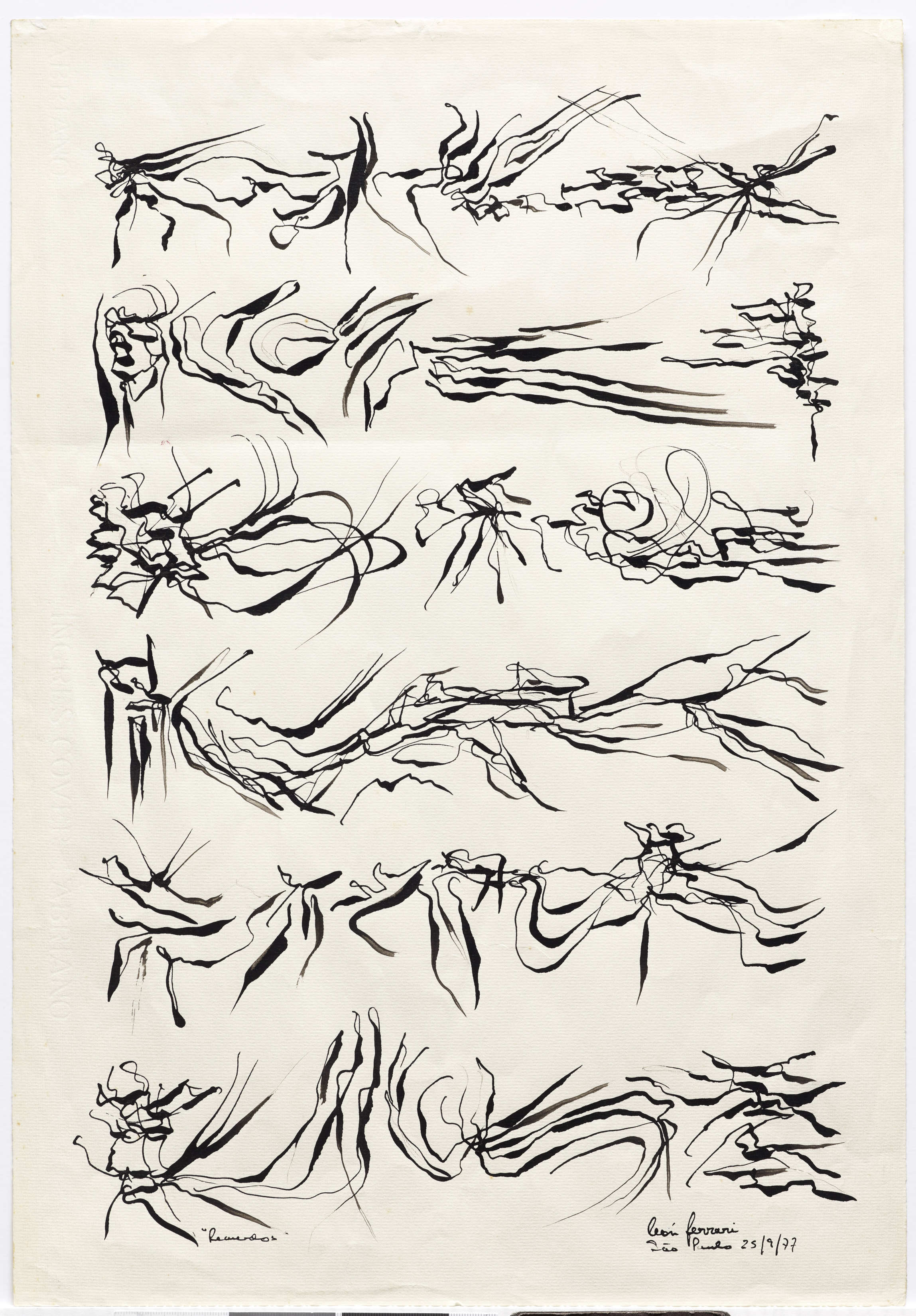
- León Ferrari, “Untitled,” 1978, ink on paper, Dallas Museum of Art, Mary Margaret Munson Wilcox Fund, Susan Mead Contemporary Art Fund, and gift of Mrs. Teresa Bulgheroni, T44010.1
-
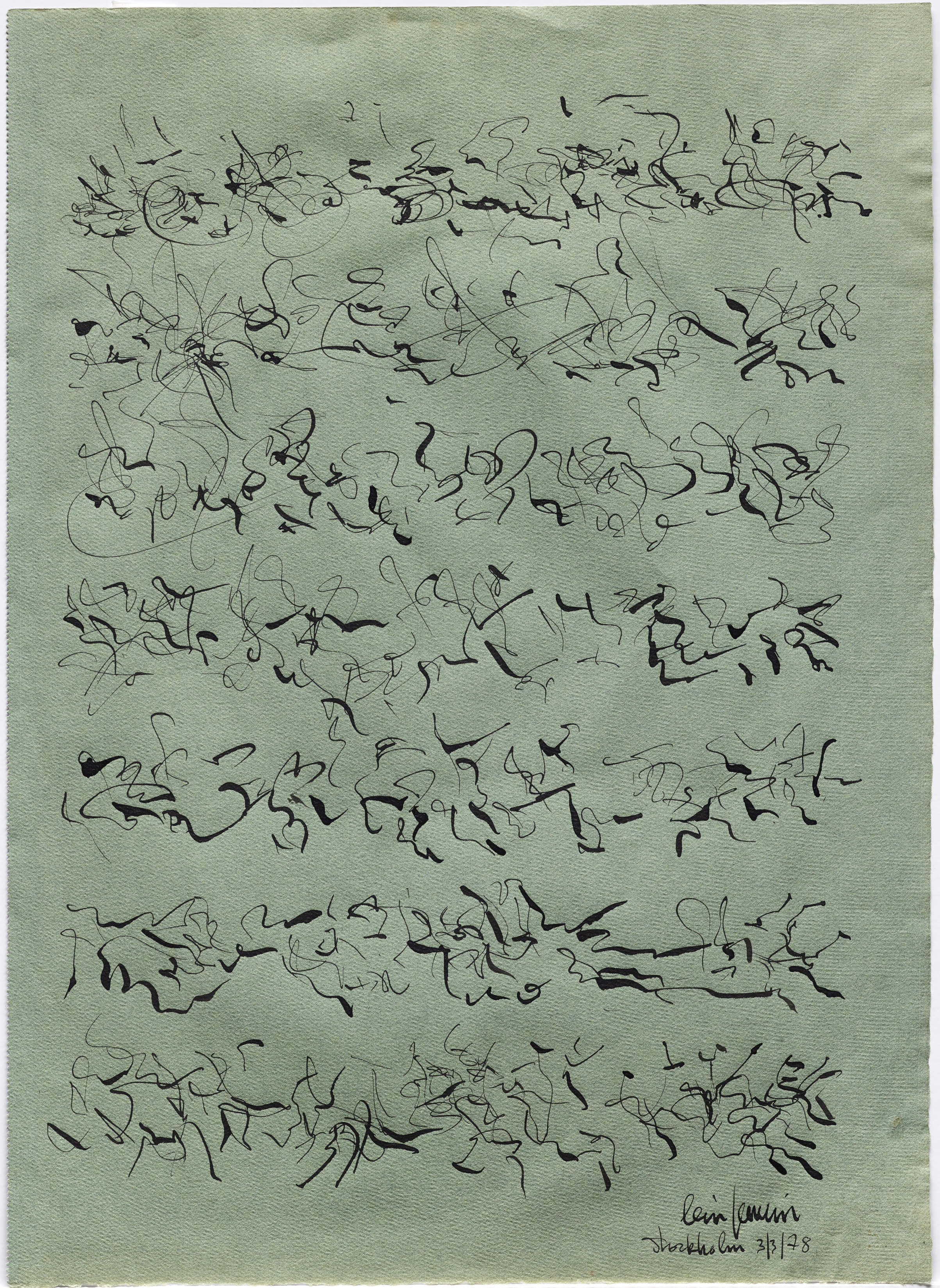
- León Ferrari, “Untitled,” 1978, ink on paper, Dallas Museum of Art, Mary Margaret Munson Wilcox Fund, Susan Mead Contemporary Art Fund, and gift of Mrs. Teresa Bulgheroni, T44010.2
Runo Lagomarsino, the subject of the DMA’s upcoming Concentrations exhibition EntreMundos, shares a geographic lineage with Ferrari. Lagomarsino was born to Argentine parents who migrated to Sweden during the Dirty War. His grandparents were Italian, as were Ferrari’s parents (up to 62% percent of Argentines are of Italian descent), and both artists have lived and worked in São Paulo. Lagomarsino’s heritage and travels have informed his work, which comments on mass migrations from the colonial period to the present. But their work has more in common than this shared trajectory. Like Ferrari, Lagomarsino renders legible systems illegible, and stable meanings unstable.

Runo Lagomarsino, Crucero del Norte , 1976–2012, 24 exposed photographic papers, 7 x 9 1/2 in. (17.8 x 24 cm) each, Collection Lena and Per Josefsson, Stockholm, Photo: Erling Lykke Jeppesen
Runo Lagomarsino, West Is Everywhere you Look, 2016, 9 maps, motors, cables, and wires, variable dimensions, Courtesy of the artist and Francesca Minini, Milano
In the upcoming exhibition, visitors will encounter maps, like those found in primary school classrooms. Yet these maps are rolled up and closed so that their contents cannot be seen. In other works, photographic paper has been exposed to light so that any imagery is blurred beyond recognition; portmanteaus stamped on a wall create surprising associations. By putting into doubt what is typically taken as factual, Lagomarsino asks us to question our own assumptions and biases, and how these become codified into larger social and political systems. This questioning of the powers-that-be is exactly what drove Ferrari during his long career. These sympathetic artists demonstrate art’s ability to thrive in the space of ambiguity, empowering viewers to create their own interpretations.
Concentrations 61: Runo Lagomarsino, EntreMundos opens on September 30; the exhibition is included in free general admission.
Anna Katherine Brodbeck is The Nancy and Tim Hanley Associate Curator of Contemporary Art at the DMA and curator of the exhibition.