Posts Tagged 'Works on Paper'

A Sneak Peek of “Dalí’s Divine Comedy”

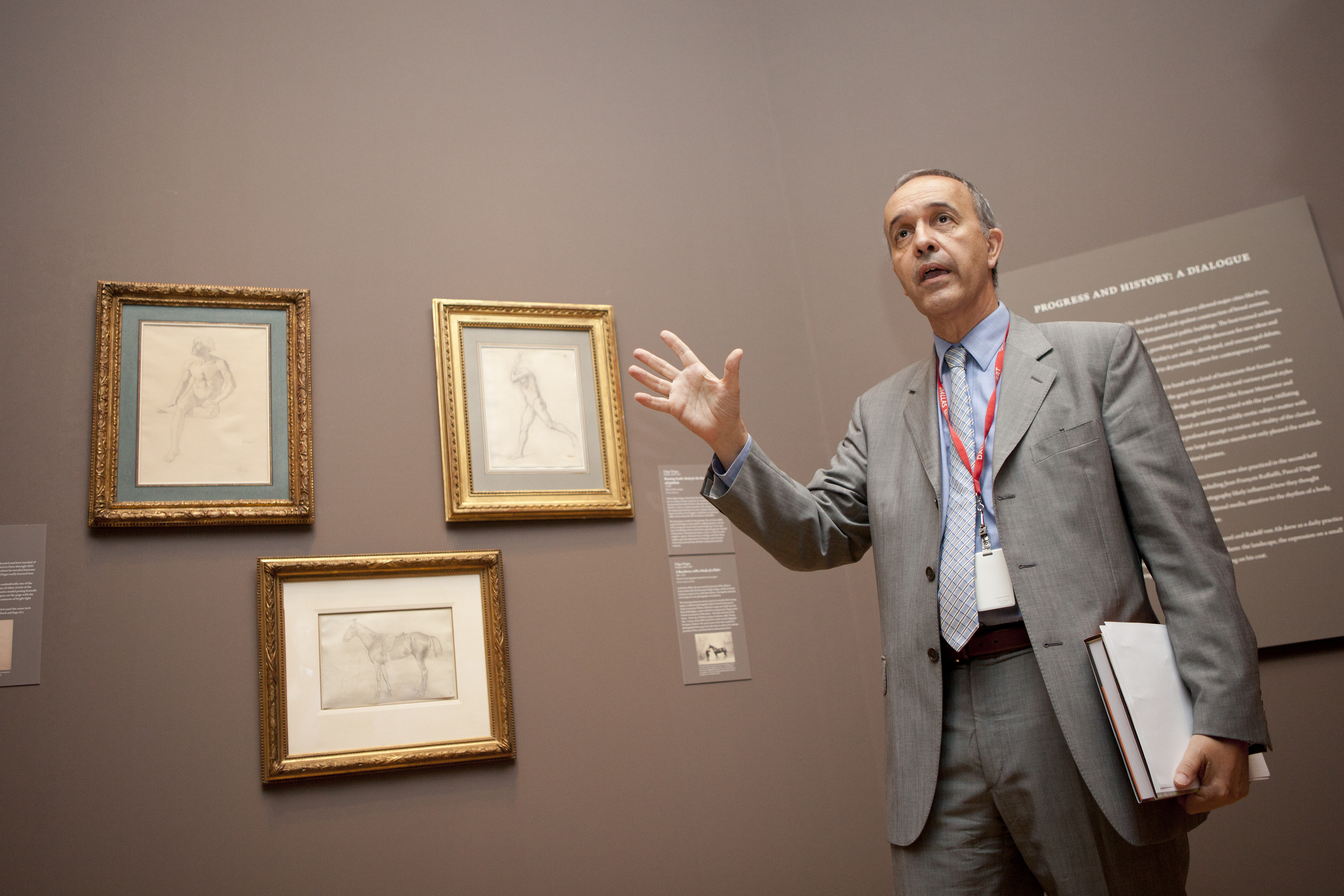
Whimsical. Unsettling. Surreal. These are a few of the adjectives used to describe the look and feel of the exhibition Dalí’s Divine Comedy, coming soon to the DMA. As the 2019-2020 Dedo and Barron Kidd McDermott Intern Fellow for European Art, I was given the opportunity to curate an exhibition of works on paper in a space in the European galleries on Level 2, drawing from the Museum’s rich collection of European prints and drawings. Exhibition planning comes several months (if not years for large exhibitions!) in advance before the works even touch the wall. Thus, I arrived at the DMA at the beginning of my tenure in mid-August last year with my sleeves rolled up and ready to work.

Dali’s Divine Comedy brings together works from prominent Surrealist artist Salvador Dalí’s series illustrating The Divine Comedy. Written by Florentine poet Dante Alighieri in 1320, this long narrative poem charts Dante’s journey through Hell, Purgatory, and Paradise in search of salvation.

In 1950 the Italian government commissioned Dalí to illustrate The Divine Comedy in celebration of Dante’s 700th birthday. Although the request was later revoked, Dalí, likely inspired by the poem’s imaginative qualities and its potential for fantastical illustrations, persisted with this project. From 1951 to 1960 he created 100 watercolors representing each canto (or section) of the poem. The watercolors were later transferred to colored wood engravings. This series, containing 100 prints, came into the DMA’s collection in 1996 as a gift from collectors Lois and Howard B. Wolf.

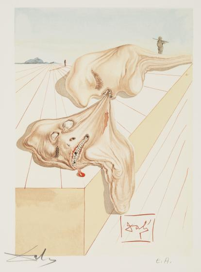
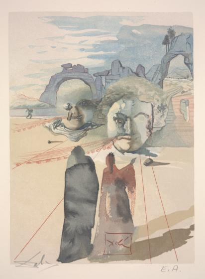
Following the narrative cycle of its original literary source, Dalí’s Divine Comedy opens with a presentation of Dante’s depictions of Hell. Dalí visually reinterprets this realm as a barren, empty landscape crawling with strange amorphous forms as illustrated in the print Hell: Men Who Devour Each Other (Canto 30). His radical articulation of space demonstrates his unique Surrealist spin on the frightful qualities traditionally ascribed to Hell. Instead of depicting Hell as a fiery inferno, Dalí portrays this region as a vast empty space that conjures comparable feelings of terror.

Salvador Dalí, Hell: Men Who Devour Each Other (Canto 30), about 1960, wood engraving printed in color, Dallas Museum of Art gift of Lois and Howard B. Wolf, 1996.219.30
Salvador Dalí, Hell: The Blasphemers (Canto 14), about 1960, wood engraving printed in color, Dallas Museum of Art, gift of Lois and Howard B. Wolf, 1996.219.14

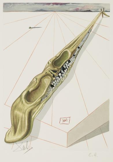
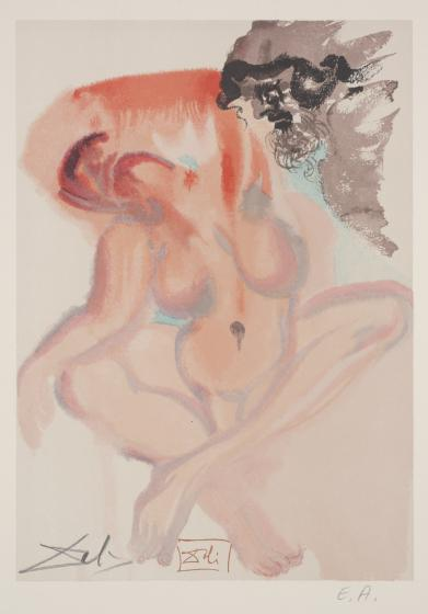
Echoing the liminality, or state of in-betweenness, that characterizes Purgatory, Dalí recycles visual strategies employed in his renderings of Hell and Heaven to illustrate scenes from this region. In Purgatory: Avarice and Prodigality (Canto 20), sharp lines seen in Hell resurface in Purgatory, mediated by dynamic watercolor forms that distinguish Heaven. Dalí also provides up-close portraits of the realm’s inhabitants, providing a psychoanalytic glimpse into the complex nature of repentance.

Salvador Dalí, Purgatory: Avarice and Prodigality (Canto 20), about 1960, wood engraving printed in color, Dallas Museum of Art, gift of Lois and Howard B. Wolf, 1996.219.14
Salvador Dalí, Purgatory: The Indolent Ones (Canto 3), about 1960, wood engraving printed in color, Dallas Museum of Art, gift of Lois and Howard B. Wolf, 1996.219.37

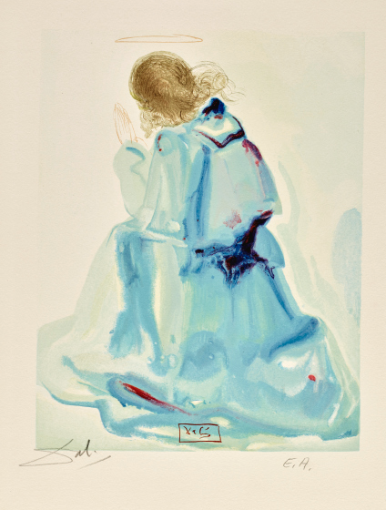
Visitors will find Dalí’s seemingly placid though uncanny representations of Heaven in stark contrast to the scenes presented in the previous two realms. Dalí depicts the celestial cosmos with vibrant, warm watercolors as illustrated in Paradise: The Angel (Canto 2). The loose, fluid brushstrokes that compose the painterly form of the angel resonate with the ethereal properties that Dante ascribes to Heaven.

Perhaps the most visually striking element among these prints is Dalí’s persistent use of tiny geometric forms, which he refers to as rhinoceros horns, to make up the bodies of the angels and spirits that Dante encounters in Heaven. Dalí developed a peculiar interest in these forms during the later phase of his career claiming that they served as his sources of “angelic inspirations.”

Salvador Dalí, Paradise: The Angel (Canto 2), about 1960, wood engraving printed in color, Dallas Museum of Art, gift of Lois and Howard B. Wolf, 1996.219.69
Salvador Dalí, Paradise: The Sixth Sphere of Jupiter (Canto 20), about 1960, wood engraving printed in color, Dallas Museum of Art, gift of Lois and Howard B. Wolf, 1996.219.87

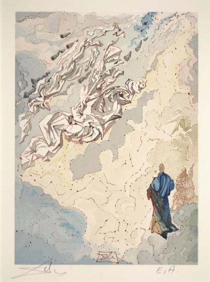
Dalí employs different visual aesthetics in his depiction of each realm while also guiding the viewer to consider the timeless paragone, or interaction between word and image, through his illustrations. The DMA’s exhibition Dalí’s Divine Comedy presents these varying perspectives, all while encouraging an endless pursuit of fantasy, play, and imagination.

Chasitie Brown is the Dedo and Barron Kidd McDermott Intern Fellow for European Art at the DMA.

Six Centuries Unabridged

Word & Image: Works on Paper from the 15th through 20 Centuries, on view in the DMA’s level 2 European Galleries, focuses on artists who blurred the boundaries between art and text, and uniquely explores this dynamic progression as it developed across Europe for over six centuries. Each of these works, selected from the DMA’s permanent collection, have a rich and diverse history. While many were originally intended as personal objects for private use, others were made for mass production on the open market or for a select group of art connoisseurs. Several of these pieces have not been on view for several years, if ever.

Here’s a close look at a few of the objects on display:

15th-Century German Artist, David and the Ark of the Covenant, page from the Cologne Bible, late 15th century, published in Cologne, Germany, printed by Heinrich Quentell and Bartholomäus von Unckel, hand-colored woodcut on paper, Gift of the Dallas Print Society. 1937.18

What is this page from?
This page was removed from a copy of the Cologne Bible, printed in Germany. The Cologne Bible was one of the most ground-breaking evolutions in book design. We take for granted today that a book may be produced with as many pictures as a writer or publisher desires, scattered however and wherever across the page. In this period, only the upper-class could afford elaborately designed manuscripts. Even these opulent books followed a traditional standard of production with images set either above or below the text, or separated completely on another page. The Cologne Bible shocked viewers with over 100 images that break directly through the text.

How was it made?
Johannes Gutenberg’s printing press lead book production out of the Middle Ages and into the Early Modern era. This page was assembled using individually cast letters and symbols covered with an oil based ink. Its woodcut illustration was created using a relief printing technique, in which a woodblock is carved with a chisel or gouge and inked with a roller. The sunken, cut-away areas received no ink and appeared white in the print. Color was added after the page dried. This addition of pigment also signals the wealth of the patron.

William Hogarth, The Five Orders of the Periwigs, 1761, etching on paper, Dallas Museum of Art, Foundation for the Arts Collection, gift of Mrs. Alfred L. Bromberg, 1984.194.FA

What inspired this work?
In 1748, the antiquarians James Stuart and Nicholas Revett announced that their important work The Antiquities of Athen Measured and Delineated was soon to be published. However, the first volume only made it to press in 1762, with the second appearing around 1789 or 1790. Nearly 40 years after their announcement! Here, Hogarth plays on the annticipation of the long wait for their work, with the opening line “In about Seventeen Years, will be completed” at the bottom. This may have been more lighthearted than really biting, as James Stuart was claimed to keep a copy of the print on a fire screen in his parlor to show visitors.

Who are we looking at?
This complex etching is organized by row based on the five classical orders: Doric, Tuscan, Iconic, Composite, and Corinthian. He arranges the wigs like a display in a shop window with each line corresponding to the five social classes who wore them. Notice at the bottom, there is a sixth additionial order for aristocratic women. The characters wearing the wigs were recognizable individuals, including William Warburton at the very top left turned in profile, Bubb Doginton below him, and the Queen Charlotte and Countess of Northumberland on the bottom line.

Olga Vladimirovna Rozanova, Authors: Alexei Kruchenykh, Velimir Khlebnikov, text and Illustration from A Game in Hell, 1914, Second Edition, published in St. Petersburg, Printed by Svet, Nevski Prospect, 136, lithograph on paper, Dallas Museum of Art, The Art Museum League Fund in honor of Mr. and Mrs. James H. Clark. 1978.75.4

What is it?
This second edition of the Futurist book A Game in Hell is quite different from the first in binding technique, lettering type, illustration, and its further additional 292 verses. A Game in Hell is an extended poem about a card game going on between devils and sinners in hell. Artists Olga Rozanova and Kazmir Malevich collaborated with writers Alexei Kruchenykh and Velimir Khlebnikov to create a completely new work filled with more lively devils and sinister characters. While Malevich did three drawings and the cover, Rozanova dominates the character of the book with over twenty compositions and marginal figures.

What influenced this piece?
During the early 20th century, there was a dominant Russian peasant population, influencing Futurist interests in handmade books and folk-like imagery. The poetics of play and chance manifested in the aesthetics of early Russian avant-garde as a rebellious method of making art without rules. Futurist books were the perfect marriage of physical object and literary expression, which created a true merging of art and word.

Beth CreMeens is the Dedo and Barron Kidd McDermott Graduate Intern for European Art at the DMA

Picture Yourself

Self-portraits are compelling images because they appear to show us the person behind the artwork, offering us a special peek into who the artist was. We hope that by looking at the self-portrait, we can learn something about the subject. Yet, much like the selfies we post on social media, the artists were presenting themselves how they wished to be seen.

Just as selfies allow our friends and family to feel like they’re sharing in our daily lives, they are ultimately the result of our own conscious decisions, just like a self-portrait. The self-portraits we see in museums are images that exist somewhere between how we see the artist and how the artist wanted us to see him or her.

My upcoming exhibition Multiple Selves: Portraits from Rembrandt to Rivera, opening this weekend in the Museum’s European Galleries on Level 2,  focuses on this play between how we want to be seen and how we are seen. The majority of the images are self-portraits, ranging from the 17th to the 20th centuries in a variety of media, including etching, lithography, and drawing.

Just as we use objects and clothing in our selfies to identify ourselves (think college t-shirts to mark us as alums or pictures in front of tourist landmarks to show where we’ve been), artists in these self-portraits use different objects and costumes to help us identify the person we see in the portrait as an artist.

Koloman Sokol, Self-Portrait, mid-20th century, wood engraving, Dallas Museum of Art, anonymous gift, 1949.11

In many of the works, these objects are tools of the trade, or items that are specific to an artist’s working life. This includes palettes, canvases, mahl sticks (used by artists to keep their painting hand steady), drawing implements, and jewelry, which historically marked an artist’s inclusion in a professional guild or within a royal court.

One work in particular offers an intriguing example of this complex dynamic. Self-Portrait by Koloman Sokol is this type of double self-portrait. Sokol, a Slovakian artist by birth who worked extensively in Mexico and the United States, probably created this self-portrait sometime in his 30s. In it, we see not only the completed self-portrait but also the artist caught in the act of creating a self-portrait. At the bottom of the print, the outlines of this second self-portrait take shape. This second self-portrait is being created just as the first one was, through a printmaking process known as wood engraving. To help us identify the work he is doing, he includes his tools—the wood block he is carving on and a burin, a tool used in printmaking to cut into the metal plate or wood block.

Detail of Self-Portrait

In the works that feature artist tools, like Sokol’s, the artists are manipulating their own image to ensure that we as an audience recognize the duality of their self-portrait, that we recognize the artist as an artist through both the self-portrait as a work of art and through the artist’s self-presentation as an artist.

For more about self-portraits, join me for a free Gallery Talk on Wednesday, May 3, at 12:15 p.m. in the exhibition. For another type of double self-portrait, be sure to visit The Two Fridas, now on view in the exhibition México 1900–1950: Diego Rivera, Frida Kahlo, José Clemente Orozco, and the Avant-Garde, on view only at the DMA.

Amy Wojciechowski is the Dedo and Barron Kidd McDermott Graduate Intern for European Art.

Art, Camera, Selfie!

We love seeing the creative photos that our visitors take with our collection, so we’re turning the spotlight on you. This summer, feel free to explore, and share your fun with us!

Now through Labor Day, visitors who submit their creative DMA photos will receive a chance to win a private tour of the DMA with curator Olivier Meslay, and everyone who participates receives a free ticket to Mind’s Eye: Masterworks on Paper from David to Cézanne.

Enter your own DMA snapshot here and enjoy some of the great photos that we’ve already received – even Chef Stephan Pyles got in on the action!


Anthea Halsey is the Senior Marketing & Social Media Manager at the DMA

What Our Staff Is Viewing

Last week, DMA staff got a chance to preview our newest special exhibition, Mind’s Eye: Masterworks on Paper from David to Cézanne, with co-curators Olivier Meslay and Bill Jordan. Because of their delicate nature, many of these works on paper by Delacroix, Degas, Cézanne, van Gogh, Manet, Schiele, Mondrian, Picasso, and more than sixty others are rarely on view. We’re open all week—including July 4—so stop by for what may be a once-in-a-lifetime opportunity to see them.

EP-41_06_21_2014_AG_033

EP-41_06_21_2014_AG_034

EP-41_06_21_2014_AG_037

EP-41_06_21_2014_AG_035 EP-41_06_21_2014_AG_036

Photography by Adam Gingrich, DMA Digital Media Specialist.


World War I Through the Eyes of Käthe Kollwitz: One Hundred Years Later

A new installation in the European Works on Paper Gallery contemplates the life and work of the German artist Käthe Kollwitz (1867-1945). For Germans born in the latter half of the 19th century, life was in a constant state of chaos. Immigration to America was at an all-time high, and World War I would soon be on their doorstep only to be followed by the destruction of World War II. For Kollwitz, the impact of these grave events became the inspiration for her artwork.

Käthe Kollwitz, Self Portrait, 1927. Lithograph, 12 5/8 x 11 ¾ in. (32.068 x 29.845 cm.), Gift of Mr. and Mrs. Alfred L. Bromberg, 1953.37

Käthe Kollwitz, Self-Portrait, 1927. lithograph, Dallas Museum of Art, gift of Mr. and Mrs. Alfred L. Bromberg

As a graphic artist and sculptor, Kollwitz was widely popular in Europe and America throughout her long life. Kollwitz had always been drawn to representing the working classes. But it was with a cycle of six prints documenting the Weaver’s Revolt of 1844 that she achieved instant fame. The DMA owns the last two prints in the series, Revolt and End.

Käthe Kollwitz, Revolt (Sturm), 1897. ink and etching on paper, Dallas Museum of Art, Foundation for the Arts, The Alfred and Juanita Bromberg Collection, bequest of Juanita K. Bromberg

Käthe Kollwitz, Revolt, 1897. ink and etching on paper, Dallas Museum of Art, Foundation for the Arts, The Alfred and Juanita Bromberg Collection, bequest of Juanita K. Bromberg

Käthe Kollwitz, End (Ende), 1897. aquatint and etching on paper, Gift of Mr. and Mrs. Alfred L. Bromberg

Käthe Kollwitz, End, 1897, aquatint and etching on paper, Dallas Museum of Art, gift of Mr. and Mrs. Alfred L. Bromberg

Together these works document the uprising of peasant workers and the resulting death and destruction. This series was so popular that Kollwitz was awarded a gold medal at the Great Berlin Exhibition of 1898, but the Prussian emperor Wilhelm II refused to award it to her, fearing her striking images would spark rebellions among the working classes. Nevertheless, it was this subject matter that would carry throughout her life’s work. She became dedicated to advocating for the lower classes and the downtrodden in society.

After the war, Kollwitz created many lithographs of women and children, such as Bread! and Hungry Children. These images were widely popular and circulated throughout the country. Kollwitz intended to draw attention to the starving working class and the impact of World War I on the nation.

Käthe Kollwitz, Bread! (Brot!), 1924. lithograph, Gift of Mr. and Mrs. Alfred L. Bromberg

Käthe Kollwitz, Bread!, 1924. lithograph, Dallas Museum of Art, gift of Mr. and Mrs. Alfred L. Bromberg

Käthe Kollwitz, Hungry Children (Deutschlands Kinder Hungern!), 1924. lithograph and ink, Dallas Museum of Art, Foundation for the Arts, The Alfred and Juanita Bromberg Collection, bequest of Juanita K. Bromberg

Käthe Kollwitz, Hungry Children, 1924. lithograph and ink, Dallas Museum of Art, Foundation for the Arts, The Alfred and Juanita Bromberg Collection, bequest of Juanita K. Bromberg

These two works were reprinted nearly a decade later. During World War II, Bread! was published in the National Socialist women’s magazine, Warte, as pro-Nazi propaganda, with the forged signature of St. Frank. Kollwitz was outraged, as she was a staunch opponent of Nazism and another world war. The United States appropriated Hungry Children as a propaganda poster to encourage rationing for the war effort.

After Käthe Kollwitz (German, 1867-1945), Brot!, reprinted by the Nazi Party in NS Frauen Warte, the National Socialist Women’s Paper, photo credit Elizabeth Prelinger, Käthe Kollwitz (Washington: National Gallery of Art, 1992), pg. 122. After Käthe Kollwitz (German, 1867-1945), Ask the Women and Children Whom Hitler is Starving Whether Rationing is Too Great a “Sacrifice,” 1942-1945, Photomechanical print, 55 ¾ x 39 13/16 in. (141.6 x 101.2 cm.), National Archives at College Park, MD, ARC Identifier, 513836

After Käthe Kollwitz, Bread!, reprinted by the Nazi Party in NS Frauen Warte, the National Socialist Women’s Paper, photo credit Elizabeth Prelinger, Käthe Kollwitz (Washington: National Gallery of Art, 1992), pg. 122. After Käthe Kollwitz , Ask the Women and Children Whom Hitler Is Starving Whether Rationing Is Too Great a “Sacrifice,” 1942-45, Photomechanical print, National Archives at College Park, MD, ARC Identifier, 513836

The works are currently on view in the Museum’s European Works on Paper Gallery on Level 2 and are included in the DMA’s free general admission.

Update September 5, 2014:
Listen to an interview with Michael Hartman discussing the exhibition on Tyler Green’s The Modern Art Notes Podcast here.

Michael Hartman is the McDermott Intern for European Art at the DMA.

A Dot That Went for a Walk

Once again, the Works on Paper Gallery on the Museum’s second level is being reinstalled. Fourteen drawings, lithographs, etchings, and engravings by some of the 20th century’s greatest artists—Henri Matisse, Alberto Giacometti, Pablo Picasso, and many more—will adorn the gray walls.

The new installation, titled Linear Possibilities in Modern European Prints, didn’t come together overnight. I’ve been working on it for the last six months, and I am now very excited (even a bit nervous) to present it to the Museum’s public. The idea came to me after looking many times through the Museum’s collection of European works on paper, which includes over 2,000 prints, drawings, and photographs dating from the late 1400s to the 1980s.

Henri Matisse, Loulou, 1914, etching, Dallas Museum of Art, Foundation for the Arts Collection, gift of the Wendover Fund

Henri Matisse, Loulou, 1914, etching, Dallas Museum of Art, Foundation for the Arts Collection, gift of the Wendover Fund, © 2013 Succession H. Matisse / Artists Rights Society (ARS), New York

I had to work with a few limiting factors before finding my final concept. The three walls of the gallery can only accommodate a certain number of works comfortably, so I had to keep the number within a range of eight to fourteen works. Also, works on paper are very sensitive to natural light. The longer a work is on view, the more damage that occurs, causing the paper to darken and certain media to fade. Therefore, I couldn’t use any work that had recently been on view. I found a few possibilities based on particular themes or artistic movements before choosing to investigate lines, one of art’s most basic elements.

Alberto Giacometti, Annette in the Studio, 1954, lithograph, Dallas Museum of Art, gift of Mr. and Mrs. Alfred L. Bromberg

Alberto Giacometti, Annette in the Studio, 1954, lithograph, Dallas Museum of Art, gift of Mr. and Mrs. Alfred L. Bromberg, © 2013 Artists Rights Society (ARS), New York / ADAGP, Paris

The idea was influenced by a great quote from the Swiss artist Paul Klee: “A line is a dot that went for a walk.” Lines appear in many types and sizes: vertical, horizontal, zigzagged, curvy, squiggly, thick, thin, long, short. When combined, lines reveal spaces or forms and allude to volume or mass. They can possess emotive qualities as well as imply movement.

Paul Klee, Hoffmanesque Scene (Hoffmaneske Szene), 1921, color lithograph, Dallas Museum of Art, gift of Stuart Gordon Johnson by exchange; General Acquisitions Fund; and The Patsy Lacy Griffith Collection, gift of Patsy Lacy Griffith by exchange

Paul Klee, Hoffmanesque Scene, 1921, color lithograph, Dallas Museum of Art, gift of Stuart Gordon Johnson by exchange; General Acquisitions Fund; and The Patsy Lacy Griffith Collection, gift of Patsy Lacy Griffith by exchange, (c) Artists Rights Society (ARS), New York / VG Bild-Kunst, Bonn

Pablo Picasso, Three Standing Nudes, at Right, Sketches of Heads (Trois nus debout, à droite esquisses de têtes), 1927, etching, Dallas Museum of Art, Dallas Art Association Purchase

Pablo Picasso, Three Standing Nudes (left) and Sketches of Heads (right), 1927, etching, Dallas Museum of Art, Dallas Art Association Purchase, © 2013 Estate of Pablo Picasso / Artists Rights Society (ARS), New York

The works in the installation demonstrate how painters and sculptors of the European avant-garde turned to drawing and printmaking in a new manner, creating with nothing but lines. They explored the possibilities of rhythmic or abstracted sequences of delicate, robust, and expressive lines in their compositions of a nude, an artist’s studio, or more abstracted scenes. There is an astonishing beauty to be found in these prints and drawings by Matisse, Giacometti, Picasso, and others. I encourage you to visit the Dallas Museum of Art (general admission is free!) to see these amazing and innovative works.

Linear Possibilities in Modern European Prints goes on view in the European Art Galleries on Level 2 Sunday, March 17.

Hannah Fullgraf is the McDermott Graduate Curatorial Intern in European Art at the DMA.

Papered Walls

Sara Woodbury, McDermott Curatorial Intern for American and European Art, recently organized an installation of prints for the Works on Paper gallery on the Museum’s second floor. Cross Cultural Dialogues in European and American Landscapes features landscapes from the 19th and 20th centuries that demonstrate artistic influences occurring between Europe and America. The show also highlights different printmaking techniques. We’d like to explore a few of these methods here, and also share a behind-the-scenes look at how works on paper are stored and cared for at the Museum. All of the prints you’ll see here are included in the installation, so be sure to check them out in person next time you visit the DMA.

Printmaking Techniques

Artists use a variety of printing techniques, but we’ll highlight just three methods here: woodcuts, etching, and lithography.

Lyonel Feininger, Mansion on the Beach (Villa am Strand), 1921, woodcut

Woodcuts are recognized by their linear quality, reflecting the laborious process required to make them. An artist draws onto a block of wood, and then all of the wood surrounding the drawing is carved away, turning the design into a three-dimensional relief. These raised lines are coated with ink, and the block is pressed to a piece of paper, printing the image. The oldest known printing method, the woodcut developed in Europe around 1400. It became less popular as easier printing techniques emerged, but many 20th-century artists embraced the medium’s bold, linear character.

Charles Emile Jacque, A Corner of the Forest of Fontainbleau, n.d. (mid to late 19th-century), etching

Another interesting technique is etching, which is similar to drawing. To make an etching, an artist draws with a tool called an etching needle onto a metal plate that has been coated in wax. Next, the plate is submerged in an acid bath, which corrodes, or “bites” into the exposed metal lines, leaving the wax-covered areas unaffected. The plate is then rinsed, covered with ink, and wiped down. The ink remains in the grooves of the etched lines, and the plate is ready for printing. Etching first appeared in the 16th century and became especially popular during the 17th century. It also experienced a resurgence in popularity during the late 19th century, a period that has become known as the Etching Revival.

John Rogers Cox, Wheat Shocks, 1951, Lithograph

One of the most important printing techniques in 20th-century art is lithography. An artist draws onto a stone or metal plate with a special greasy crayon. The stone is treated with acid, and then covered with ink and rinsed with water. The ink sticks to the greasy crayon, but washes off everywhere else. A piece of paper is pressed to the stone to print the image.

Lithography was invented in 1798 by Alois Senefelder and was initially used for commercial images. By the late 19th century, however, artists had begun exploring lithography’s creative possibilities. Lithography accommodates a wide range of styles, making it an ideal medium for the stylistic variety that characterizes 20th-century art.

Behind-the-Scenes with Registrar Anne Lenhart

Did you know that works on paper–including prints, drawings, photographs, and other types of work–are  stored and cared for differently than paintings and sculptures? Works on paper are sensitive to various conditions and must be handled with special care and attention. We asked Anne Lenhart, Assistant Registrar, to share insight into how the Museum stores and handles its large collection of works on paper.

What DMA department is responsible for handling prints?

Anne: The care and handling of prints is a shared responsibility between the curators, registrars, conservators, and preparators. The curators are responsible for choosing the works on paper for installations and exhibitions. Once the works on paper are chosen, the registrars, conservators, and preparators are responsible for making sure the prints are in good condition and ready for installation.

Where are the prints stored in the Museum? How are they stored?

Anne:  All of our objects are stored in secured art storage spaces. These areas, which have limited staff access and are monitored twenty-four hours a day, have a consistent temperature of 70° Fahrenheit (+/- 2°) and 50% (+/- 5%) relative humidity. Because paper is susceptible to even small changes in humidity (think about what happens to a sheet of paper when it contacts a drop of water), we try to be especially vigilant in terms of how we store our paper collection.

These numbers are considered guidelines for very stable pieces, such as those created with carbon-based ink applied to a good quality rag paper. Objects that are less stable—where the pigment and the materials are of lower or unknown quality or in the case of color photographs (especially Polaroids)—are exhibited for shorter periods of time.

A display table in the Print and Textiles Study Room, where the Museum’s works on paper are kept.

Many of the Museum’s unframed prints are stored in Solander boxes, such as this one.

How long can prints stay mounted in the galleries?

Anne:  The general rule for exposure of works on paper is one to three months, and we try to keep the maximum period of time any work on paper is on view to less than six months. After a work comes down, we usually do not reinstall it for eighteen months so that it can “rest.”

Cross Cultural Dialogues in European and American Landscapes is on view now, and we hope to see you soon at the Museum.

Sara Woodbury is the McDermott Curatorial Intern for American and European Art, and Karen A. Colbert is the McDermott Education Intern for Teaching Programs.

Growing Pains

Since our art storage area is not available to the general public, we thought we’d give you a behind-the-sceneslook at our new and improved space.

In 2008, the Museum was awarded an important grant from the National Endowment for the Humanities. Through the grant, the DMA has increased the square footage of several art storage spaces, expanded storage capacity, and modernized the spaces with new lighting, HVAC, and furniture fixtures. Each storage space was renovated to the highest preservation and green-building standards in coordination with the architecture firm Solomon & Bauer of Watertown, Ma., the City of Dallas, and contractors.

The building of the new Works on Paper (WOP) facilities was the final building stage of this multi-year project.  Three new rooms were constructed within the museum’s existing storage space to specifically hold the museum’s roughly 6,000 works. With the construction complete and the new cabinets installed, we have started the process of moving art from our old storage to the new.

Space was one of the biggest concerns in our previous WOP storage. This was especially true for our storage of framed works, where our cabinets were full the point of overflow. We often needed to remove five or six pieces in order to access the one object we needed. Since the goal is to move the work as little as possible, the “overflow” constituted a threat to the care of our objects.

Speaking in strictly numbers, we previously had 18 cabinets with a total of 126 bins, each bin being 10 inches wide and 42 inches deep. As you can see in the picture below, the height of each bin was set. While this created an aesthetically pleasing consistency, it left significant gaps and wasted precious space.

In our new space, conversely, we have 142 bins, each 11 inch wide by 42 inches deep. Not only do we have a greater number of overall bins, our new cabinets are completely modular.  Depending upon the need of the collection, we can add or subtract shelves.  The photo below shows the new cabinets in process of being loaded with objects.  Already you can see the increased functionality of this style unit.

The new framed work storage units are attached to rolling racks, which allows us to maximize our space by removing the need for aisles. While the use of rolling racks has been relatively common in library stacks for years, it is only now becoming the standard in collections care. With the addition of the rolling racks in the area, we have now updated all of our storage spaces to these compacting racks.  The photo below shows the new flat storage units on a rolling rack.

Always a problem in our old space, we specifically designed an area of the new storage space to view works on paper. Shelves built in to the slanted wooden backing fold out to support objects without having to bother with hanging.  The shelves are large enough to support almost any framed work in the collection, but are also designed in such a way where many smaller pieces could also be shown all at once.  The flexibility of the unit is vital to curators as they arrange and rearrange objects in preparation for gallery installations.  The overall size of the viewing space is an extra plus as we can now accommodate more students or scholars visiting on research trips.

The changes in how we store our works on paper will greatly improve the overall level of care we are able to maintain.  Thanks to the NEH and the Hoblitzelle Foundation, these improvements, along with the updates to our library and archives, the collections file storage space, and small objects—shown in last fall’s  Small Objects Collection is Movin’ on Up!—have made a profound impact on the way the collections staff cares for our museum’s collection.

Anne Lenhart is an Assistant Registrar at the Dallas Museum of Art


Archives

Flickr Photo Stream

Categories