Archive for the 'Museum Insight' Category


The Signs They Are A-Changin’: Bilingual Museum Signage

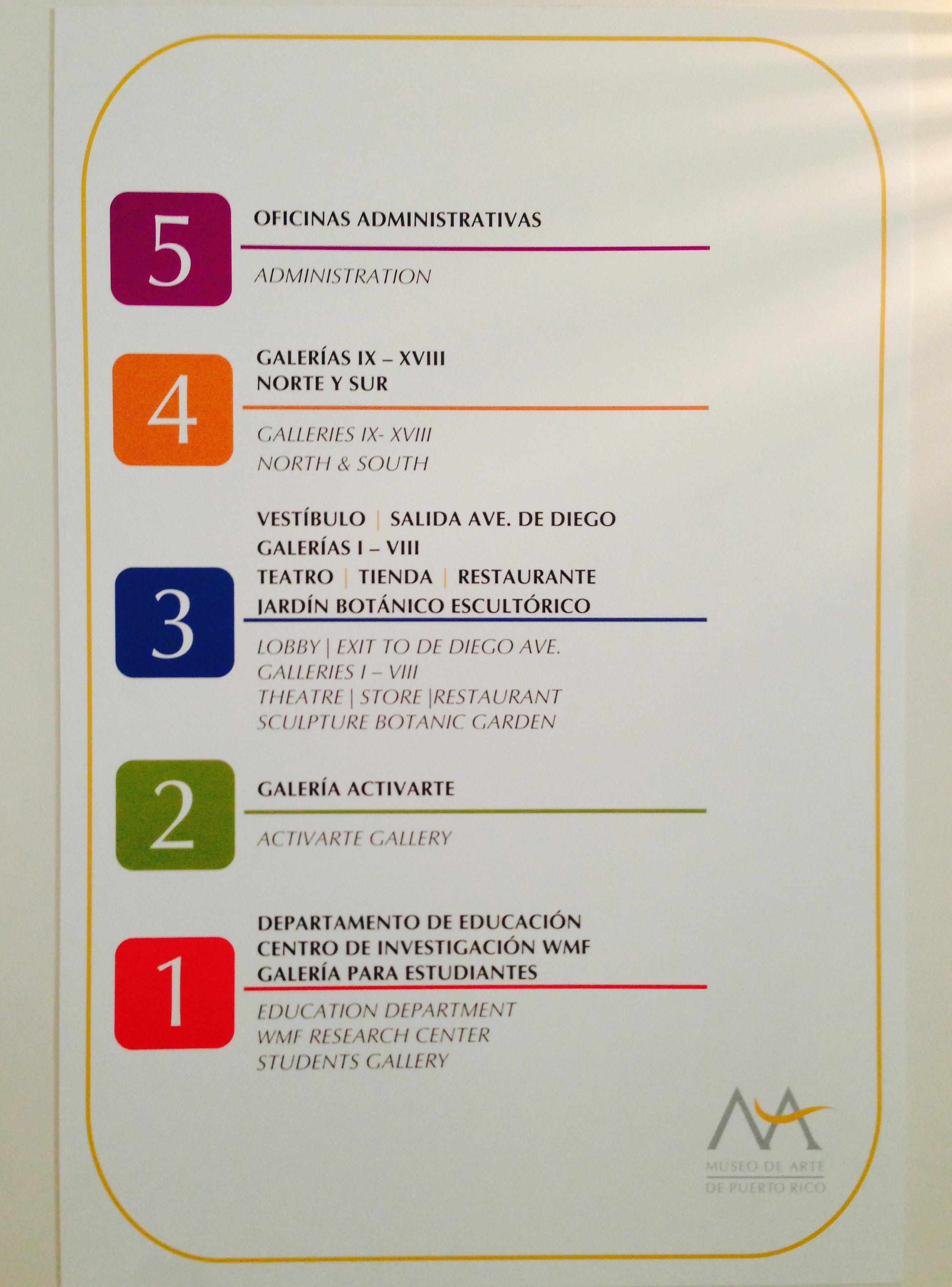
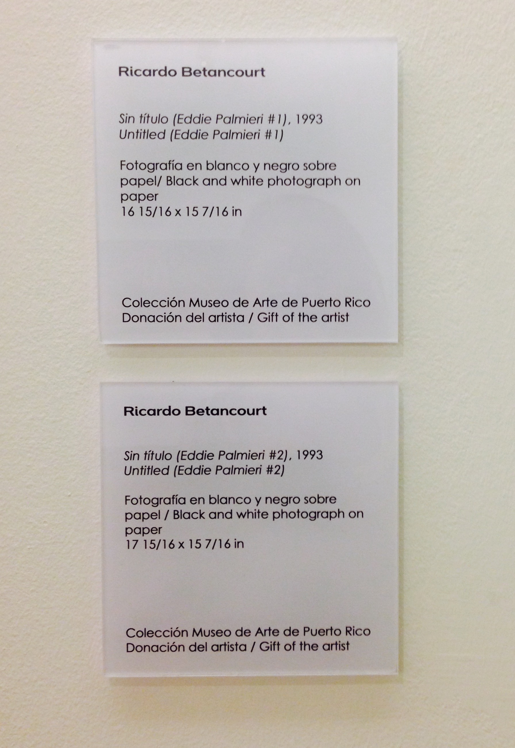
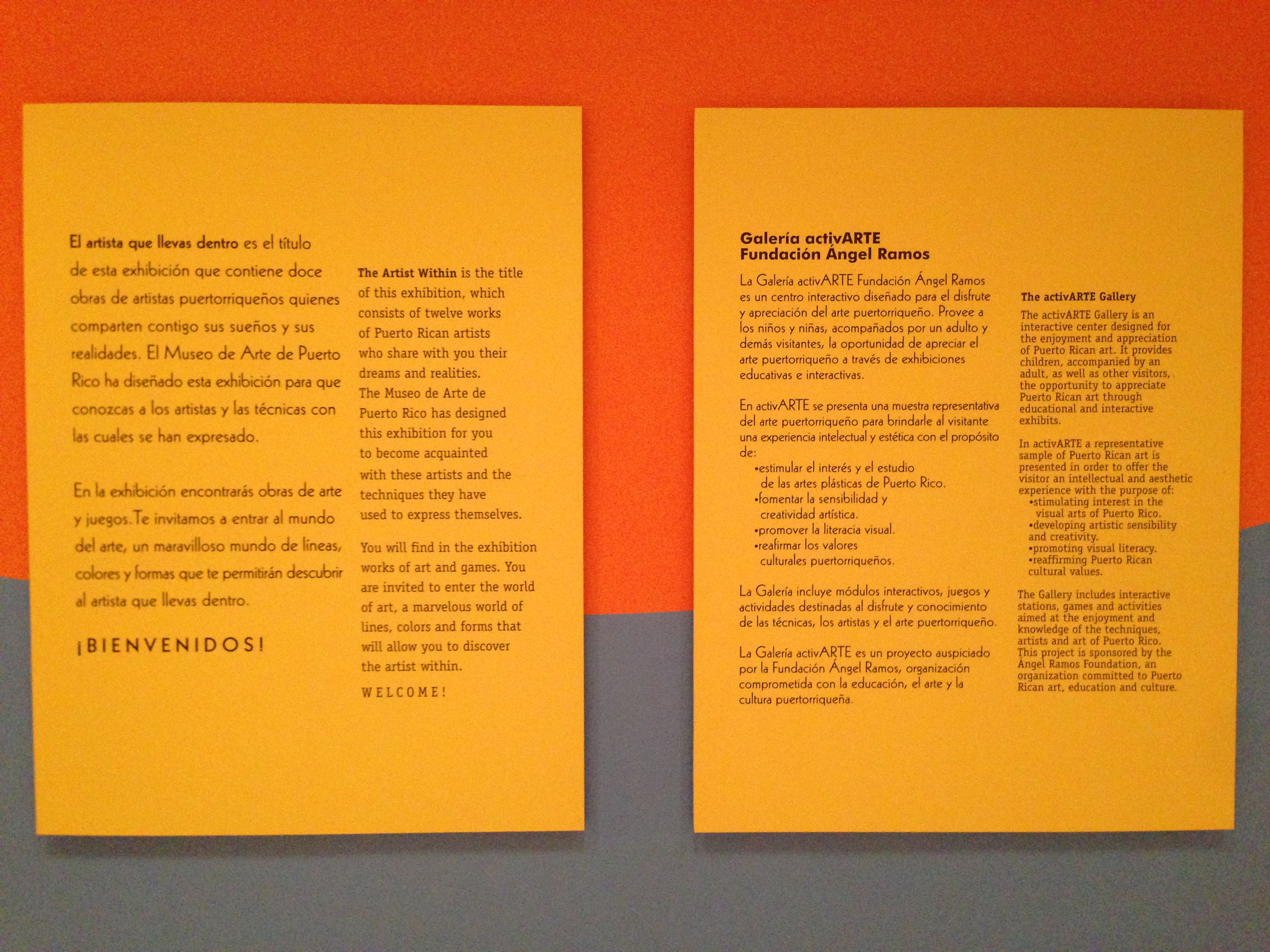
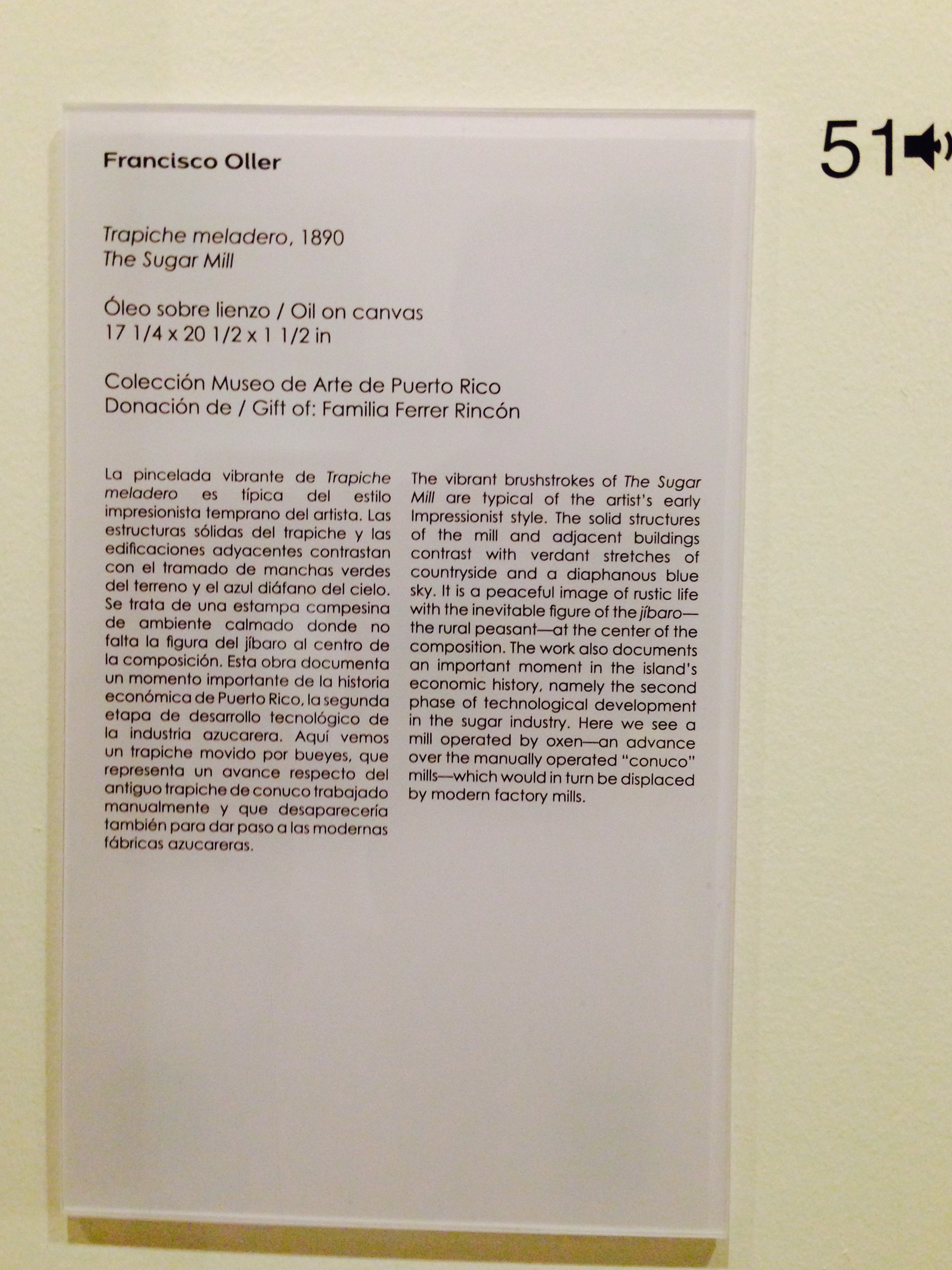
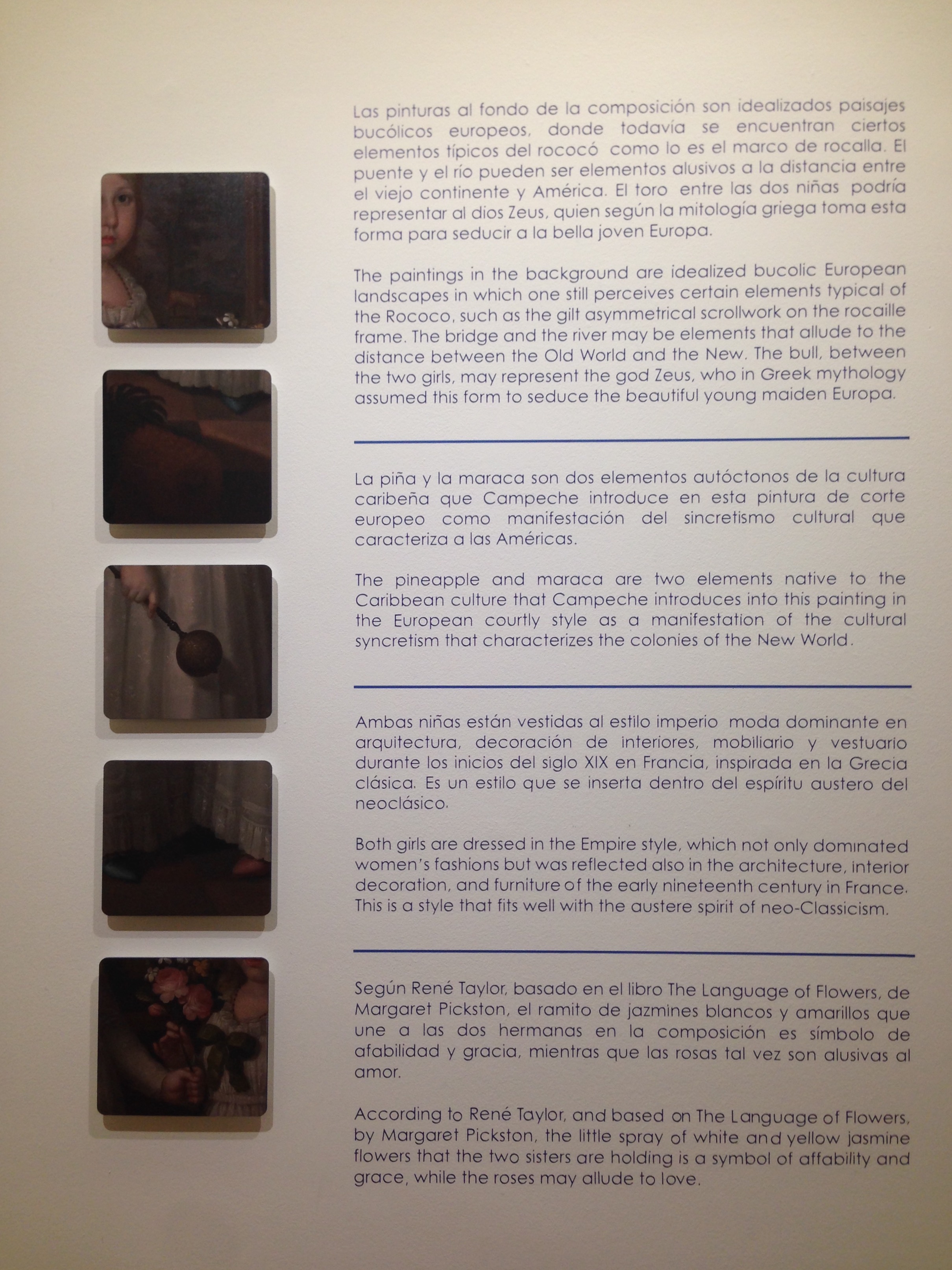
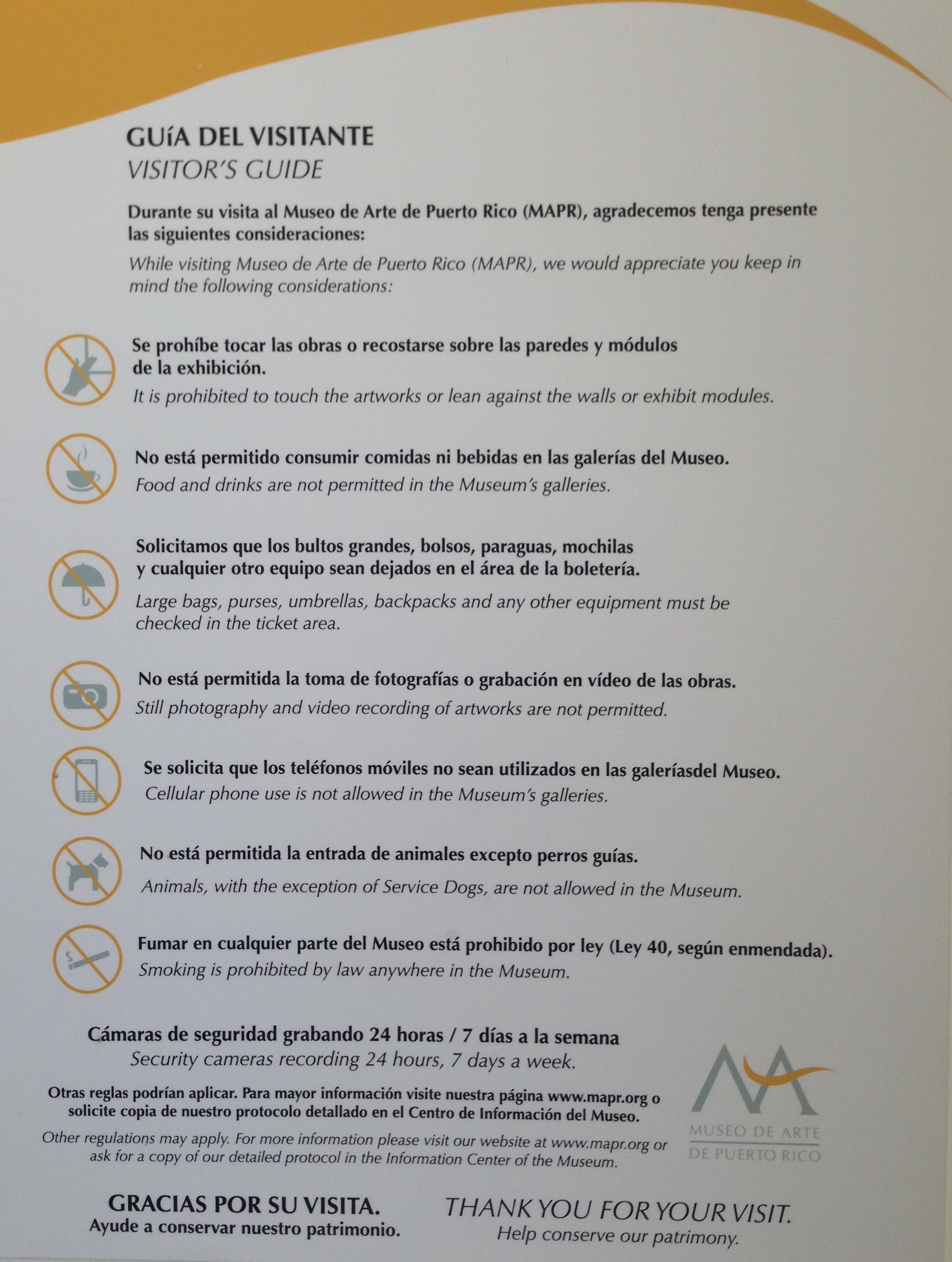
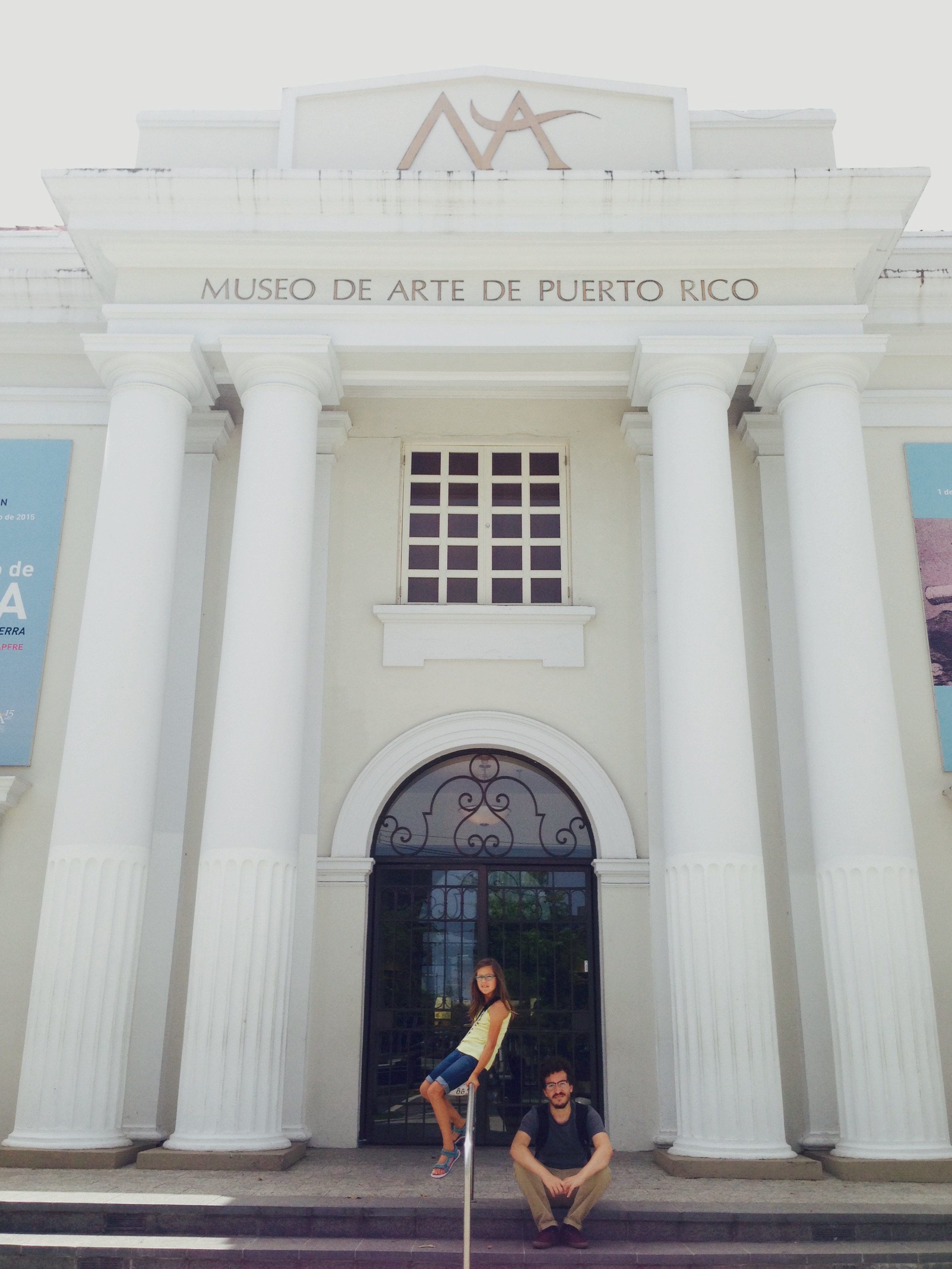
FullSizeRenderLast week, while vacationing in San Juan with my family, we stopped by the Museo de Arte de Puerto Rico. When I travel to a new city, I always like to visit the museums to see their collections and learn about their educational initiatives. Puerto Rico is a US Territory, but it’s quite a different place than any of the fifty states. Though my family is bilingual, I’m a non-Spanish speaker, so I was pleased to learn that Puerto Rico is bilingual. Many residents speak both Spanish and English and, to my delight, all of the museum signage was bilingual! As a museum educator who has been involved in making signage more accessible, it was amazing to walk in and find that everything from the museum map to the artwork labels were in both Spanish and English. (Click on the images below to enlarge.)


Last year Steve Yalowitz wrote a guest post on Nina Simon’s blog about the significance of bilingual signage. As co-author of the Bilingual Exhibit Research Initiative, which strove to better understand bilingual labels from the visitor perspective, Yalowitz offered these three points as significant findings:

  1. Code-switching – We found lots of evidence of effortless switching back-and-forth between English and Spanish….The power of bilingual text is that it’s bilingual – it provides access in two languages, and code switching lets you understand and express yourself from two different perspectives, with two sets of vocabulary.

  2. Facilitation – We researched intergenerational groups, so it’s not surprising that many of the adults saw their role as facilitator as essential to their own and the group’s success in the exhibition….With Spanish labels available, adults were able to facilitate, guiding the conversations and interactions, showing their children, grandchildren, nieces and nephews where to focus and how to interact. Adults who were previously dependent on their children could now take the lead as confident facilitators.

  3. Emotional reaction – This study found that the presence of bilingual interpretation had a profound emotional effect on the groups. Groups said they enjoyed the visit more, felt more valued by the institution, and many said having bilingual interpretation changed how they felt about the institution.

When I read Yalowitz’s article last year, it opened my eyes to the experiences of non-English speakers in museums with English only text. But the experience was made even more tangible as an English speaker visiting the Museo de Arte de Puerto Rico. Had the text only been in Spanish, I would have had to ask my daughter or significant other to translate for me. This would not have been impossible, but rather inconvenient. If I stopped to look closely at a work of art that they were not interested in, I would have to call them back and interrupt their experience to get assistance understanding the label. Having bilingual text allowed me to take on the role of facilitator, reading the label and prompting my daughter with questions, and allowed my family to switch between Spanish and English comfortably. Furthermore, going beyond bilingual label text and providing bilingual directional signage was significant as well: we were each able to easily and equally participate in the entire museum experience.

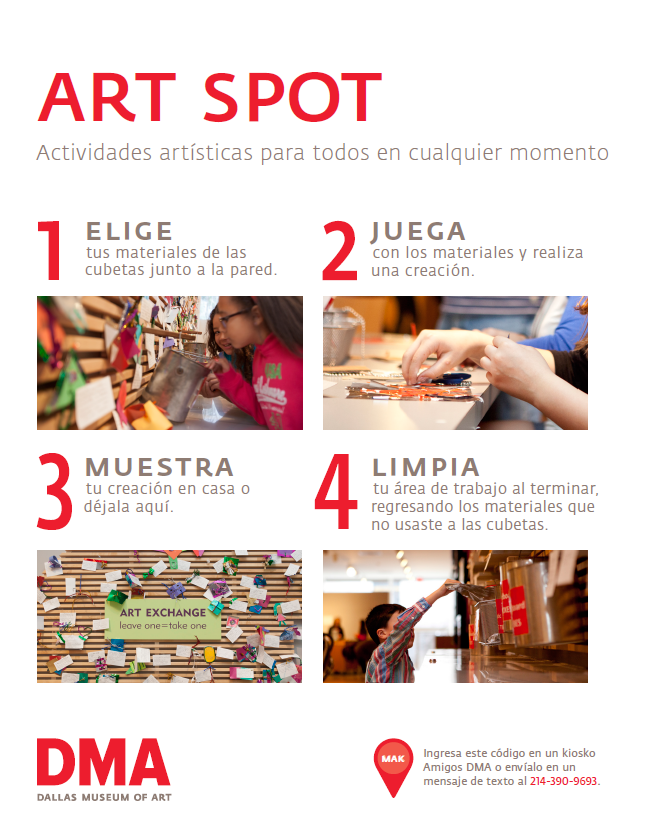
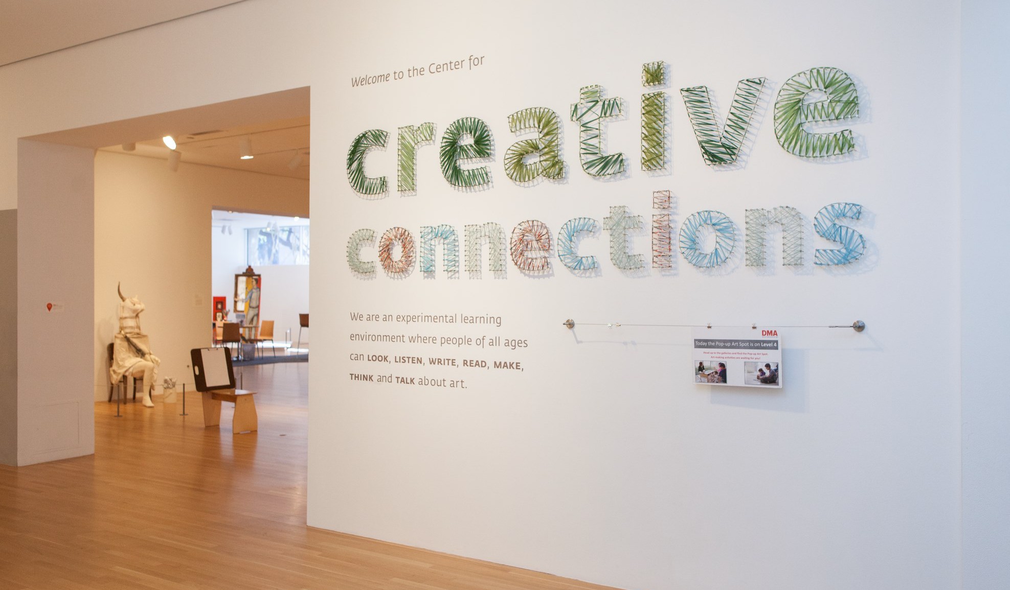
Over the last few years, the Center for Creative Connections (C3) has begun to incorporate bilingual text and voices in a variety of ways. This initiative began soon after the DMA moved to free general admission. With this change in our admission policy, our overall number of visitors and the diversity of those visitors increased. The need for accessible signage for Spanish speakers was apparent, so in late 2012 we started to test out the use of bilingual prompts at the C3 Art Spot.

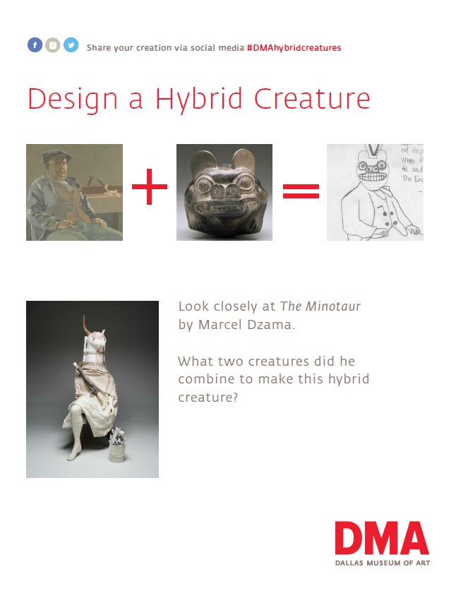
This was the perfect place to start because it is one of the busiest spaces in the Center for Creative Connections. It was also easy to begin using bilingual text in these kinds of prompts because these signs typically change more often and are easier to alter than more permanent wall signage. In 2014, we began to use bilingual activity prompts in the main C3 Gallery as well. This is a prompt for an activity where visitors use a light box and reproductions of works of art from the Museum’s collection to create hybrid creatures.

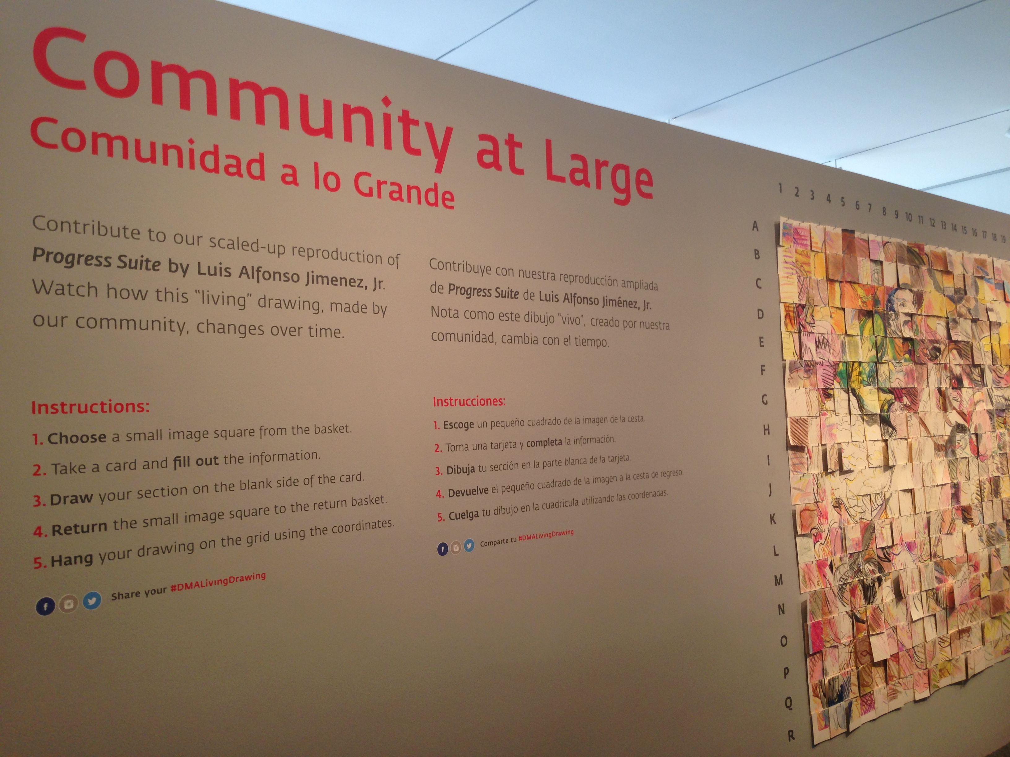
These small steps have been leading up to a bigger change. This year when we installed our Community at LARGE project, both English and Spanish text was included not only in the table prompt, but also on the wall text.

IMG_7413

As we continue to install new works of art in the Center for Creative Connections, our hope is to integrate bilingual text throughout the space.

Jessica Fuentes
C3 Gallery Manager

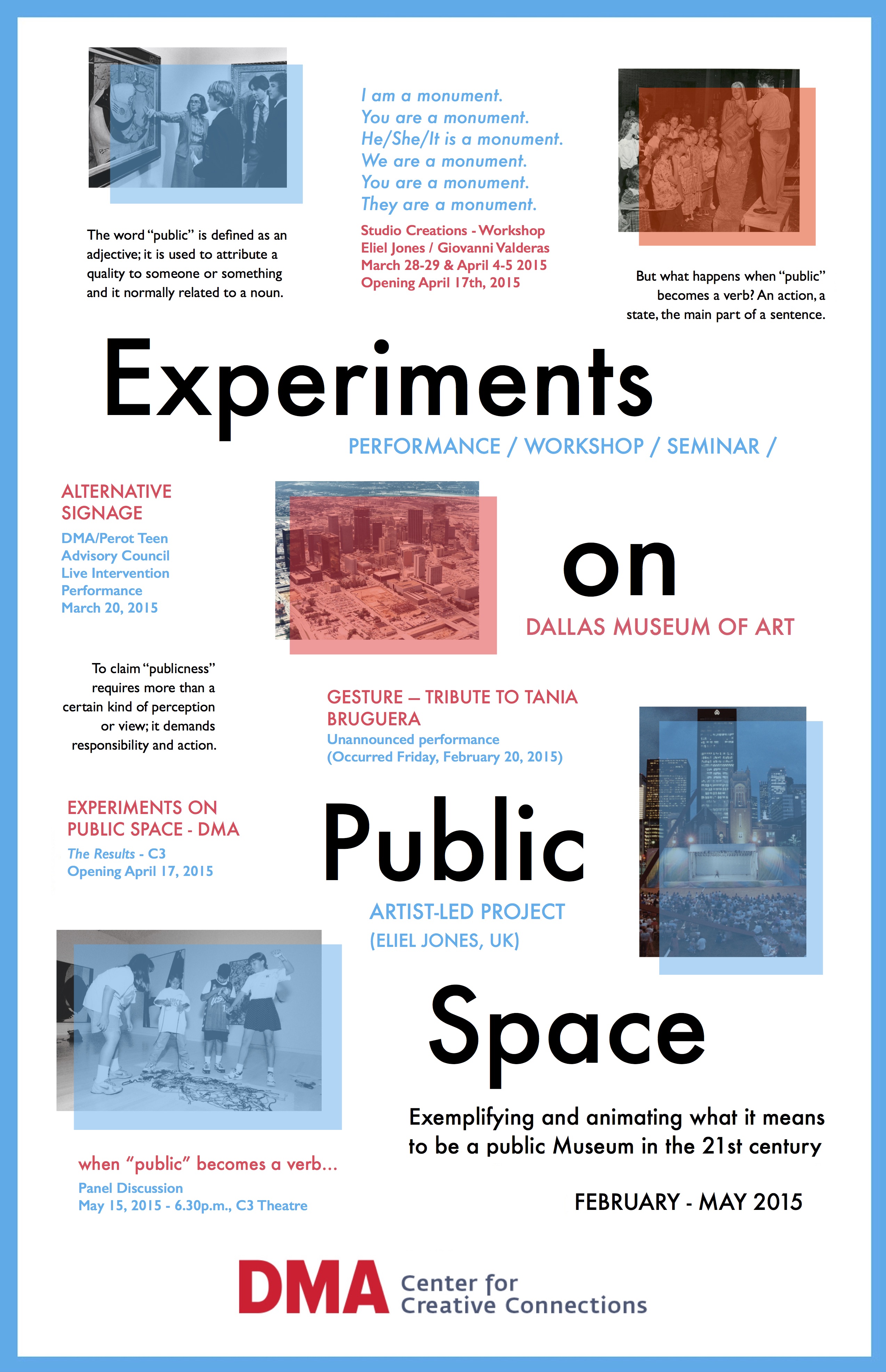
Experiments on Public Space

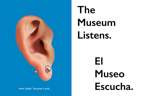
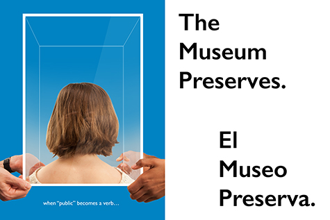
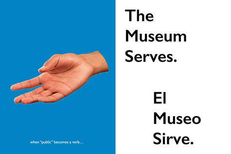
The word public is defined as an adjective: it is used to attribute a quality to someone or something, usually modifying and describing a noun. But what happens when public becomes a verb–an action, a state, the main part of a sentence? Public suddenly stops being passive and becomes active–an occurrence, a happening, an event…

But what makes a museum public? What are its responsibilities? How do we build democratic space/vision? Is it possible or necessary? And if it’s true that we’re losing publicness, how do we reclaim it back?

These are some of the questions I hope to explore with my new work, Experiments on Public Space (EPS). EPS came about thanks to the opportunity to carry out an independent project as part of my McDermott Internship at the Dallas Museum of Art. My background in both research and artistic practice is focused in an interest to understand, explore and expand the ways audiences interact/participate with contemporary art. This project is an extension of that line of inquiry specifically looking at institutional contexts.

Experiments on Public Space / Dallas Museum of Art, February - May 2015

Experiments on Public Space / Dallas Museum of Art, February – May 2015

I’m fascinated by the language used in museums when referring to issues around publicness, because what do we actually mean when we refer ourselves as a “public museum”? What does it entail? How does a public museum feel or look? What do our visitors understand by “public”? Are they not the public themselves? And why probe publicness? Why now? Why here?

Coming from England, I was very curious about the differences between public cultural institutions here in America and those back in Europe. I think the dialogue is particularly of relevance to the DMA because of its historical founding as a public museum and it’s recently reestablished free general admission, something that is rare in this country. I’m also intrigued by the context of the Museum in a city as diverse as Dallas. Considering the city’s large latino population, I want to explore the standings of the institution in serving a wide range of communities.

This slideshow requires JavaScript.

The project itself is built on a series of practice-based evaluation methods that take place in the Museum. The public will provide the data with their participation in performances, interventions, seminars and workshops, aiming to collaboratively measure the publicness of the environment in which the institution acts. With this approach I hope to implement active research into the life of the Museum, collecting both inside and outside voices as a way of opening up dialogue. In this sense, the project uses unconventional evaluation methodologies to promote opportunities for reflection, thought, participation and active discussion. The goal is that through these programs, we might collectively exemplify and animate publicness and what it means in the context of museums in the 21st century.

Alternative Signage

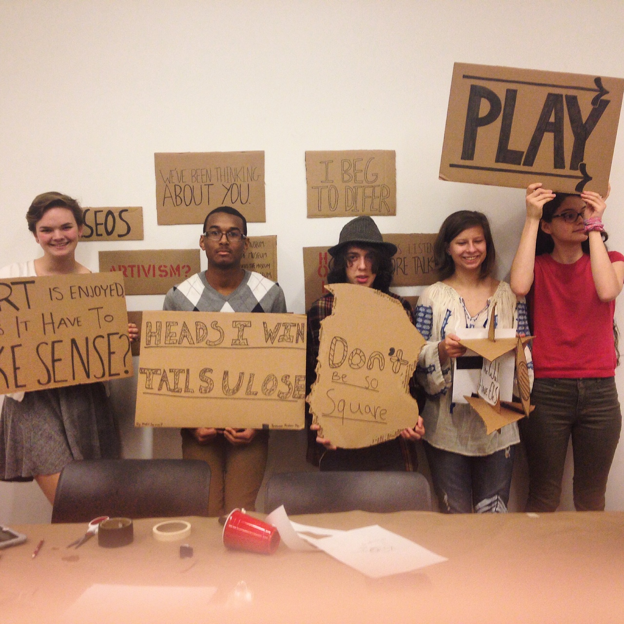
Members of the DMA/Perot Teen Council during a production session for “Alternative Signage”, one of the EPS programs happening during March Late Night.

Confused? Challenged? Excited? – This is a very brief introduction to a project that has almost taken a life of its own. Publicness is a complex issue that touches upon many different fields and it is easy for it to be overlooked or even forgotten. With EPS I hope to bring it back to the fore in an attempt to reclaim its importance. I believe there is a big difference between possessing a quality and being one, and it is crucial that we understand the difference. To claim ‘publicness’ requires more than a certain kind of perception or view; it demands responsibility and action.

Program scheduling will be published on the DMA website, under Center for Creative Connections –  Community Projects. I hope you’ll join me in this experiment!

Eliel Jones
McDermott Intern for Visitor Engagement

So What? One Question Evaluations at the DMA

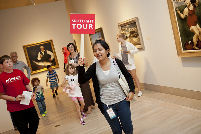
tour

Almost all museums have programs for the public, in one form or another. These programs may fall under the fields of education, visitor engagement or interpretation, and may take the forms of drop-in workshops, ticketed lectures, in-gallery interactives or scheduled tours. Even within a single museum, these programs are diverse in their scope, varied in the spaces they take place, and wide-ranging in their scale. Furthermore, they differ in their intended outcomes, but more on that later.

Importance has been placed on growing different types programs for the public, as these can garner more attention from the community, increase overall attendance, and develop audiences. Oftentimes, this growth is approached by expanding programmatic offerings: increasing lecture topics, presenting more classes and workshops, or providing additional interactives in galleries. In these instances, growth is measured by quantity: “Well yes we serve our community, look how many programs we offer!” But I question whether this type of growth is positive for museums. Is expansion without reflection a good idea? I am inevitably reminded of the adage, “Less is more,” and wonder how this concept can be manifested in museum education programs.

The process of reflection and evaluation is an often overlooked step in program creation. Activities are designed, implemented, and either repeated (perhaps next week, or next month) or they are archived (if they’re lucky) for posterity. But rarely does someone stop and ask, “So what?” This question, seemingly harsh and unforgiving to some, or unimportant to others, is an invaluable asset to evaluation in my mind. It is a question that harks back to my time as a graduate student at The University of Texas at Austin in the Art Education department. My thesis advisor and Assistant Chair to the department Dr. Paul E. Bolin situated this question as an integral part of all academic research. Students would approach him with research proposals and he would answer, “Well yes, that does sound like an interesting study of this-and-that at the so-and-so institution, but so what?” This simple question produced its fair share of frustration, but also some very fruitful discussion about the field of art education. It caused us to reflect on how our intended research would impact or advance the discipline. It wasn’t enough for the topic to simply garner interest, it had to have purpose and intention; it needed to be able to stand on its own and answer, “This is why I exist.” Now, I am not proposing that every public program initiated by a museum or art institution should be held to the bar of furthering the field of art education (this would be rather difficult), but I do feel that every program should be accountable in providing a significant answer to this critical question.

As a department, the DMA’s Education team has spent many hours creating a mission statement that encapsulates our departmental practice, inevitably answering the So What question for ourselves. And during this process we have hit upon some key concepts that fuel our programs, the chief one being engagement. As educators, we aim to broaden and deepen engagement, and recognize that the DMA can influence the depth of one’s engagement, not by pitching more programs at our community, but by facilitating meaningful experiences in our current educational endeavors. But how can we know that these experiences are meaningful, unless we ask?

Our Education team is undertaking the evaluation process by implementing a series of one question studies that aim to pinpoint specific queries we as educators have about our public programs. The restricted format of this evaluation exercise is key, because evaluation can be a daunting task if approached too broadly. The one question design ensures that we concentrate on a single point—one program or interactive, one outcome, one bit of information that is important for us to determine. Just as the questions vary, so too do the methods of collecting data from visitors, ranging from written surveys, a post-it note response wall, and even a voting system using colorful pony beads. Below are preliminary looks into two different one question case studies we’ve begun.

CASE STUDY #1: YOUNG LEARNERS GALLERY (contributed by Jessica Fuentes)

Young Learners Gallery

The Young Learners Gallery, within the Center for Creative Connections (C3), is a space designed for children ages 5-8 and their caregivers. Over the past three years while much of C3 has changed—with the introduction of new artworks, art-making materials and gallery interactives—the Young Learners Gallery has gone untouched, because making changes to that space requires a complete redesign. Before undertaking such a task, the C3 staff want to learn more about families’ anticipated and actual experiences at the Museum.

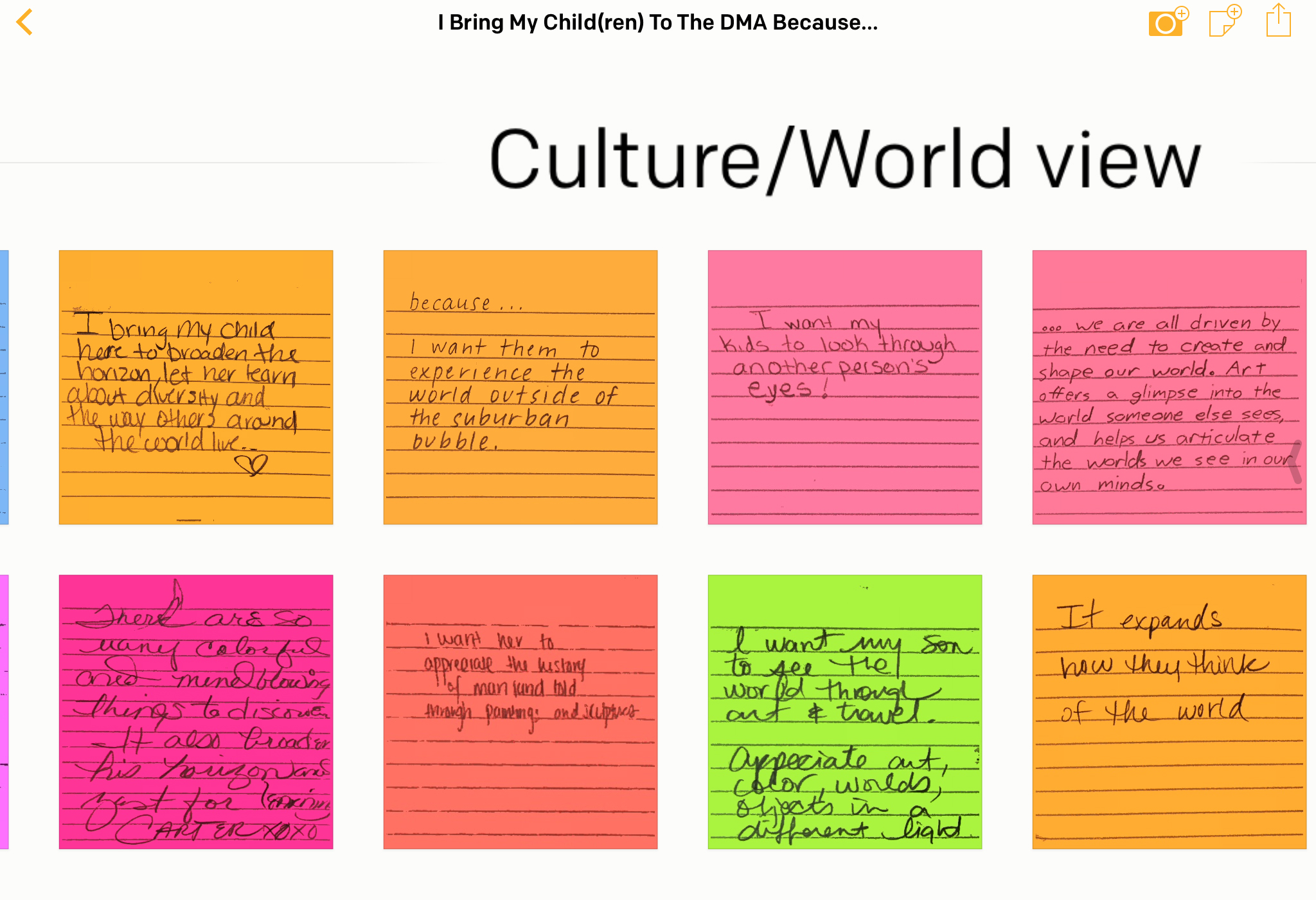
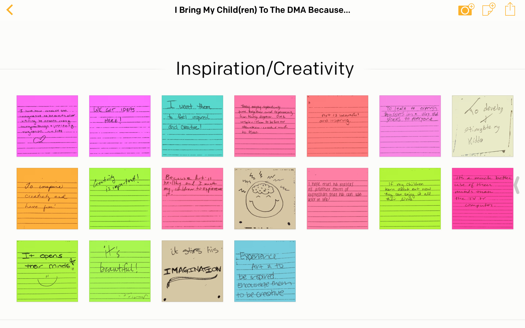
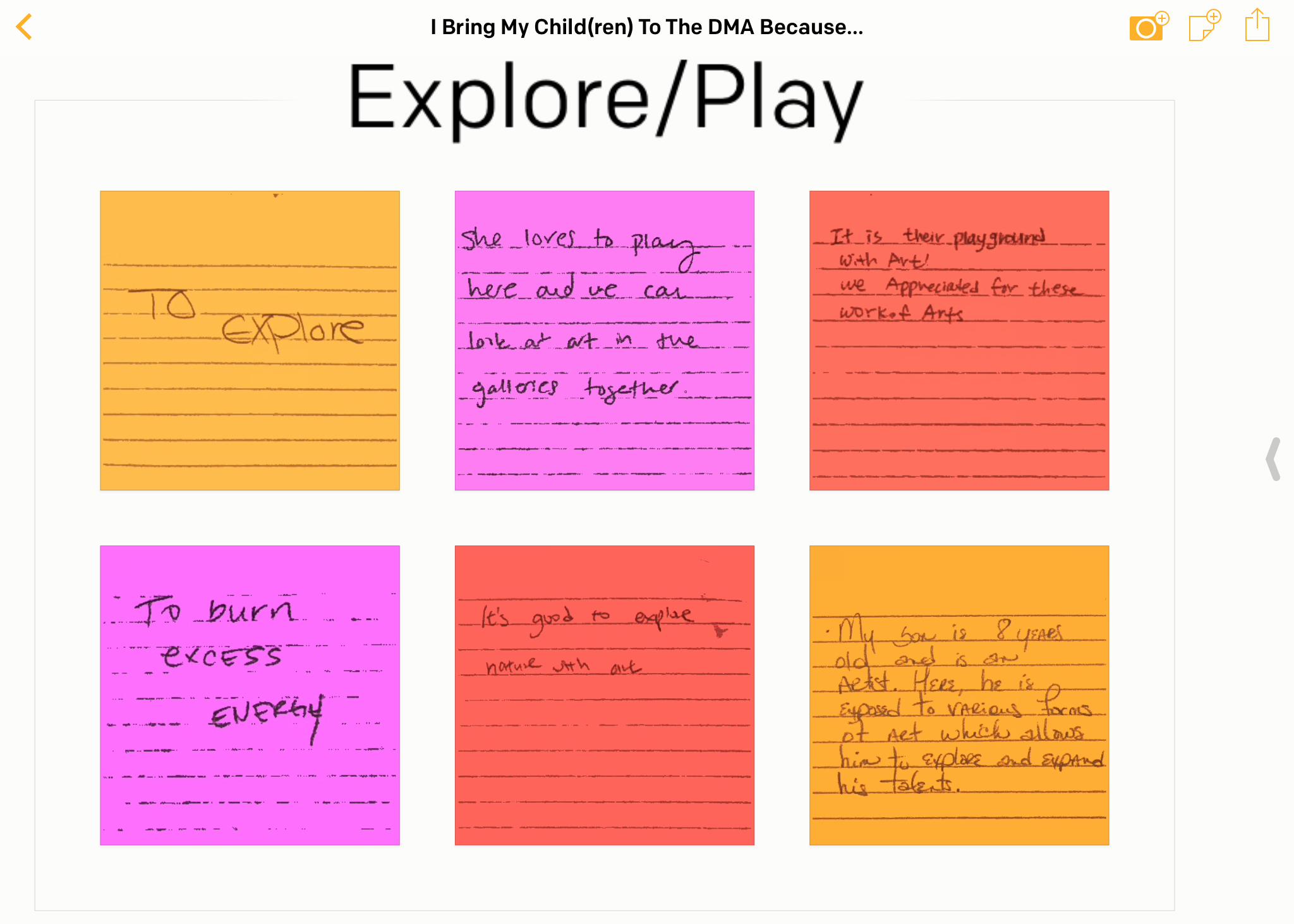
We started with the prompt, “I bring my child(ren) to the Dallas Museum of Art Prompt signbecause…” posted on a wall in the Young Learners Gallery near a small table equipped with post-it notes and pencils. Unlike a survey, this method allows for open-ended responses that can later be categorized and analyzed while retaining the individual visitor’s voice. This analog system has been brought into the 21st Century through the development of the Post-It Plus App. With this app, instead of sifting through responses and later transcribing them in digital form, we can simply photograph the post-it notes and organize the digitized notes on a virtual board. The board can then be exported in a variety of formats including PowerPoint, Excel, and PDF.
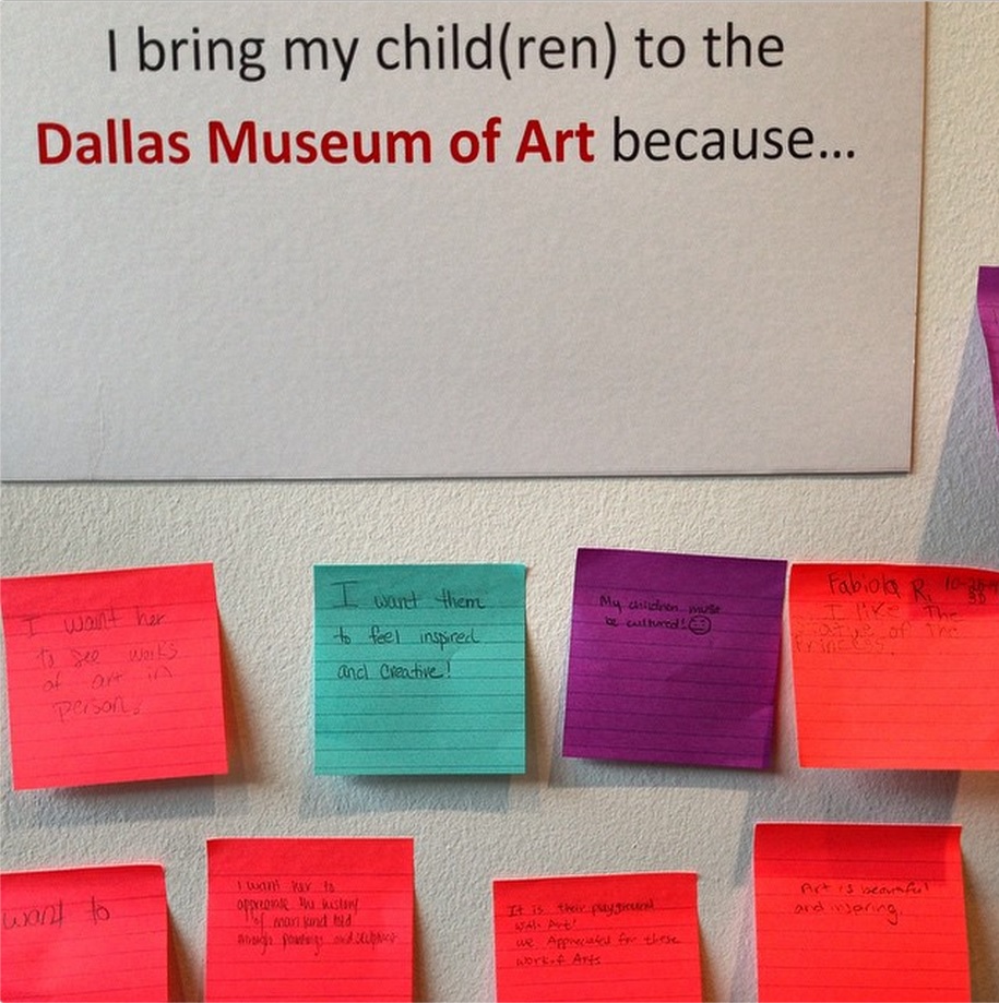
We posted our question for a month and received 107 responses. The responses ranged from children’s drawings to eloquent statements expressing a desire to expose children to a broader world view. Because the purpose of this question was to gauge the caregiver’s motivations, we set aside the 26 children’s responses and the 4 irrelevant responses; however, we plan to use future questions to gather children’s input as well. The top three categories for why caregivers bring their child(ren) to the DMA is to get inspiration or foster creativity, to provide exposure to different cultures or broaden their world view, and because it’s fun.

As we plan the new Young Learners Gallery, we are keeping these findings in mind. For example, we have decided to include works of art in the space which currently is an activity area. The works of art selected will have a strong emphasis on culture and creativity. We also plan to create hands-on activities that address the developmental milestones of children aged 5-8 and provide opportunities for children and their caregivers to play, draw, and talk together about the works of art in front of them.

Now that we understand why caregivers bring their children to the DMA, we are in the process of posing more questions to learn what families actually do in the Young Learners Gallery. Understanding both expectations and experiences will help us develop a space that will meet a wider spectrum of caregivers’ and children’s needs.
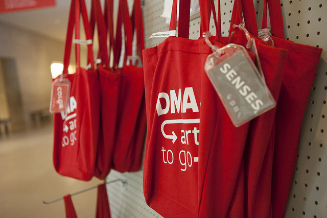
totes45CASE STUDY #2: ART TO GO FAMILY TOTE BAGS

The DMA first offered activity-filled tote bags to families around this time last year, premiering during our January 2013 Late Night event. Each tote bag contains a variety of activities that encourage families to write, talk, play, or make while exploring the galleries together, the idea being to have fun with the art as a family. Since their public introduction last year, our Art To Go Family tote bags have grown to include many different themes: Senses, to help explore art through the five senses; Color, to explore art while thinking about colors; Family Fun, with activities designed by a family who frequently visits the Museum; and Arturo’s Library totes, designed for children under five years of age, which focus on a single work of art with an accompanying book and hands-on activity. These tote bags are available for check-out at our Family Fun Cart, located at the main entrance to the Museum, and are free to use by families anytime the Museum is open.

Initially, the Family & Access programs staff sought feedback on tote bags through individual paper surveys, presented to families once they returned tote bags to the Family Fun Cart. We found that very few of these surveys were returned, or even taken in the first place. During busy times at the Museum, those who coordinated checking bags in and out to visitors rarely had time to focus on handing out this extra survey to families, who for their part, were usually rushing to leave the Museum, and therefore rarely could spend extra time answering a two-page questionnaire. In this case, the one question evaluation was ideal not only because of its simplicity and accessibility, but also because of its straightforwardness. Unlike the above-mentioned project with the Young Learners Gallery, for the tote bags we were not looking for open-ended answers, at least not yet. While it is absolutely valuable to know whether or not visitors feel that the tote bags encourage a playful attitude towards looking at art, or if they are able to increase visitor confidence in looking at art with children, this is information that is best obtained in a second stage of evaluation, when we look at the specific effects of each activity and deem whether things should be modified or not. At this still early stage in the life of the tote bags, our team is really interested in the simple question of whether families are indeed using the tote bags during their visit, and where in the Museum they are being used. (This is our So What question.)

We designed our one question evaluation as a multiple choice prompt, which was added to the tote bag check-out sheet. We asked, “On Which Floor Did You Use the Tote Bag?” and invited visitors to check the box next to each area in which they used the bags—Level 1, Level 2, Level 3, Level 4—or, if they didn’t in fact use the activities in the bag, to check Did Not Use. Our hope was that including our one question evaluation on the check-out sheet, something that families were already using and thus familiar with, would increase the amount of feedback we received.

The updated check-out sheet has been in rotation for two months, and we have collected data for November and December 2014. On average, 52% of people who checked-out tote bags during that time responded to our evaluation, and of that total only 6% did not use the tote bag activities at all. While in the Museum, the respondents said they preferred to use the tote bags most on Level 1 (28%) and least on Level 4 (16%). Now, is this choice based on physical access (Level 1 is the same level on which the tote bags are offered, while Level 4 is farthest away) or related to the works of art available on each level (Level 1 is Contemporary art, Level 4 is American)? Now that we are beginning to better understand how much the tote bags are being utilized by visitors, and where in the Museum galleries they are being taken, we can start to pose these types of ancillary questions, that tap into deeper inquiries about visitor engagement.
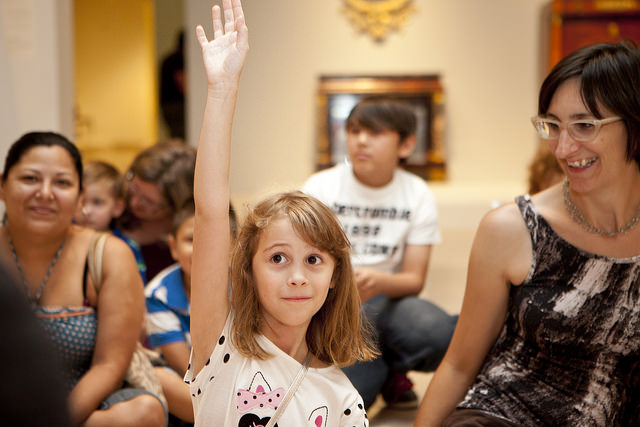
Tour

The insight provided by these two studies hopefully demonstrates the importance of evaluation to both growing and expanding program development. These are just preliminary looks into initial studies, and we hope to have more one question studies, as well as data, on the horizon. In order to increase the effectiveness of our programs and spaces, museum educators need the input of our audience to better understand their level and scope of engagement. Reflection and evaluation, in the style of these one question studies or other formats, can facilitate this exchange of ideas in a positive and productive manner, providing a strong foundation for educators to answer the So What question for themselves, their institution, as well as their community.

Danielle Schulz
Teaching Specialist
Arturo’s Magical Mail: Redux

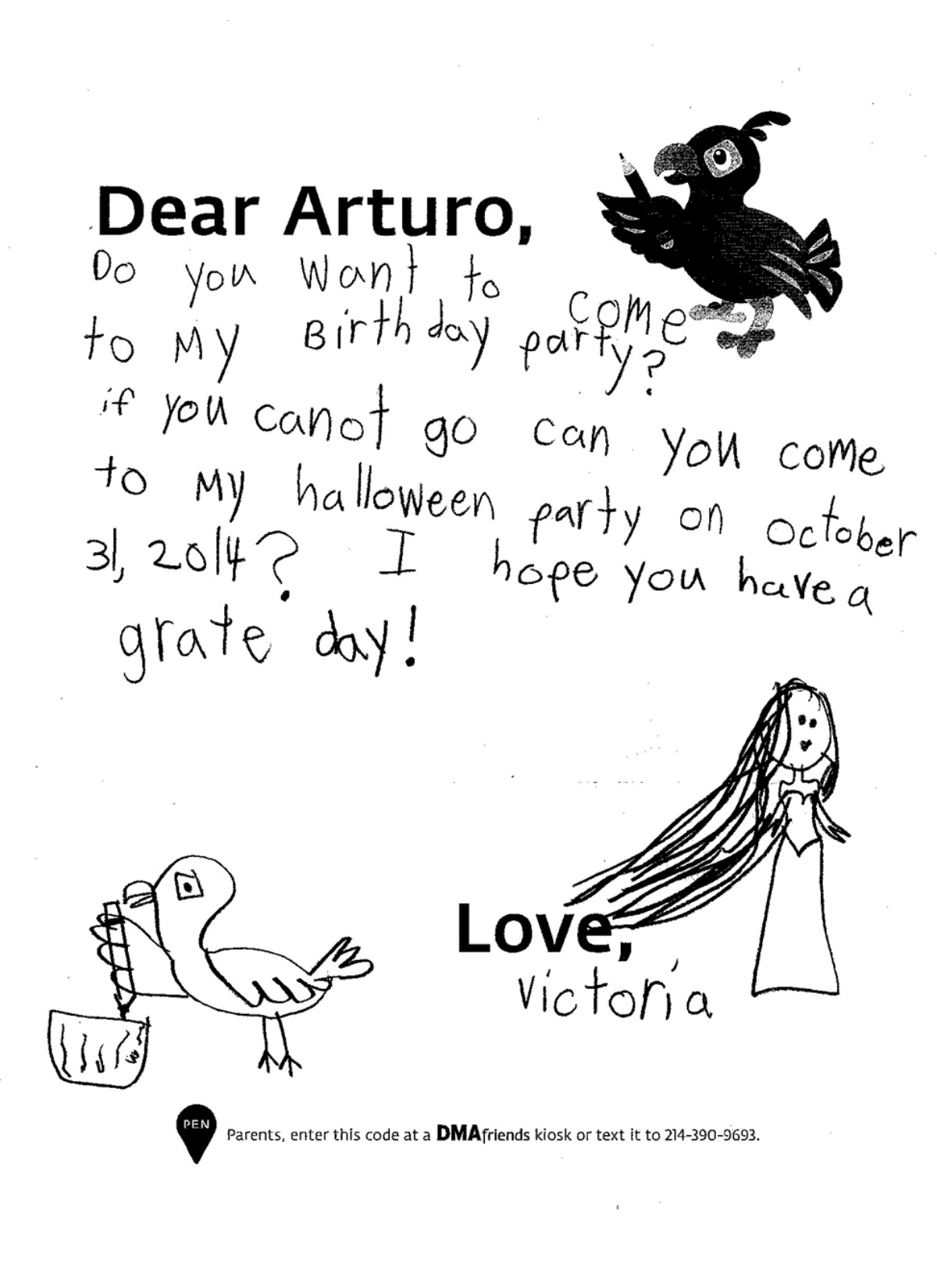
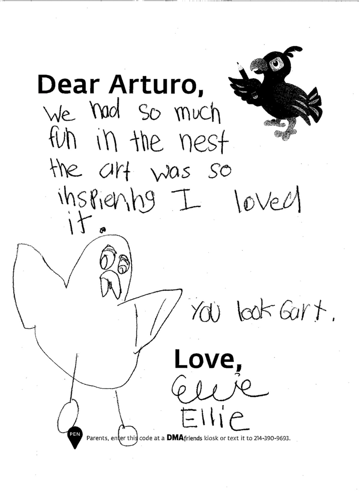
Santa’s mailbox may see a lot of action leading up to December, but our own celebrity here at the Museum gets mail all year long–our family mascot, Arturo!

Amelia Wood, last year’s McDermott Intern for Family and Access Teaching, wrote a post in February about how magical sending and receiving mail can be, especially in the form of letters to Arturo. As we start wrapping up 2014, I think it’s only fitting to share some of the highlights from the year since then–a “best of” Arturo Letters, if you will.

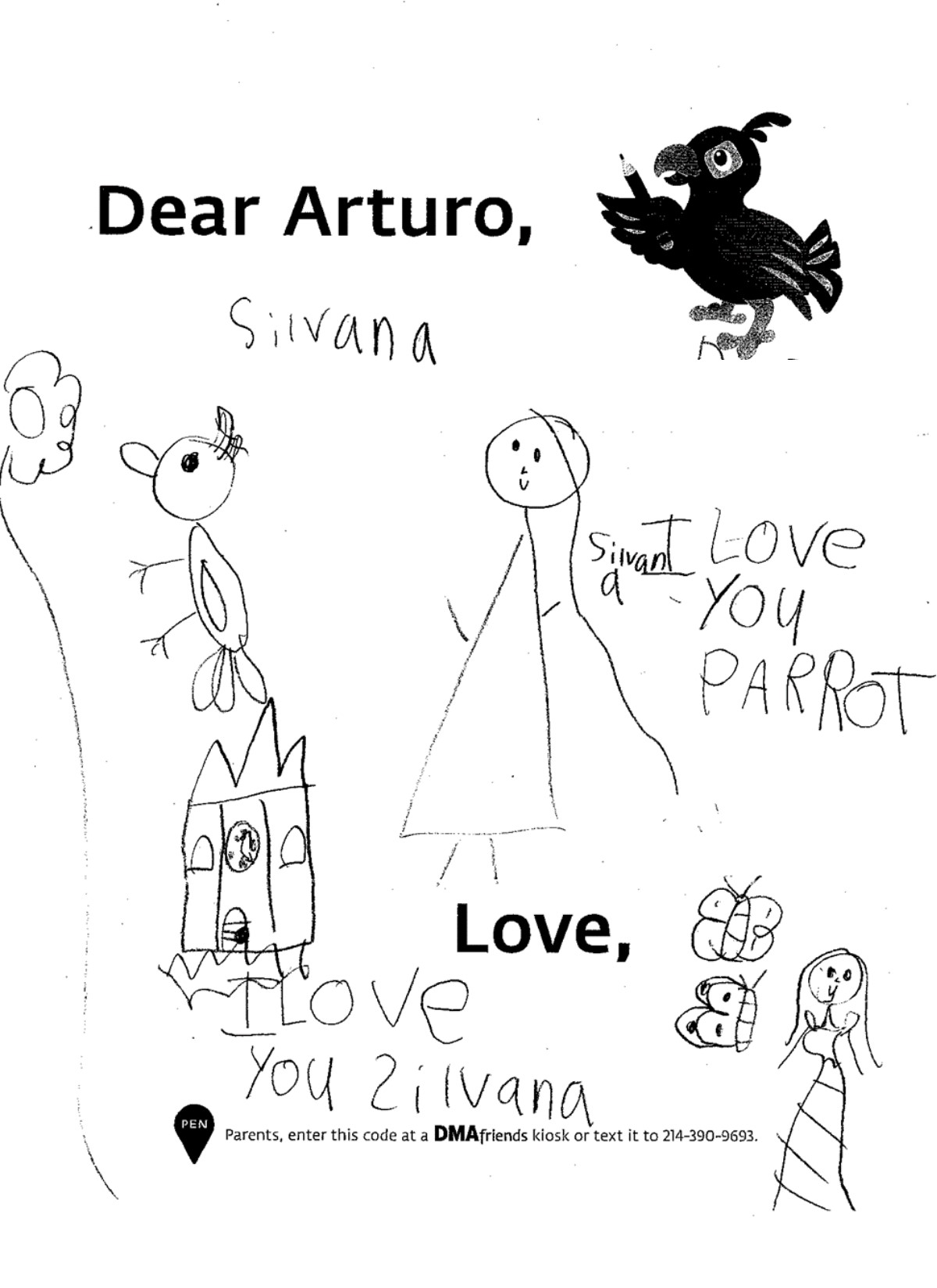
What strikes me most about these letters is always how open and loving the messages are. Sometimes it’s an assortment of pencil scribbles with the child’s name and age (these are usually parent-written: from Sophie, age three, or Mikey, two years old) included at the bottom. Sometimes the sender chooses to use art instead of words. Sometimes the message takes up the whole page; sometimes it is short and sweet. Often, the child simply wants to tell Arturo “Thank you” or “I love you.”

Many days I’m surprised by the insightful questions that these children ask. How does Arturo write his letters? (Feathers make it difficult to hold a pencil, so he has a human friend that helps him write and draw pictures!) Or how do you explain why Arturo, a male bird, has eggs in his nest? Why, he’s a great babysitter, of course!

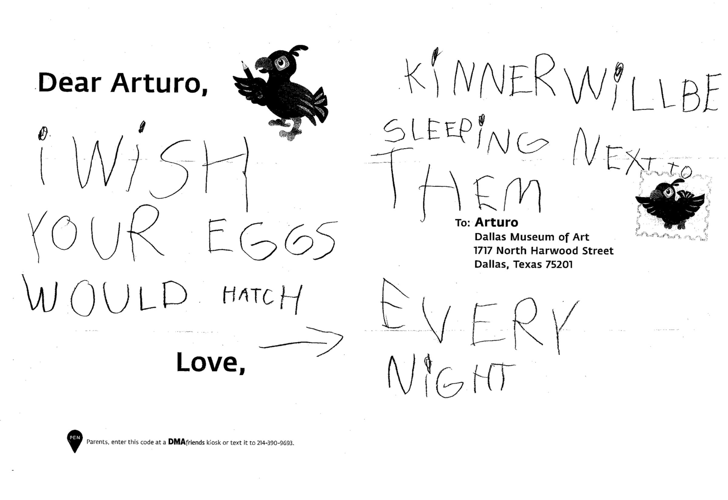
Arturo also hopes the eggs will hatch soon, Kinner! It will be great to have some new bird friends to play with.

Arturo also hopes the eggs will hatch soon, Kinner! It will be great to have some new bird friends to play with.

The creativity that this simple act of exchanging messages draws out is absolutely magical. Amelia loved “imagining the excitement as children discovered a response from Arturo,” and I’m just as excited to receive their letters in the first place. I’m in for an adventure every time I go to collect the latest crop from that little red and yellow mailbox – there will be some new question, some sharing of an experience in the galleries, or some imaginative drawing that I haven’t encountered yet.

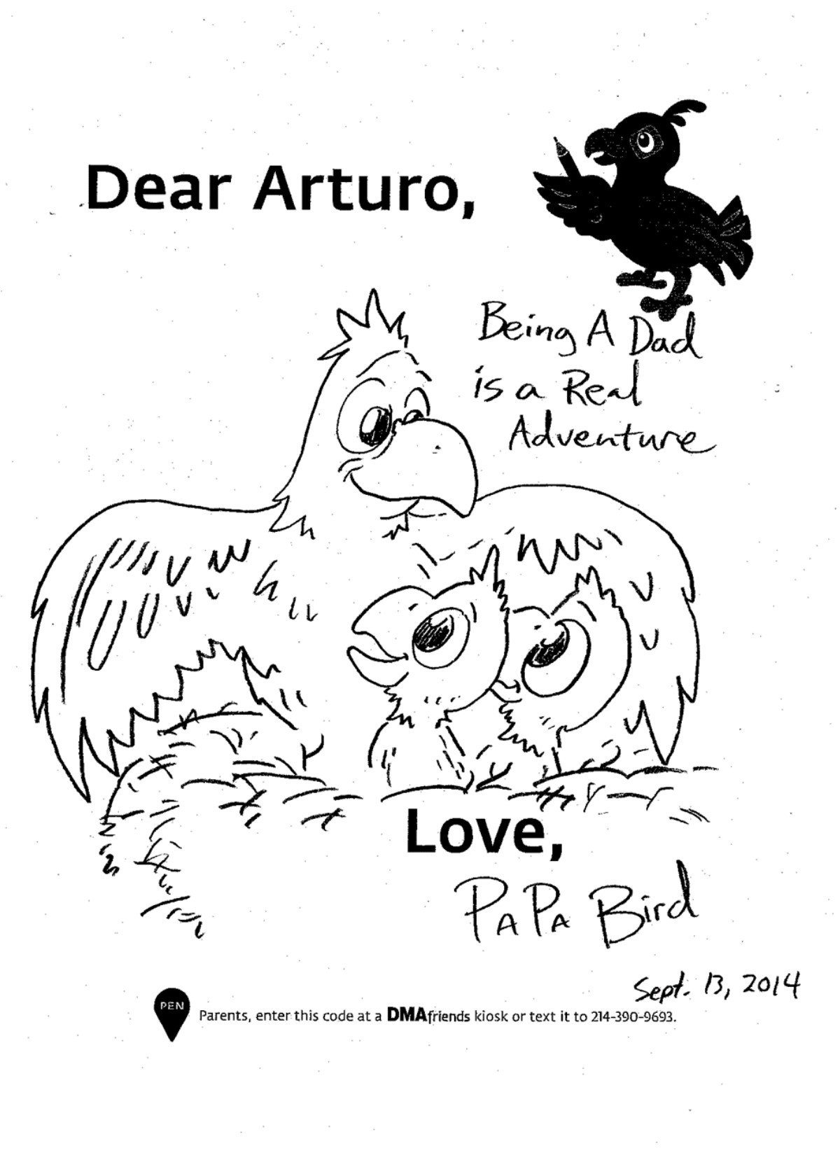
For now, I’ll leave you with one of Arturo’s and my favorite letters yet–a rare, purely parent-written one. Signed only as “Papa Bird,” this touching drawing reminds us of our own families.

"Being a Dad is a Real Adventure - Love, Papa Bird"

“Being a Dad is a Real Adventure – Love, Papa Bird”

So as we head into the holidays, whichever one you may celebrate, don’t forget to give your loved ones a great big bird hug…

…or if they’re too far away to hug in person, a piece of wonderful, magical mail should do nicely.

Jennifer Sheppard
McDermott Intern for Family and Access Teaching

Hands-On Learning: Not Just for Kids

“Every child is an artist. The problem is how to remain an artist once we grow up.” – Pablo Picasso

c3 sign.jpg

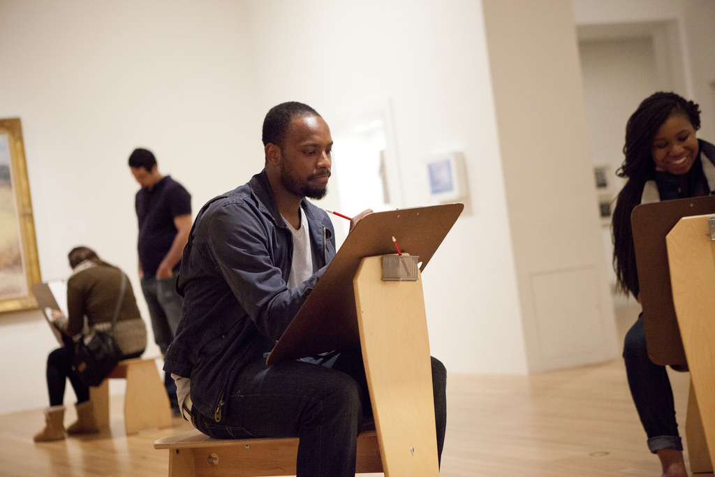
The Center for Creative Connections (C3) is unique because we focus on learning by doing. That means we design activities for people of all ages to learn about works of art from the collection by participating in a hands-on way. The activities we create to accompany works of art prompt visitors to engage in ways that are different from the standard didactic approach of a wall label. In C3, we want to provide experiences where visitors can make personal connections by drawing, writing, making, and discussing works of art with each other.

This kind of active engagement carries a certain stigma; many people assume that it’s only for kids, mainly because we are used to seeing activities like these in children’s museums. Part of our design process is to evaluate visitors’ experiences by observation, interviewing and counting. We’ve learned that half of our participants are adults and that there is a reoccurring theme in their comments regarding why they participate. So, why do adults flock to C3 to draw, write, make, and talk about art? Because it connects them to a childlike curiosity and creativity which, as an adult, often takes a backseat to other responsibilities and tasks.

JFuentes_image2.jpg

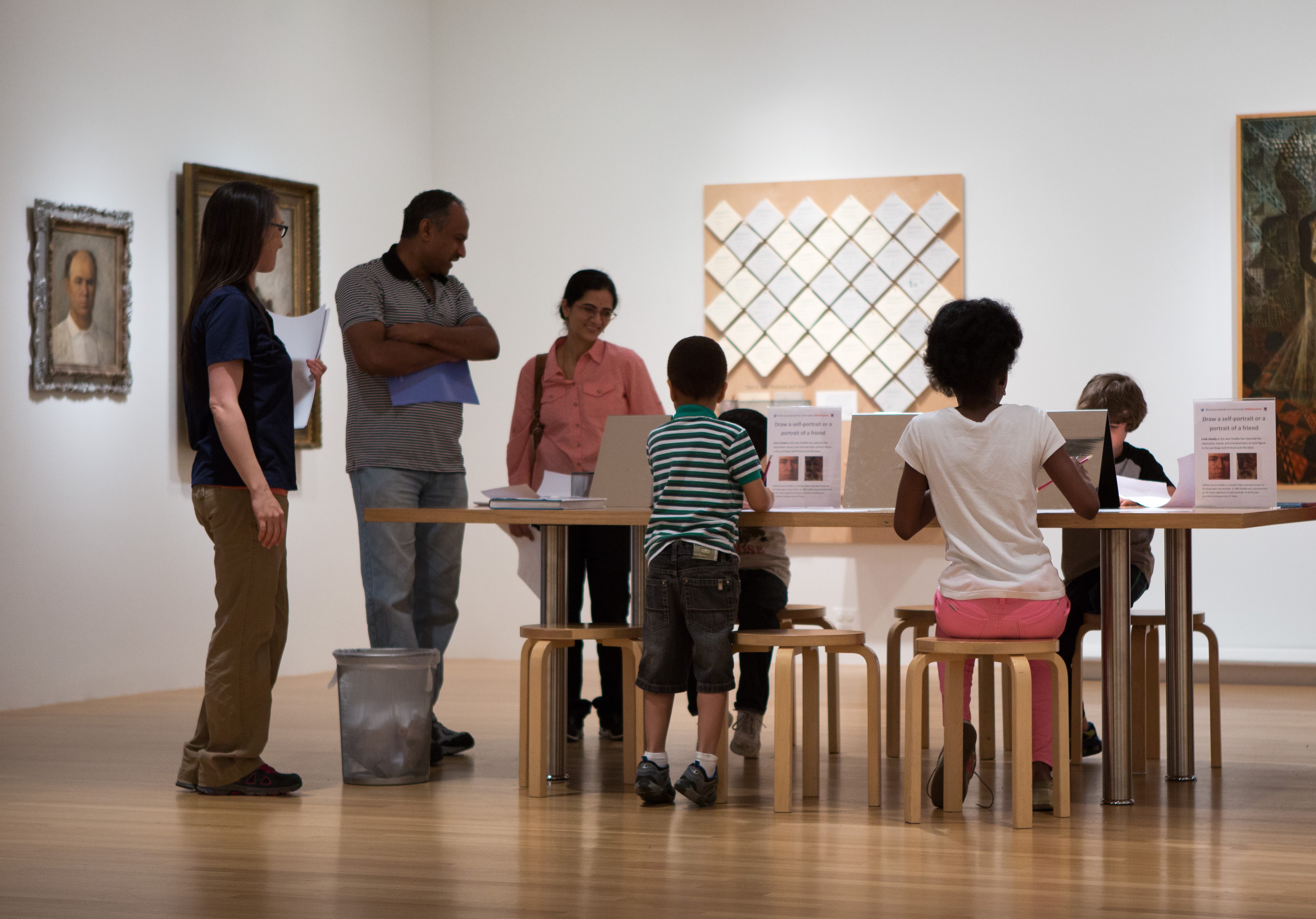
In January 2014, we installed a large table in the middle of the C3 Gallery, that hosts three activities that rotate on a monthly basis. As a part of the evaluation of these activities, we interviewed visitors about their motivations for participating, their past experience with art making, and their view of the value derived from participating in a making activity at the Museum. I was repeatedly intrigued by the responses of the adult participants.

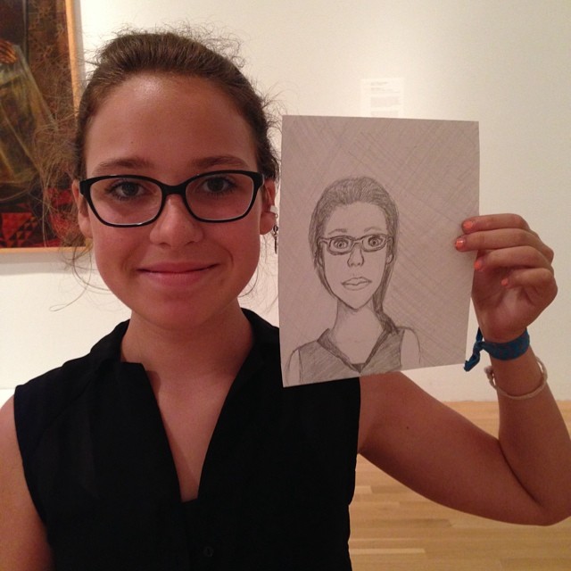
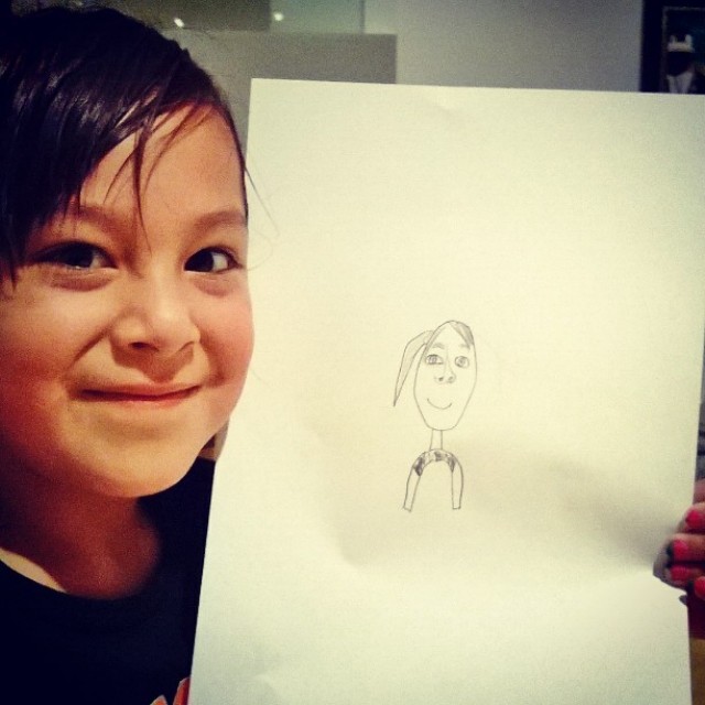
For example, I spoke with a couple participating in a portrait drawing activity which encouraged close looking at the proportions and scale of the human face.  The couple, in their mid-thirties, each claimed to have no artistic experience. Through our conversation, they divulged that they both graduated from arts based college programs. “I went for fashion, like a BFA in Design, and he went for Graphic Design. We don’t really draw in our free-time though, I mean, he does for work,” the woman stated as she looked over at the man who accompanied her. He added, “Yeah, but just on the computer.” Then the woman broke in, “And I do for work, but it’s not the same. Like, I do fashion sketches, not this kind of drawing.” I prodded them a bit to understand what “this kind of drawing,” meant. “Well, it’s like… it’s fun. Like drawing before was so serious and it had to be perfect, cause you were doing it for a grade. But this is just for enjoyment.”

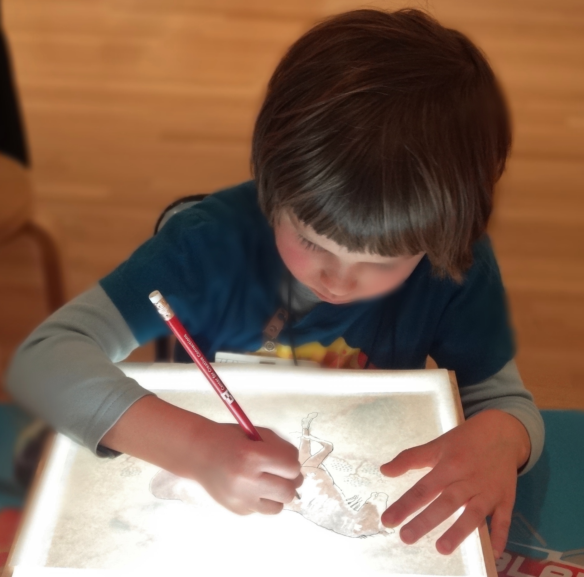
This idea was reinforced by further conversations with other adult participants: drawing, making, and discussing in C3 is fun in a freeing kind of way. I interviewed another thirty-something couple drawing at a light box activity designed to assist in the making of hybrid imagery. The man began with, “I’m guessing this was made for children? It’s fun and different and I didn’t expect to see this here.” The woman with him agreed, “Yeah, it’s like that spark of creativity, kind of… childlike. I didn’t think I’d spend as much time or get into it like I did.” A sixty-something man participating in the portrait drawing activity remarked, “I used to take art classes, but it’s been so long ago… it’s like I forgot that and I saw this and I remembered.” This feeling of nostalgia for something that is no longer a part of someone’s everyday life was also a common response from adults. Many adults responded that they enjoy drawing or making but, “don’t do it enough.”

JFuentes_image3.jpg

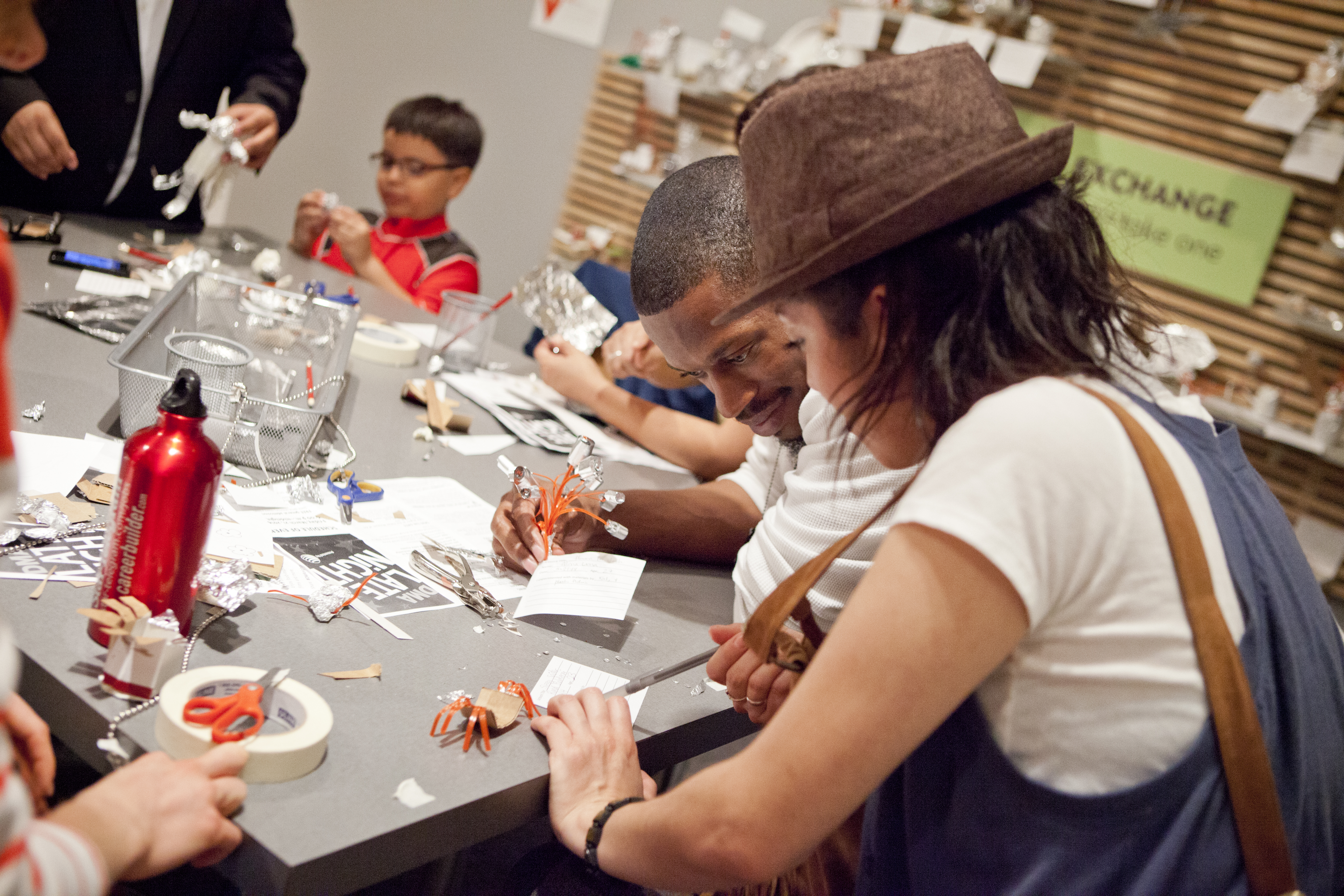
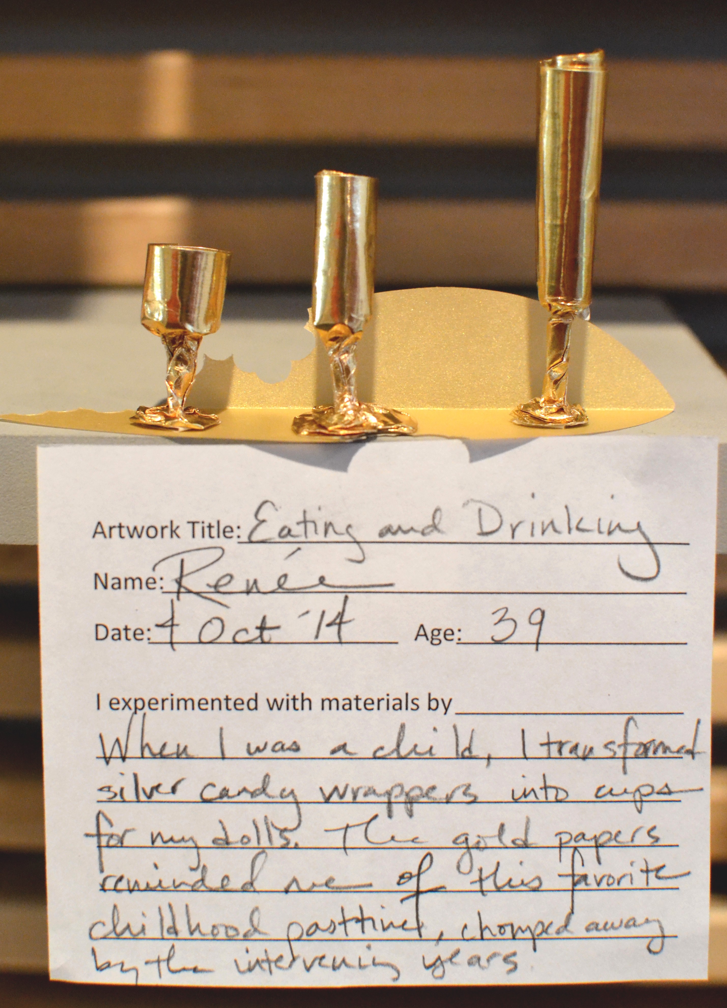
Aside from drawing based activities, the Center for Creative Connections also has a drop-in art making area with large communal tables called the Art Spot, which we say is the place for “anytime art-making for everyone.” We invite visitors to explore their creativity by making creations out of unexpected or everyday materials. Every two months we change the materials and provide a prompt to inspire ideas. Each time I’m hesitant and wonder, “What will people make with this?” But, I am always delighted and surprised by the imaginative creations that are made and left behind. Children often come to C3 and head straight for the Art Spot, while adults can be a bit more tentative. However, regardless of age, most visitors stay anywhere from 5 minutes to two hours, with an average of about 20 minutes. Once they gather their materials they become immersed in their creation. For some it is a hands-on problem solving activity while for others it is about manipulating materials. How can you combine these objects (cups, spoons, paperclips, wire, egg cartons, cardboard, etc.) into something unique and surprising? This kind of open-ended activity, reminiscent of childhood playing and pretending, is not often made available to adults. I frequently watch my eight-year-old daughter take something like a toilet paper roll and turn it into a piano for her dollhouse, or repurpose a cardboard box to make an enormous rocket ship. This nostalgia for childhood play was brought perfectly into perspective by a recent Art Spot creation.

artspot creation.jpg

At the DMA, learning can take many approaches and forms. We strive to be inclusive so that we can reach visitors with a multitude of interests and experiences and preferences for learning. In the Center for Creative Connections, our mission is to engage visitors of all ages with works of art and the creative process of artists. We hope that by designing participatory ways to learn we will provide fun and playful activities for all of our visitors, regardless of their age.

Jessica Fuentes
C3 Gallery Coordinator

Measuring the Immeasurable

In January 2014, the Center for Creative Connections (C3) launched a series of activities which take place at a large table in our gallery space.  Each activity is related to a work of art in the C3 Gallery and offers resources to assist in visitors’ creative process.

This slideshow requires JavaScript.

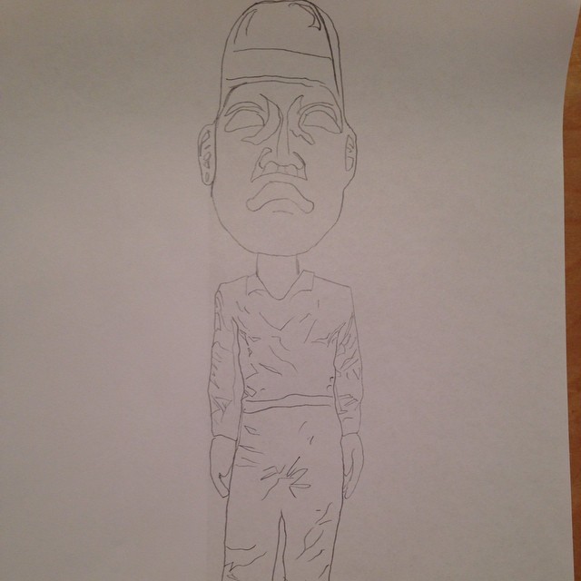
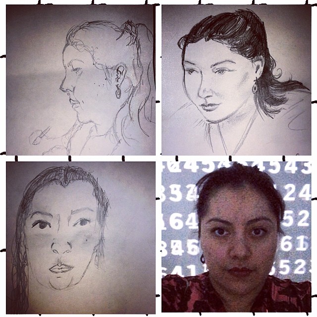
  •  The Portrait Drawing activity, which focuses on two portrait paintings by William Henry Huddle (Old Slave and Self Portrait), includes mirrors for self-portraiture and facial proportion handouts.
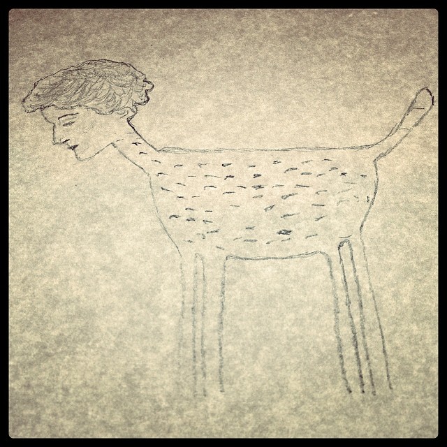
  • The Hybrid Drawing with Light Boxes activity, which focuses on The Minotaur by Marcel Dzama, includes four large light boxes and printouts of works of art from the Museum’s collection so that visitors can combine human and animal figures to draw a hybrid creature.
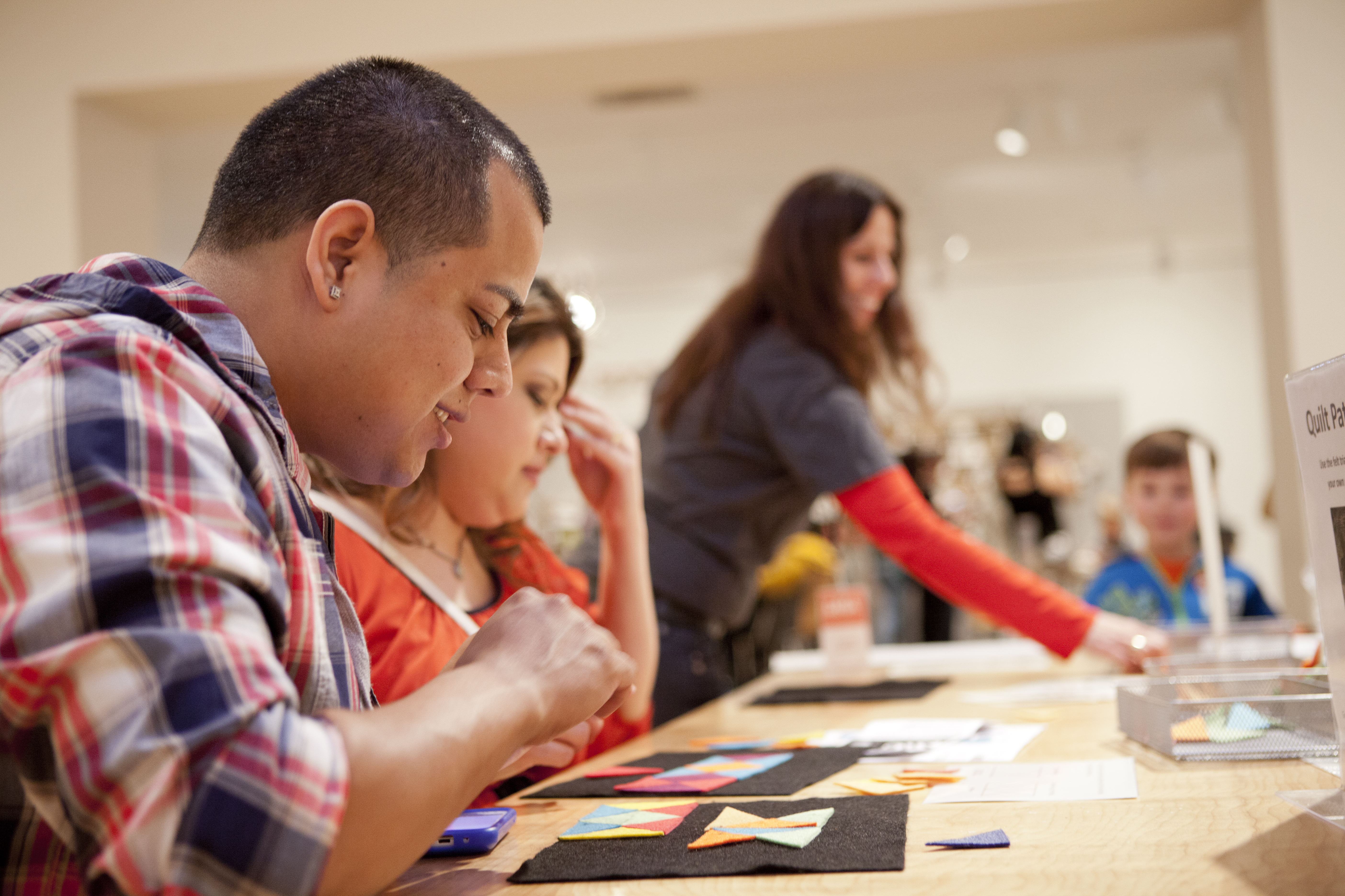
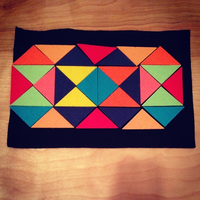
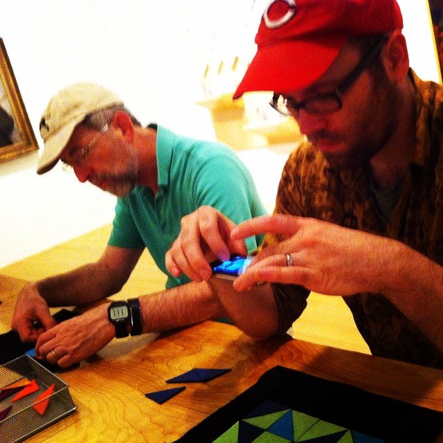
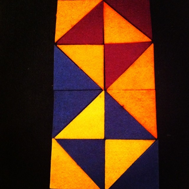
  • The Patterns with Felt Triangles activity, which focuses on Starry Crown by John Biggers, includes 9×12 inch black felt backgrounds and a colorful assortment of small felt triangles that visitors can use to create patterns similar to those represented in the painting.

After each of the three activities had a one month trial period, we felt certain that they were successful, but wanted to learn more about why and how these activities were successful.  As art educators, we know intrinsically that experiences with art make a difference in people’s lives.  Yet, when we are asked to prove this it can seem an unattainable task.  Proving the importance of art education is perhaps made even more daunting in an informal learning environment where visitors come for various reasons, but generally not to be quizzed about their experiences with art.  So, we sought advice from our evaluator to determine goals, indicators, and potential interview questions for each activity and immediately set to the task of measuring the immeasurable.  Since April, we have observed and interviewed participants at the gallery table each Saturday from 1:30 p.m. until 4:00 p.m.  During that two and a half hour block of time we have found the following averages:

  • Portrait Drawing– on average 23, adults and 18 children participated; visitors spent about 13.8 minutes drawing with times ranging from 1 – 30 minutes.
  • Hybrid Drawing – on average 27 adults and 36 children participated; visitors spent about 10 minutes drawing with a time range of 1 – 50 minutes.
  • Patterns– on average 11 adults and 9 children participated; visitors spent about 7 minutes creating patterns with a range of 1 – 33 minutes.

Though these averages tell us a lot about how much time people spend and how many people engage in our activities, the most interesting aspect of this evaluation has been hearing our visitors’ feedback and seeing the images they post of their work on social media.

Visitor Feedback:

“Well, it’s like… it’s fun.  Like drawing before was so serious and it had to be perfect, cause you were doing it for a grade.  But this is just for enjoyment.”

“I’m guessing this was made for children? It’s fun and different and I didn’t expect to see this here. Yeah, it’s like that spark of creativity, kind of… childlike.  I didn’t think I’d spend as much time or get into it like I did.”

“People think patterns have to be rigid, like red, yellow, blue and then repeat, but by playing with this you can be more creative.”

“This is more interactive than other galleries. [In] the other galleries you’re just looking, but here you get to do something.”

“I like to do the activity because it gets the kids interested in art, and if I do it, they’ll probably want to try it too.”

“It’s nice to make everyone focus.  I would have never gotten him [points to husband] to do this at home.”

Through this evaluation we have come to better understand our visitors’ habits and motivations. For example, we found that most visitors do not read instructions.  If the instructions are read it is only the main text at the top of the document that catches a visitor’s eye.  This could be because these activities tend to attract visitors who prefer some amount of active doing or making rather than passive looking.  Furthermore, visitors will spend more time participating in activities that provide seating and social interaction.  Regarding motivations, we found that visitors who participate in these activities are likely to have some underlying interest in the media or subject matter presented.

As we move forward and continue to develop activities for the gallery table we will take these lessons into consideration.   We will make our instructions more concise, we will offer activities that involve a social component, and we’ll branch out to include a variety of media so as to appeal to visitors who are interested in diverse artistic processes.

Jessica Fuentes
C3 Gallery Coordinator


Camp and Community

photo (1)

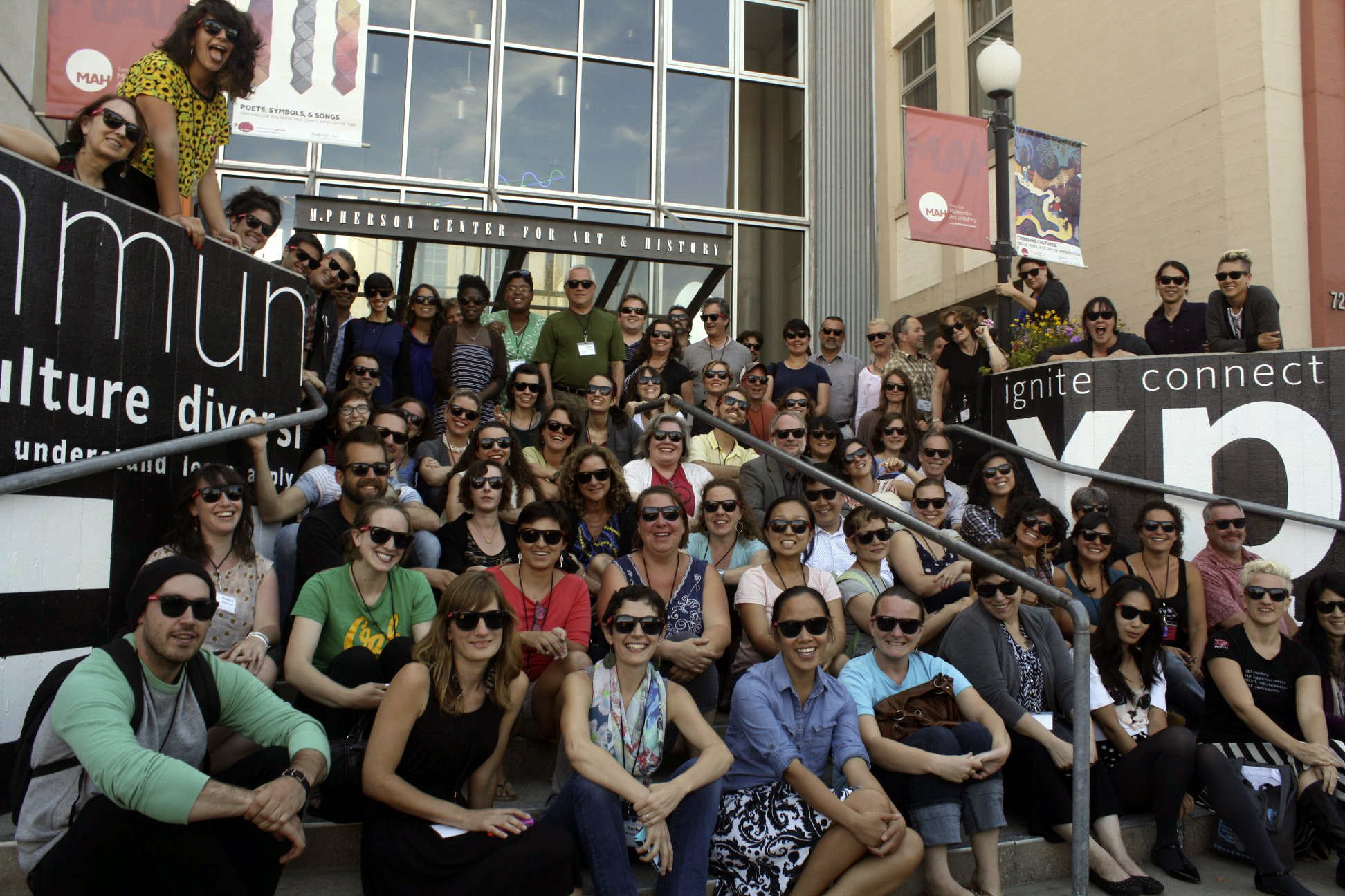
I spent the last week in July in sunny California. Though I divided my time between walks on the beach, wandering the bustling boardwalk, and exploring the Santa Cruz Museum of Art & History (MAH), this was no beach vacation, but rather an intense seventy-two hours at Nina Simon’s Museum Camp 2014.  Even with the itinerary, I honestly did not know what to expect as I walked up to the MAH, feeling like a true camper toting my loaded backpack and refillable water bottle attached to my purse.  As a museum educator, this was a dream come true.  Not only has Simon influenced the way we think about and create programs and interactives in the Center for Creative Connections (C3), but I also used her book in the literature review of my Master’s thesis.  As relevant professional development can be hard to come by as a museum educator working in an interactive space, this Social Impact Assessment themed camp seemed to be what I was looking for to give me some direction in the evaluation of the C3 and specific activities within our space.

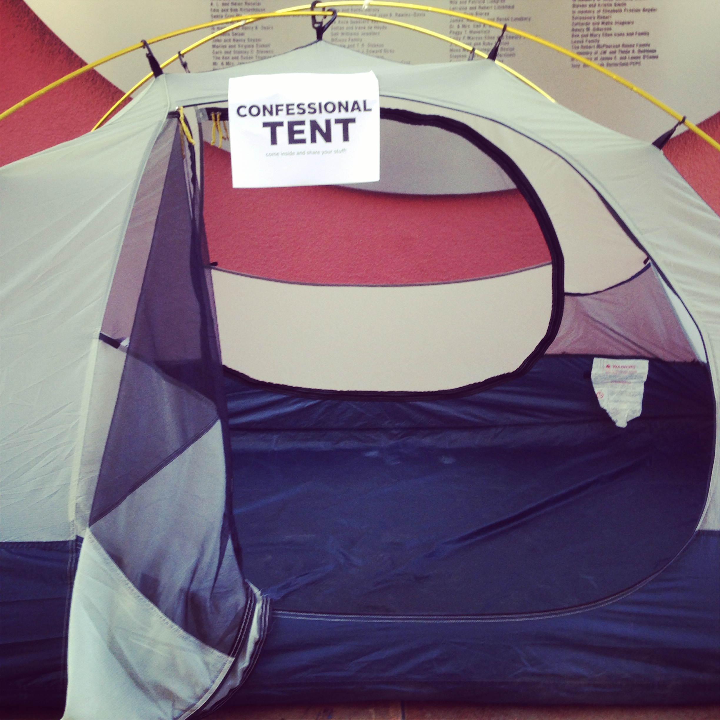
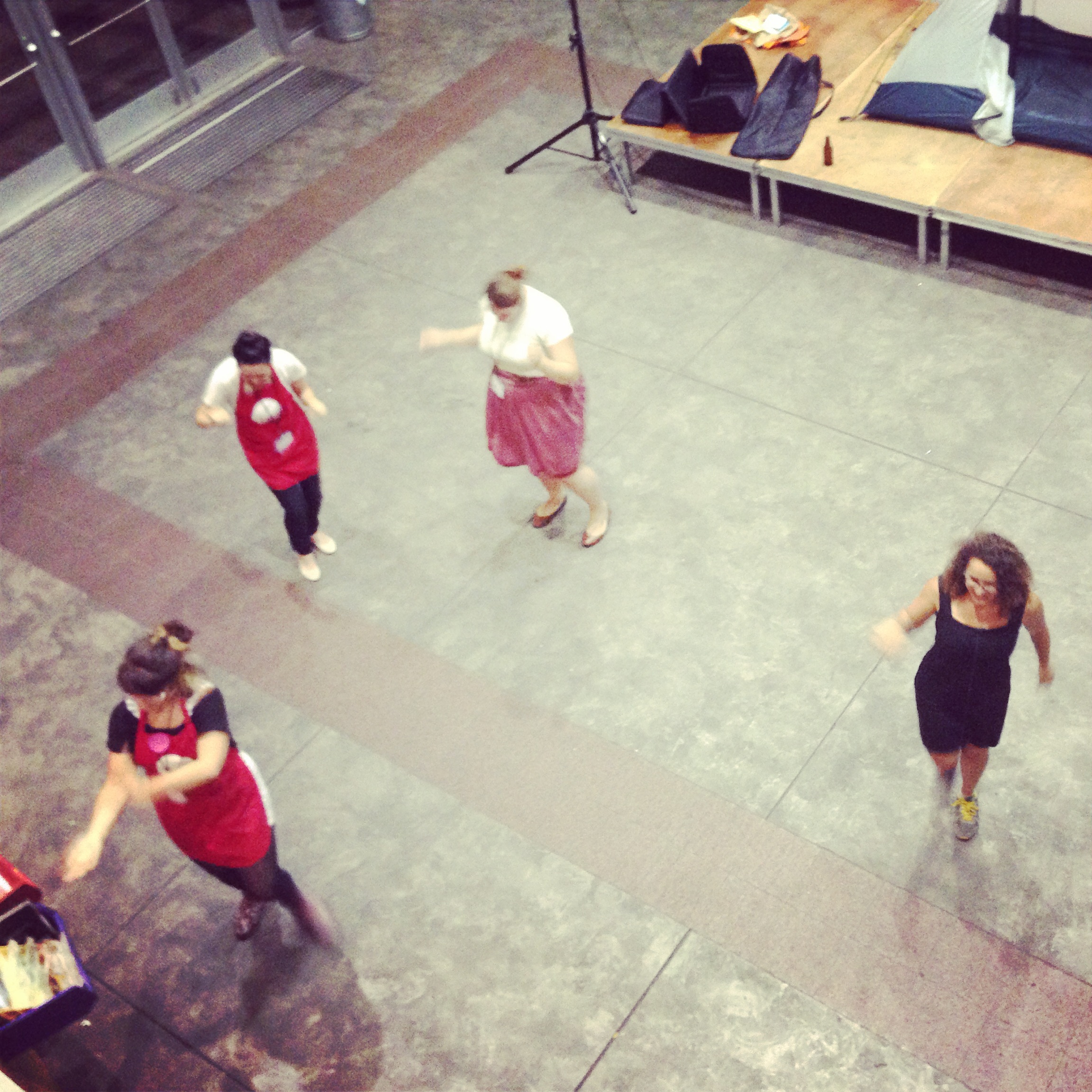
Overnight camp as an adult is a unique opportunity, so when I was offered the chance to attend Museum Camp and sleep over at the museum, I was all in.  There is a special bond that is formed by spending that kind of concentrated time with a group of people.  That bond is reinforced by going through certain trials and tribulations together, like searching for a comfortable spot to sleep, waking up and walking through a foggy Santa Cruz morning to the gym to take a shower, or late night revelations in the Confessional Tent.  Though not all the campers opted to stay the night at the Museum, there were other opportunities for bonding, like karaoke night, mess-hall style dinners, swimming in the Pacific, and of course the fast-paced group research projects that were at the center of our camp experience.


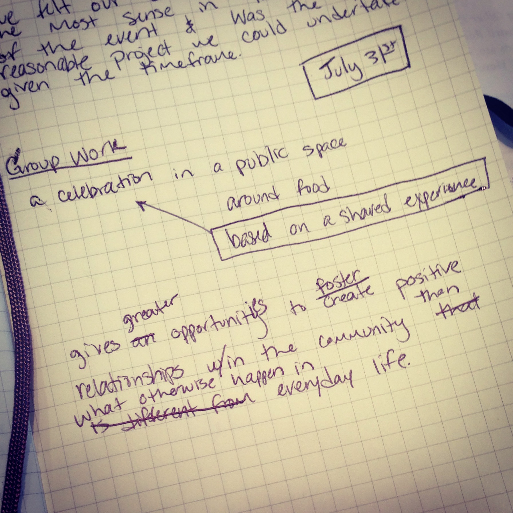
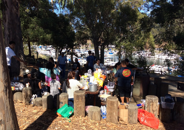
We met our group members at the end of the first day of Museum Camp and, through a tumultuous game of White Elephant, our research locations were determined.  Over the next few days we developed a research question, hypothesis, and indicators, then carried out our research and compiled our findings. The goal was to use unconventional methods of data collection to gather information regarding social impact. My group, the Metacampers, had a more sensitive location than most because we were attending a private rather than public event. The event was hosted by the Beach Flats Community Center for a small group of Latino families. Since we were all outsiders, we found it important to gather as much information as possible before engaging in our research.  We visited both the community center that was hosting the event and the park where the event would take place. Yet, we still came to our project with a handful of assumptions both about the community and the location. We planned our methods so as to be as natural as possible at the event; our Spanish-speaking group members engaged in informal interviews with adult participants, our non-Spanish-speaking members made observations of both adult and youth participants, and towards the end of the gathering we asked the youths to each take a photograph of  what they found most fun at the event. We expected to be greeted with some amount of skepticism, but were surprised to find the community was quite welcoming. The key to this was our Spanish-speaking group members; they were able to become ingrained in the event as participants, and holding informal interviews was a natural aspect of that.

This brings me to my biggest take-away from Museum Camp.  While undertaking the research project and learning about the other groups’ methods was interesting and insightful, my biggest take-away has more to do with the idea of community.  Time and again throughout camp, I was surprised by how immersed Nina Simon is in her city.  Clearly, whether the camp was going on or not, Simon would have had dinner at India Joze or gone to karaoke at I Love Sushi or walked to the beach to go swimming in the Pacific. As a cultural and educational institution, connecting to the community is an important aspect of the Dallas Museum of Art’s mission. What I learned at Museum Camp is that rather than seeking to connect to the community we must be embedded in it; we must be active participants in our own communities.

If you’re interested in learning more about the Museum Camp 2014 experience, take a look at these resources from camp and reflections by other campers.

Jessica Fuentes
C3 Gallery Coordinator

Touch Tour for Students with Vision Impairment

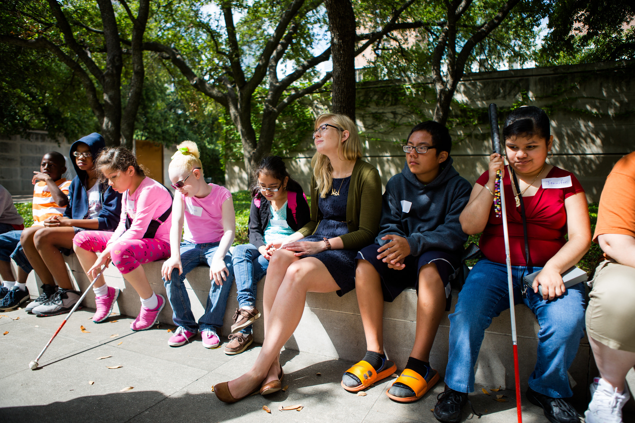
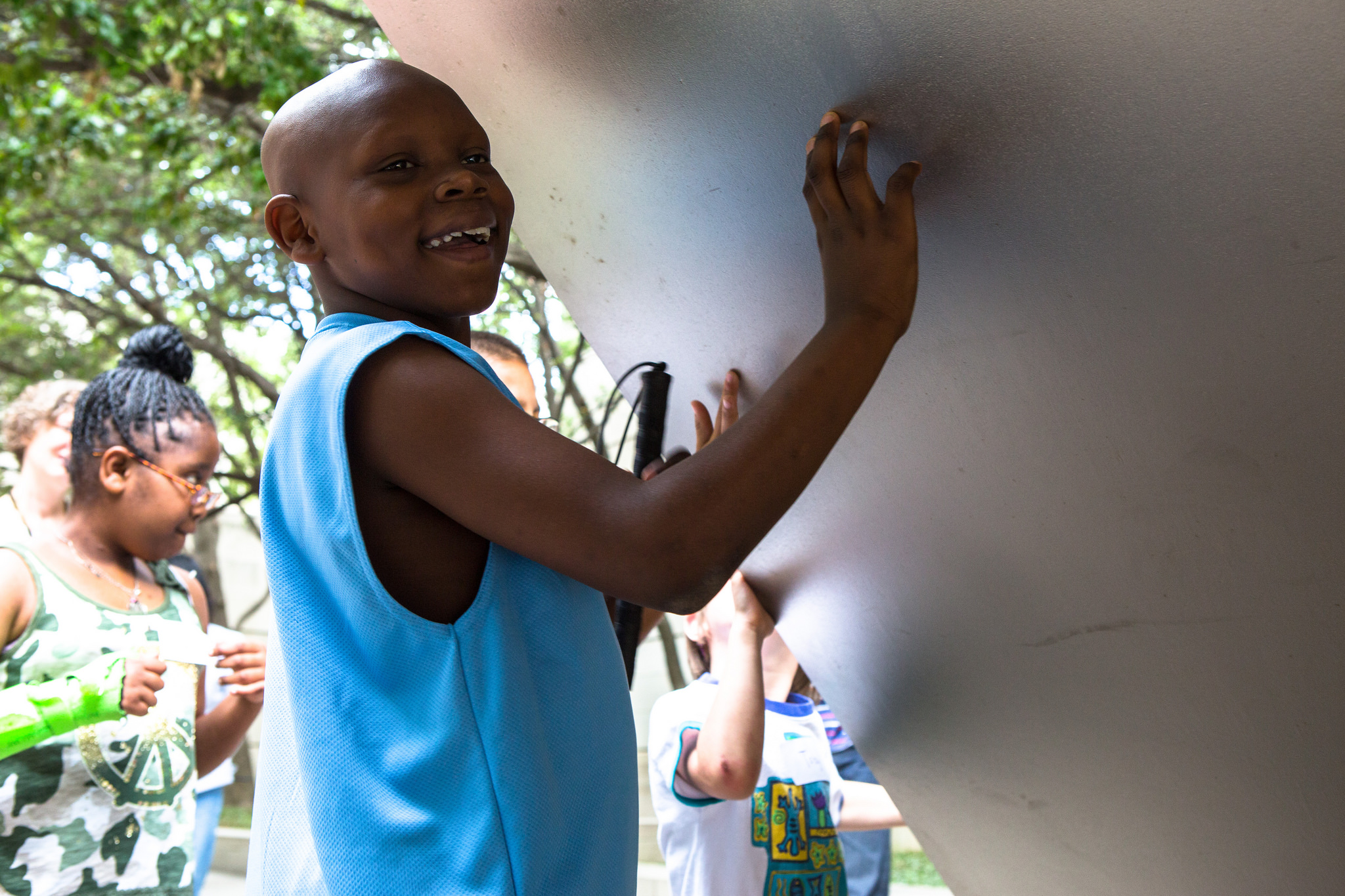
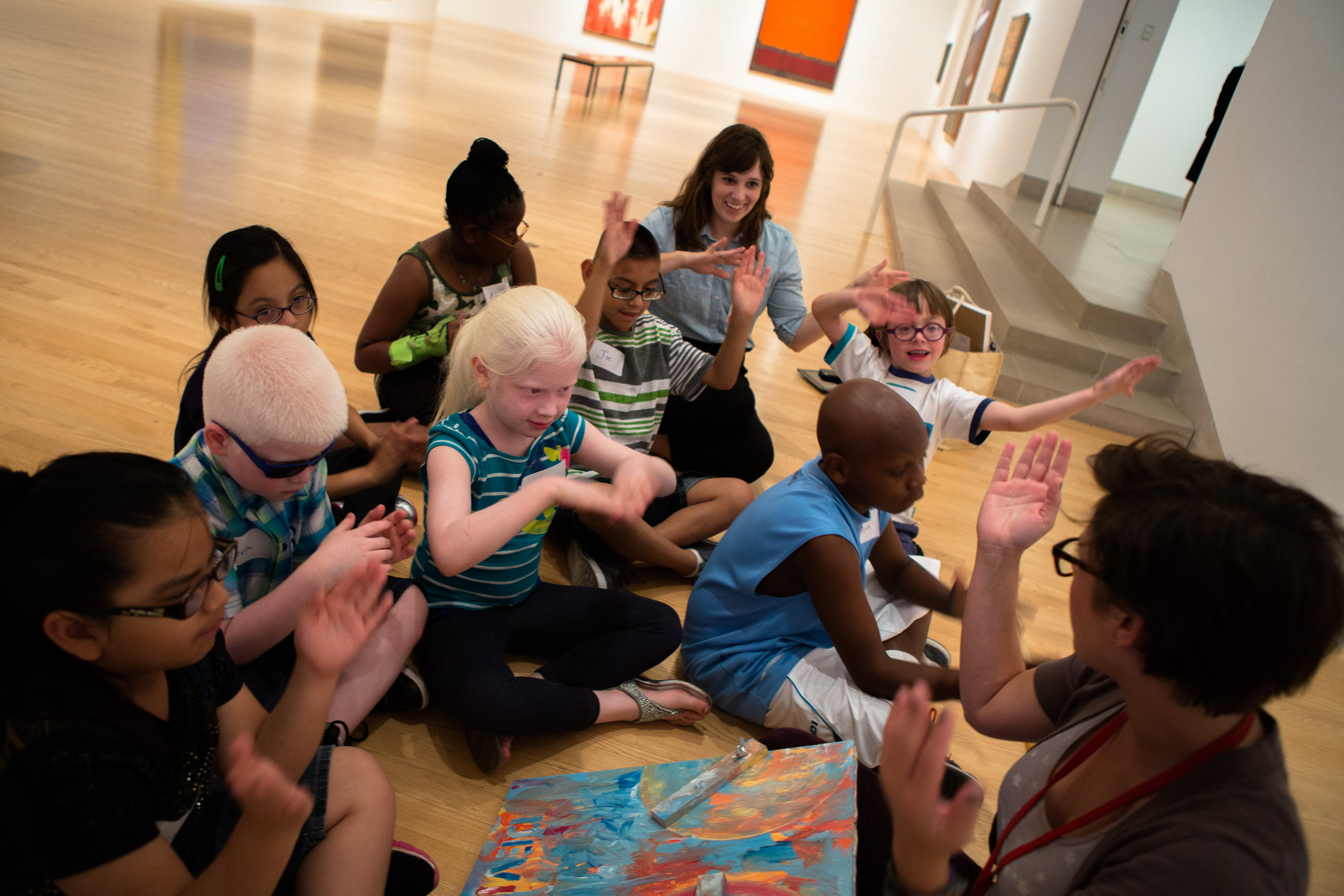
Many people may not think that of an art museum as the ideal field trip location for a group of children with visual impairment, but when the Dallas Independent School District (DISD) contacted the DMA earlier this summer with such a tour request, we were eager to provide the best experience possible. When discussing the visit with vision teachers at DISD, they felt it was important to expose their students to art and wanted an experience that would illustrate to the students that they too have the ability to create and appreciate art just as well as any other student.

DISD students with vision impairments visiting the DMA.

DISD students with vision impairments visiting the DMA.

The Planning Process
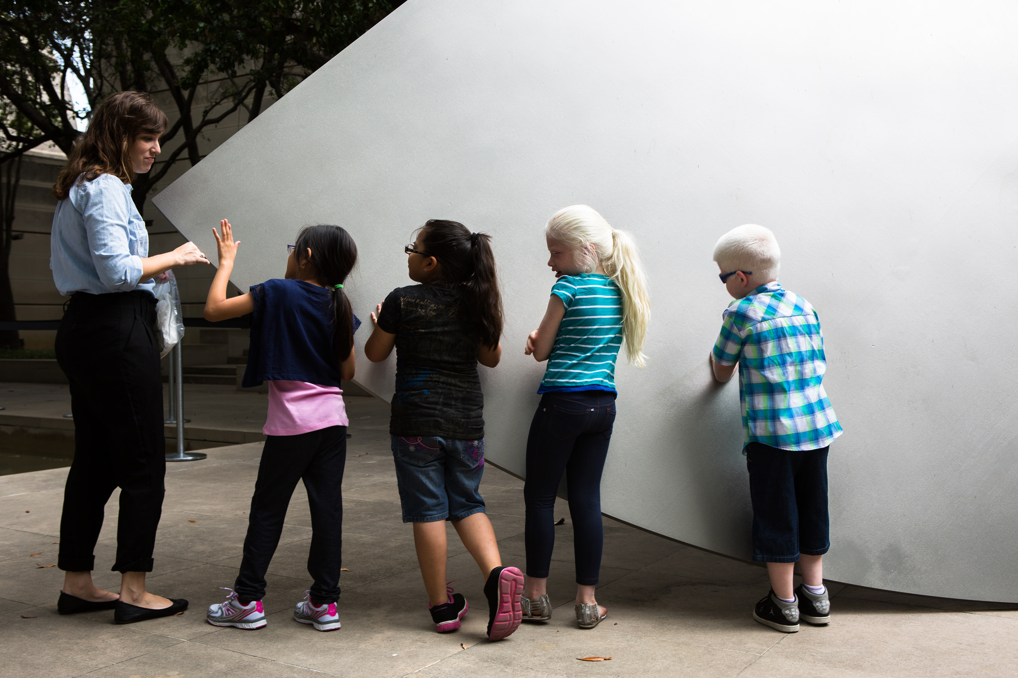
The Dallas Museum of Art has never before offered guided touch tours to visitors with visual impairment, but after speaking with our Director of Exhibition Design, we learned that she fully supports inclusive gallery teaching, and thus was open to supporting the Museum’s first ever touch tour. We talked with our colleagues in the exhibitions and conservation departments and found that they too were fully supportive of trying out a touch tour with the DISD students. The DMA Sculpture Garden was identified as the best place for our inaugural touch tour, since the objects in the garden are designed for an outdoor space and are thus subject to (and able to withstand) a variety of natural elements. We also felt that it was essential for the students to have the galleries to themselves during the tour, so as not to confuse other visitors about the acceptability of touching works of art, as well as for the overall comfort of the students with vision impairment. We therefore decided to schedule the touch tour for a Monday, when the Museum is closed to the public.

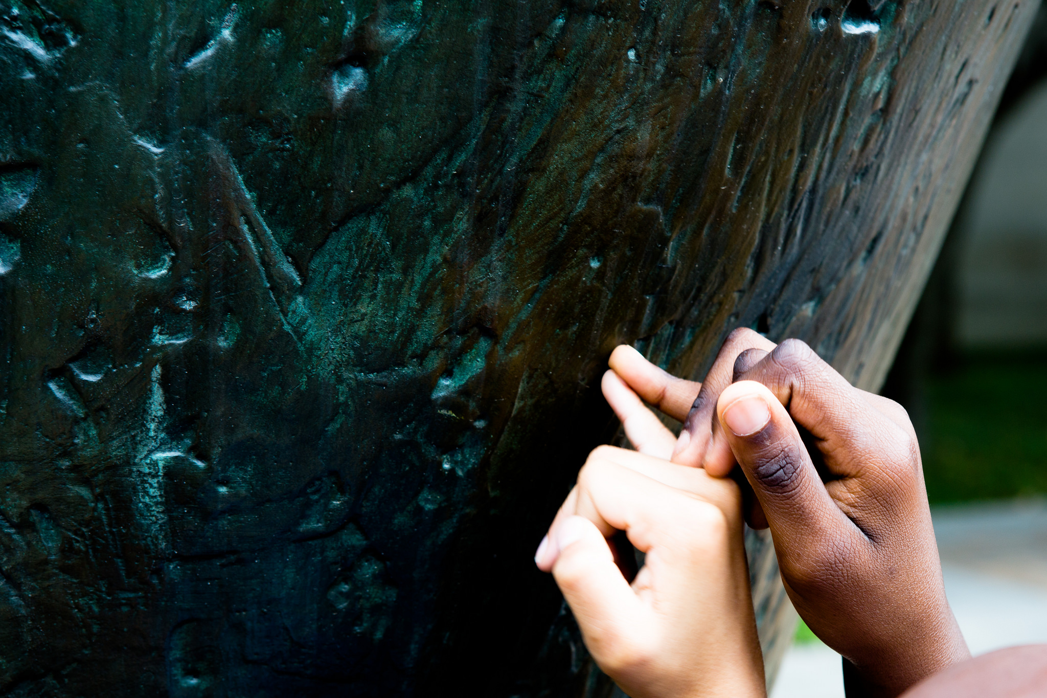
Our next step in the planning process was to walk through the space as a group, making note of areas that may be problematic for someone with vision impairment to navigate. The team was comprised of education, conservation, and exhibitions staff, and everyone on the team raised thoughtful questions and contributed wonderful ideas! We discussed which works of art may be the best for a tactile experience, and our conservators suggested that the kids have the chance to touch the works of art without gloves (which is usually unheard of in other touch tours!). Our exhibitions team offered to wash and hand-clean the works we selected so that they would be nice and clean for the experience. And one conservator suggested we select works of art that were large enough to be touched by more than one student at a time, so that the students could talk to one another about what they felt as they each touched the artwork.

After squaring things away with the exhibitions and conservation teams, the education team began planning the educational experiences of the tour. We prepared for twenty-five students, ranging in age from six to thirteen years, all with a range of visual impairment. The majority of students in the group had some residual vision, while two students were very photophobic, and two were blind from birth. Due to the range of abilities of our tour group, our education team knew it was important to include a variety of artworks in the tour (in addition to those on the touch tour), integrate many descriptive explanations of works of art and hands-on activities, and to have numerous tactile objects available.

In the Galleries
When designing the overall tour, we selected a variety of objects that spanned time periods, artistic techniques, and geographic locations. We visited two contemporary art sculptures in the Sculpture Garden for the touch portion, two Abstract Expressionist works in the contemporary gallery, and a mask in the African gallery. Our aim was to engage all of the senses throughout our tour, as we believe that presenting multiple representations of content would effectively cater to the different learning styles of the group. We created a multi-modal experience by collecting auditory clips for sound stimulation, tactile materials and replica objects for touch, Jelly Belly jelly beans for taste sensations, and essential oils and scented colored pencils for olfactory information.

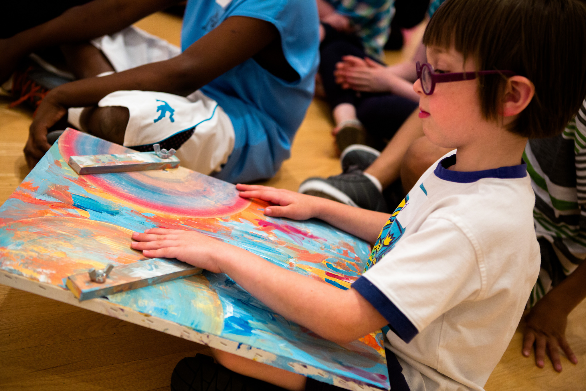
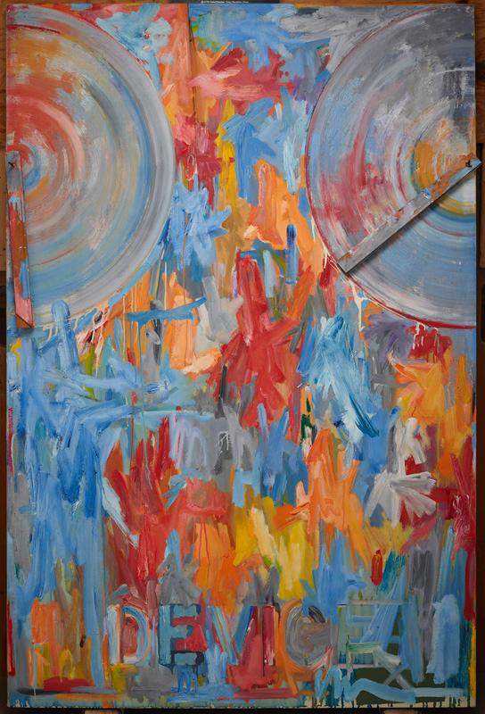
Each stop on the tour had a visual description of the gallery space and of the works of art we focused on, because it was important for us to situate ourselves, the children, and the art in space, as the sense of bodily awareness in space is something that many people without vision impairment may take for granted. Much of our time in the galleries was spent guiding students in tactile looking activities connected to specific works of art and facilitating conversations about texture and form. For instance, we created a reproduction of Jasper John’s Device so that the students could not only touch canvas and feel layers of paint, but they could also replicate moving the wooden stretchers back and forth across the canvas, while imagining the technique in which Johns spread the paint back and forth.

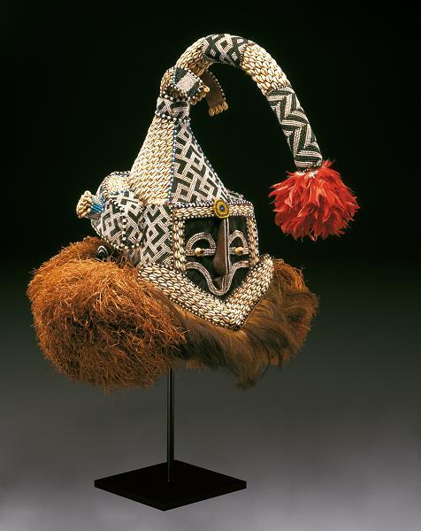
In the African galleries, we focused on a helmet mask made by the Kuba people of the Democratic Republic of the Congo, and passed around raffia, cowrie shells, feathers and other materials found in the mask. Additionally, we played sound clips of the various animals that related to the mask.

Helmet mask (Mukenga), Kuba peoples, mid-20th century, Dallas Museum of Art, gift in honor of Peter Hanszen Lynch and Cristina Martha Frances Lynch

Democratic Republic of the Congo, Kuba peoples, Helmet mask (mukenga),  mid-20th century, Dallas Museum of Art, gift in honor of Peter Hanszen Lynch and Cristina Martha Frances Lynch

Relating to Richard Diebenkorn’s Ocean Park No. 29, we discussed how an artist could depict a place using sounds, smells, and taste. The students each ate a jelly bean and imagined the color they believed the flavor might represent. Next, they used a scented colored pencil to illustrate a place based on that smell. We also played sound clips of ocean waves and boat horns to recreate the Santa Monica locale that inspired Diebenkorn’s Ocean Park series.

Richard Diebenkorn, Ocean Park 29, 1970

Richard Diebenkorn, Ocean Park 29, 1970, Dallas Museum of Art, gift of the Meadows Foundation, Incorporated

Our tour concluded with a sensory drawing activity that took place at the large fountain outside the Museum’s Flora Street entrance. The students listened to the sounds created by the water in the fountain, and considered how the water (and space around it) might appear, what color the water would be, even how the smell would be rendered. We gave each student a piece of thin Styrofoam and a pencil to create their drawing of the fountain; the students were able to feel the indented lines they drew onto the Styrofoam and took turns sharing their creations with one another.

Until Next Time
This was an exceptional experience for DISD students, teachers, and DMA staff alike. One teacher who helped to organize this visit said that this experience “might be the only time this whole summer [the students] get this opportunity to learn tactually, through their auditory channels and their residual vision, which sighted people take so much for granted.” It was a transformative experience as well for our Museum. We are honored to have been a part of this experience, and cannot celebrate enough the fantastic support and collaboration exhibited by DMA staff from many different departments. A huge thank you to DISD for bringing their students, and a thousand thank you’s to the DMA’s conservation, exhibitions, visitor services, and security teams. This was a team effort and we appreciate the unified support and assistance—let’s hope this is the first of many touch tours to come!

Amanda Blake
Head of Family, Access, and School Experiences

Danielle Schulz
Teaching Specialist

Art’s Inspiration


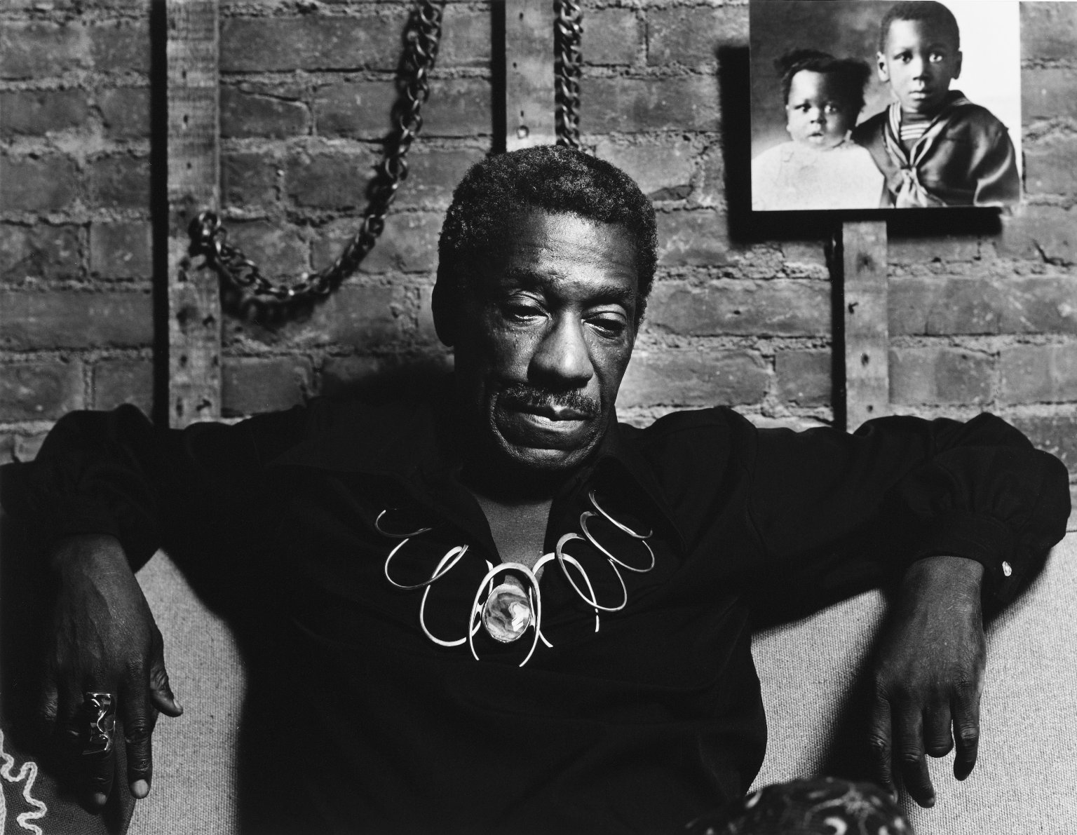
Image of Art Smith photo by Arthur Mones, 1979

Image of Art Smith photo by Arthur Mones, 1979

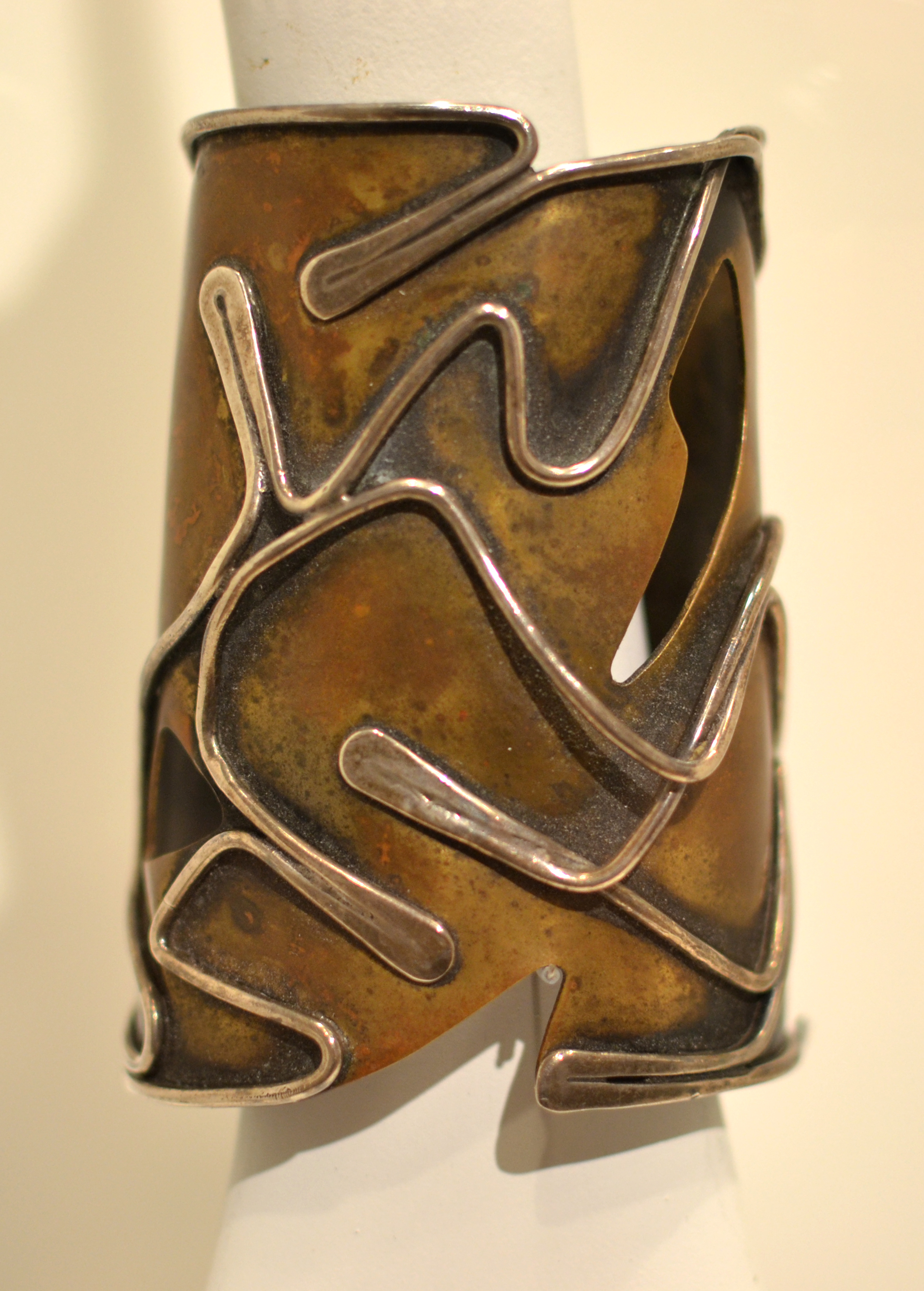
Last weekend, From Village to Vogue: The Modernist Jewelry of Art Smith opened at the Dallas Museum of Art.  In connection with this exhibition, the Center for Creative Connections is pleased to have on view a “Baker” Bracelet by Art Smith, along with a collection of tools owned by the artist.  Because a different “Baker” Bracelet is also on view in the exhibition, we faced the challenge of providing information that would expand on and not simply duplicate the information included in the exhibition.  In the months prior to installing the bracelet, I  learned that “Baker” referred to Josephine Baker.  So, naturally, my first question (and the one that I thought visitors might have) was “Who is Josephine Baker?”

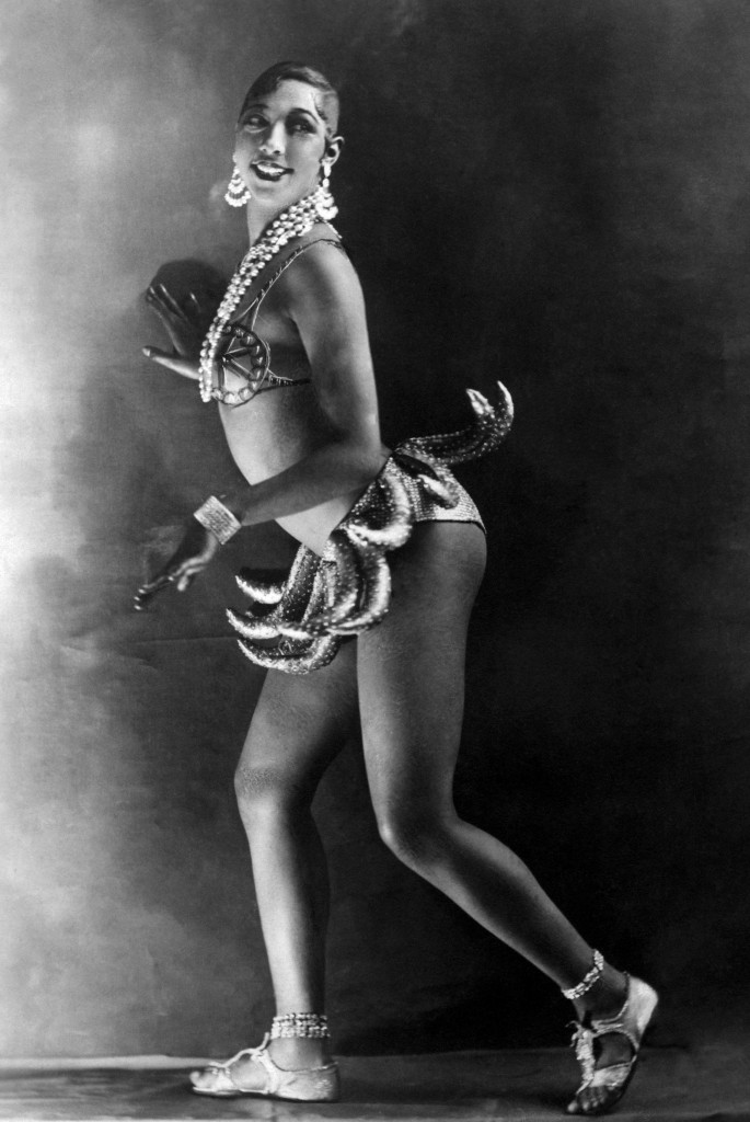
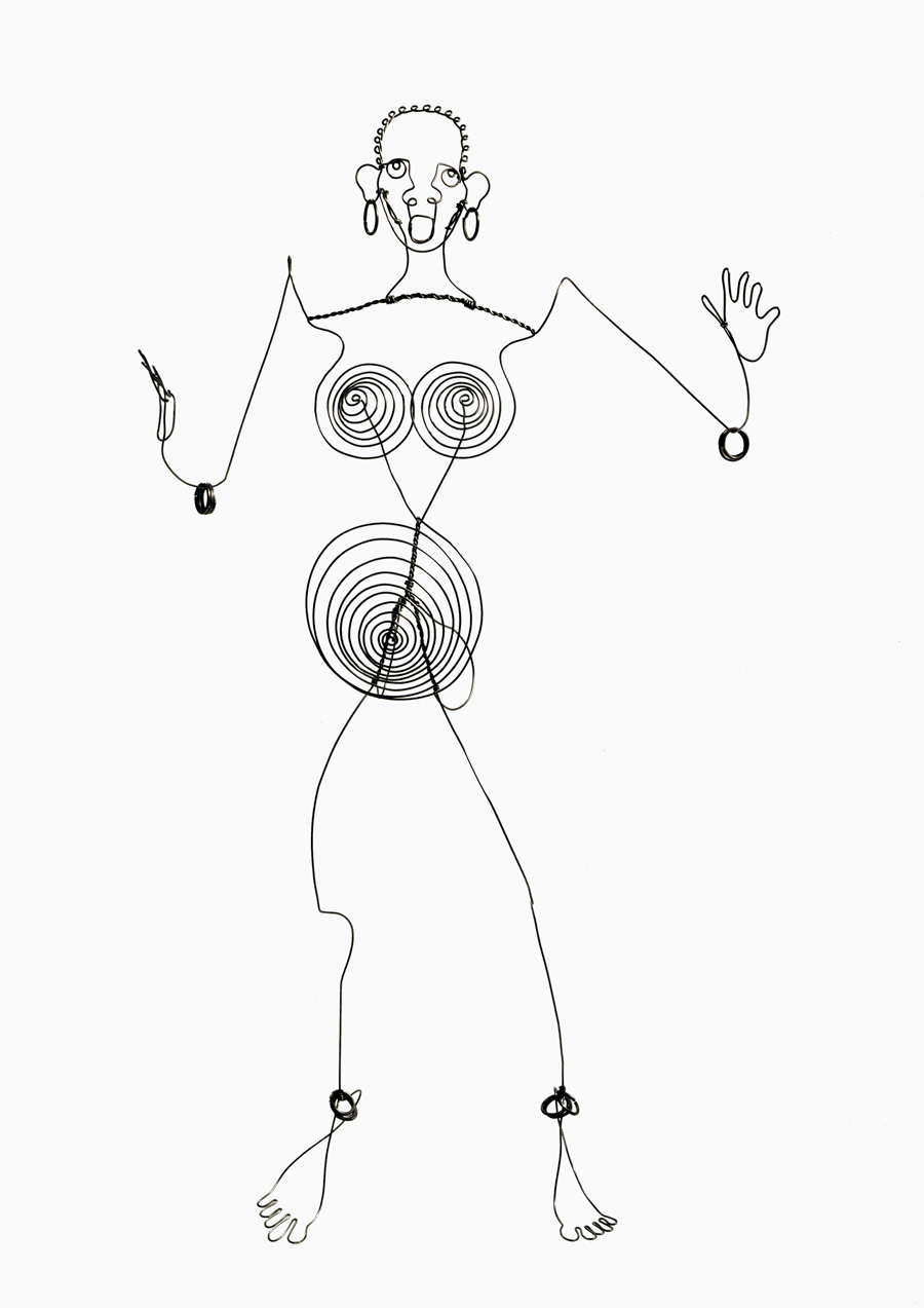
As it turns out, Josephine Baker led quite an amazing life.  Baker was an African-American dancer and singer, who rose to fame in France.  In 1926, her performance in the popular show La Folie du Jour cemented her celebrity status.  During World War II, she worked for the French Resistance both entertaining troops and smuggling hidden messages in her sheet music.  After the war she returned to the United States and was an advocate for the Civil Rights movement.  Her efforts were acknowledged by the NAACP, who named May 20th “Josephine Baker Day.”  Baker, loved for her singing, dancing, fashion and beauty, was greatly admired by artists and writers of the time such as Langston Hughes, F. Scott Fitzgerald, and Pablo Picasso.  However, what I found most intriguing was that she inspired several sculptures by Alexander Calder.  Calder is known to have been an influence on modernist jewelers like Art Smith, and so their mutual interest in Baker caught my attention.


What similarities can you notice in the lines, shapes, angles, and curves between the bracelet and the images of Josephine Baker?

Visit the Center for Creative Connections to see the “Baker” Bracelet and Art Smith’s tools and to learn more about Smith’s inspiration and process.  On view through December 7, 2014.

Jessica Fuentes
C3 Gallery Coordinator

Friday Photos: Old Haunts, New Friends

Museums often seem to inspire very personal and strong emotional bonds, and it is not uncommon to hear people talk of specific works in a collection or favorite locations within a building as akin to “friends and family.”  As a former DMA Education employee who has recently returned to the Museum, I have enjoyed spending the last several weeks rediscovering some of my favorite spaces and works of art here.  Of course, along the way, I have stumbled across some new works of art and changes at the DMA that I am becoming newly acquainted with!   I thought I would share this –admittedly quirky and idiosyncratic– tour of “old haunts and new friends.”

IMG_20140613_095513 IMG_20140613_095654

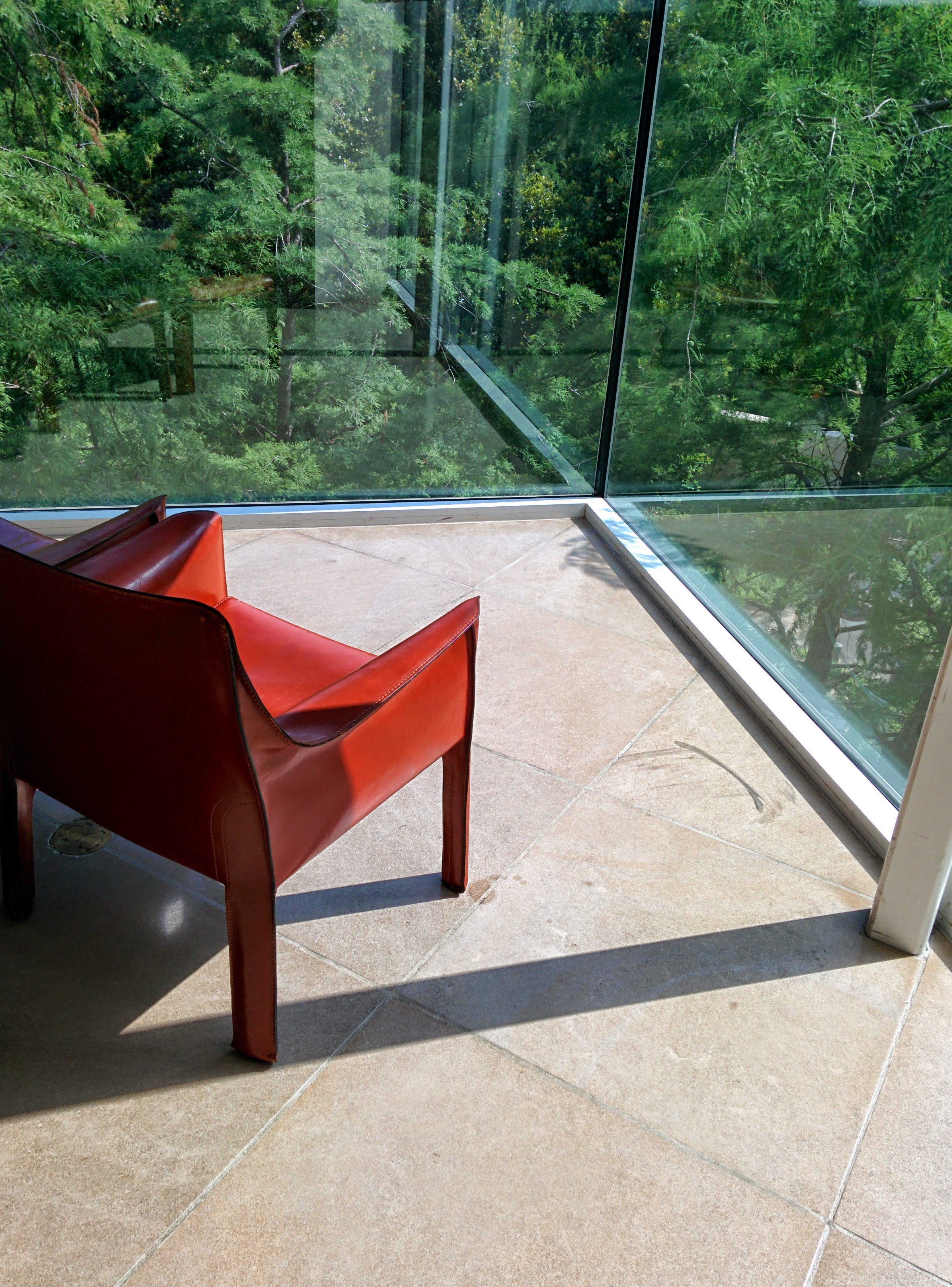
I have always loved the tree that grows in the middle of our upper office area, particularly when viewed from one of the hallways radiating from it.   Also, the tucked-away chairs at the corner windows on the fourth floor are my favorite place to sit and read a few pages of a book during a break, followed only by the view of Fleischner Courtyard from the Mayer Library (Did you know we have a fantastic library the public is welcome to use for research?)


IMG_20140613_101803

Another favorite object is one of Winston Churchill’s paint sets, tucked away with a wonderful assortment of his letters, telegrams, small works on paper, and assorted memorabilia in the Wendy and Emery Reves Collection.


Magritte_Our Daily Bread-Le Pain Quotidien_1942 IMG_20140613_145712

As a lover and student of Surrealism, I was delighted to see two works on view that I had not previously viewed in person: René Magritte’s Our Daily Bread (Le Pain Quotidien), 1942, and Dorothea Tanning’s Jeux d’Enfants, 1942.  The deep-set frame of  the Tanning is particularly lovely, I think!


IMG_20140613_102749 IMG_20140613_105324

Nearest the Ross entrance in the Founder’s Room are a set of window panels designed by Frank Lloyd Wright, originally from the Francis W. Little House in Deephaven, Minnesota.  It was interesting viewing the geometrically-designed “grilles” in the window against one of the orange-and-white striped hanging cloth panels in Daniel Buren’s Sanction of the Museum from 1973.

Finally, there is a little tucked away kitchenette in the Museum’s office area where I was always fascinated by a framed Dallas Morning News front page from 1984 announcing the donation of the Reves Collection, and I was pleased to discover it was still there.  I love how this is an historical artifact of the worldly context during which this important collection was added to the Museum, a preserved moment in time akin to the recreation of the Reves’ villa here.


Johan Christian Dahl_Frederiksborg Castle by Moonlight_1817 IMG_20140613_102630

Two newer features of the Museum that I am quickly becoming quite fond of are the recently acquired painting by Norwegian Romantic painter Johan Christian DahlFrederiksborg Castle by Moonlight, and the Conservation Studio across from the Founder’s Room.  Not only is the Conservation Studio fascinating to glimpse into, but the works on display outside it offer insightful peeks into little-seen aspects of objects like gallery labels and abandoned paintings hidden by frames.  (And, if you look carefully at my reflection in the window, it appears the female figure in the painting is tapping me on the shoulder.)

What are some of your favorite works of art and tucked away places here at the Dallas Museum of Art?  Please leave your examples in the comments!


Artworks shown (in order of appearance):

  • René Magritte, Our Daily Bread (Le Pain Quotidien), 1942, Dallas Museum of Art, Gift of Nancy B. Hamon in honor of Margaret McDermott.
  • Dorothea Tanning’s Jeux d’Enfants, 1942, Lent by Private Collection.
  • Frank Lloyd Wright, Window panels from the Francis W. Little House, “Northome” in Deephaven, Minnesota, 1912-14, Gift of Dr. and Mrs. Ralph Greenlee, Jr.
  • Johan Christian Dahl, Frederiksborg Castle, 1817, oil on canvas, Dallas Museum of Art, Foundation for the Arts Collection, Mrs. John B. O’Hara Fund.


Josh Rose
Manager of Docent and Teacher Programs


Archives

Flickr Photo Stream

Categories