Posts Tagged 'Museum Education'

Mi Museo Es Tu Museo

Learning English as a second language while living in a Spanish-speaking home didn’t come without its challenges—it took me years before I realized “better late than ever” wasn’t a phrase, and I could write an entire dictionary of hybrid words my siblings and I used by mistake (e.g. “moona,” or moon + luna). In spite of the occasional linguistic faux pas, having the opportunity to communicate in both languages has been incredibly rewarding in my personal life and my experience as an educator.

While I didn’t grow up in Texas, my experience growing up bilingual is pretty common throughout the Dallas-Fort Worth area. More than a third of the population in Texas speaks a language other than English at home, and DFW contains the 6th largest Spanish-speaking population in the United States. Current research demonstrates that both English-learners and native English-speakers benefit from educational settings that foster bilingual literacy. With all of this in mind, how does the DMA factor the demographics of its audience and the scholarship on bilingual education to engage Spanish-speaking visitors?

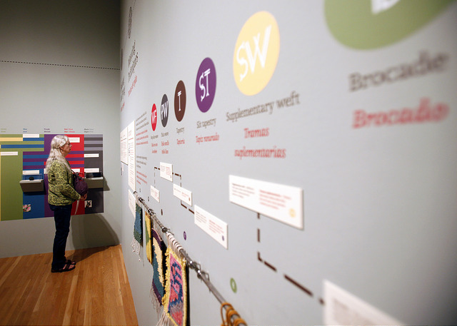
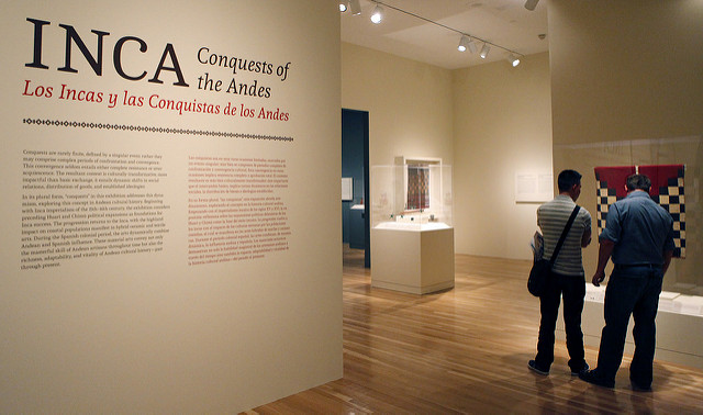
Since the Center for Creative Connections (C3) first began implementing bilingual signage on table prompts and wall text, the DMA has introduced a number of additional resources for visitors who want to engage with art by reading, writing, or listening in Spanish. Through a collaboration with Make Art with Purpose, C3 produced the Translating Culture and Translating Culture II gallery guides based on community voices. The 2015 exhibition Inca: Conquests of the Andes/Los Incas y las conquistas de los Andes featured English and Spanish text on its labels and wall didactics, as well as an interactive art scavenger hunt available in both languages. Visitors can also find extended labels in English and Spanish related to two works by Frida Kahlo currently on view in Level 4.

Here are some more bilingual resources we’ve introduced during the past year:

First Tuesday Spanish Family Tours

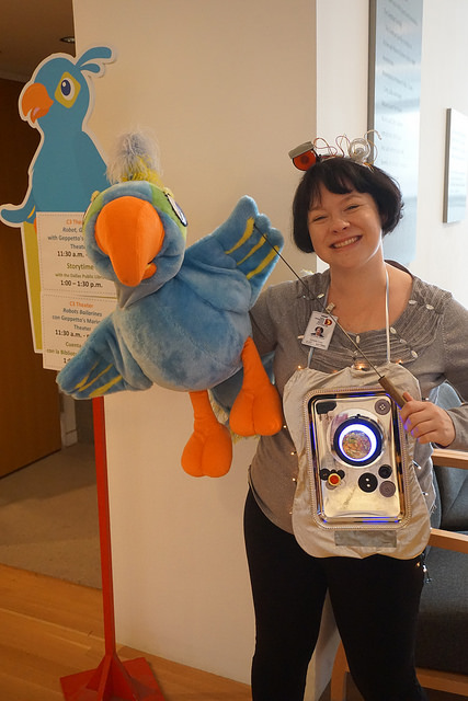
On the first Tuesday of the month from September through May, visitors ages 0-5 and their grown-ups are invited to join Museum staff for interactive tours throughout the galleries in both English and Spanish. This past year, I had the pleasure of leading families on Spanish tours inspired by nature, sculptures, robots, pop art, and more. Additionally, the signs and schedules for First Tuesday this past year were printed in both English and Spanish.

Create an exvoto / Crea un exvoto Activities

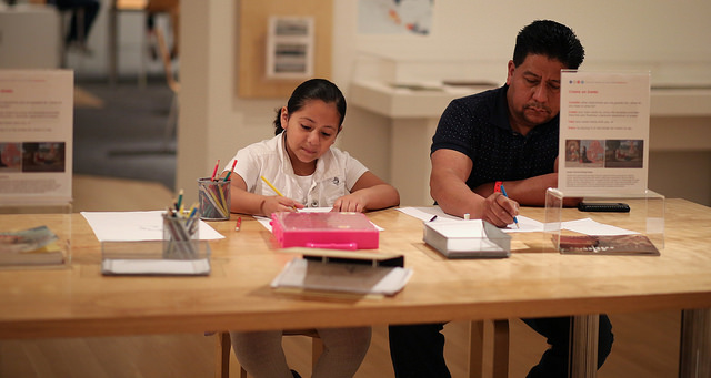
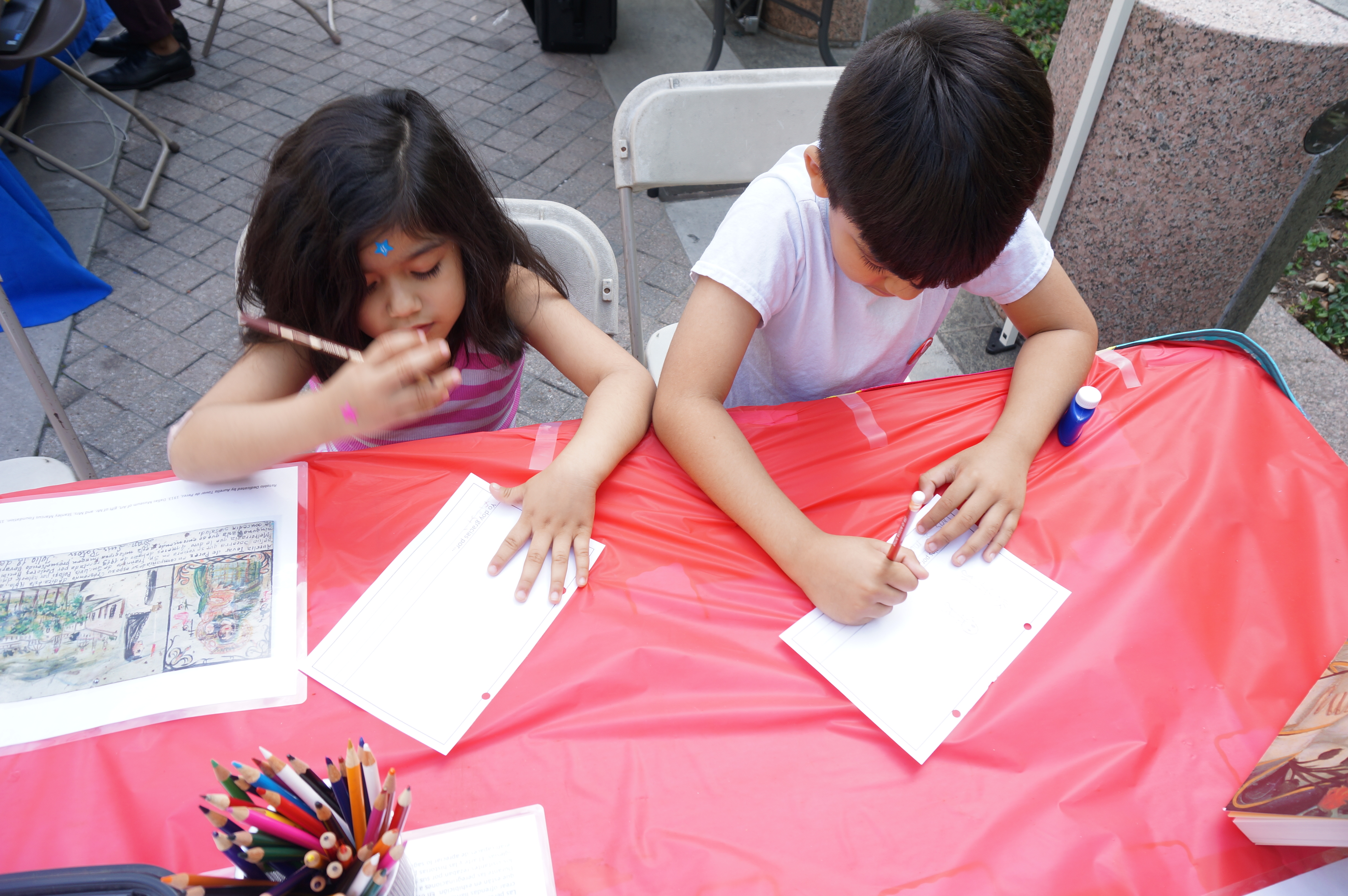
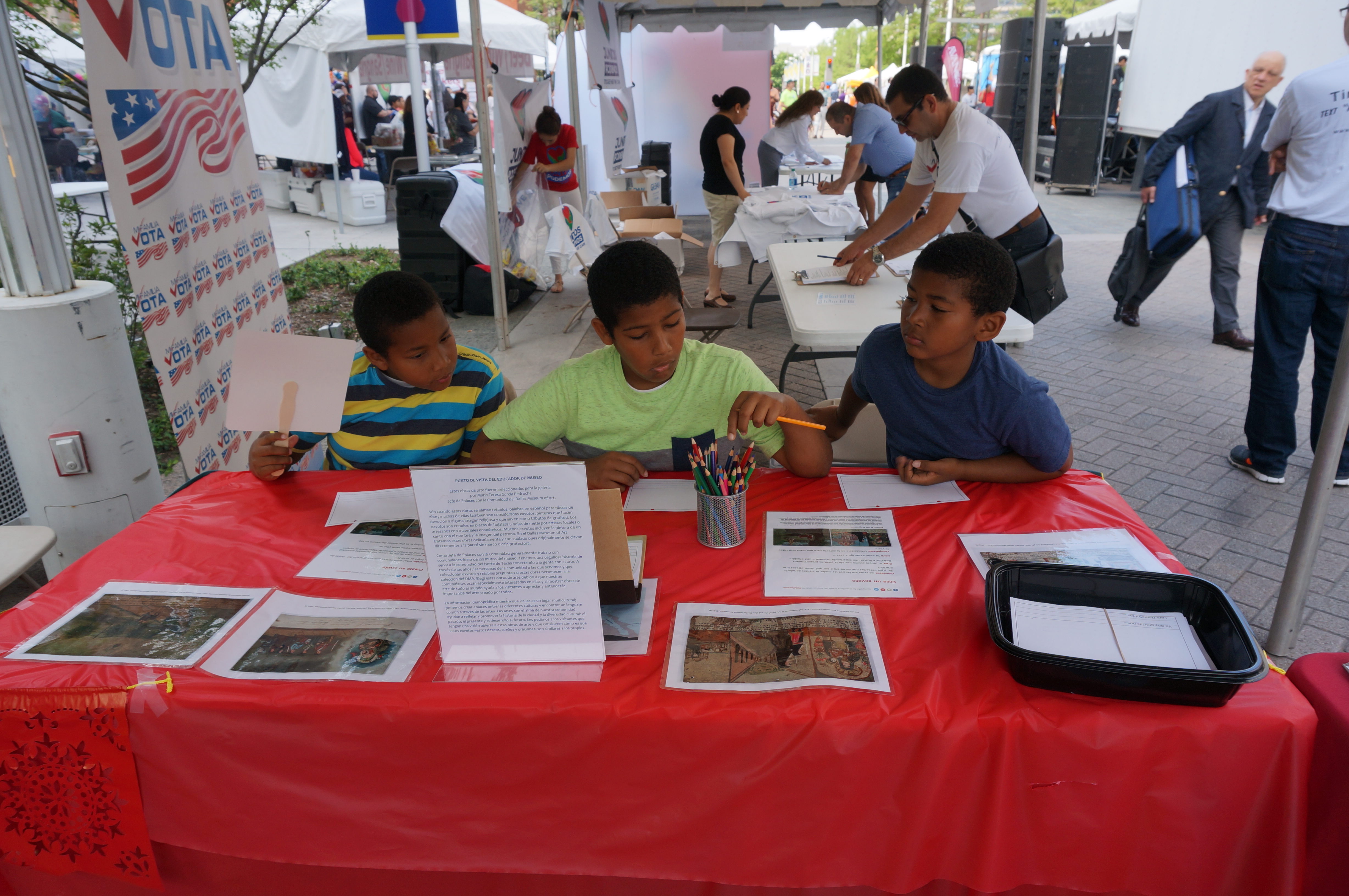
The inspiration behind this table activity in the Interactive Gallery came from the exvotos on view in C3, which contain Spanish text describing everyday miracles and expressions of gratitude. When Community Engagement staff designed an off-site version of this activity at the 2016 AVANCE Latino Street Fest, we included bilingual exvoto instructions and templates giving visitors the option to write in English or in Spanish.

Young Learners Gallery

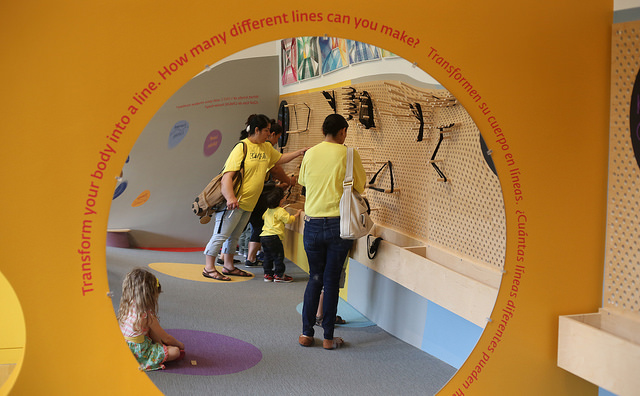
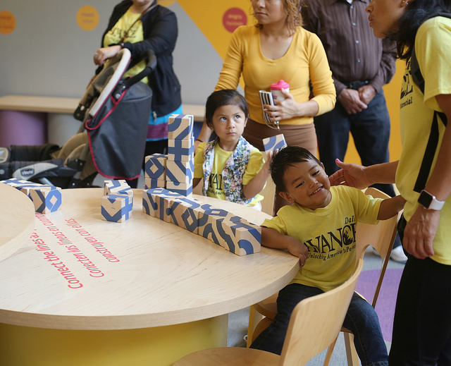
Part of the recent redesign for this interactive learning space includes bilingual wall text and activity prompts for children ages 5-8 and their families. Visitors can explore lines and line-making using English and Spanish text, and the various hands-on activities in the space were designed for a number of different learning styles.

Spanish Family Guides (COMING SOON!)

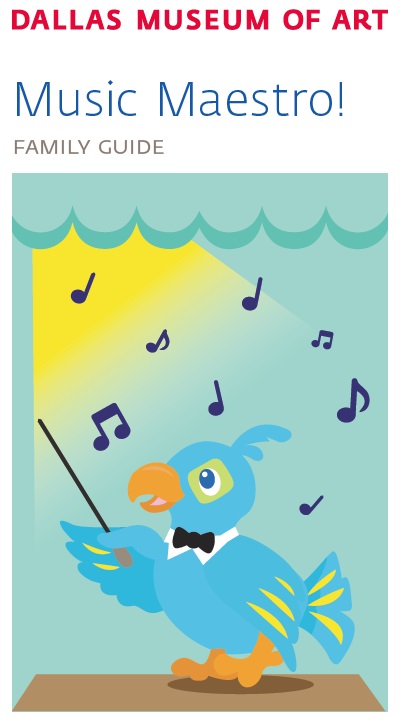
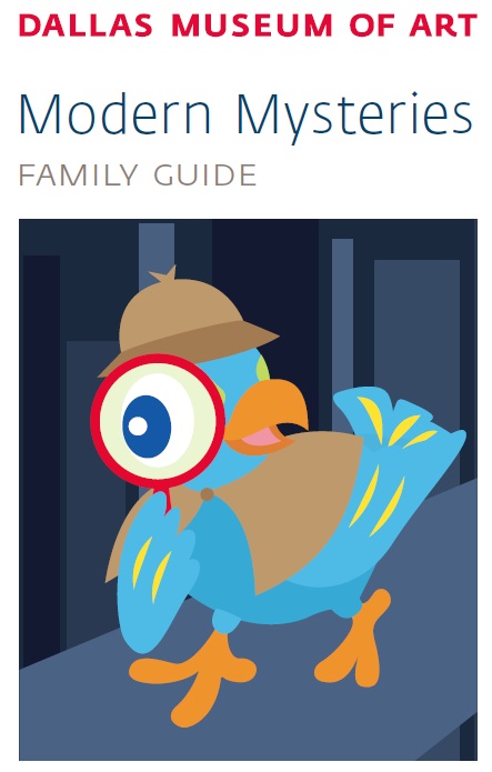
Visitors can pick up Arturo Family Gallery Guides for a fun way to explore the galleries at their own pace. Each one contains activities and questions (and maybe a few puns) for kids and their grown-ups to make meaningful connections with pieces throughout the DMA. Keep an eye out for Spanish language family guides coming soon!

Museums around the country are engaging linguistically diverse audiences in innovative ways, including video guidesco-taught bilingual gallery lessons, and workshops for adult immigrants. What other ways have you seen museums welcome visitors with diverse language backgrounds?

Paulina Lopez
McDermott Graduate Intern for Visitor Engagement
 

Creativity Matters

Creativity_Matters_09_2015_GC064

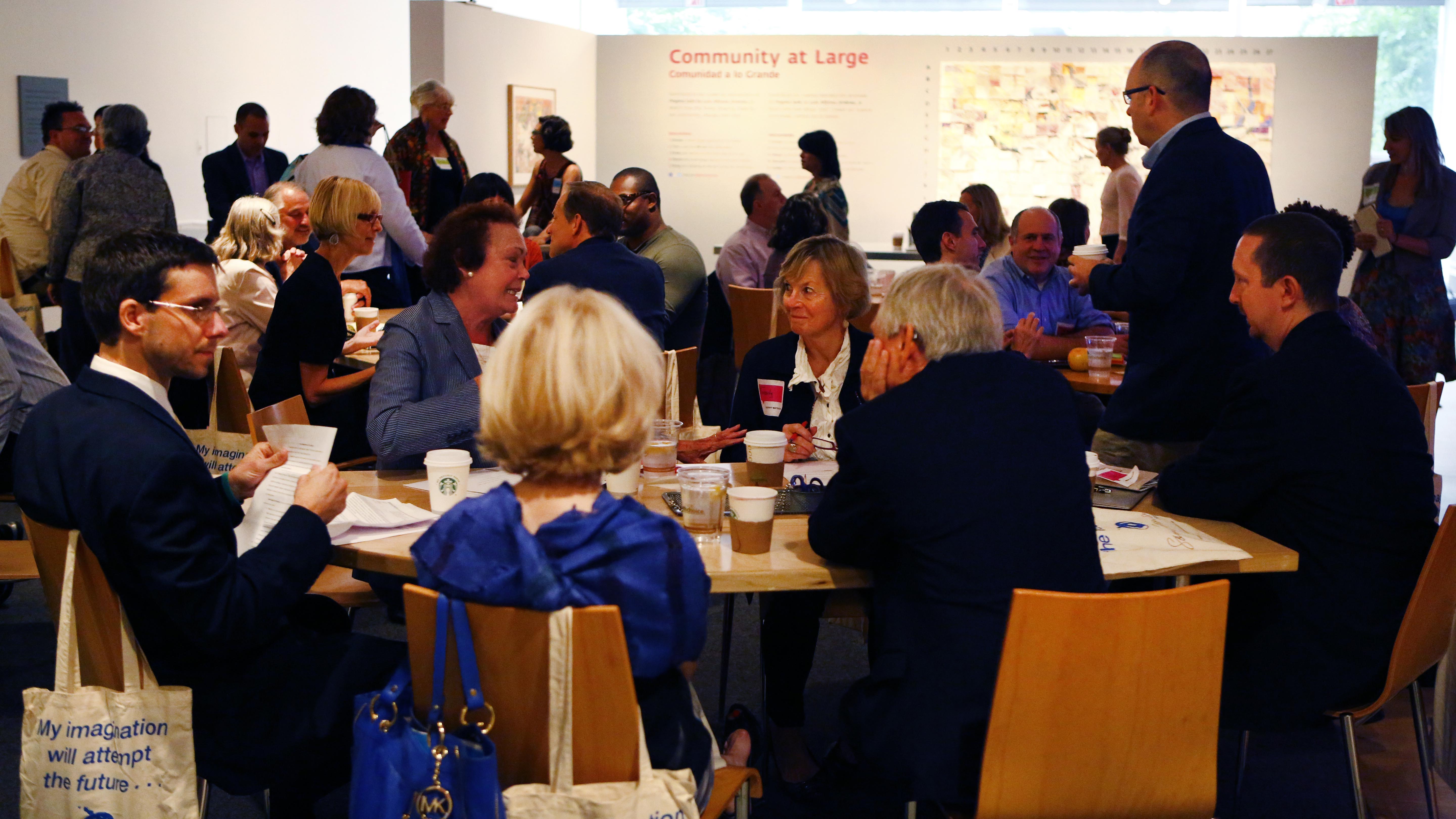
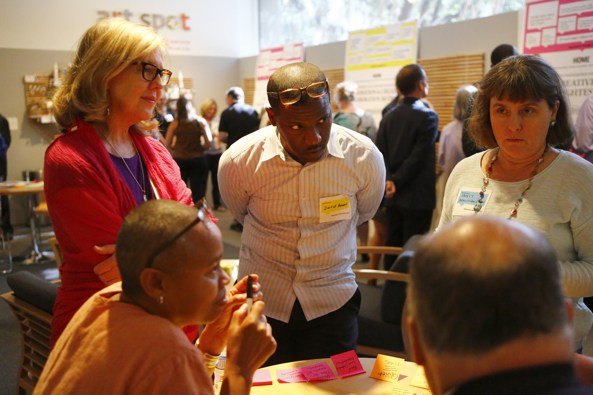
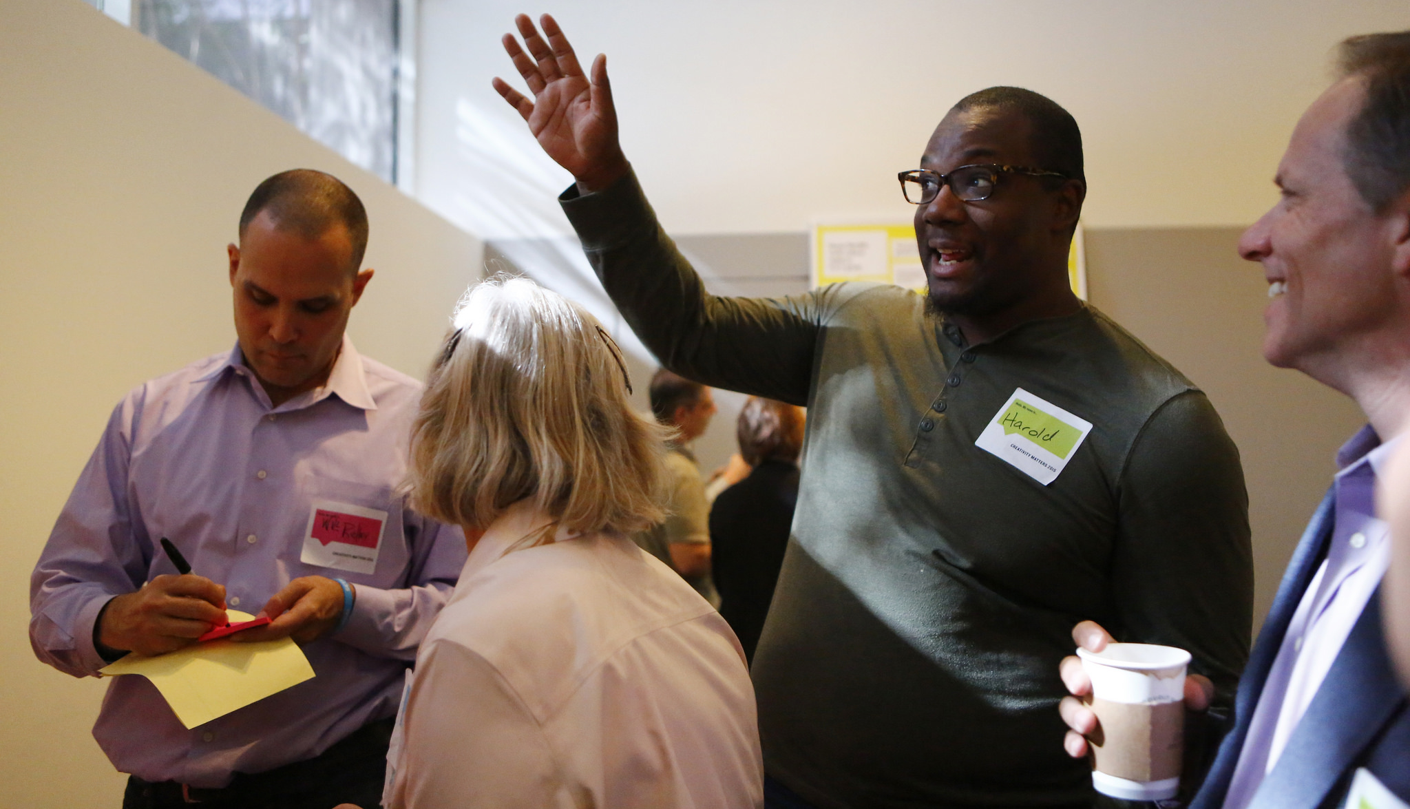
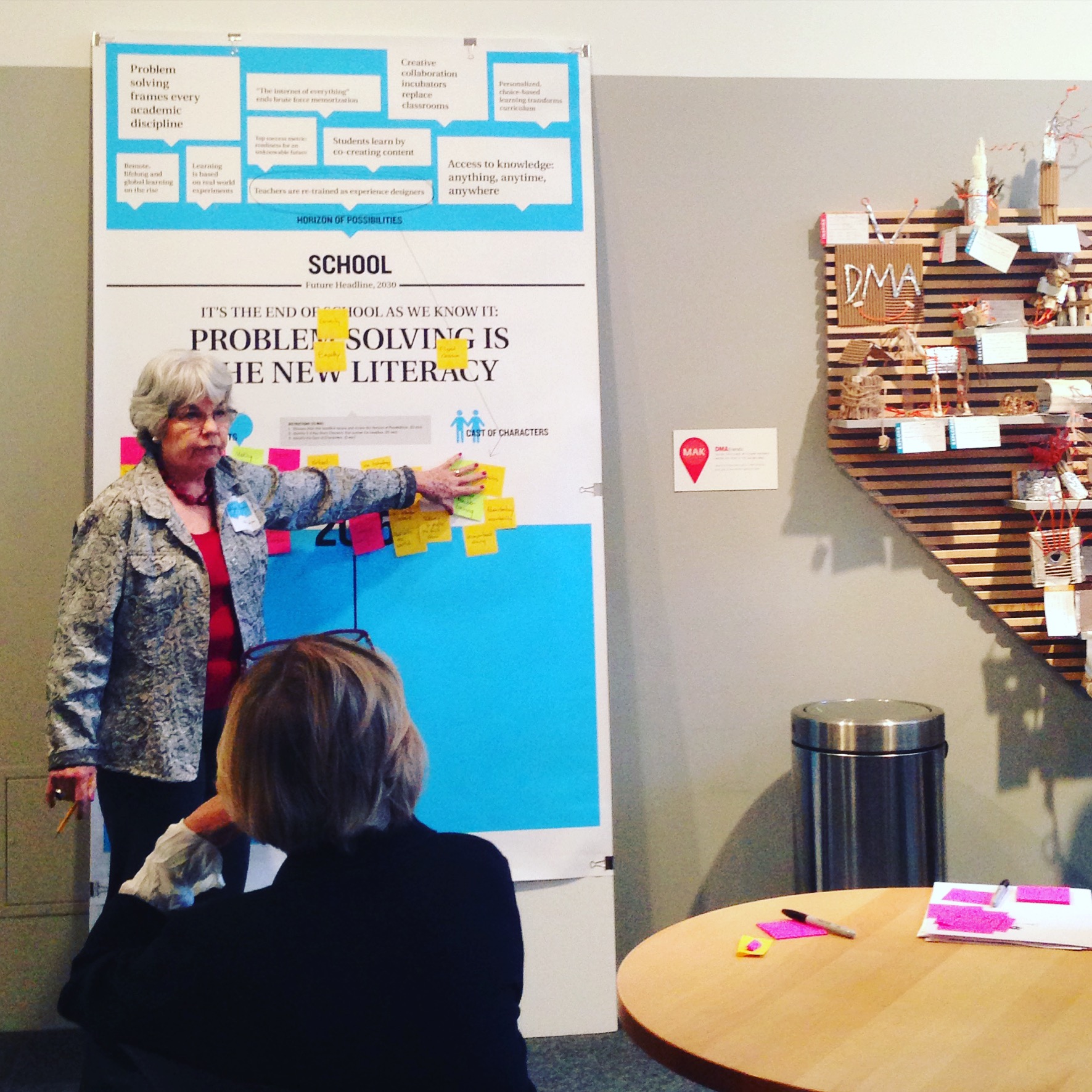
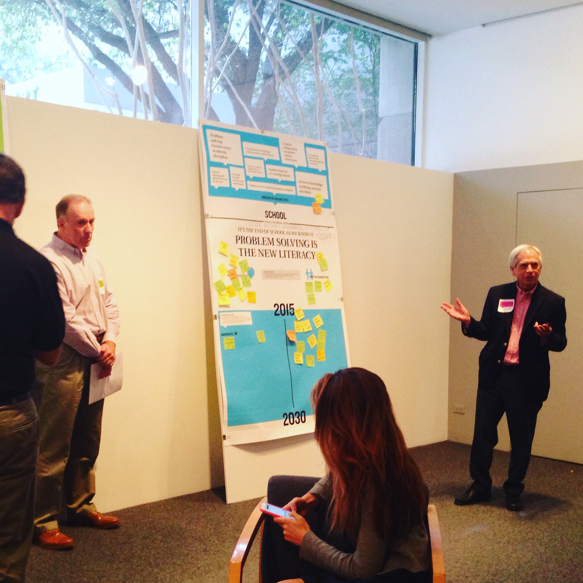
Because the Dallas Museum of Art is closed to the public on Mondays, those days are often strangely quiet without the buzz of school children and families in the Center for Creative Connections (C3). However, on Monday, October 5, C3 was brimming with energy from some of the creative educators, artists, and community organizers that make Dallas great. Earlier this year we were approached by the Sam Francis Foundation to be one of three organizations across the country to host a roundtable event focused on the Future of Creativity.

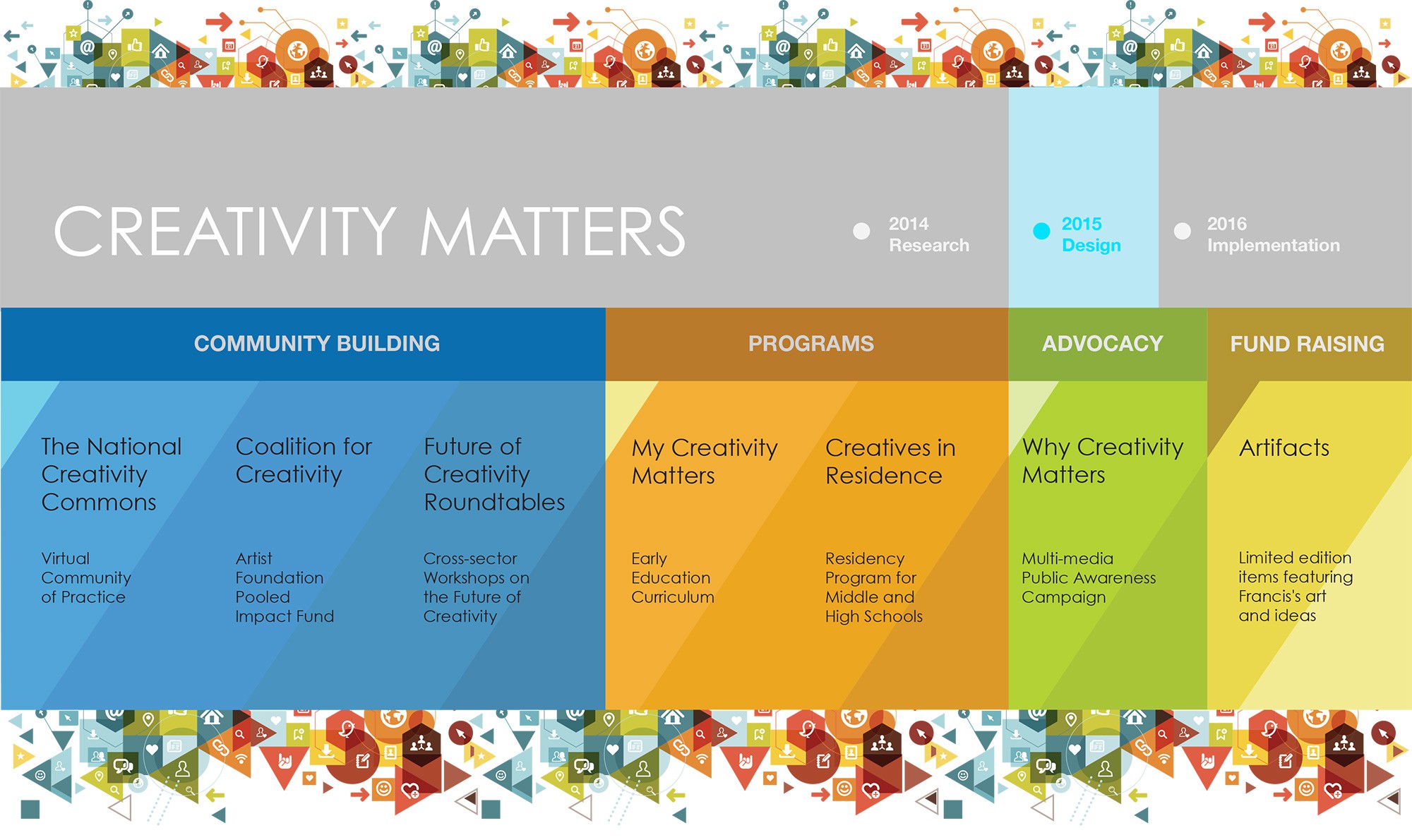
In 2014, the Sam Francis Foundation set out to start a national conversation about the importance of creativity in learning, and they called this initiative Creativity Matters: The Campaign for Creativity in Learning. The first year they partnered with Project Zero at the Harvard Graduate School of Education, and brought together leaders throughout the field in conversations across the United States (at LACMA, The Met, The Isabella Stewart Gardner Museum, and The Exploratorium). These first conversations were centered around two questions:

What does creativity look like?

Where and how does creativity thrive?

Following their 2014 roundtables, the Sam Francis Foundation compiled their findings in this report.

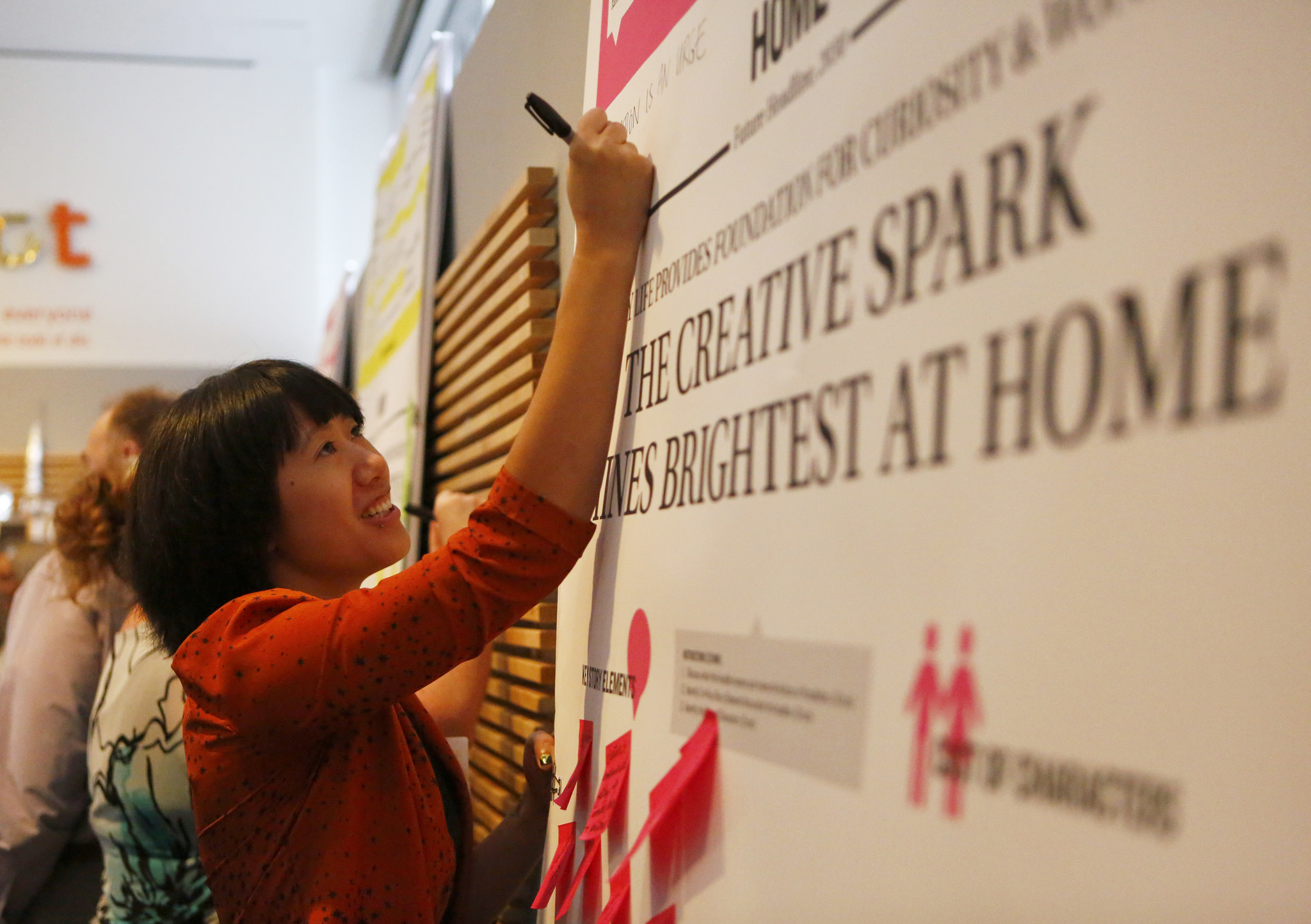
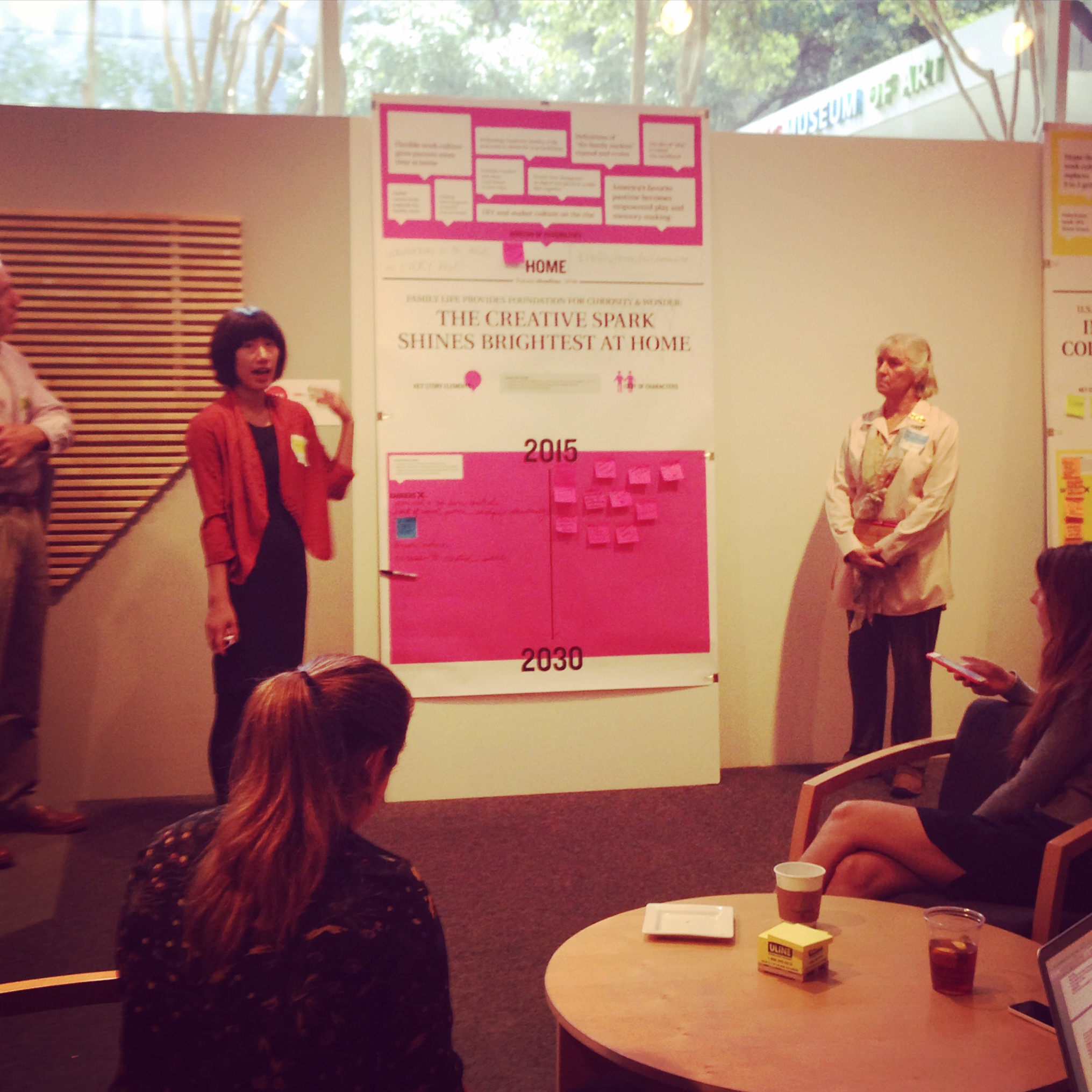
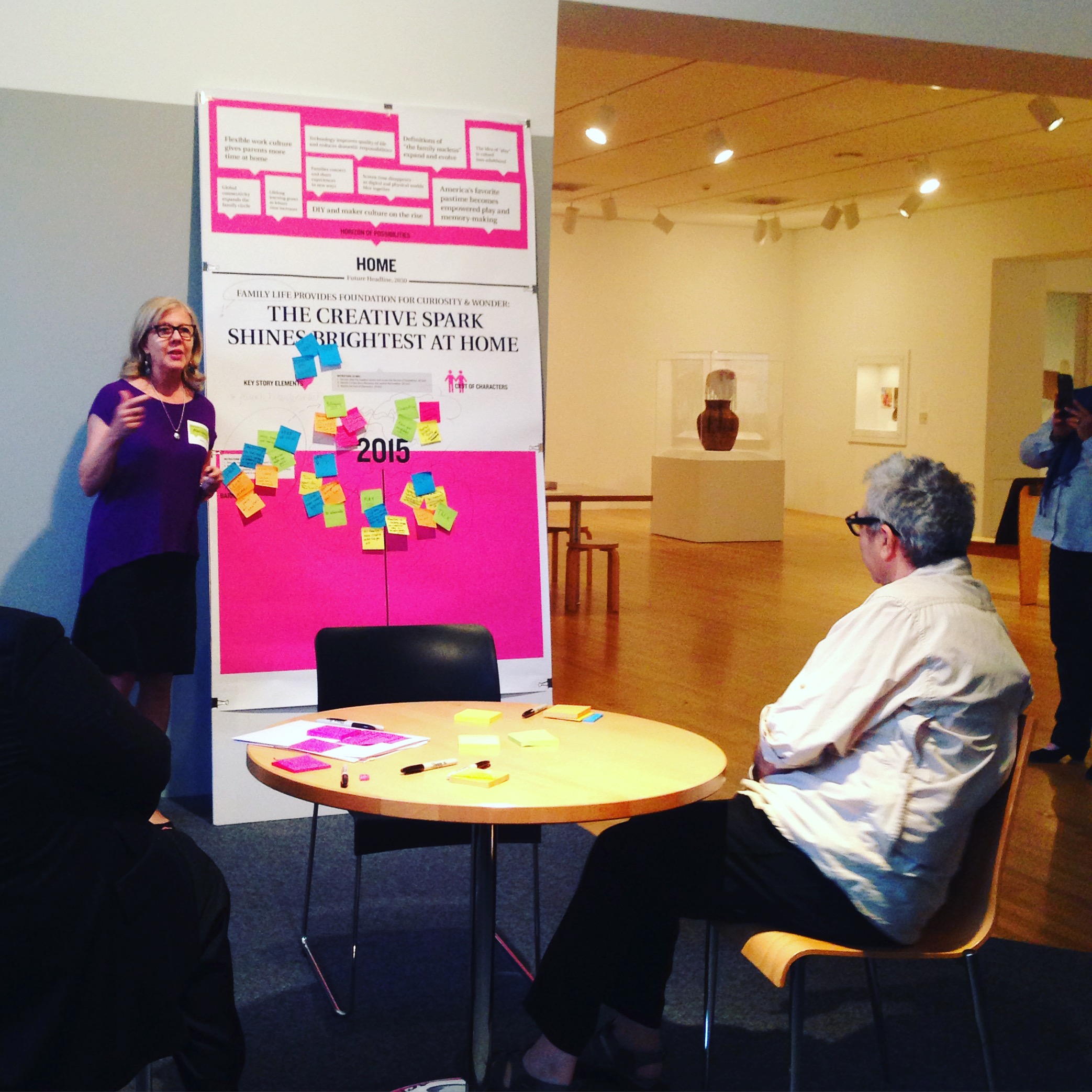
This fall, the Sam Francis Foundation continued the conversation with a set of roundtables at the Museum of Contemporary Art in Chicago, The Smithsonian Institution in Washington D.C., and the Dallas Museum of Art.  These Future of Creativity discussions sought to understand the role creativity will play in the future and the changes needed to prepare students for what that world might look like. Considering the future of creativity in our homes, workplaces, schools, and neighborhoods, our conversations were sparked by these questions:

In twenty years how will creativity shape the world we live in?

How will creativity inform our decision-making?

What new conditions will be needed to unleash creativity?

If we were building a “creativity tool-kit” for future generations – what tactics, methods, and advice would we include?

It was truly remarkable to have so many Dallas leaders, artists, and educators (many of whom we have worked with closely in the past) together in the Center for Creative Connections. The conversations were dynamic, engaging, and inspirational.

Yet, these roundtables are just part of the beginning stage for a grander plan involving community building, the creation of programs, and a public awareness campaign in support of the future of creativity.

creativity-matters.2015-projects.sff-logo.revised_3_25

In the end, I will leave you with some of my favorite quotes from the day.  Some are specific to creativity, and others are general gems to keep in mind.

This slideshow requires JavaScript.

Jessica Fuentes
C3 Gallery Manager


The Signs They Are A-Changin’: Bilingual Museum Signage

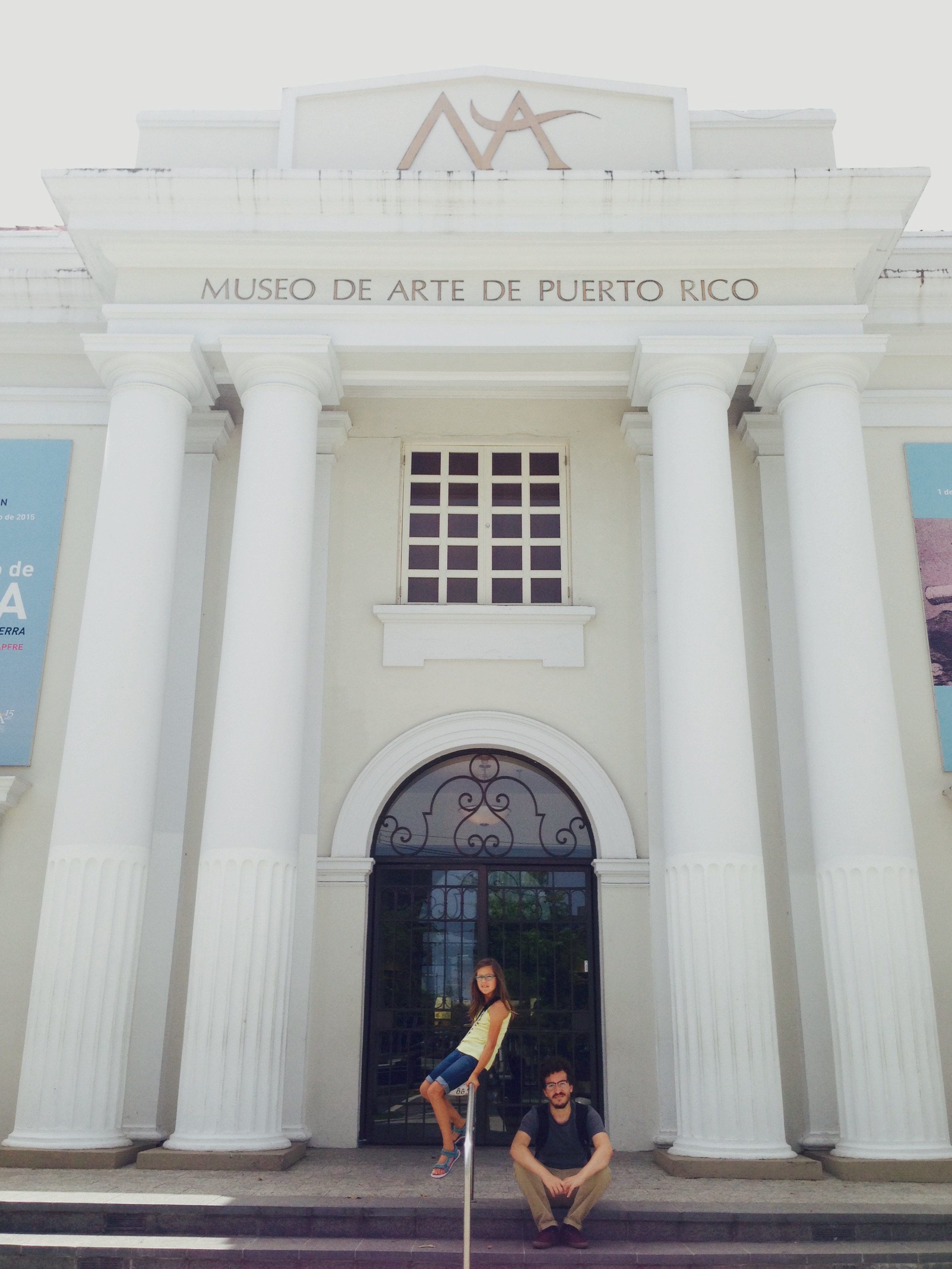
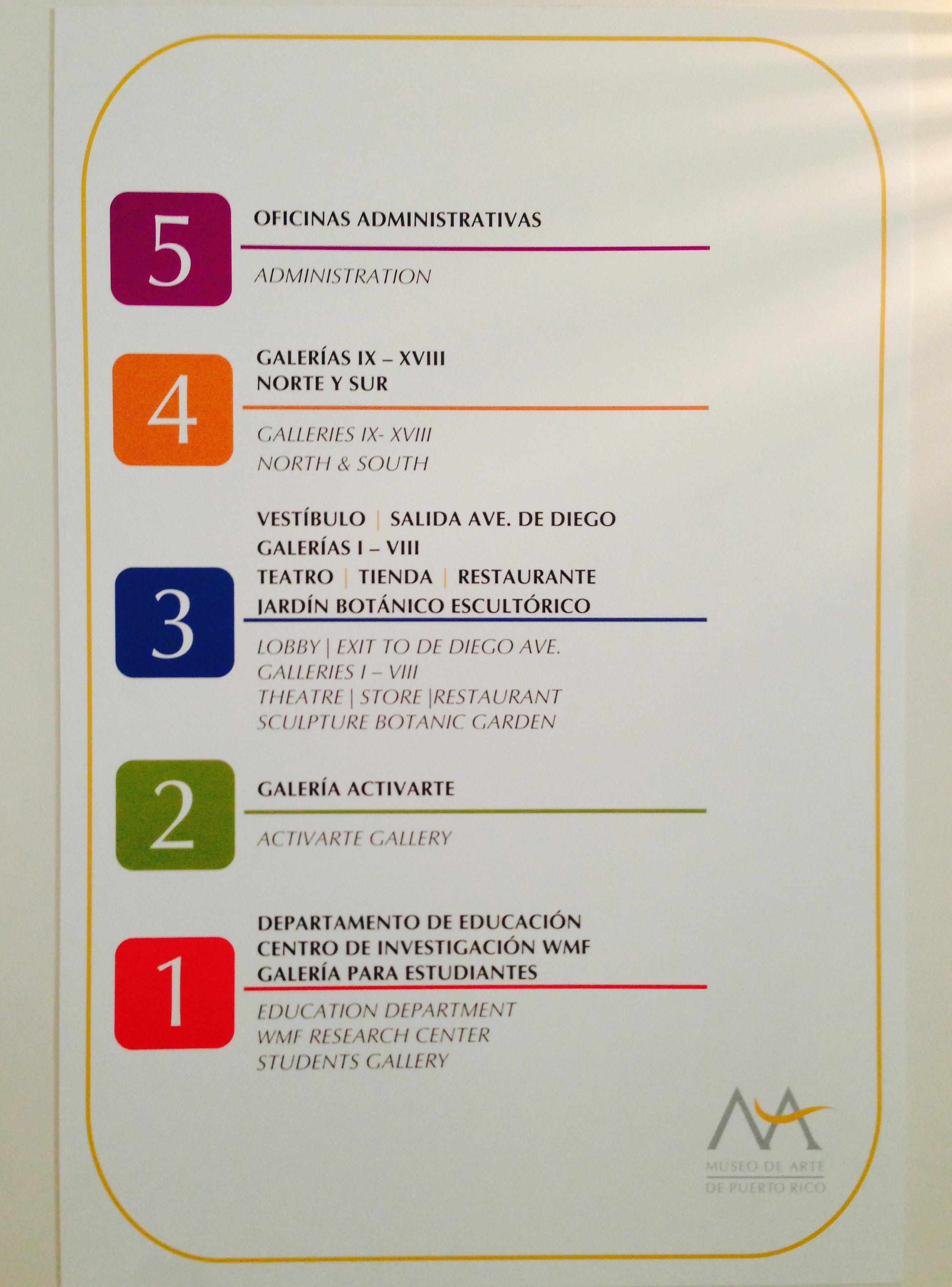
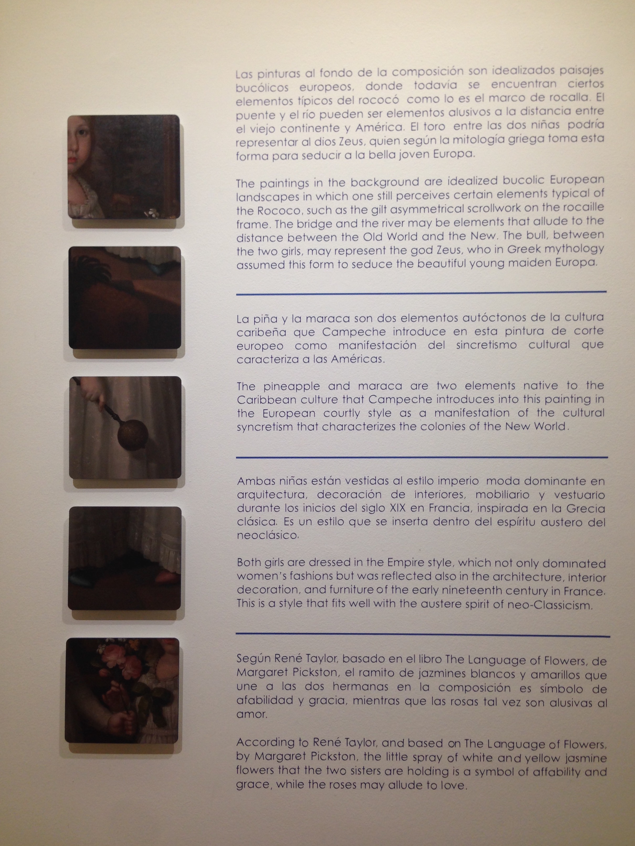
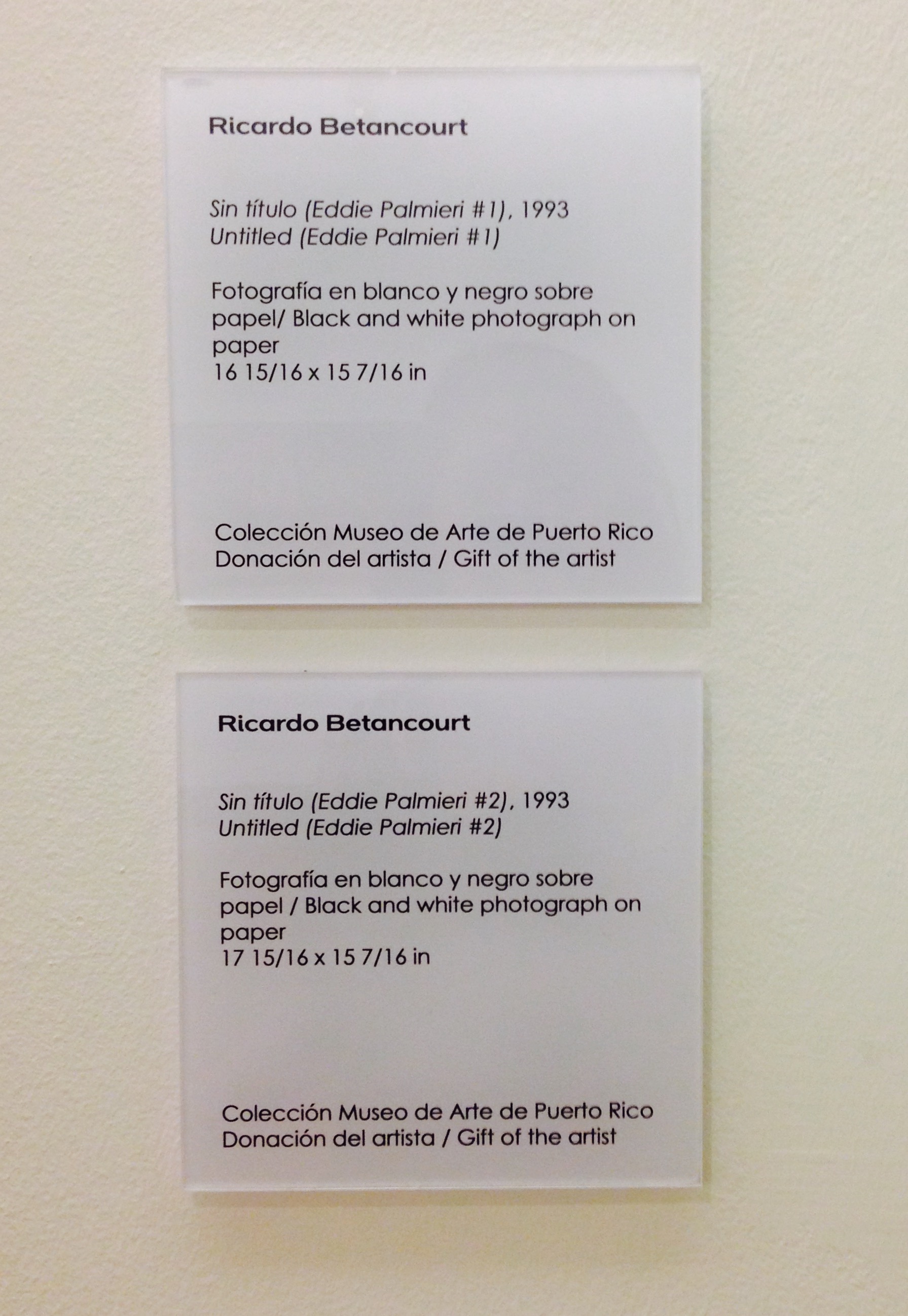
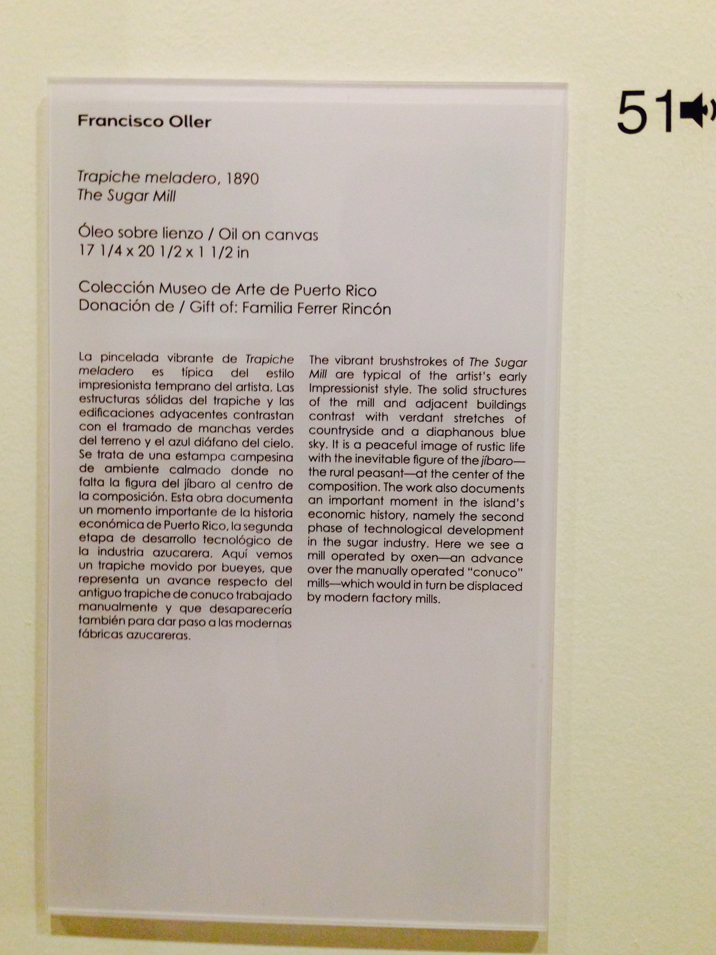
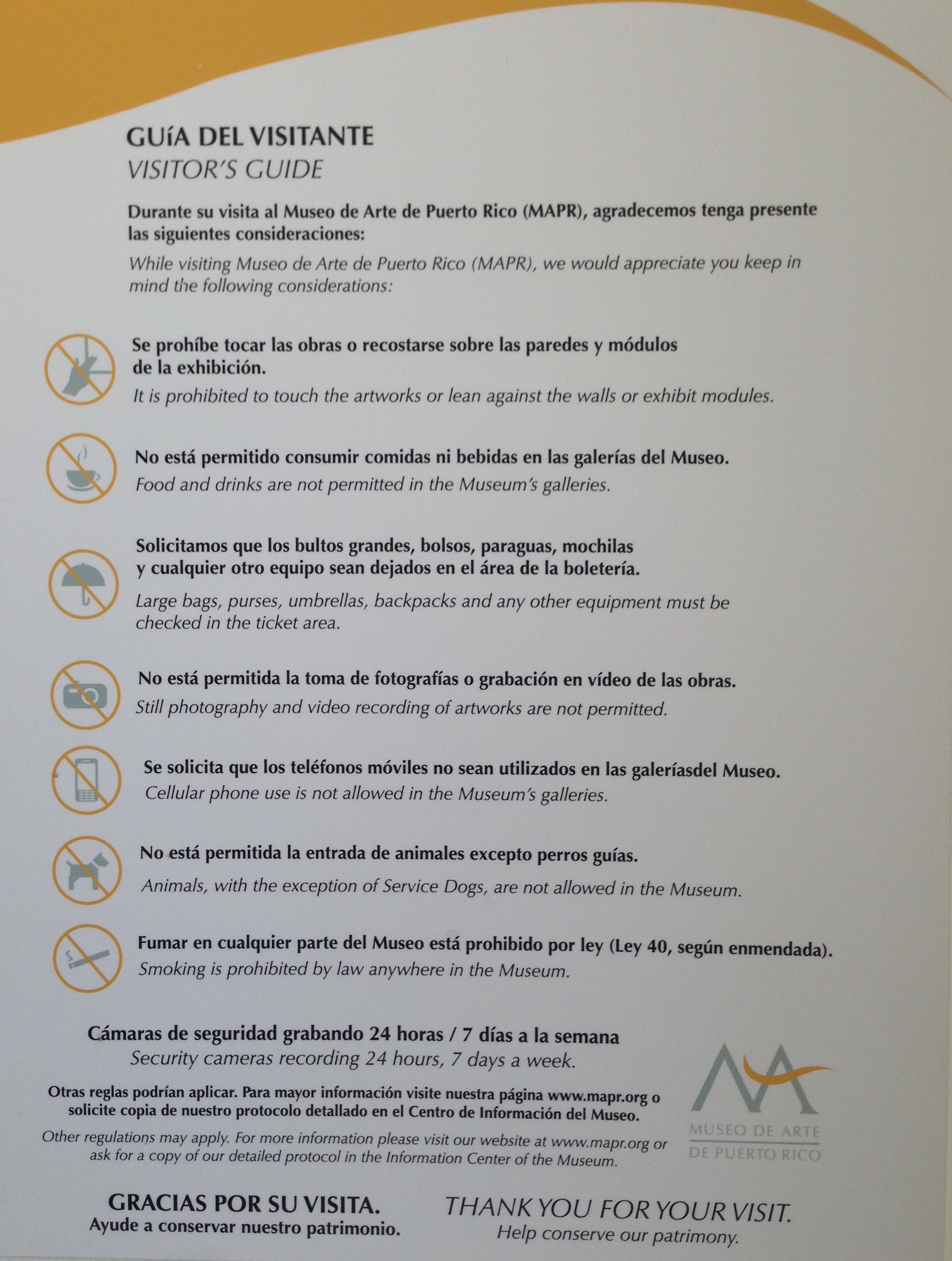
FullSizeRenderLast week, while vacationing in San Juan with my family, we stopped by the Museo de Arte de Puerto Rico. When I travel to a new city, I always like to visit the museums to see their collections and learn about their educational initiatives. Puerto Rico is a US Territory, but it’s quite a different place than any of the fifty states. Though my family is bilingual, I’m a non-Spanish speaker, so I was pleased to learn that Puerto Rico is bilingual. Many residents speak both Spanish and English and, to my delight, all of the museum signage was bilingual! As a museum educator who has been involved in making signage more accessible, it was amazing to walk in and find that everything from the museum map to the artwork labels were in both Spanish and English. (Click on the images below to enlarge.)
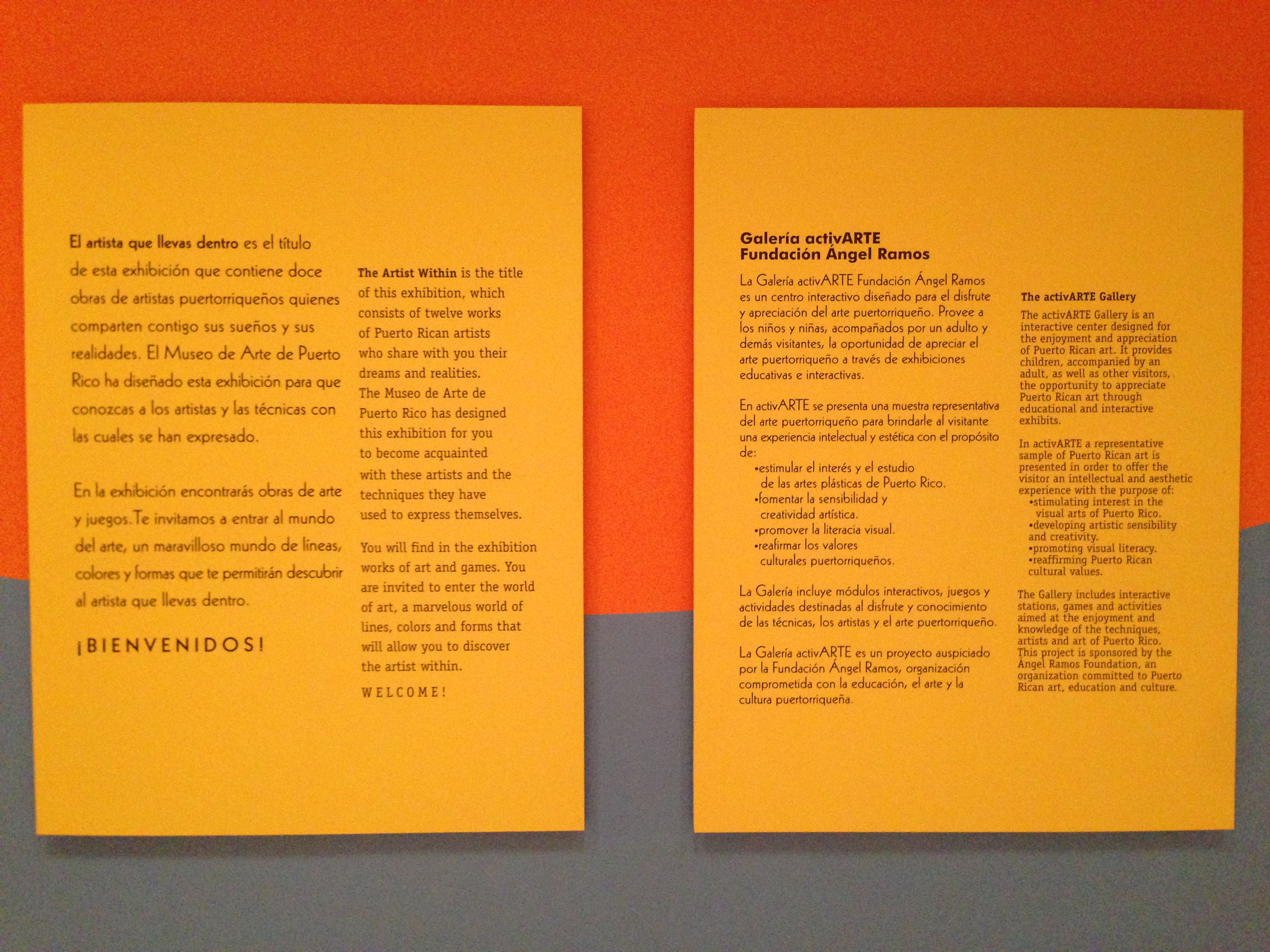
 

Last year Steve Yalowitz wrote a guest post on Nina Simon’s blog about the significance of bilingual signage. As co-author of the Bilingual Exhibit Research Initiative, which strove to better understand bilingual labels from the visitor perspective, Yalowitz offered these three points as significant findings:

  1. Code-switching – We found lots of evidence of effortless switching back-and-forth between English and Spanish….The power of bilingual text is that it’s bilingual – it provides access in two languages, and code switching lets you understand and express yourself from two different perspectives, with two sets of vocabulary.

  2. Facilitation – We researched intergenerational groups, so it’s not surprising that many of the adults saw their role as facilitator as essential to their own and the group’s success in the exhibition….With Spanish labels available, adults were able to facilitate, guiding the conversations and interactions, showing their children, grandchildren, nieces and nephews where to focus and how to interact. Adults who were previously dependent on their children could now take the lead as confident facilitators.

  3. Emotional reaction – This study found that the presence of bilingual interpretation had a profound emotional effect on the groups. Groups said they enjoyed the visit more, felt more valued by the institution, and many said having bilingual interpretation changed how they felt about the institution.

When I read Yalowitz’s article last year, it opened my eyes to the experiences of non-English speakers in museums with English only text. But the experience was made even more tangible as an English speaker visiting the Museo de Arte de Puerto Rico. Had the text only been in Spanish, I would have had to ask my daughter or significant other to translate for me. This would not have been impossible, but rather inconvenient. If I stopped to look closely at a work of art that they were not interested in, I would have to call them back and interrupt their experience to get assistance understanding the label. Having bilingual text allowed me to take on the role of facilitator, reading the label and prompting my daughter with questions, and allowed my family to switch between Spanish and English comfortably. Furthermore, going beyond bilingual label text and providing bilingual directional signage was significant as well: we were each able to easily and equally participate in the entire museum experience.

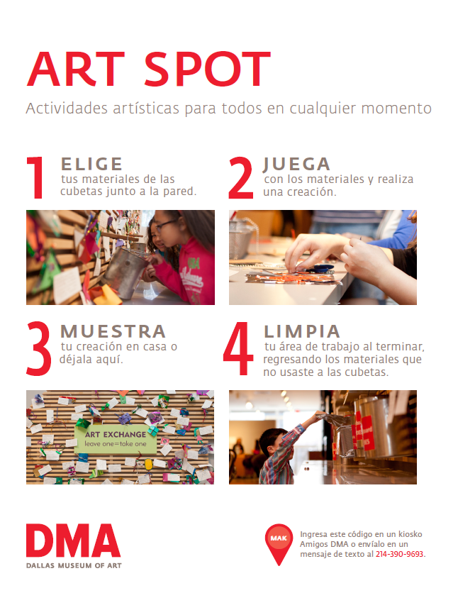
Over the last few years, the Center for Creative Connections (C3) has begun to incorporate bilingual text and voices in a variety of ways. This initiative began soon after the DMA moved to free general admission. With this change in our admission policy, our overall number of visitors and the diversity of those visitors increased. The need for accessible signage for Spanish speakers was apparent, so in late 2012 we started to test out the use of bilingual prompts at the C3 Art Spot.

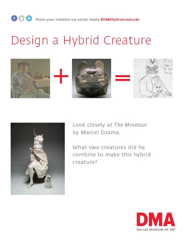
This was the perfect place to start because it is one of the busiest spaces in the Center for Creative Connections. It was also easy to begin using bilingual text in these kinds of prompts because these signs typically change more often and are easier to alter than more permanent wall signage. In 2014, we began to use bilingual activity prompts in the main C3 Gallery as well. This is a prompt for an activity where visitors use a light box and reproductions of works of art from the Museum’s collection to create hybrid creatures.

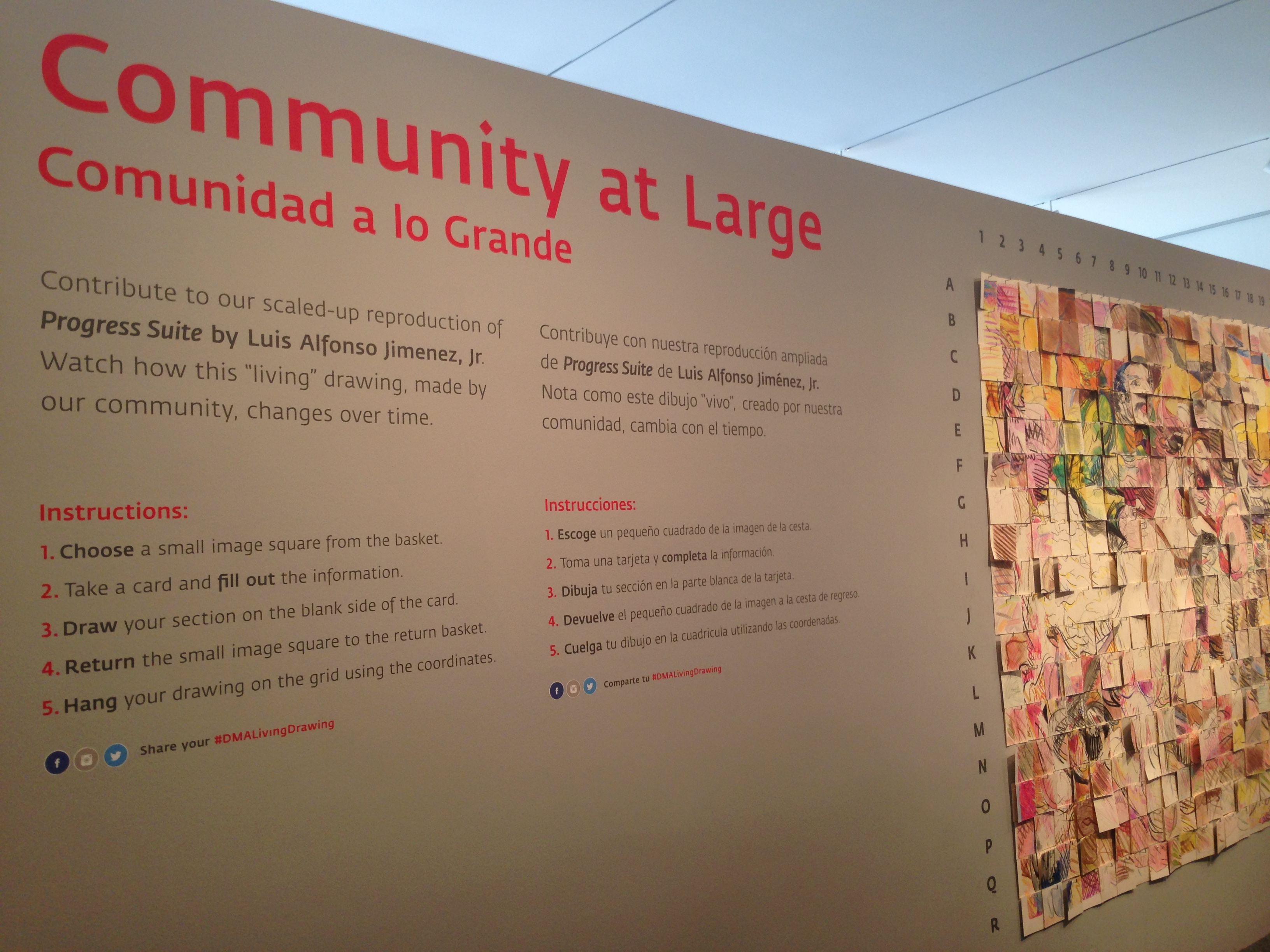
These small steps have been leading up to a bigger change. This year when we installed our Community at LARGE project, both English and Spanish text was included not only in the table prompt, but also on the wall text.

IMG_7413

As we continue to install new works of art in the Center for Creative Connections, our hope is to integrate bilingual text throughout the space.

Jessica Fuentes
C3 Gallery Manager

Community at LARGE

If you’ve visited the Center for Creative Connections (C3) within the last week, you may have noticed that the popular Art Spot is currently under construction. In addition to this redesign, we’re also installing a new work of art and related activity. Often when we plan these types of activities, we begin with the work of art as inspiration. This time, however, we started with the activity and found a work of art that fit.

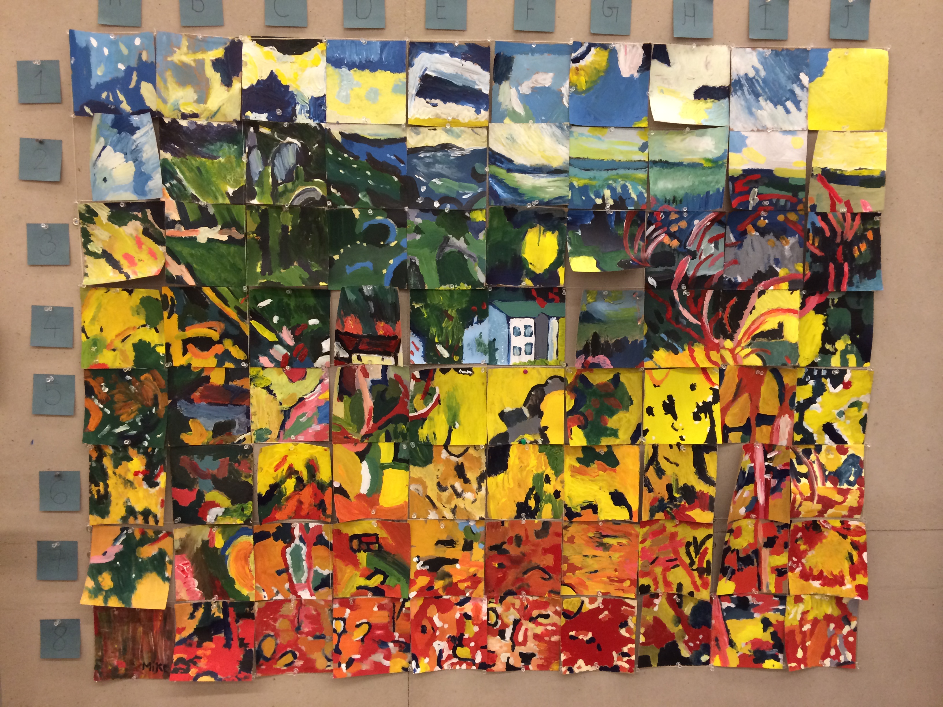
Last summer during our July Late Night we hosted a drop-in program in the C3 Studio where visitors participated in a communal grid enlargement project. As visitors entered the studio they received a small image square and a larger blank card. Their task was to paint the image from their square onto their blank card and then display their painted card on a large grid in the back of the room. Over the course of the evening, the identity of the two paintings were revealed as visitors completed their cards and added them to the wall. The activity was such a success that we decided to recreate it in the C3 gallery this summer.

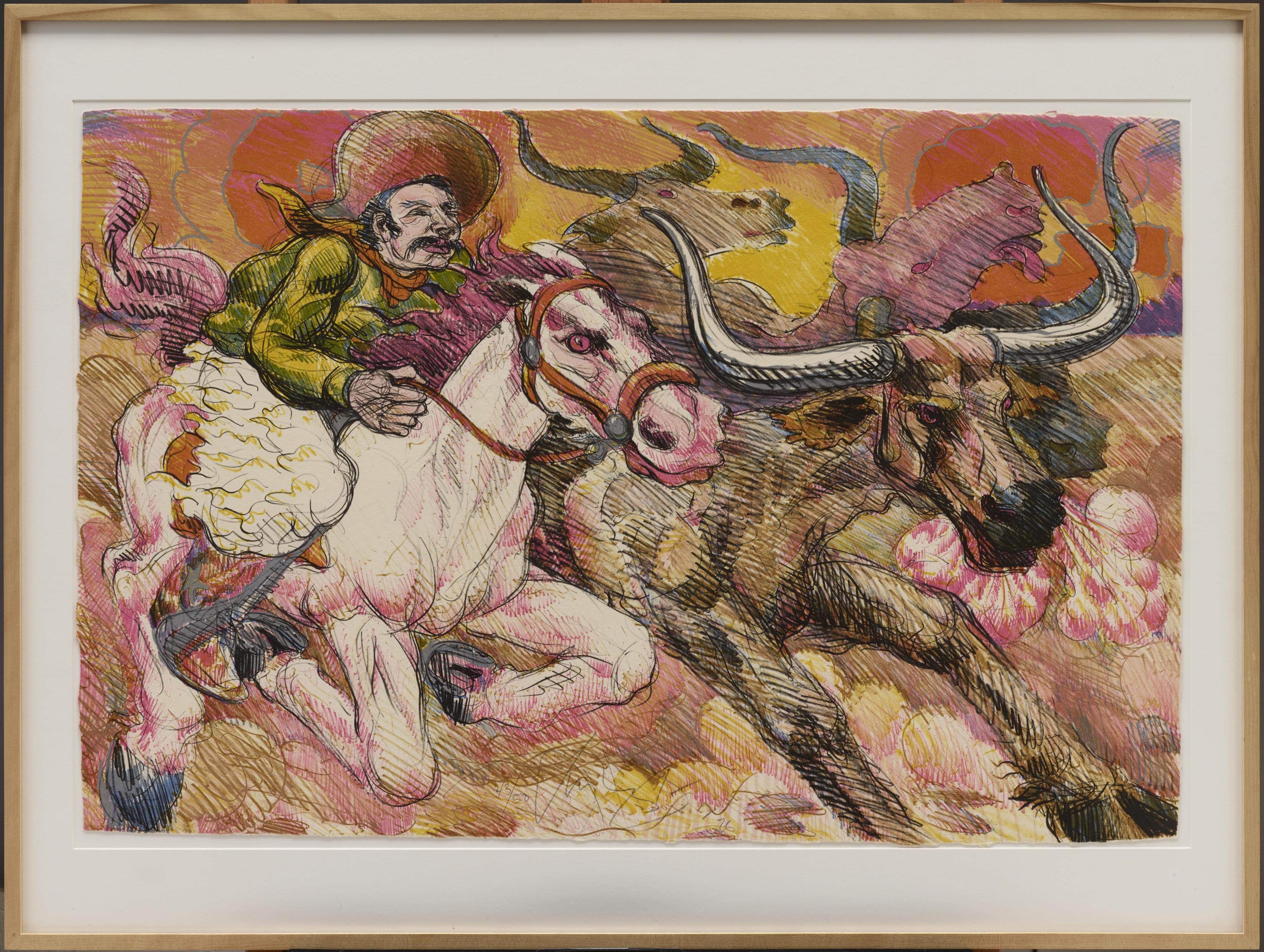
The question was, which work of art to choose? We had a few ideas that guided our decision. First, since this is an enlargement activity, we were looking for a relatively small work of art. Also, since the activity takes place in the gallery, visitors will be limited to using colored pencils, so we wanted a work of art that demonstrated that kind of mark-making. Originally we considered a drawing, but after consulting with our registrars, we found that lithographs or engravings might also be a good option. Finally, subject matter was of great importance; we wanted something bright and lively. All of these specifications led us directly to Progress Suite by Luis Alfonso Jimenez, Jr.

1978_38_3_o4

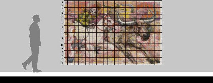
Progress Suite exemplifies all of these qualities: it’s a colorful dynamic lithograph created by a Texas-born artist, measuring 23.5 inches x 35 inches. It will be enlarged by visitors to 300% of its original size. This mock-up illustrates just how large the activity will be.

c3 Protoyping Wall Elevation

Throughout the summer, as more visitors participate, the drawing will grow and evolve. Stop by the Center for Creative Connections to contribute to our scaled-up reproduction of Progress Suite and watch how this “living” drawing, made by our community, changes over time.

Jessica Fuentes
C3 Gallery Manager

Touch Tour for Students with Vision Impairment

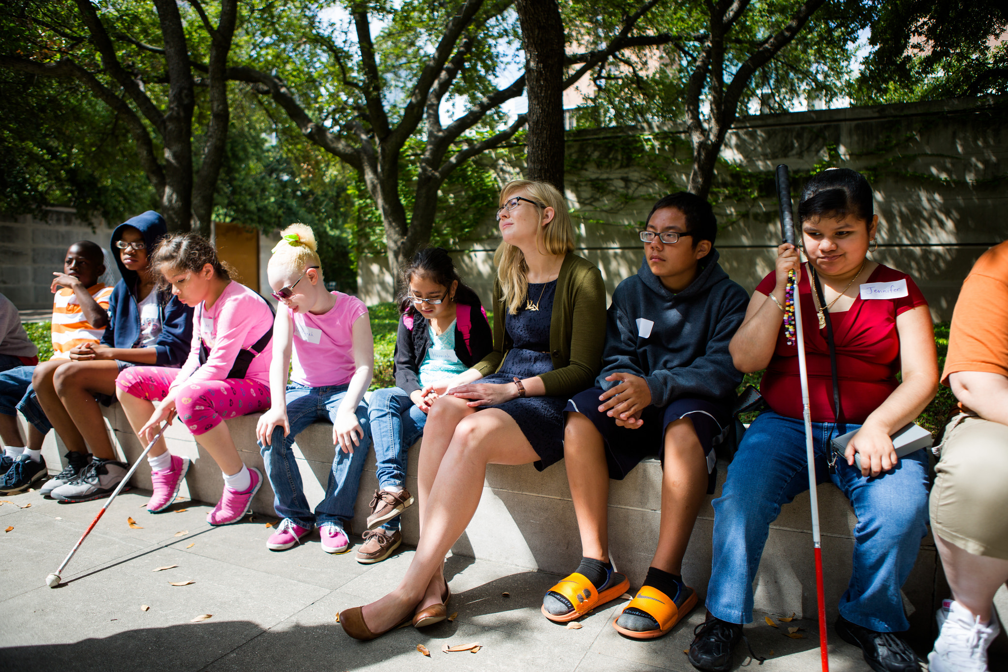
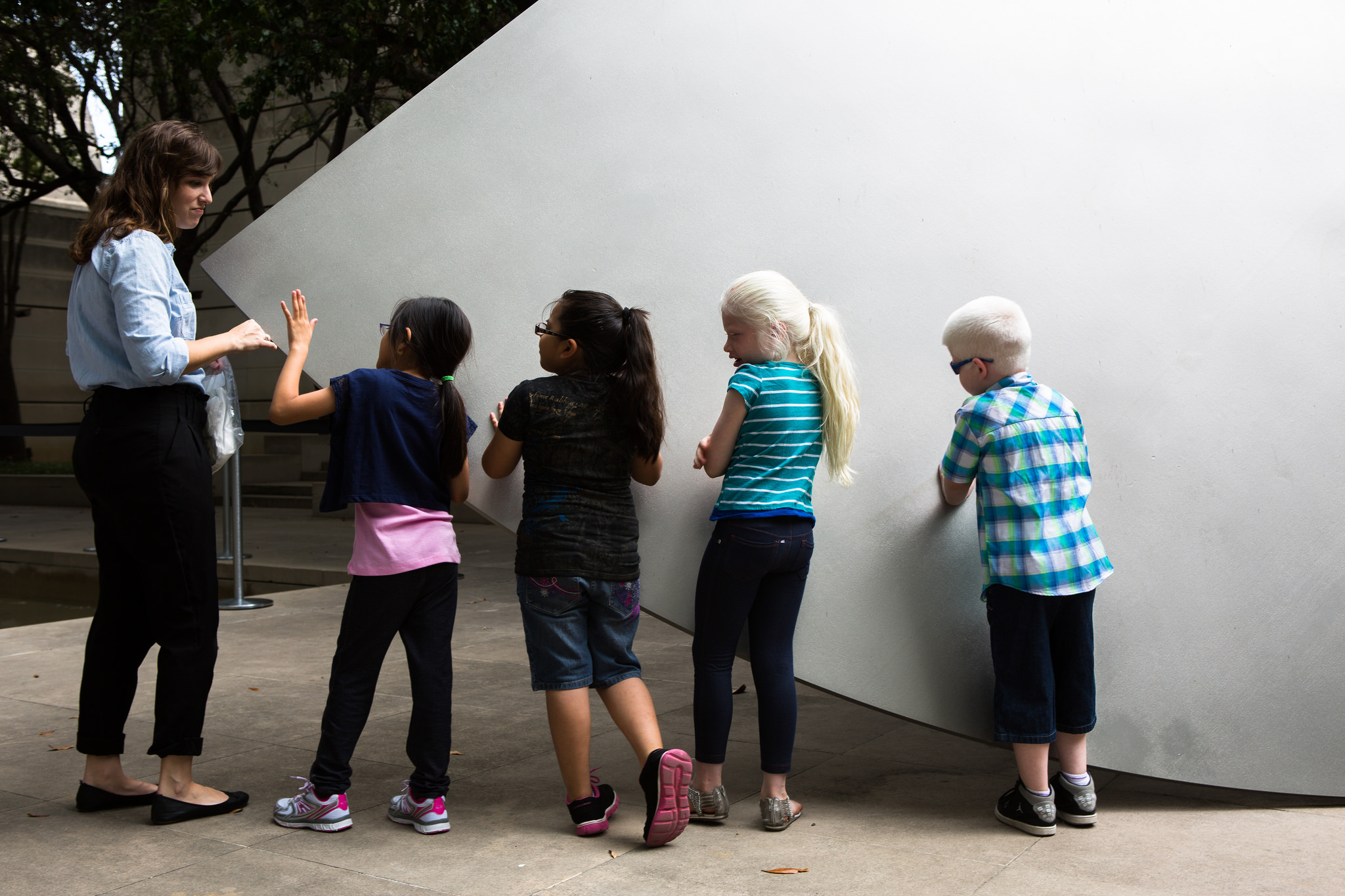
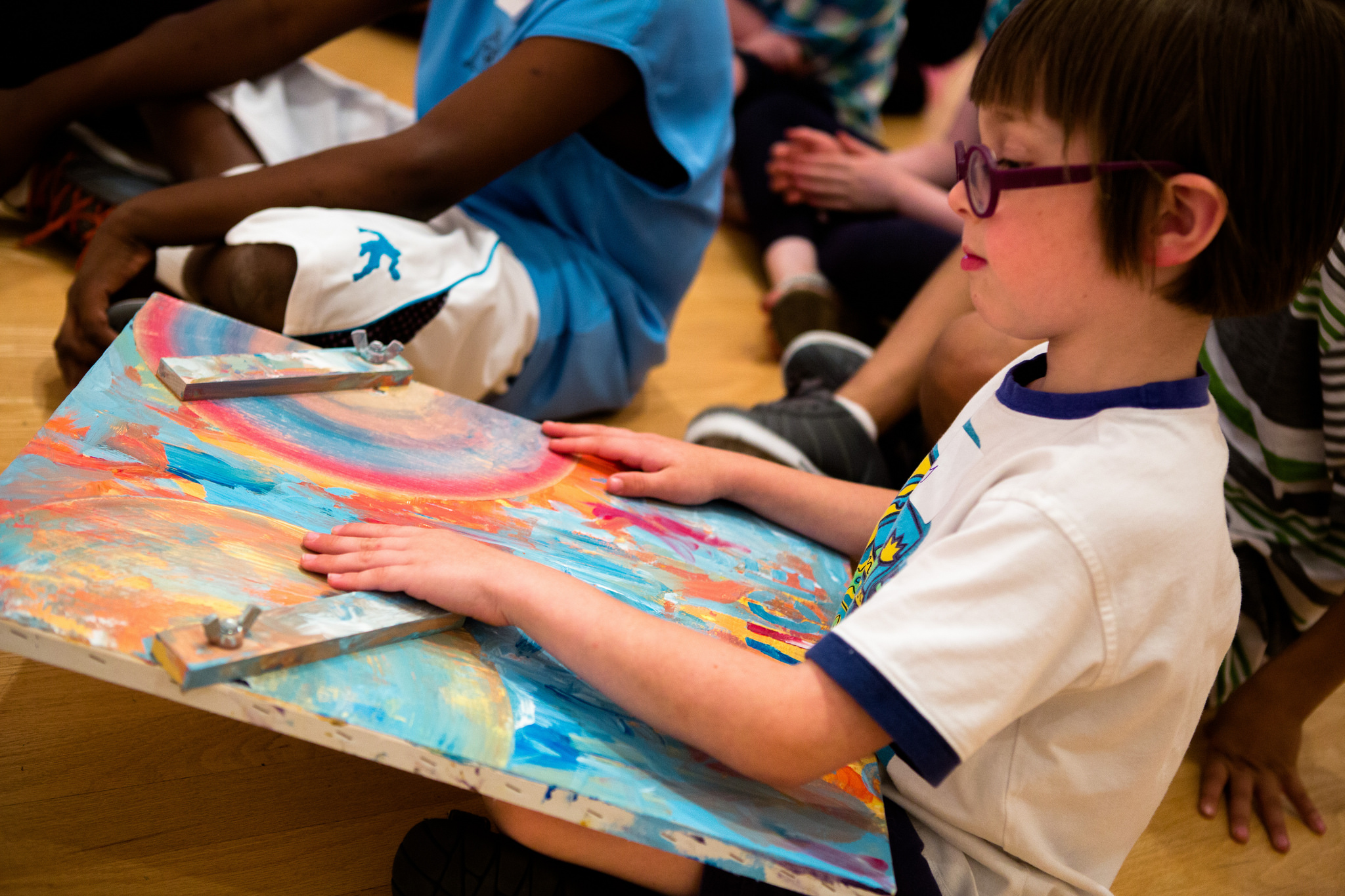
Many people may not think that of an art museum as the ideal field trip location for a group of children with visual impairment, but when the Dallas Independent School District (DISD) contacted the DMA earlier this summer with such a tour request, we were eager to provide the best experience possible. When discussing the visit with vision teachers at DISD, they felt it was important to expose their students to art and wanted an experience that would illustrate to the students that they too have the ability to create and appreciate art just as well as any other student.

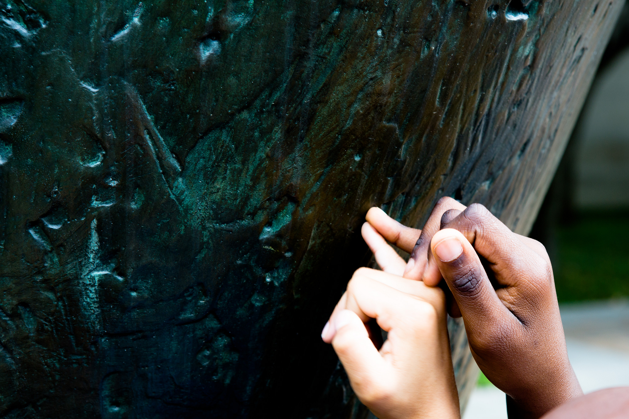
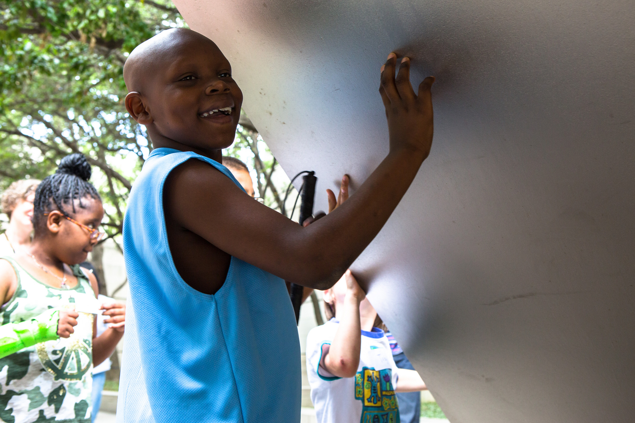
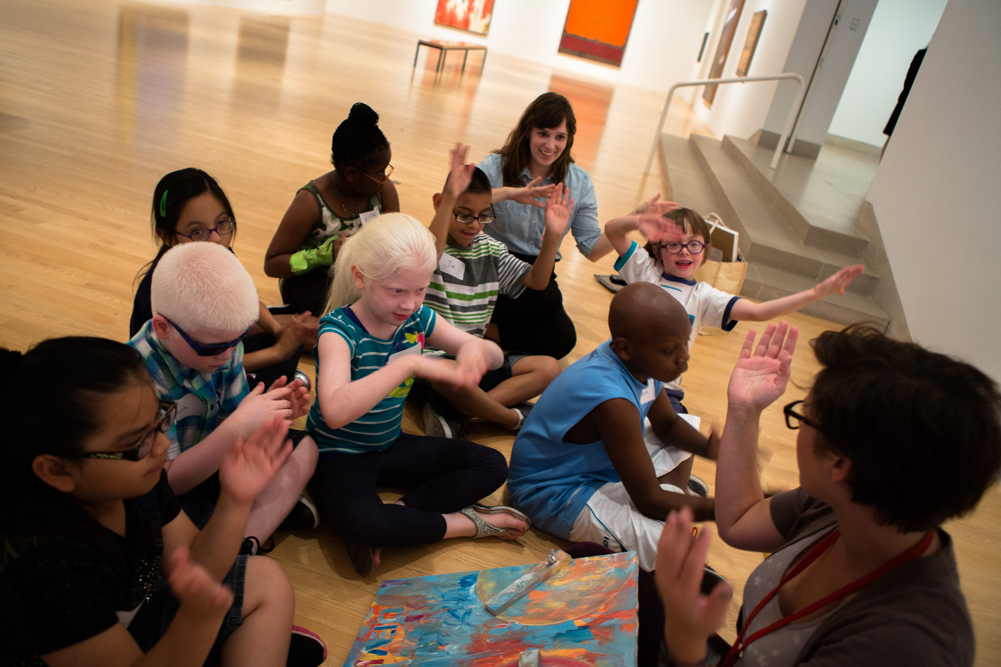
DISD students with vision impairments visiting the DMA.

DISD students with vision impairments visiting the DMA.

The Planning Process
The Dallas Museum of Art has never before offered guided touch tours to visitors with visual impairment, but after speaking with our Director of Exhibition Design, we learned that she fully supports inclusive gallery teaching, and thus was open to supporting the Museum’s first ever touch tour. We talked with our colleagues in the exhibitions and conservation departments and found that they too were fully supportive of trying out a touch tour with the DISD students. The DMA Sculpture Garden was identified as the best place for our inaugural touch tour, since the objects in the garden are designed for an outdoor space and are thus subject to (and able to withstand) a variety of natural elements. We also felt that it was essential for the students to have the galleries to themselves during the tour, so as not to confuse other visitors about the acceptability of touching works of art, as well as for the overall comfort of the students with vision impairment. We therefore decided to schedule the touch tour for a Monday, when the Museum is closed to the public.

Our next step in the planning process was to walk through the space as a group, making note of areas that may be problematic for someone with vision impairment to navigate. The team was comprised of education, conservation, and exhibitions staff, and everyone on the team raised thoughtful questions and contributed wonderful ideas! We discussed which works of art may be the best for a tactile experience, and our conservators suggested that the kids have the chance to touch the works of art without gloves (which is usually unheard of in other touch tours!). Our exhibitions team offered to wash and hand-clean the works we selected so that they would be nice and clean for the experience. And one conservator suggested we select works of art that were large enough to be touched by more than one student at a time, so that the students could talk to one another about what they felt as they each touched the artwork.

After squaring things away with the exhibitions and conservation teams, the education team began planning the educational experiences of the tour. We prepared for twenty-five students, ranging in age from six to thirteen years, all with a range of visual impairment. The majority of students in the group had some residual vision, while two students were very photophobic, and two were blind from birth. Due to the range of abilities of our tour group, our education team knew it was important to include a variety of artworks in the tour (in addition to those on the touch tour), integrate many descriptive explanations of works of art and hands-on activities, and to have numerous tactile objects available.

In the Galleries
When designing the overall tour, we selected a variety of objects that spanned time periods, artistic techniques, and geographic locations. We visited two contemporary art sculptures in the Sculpture Garden for the touch portion, two Abstract Expressionist works in the contemporary gallery, and a mask in the African gallery. Our aim was to engage all of the senses throughout our tour, as we believe that presenting multiple representations of content would effectively cater to the different learning styles of the group. We created a multi-modal experience by collecting auditory clips for sound stimulation, tactile materials and replica objects for touch, Jelly Belly jelly beans for taste sensations, and essential oils and scented colored pencils for olfactory information.

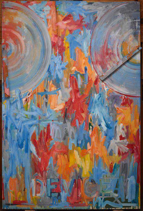
Each stop on the tour had a visual description of the gallery space and of the works of art we focused on, because it was important for us to situate ourselves, the children, and the art in space, as the sense of bodily awareness in space is something that many people without vision impairment may take for granted. Much of our time in the galleries was spent guiding students in tactile looking activities connected to specific works of art and facilitating conversations about texture and form. For instance, we created a reproduction of Jasper John’s Device so that the students could not only touch canvas and feel layers of paint, but they could also replicate moving the wooden stretchers back and forth across the canvas, while imagining the technique in which Johns spread the paint back and forth.

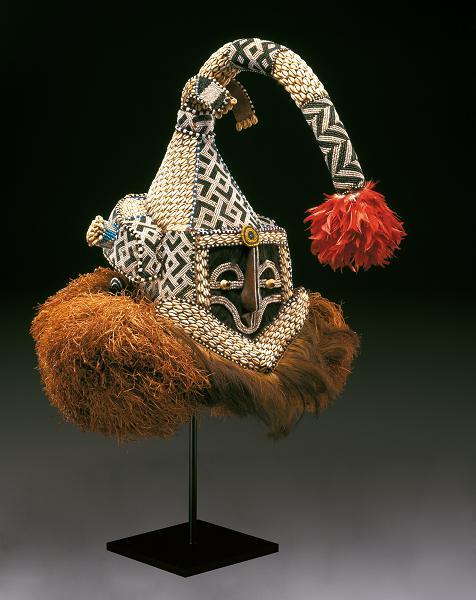
In the African galleries, we focused on a helmet mask made by the Kuba people of the Democratic Republic of the Congo, and passed around raffia, cowrie shells, feathers and other materials found in the mask. Additionally, we played sound clips of the various animals that related to the mask.

Helmet mask (Mukenga), Kuba peoples, mid-20th century, Dallas Museum of Art, gift in honor of Peter Hanszen Lynch and Cristina Martha Frances Lynch

Democratic Republic of the Congo, Kuba peoples, Helmet mask (mukenga),  mid-20th century, Dallas Museum of Art, gift in honor of Peter Hanszen Lynch and Cristina Martha Frances Lynch

Relating to Richard Diebenkorn’s Ocean Park No. 29, we discussed how an artist could depict a place using sounds, smells, and taste. The students each ate a jelly bean and imagined the color they believed the flavor might represent. Next, they used a scented colored pencil to illustrate a place based on that smell. We also played sound clips of ocean waves and boat horns to recreate the Santa Monica locale that inspired Diebenkorn’s Ocean Park series.

Richard Diebenkorn, Ocean Park 29, 1970

Richard Diebenkorn, Ocean Park 29, 1970, Dallas Museum of Art, gift of the Meadows Foundation, Incorporated

Our tour concluded with a sensory drawing activity that took place at the large fountain outside the Museum’s Flora Street entrance. The students listened to the sounds created by the water in the fountain, and considered how the water (and space around it) might appear, what color the water would be, even how the smell would be rendered. We gave each student a piece of thin Styrofoam and a pencil to create their drawing of the fountain; the students were able to feel the indented lines they drew onto the Styrofoam and took turns sharing their creations with one another.

Until Next Time
This was an exceptional experience for DISD students, teachers, and DMA staff alike. One teacher who helped to organize this visit said that this experience “might be the only time this whole summer [the students] get this opportunity to learn tactually, through their auditory channels and their residual vision, which sighted people take so much for granted.” It was a transformative experience as well for our Museum. We are honored to have been a part of this experience, and cannot celebrate enough the fantastic support and collaboration exhibited by DMA staff from many different departments. A huge thank you to DISD for bringing their students, and a thousand thank you’s to the DMA’s conservation, exhibitions, visitor services, and security teams. This was a team effort and we appreciate the unified support and assistance—let’s hope this is the first of many touch tours to come!

Amanda Blake
Head of Family, Access, and School Experiences

Danielle Schulz
Teaching Specialist


Archives

Flickr Photo Stream

Categories