Archive Page 51

Wine Not?

Since today is National Wine Day, we’ve created some lovely pairings with a few wine-themed objects in our collection. So, whether you are a fan of red or white, we have something for every palate.

The Eight Immortals of the Wine Cup, Momoyama period, Japan, Ink, Pigment On Gold, Pair Of Six-Fold Screens, The Eugene and Margaret McDermott Art Fund, Inc. 1989.78.A-B.McD

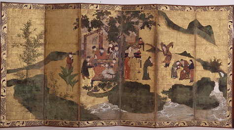
The Eight Immortals of the Wine Cup, Momoyama period, c. 1600,  Japan, ink and pigment on gold; pair of six-fold screens, Dallas Museum of Art, The Eugene and Margaret McDermott Art Fund, Inc. 1989.78.a-b.McD

From Japan we have The Eight Immortals of the Wine Cup, created around 1600. Although this is a Japanese work, the screen depicts an 8th-century Chinese poem about a group of high-class revelers that included politicians, priests, calligraphers, and musicians. In both China and Japan during this period, wine would have been made from rice. Today, we know this wine as sake. So, grab a glass and read this excerpt from the poem, and maybe you, too, can feel like an immortal.

“Su Jin has made a vow to the Buddha embroidered on his vest
but for his drunkenness he takes care to forget all his rules.

Li Tai-bo drinks a gallon of wine, writes a hundred poems
then sleeps it off in the back of a wine shop in Chang-an
when the emperor asked him to board the royal barge
he shouted back, I am a drunken immortal.”

Black-Figure Krater, Attic, Greece, first half of 6th century B.C.E, ceramic, gift of The Jonsson Foundation and Mr. and Mrs. Frederick M. Mayer, 1972.22

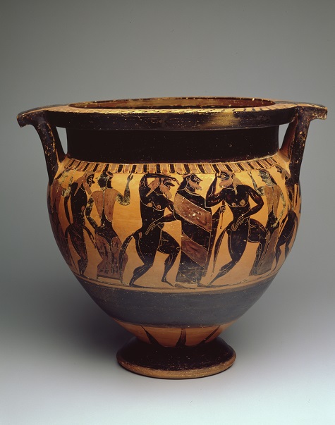
Black-figure krater, Greece, Attic, first half of 6th century B.C.E, ceramic, Dallas Museum of Art, gift of The Jonsson Foundation and Mr. and Mrs. Frederick M. Mayer, 1972.22

You can’t talk about wine without talking about the Greeks. Even though they drank various alcoholic beverages like beer and honey mead, their main drink for a good time was wine. Here we have a black-figure krater made in the first half of the 6th century B.C.E. This piece of pottery would have been used to mix wine with water to dilute it for parties. The figures on the krater are Dionysus, the god of wine, and his followers, the maenads. The maenads were said to have been possessed by Dionysus and his drink, and they were therefore able to perform miracles, like having honey come from the ivy-covered staffs they carried. Dionysus and his maenads would want you to open a bottle of Agiorgitiko, which is a bit like a cabernet sauvignon, but please drink more responsibly than these krater characters.

“Embassy” Shape Wine Glass, Edwin W. Fuerst, Walter Dorwin Teague, Libbey Glass Company, 1939, glass, gift of The Dallas Antiques and Fine Arts Society, 1989.18.2

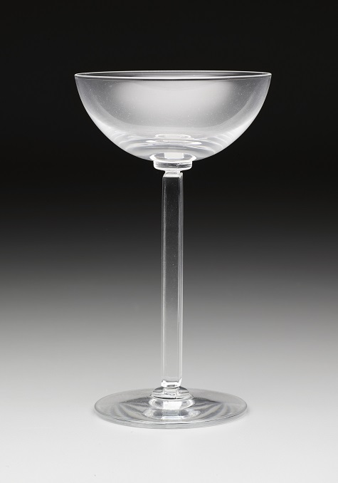
Embassy shape wine glass, Edwin W. Fuerst and Walter Dorwin Teague, designers; Libbey Glass Company, manufacturer; Toledo, Ohio, designed 1939, glass, Dallas Museum of Art, gift of The Dallas Antiques and Fine Arts Society, 1989.18.2

A wine pairing wouldn’t be complete without a glass to go with it. This is Embassy shape wine glass from 1939 was designed by Edwin W. Fuerst and Walter Dorwin Teague for the Libbey Glass Company. The company was not originally known for its blown glassware. Their beginnings were in lightbulbs and car windshield glass; however, throughout the 20th century they became known for their elegant glassware. In the 1970s, they created the first glass ever to be created through a patented “one piece and blow” technique. Today, this shape of glass with a wide mouth is used mainly to drink chardonnay. Even if you don’t have a glass quite like this one, open a bottle of chardonnay while you appreciate the beautiful Art Deco style of the Embassy shape wine glass .

Bacchic Concert, Pietro Paolini, c. 1625–1630, oil on canvas, Dallas Museum of Art, The Karl and Esther Hoblitzelle Collection, gift of the Hoblitzelle Foundation 1987.17

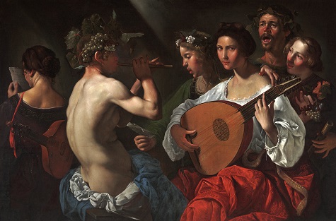
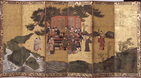
Pietro Paolini, Bacchic Concert, c. 1625–30, oil on canvas, Dallas Museum of Art, The Karl and Esther Hoblitzelle Collection, gift of the Hoblitzelle Foundation 1987.17

The Italian Renaissance was known for its art, music, and architectural genius. It was also a time of considerable wine consumption. In this painting by Pietro Paolini, we see a fairly mysterious scene with party goers, musicians, and someone dressed as the god Bacchus, the Roman god of wine. This scene is thought to have been from a marriage ceremony, where it was not unusual for the performers to dress as Bacchus and his followers. The image is unusual because the woman on the left has her back toward us and the woman with the lute stares directly at us. But, for today, we will just say that these performers are playing us a little tune to go along with a glass of chianti.

Katie Cooke is the McDermott Intern for Adult Programming and Arts & Letters Live at the DMA.

Early Start: Young Learners Gallery

We’ve recently debuted a new space for inquisitive young Museum visitors. Check out the Young Learner’s Gallery on your next visit!

Proud to Be an American

Today the DMA was honored to host 49 individuals from 21 countries as they became U.S. citizens in the Museum’s fourth annual Naturalization Ceremony. The always touching ceremony included performances of our national anthem and America the Beautiful by Booker T. Washington High School for the Performing and Visual Arts student Brittany Hewitt, followed by a reception in the DMA Cafe and tours of the American art collection. Here are some images from today’s ceremony.


Friday Photos: Strike a Pose with Penn

This month, we’ve been exploring the new exhibition Irving Penn: Beyond Beauty during our Access Programs. In the galleries, we took an up-close look at the extensive work of one of America’s most famous photographers. Back in the studio, we put ourselves in the place of Penn’s fashion models to create our own magazine covers. Take a look at what developed!

Emily Wiskera
McDermott Intern for Family and Access Teaching

Brush it Off

Director, writer, and artist Jean Cocteau is famous for saying “An artist cannot speak about his art any more than a plant can discuss horticulture” (Newsweek, 1955). Though Cocteau suggests that artists are not the best verbal communicators, many artists include words, characters, and writing into their works. Here at the DMA, we have many examples of handwriting and calligraphy in our collection.

Last month I took an introductory calligraphy class with my friend and fellow intern Emily Wiskera at Wildflower Art Studio. I learned a lot from our teacher Emile, and have not been able to stop practicing since! I thought it would be fun to give you guys a quick and basic tutorial on brush pen calligraphy. You can add calligraphy to your art, you can address a letter, write your name, or make a fancy grocery list! For this tutorial you will need a brush pen in the color of your choosing (which can be bought at any craft store) and a piece of paper. I have used scraps of watercolor paper for this tutorial.

Tip #1
Pressure makes perfect. When writing, upward strokes require a light amount of pressure and downward strokes require firmer pressure. Practice using different amounts of pressure by drawing straight lines. Once you feel comfortable with straight lines, try drawing loops while applying the same pressure techniques.

BP002

BP003

BP001

Tip #2
Practice your alphabet. Brush lettering should be fun! I like to practice writing the alphabet using variations in the thickness of the letters, with assorted flourishes, and in different styles. Develop a style of your own or find a template (like this one) of a calligraphy style you like. Now practice, practice, practice! Whether you use a found template or your own, you can use tracing paper and pencil to trace over the letters.

BP000

Tip #3
Take your time! Calligraphy takes concentration, but it can also be very soothing. You want to write at a pace that is not too fast and not too slow so that your letters are nice and smooth.

Tip #4
Put it all together. Once you are comfortable with your loops and alphabet you can now combine the two! Try to write the alphabet with the brush pen calligraphy technique. Once you have gotten the hang of it, writing your name can be a fun way to practice your letters, too.

BP004

Tip #5
Make it your own!
Keep it simple or add flourishes— it’s up to you. Your calligraphy style is as unique as you are! I went back and added a few little hooks at the top of my capital letters “R” and “M.”

BP005

Show us your samples by using the hashtag #dmabrushtips on your social media sites. I’ll-pha-bet they look great! Make sure to check out our C3 gallery and Spirit and Matter exhibition to see more examples of writing and calligraphy on display at the DMA.

Whitney Sirois
McDermott Graduate Intern for Gallery and Community Teachin

Window Gazing

Art collector and longtime DMA supporter Dorace Fichtenbaum left a generous bequest of 138 objects to the Museum. We installed a selection of these works of art, selected by curators Olivier Meslay and Gavin Delahunty, to celebrate the extraordinary personality of their collector, who died last summer.

As an exhibition designer, I was struck by Ms. Fichtenbaum’s singular vision in her collecting practice, one that was defined by personal preference and spread over multiple genres. Her worldliness comes across in the breadth of the collection, which ranged from Abstract Expressionist prints to carved African figures. This juxtaposed style, once installed all together in her home, reminded me of Alfred Barnes’ manner of collecting for what is now the Barnes Foundation in Philadelphia. Like Dr. Barnes, Dorace Fichtenbaum included in her collection new works by the  contemporary artists of her time, including Yayoi Kusama and Nam June Paik, among others. In my efforts to design a space to do justice to this special gift, I was inspired by the collector’s manner of dense display in her home.

Image 1 copy

My idea for the space was to create intriguing sightlines that invite visitors inside, and also distinguish this gallery within the larger Barrel Vault area of the Museum, which is installed with other works from the permanent collection. To accomplish this, we created a gray foyer-like space to temper the disconnect between the interior installation and the large exterior white gallery. The central sightline when looking into the gallery is a window that provides a key vantage point into the collection installed on the far wall. A framed door on either side of the window asks visitors to engage in the space and treat it as a more intimate interior space, much like you would find in someone’s home.

That space uses color and architectural trim to distinguish it, and to suggest a domestic interior. A classic salon-style hanging of the artworks allows for aesthetic relationships to form easily between the works that are hung on one surface and use the full height of the wall. This type of “hang,” as we call the installation of artworks on a wall, is special in that it includes three-dimensional works mounted on the wall or displayed in museum casework.

To maintain a consistency with these design concepts, no museum labels have been installed in the space; however, there is much contextual information on the collection and on each individual piece in the “label” booklets we provide. The booklets use a diagram of the installation with numbered elements so that visitors can refer to individual objects.

Our skilled team of preparators installed the works based on this detailed diagram.

Image 2 copy

As Olivier Meslay wrote in his article for the DMA Member magazine, Artifacts, “The walls and shelves of Dorace’s home were full of remarkable works that will now grace ours. Dallas is fortunate to have had a collector like her: generous, modest, tasteful, and passionate.”

Skye Malish-Olson is the Exhibition Designer at the DMA.

Early Start: Young Learners Gallery

construction
Last week the redesigned Young Learners Gallery re-opened after a month of construction, and we are so proud of the new space. Along with a complete overhaul of the color scheme, furniture, and design elements, the new space incorporates bilingual signage, an art installation, and a variety of activities focused on the theme of Line.


Adrian Windmills and Von

Windmills, by El Paso–based artist Adrian Esparza, serves as inspiration for children ages 5–8 and their grown-ups as they explore line through the activities.

Julia in Reading Nook books2

These comfy cozy reading nooks are the perfect place to curl up with a good book about lines. Leah Hanson, resident children’s book guru and Manager of Family and Early Learning Programs, picked out a slew of amazing books for the reading area.

pegs blocks

Visitors to  the Young Learners Gallery can explore line through a variety of activities including building with lines, creating and transforming lines on our pegboard wall, transforming their body into a line in our distortion mirror, and exploring storylines using figures and works of art from the Museum’s permanent collection as inspiration.

YLG banner2016

Stop by the Young Learners Gallery on your next visit to the Dallas Museum of Art!

Jessica Fuentes is the Manager of Gallery Interpretation and the Center for Creative Connections at the DMA.

The Day the Crayons Came to the DMA

Earlier this week, we had some very special guests visit the Museum! Drew Daywalt, author of the book The Day the Crayons Quit and The Day the Crayons Came Home, will be coming to the Museum on May 22 for some family fun as part of the Arts & Letters Live BooksmART lecture series. We were able to snap some behind-the-scenes pics as Orange Crayon and Purple Crayon scouted out the galleries, and we even caught a glimpse of some of their top secret correspondence. If you haven’t already, get your tickets to see Drew in person and hear more about these crazy crayons and their colorful adventures!

The Day the Crayons letter

Artworks shown:

  • Maurice de Vlaminck, Bougival, c. 1905, Dallas Museum of Art, The Wendy and Emery Reves Collection.
  • Martha E. Keech, Baltimor, Maryland, “Album” quilt, c. 1861, Dallas Museum of Art, anonymous centennial gift.
  • Claude Monet, Water Lilies, 1908, Dallas Museum of Art, gift of the Meadows Foundation, Incorporated.
  • Egungun costume, Republic of Benin: Yoruba peoples, Late 20th century, Dallas Museum of Art, gift of Pace Primitive Gallery, New York.
  • Buddha, Thailand: La-na, 15th century, Dallas Museum of Art, gift of David T. Owsley via the Alvin and Lucy Owsley Foundation.
  • Oli Sihvonen, Matrix – Red, Gray II, 1967, Dallas Museum of Art, Dallas Art Association Purchase, © Oli Sihvonen / Licensed by VAGA, New York, NY.

Leah Hanson
Manager of Family and Early Learning Programs

Madeleine Fitzgerald
Audience Relations Coordinator

In-House Photography

It has been a few years since the DMA has hosted a photography exhibition, and it has been a real treat to present Irving Penn: Beyond Beauty—the artist’s first retrospective in 20 years and the first since his death. While Penn is well known for his work in fashion and portraiture for magazines like Vogue, the exhibition also features some of his lesser-known, personal work, like his street photographs and a series of nudes.

In celebration of National Photography Month, we sauntered down to the studios of the three DMA staff photographers—Chad Redmon, Ira Schrank, and Jerry Ward—for their take on the exhibition.

Chad Redmon, Assistant Photographer, Digital Media at the DMA

Chad Redmon, Assistant Photographer, Digital Media, at the DMA

Ira Schrank, Digital Collection Photographer at the DMA

Ira Schrank, Digital Collection Photographer at the DMA

Jerry Ward, Collection Photographer at the DMA

Jerry Ward, Collection Photographer at the DMA

On their own work
Chad: The piece that was in the DMA staff art show last year was a pretty good example of my work: I cut a hole and my arm was reaching through, taking a picture. It was a trompe-l’œil, speculative space. I like to play with your expectations of looking at photographs, something that would obviously not actually happen in real time. People have to take a second look at it, even if I’m standing next to them.

Ira: I shoot landscapes mostly. But I’ve also done environmental portraits. I’ll use backdrops to hide the background, or take the environment out, not quite like Penn; I didn’t try to have one specific look. I often use either paper or fabrics to isolate the things I shoot. To a photographer, it enables you to really look at what it is you are looking at, without letting the world cloud it.

Jerry: I’m a commercial photographer; this is my first museum job. My background is in sports, food, and journalism—mostly ads and billboards. I was a Saints team photographer when I was younger. So if it moves, I can capture it.

On their familiarity with Penn:
Chad: I saw an Irving Penn show at the National Portrait Gallery in D.C. in 1988, when I was a freshman at art school. I saw that show 20 times. I went over and over again. I even bought the book, which was one of the first coffee table books I ever bought, and I still have it to this day.

Ira: I’m really fine art oriented, but of all the commercial photographers, he is my favorite.

On their favorite work in the show
Chad: Willie Mays, jumping up. It looks like he’s flying like Superman. It’s not an often-seen photograph. It’s one of the few actually manipulated. He took a photo from a long way away of Willie Mays in action, cut him out of whatever background he was on, and stuck him on a field of white. It doesn’t look like anything else in the show.

Ira: I don’t really have a favorite. There is so much different work. He is all over. The early work that he’s done, where he is an editorial photographer, I love those. But those are so different. It’s hard to see how he goes from those pictures—like traveling around the South—to how he got to his studio work. I guess his experience of being an artist in New York got him from point A to point B.

Jerry: The lady with the martini (Woman in Dior Hat with Martini (Lisa Fonssagrives-Penn), New York, 1952). It’s really high contrast. And it’s cool how the martini works in the glass. And I like food stuff, since I’ve shot food.

On Penn’s most interesting body of work
Chad: I like the portraits of intellectuals crammed in corners, on scaffolding, and what not. It’s really egalitarian the way he took portraits. He would take that mobile studio to North Africa and take pictures of the locals. It looked basically like the set he would shoot fashion people in in New York. It highlights the differences between the people, but it also highlights the similarities between them. It divorces them from the background to such a degree that you have to see the similarities and differences immediately.

Ira: I love the raw backgrounds, which allow the photographic process to show. His portable studio, in a way, cancels out the environment, and he can just engage in his process. And he took the portable studio everywhere, to South America, Africa.

Jerry: I like the food and the American South section. I’m from New Orleans—so, the old barber shop and the people outside. You still see those signs at home. It’s familiar.

On what’s surprising
Chad: I had never seen any of the early street photography. I don’t like it very much. There’s nothing exceptional about them to me, but seeing them doesn’t take the shine off of the rest of his work. It’s good to know that he grew into his aesthetic, as opposed to just arriving fully realized.

Ira: No surprises. But what makes so many of his pictures work so well is that he isolates them. None of the sets are fancy—sometimes it’s torn-up carpet turned upside down. It’s interesting that in our show, when you turn the corner and enter into that newer, color work, it doesn’t quite work in the same way. To me, there is a big difference between what looked like commercial work and his art, which is what we all respond to. Like that work when you walk in [to the exhibition]. What a spectacular photograph.

Jerry: What’s surprising is that Penn would go out and do it his own way. But a lot of [commercial] photographers buckle under to the art director. It’s pretty obvious that Penn was so great that they let him run free. They didn’t tie him up with an art director. The collaboration looked like this: Penn, and-oh yeah-there is an art director, as opposed to, an art director and-oh yeah-there’s a photographer pushing a button. As a commercial guy, that is really cool.

Thanks, Chad, Ira, and Jerry for your insight! Come celebrate National Photography Month with a visit to the DMA this May.

Andrea Severin Goins is Head of Interpretation at the DMA.

Friday Photos: Gridiron Gallery

Last Friday, the McDermott Interns and I enjoyed a visit to AT&T Stadium. Did you know that, in addition to being home to the Dallas Cowboys, the stadium boasts a world class contemporary art collection? So the next time you’re there cheering on America’s team, when you go for those nachos, don’t forget to look up!

Sarah Coffey
Education Coordinator


Archives

Categories