Archive for the 'Curatorial' Category


Time Travel at the DMA

This week we had a special visitor who traversed through time and space in advance of our November 8 Second Thursdays with a Twist all about Doctor Who. For his tour through the Museum, he said he would like to see some people and places that he’s traveled through time to visit. We were happy to oblige, mostly because we didn’t want him to use his sonic screwdriver on us. As he was walking through the Museum, he also found a few artworks featuring people and places he had not encountered and he wanted to learn more about those too.

The Doctor hadn’t yet met George Washington, so he was eager to see his portrait:

No trip to the DMA is complete without a stop at Frederic Edwin Church’s The Icebergs:

A future iteration of the Doctor met Vincent van Gogh, so naturally we had to show him Sheaves of Wheat:

And here are a few of the other stops he made in our galleries:

This slideshow requires JavaScript.

When you visit the DMA on November 8 for our next Second Thursdays with a Twist, you, too, can go back in time to see Winston Churchill, the Aztecs, and many other important historical characters through our scavenger hunt and warp drive tours that’ll have you exploring all that timey wimey stuff!

Katie Cooke is the Manager of Adult Programs at the DMA.

Basis of Bourbon

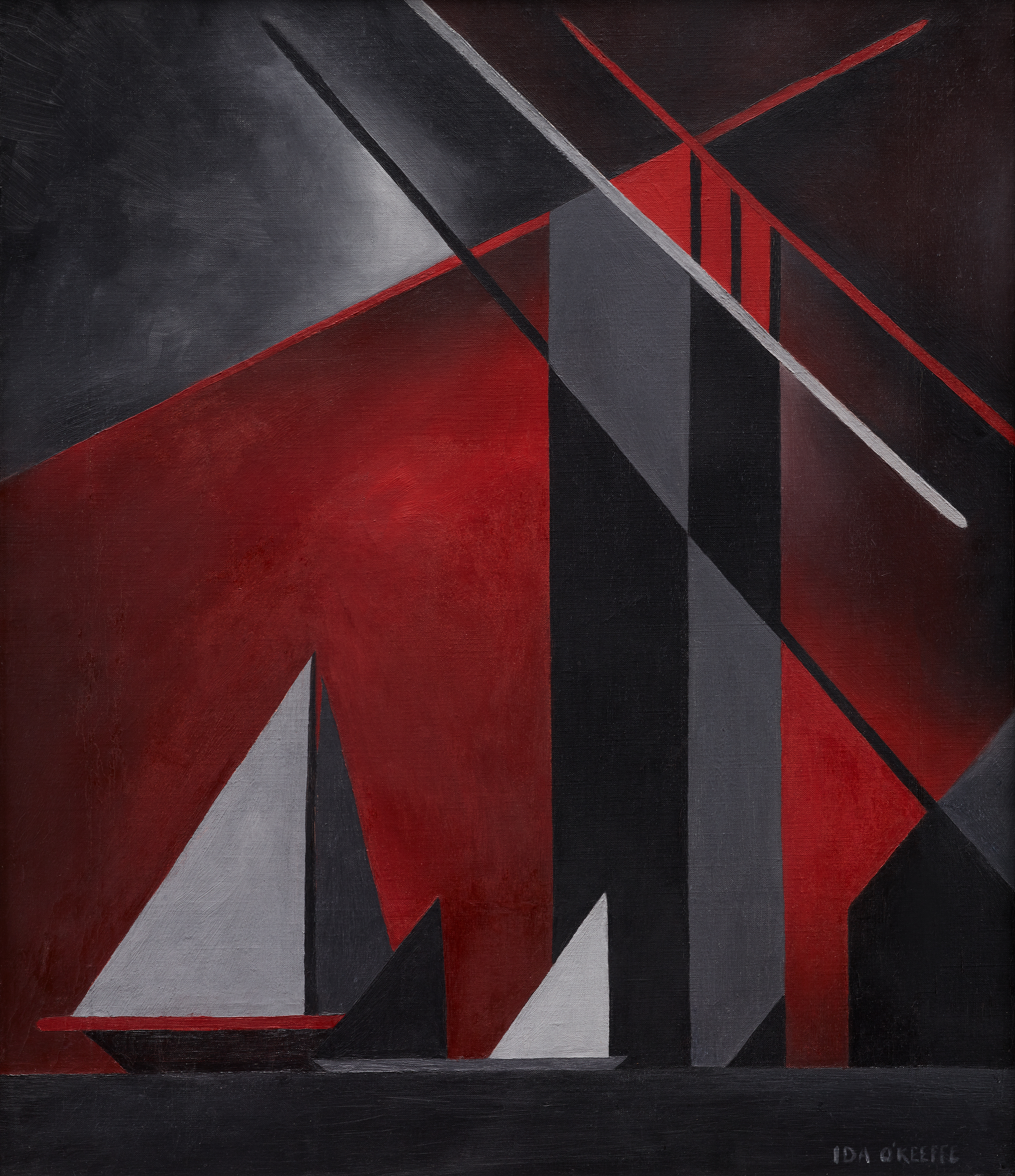
As the weather becomes cooler (well, sort of), we’re looking forward to warming up inside the Museum with our third installment of Artful Pairings this Thursday—an exclusive night of drink tastings and Museum tours for adults. This event will feature a tour of our new exhibition Cult of the Machine: Precisionism and American Art, and what better drink to go with quintessentially American art than bourbon? We’ll hear from the folks at Crooked Fox Bourbon about their product, and mix our own cocktails with bourbon as the star, paired with small bites from our cafe.

To get you in the mood for some barrel-aged goodness, here are some fun facts about bourbon and a few works from our collection that pair nicely with them.

Rembrandt Peale, George Washington, c. 1850, oil on canvas, Dallas Museum of Art, The Karl and Esther Hoblitzelle Collection, gift of the Hoblitzelle Foundation, 1987.41
Did you know that George Washington played a role in how bourbon came to be? In 1789 frontier farmers violently rebelled against their new American government for trying to tax their whiskey, which they used for currency and trade (not just for drinking). As George Washington led an army out west to end this rebellion, some of the disgruntled distillers fled further west to Kentucky, where they thought they would be able to operate under less restrictive conditions. These settlers ended up distilling corn-based alcohol, which gave us the modern day drink we know and love.

To pair with this fact, we have the portrait of George Washington by Rembrandt Peale. Peale widely advertised this portrait with pamphlets including quotes from family members and friends of the president to show this was the most accurate portrayal. His advertising campaign worked, because nearly 80 versions of this portrait exist, including one hanging above the dais in the US Senate Chamber.

Richard Long, Stones of Scotland, 1979, gelatin silver print, Dallas Museum of Art, gift of Nancy M. O’Boyle, 1997.154

Although many people could argue the differences between American bourbon and Irish whiskey, they are much closer in production process than you might realize. Bourbon barrels can only be used once for storing the liquor before bottling. Once those barrels have had one batch in them, some become furniture or firewood. Others are repurposed for aging either soy sauce or—most often—Scotch whiskeys made across the pond. Much like the rules and regulations keeping bourbon from being made outside the US, Scotch whiskey can only be made in Scotland. The landscape and natural materials of Scotland inspired the land artist Richard Long to create his space-specific artworks.

Cup: upside-down head, Peru, Sicán (Lambayeque), 900-1100 CE, gold, Dallas Museum of Art, The Nora and John Wise Collection, gift of Mr. and Mrs. Jake L. Hamon, the Eugene McDermott Family, Mr. and Mrs. Algur H. Meadows and the Meadows Foundation, Incorporated, and Mr. and Mrs. John D. Murchison, 1976.W.543

When Irish immigrants settled in Kentucky, they discovered they could make corn into a sweet-tasting liquor. Even though the Irish Americans believed they had come across a new form of alcohol, many cultures in Central and South America had been making corn-based alcohol for centuries. The golden cup above is from the Sicán peoples, who lived around the Andes in Peru until around the 12th century. The vessel would have been used to drink chicha, a corn-based beer that is still made today in many areas of South America during special ceremonies.

We hope this whets your appetite to learn more about this American-made spirit. We still have a few spots open for Artful Pairings, so get your tickets here for the program on Thursday, October 4, at 7:00 p.m.

Katie Cooke is Manager of Adult Programs at the DMA.

Writing the Wrong

While museums increasingly take on roles in entertainment and education, they remain, like libraries, stewards of knowledge. However, sometimes this knowledge—what we think of as researched, established fact—is misguided. Admitting you’ve been wrong can be humiliating, yet slip-ups within the museum field encourage humility. Mistakes remind us that correcting, preserving, and adding to the record is, at the end of the day, what museums are called to do.

The blunder in question surrounds the identity of the objects seen in Gerald Murphy’s 1924 painting Razor.

Gerald Murphy Razor

Gerald Murphy, Razor, 1924, oil on canvas, The Dallas Museum of Art, Foundation for the Arts Collection, gift of the artist, © Estate of Honoria Murphy Donnelly, 1963.74.FA

The journey began when Sue Canterbury, The Pauline Gill Sullivan Associate Curator of American Art, received an email from a concerned fountain pen enthusiast who notified her that the Museum was misinformed about Murphy’s painting. Sue asked me to create a timeline of recorded references to find out when the misinformation began. Then I was asked to search for what may have misled our predecessors and to untangle this 15-plus-year hiccup in the DMA’s records.

For years, the Museum said the razor and pen featured in the painting were modeled after products designed or sold by the Murphy family through their successful storefront, Mark Cross & Co. While it is true that Murphy designed a prototype razor in the mid-1910s that had a short burst of fame from 1912 to 1913, and that his family’s company most likely sold top-of-the-line writing utensils in their luxury goods stores, the razor and pen are NOT Murphy-designed objects. After thorough research, I concluded that years of accidental conflation caused the mix up.

Mark Cross Logo

The Mark Cross logo after its inception in 1845. Gerald Murphy’s father, Patrick Murphy, bought the company in the 1880s, which led to the family’s increasing wealth. © Mark Cross Leathergoods LLC

Murphy confirms the object’s correct identity in his letters with former DMCA director Douglas MacAgy: “The first Gillette razor and the first Parker pen (of red rubber) were real objects (not gadgets) ‘no bigger than a man’s hand.’”

Gerald Murphy letter

A letter from Gerald Murphy to Douglas MacAgy referencing Razor and Watch, another painting by Murphy, 1960, DMA Archives

The object for which Razor takes its name is a Gillette “New Standard” safety razor. This razor featured new technology that increased consumers’ ease of use and overall safety. Fewer shaving cuts? Yes, please! It was the most successful razor during the time of the painting’s creation and reached both American and European markets. By comparing the Mark Cross and Gillette razors below, and looking again at the painting, you can see how the Gillette attribution makes more sense with what Murphy illustrates.

The Parker Pen Company took the American (and later European) markets by storm with its iconic “Big Red” Duofold fountain pen in the early 1920s. Instead of wanting a new Xbox or iPhone as a gift, consumers hoped for a Parker pen.

lucky strike

A 1920s Parker “Lucky Strike” Duofold fountain pen, Courtesy of edgepens on Ebay.com

Why? The pen featured cutting-edge technology, including a leak-proof inkwell system and a durable, strikingly modern red rubber shaft. Murphy’s detailing even alludes to it being not the first version of the pen but the glitzier 1923 version, which included the fashionable “gold girdle,” seen in the advertisement below.

parker ad

1923 Parker advertisement, Courtesy of the-ad-store on Ebay.com

Now to the probable sources of the mix-up: a combination of trying to make the painting more personal to Murphy, plus an unfortunate conflation of similarly named companies. Symbols are always intriguing and tempting for art historians. If Murphy had designed the razor and/or pen, it could be seen as a self-portrait; yet, Razor still can be, despite the objects not being of his design (see Deborah Rothschild’s book Making It New: The Art and Style of Sara and Gerald Murphy).

Additionally, an accidental conflation occurred between the Mark Cross name and the A.T. Cross Company, a popular producer of pens. A.T. Cross bought the Mark Cross company in 1983 (right before the first publication of the misinformation), as referenced on A.T. Cross’s website. Prior to the buyout, Mark Cross was known primarily for its leather goods, not its side hustle of writing accessories. Every source that labels Mark Cross as a pen company and the pen as sold/designed by Mark Cross occurs after this buyout date.

Murphy’s Razor and his dazzling 1925 painting Watch are currently not on view, but be sure to check them out in the DMA’s upcoming exhibition Cult of the Machine: Precisionism and American Art, on view from September 16 through January 6!

Ashton Smyth is the Summer Curatorial Intern for American Art at the DMA.

Shared Trajectories

In spring of 1978, while the artist León Ferrari was in Stockholm, Sweden, his son was disappeared by the military police back in his home country of Argentina. Long suspicious of governmental and religious powers, Ferrari was openly critical of the Argentine dictatorship, and had been living in São Paulo, Brazil, in exile since 1976. His son had stayed behind and was actively engaged in the leftist resistance, ultimately suffering the same fate as 30,000 of his compatriots who were kidnapped and murdered during the country’s decade-long “Dirty War.” Two untitled works on paper recently acquired by the Dallas Museum of Art serve as witness to these important junctures in the artist’s life, and are signed and dated from São Paulo and Stockholm, respectively. Functioning as abstracted letters, they form part of a long-running series Ferrari inaugurated in 1963 with Carta a un general (Letter to a General), in which the artist’s script becomes illegible and morphs into almost Surrealist imagery, calling to mind that movement’s interest in automatic writing and its possibilities.

Runo Lagomarsino, the subject of the DMA’s upcoming Concentrations exhibition EntreMundos, shares a geographic lineage with Ferrari. Lagomarsino was born to Argentine parents who migrated to Sweden during the Dirty War. His grandparents were Italian, as were Ferrari’s parents (up to 62% percent of Argentines are of Italian descent), and both artists have lived and worked in São Paulo. Lagomarsino’s heritage and travels have informed his work, which comments on mass migrations from the colonial period to the present. But their work has more in common than this shared trajectory. Like Ferrari, Lagomarsino renders legible systems illegible, and stable meanings unstable.

4Crucero Del Norte

Runo Lagomarsino, Crucero del Norte , 1976–2012, 24 exposed photographic papers, 7 x 9 1/2 in. (17.8 x 24 cm) each, Collection Lena and Per Josefsson, Stockholm, Photo: Erling Lykke Jeppesen

_X9A7274

Runo Lagomarsino, West Is Everywhere you Look, 2016, 9 maps, motors, cables, and wires, variable dimensions, Courtesy of the artist and Francesca Minini, Milano

In the upcoming exhibition, visitors will encounter maps, like those found in primary school classrooms. Yet these maps are rolled up and closed so that their contents cannot be seen. In other works, photographic paper has been exposed to light so that any imagery is blurred beyond recognition; portmanteaus stamped on a wall create surprising associations. By putting into doubt what is typically taken as factual, Lagomarsino asks us to question our own assumptions and biases, and how these become codified into larger social and political systems. This questioning of the powers-that-be is exactly what drove Ferrari during his long career. These sympathetic artists demonstrate art’s ability to thrive in the space of ambiguity, empowering viewers to create their own interpretations.

Concentrations 61: Runo Lagomarsino, EntreMundos opens on September 30; the exhibition is included in free general admission.

Anna Katherine Brodbeck is The Nancy and Tim Hanley Associate Curator of Contemporary Art at the DMA and curator of the exhibition.

Streamline Design: The Art of Technology

Today is National Radio Day, and yesterday, August 19, was National Aviation Day. The two days celebrate the development and technological advancements in aviation and the invention of the radio. While it is most likely coincidental that both holidays fall back-to-back, in terms of 1930s industrial design, this pairing is meant to be.

The years between World War I and World War II were the Golden Age of Flight and the Golden Age of Radio in America. During these decades, affordable, safe, and comfortable long distance plane trips became a foreseeable travel option for the greater American public. Similarly, the affordability of the radio brought families across the United States together for regular nightly programming and entertainment—essentially bringing the world into their living room. With both the skies and airways now within reach, the fascination with rapidly developing technology, speed, and motion became hallmarks of the era.

Artistically speaking, this era is one of my favorite periods in terms of the decorative arts. The emergence of flight had a profound impact on the design of many household and consumer goods during the interwar years, and radio encasements often reflected the Machine Age aesthetic of the 1930s. Prominent industrial designers of the day embraced America’s love affair with flight and successfully blurred the lines between art and technology with of-the-moment consumer products. Good design sells; therefore, it is no surprise that for the radio—one of the most prominent fixtures in the 1930s American household—overall design aesthetic often dominated the purchasing decision of a design-savvy consumer.

If you’re looking for a creative way to pay homage to these two holidays, take note of these aerodynamic gems on view at the Dallas Museum of Art that incorporate characteristic elements of streamline design, including horizontal banding, smooth exteriors, and the use of modern materials like chrome and plate glass. Each object suggests the concepts of speed and movement while stylishly capturing a moment in decorative art and design history when the worlds of aviation and radio effortlessly collide.

Take a look at the 1933 “Air-King” radio (model 66) designed by Harold Van Doren and John Gordon Rideout. The form of this radio is a play on the motif of a skyscraper, with its stepped shape toward the top; however, the circular glass plate on the façade with showing AM and FM broadcast band numbers, combined with the tuning and volume knobs, remind me of a cockpit’s control panel.

Don’t miss this “Bluebird” radio (model 566) designed by Walter Dorwin Teague and manufactured by the Sparton Corporation in 1934. The name alone embraces the notion of flight and is enhanced even further through streamlined design elements. Here, the straightforward use of circles and horizontal banding set against the plate-glass backdrop seems to mimic a single engine propeller plane’s nose and wingspan. I imagine a plane flying gracefully through the clear blue open sky, transporting the avid listener to new destinations through the magic of radio.

To learn more about how the Machine Age influenced art and design in America, visit the Dallas Museum of Art’s upcoming exhibition Cult of the Machine: Precisionism and American Art, which will open to the public on September 16.

Jennifer Bartsch-Allen is a Digital Collections Content Coordinator at the DMA.

Farewell to #LauraOwens

We’ve reached the final weekend of our Laura Owens exhibition, and the whimsy and wonder that lit up our Hoffman Galleries will be fondly missed after its closing day on Sunday, July 29. This exhibition has been inspiring to many, and we can see why; the intricate artworks that represent the artist’s career from the mid-1990s to today include intriguing themes of fantasy, pop culture, nature, technology, and the avant-garde that tie it all together. Exploring Owens’s art was the highlight of many fun spring and summer programs and classes at the DMA, including Arturo’s Art & Me, Family Workshops, and Teen Tours. We also saw incredible new works of art created by visitors to the exhibition, including this vivid poem written by a young poet in The Writer’s Garret‘s summer program “Rail Writers.”

Among the inspiring aspects of this presentation is how delightfully “Instagram-able” it is, allowing viewers to create their own stories around each playful artwork and connect with an even broader audience. Just search the hashtag #LauraOwens and you’ll find a lively array of visitors interacting with Owens’s bold works and becoming part of the art. With bright colors, thickly layered swashes of paint and other mixed media, and untitled works that leave many subjects up to the imagination, these works are all about stimulating and sharing curiosity. Here’s a look back at what a few of our visitors had to say about their experiences:

_.mickelodeon._“Laura Owens is an amazing artist; prior to my venture I hadn’t heard of her. But now, I am a fan.” –@_.mickelodeon._

“Went to see some art without realizing we are the art.” –@ary_balderrama

in_dfwfamily2“Her work is LOUD, quirky, silly, dimensional, full of layers!” –@in_dfwfamily

edithvm“Exhibición de Laura Owens está llena de color y amor” –@edithvm

IMG_E1065“This painting really cat-ures my spirit.” –@kmeansbusinezz

There is still time left for you to share your perspective from this exhibition, whether it’s on social media or through artistic creations of your own. Either way, there is plenty to take away from Owens’s art, and we hope you take the opportunity this weekend to discover what that inspiration looks like for you.

Hayley Caldwell is the Communications and Marketing Coordinator at the DMA.

Ten Questions with Three Artists

Throughout the summer, the Quadrant Galleries on Level 1 will feature two exhibitions drawn from the Contemporary art collection: Soft Focus and Body Ego. Four of the artists included in these installations call the DFW area home, and each Saturday in July at 3:00 p.m. one of the artists will give a free talk about the work she has on view. Last week Denton-based artist Annette Lawrence joined us to speak about her fascinating Free Paper series and how she uses drawing, collecting, and data to create objects that measure the passage of time.

This week, we’ll hear from photographer Debora Hunter, followed by artists Linda Ridgway and Frances Bagley later this month. Before they arrive, we had some burning questions for these artists about their lives and their work. Here’s what they had to say:

Debora Hunter

Hunter is a Dallas-based photographer and Professor Emerita of Art at Southern Methodist University. In 2016 she was the honoree of the Dallas Art Fair. Aside from the DMA’s collection, Hunter’s work is included in the permanent collections of the Art Institute of Chicago, High Museum of Art, Corcoran Museum of Art, Museum of Fine Arts, Houston, Amon Carter Museum of American Art, Yale University Art Museum, University of New Mexico Museum, Wesleyan University Art Museum, Rhode Island School of Design Art Museum, Creative Photography Laboratory of Massachusetts Institute of Technology, Louisiana Art and Science Center, and Dallas Area Rapid Transit.

Debora Hunter, Floral Spine, 1975, photograph, Dallas Museum of Art, Polaroid Foundation grant, 1976.79, © Debora Hunter

Learn more about Hunter’s photograph Floral Spine in the online collection.

If you could take one work of art from the DMA home, what would it be?
What fun to sleep in the Gothic revival bedstead from Rosedown Plantation.

Bed, Crawford Riddell (maker), 1844, Brazilian rosewood, tulip poplar, and yellow pine, Dallas Museum of Art, gift of three anonymous donors, Friends of the Decorative Arts Fund, General Acquisitions Fund, Discretionary Decorative Arts Fund, and the Boshell Family Foundation., 2000.324

What was the first subject you loved to photograph?
The backs of people gazing out to sea.

If you could have coffee with a photographer from the past, who would it be?
Julia Margaret Cameron (1815-1879)—since she is English she would probably want tea.

What do you love most about teaching?
Retiring! (only joking). Actually, working with young people as they discover their interests and talents.

Any advice for young artists out there?
Listen carefully to your inner voice and then work really hard.

What is something you are looking forward to?
“Emerita,” a retrospective exhibition of forty years of my work at SMU’s Pollock Gallery opening September 7, 2018.

Film or digital?
Yes!

Last book you read?
Cake, a very fun cookbook of cake recipes with stories and illustrations by Maira Kalman.

If you hadn’t become an artist, what career would you have chosen?
Film editor or architect.

Where do you feel inspired around Dallas?
The weird Valley View Mall and the Santa Fe Trestle Trail, for different reasons.


Linda Ridgway

Ridgway is a Dallas-based printmaker and sculptor working primarily in bronze. Her work has been the subject of solo exhibitions around the country, most recently at Talley Dunn Gallery in Dallas, as well as group exhibitions at the Grace Museum and the Amon Carter Museum of American Art this year. Aside from the DMA’s collection, Ridgway’s work is in the permanent collections of the El Paso Museum of Art, Modern Art Museum of Fort Worth, Museum of Fine Arts, Houston, Phillips Collection, Weisman Collection, and AMOA Arthouse.

Linda Ridgway, Harvest Line, 1995, bronze, Dallas Museum of Art, gift of Nona and Richard Barrett and Mr. and Mrs. Bryant M. Hanley, Jr., 1996.190

Learn more about Ridgway’s sculpture Harvest Line in the online collection.

If you could take one work of art from the DMA home, what would it be?
If I could take only one piece, it would be Beginning of the World by Constantin Brancusi.

Constantin Brancusi, Beginning of the World, 1920, marble, nickel silver, and stone, Dallas Museum of Art, gift of Mr. and Mrs. James H. Clark, 1977.51.FA, © Artists Rights Society (ARS), New York / ADAGP, Paris

What is your favorite bit of nature around Dallas?
My favorite bit of nature is White Rock Lake.

What is your favorite poem?
Uses of Sorrow by Mary Oliver is my favorite poem at the moment.

Any advice for young artists out there?
There is a lot of advice you can give to a young artist, but the most valuable lesson is hard work and to never give up.

What is something you are looking forward to?
Having a bigger studio space to create more work.

What was the last thing you looked up on Wikipedia?
I don’t use Wikipedia, but I do use my smartphone to look up things. Recently, I looked up images by John Singer Sargent, because of a book I am now reading.

How long have you been drawing?
I started drawing as a child, but at the age of 13 I made the decision to become an artist.

Do you listen to music while you are working?
I listen to the classical station.

If you hadn’t become an artist, what career would you have chosen?
A biologist.

What are some words that you live by?
Everything will be okay.


Frances Bagley

Bagley is a Dallas-based sculptor and installation artist. Among numerous public art projects, and both Texas and national exhibitions, her work is included in the permanent collections of American Airlines, the National Museum of Women in the Arts, the El Paso Museum of Art, Pepsi-Co, UT Arlington, and Southwestern Bell. Bagley is the recipient of multiple awards, including the Moss Chumley Award in 2011, the 10th Kajima Sculpture Exhibition in Tokyo in 2008, and the Jurors Award for the Texas Biennial in 2007.

Frances Bagley, Tiny Dancer, 2008, mixed media, Dallas Museum of Art, Charron and Peter Denker Contemporary Texas Art Fund, 2009.23, © Frances Bagley

Learn more about Bagley’s sculpture Tiny Dancer in the online collection.

If you could take one work of art from the DMA home, what would it be?
Isa Genzken’s sculpture Door (Tür).

Isa Genzken, Door (Tür), 1988, concrete and steel, Dallas Museum of Art, gift of The Rachofsky Collection and purchase through the TWO x TWO for AIDS and Art Fund, 2006.46, © Isa Genzken

What was the last thing you looked up on Wikipedia?
Billy Bob Thornton’s background.

What are some words that you live by?
“Tell the Truth.”

Any advice for young artists out there?
Becoming an artist is not a career choice. You should only do it if you have to and won’t be happy with any other choice.

What is something you are looking forward to?
Going to Maine this summer for Barry Whistler’s birthday party.

Favorite place you have traveled?
Tunisia.

Last book you read?
Buddha Mind in Contemporary Art, edited by Jacquelynn Baas and Mary Jane Jacob.

If you hadn’t become an artist, what career would you have chosen?
See my answer to question #4. No other choice would have made me happy.

What is a daily ritual that you have?
Discussing the world with Tom Orr while having coffee every morning.

What material are you interested in working with next?
Oil paint.

What questions do you have for the artists? Drop by each Saturday to spend time with them in the galleries and learn about their creative process firsthand.

Jessie Carrillo is Manager of Adult Programs at the Dallas Museum of Art. 

America the Beautiful

Happy Independence Day! Many of you likely have exciting activities on your agenda today, like proudly parading through the streets, chowing down on some backyard BBQ, watching the night sky illuminate with sparkling bursts of color, or all of the above. For those of you in need of some balance between raucous outdoor festivities and quieter, more subdued plans, today is a great time to visit the DMA and stroll through the American art in our collection. The Museum is open today from 11:00 a.m. until 5:00 p.m.

To celebrate the array of differing landscapes and perspectives that make up the United States, here are a few works from American artists that illustrate various scenes and slices of life in our country.

Small towns:


Big cities:


Towering mountainscapes:


Seaside scenes:


Deserts and dry lands:


Lush green views:


Everyday people:


And all the critters in between:


Hayley Caldwell is the Communications and Marketing Coordinator at the DMA.

Holding Up a Mirror to Texas Icons

If you’ve visited the DMA lately, you likely noticed the large red mural created by Minerva Cuevas in our Concourse. For those unfamiliar with Cuevas’s art, she is known for her conceptual multi-media installations, and the way her images, language, found objects, and sculpture work together to create political critiques. Some of her projects reformat the visual language of advertisements, using it to harness advertising’s power to affect cultural narratives. For example, see Cuevas’s morbid reimagining of the Del Monte logo. What makes her work so interesting and accessible is the way it explores the relationships among socioeconomic systems, indigenous identity, and the environment with a sense of dark humor. Sometimes, as we see in Fine Lands, her work is downright playful.

Fine Lands, on view at the DMA through September 2, transforms the Museum’s central Concourse into a dystopian Texas landscape, rendered in a powerful comic-book style. Familiar silhouettes of oil wells become menacing, insectlike forms, while crude oil spewing from a derrick morphs into a cloud of bats filling the sky.

Minerva_Cuerva_Installation_07_o3

Alongside cacti and desert scrub, a tortoise’s shell is reimagined as a backpack, a reference to the northward journeys of migrants. A tough, muscled armadillo and wide-eyed prairie dogs wear bulletproof vests. It’s easy to imagine these critters as comic book characters with individual personalities.

Minerva_Cuerva_Installation_06_o2

Meanwhile, enormous ants represent industrial and agricultural labor. Echoes of the Texas State Fair’s midway evoke the quintessential cultural icons of Dallas. Framing the mural at one end of the Concourse are the words “LAND LIBERTY LIFE,” a message that is equally evocative of the American dream and of indigenous struggles for autonomy and food sovereignty.

Minerva_Cuerva_Installation_05_o3


Minerva_Cuevas_Press_Preview_3.jpg

Fine Lands Press Preview, May 11, 2018

This imagery and its layers of associations allow us to imagine unfolding narratives, or to insert our own memories of the Texas landscape. Although the mural clearly references hot-button issues such as pollution, migrant labor, and the power of the fossil fuel industry, there is no single overarching message. Rather, Cuevas holds a mirror up to Texas culture, reflecting it back to us with the added insights that creative metaphor brings. For example, she treats oil in several ways: as a natural resource, as an element of our economy (for better or worse), and as a visually fascinating substance that oozes and seeps across the landscape. More than a simple warning about the dangers of oil as a pollutant, this imagery evokes the role of fossil fuels as the bedrock of Texas industry and an important component of our deep-rooted sense of independence.

Through its examination and reframing of common cultural stereotypes surrounding our state, Fine Lands offers a new way of seeing and understanding subjects such as immigration, the politics surrounding natural resources, and ideas about Texan identity. The presence of bright white crosshairs distributed throughout the mural lends an undertone of menace. The sight of these crosshairs hovering on the wall just ahead implies an immediate threat, lurking right behind us. How we understand that implied threat, and the extent to which we participate in Cuevas’s reflection on the Texas landscape, is up to each of us.

Chloë Courtney is a Digital Collections Content Coordinator at the DMA.

Six Centuries Unabridged

Word & Image: Works on Paper from the 15th through 20 Centuries, on view in the DMA’s level 2 European Galleries, focuses on artists who blurred the boundaries between art and text, and uniquely explores this dynamic progression as it developed across Europe for over six centuries. Each of these works, selected from the DMA’s permanent collection, have a rich and diverse history. While many were originally intended as personal objects for private use, others were made for mass production on the open market or for a select group of art connoisseurs. Several of these pieces have not been on view for several years, if ever.

Here’s a close look at a few of the objects on display:

15th-Century German Artist, David and the Ark of the Covenant, page from the Cologne Bible, late 15th century, published in Cologne, Germany, printed by Heinrich Quentell and Bartholomäus von Unckel, hand-colored woodcut on paper, Gift of the Dallas Print Society. 1937.18

What is this page from?
This page was removed from a copy of the Cologne Bible, printed in Germany. The Cologne Bible was one of the most ground-breaking evolutions in book design. We take for granted today that a book may be produced with as many pictures as a writer or publisher desires, scattered however and wherever across the page. In this period, only the upper-class could afford elaborately designed manuscripts. Even these opulent books followed a traditional standard of production with images set either above or below the text, or separated completely on another page. The Cologne Bible shocked viewers with over 100 images that break directly through the text.

How was it made?
Johannes Gutenberg’s printing press lead book production out of the Middle Ages and into the Early Modern era. This page was assembled using individually cast letters and symbols covered with an oil based ink. Its woodcut illustration was created using a relief printing technique, in which a woodblock is carved with a chisel or gouge and inked with a roller. The sunken, cut-away areas received no ink and appeared white in the print. Color was added after the page dried. This addition of pigment also signals the wealth of the patron.

William Hogarth, The Five Orders of the Periwigs, 1761, etching on paper, Dallas Museum of Art, Foundation for the Arts Collection, gift of Mrs. Alfred L. Bromberg, 1984.194.FA

What inspired this work?
In 1748, the antiquarians James Stuart and Nicholas Revett announced that their important work The Antiquities of Athen Measured and Delineated was soon to be published. However, the first volume only made it to press in 1762, with the second appearing around 1789 or 1790. Nearly 40 years after their announcement! Here, Hogarth plays on the annticipation of the long wait for their work, with the opening line “In about Seventeen Years, will be completed” at the bottom. This may have been more lighthearted than really biting, as James Stuart was claimed to keep a copy of the print on a fire screen in his parlor to show visitors.

Who are we looking at?
This complex etching is organized by row based on the five classical orders: Doric, Tuscan, Iconic, Composite, and Corinthian. He arranges the wigs like a display in a shop window with each line corresponding to the five social classes who wore them. Notice at the bottom, there is a sixth additionial order for aristocratic women. The characters wearing the wigs were recognizable individuals, including William Warburton at the very top left turned in profile, Bubb Doginton below him, and the Queen Charlotte and Countess of Northumberland on the bottom line.

Olga Vladimirovna Rozanova, Authors: Alexei Kruchenykh, Velimir Khlebnikov, text and Illustration from A Game in Hell, 1914, Second Edition, published in St. Petersburg, Printed by Svet, Nevski Prospect, 136, lithograph on paper, Dallas Museum of Art, The Art Museum League Fund in honor of Mr. and Mrs. James H. Clark. 1978.75.4

What is it?
This second edition of the Futurist book A Game in Hell is quite different from the first in binding technique, lettering type, illustration, and its further additional 292 verses. A Game in Hell is an extended poem about a card game going on between devils and sinners in hell. Artists Olga Rozanova and Kazmir Malevich collaborated with writers Alexei Kruchenykh and Velimir Khlebnikov to create a completely new work filled with more lively devils and sinister characters. While Malevich did three drawings and the cover, Rozanova dominates the character of the book with over twenty compositions and marginal figures.

What influenced this piece?
During the early 20th century, there was a dominant Russian peasant population, influencing Futurist interests in handmade books and folk-like imagery. The poetics of play and chance manifested in the aesthetics of early Russian avant-garde as a rebellious method of making art without rules. Futurist books were the perfect marriage of physical object and literary expression, which created a true merging of art and word.

Beth CreMeens is the Dedo and Barron Kidd McDermott Graduate Intern for European Art at the DMA


Archives

Flickr Photo Stream

Categories