Posts Tagged 'exhibition design'

Empathy in Museum Design and Interpretation

Wow, what a weird world we are living in!

I want to start by saying how much we miss our visitors. We can’t wait to be able to return to the Museum so that we can continue to create the exhibitions and experiences we’ve all been dreaming about. In the meantime, I want to tell you a little bit about how the Design and Interpretation team at the DMA uses empathy to center our processes and thinking around you, our visitors.

Historically, museum design teams were trained to use an object-centered aesthetic approach, which prioritized object safety and making exhibitions pretty. Over the past 10 to 15 years, however, the way we think about design in a museum has changed. DMA designers place visitors at the center of our thinking and apply an experience- and needs-based approach.

Design and Interpretation is a visitor-centered department that cultivates meaningful communication and compelling experiences. Photo taken from a recent departmental retreat.

The DMA put this idea into practice by creating the department of Design and Interpretation in 2018. The idea was to create a collaborative creative team that places content and the visitor at the center of our processes of creating exhibitions and museum experiences. Our goal is to create rich, dynamic, and engaging experiences that our visitors can explore in deep and meaningful ways. Throughout our planning process, we consider how visitors will use, navigate, and interact with our spaces. Through visitor studies and evaluation, we research and learn about human behavior. We study subjects like environmental psychology, multiple learning types, and how people perceive and process information. We discuss differences in mobility and sensory sensitivity as we strive to be welcoming and accessible for all. We plan for families and groups of various sizes and types. And we have worked very hard toward our goal of providing inclusive experiences for broad audiences, such as creating bilingual and more accessible exhibition content, and working with our education team to expand our offerings that address special needs audiences. A recent example of this is when we provided noise-canceling headphones, “doodle” instructional signage, and braille booklets developed for the exhibition speechless: different by design.

Noise-canceling headphones and braille booklets were offered at the entrance of speechless: different by design.

Now, more than ever, this visitor-centered approach to design and interpretation is extremely important in how we are thinking about upcoming museum experiences. We are researching, learning, and planning for the evolving needs and behaviors of our visitors in the post-pandemic world. We are thinking about how we can address fears and how we can hold a space for complex feelings; we want to ensure that our facilities are prepared and our content remains relevant, relatable, and meaningful.

We understand that humans need ways to express, connect, and process the myriad of emotions elicited by the world in which we find ourselves, and we at the DMA are uniquely equipped to provide our visitors with tools and experiences that can help. Whether it is giving visitors encouragement to express ideas, feelings, and fears through independent activities, or creating experiences that allow our visitors to connect deeply and meaningfully with artists and artwork, we hope to meet the wide range of needs exposed by this global health crisis.

Jessica Harden is the Director of Design and Content Strategy at the DMA.
Building on Truth

As visitors go through Truth: 24 frames per second, they will notice some truly unique environments that were created just for this exhibition. Some of these works have very specific requirements for how the artist wanted them to be installed; although the film or video is its own type of “world,” the artists are very sensitive to how it is experienced in space. The exhibitions team worked directly with some of the artists to realize very specific visions of built environments.

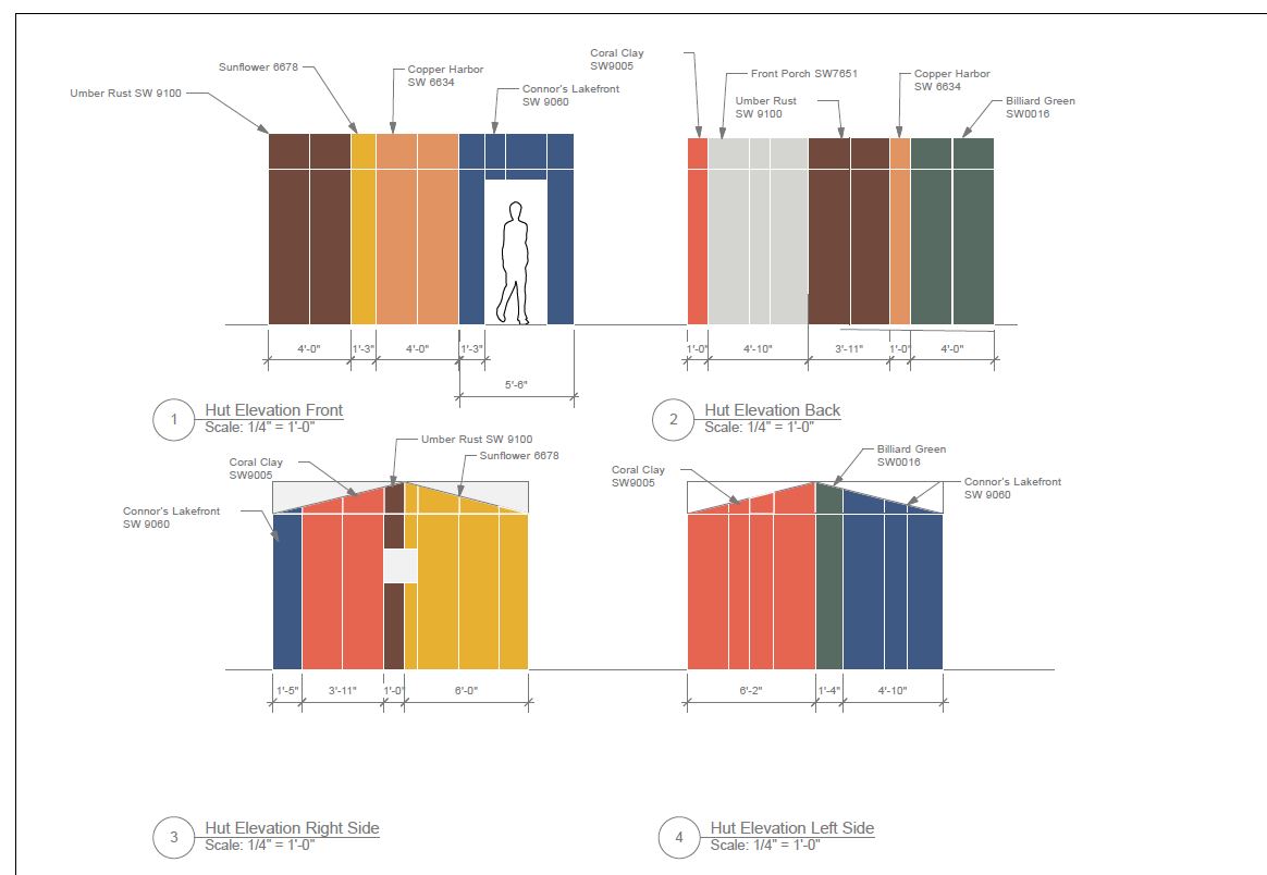
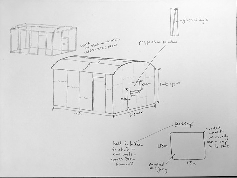
Ben Rivers drew inspiration from Jake, the subject of his film, who had corrugated metal sheets in various colors on his roof and siding of his “hut.” This shelter in the forest is shown in the film, but as it is black and white, the physical structure in the exhibition brings the playful character of this shelter to life. It has the added benefit of creating a more intimate place to view this voyeuristic narrative. Rivers first provided us with a hand sketch, which I drew up to scale, and we determined that we needed to adjust the size to make it more accessible to all of our visitors. The team built the internal structure out of two by fours, and scouted for used corrugated metal. During the process, the artist decided to mimic the colors of Jake’s roof instead of the patina on the metal, so we ended up buying corrugated metal sheets and painting them. Seeing the finished piece draw in visitors with its curious color palette and flicker film inside has been a wonderful reward for our hard work on this piece, and Ben Rivers was very pleased with this iteration of his work as well.

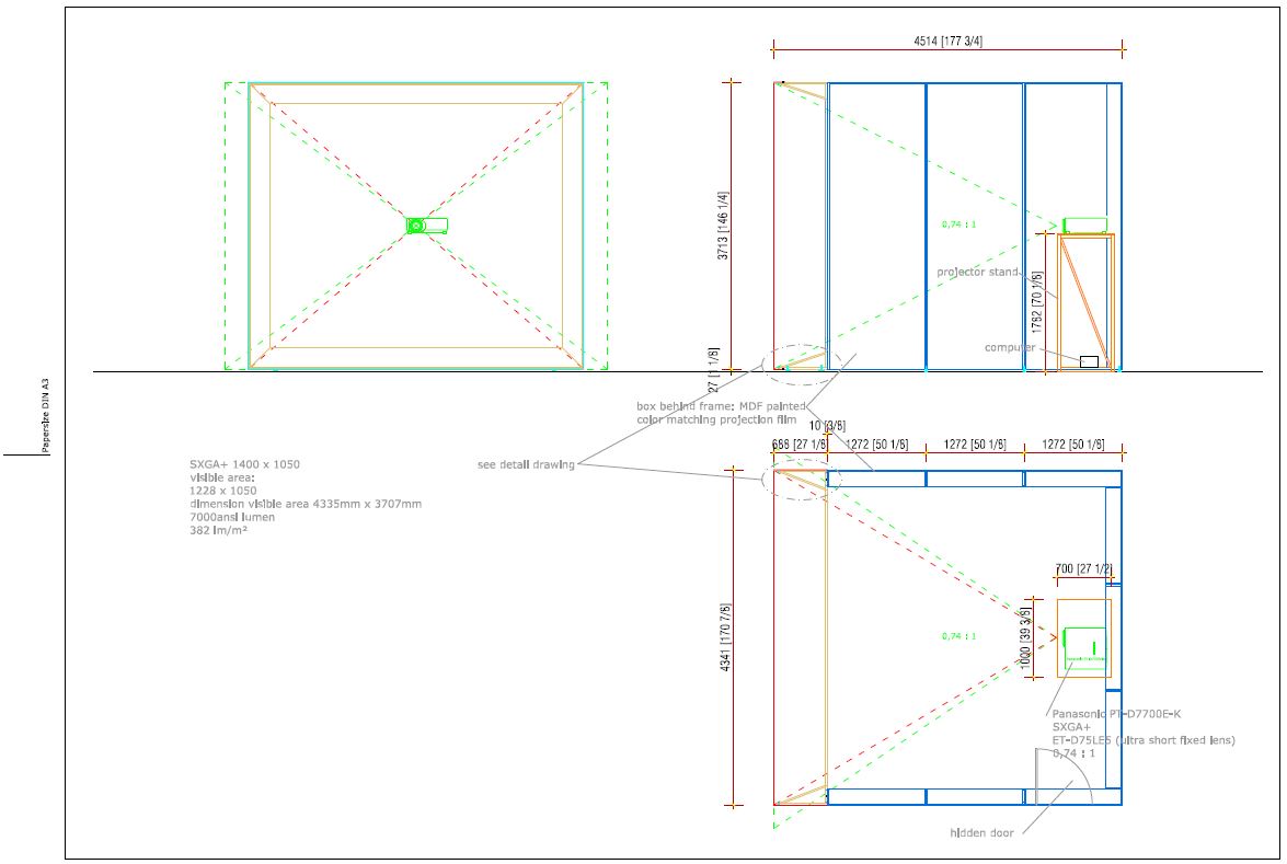
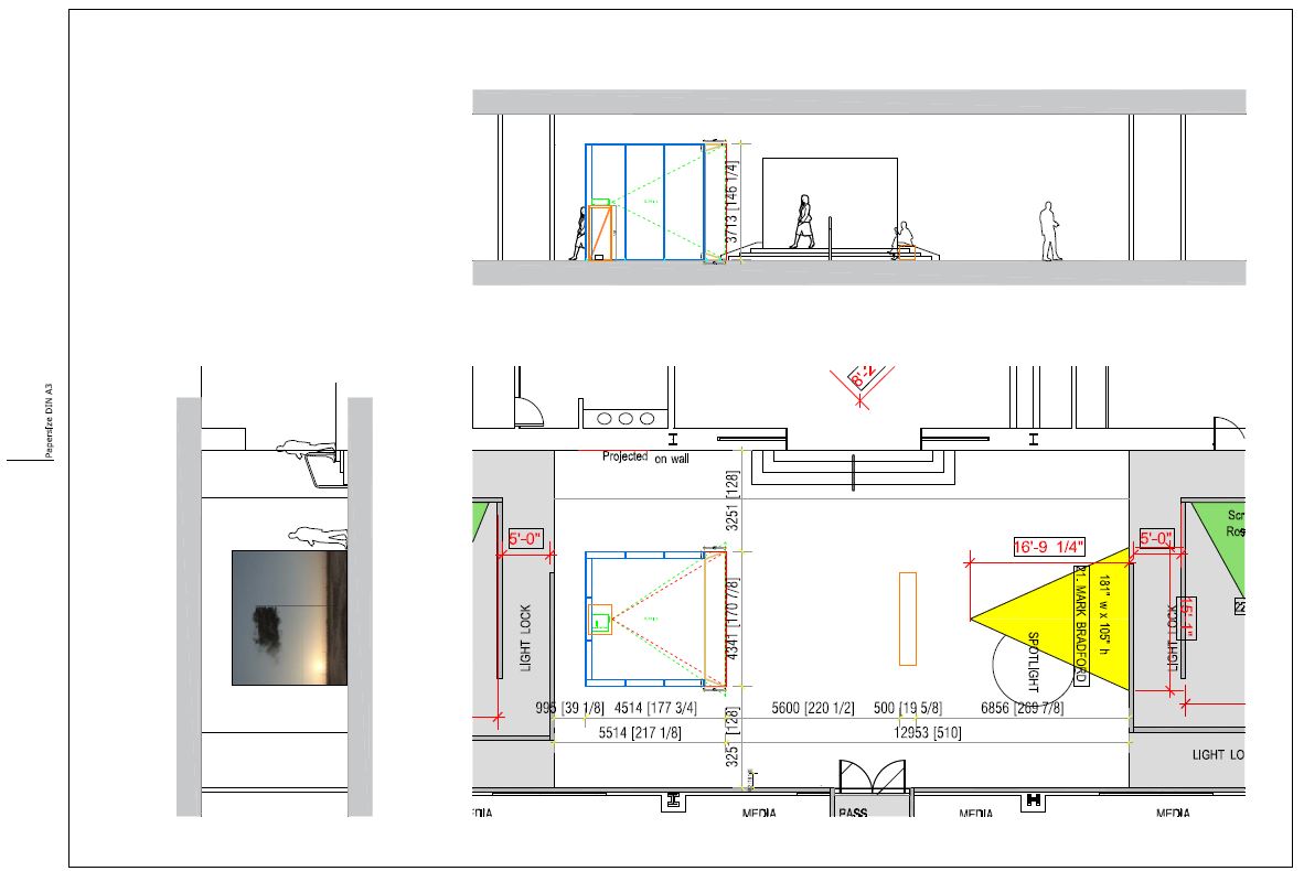
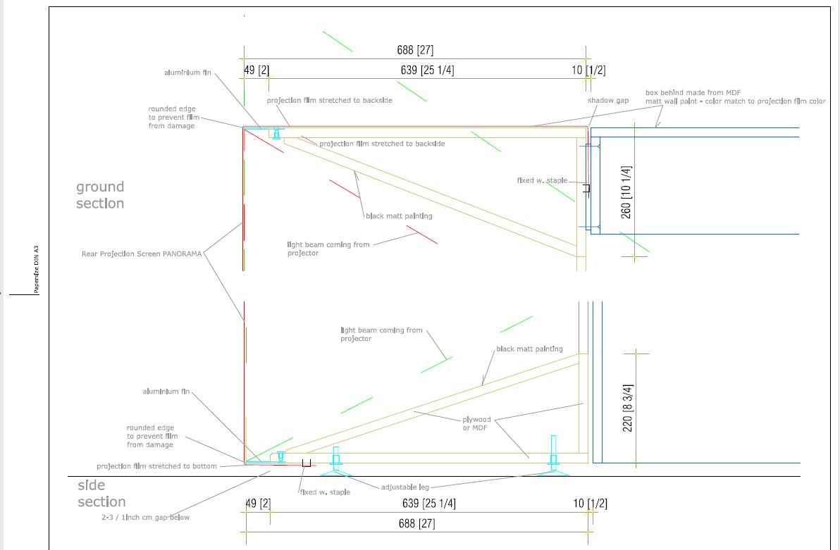
Creating an environment around John Gerrard’s Western Flag followed a somewhat similar process, although he has a very involved working studio. They provided us with detailed and precise fabrication specs  to emulate and adapt to our space. The result is a beautifully seamless surface, projected from inside of a cube. The cube appears to float ever so slightly off the floor, which adds to the perfect otherworldliness of the computer-generated reality portrayed in Western Flag.

Discover more about Gerrard’s work from the artist himself during State of the Arts: New Media and the Future of Art on Thursday, January 25, when the artist joins KERA’s Jerome Weeks in conversation with SMU Assistant Professor of Media Arts Amber Bemak.

Skye Malish-Olson is an Exhibition Designer at the DMA.

Open Office: Exhibition Planning

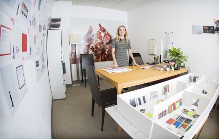
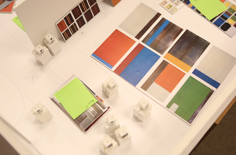
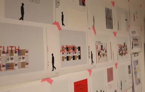
It has been said that the environment we create is a reflection of our state of mind. For Skye Olson, Exhibition Designer at the DMA, this sentiment could not be more true. Her office is crisp and organized with pops of color peeking through exhibition models and paper diagrams. She is in the business of aesthetics, choosing paint, finishes, and elements that will showcase art in the best possible light. The clean lines of her office reflect the detailed approach she takes in designing exhibition spaces. Sneak a peek inside Skye’s Museum office:

skye

Friday Photos: Turn Your Classroom into an Exhibition!

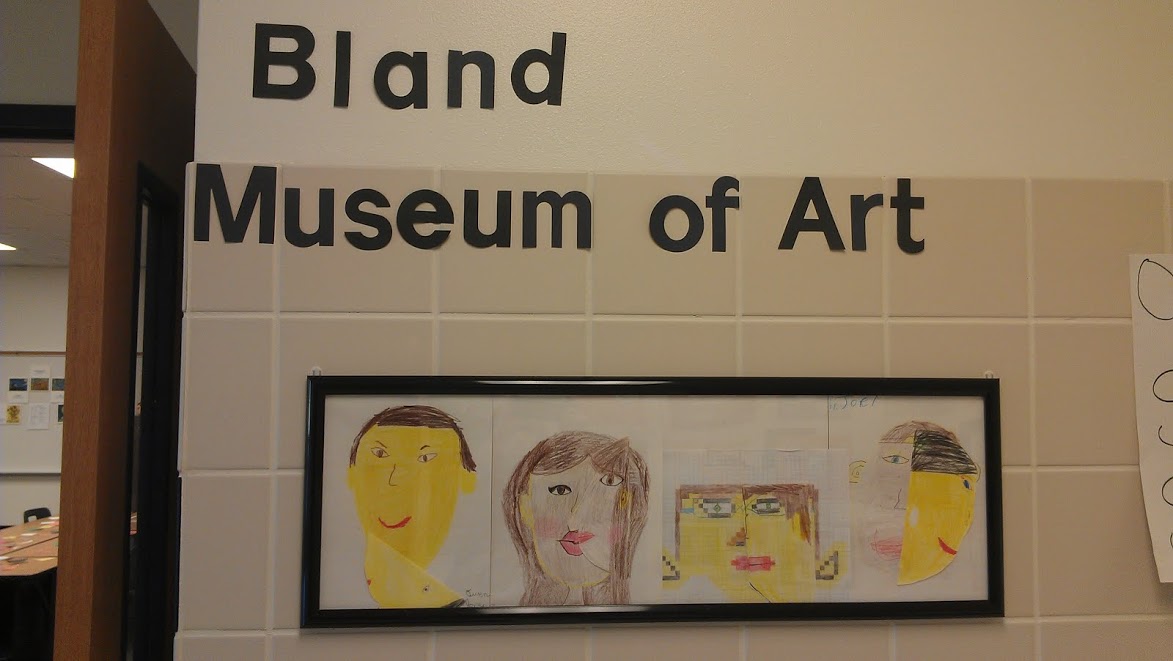
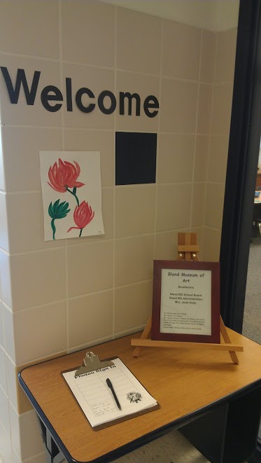
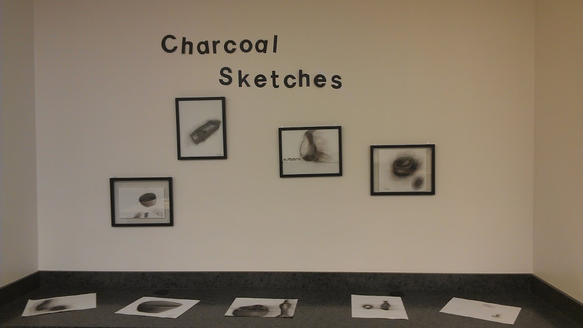
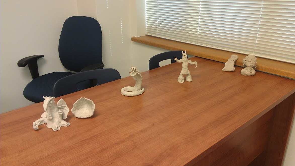
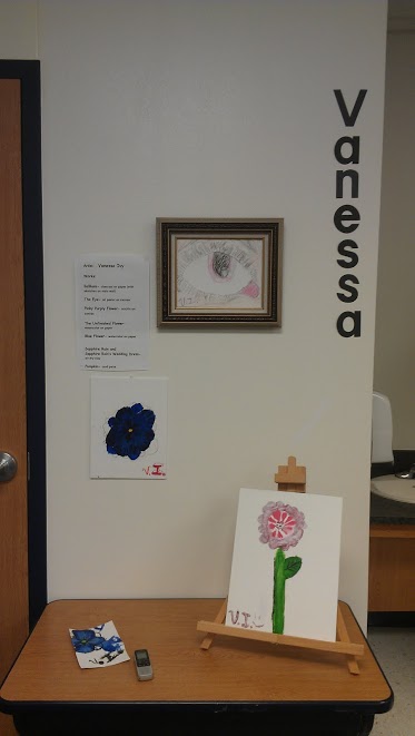
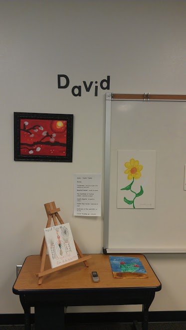
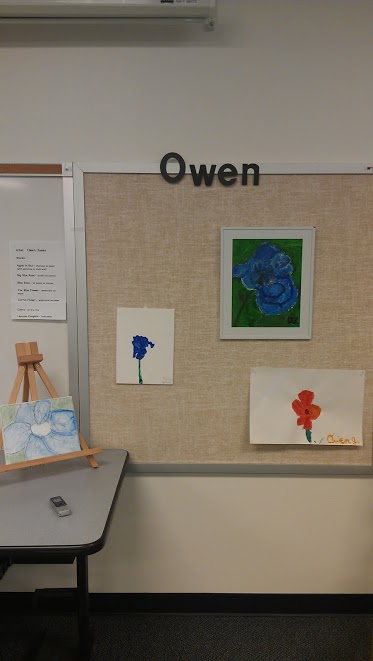
Last month I had the opportunity to spend an afternoon touring the DMA with four Gifted/Talented students from Bland Elementary. In preparation for an exhibition they were planning at their school, they wanted to learn how museums design gallery spaces, considering decisions such a display, framing, labels, chronology, etc. Ms. Carissa Brophy, the Gifted/Talented teacher at Bland Elementary, recently answered a few questions about this project. We hope the success of her exhibition can inspire a similar project at your school!

How did you develop the idea for a student art exhibition? Is this something you have done in the past?

Ms. Brophy: Students discussed what areas of study we could look at for the year and decided that art was an area our small school could improve upon since we do not have an art teacher at our elementary… The group decided that we could take all of our individual works and create a mini-museum for our school to view. This was a new concept for us.

During the tour, what did your students learn about exhibition design?

Ms. Brophy: My students learned that the space around art can impact the experience of the viewers–small art may need an intimate or small space while large art can fill a large room and be a focal point. Frames can impact the experience of the patron… [and] must match the style so they do not overpower the art. The students [also] learned that you should label artworks to identify medium, type of display mat, artist’s name, year created… and labels should not interfere with the viewing [experience].

What do you think the students gained from visiting the museum? What information did they take away from the experience?

Ms. Brophy: They learned to look at art from different perspectives… They [also] gained knowledge of ways to display collections of art [and] appreciation for other’s art.

How was this new information translated into the exhibition design for your classroom?

Ms. Brophy: We viewed the space in our room with the desire to create flow for our patrons to enjoy all the student-created art, not just stand in one spot.

Are there any elements of the exhibition that you found more successful than others?

Ms. Brophy: Students loved the entire experience [and] parents said they loved the [classroom] museum. We had several comments on the digital tour the artists recorded for their display.

Do you have any suggestions for teachers who want to adapt this idea for their classroom?

Ms. Brophy: Have fun and let the students make it their own!

A huge thank you to Ms. Carissa Brophy and all of her students at Bland Elementary! And congratulations on your wonderful exhibition!

Hayley Prihoda
McDermott Intern for Gallery and Community Teaching


Friday Photos: Designing Exhibitions Workshop

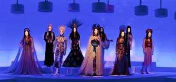
Last Saturday, a dozen teachers explored exhibition design in a half-day teacher workshop, slipping in and out of the galleries before the crowds waiting for one last look at The Fashion World of Jean Paul Gaultier: From the Sidewalk to the Catwalk.  We were thrilled to have Jessica Harden, DMA Exhibition Design Coordinator, take us through various galleries she had designed. As we looked at the work, she enlightened us on the effect of design elements on visitor experience. It was especially exciting to hear Jessica explain her creative process for the Gaultier exhibition, which is full of imaginative elements, such as a satin-tufted display case and graffiti-filled walls!

The teachers spent the second part of the day designing mini exhibitions of works in the DMA’s collection. They considered lighting, wall color, interactive components, mood, and object and visitor safety, pinning their layouts and ideas to project boards. The teachers ended the day by sharing how their chosen design elements expressed the focus of their exhibitions. Here’s the breakdown of our Exhibition Re-design Project.

Enjoy these photos that capture some of our fun morning. Thanks to all the teachers who joined us on Saturday!

Andrea Severin

Coordinator of Teaching Programs

2012 Spring Teacher Workshops

We are officially in the middle of January, and that means that it is time to announce our Spring Teacher Workshops for 2012!

The Fashion World Of Jean Paul Gaultier: From the Sidewalk to the Catwalk at the Dallas Museum of Art

If you have ever wondered how exhibitions are created, then you absolutely must attend our first workshop on February 11th, Designing Exhibitions. Learn about the creativity, challenges, and design of exhibitions at the Dallas Museum of Art with the DMA’s exhibition designer, Jessica Harden. Explore The Fashion World of Jean Paul Gaultier from the Designer’s perspective, participate in art-inspired, design-based thinking projects, and be prepared to look at museum exhibitions in a brand new light.

As you may know, we love the idea of combining art and poetry, so we are excited to promote The Art of Language: Mark Manders and Elliott Hundley as an Adult Workshop that is open to teachers as well as the general public. This evening workshop will take place at the Dallas Museum of Art and the Nasher Sculpture Center on March 8th. Come and explore connections between language and visual art in this workshop, as we examine the work of contemporary artists Mark Manders and Elliott Hundley. Led by Farid Matuk, poet, and Dr. Cynthia King, an English professor at UNT, as well as staff from the DMA and the Nasher, participants will discover each artist’s unique relationship to language and then respond to the exhibitions through writing.

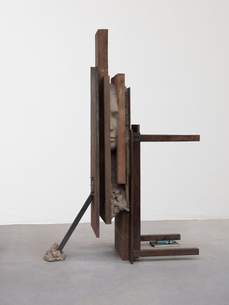
Still Life with Books, Table and Fake Newspaper, Mark Manders, 2010, Collection David Teiger

The Amazon, Joseph Stella, 1925-1926 The Baltimore Museum of Art: Purchase with exchange funds from the Edward Joseph Gallagher III Memorial Collection

.
.
.
.
.
.
.
.
.

.

.

.

.

.

.

.

Later this spring, on March 31st, The Twenties: American Art, Literature, and History will coincide with the exhibition Youth and Beauty: Art of the American Twenties. Participants will view the varied works in this exhibition and study key American artworks in the DMA’s collection as they explore ideas about art, literature and popular culture in 1920s American life.

We hope to see you at the DMA in 2012!

Jessica Kennedy
McDermott Intern for Gallery Teaching


Archives

Flickr Photo Stream

Categories