Posts Tagged 'DMA'


Basis of Bourbon

As the weather becomes cooler (well, sort of), we’re looking forward to warming up inside the Museum with our third installment of Artful Pairings this Thursday—an exclusive night of drink tastings and Museum tours for adults. This event will feature a tour of our new exhibition Cult of the Machine: Precisionism and American Art, and what better drink to go with quintessentially American art than bourbon? We’ll hear from the folks at Crooked Fox Bourbon about their product, and mix our own cocktails with bourbon as the star, paired with small bites from our cafe.

To get you in the mood for some barrel-aged goodness, here are some fun facts about bourbon and a few works from our collection that pair nicely with them.

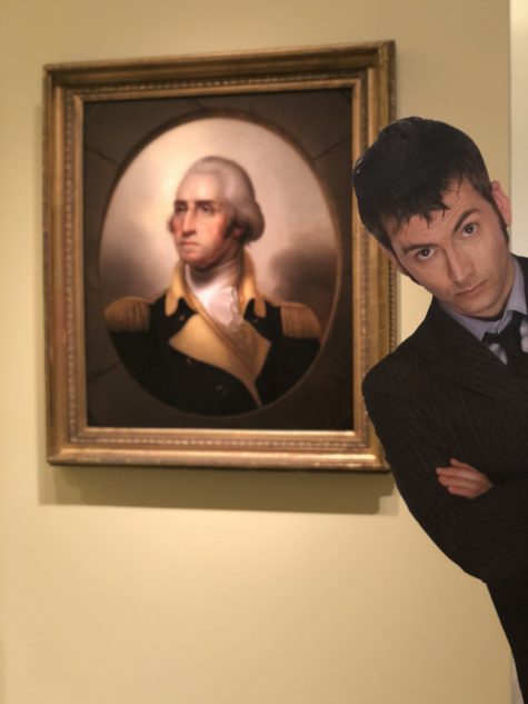
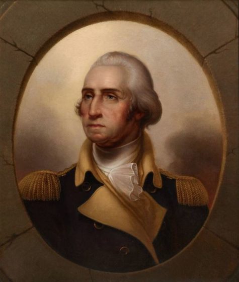
Rembrandt Peale, George Washington, c. 1850, oil on canvas, Dallas Museum of Art, The Karl and Esther Hoblitzelle Collection, gift of the Hoblitzelle Foundation, 1987.41

Did you know that George Washington played a role in how bourbon came to be? In 1789 frontier farmers violently rebelled against their new American government for trying to tax their whiskey, which they used for currency and trade (not just for drinking). As George Washington led an army out west to end this rebellion, some of the disgruntled distillers fled further west to Kentucky, where they thought they would be able to operate under less restrictive conditions. These settlers ended up distilling corn-based alcohol, which gave us the modern day drink we know and love.

To pair with this fact, we have the portrait of George Washington by Rembrandt Peale. Peale widely advertised this portrait with pamphlets including quotes from family members and friends of the president to show this was the most accurate portrayal. His advertising campaign worked, because nearly 80 versions of this portrait exist, including one hanging above the dais in the US Senate Chamber.

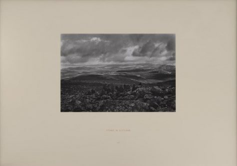
Richard Long, Stones of Scotland, 1979, gelatin silver print, Dallas Museum of Art, gift of Nancy M. O’Boyle, 1997.154

Although many people could argue the differences between American bourbon and Irish whiskey, they are much closer in production process than you might realize. Bourbon barrels can only be used once for storing the liquor before bottling. Once those barrels have had one batch in them, some become furniture or firewood. Others are repurposed for aging either soy sauce or—most often—Scotch whiskeys made across the pond. Much like the rules and regulations keeping bourbon from being made outside the US, Scotch whiskey can only be made in Scotland. The landscape and natural materials of Scotland inspired the land artist Richard Long to create his space-specific artworks.

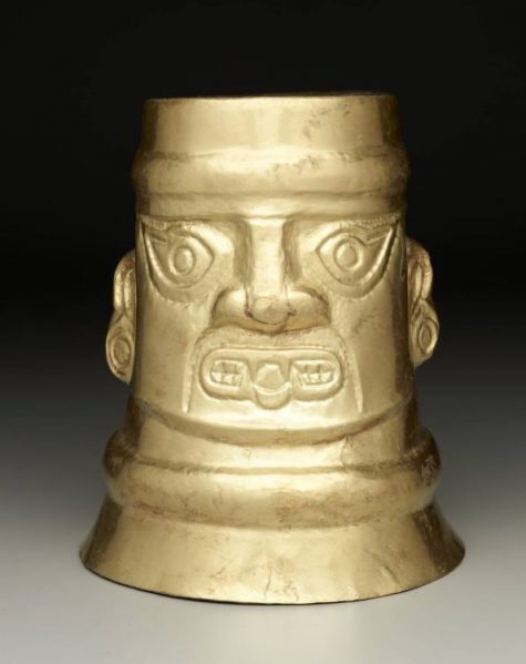
Cup: upside-down head, Peru, Sicán (Lambayeque), 900-1100 CE, gold, Dallas Museum of Art, The Nora and John Wise Collection, gift of Mr. and Mrs. Jake L. Hamon, the Eugene McDermott Family, Mr. and Mrs. Algur H. Meadows and the Meadows Foundation, Incorporated, and Mr. and Mrs. John D. Murchison, 1976.W.543

When Irish immigrants settled in Kentucky, they discovered they could make corn into a sweet-tasting liquor. Even though the Irish Americans believed they had come across a new form of alcohol, many cultures in Central and South America had been making corn-based alcohol for centuries. The golden cup above is from the Sicán peoples, who lived around the Andes in Peru until around the 12th century. The vessel would have been used to drink chicha, a corn-based beer that is still made today in many areas of South America during special ceremonies.

We hope this whets your appetite to learn more about this American-made spirit. We still have a few spots open for Artful Pairings, so get your tickets here for the program on Thursday, October 4, at 7:00 p.m.

Katie Cooke is Manager of Adult Programs at the DMA.
Patches with a Purpose

The Guerrilla Girls exhibition is in its final week on view at the DMA. For the last few months, the posters, books, and videos in the gallery have prompted a lot of questions, including the often overheard “What’s the deal with the gorilla masks?”

MzZCjLlg

The Guerrilla Girls are an anonymous collective of women artists who draw attention to sexism and racism in the art world. To borrow their words, without women and people of color represented in the art world “you’re seeing less than half the picture.” Using bold protest art and guerrilla-style marketing techniques (hence their name and use of gorilla masks, as a play on words), they demonstrate how images are a powerful way to send messages to others.
Consider what is important to you. When you think about those things, is there an image or symbol that comes to mind? Taking inspiration from the Guerrilla Girls, here’s a way to broadcast that idea or cause through a DIY iron-on patch.

Materials Needed
Felt or fabric
Embroidery floss
Embroidery hoop
Tapestry needle
Scissors
HeatnBond iron-on adhesive sheet
Iron
Threader (optional)

Using the screw at the top, loosen and separate the two rings of your embroidery hoop. Load the embroidery hoop with the felt or fabric of your choice, placing the fabric on top of the smaller ring and closing the larger ring around it to hold the fabric in place.

Tip: The hoop stretches the fabric tight to create tension. If the fabric sags in the middle, pull the edges before tightening the hoop screw all the way.

Thread your needle with the first color of embroidery floss, tying off one end. Start your design from the back side of the hoop, pulling the needle straight through the fabric. Create the first stitch by pulling the needle straight back down through the fabric. When you’d like to switch colors, simply tie the floss off on the back and repeat the process.

Tip: Keeping the needle straight and avoiding pulling hard keeps the stitches even and fabric wrinkle-free. Knowing how to sew makes embroidery pretty intuitive, but different kinds of stitches create different textures and effects. DMC Embroidery has great resources for those looking to learn new techniques.  

Once you finish your design, make sure all the thread is tied off on the back, and any loose threads are trimmed.

Rm64yqnQ

HeatnBond adhesive sheets will make the design into a patch. HeatnBond is two sided, with a shiny, textured plastic side and a paper side. Cut a piece of HeatnBond large enough to cover the design and place it on the backside of the fabric, with the paper side of the HeatnBond facing up. Pass an iron set on medium heat over the HeatnBond for approximately 30 seconds, ensuring that the iron passes over the edges and corners of the adhesive. Make sure that the HeatnBond is completely adhered to the fabric; no corners or edges should lift.

Once the fabric has cooled, use scissors to trim around the design. The HeatnBond seals the fabric, so no hemming is needed. After the design is cut to size, remove the paper backing from the back of the design. Underneath, the plastic should be smooth and shiny. Now the patch can be ironed onto another piece of fabric, like a jacket or backpack.

Be sure to visit The Guerrilla Girls before it closes on September 30. If you liked this project, join us at our upcoming workshops for families, teens, and adults to get your make on.

Jessica Thompson is the Manager of Teen Programs at the DMA.

Material Girls (and a Guy)

To make browsing through our online collection easier, there are filters to see smaller samples so you aren’t wading through thousands of artworks. For instance, you can search through culture of origin or look at the period in which an artwork was made—maybe you enjoy 18th-century French, or you want to go back to B.C.E. But one place where you might not normally look is our section labeled “Medium,” which lets you know how each artwork was made and what it is made from. While there are plenty of works made with oil paint, bronze, and marble, there are also those made of neon, bone, and soda cans.

What better time to showcase the interesting materials in our collection than the same week we celebrate the original “Material Girl” herself, Madonna. Second Thursdays with a Twist on September 13 is all about Madonna’s style, music, and the decade she helped shape: the 1980s. Until then, you can learn more about the materials in our collection that, like Madonna herself, are anything but ordinary!

Henri de Toulouse-Lautrec, Prostitutes, c. 1893–95, pastel on emery board, Dallas Museum of Art, The Wendy and Emery Reves Collection, 1985.R.75

There are unique materials scattered among all the cultures that make up our collection. As you look at the different materials, some might stick out as interesting or odd, but for the artist making that piece it would not have been such a strange choice. This is the case in the pastel work by Henri de Toulouse-Lautrec in which he used emery board, or emery cloth, as the base. This has similar qualities to sandpaper—slightly rough and coarse compared to traditional canvas. Using a delicate medium like pastel on something that will rip apart the creamy texture was a technique he learned from studying 18th-century pastellistes. Lautrec used the technique to create the beautiful, modeled shadows on the woman’s back with the heavier application of pastel. Although today we might think of emery board as an interesting material, at the time the work was created it would have been somewhat traditional for the pastel medium.

Meg Webster, Untitled (Turmeric), date unknown, jade adhesive on arches paper, Dallas Museum of Art, gift of Caroline and Michael Van Valkenburgh, 2017.47.3, © Meg Webster

Contemporary artist Meg Webster was influenced by the Land art movement in the 1970s and studied under Michael Heizer. This influence led her to work primarily in sculpture using natural elements like plants. Webster’s untitled work in our collection is not a sculpture but one of her works on paper. These works share the same focus on the earth and connection to nature with her use of materials such as soil, ash, beeswax, and spices. Untitled uses turmeric to create a textured, dyed element on the paper. She uses natural materials in this series, but on a more intimate scale compared to her room-sized works with living plants. Using natural elements to dye or paint isn’t new, but using turmeric in its raw form shows Webster’s ability to create art without changing the natural form of the materials she uses, while also giving the piece a multisensory effect through smell and the visually distinct color.

Deborah Butterfield, Horse #6-82 – Steel, 1982, sheet aluminum, wire, and tar, Dallas Museum of Art, Foundation for the Arts Collection, Edward S. Marcus Fund, 1982.96.FA, © 1982 Deborah Butterfield, Bozeman, Montana

Artist Deborah Butterfield has been making organic sculptures of horses almost her entire career. She has experimented with many different materials to make the animals to scale. In her early career, she used mostly wood and organic materials. The horse in our collection is made from steel, sheet aluminum, wire, and tar during the period in which Butterfield used mainly found metals to make the horse’s form. Even though the materials are rough, she contrasts them by creating smooth, precise forms, making the inorganic look organic. Butterfield is still working today, and now combines the materials from earlier in her career. She finds wood to create the shape of the horse, and then casts the pieces in bronze and reassembles it, Combining the two mediums to make one sculpture.

Katie Cooke is Manager of Adult Programs at the DMA.

Join the Club! A Moveable Feast Series Preview

Today is National Read a Book Day! Have you been wanting to join a book club or wishing someone would curate a list of “must reads” for you? This month the DMA’s acclaimed literary series, Arts & Letters Live, kicks off a new initiative intended to build community through conversation, offering you another opportunity to take a deeper dive into books featured in the series. A Moveable Feast Book Club will feature four books over the next three months, allowing you to select any (or all) you would like to attend. We hope that by reading and sharing insights together a week or so before hearing the author speak, your experience will be richer and even more meaningful. Book Club events will take place in the DMA’s Founders Room, where participants can enjoy lunch while engaging in conversation with fellow bibliophiles.

The series kicks off on September 13 with Dr. Jaina Sanga, author and fellow of the Dallas Institute of Humanities and Culture, leading a conversation about Texas Literary Hall of Fame author Sarah Bird’s tenth novel. Daughter of a Daughter of a Queen is a historical novel depicting the story of slave-turned-soldier Cathy Williams, who disguised herself as a man and fought in the Civil War with the legendary Buffalo Soldiers.

Photo credit: Sarah Wilson

On October 9, Dr. Jaina Sanga will lead a discussion of MacArthur “Genius” grant winner Jesmyn Ward’s Sing, Unburied, Sing,a road novel through Mississippi’s past and present that explores the bonds of a family tested by racism and poverty. Ward became the first woman and the first person of color to win two National Book Awards for Fiction, joining the ranks of William Faulkner, Saul Bellow, John Cheever, Philip Roth, and John Updike.

Photo credit: Beowulf Sheehan

Debut novelist Fatima Farheen Mirza’s A Place for Us will be the topic of discussion on October 23, again led by Dr. Jaina Sanga. The first novel from Sarah Jessica Parker’s new imprint, SJP for Hogarth, A Place for Us is a deeply moving and resonant story of love, identity, and belonging, and a powerful portrait of what it means to be a Muslim American family today. Reviewers have described it as “absolutely gorgeous” and “stunning.” 

Photo credit: Gregg Richards

The final gathering, on November 20, will feature a discussion of Jill Lepore’s These Truths: A History of the United States, moderated by Dr. Andrew R. Graybill, professor and chair in the department of history at Southern Methodist University, and co-director of the William P. Clements Center for Southwest Studies. History buffs will have an opportunity to dissect award-winning historian and New Yorker writer Jill Lepore’s magisterial account of the origins and rise of a divided nation, and the beauty and tragedy of American history.

Photo credit: Dari Pillsbury

Michelle Witcher is the Program Manager for Arts & Letters Live at the DMA.

Getting Interactive: A C3 Internship Recap

My name is Brisa Marie Smith Flores. I was born and raised in Texas, and after spending six years in Pennsylvania for my undergraduate and graduate study, I was beyond excited to move back to Texas and work at the Dallas Museum of Art!
Brisa 1

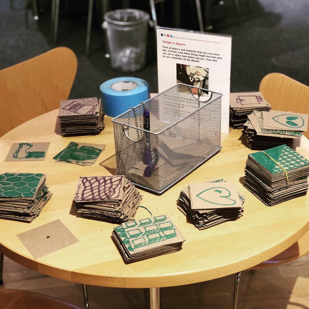
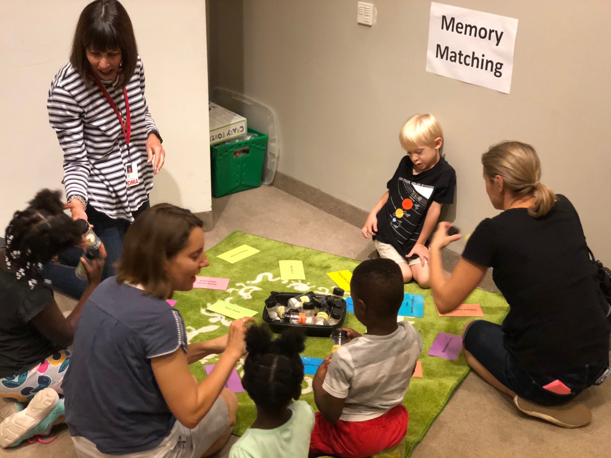
Working in the Center for Creative Connections (C3) at the DMA has truly been a valuable experience. What makes the C3 Summer Internship unique is the dynamic structure of the program that caters to its interns, as well as my supervisor’s dedication to my education and growth during the summer. As an applicant, I was passionate about applying my personal research on accessibility and inclusion to my summer project. My supervisor was supportive and encouraged me to explore what interests me. With her guidance, I was able to design my own evaluation metrics, install it in C3’s Testing Zone space, interact with visitors, and compile all the data into a report to present at a department-wide meeting at the end of my term.

Brisa 2
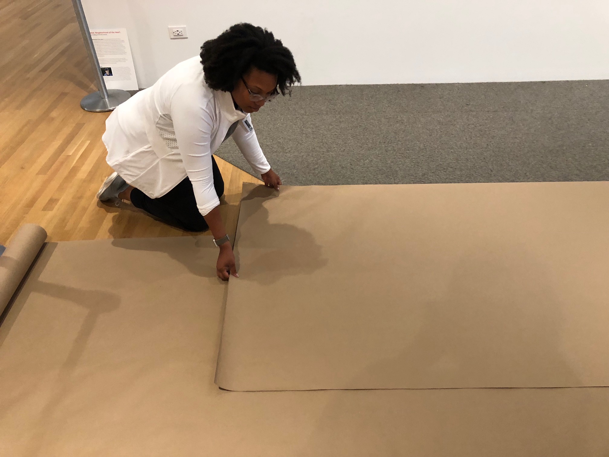
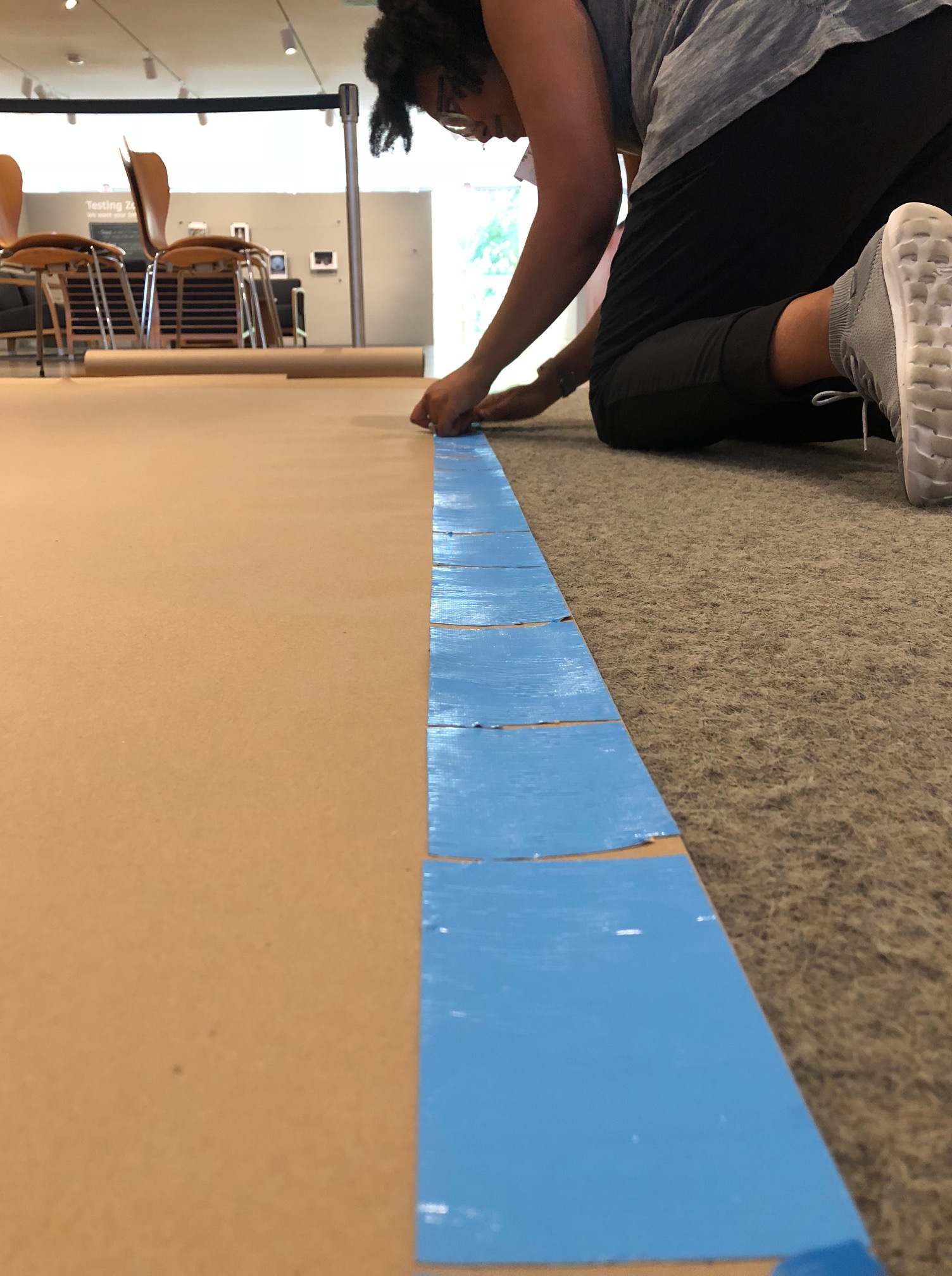
My project consisted of three major components. The first was an interactive graph that encouraged visitors to place colorful sticky dots on a grid to denote their age, favorite C3 location, and the amount of times they had visited. The second part was a series of feedback cards that presented two or three questions specific to the things we as a department care about, as well as one open-ended question to allow visitors to share anything they wanted with us. The third component focused on visitor interaction. The process consisted of me spending time in each of our C3 spaces, watching and recording how much time our visitors spent in each specific area, what activities they gravitated toward, and which age groups enjoyed the space most.

My responsibilities were not limited to just facilitating my own project; in fact, during my time working in the Center for Creative Connections, I was able to assist with gallery rotation planning, develop new activities, and train and manage volunteers, as well as prepare and lead group workshops. These were all exciting and useful new experiences that helped enhance my skill set, confidence, and résumé.

Now that my internship is over, I’m packing up and getting ready to move to sunny California! There I will be starting my first year as a PhD student at UCLA. My passions have always been people, culture, and inclusion, and because of that, I’m focusing my future research on ways museums can be more accessible and better support their communities. Having the opportunity to work at the DMA has been invaluable to my understanding of how museums function, adapt, and think about the communities they serve. I am so thankful for this experience and all the amazing friendships I have made!

Brisa Marie Smith Flores is a C3 Summer Intern at the DMA.


Paper Collecting: A Peek into the Archives

Did you know that in addition to keeping records that document the Museum’s activities from the past to the present for the future, the DMA Archives also collects personal papers from Dallas-based artists and galleries? I’ve previously highlighted a few things from these collections—here, here, and here are a few examples—but it has been awhile. As our quadrant galleries currently feature a group of exhibitions by female artists in the DMA’s collection, here are a few cool things from archival special collections of women artists and a women-run cooperative gallery.

Color Equations installation photo book, Pamela Nelson Papers

Artist Pamela Nelson has done a number of public art projects around Dallas. One of my favorites is Color Equations at NorthPark Center, which she created with author Robert A. Wilson. The Pamela Nelson Papers contain preliminary sketches, design and fabrication plans, and the catalogue for the initial installation exhibition.

Color Equations, Pamela Nelson Papers

Color Equations, Pamela Nelson Papers

While less visual, the exhibition list from the Coreen Mary Spellman Papers is incredibly useful for someone researching Spellman’s work, as it documents the exhibitions in which her work appeared and which works were accepted for the show.


The DMA Archives also holds records from the DW Gallery, also known as the Dallas Women’s Gallery. The gallery was founded in 1975 by Linda Samuels with several other women. It was incorporated in 1978, and later managed by Diana Block from 1981 until it closed in 1988. In addition to administrative, legal, and artist records, the collection also contains textiles—T-shirts promoting the gallery.

DW Gallery T-shirts

Information about these and other special collections in the DMA Archives can be found at DMA.org/research/archives or in the library catalog.

Hillary Bober is the Archivist at the Dallas Museum of Art. 

Writing the Wrong

While museums increasingly take on roles in entertainment and education, they remain, like libraries, stewards of knowledge. However, sometimes this knowledge—what we think of as researched, established fact—is misguided. Admitting you’ve been wrong can be humiliating, yet slip-ups within the museum field encourage humility. Mistakes remind us that correcting, preserving, and adding to the record is, at the end of the day, what museums are called to do.

The blunder in question surrounds the identity of the objects seen in Gerald Murphy’s 1924 painting Razor.

Gerald Murphy Razor

Gerald Murphy, Razor, 1924, oil on canvas, The Dallas Museum of Art, Foundation for the Arts Collection, gift of the artist, © Estate of Honoria Murphy Donnelly, 1963.74.FA

The journey began when Sue Canterbury, The Pauline Gill Sullivan Associate Curator of American Art, received an email from a concerned fountain pen enthusiast who notified her that the Museum was misinformed about Murphy’s painting. Sue asked me to create a timeline of recorded references to find out when the misinformation began. Then I was asked to search for what may have misled our predecessors and to untangle this 15-plus-year hiccup in the DMA’s records.

For years, the Museum said the razor and pen featured in the painting were modeled after products designed or sold by the Murphy family through their successful storefront, Mark Cross & Co. While it is true that Murphy designed a prototype razor in the mid-1910s that had a short burst of fame from 1912 to 1913, and that his family’s company most likely sold top-of-the-line writing utensils in their luxury goods stores, the razor and pen are NOT Murphy-designed objects. After thorough research, I concluded that years of accidental conflation caused the mix up.

Mark Cross Logo

The Mark Cross logo after its inception in 1845. Gerald Murphy’s father, Patrick Murphy, bought the company in the 1880s, which led to the family’s increasing wealth. © Mark Cross Leathergoods LLC

Murphy confirms the object’s correct identity in his letters with former DMCA director Douglas MacAgy: “The first Gillette razor and the first Parker pen (of red rubber) were real objects (not gadgets) ‘no bigger than a man’s hand.’”

Gerald Murphy letter

A letter from Gerald Murphy to Douglas MacAgy referencing Razor and Watch, another painting by Murphy, 1960, DMA Archives

The object for which Razor takes its name is a Gillette “New Standard” safety razor. This razor featured new technology that increased consumers’ ease of use and overall safety. Fewer shaving cuts? Yes, please! It was the most successful razor during the time of the painting’s creation and reached both American and European markets. By comparing the Mark Cross and Gillette razors below, and looking again at the painting, you can see how the Gillette attribution makes more sense with what Murphy illustrates.

The Parker Pen Company took the American (and later European) markets by storm with its iconic “Big Red” Duofold fountain pen in the early 1920s. Instead of wanting a new Xbox or iPhone as a gift, consumers hoped for a Parker pen.

lucky strike

A 1920s Parker “Lucky Strike” Duofold fountain pen, Courtesy of edgepens on Ebay.com

Why? The pen featured cutting-edge technology, including a leak-proof inkwell system and a durable, strikingly modern red rubber shaft. Murphy’s detailing even alludes to it being not the first version of the pen but the glitzier 1923 version, which included the fashionable “gold girdle,” seen in the advertisement below.

parker ad

1923 Parker advertisement, Courtesy of the-ad-store on Ebay.com

Now to the probable sources of the mix-up: a combination of trying to make the painting more personal to Murphy, plus an unfortunate conflation of similarly named companies. Symbols are always intriguing and tempting for art historians. If Murphy had designed the razor and/or pen, it could be seen as a self-portrait; yet, Razor still can be, despite the objects not being of his design (see Deborah Rothschild’s book Making It New: The Art and Style of Sara and Gerald Murphy).

Additionally, an accidental conflation occurred between the Mark Cross name and the A.T. Cross Company, a popular producer of pens. A.T. Cross bought the Mark Cross company in 1983 (right before the first publication of the misinformation), as referenced on A.T. Cross’s website. Prior to the buyout, Mark Cross was known primarily for its leather goods, not its side hustle of writing accessories. Every source that labels Mark Cross as a pen company and the pen as sold/designed by Mark Cross occurs after this buyout date.

Murphy’s Razor and his dazzling 1925 painting Watch are currently not on view, but be sure to check them out in the DMA’s upcoming exhibition Cult of the Machine: Precisionism and American Art, on view from September 16 through January 6!

Ashton Smyth is the Summer Curatorial Intern for American Art at the DMA.

Shared Trajectories

In spring of 1978, while the artist León Ferrari was in Stockholm, Sweden, his son was disappeared by the military police back in his home country of Argentina. Long suspicious of governmental and religious powers, Ferrari was openly critical of the Argentine dictatorship, and had been living in São Paulo, Brazil, in exile since 1976. His son had stayed behind and was actively engaged in the leftist resistance, ultimately suffering the same fate as 30,000 of his compatriots who were kidnapped and murdered during the country’s decade-long “Dirty War.” Two untitled works on paper recently acquired by the Dallas Museum of Art serve as witness to these important junctures in the artist’s life, and are signed and dated from São Paulo and Stockholm, respectively. Functioning as abstracted letters, they form part of a long-running series Ferrari inaugurated in 1963 with Carta a un general (Letter to a General), in which the artist’s script becomes illegible and morphs into almost Surrealist imagery, calling to mind that movement’s interest in automatic writing and its possibilities.

Runo Lagomarsino, the subject of the DMA’s upcoming Concentrations exhibition EntreMundos, shares a geographic lineage with Ferrari. Lagomarsino was born to Argentine parents who migrated to Sweden during the Dirty War. His grandparents were Italian, as were Ferrari’s parents (up to 62% percent of Argentines are of Italian descent), and both artists have lived and worked in São Paulo. Lagomarsino’s heritage and travels have informed his work, which comments on mass migrations from the colonial period to the present. But their work has more in common than this shared trajectory. Like Ferrari, Lagomarsino renders legible systems illegible, and stable meanings unstable.

4Crucero Del Norte

Runo Lagomarsino, Crucero del Norte , 1976–2012, 24 exposed photographic papers, 7 x 9 1/2 in. (17.8 x 24 cm) each, Collection Lena and Per Josefsson, Stockholm, Photo: Erling Lykke Jeppesen

_X9A7274

Runo Lagomarsino, West Is Everywhere you Look, 2016, 9 maps, motors, cables, and wires, variable dimensions, Courtesy of the artist and Francesca Minini, Milano

In the upcoming exhibition, visitors will encounter maps, like those found in primary school classrooms. Yet these maps are rolled up and closed so that their contents cannot be seen. In other works, photographic paper has been exposed to light so that any imagery is blurred beyond recognition; portmanteaus stamped on a wall create surprising associations. By putting into doubt what is typically taken as factual, Lagomarsino asks us to question our own assumptions and biases, and how these become codified into larger social and political systems. This questioning of the powers-that-be is exactly what drove Ferrari during his long career. These sympathetic artists demonstrate art’s ability to thrive in the space of ambiguity, empowering viewers to create their own interpretations.

Concentrations 61: Runo Lagomarsino, EntreMundos opens on September 30; the exhibition is included in free general admission.

Anna Katherine Brodbeck is The Nancy and Tim Hanley Associate Curator of Contemporary Art at the DMA and curator of the exhibition.

Streamline Design: The Art of Technology

Today is National Radio Day, and yesterday, August 19, was National Aviation Day. The two days celebrate the development and technological advancements in aviation and the invention of the radio. While it is most likely coincidental that both holidays fall back-to-back, in terms of 1930s industrial design, this pairing is meant to be.

The years between World War I and World War II were the Golden Age of Flight and the Golden Age of Radio in America. During these decades, affordable, safe, and comfortable long distance plane trips became a foreseeable travel option for the greater American public. Similarly, the affordability of the radio brought families across the United States together for regular nightly programming and entertainment—essentially bringing the world into their living room. With both the skies and airways now within reach, the fascination with rapidly developing technology, speed, and motion became hallmarks of the era.

Artistically speaking, this era is one of my favorite periods in terms of the decorative arts. The emergence of flight had a profound impact on the design of many household and consumer goods during the interwar years, and radio encasements often reflected the Machine Age aesthetic of the 1930s. Prominent industrial designers of the day embraced America’s love affair with flight and successfully blurred the lines between art and technology with of-the-moment consumer products. Good design sells; therefore, it is no surprise that for the radio—one of the most prominent fixtures in the 1930s American household—overall design aesthetic often dominated the purchasing decision of a design-savvy consumer.

If you’re looking for a creative way to pay homage to these two holidays, take note of these aerodynamic gems on view at the Dallas Museum of Art that incorporate characteristic elements of streamline design, including horizontal banding, smooth exteriors, and the use of modern materials like chrome and plate glass. Each object suggests the concepts of speed and movement while stylishly capturing a moment in decorative art and design history when the worlds of aviation and radio effortlessly collide.

Take a look at the 1933 “Air-King” radio (model 66) designed by Harold Van Doren and John Gordon Rideout. The form of this radio is a play on the motif of a skyscraper, with its stepped shape toward the top; however, the circular glass plate on the façade with showing AM and FM broadcast band numbers, combined with the tuning and volume knobs, remind me of a cockpit’s control panel.

Don’t miss this “Bluebird” radio (model 566) designed by Walter Dorwin Teague and manufactured by the Sparton Corporation in 1934. The name alone embraces the notion of flight and is enhanced even further through streamlined design elements. Here, the straightforward use of circles and horizontal banding set against the plate-glass backdrop seems to mimic a single engine propeller plane’s nose and wingspan. I imagine a plane flying gracefully through the clear blue open sky, transporting the avid listener to new destinations through the magic of radio.

To learn more about how the Machine Age influenced art and design in America, visit the Dallas Museum of Art’s upcoming exhibition Cult of the Machine: Precisionism and American Art, which will open to the public on September 16.

Jennifer Bartsch-Allen is a Digital Collections Content Coordinator at the DMA.

The Secret Lives of Color

In her newest book, The Secret Lives of Color, author Kassia St. Clair reveals the hidden histories of 75 colors that shaped everything from art and fashion to medicine, politics, commerce, and religion.

This Friday at 7:00 p.m., the author will join us for a Late Night talk about her book, where she will discuss what inspired it, how she conducted her research, and a few favorite hues—from the ultra-pricey ultramarine to the morbid mummy brown. Here’s a sneak peek.

What inspired you to write The Secret Lives of Color

Several things honestly. It definitely helped that my mother was a florist, so growing up I was always seeing colors being put together creatively and was encouraged to do likewise. Academically, I became interested in color when I studied at university. I wrote my dissertations on 18th-century fashion, which involved a lot of research into the shades that were fashionable at the time: it fascinated me that they had changed so much. Some of the combinations they loved back then would make your eyes water today! I also loved researching the names or trying to figure out what a once-fashionable tone might have looked like, since often only written descriptions would survive.

How did you decide which colors made the cut? Is there one that you would have liked to include but didn’t?

When I pitched the book, I had a whole list of shades, dyes, and pigments that would go into each chapter, and although many of those did make it into the final book, many others did not and many more were added. The trick was to get exactly the right combination of story and variety. It would have been boring to have five yellows one after the other that all dated from a similar period and were used in near-identical ways. This is something that you very quickly discover when writing but which might not be obvious in the planning stage! There are certainly colors that it would have been wonderful to include full entries for, and many of these I was able to put into the glossary at the back.

In your opinion, what is the most underrated color and why?

I think black is a hugely underrated color. For a start it’s an absolutely vast category: we’re used to giving lots of different names to various whites—cream, ivory, beige, canvas, and so on—but with black it all gets collapsed in together, with very little regard for how different two shades might be from one another. I loved discovering in the course of writing this chapter that there were once two words for black: one for the glossy, luxurious kinds and another for the matte, light-sucking variety. And then again, black is often thought of as scary, unimaginative, or negative, when in fact shade and darkness can be restful, soothing, and cool.

Did the research for this book take you down any unexpected rabbit holes?

Yes, many! (See my answer above for just one example). But that’s why I love studying and writing about color; it’s never boring and you can’t help but be dragged in myriad directions. I also love how people initially think it’s a shallow, niche topic, but then the moment they start discussing it they soon realize just how vast and deep it truly is. Everyone has an opinion or a story or a fact that they want to share; it’s inclusive and I love hearing from people about the colors I’ve missed or anecdotes about festivals, customs, songs, and fashions that I might not know about.

What was one section you really enjoyed writing and why?

I love a challenge, so writing the introduction, although I always find it the hardest bit, is probably also the most rewarding. The introduction has to set the tone. It also has to cover a lot of ground and make sure everyone is carried along. Yes, you might be explaining some tricky physics (I speak as someone who gave up the sciences relatively early to concentrate on the arts), but that is no excuse for not making sure both that you understand it and that you’re making it interesting and palatable for your reader. When you’re writing, it’s my belief that you should treat your reader like an honored guest: it’s not good manners to bore on about something you enjoy but they might not. I try to be as inclusive and entertaining as possible.

If you had a signature color of nail polish what would you name it?

Because I’m going through a green phase and because it’s currently incredibly hot and parched in London so that everything is turning brown and crisp, maybe a really refreshing, cooling green-blue—something that’s a little mid-century but has just a hint of sheen: “Verdant Lagoon.”

Join us this Friday for Late Nights at the Dallas Museum of Art to hear more from Kassia St. Clair.

Jessie Carrillo is Manager of Adult Programs at the DMA.


Archives

Flickr Photo Stream

Categories