Archive Page 3


Expanded for DMA Members: Q&A with Dr. Nicole R. Myers

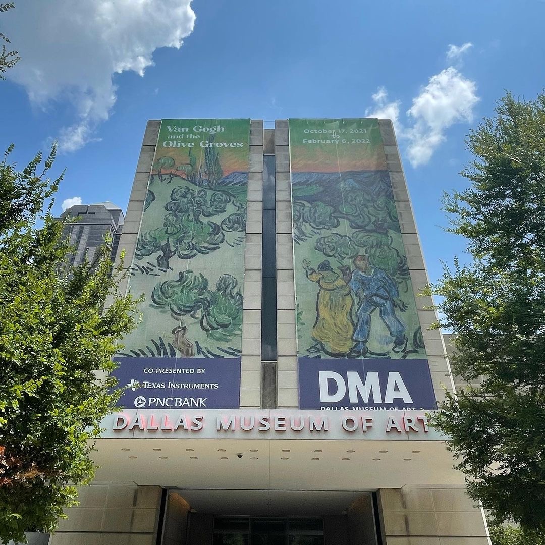
Dr. Nicole R. Myers, Interim Chief Curator and The Barbara Thomas Lemmon Senior Curator of European Art, spent almost a decade working tirelessly on bringing Van Gogh and the Olive Groves to life. Read about her perspective in making the magic of the exhibition happen.

This exhibition has never been done before, and yet Van Gogh is a legendary artist. How does it feel to premiere this exhibition in Dallas?  

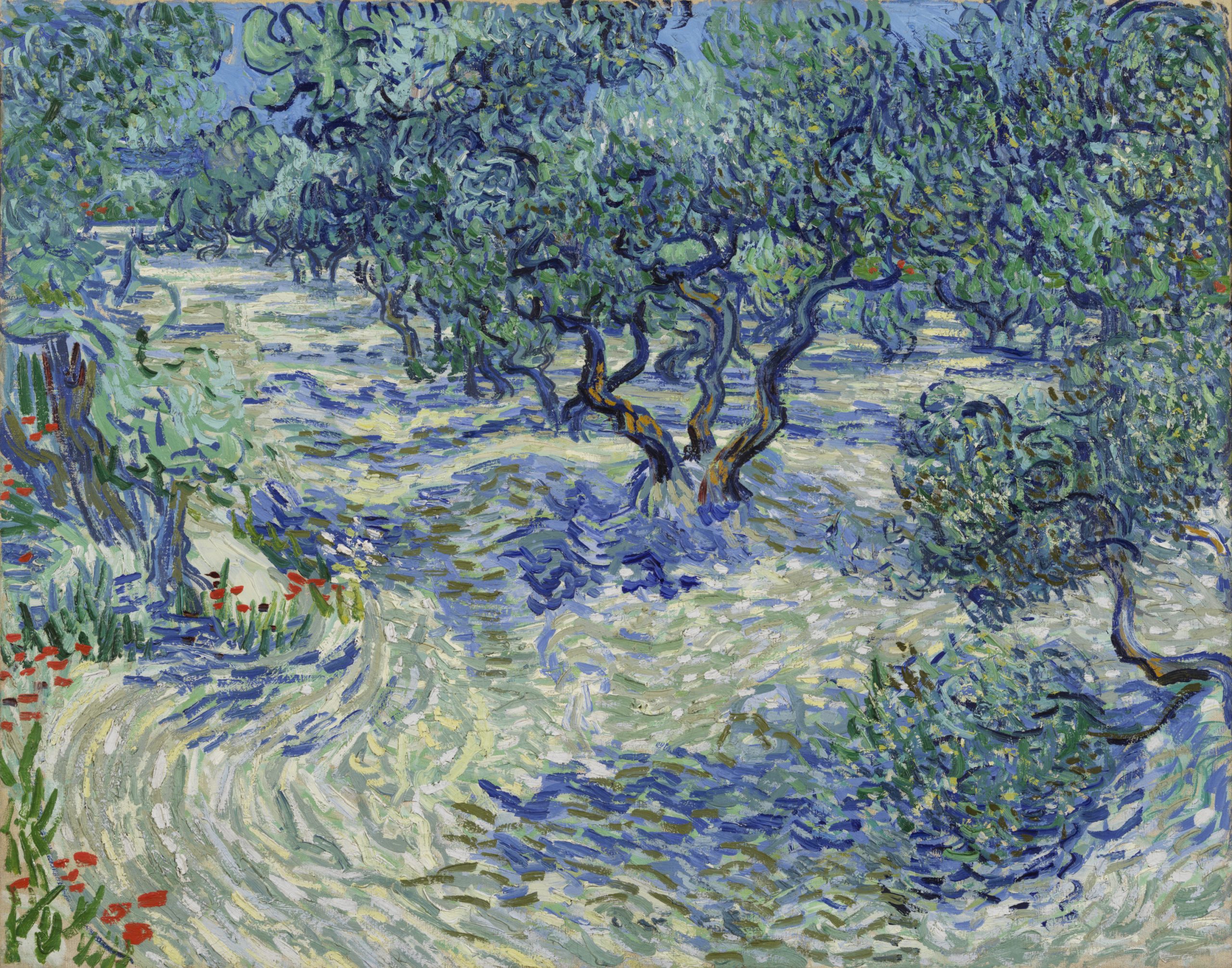
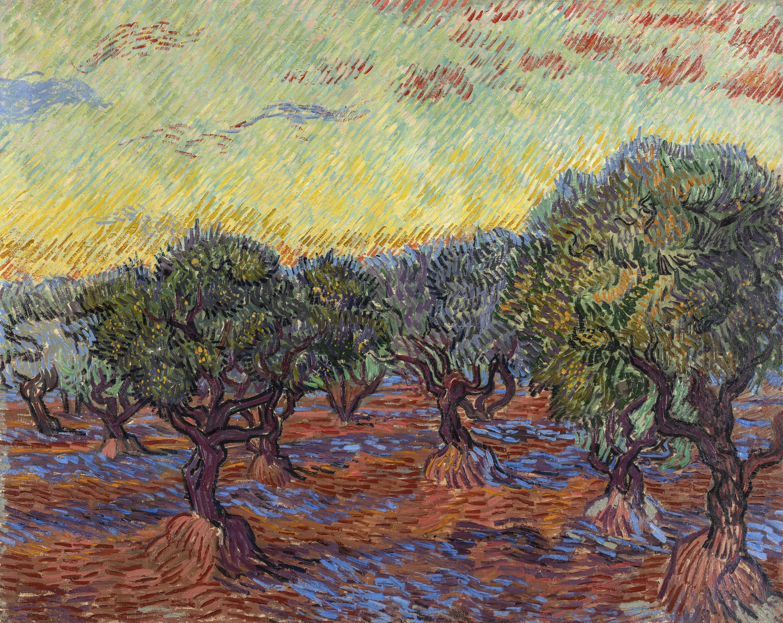
I’m incredibly excited to bring Van Gogh’s dazzling olive grove series to the DMA this fall. The paintings are not only beautiful but unique as well, and hold a special place in the artist’s life and production. Van Gogh and the Olive Groves is the very first exhibition to reunite this important, yet relatively unknown, series of paintings, and Dallas is the only place in the US to see them.  

In addition to learning about Van Gogh’s olive groves—the fascinating story of their production, as well as their evolving styles and symbolism—I hope that visitors will leave with a deeper understanding and appreciation of the artist not as the mythic persona of popular culture, but as a hard-working artist and complex human being. Van Gogh painted the olive groves while he was grappling with serious mental illness at the asylum in Saint-Rémy-de-Provence. He was thoughtful and deliberate in his selection of the olive trees as a motif and the visual means he used to convey both their appearance and the deeply personal, often spiritual significance they held for him. Produced in isolation during this very difficult period of his life, the olive grove paintings were intended to provide us—the weary modern viewer—with feelings of solace, peace, and hope, something that resonates today more than ever. 

What was your favorite part about working with the Van Gogh Museum in Amsterdam to make this exhibition possible?  

When I first started this exhibition, I had the hope that the Van Gogh Museum (VGM) would join me on the endeavor. They have three out of the 15 paintings in the olive grove series, in addition to related drawings, so their support was tantamount to the project’s success. I initially approached my colleagues at the VGM to gauge their general interest and whether they would be willing to lend artwork to the show. Their enthusiastic response exceeded my expectations, and a wonderful partnership was born on the spot. I’m fortunate to work with such great colleagues in Dallas and Amsterdam to bring this once-in-a-lifetime show to fruition. And now, after almost a decade in the making, we’re ready to share our discoveries and passion for Van Gogh’s olive groves on both sides of the Atlantic! 

Vincent van Gogh, Olive Trees, June 1889, oil on canvas, The Nelson-Atkins Museum of Art, Kansas City, Missouri. Purchase: William Rockhill Nelson Trust, 32-2. Image courtesy of The Nelson-Atkins Museum of Art, Media Services/Photo: Gabe Hopkins

How does it feel to approach the exhibition opening after so many years in development? 

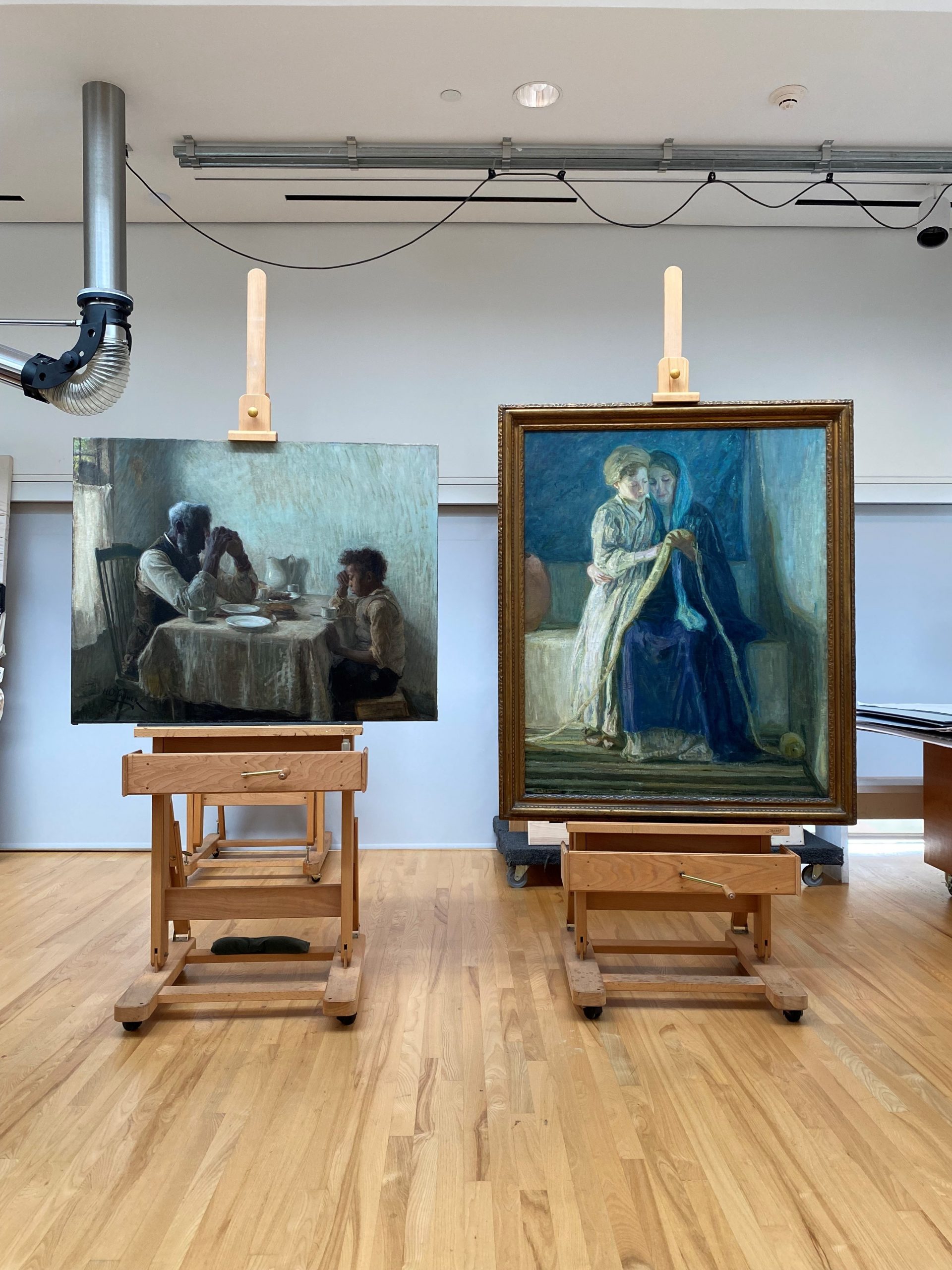
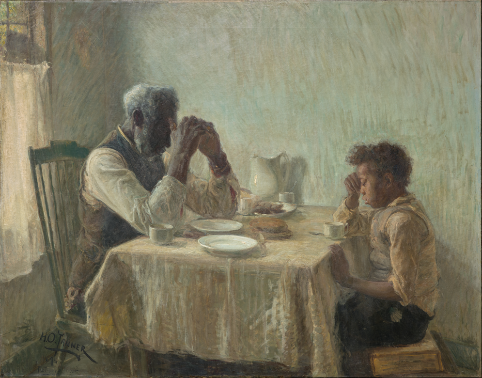
I began developing the concept for this exhibition in 2012, while I was researching the incredible olive tree painting by Van Gogh in the collection of the Nelson-Atkins Museum of Art in Kansas City. Although I had worked a great deal on the artist, I was shocked to find that the painting belonged to a significant series about which I knew nothing. I set out to learn more, only to find that there had been no exhibition or book dedicated to the subject to date. Moreover, there were many unknowns about the series, such as the dates of some of the paintings, the sequence in which they were made over a six-month production period, and which paintings Van Gogh was describing in his letters—something unexpected given the incredibly saturated research field dedicated to this beloved world-famous artist. With that, I launched the exhibition and the unprecedented comparative study that involved an international team of curators, researchers, conservators, and scientists.  

The exhibition planning took many twists and turns along the way. It’s never easy to borrow important artwork by heavily sought-after artists such as Van Gogh, and some of our loan negotiations took five years to secure. Just as the checklist was nearly finalized, the onset of the COVID-19 pandemic brought about new challenges and uncertainties. Rather poignantly, the exhibition catalogue, which takes as its subject the artistic production of a painter confined within an asylum—an experience Van Gogh described as a “necessary and salutary quarantine”—was written and produced in its entirety during the self-isolation and confinement imposed by the pandemic. It was with a mixture of trepidation and sadness that after all these years of working tirelessly to bring this project to fruition, I didn’t have access to a library or other resources when it finally came time to start the book. But the work forged ahead and I’m deeply grateful for what we accomplished under these exceptional circumstances.  

As I worked at my dining room table turned remote office, I thought often of Van Gogh and his experience at the asylum. Never before had his enduring belief in the healing and consolatory power of art and of nature felt more relevant, his experience more relatable, his achievement more astounding. I hope that visitors to the show will take as much joy and comfort from the olive trees as I have over the last decade, and especially this last year. 

Vincent van Gogh, Olive Grove, Saint-Rémy, November 1889, oil on canvas, Gothenburg Museum of Art, Sweden. Photo: Hossein Sehatlou, Gothenburg Museum of Art

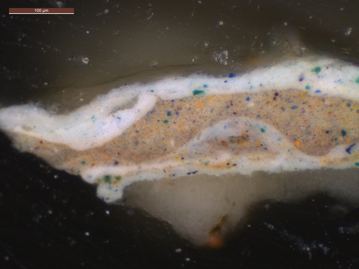
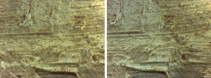
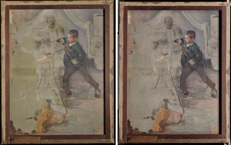
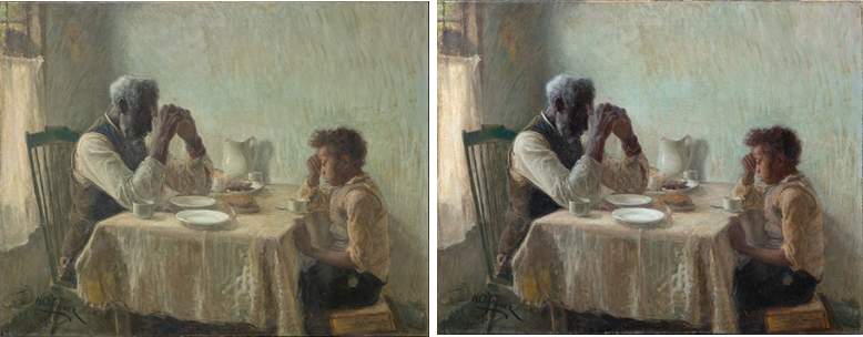
Describe some of the discoveries from the conservation study for the exhibition. 

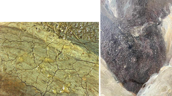
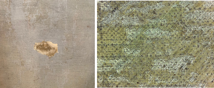
At the heart of the exhibition are the discoveries we made by studying all 15 olive grove paintings in the series. My original questions—what month did Van Gogh paint each work? In what order did he paint them? Can we connect individual paintings to specific mentions in his letters?—were explored in-depth by an international research team over the course of three years. Conservators and scientists analyzed every aspect of the olive tree paintings, from the materials used to how their appearance was altered by time. The exciting results of this three-year study make their debut in the exhibition in the chronological display of the olive groves, as well as in a dedicated gallery that will present the research team’s methods and discoveries. It’s the perfect demonstration of what’s possible when art meets science. 

Artist Spotlight: Emilio Amero

Modern Mexican art is dominated by artists with colossal reputations—Diego Rivera, Rufino Tamayo, Frida Kahlo, and many others. In my experience though, it is sometimes the artists who have garnered less attention that produced the most gripping works, charting unique artistic trajectories. One such figure, whose work I adore and have long wanted to write about, is Emilio Amero (1901–1976). Among the most versatile artists of his generation, Amero painted in fresco and on canvas, but was also a graphic designer, caricaturist, photographer, filmmaker, printmaker, gallery owner, and professor.

Born in Ixtlauaca, in the State of Mexico, Amero moved to the capital as a boy, eventually studying at the National School of Fine Arts. Although he was initially drawn to fresco painting and assisted on several important mural projects, Amero left Mexico in 1925 and settled in New York, where he worked as an illustrator for various publications, including the New Yorker and Life, and designed advertising campaigns for Saks Fifth Avenue. In New York, he explored new mediums, producing a short experimental film, 777, and trying his hand at photography. In his early photographs, he played with double exposures and other techniques for manipulating photographic negatives, but he eventually began working in a more documentary style.

Although Amero’s love for film and photography would continue when he returned to Mexico in 1930, he began working in the medium for which he appears to have had the greatest creative passion—printmaking. While teaching lithography at the National School of Fine Arts, Amero also opened a gallery, Galería Posada, where he exhibited the work of young artists, gave lectures, and held film screenings. In the mid-1930s, he returned to the United States, moving between the two countries for many years while completing various projects and teaching in New York, Mexico City, and Seattle. In 1946 Amero accepted a position at the University of Oklahoma in Norman, where he taught graphic arts until his retirement in 1967.

Emilio Amero, There is Fear, 1947, lithograph, Dallas Museum of Art, Neiman-Marcus Prize, First Southwestern Print Exhibition, 1948, 1948.12
Emilio Amero, Where?, 1948, lithograph, Dallas Museum of Art, Museum Zonne Memorial Prize, 2nd Southwestern Exhibition of Prints and Drawings, 1949, 1949.5

The DMA is fortunate to have four lithographs from Amero’s time in Norman, all of which speak to larger themes in the artist’s work. There is Fear and Where? show the artist’s propensity for contorting and compressing figures, their rigid bodies giving the impression of flesh that has turned to stone. This disquiet is enhanced by the dreamlike landscape in which the figures exist, filled with oddly shaped objects whose purpose seems unclear. In contrast, Dressing and Fiesta show more relatable scenes, their figures alive with movement, recalling some of Amero’s photographs of everyday life in rural Mexico.

Emilio Amero, Dressing, 1949, lithograph, Dallas Museum of Art, Museum Zonne Memorial Prize, 2nd Southwestern Exhibition of Prints and Drawings, 1949, 1949.4
Emilio Amero, Fiesta, 1950, color lithograph, Dallas Museum of Art, Dallas Art Association Purchase, 1954.27

Three of these prints entered the collection after winning prizes at DMA exhibitions celebrating printmaking in the Southwest during the mid-20th century. Together they are a testament to Amero’s impact on the arts of this region.

Dr. Mark A. Castro is The Jorge Baldor Curator of Latin American Art at the DMA.

Expressing Hope, Dreams, and Gratitude with Ex-votos

Ex-votos are works of art that express gratitude for miraculous events or answered prayers. To go along with the works displayed in the Devoted exhibition, we asked visitors to create their own ex-votos that express something they are thankful for or that is meaningful to them. Check out this round-up of community artwork submissions! Click each artwork to expand the image.

Themes of family:

Themes of nature and animals:

Themes of health:

Themes of art:

And everything in between:

Expanded for DMA Members: Visitors’ Ex-votos

Ex-votos are works of art that express gratitude for miraculous events or answered prayers. To go along with the ex-votos displayed in the Devoted exhibition, we asked visitors to create their own ex-votos that express something they are thankful for or that is meaningful to them. Check out this roundup of community artwork submissions! Click each artwork to expand the image.

Themes of family:

Themes of nature and animals:

Themes of health:

Themes of art:

And everything in between:

Connections Across Collections: “Slip Zone”

Opening September 14, Slip Zone: A New Look at Postwar Abstraction in the Americas and East Asia highlights the innovations in painting, sculpture, and performance that shaped artistic production in the Americas and East Asia during the mid-20th century. Find out about the transnational connections between pairs of artworks featured in the show from the exhibition’s curators.

Dr. Anna Katherine Brodbeck, Hoffman Family Senior Curator of Contemporary Art

While the narrative of US art history has focused on the singular achievements of Abstract Expressionism, it did not emerge on the world scene ex nihilo. Rather, US artists drew from multiple precedents, including the Mexican mural movement, which has special resonance for us at the DMA given our longstanding strengths in art from the region. In Slip Zone, Jackson Pollock’s Figure Kneeling Before Arch with Skulls is paired with Crepúsculo by David Alfaro Siqueiros. Siqueiros taught Pollock to use industrial paints at the Experimental Workshop in New York in 1936, which would later inform his use of nontraditional art media in his classic era drip paintings. The expressionistic pathos of this earlier Pollock painting also mirrors the influence of José Clemente Orozco, whose murals he had seen at Dartmouth College the same year.

Images: Jackson Pollock, Figure Kneeling Before Arch with Skulls, about 1934–38, oil on canvas, Dallas Museum of Art, TWO x TWO for AIDS and Art Fund, 2017.7, © Pollock-Krasner Foundation / Artists Rights Society (ARS), New York; David Alfaro Siqueiros, Crepúsculo, 1965, pyroxylin and acrylic on panel, private collection, © 2021 Artists Rights Society (ARS), New York / SOMAAP, Mexico City

Dr. Vivian Li, The Lupe Murchison Curator of Contemporary Art

Using a hair dryer and polyvinyl acetate adhesive—commercially available since 1947 as Elmer’s Glue-All—Takesada Matsutani discovered that he could create corporeal, bulbous forms by blowing air into the material from behind until each “bubble” burst. Affixing them to the surface of his paintings, Matsutani constructed uncanny compositions. Similar to Matsutani and other members of the pioneering Gutai collective in Osaka, Robert Rauschenberg sought to blur the distinction between art and life through the use of everyday materials. For his Hoarfrost series, he transferred newspaper images to pieces of diaphanous fabric. After meeting the Gutai collective in 1964, Rauschenberg later collaborated with them, including onstage.

Images: Takesada Matsutani, Work-63-A.L. (The night), 1963, polyvinyl acetate adhesive, oil, and acrylic on canvas, The Rachofsky Collection and the Dallas Museum of Art through the TWO x TWO for AIDS and Art Fund, 2012.1.5. Courtesy the artist. © Takesada Matsutani; Robert Rauschenberg, Night Hutch (Hoarfrost), 1976, ink on unstretched fabric, Dallas Museum of Art, gift of the artist, 1977.21, © Robert Rauschenberg Foundation

Vivian Crockett, Former Nancy and Tim Hanley Assistant Curator of Contemporary Art

Around 1968 Lynda Benglis began pigmenting large vats of rubber latex with day-glo paint and pouring the dyed materials directly onto the floor. Created after Benglis visited a 1969 Helen Frankenthaler retrospective, this work is a nod to Frankenthaler’s method of pouring paint onto unprimed canvas. A founding member of the Gutai Art Association, Shozo Shimamoto was also deeply invested in experiments with materiality and technique. The artist often incorporated elements of performance in the creation of his paintings, such as throwing glass bottles of paint at the canvas. To produce Untitled – Whirlpool, Shimamoto poured layers of paint onto the canvas, removing the paintbrush as a mediating tool and leaving the final composition to chance and the physical, viscous qualities of the material itself.

Images: Lynda Benglis, Odalisque (Hey, Hey Frankenthaler), 1969, poured pigmented latex, Dallas Museum of Art, TWO x TWO for AIDS and Art Fund, 2003.2, © 2021 Lynda Benglis / Licensed by VAGA at Artists Rights Society (ARS), NY; Shozo Shimamoto, Untitled – Whirlpool, 1965, oil on canvas, The Rachofsky Collection and the Dallas Museum of Art through the TWO x TWO for AIDS and Art Fund, 2012.1.3, © Shozo Shimamoto Association. Naples

Behind the Scenes: Bosco Sodi

Opening September 14, 2021, Bosco Sodi: La fuerza del destino will feature approximately 30 outdoor sculptures by the artist in the DMA’s Sculpture Garden. Created from clay sourced at Sodi’s studio in Oaxaca, dried in the sun, and fired in a traditional brick kiln, the resulting surfaces bear the beautiful scars of their process. Take a behind-the-scenes look at the artist creating his work.

Preparing the clay to sculpt:

Creating the clay spheres:

Drying the clay spheres:

Courtesy: Studio Bosco Sodi, Photographer Sergio Lopez.

Expanded for DMA Members: “Slip Zone” Connections Across Collections

Opening September 14, Slip Zone: A New Look at Postwar Abstraction in the Americas and East Asia highlights the innovations in painting, sculpture, and performance that shaped artistic production in the Americas and East Asia during the mid-20th century. Find out about the transnational connections between pairs of artworks featured in the show from the exhibition’s curators.

Dr. Anna Katherine Brodbeck, Hoffman Family Senior Curator of Contemporary Art

While the narrative of US art history has focused on the singular achievements of Abstract Expressionism, it did not emerge on the world scene ex nihilo. Rather, US artists drew from multiple precedents, including the Mexican mural movement, which has special resonance for us at the DMA given our longstanding strengths in art from the region. In Slip Zone, Jackson Pollock’s Figure Kneeling Before Arch with Skulls is paired with Crepúsculo by David Alfaro Siqueiros. Siqueiros taught Pollock to use industrial paints at the Experimental Workshop in New York in 1936, which would later inform his use of nontraditional art media in his classic era drip paintings. The expressionistic pathos of this earlier Pollock painting also mirrors the influence of José Clemente Orozco, whose murals he had seen at Dartmouth College the same year.

Images: Jackson Pollock, Figure Kneeling Before Arch with Skulls, about 1934–38, oil on canvas, Dallas Museum of Art, TWO x TWO for AIDS and Art Fund, 2017.7, © Pollock-Krasner Foundation / Artists Rights Society (ARS), New York; David Alfaro Siqueiros, Crepúsculo, 1965, pyroxylin and acrylic on panel, private collection, © 2021 Artists Rights Society (ARS), New York / SOMAAP, Mexico City

Swiss Concretism promoted geometric art, often using industrially derived materials, which became especially attractive to artists in South America, where it complemented the region’s rapid industrialization. When a sculpture by Swiss Concretist Max Bill won first prize at the inaugural São Paulo Biennial, it had a huge impact on young artists there, such as Lygia Clark. Clark’s Cocoon revolutionized Bill’s use of geometric forms in Rhythm in Space. She takes a layered square, and through a simple action—folding one corner of the black foreground across the composition—she introduces the element of time and irregularity that will be heightened in her later Critters, which have no default form and can be manipulated by the viewer to create multiple configurations. Unlike Swiss Concretism, Clark used organic metaphors to describe these works.

Images: Lygia Clark, Casulo (Cocoon), 1959, acrylic paint and balsam, Collection of Deedie Rose; Max Bill, Rhythm in Space, 1962, granite, Dallas Museum of Art, Foundation for the Arts Collection, gift of Mrs. James H. Clark, 1981.91.FA, © Artists Rights Society (ARS), New York / Pro Litteris, Zurich

Dr. Vivian Li, The Lupe Murchison Curator of Contemporary Art

Using a hair dryer and polyvinyl acetate adhesive—commercially available since 1947 as Elmer’s Glue-All—Takesada Matsutani discovered that he could create corporeal, bulbous forms by blowing air into the material from behind until each “bubble” burst. Affixing them to the surface of his paintings, Matsutani constructed uncanny compositions. Similar to Matsutani and other members of the pioneering Gutai collective in Osaka, Robert Rauschenberg sought to blur the distinction between art and life through the use of everyday materials. For his Hoarfrost series, he transferred newspaper images to pieces of diaphanous fabric. After meeting the Gutai collective in 1964, Rauschenberg later collaborated with them, including onstage.

Images: Takesada Matsutani, Work-63-A.L. (The night), 1963, polyvinyl acetate adhesive, oil, and acrylic on canvas, The Rachofsky Collection and the Dallas Museum of Art through the TWO x TWO for AIDS and Art Fund, 2012.1.5. Courtesy the artist. © Takesada Matsutani; Robert Rauschenberg, Night Hutch (Hoarfrost), 1976, ink on unstretched fabric, Dallas Museum of Art, gift of the artist, 1977.21, © Robert Rauschenberg Foundation

Mira Schendel and Zao Wou-Ki drew upon language and its myriad graphic forms to create intricate works of abstraction. As postwar émigré artists—Zao in France and Schendel in Brazil—both were acutely receptive to the multiple sources of conceptual and material inspiration they encountered, including European modernism, phenomenology, and East Asian philosophy and calligraphy. In 1951, upon seeing Paul Klee’s fascinating use of line while visiting Switzerland, Zao returned to his earlier training in calligraphy to create compositions of atmospheric energy and ecstatic lines. Schendel’s compulsive repetition of icons, symbols, and signs also embraces the spontaneity and transcendent possibilities of language and abstraction informed partly by her interest in Zen philosophy and calligraphy.

Images: Zao Wou-Ki, Dedie a may chan (Dedicated to May Chan), 1958, oil on canvas, Dallas Museum of Art, gift of Elsa von Seggern because of her love and respect for the arts, 1996.60, © 2021 Artists Rights Society (ARS), New York / ProLitteris, Zurich; Mira Schendel, Untitled, 1960s, oil transfer drawing on thin Japanese paper between acrylic sheets, Collection of Marguerite Steed Hoffman, © The Estate of Mira Schendel. Courtesy the Estate of Mira Schendel and Hauser & Wirth. Photographer: Jeff McLane

Vivian Crockett, Former Nancy and Tim Hanley Assistant Curator of Contemporary Art

Around 1968 Lynda Benglis began pigmenting large vats of rubber latex with day-glo paint and pouring the dyed materials directly onto the floor. Created after Benglis visited a 1969 Helen Frankenthaler retrospective, this work is a nod to Frankenthaler’s method of pouring paint onto unprimed canvas. A founding member of the Gutai Art Association, Shozo Shimamoto was also deeply invested in experiments with materiality and technique. The artist often incorporated elements of performance in the creation of his paintings, such as throwing glass bottles of paint at the canvas. To produce Untitled – Whirlpool, Shimamoto poured layers of paint onto the canvas, removing the paintbrush as a mediating tool and leaving the final composition to chance and the physical, viscous qualities of the material itself.

Images: Lynda Benglis, Odalisque (Hey, Hey Frankenthaler), 1969, poured pigmented latex, Dallas Museum of Art, TWO x TWO for AIDS and Art Fund, 2003.2, © 2021 Lynda Benglis / Licensed by VAGA at Artists Rights Society (ARS), NY; Shozo Shimamoto, Untitled – Whirlpool, 1965, oil on canvas, The Rachofsky Collection and the Dallas Museum of Art through the TWO x TWO for AIDS and Art Fund, 2012.1.3, © Shozo Shimamoto Association. Naples

Lygia Clark’s works were one of the main inspirations behind Brazilian theorist Ferreira Gullar’s “Theory of the Non-object” (1959), which described the increasingly blurred lines between painting and sculpture, as well as an overall shift from representational space to physical space. While the theory referred specifically to artists in Brazil, it has many resonances with the works created by Senga Nengudi throughout the late 1960s and 1970s. Both Clark and Nengudi centered interactivity and the use of unconventional materials in their practices. The influence of Sadamasa Motonaga (whose work is also featured in Slip Zone) and his 1956 installation Work (Water) can be felt on Nengudi’s Water Composition, with their shared use of vivid colors, innovative use of materials, and consideration of weight in space.

Images: Lygia Clark, Creature–in itself (Bicho–Em si), 1962, aluminum, Promised gift of Deedie and Rusty Rose to the Dallas Museum of Art, PG.2011.6; Senga Nengudi, Water Composition I, 1969–1970/2019, heat-sealed vinyl and colored water, TWO x TWO for AIDS and Art Fund. Simone Gänsheimer. Installation at Lenbachhaus, Munich, via The New York Times

Mirror Mirror

Curbed Vanity: A Contemporary Foil by Chris Schanck has given visitors the opportunity to step between the past and the present and see themselves caught in the middle. The free exhibition features two ornate dressing tables facing each other—one an extravagant example of Gilded Age silversmithing and the other a contemporary interpretation by artist Chris Schanck. The vanities are presented together in a conversation from the 19th century to today about craftsmanship, material, and how humans see and perceive themselves.

The exhibition is the perfect spot to stop, reflect, and snap a selfie—something many of you have done over the past five months that these works have been on view. As the show nears its closing date on August 29, we’re looking back on some highlighted “silver selfies” that have been shared on Instagram:

https://www.instagram.com/p/CRU58FgLkS0/
https://www.instagram.com/p/CRjnDA3sw0B/
https://www.instagram.com/p/CRXPVZ4soA6/
https://www.instagram.com/p/CQREMVjLJis/
https://www.instagram.com/p/CQhAhS-HbMd/

Hayley Caldwell is the Social Media and Content Manager at the DMA.

Behind the Scenes: Treatment of an Early Work by Henry Ossawa Tanner

Henry Ossawa Tanner’s paintings in the conservation studio

The Dallas Museum of Art and Art Bridges Foundation partnered in early January of this year to undertake the conservation treatment and technical study of Art Bridge’s newly acquired masterpiece The Thankful Poor by Henry Ossawa Tanner. Additionally, the project will allow for the first public presentation of the work, curated by Sue Canterbury at the DMA.

Before conservation treatment: Henry Ossawa Tanner, The Thankful Poor, 1894, oil on canvas, Owned by Art Bridges Foundation

When The Thankful Poor arrived at the DMA’s conservation studio, it was already strikingly beautiful. The composition holds space and immediately draws the viewer in. The painting is double-sided, presenting an unfinished version of The Young Sabot Maker on the reverse, a composition Tanner would complete the following year and which now resides in the Nelson-Atkins Museum of Art’s collection.

The Young Sabot Maker on the back of The Thankful Poor

Prior to any conservation treatment, a thorough examination is always undertaken, including archival documentation research relating to any previous interventions. It became apparent that the work had undergone at least one relatively minor restoration campaign in the 1970s. It was also evident that the painting was cleaned and re-varnished in a second treatment, though no verifiable documentation was found. UV illumination was used to better understand which varnishes and treatment materials might have been used, as surface materials such as varnishes and areas of retouching can be differentiated based on their observed fluorescence. In this painting, the varnish is seen glowing green, and older areas of restoration present as black spots.

Here, the front of the work is illuminated with UV light. The streaky green appearance is the fluorescence exhibited by the surface varnish, and the black spots are areas of older restoration.

As both of these treatments took place many years earlier, the varnish layers had become discolored, both yellowed and cloudy. An old tear that had been repaired using wax and paper had also begun to open and needed to be addressed. Finally, a thick layer of discolored adhesive was scattered throughout the composition on the reverse of the canvas.

Left: A tear before treatment. Right: First image showing tear before treatment; detail showing adhesive residues on reverse of canvas.

Tanner was an innovative artist, known to experiment with layering techniques that require especially mindful cleaning approaches. Cleaning tests were conducted under microscopic magnification to determine a cleaning protocol to remove the layers of discolored varnish. To better understand the boundary between paint and varnish, a microscopic sample was used to gain a view of the various layers. The resulting cleaning process was executed almost entirely under the microscope to ensure the most delicate layers were preserved.

Layers seen in a photomicrograph of a cross-sectional sample at 20X magnification

The tear was then mended and areas of losses were filled and retouched using reversible conservation materials. Wide cracks, known as traction cracks, were carefully retouched to better integrate the surface visually.

Left: Detail of areas of traction cracking before treatment. Right: Same detail after treatment.

The cleaning was transformative. The layers of discolored varnish lifted to reveal a colorful palette previously unseen. The overall tone of the painting shifted to unveil a much cooler composition, balancing the contrast.

It was an honor to work on this beautiful painting. Results from the treatment allow the work to be appreciated as the artist intended. Tanner was a master of tone and light, both of which he captured so beautifully in this magnificent composition. Research and treatment work were done collaboratively with my fabulous curatorial colleagues, both at the DMA and at Art Bridges, and I want to give a heartfelt acknowledgment to Sue Canterbury, Martha MacLeod, and Margi Conrads for their collaboration.

Reverse of painting before (left) and after treatment (right)
Front of painting before (left) and after treatment (right).

Laura Eva Hartman is the Paintings Conservator at the DMA.

Expanded for DMA Members: Treatment of an Early Work by Henry Ossawa Tanner

Henry Ossawa Tanner’s paintings in the conservation studio

The Dallas Museum of Art and Art Bridges Foundation partnered in early January of this year to undertake the conservation treatment and technical study of Art Bridge’s newly acquired masterpiece The Thankful Poor by Henry Ossawa Tanner. Additionally, the project will allow for the first public presentation of the work, curated by Sue Canterbury at the DMA.

Before conservation treatment: Henry Ossawa Tanner, The Thankful Poor, 1894, oil on canvas, Owned by Art Bridges Foundation

When The Thankful Poor arrived at the DMA’s conservation studio, it was already strikingly beautiful. The composition holds space and immediately draws the viewer in. The painting is double-sided, presenting an unfinished version of The Young Sabot Maker on the reverse, a composition Tanner would complete the following year and which now resides in the Nelson-Atkins Museum of Art’s collection.

The Young Sabot Maker on the back of The Thankful Poor

Prior to any conservation treatment, a thorough examination is always undertaken, including archival documentation research relating to any previous interventions. It became apparent that the work had undergone at least one relatively minor restoration campaign in the 1970s. It was also evident that the painting was cleaned and re-varnished in a second treatment, though no verifiable documentation was found. UV illumination was used to better understand which varnishes and treatment materials might have been used, as surface materials such as varnishes and areas of retouching can be differentiated based on their observed fluorescence. In this painting, the varnish is seen glowing green, and older areas of restoration present as black spots.

Here, the front of the work is illuminated with UV light. The streaky green appearance is the fluorescence exhibited by the surface varnish, and the black spots are areas of older restoration.

As both of these treatments took place many years earlier, the varnish layers had become discolored, both yellowed and cloudy. An old tear that had been repaired using wax and paper had also begun to open and needed to be addressed. Finally, a thick layer of discolored adhesive was scattered throughout the composition on the reverse of the canvas.

Left: A photomicrograph taken at 10X magnification, showing the discolored varnish layers.
Left: A tear before treatment. Right: First image showing tear before treatment; detail showing adhesive residues on reverse of canvas.

Tanner was an innovative artist, known to experiment with layering techniques that require especially mindful cleaning approaches. Cleaning tests were conducted under microscopic magnification to determine a cleaning protocol to remove the layers of discolored varnish. To better understand the boundary between paint and varnish, a microscopic sample was used to gain a view of the various layers. The resulting cleaning process was executed almost entirely under the microscope to ensure the most delicate layers were preserved.

Layers seen in a photomicrograph of a cross-sectional sample at 20X magnification
Left: Photomicrograph at 10X magnification before testing. Right: Photomicrograph at 10X magnification showing successful cleaning test.

The tear was then mended and areas of losses were filled and retouched using reversible conservation materials. Wide cracks, known as traction cracks, were carefully retouched to better integrate the surface visually.

Left: Detail of areas of traction cracking before treatment. Right: Same detail after treatment.

The cleaning was transformative. The layers of discolored varnish lifted to reveal a colorful palette previously unseen. The overall tone of the painting shifted to unveil a much cooler composition, balancing the contrast.

It was an honor to work on this beautiful painting. Results from the treatment allow the work to be appreciated as the artist intended. Tanner was a master of tone and light, both of which he captured so beautifully in this magnificent composition. Research and treatment work were done collaboratively with my fabulous curatorial colleagues, both at the DMA and at Art Bridges, and I want to give a heartfelt acknowledgment to Sue Canterbury, Martha MacLeod, and Margi Conrads for their collaboration.

Reverse of painting before (left) and after treatment (right).
Front of painting before (left) and after treatment (right).

Laura Eva Hartman is the Paintings Conservator at the DMA.


Archives

Categories