Archive Page 19

Beachy Keen

Today is Grandparent’s Day, a day for everyone to recognize the strength, wisdom, and guidance older people can offer. At the DMA, we take every opportunity to celebrate our seniors and learn from their experiences.

During a recent Meaningful Moments program, participants Mel and Barbara shared their lifelong love of seashells with the rest of the group. Mel and Barbara have been collecting seashells for more than 40 years and brought some of their own specimens to the Museum to help us explore seashells in works of art.

Participants shared their memories of trips to the beach and enjoyed some hands-on time with Mel and Barbara’s seashell collection. Mel even surprised us when he blew his conch shell like a horn, filling the gallery with the sound of a bellowing trumpet. According to Mel and Barbara, this type of natural instrument has been used since Neolithic times!

As participants continue their lifelong learning at the Museum, we are so fortunate to share in their vast knowledge and rich experiences.

Emily Wiskera is Manager of Access Programs at the DMA.

Join the Club! A Moveable Feast Series Preview

Today is National Read a Book Day! Have you been wanting to join a book club or wishing someone would curate a list of “must reads” for you? This month the DMA’s acclaimed literary series, Arts & Letters Live, kicks off a new initiative intended to build community through conversation, offering you another opportunity to take a deeper dive into books featured in the series. A Moveable Feast Book Club will feature four books over the next three months, allowing you to select any (or all) you would like to attend. We hope that by reading and sharing insights together a week or so before hearing the author speak, your experience will be richer and even more meaningful. Book Club events will take place in the DMA’s Founders Room, where participants can enjoy lunch while engaging in conversation with fellow bibliophiles.

The series kicks off on September 13 with Dr. Jaina Sanga, author and fellow of the Dallas Institute of Humanities and Culture, leading a conversation about Texas Literary Hall of Fame author Sarah Bird’s tenth novel. Daughter of a Daughter of a Queen is a historical novel depicting the story of slave-turned-soldier Cathy Williams, who disguised herself as a man and fought in the Civil War with the legendary Buffalo Soldiers.

Photo credit: Sarah Wilson

On October 9, Dr. Jaina Sanga will lead a discussion of MacArthur “Genius” grant winner Jesmyn Ward’s Sing, Unburied, Sing,a road novel through Mississippi’s past and present that explores the bonds of a family tested by racism and poverty. Ward became the first woman and the first person of color to win two National Book Awards for Fiction, joining the ranks of William Faulkner, Saul Bellow, John Cheever, Philip Roth, and John Updike.

Photo credit: Beowulf Sheehan

Debut novelist Fatima Farheen Mirza’s A Place for Us will be the topic of discussion on October 23, again led by Dr. Jaina Sanga. The first novel from Sarah Jessica Parker’s new imprint, SJP for Hogarth, A Place for Us is a deeply moving and resonant story of love, identity, and belonging, and a powerful portrait of what it means to be a Muslim American family today. Reviewers have described it as “absolutely gorgeous” and “stunning.” 

Photo credit: Gregg Richards

The final gathering, on November 20, will feature a discussion of Jill Lepore’s These Truths: A History of the United States, moderated by Dr. Andrew R. Graybill, professor and chair in the department of history at Southern Methodist University, and co-director of the William P. Clements Center for Southwest Studies. History buffs will have an opportunity to dissect award-winning historian and New Yorker writer Jill Lepore’s magisterial account of the origins and rise of a divided nation, and the beauty and tragedy of American history.

Photo credit: Dari Pillsbury

Michelle Witcher is the Program Manager for Arts & Letters Live at the DMA.

Getting Interactive: A C3 Internship Recap

My name is Brisa Marie Smith Flores. I was born and raised in Texas, and after spending six years in Pennsylvania for my undergraduate and graduate study, I was beyond excited to move back to Texas and work at the Dallas Museum of Art!
Brisa 1

Working in the Center for Creative Connections (C3) at the DMA has truly been a valuable experience. What makes the C3 Summer Internship unique is the dynamic structure of the program that caters to its interns, as well as my supervisor’s dedication to my education and growth during the summer. As an applicant, I was passionate about applying my personal research on accessibility and inclusion to my summer project. My supervisor was supportive and encouraged me to explore what interests me. With her guidance, I was able to design my own evaluation metrics, install it in C3’s Testing Zone space, interact with visitors, and compile all the data into a report to present at a department-wide meeting at the end of my term.

Brisa 2
My project consisted of three major components. The first was an interactive graph that encouraged visitors to place colorful sticky dots on a grid to denote their age, favorite C3 location, and the amount of times they had visited. The second part was a series of feedback cards that presented two or three questions specific to the things we as a department care about, as well as one open-ended question to allow visitors to share anything they wanted with us. The third component focused on visitor interaction. The process consisted of me spending time in each of our C3 spaces, watching and recording how much time our visitors spent in each specific area, what activities they gravitated toward, and which age groups enjoyed the space most.

My responsibilities were not limited to just facilitating my own project; in fact, during my time working in the Center for Creative Connections, I was able to assist with gallery rotation planning, develop new activities, and train and manage volunteers, as well as prepare and lead group workshops. These were all exciting and useful new experiences that helped enhance my skill set, confidence, and résumé.

Now that my internship is over, I’m packing up and getting ready to move to sunny California! There I will be starting my first year as a PhD student at UCLA. My passions have always been people, culture, and inclusion, and because of that, I’m focusing my future research on ways museums can be more accessible and better support their communities. Having the opportunity to work at the DMA has been invaluable to my understanding of how museums function, adapt, and think about the communities they serve. I am so thankful for this experience and all the amazing friendships I have made!

Brisa Marie Smith Flores is a C3 Summer Intern at the DMA.


Paper Collecting: A Peek into the Archives

Did you know that in addition to keeping records that document the Museum’s activities from the past to the present for the future, the DMA Archives also collects personal papers from Dallas-based artists and galleries? I’ve previously highlighted a few things from these collections—here, here, and here are a few examples—but it has been awhile. As our quadrant galleries currently feature a group of exhibitions by female artists in the DMA’s collection, here are a few cool things from archival special collections of women artists and a women-run cooperative gallery.

Color Equations installation photo book, Pamela Nelson Papers

Artist Pamela Nelson has done a number of public art projects around Dallas. One of my favorites is Color Equations at NorthPark Center, which she created with author Robert A. Wilson. The Pamela Nelson Papers contain preliminary sketches, design and fabrication plans, and the catalogue for the initial installation exhibition.

Color Equations, Pamela Nelson Papers

Color Equations, Pamela Nelson Papers

While less visual, the exhibition list from the Coreen Mary Spellman Papers is incredibly useful for someone researching Spellman’s work, as it documents the exhibitions in which her work appeared and which works were accepted for the show.


The DMA Archives also holds records from the DW Gallery, also known as the Dallas Women’s Gallery. The gallery was founded in 1975 by Linda Samuels with several other women. It was incorporated in 1978, and later managed by Diana Block from 1981 until it closed in 1988. In addition to administrative, legal, and artist records, the collection also contains textiles—T-shirts promoting the gallery.

DW Gallery T-shirts

Information about these and other special collections in the DMA Archives can be found at DMA.org/research/archives or in the library catalog.

Hillary Bober is the Archivist at the Dallas Museum of Art. 

Writing the Wrong

While museums increasingly take on roles in entertainment and education, they remain, like libraries, stewards of knowledge. However, sometimes this knowledge—what we think of as researched, established fact—is misguided. Admitting you’ve been wrong can be humiliating, yet slip-ups within the museum field encourage humility. Mistakes remind us that correcting, preserving, and adding to the record is, at the end of the day, what museums are called to do.

The blunder in question surrounds the identity of the objects seen in Gerald Murphy’s 1924 painting Razor.

Gerald Murphy Razor

Gerald Murphy, Razor, 1924, oil on canvas, The Dallas Museum of Art, Foundation for the Arts Collection, gift of the artist, © Estate of Honoria Murphy Donnelly, 1963.74.FA

The journey began when Sue Canterbury, The Pauline Gill Sullivan Associate Curator of American Art, received an email from a concerned fountain pen enthusiast who notified her that the Museum was misinformed about Murphy’s painting. Sue asked me to create a timeline of recorded references to find out when the misinformation began. Then I was asked to search for what may have misled our predecessors and to untangle this 15-plus-year hiccup in the DMA’s records.

For years, the Museum said the razor and pen featured in the painting were modeled after products designed or sold by the Murphy family through their successful storefront, Mark Cross & Co. While it is true that Murphy designed a prototype razor in the mid-1910s that had a short burst of fame from 1912 to 1913, and that his family’s company most likely sold top-of-the-line writing utensils in their luxury goods stores, the razor and pen are NOT Murphy-designed objects. After thorough research, I concluded that years of accidental conflation caused the mix up.

Mark Cross Logo

The Mark Cross logo after its inception in 1845. Gerald Murphy’s father, Patrick Murphy, bought the company in the 1880s, which led to the family’s increasing wealth. © Mark Cross Leathergoods LLC

Murphy confirms the object’s correct identity in his letters with former DMCA director Douglas MacAgy: “The first Gillette razor and the first Parker pen (of red rubber) were real objects (not gadgets) ‘no bigger than a man’s hand.’”

Gerald Murphy letter

A letter from Gerald Murphy to Douglas MacAgy referencing Razor and Watch, another painting by Murphy, 1960, DMA Archives

The object for which Razor takes its name is a Gillette “New Standard” safety razor. This razor featured new technology that increased consumers’ ease of use and overall safety. Fewer shaving cuts? Yes, please! It was the most successful razor during the time of the painting’s creation and reached both American and European markets. By comparing the Mark Cross and Gillette razors below, and looking again at the painting, you can see how the Gillette attribution makes more sense with what Murphy illustrates.

The Parker Pen Company took the American (and later European) markets by storm with its iconic “Big Red” Duofold fountain pen in the early 1920s. Instead of wanting a new Xbox or iPhone as a gift, consumers hoped for a Parker pen.

lucky strike

A 1920s Parker “Lucky Strike” Duofold fountain pen, Courtesy of edgepens on Ebay.com

Why? The pen featured cutting-edge technology, including a leak-proof inkwell system and a durable, strikingly modern red rubber shaft. Murphy’s detailing even alludes to it being not the first version of the pen but the glitzier 1923 version, which included the fashionable “gold girdle,” seen in the advertisement below.

parker ad

1923 Parker advertisement, Courtesy of the-ad-store on Ebay.com

Now to the probable sources of the mix-up: a combination of trying to make the painting more personal to Murphy, plus an unfortunate conflation of similarly named companies. Symbols are always intriguing and tempting for art historians. If Murphy had designed the razor and/or pen, it could be seen as a self-portrait; yet, Razor still can be, despite the objects not being of his design (see Deborah Rothschild’s book Making It New: The Art and Style of Sara and Gerald Murphy).

Additionally, an accidental conflation occurred between the Mark Cross name and the A.T. Cross Company, a popular producer of pens. A.T. Cross bought the Mark Cross company in 1983 (right before the first publication of the misinformation), as referenced on A.T. Cross’s website. Prior to the buyout, Mark Cross was known primarily for its leather goods, not its side hustle of writing accessories. Every source that labels Mark Cross as a pen company and the pen as sold/designed by Mark Cross occurs after this buyout date.

Murphy’s Razor and his dazzling 1925 painting Watch are currently not on view, but be sure to check them out in the DMA’s upcoming exhibition Cult of the Machine: Precisionism and American Art, on view from September 16 through January 6!

Ashton Smyth is the Summer Curatorial Intern for American Art at the DMA.

Shared Trajectories

In spring of 1978, while the artist León Ferrari was in Stockholm, Sweden, his son was disappeared by the military police back in his home country of Argentina. Long suspicious of governmental and religious powers, Ferrari was openly critical of the Argentine dictatorship, and had been living in São Paulo, Brazil, in exile since 1976. His son had stayed behind and was actively engaged in the leftist resistance, ultimately suffering the same fate as 30,000 of his compatriots who were kidnapped and murdered during the country’s decade-long “Dirty War.” Two untitled works on paper recently acquired by the Dallas Museum of Art serve as witness to these important junctures in the artist’s life, and are signed and dated from São Paulo and Stockholm, respectively. Functioning as abstracted letters, they form part of a long-running series Ferrari inaugurated in 1963 with Carta a un general (Letter to a General), in which the artist’s script becomes illegible and morphs into almost Surrealist imagery, calling to mind that movement’s interest in automatic writing and its possibilities.

Runo Lagomarsino, the subject of the DMA’s upcoming Concentrations exhibition EntreMundos, shares a geographic lineage with Ferrari. Lagomarsino was born to Argentine parents who migrated to Sweden during the Dirty War. His grandparents were Italian, as were Ferrari’s parents (up to 62% percent of Argentines are of Italian descent), and both artists have lived and worked in São Paulo. Lagomarsino’s heritage and travels have informed his work, which comments on mass migrations from the colonial period to the present. But their work has more in common than this shared trajectory. Like Ferrari, Lagomarsino renders legible systems illegible, and stable meanings unstable.

4Crucero Del Norte

Runo Lagomarsino, Crucero del Norte , 1976–2012, 24 exposed photographic papers, 7 x 9 1/2 in. (17.8 x 24 cm) each, Collection Lena and Per Josefsson, Stockholm, Photo: Erling Lykke Jeppesen

_X9A7274

Runo Lagomarsino, West Is Everywhere you Look, 2016, 9 maps, motors, cables, and wires, variable dimensions, Courtesy of the artist and Francesca Minini, Milano

In the upcoming exhibition, visitors will encounter maps, like those found in primary school classrooms. Yet these maps are rolled up and closed so that their contents cannot be seen. In other works, photographic paper has been exposed to light so that any imagery is blurred beyond recognition; portmanteaus stamped on a wall create surprising associations. By putting into doubt what is typically taken as factual, Lagomarsino asks us to question our own assumptions and biases, and how these become codified into larger social and political systems. This questioning of the powers-that-be is exactly what drove Ferrari during his long career. These sympathetic artists demonstrate art’s ability to thrive in the space of ambiguity, empowering viewers to create their own interpretations.

Concentrations 61: Runo Lagomarsino, EntreMundos opens on September 30; the exhibition is included in free general admission.

Anna Katherine Brodbeck is The Nancy and Tim Hanley Associate Curator of Contemporary Art at the DMA and curator of the exhibition.

Streamline Design: The Art of Technology

Today is National Radio Day, and yesterday, August 19, was National Aviation Day. The two days celebrate the development and technological advancements in aviation and the invention of the radio. While it is most likely coincidental that both holidays fall back-to-back, in terms of 1930s industrial design, this pairing is meant to be.

The years between World War I and World War II were the Golden Age of Flight and the Golden Age of Radio in America. During these decades, affordable, safe, and comfortable long distance plane trips became a foreseeable travel option for the greater American public. Similarly, the affordability of the radio brought families across the United States together for regular nightly programming and entertainment—essentially bringing the world into their living room. With both the skies and airways now within reach, the fascination with rapidly developing technology, speed, and motion became hallmarks of the era.

Artistically speaking, this era is one of my favorite periods in terms of the decorative arts. The emergence of flight had a profound impact on the design of many household and consumer goods during the interwar years, and radio encasements often reflected the Machine Age aesthetic of the 1930s. Prominent industrial designers of the day embraced America’s love affair with flight and successfully blurred the lines between art and technology with of-the-moment consumer products. Good design sells; therefore, it is no surprise that for the radio—one of the most prominent fixtures in the 1930s American household—overall design aesthetic often dominated the purchasing decision of a design-savvy consumer.

If you’re looking for a creative way to pay homage to these two holidays, take note of these aerodynamic gems on view at the Dallas Museum of Art that incorporate characteristic elements of streamline design, including horizontal banding, smooth exteriors, and the use of modern materials like chrome and plate glass. Each object suggests the concepts of speed and movement while stylishly capturing a moment in decorative art and design history when the worlds of aviation and radio effortlessly collide.

Take a look at the 1933 “Air-King” radio (model 66) designed by Harold Van Doren and John Gordon Rideout. The form of this radio is a play on the motif of a skyscraper, with its stepped shape toward the top; however, the circular glass plate on the façade with showing AM and FM broadcast band numbers, combined with the tuning and volume knobs, remind me of a cockpit’s control panel.

Don’t miss this “Bluebird” radio (model 566) designed by Walter Dorwin Teague and manufactured by the Sparton Corporation in 1934. The name alone embraces the notion of flight and is enhanced even further through streamlined design elements. Here, the straightforward use of circles and horizontal banding set against the plate-glass backdrop seems to mimic a single engine propeller plane’s nose and wingspan. I imagine a plane flying gracefully through the clear blue open sky, transporting the avid listener to new destinations through the magic of radio.

To learn more about how the Machine Age influenced art and design in America, visit the Dallas Museum of Art’s upcoming exhibition Cult of the Machine: Precisionism and American Art, which will open to the public on September 16.

Jennifer Bartsch-Allen is a Digital Collections Content Coordinator at the DMA.

The Secret Lives of Color

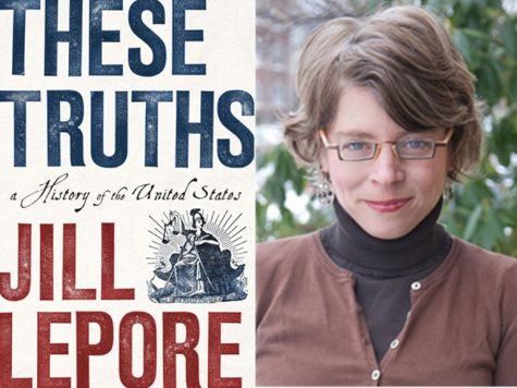
In her newest book, The Secret Lives of Color, author Kassia St. Clair reveals the hidden histories of 75 colors that shaped everything from art and fashion to medicine, politics, commerce, and religion.

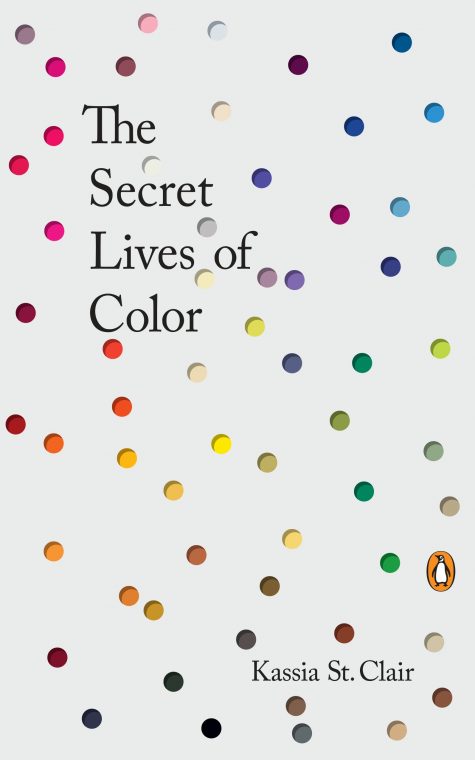
This Friday at 7:00 p.m., the author will join us for a Late Night talk about her book, where she will discuss what inspired it, how she conducted her research, and a few favorite hues—from the ultra-pricey ultramarine to the morbid mummy brown. Here’s a sneak peek.

What inspired you to write The Secret Lives of Color

Several things honestly. It definitely helped that my mother was a florist, so growing up I was always seeing colors being put together creatively and was encouraged to do likewise. Academically, I became interested in color when I studied at university. I wrote my dissertations on 18th-century fashion, which involved a lot of research into the shades that were fashionable at the time: it fascinated me that they had changed so much. Some of the combinations they loved back then would make your eyes water today! I also loved researching the names or trying to figure out what a once-fashionable tone might have looked like, since often only written descriptions would survive.

How did you decide which colors made the cut? Is there one that you would have liked to include but didn’t?

When I pitched the book, I had a whole list of shades, dyes, and pigments that would go into each chapter, and although many of those did make it into the final book, many others did not and many more were added. The trick was to get exactly the right combination of story and variety. It would have been boring to have five yellows one after the other that all dated from a similar period and were used in near-identical ways. This is something that you very quickly discover when writing but which might not be obvious in the planning stage! There are certainly colors that it would have been wonderful to include full entries for, and many of these I was able to put into the glossary at the back.

In your opinion, what is the most underrated color and why?

I think black is a hugely underrated color. For a start it’s an absolutely vast category: we’re used to giving lots of different names to various whites—cream, ivory, beige, canvas, and so on—but with black it all gets collapsed in together, with very little regard for how different two shades might be from one another. I loved discovering in the course of writing this chapter that there were once two words for black: one for the glossy, luxurious kinds and another for the matte, light-sucking variety. And then again, black is often thought of as scary, unimaginative, or negative, when in fact shade and darkness can be restful, soothing, and cool.

Did the research for this book take you down any unexpected rabbit holes?

Yes, many! (See my answer above for just one example). But that’s why I love studying and writing about color; it’s never boring and you can’t help but be dragged in myriad directions. I also love how people initially think it’s a shallow, niche topic, but then the moment they start discussing it they soon realize just how vast and deep it truly is. Everyone has an opinion or a story or a fact that they want to share; it’s inclusive and I love hearing from people about the colors I’ve missed or anecdotes about festivals, customs, songs, and fashions that I might not know about.

What was one section you really enjoyed writing and why?

I love a challenge, so writing the introduction, although I always find it the hardest bit, is probably also the most rewarding. The introduction has to set the tone. It also has to cover a lot of ground and make sure everyone is carried along. Yes, you might be explaining some tricky physics (I speak as someone who gave up the sciences relatively early to concentrate on the arts), but that is no excuse for not making sure both that you understand it and that you’re making it interesting and palatable for your reader. When you’re writing, it’s my belief that you should treat your reader like an honored guest: it’s not good manners to bore on about something you enjoy but they might not. I try to be as inclusive and entertaining as possible.

If you had a signature color of nail polish what would you name it?

Because I’m going through a green phase and because it’s currently incredibly hot and parched in London so that everything is turning brown and crisp, maybe a really refreshing, cooling green-blue—something that’s a little mid-century but has just a hint of sheen: “Verdant Lagoon.”

Join us this Friday for Late Nights at the Dallas Museum of Art to hear more from Kassia St. Clair.

Jessie Carrillo is Manager of Adult Programs at the DMA.

Accio, Art!

Don’t be alarmed if you’re downtown this weekend and see wands, pet owls, witches, and wizards. They are all here for the annual international LeakyCon. If you can’t tell from the name alone, LeakyCon is a weekend-long convention all about our favorite boy wizard, Harry Potter. Tickets for this immersive conference sold out the day they went on sale, so if you’re like us and didn’t snag a spot, don’t try and alohomora your way in! Just head over to the DMA and use our Marauder’s Map self-guide to find works in our collection that connect with Harry Potter characters. If you’re stuck in a cupboard under the stairs and can’t make it to the Museum, here are our DMA horcruxes that match all seven of the objects He Who Must Not Be Named placed his soul into. What better place to hide a horcrux than in a museum?

The Diary of Tom Riddle
On view in the Paintings Conservation Gallery, Level 2

Riddle Diary 1

Josef Hoffmann, Concordia Ball program cover, 1909, gilt, copper, leather, and paper, Dallas Museum of Art, gift of Dr. and Mrs. Edward Mattil, 1989.111

Marvolo Gaunt’s Ring

Ring, Velma Davis Dozier, 1959, gold and tourmaline, Dallas Museum of Art, gift of Otis and Velma Dozier, 1979.16

Salazar Slytherin’s Locket
On view in the 18th-Century European Art Gallery, Level 2

Elisabeth Louise Vigée-Lebrun, Portrait of Natalia Zakharovna Kolycheva, née Hitrovo, 1799, oil on canvas, lent by the Michael L. Rosenberg Foundation, 29.2004.13

Helga Hufflepuff’s Cup

Two-handled cup, Louis-Constant Sévin, 1866, bronze and silverplate, Dallas Museum of Art, gift of the 1991 Dallas Symposium in honor of Caroline Rose Hunt, 1992.321

Rowena Ravenclaw’s Diadem
On view in the Cecil H. and Ida M. Green Classical Galleries, Level 2

Diadem, Greek, 2nd century BCE, gold, glass, and repoussé, Dallas Museum of Art, Museum League Purchase Funds, The Eugene and Margaret McDermott Art Fund, Inc., and Cecil H. and Ida M. Green in honor of Virginia Lucas Nick, 1991.75.75

Harry Potter embodied by his favorite place, Hogwarts
On view in the 18th-Century European Art Gallery, Level 2

Johan Christian Dahl, Frederiksborg Castle, 1817, oil on canvas, Dallas Museum of Art, Foundation for the Arts Collection, Mrs. John B. O’Hara Fund, 2014.22.FA

Nagini

Mantle clock with figure of Perseus, Pierre-Victore Ledure, early 19th century, lent by David T. Owsley, 156.1994.51

If you want to check out our Marauder’s Map self-guide of the collection, grab one at the main Visitor Services Desk on Level 1 beginning Friday, August 10. Make sure to come out that weekend, they will be gone after Sunday, August 12.

If you want another wizarding world activity to celebrate the weekend, click here to complete our Sorting Hat quiz based on objects in our collection.

Katie Cooke is Manager of Adult Programs at the DMA.

Farewell to #LauraOwens

We’ve reached the final weekend of our Laura Owens exhibition, and the whimsy and wonder that lit up our Hoffman Galleries will be fondly missed after its closing day on Sunday, July 29. This exhibition has been inspiring to many, and we can see why; the intricate artworks that represent the artist’s career from the mid-1990s to today include intriguing themes of fantasy, pop culture, nature, technology, and the avant-garde that tie it all together. Exploring Owens’s art was the highlight of many fun spring and summer programs and classes at the DMA, including Arturo’s Art & Me, Family Workshops, and Teen Tours. We also saw incredible new works of art created by visitors to the exhibition, including this vivid poem written by a young poet in The Writer’s Garret‘s summer program “Rail Writers.”

Among the inspiring aspects of this presentation is how delightfully “Instagram-able” it is, allowing viewers to create their own stories around each playful artwork and connect with an even broader audience. Just search the hashtag #LauraOwens and you’ll find a lively array of visitors interacting with Owens’s bold works and becoming part of the art. With bright colors, thickly layered swashes of paint and other mixed media, and untitled works that leave many subjects up to the imagination, these works are all about stimulating and sharing curiosity. Here’s a look back at what a few of our visitors had to say about their experiences:

_.mickelodeon._“Laura Owens is an amazing artist; prior to my venture I hadn’t heard of her. But now, I am a fan.” –@_.mickelodeon._

“Went to see some art without realizing we are the art.” –@ary_balderrama

in_dfwfamily2
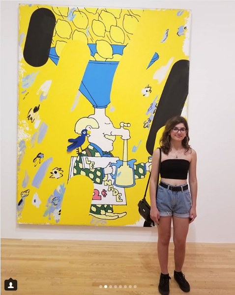
“Her work is LOUD, quirky, silly, dimensional, full of layers!” –@in_dfwfamily

edithvm
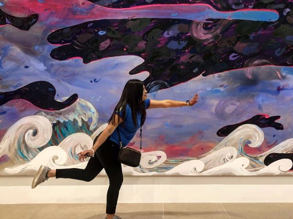
“Exhibición de Laura Owens está llena de color y amor” –@edithvm

IMG_E1065
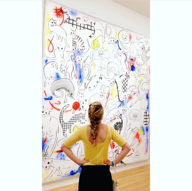
“This painting really cat-ures my spirit.” –@kmeansbusinezz

There is still time left for you to share your perspective from this exhibition, whether it’s on social media or through artistic creations of your own. Either way, there is plenty to take away from Owens’s art, and we hope you take the opportunity this weekend to discover what that inspiration looks like for you.

Hayley Caldwell is the Communications and Marketing Coordinator at the DMA.


Archives

Categories