Archive for the 'Curatorial' Category


Remembering September 11

Today is the 10th anniversary of 9/11, and in memory of that day we want to share a recent addition to the DMA’s collection, September, a print by Gerhard Richter.

Gerhard Richter, September, 2009, print between glass, Dallas Museum of Art, Lay Family Acquisition Fund

Richter was on a Lufthansa flight to New York from his home in Cologne when the Twin Towers and the Pentagon were attacked. He was traveling to New York for the September 13 opening of his exhibition at the Marian Goodman Gallery; his plane was forced to land in Halifax and he was able to return to Germany a couple of days later. Richter nearly witnessed the attacks, but in the end he only experienced them, as did the rest of the world, through images.

Throughout his long career, Richter has confronted in his work the most charged and painful issues of our day. His art has always suggested that imagery, photographic imagery in particular, carries an unbearable burden of how we perceive our world. This print of Richter’s September painting provides us with minimal information to register the subject, yet a further clue is given by the title.

Picture This

For many artists a picture was not finished when the paint had dried and the varnish was applied. The culminating step was framing the artwork. Only then was the project complete. Traditionally the artist had many options. He could choose a stock frame from a local cabinetmaker, or make a thoughtful selection from a skilled framer. Artists often possessed such a keen interest to frame a painting in a manner that perfectly complemented it that they designed their own.

The 18th-century British portrait painter George Romney (1734-1802) routinely joined forces with his preferred London framer William Saunders to produce frames of the artist’s design. Frame historians have studied Saunders’ detailed ledgers that record many of these collaborations. Romney’s decorative concepts coupled with Saunders carving expertise resulted in several exquisite frames. Regrettably, as a painting changed hands the new owner would often reframe it to suit prevailing tastes or to match the room where the artwork hung.

This may have been the fate of the original frame that once surrounded Romney’s Young Man with a Flute, which is now on view in the DMA’s European Galleries. Until recently, a simple wooden frame adorned with a gilt sight edge (the part of the frame closest to the canvas) surrounded the painting. That frame was more in keeping with the sparse ones typically used by artists working in colonial America.

George Romney, Young Man with a Flute, late 1760s in its simple wooden frame

Wishing to restore the painting to Romney’s well-documented vision for his completed works, the Museum recently purchased a frame from a London dealer with an expertise in the artist’s designs. Now a “Romney Style” frame surrounds the painting. It is a faithful reproduction of the artist’s 18th-century original. The archetype became synonymous with the painter thus earning its eponymous name.

Young Man with a Flute surrounded by its “Romney Style” frame

The approximately four-inch-wide burnished gilt neoclassical frame draws the viewer’s eye into the portrait. Its decorative elements include a rope-twist back molding, superbly carved gadrooning that traverses the circumference on the outside rim, a plain frieze, a small bead course, and a delicately reeded sight edge. The reproduction “Romney Style” frame harmonizes with the painting in a manner unrivaled by its wooden unornamented predecessor.

Compared to Romney, there are scant extant records of the frame choices made by the 19th-century artist Paul Signac (1863-1935). Last year, when the DMA acquired the French artist’s Comblat-le-Château, Le pré, it had a Régence Style frame that was popular very early in the 18th century.

Second from the right, Paul Signac’s Comblat-le-Château, Le Pré in its Régence style frame.

Its decorative components included a course of cross-hatching and punch work covering the entire frame. A fussy pattern of shells, fans, palmettes, C-scrolls, and foliage ornamented the center rails and corners, while a linen liner at the sight edge completed the overall design scheme. Although a lovely frame, it is not the prototypical choice made by a post-impressionist artist who worked in the wake of the pioneering painter Edgar Degas (1834-1917). Not only was Degas enormously influential to art history but he also revolutionized frame design. In fact, he believed that it was an artist’s duty to see his pictures properly framed. Earlier this year, the DMA heeded Degas’s mandate and purchased a new frame for its Signac.

Comblat-le-Château, Le Pré with its Degas style frame.

The picture’s new frame is a reproduction based on one of Degas’s most inventive designs. It features a lightly rounded profile embellished with rows of thin parallel grooves. The frame’s roundedness and fine fluting echo Degas’s “cockscomb” pattern, which he softly gilded but rarely burnished. Because of its shape, some call this format a “cushion” molding. The frame’s innovative streamlined repetitive forms do not compete with Signac’s lovely painting; rather their simplicity harmonizes with the picture to enhance it. While these before-and-after photographs illustrate the difference a frame can make, they pale when compared to seeing firsthand each striking painting now with its stylistically appropriate frame. On your next visit to the DMA, come view these superb frames and the paintings they surround.

Martha MacLeod is the Curatorial Administrative Assistant in the European and American Art Department at the Dallas Museum of Art.
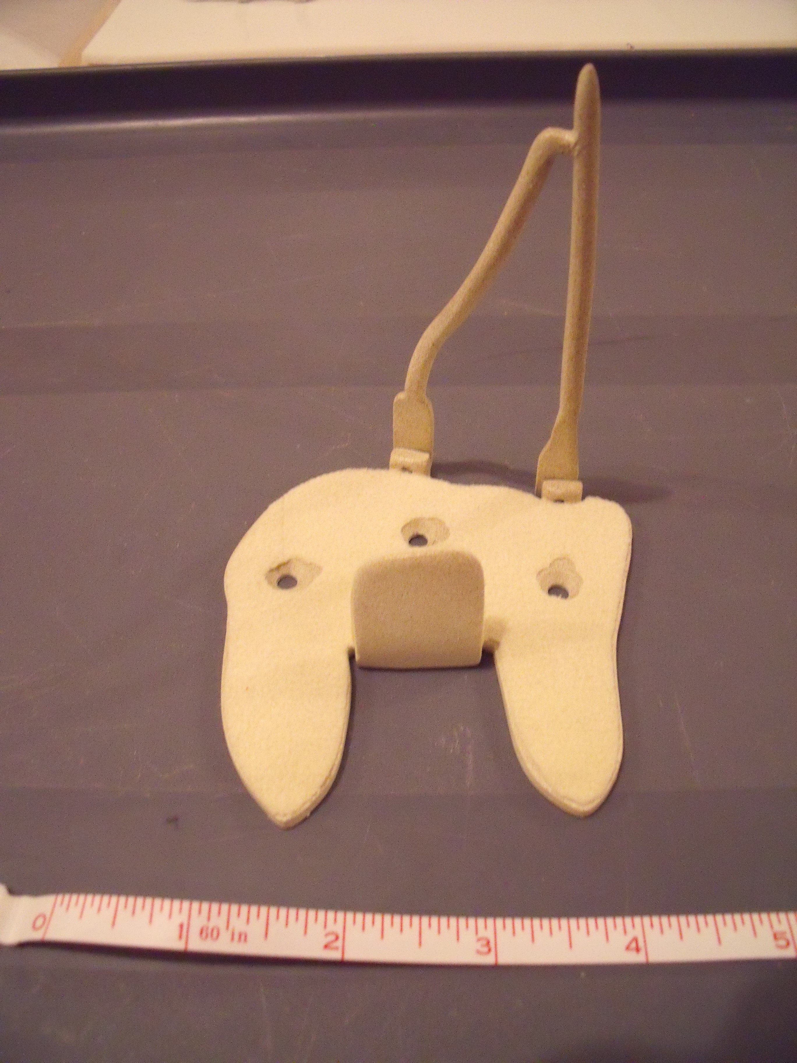
Seldom Scene: A Tip of the Hat

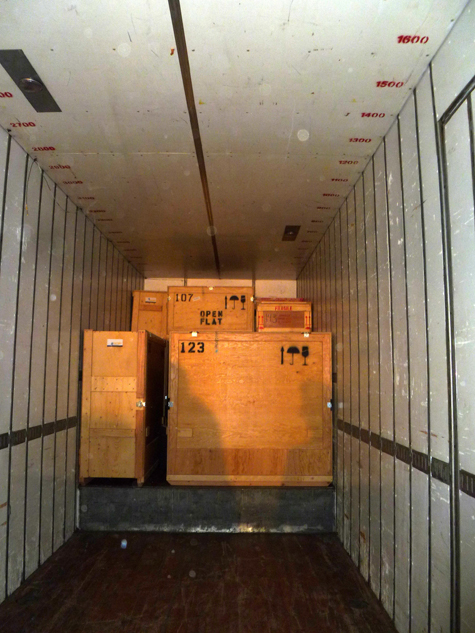
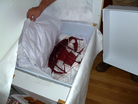
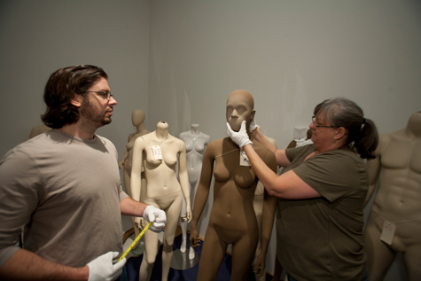
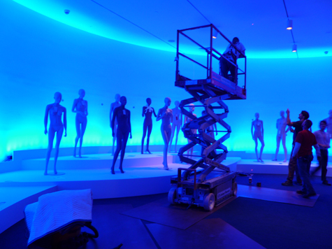
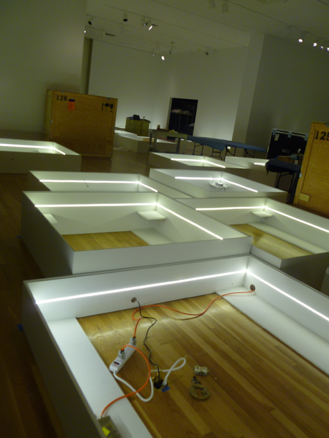
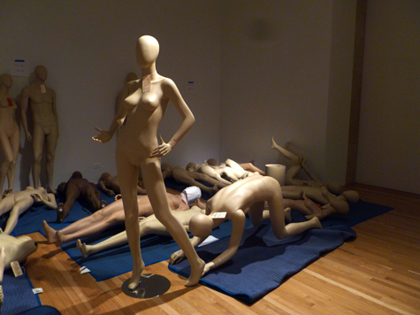
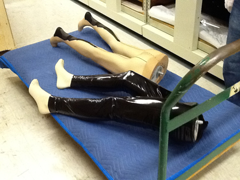
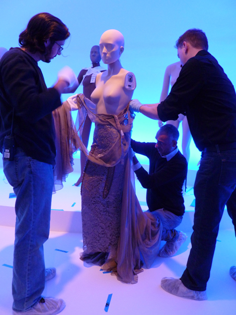
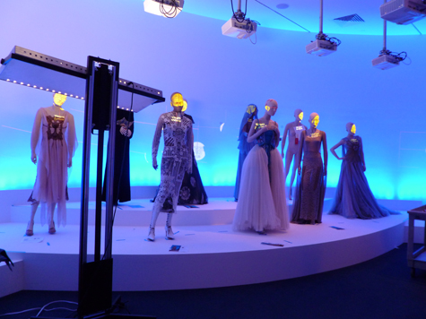
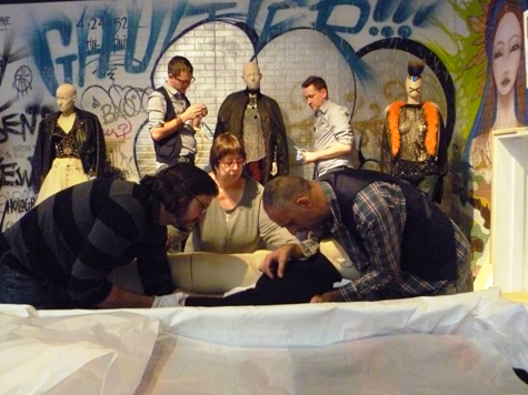
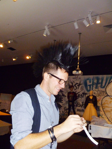
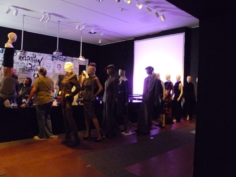
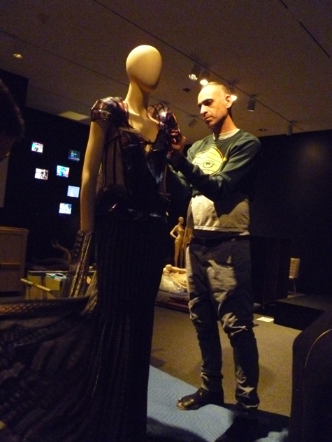
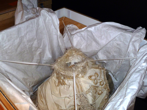
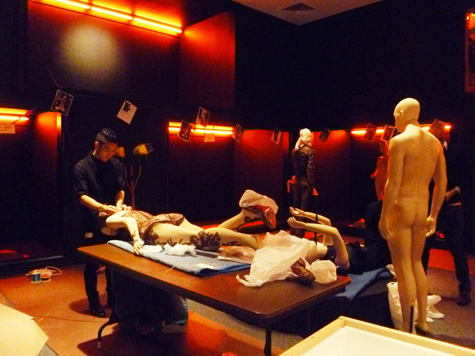
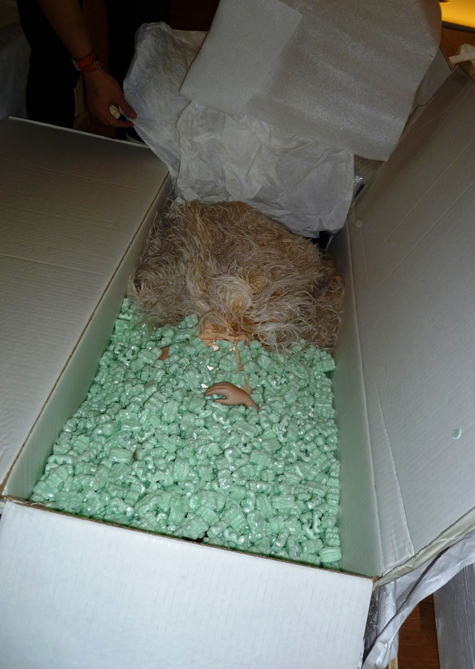
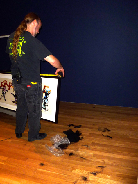
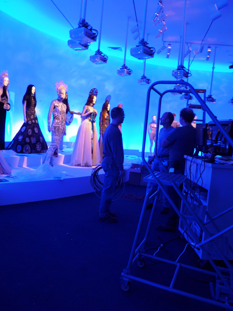
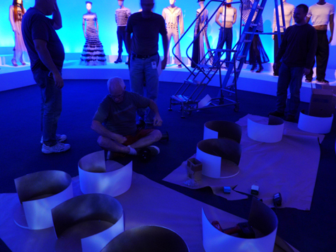
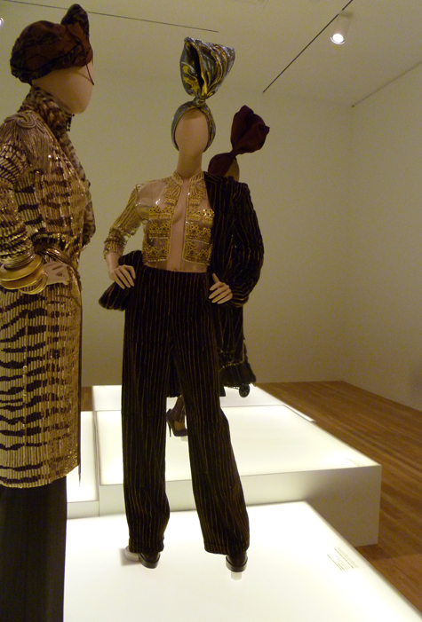
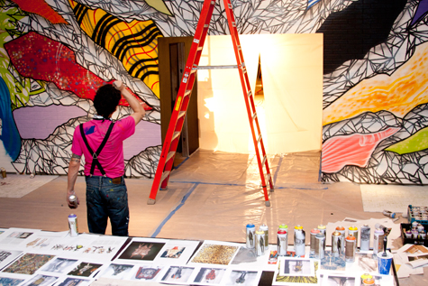
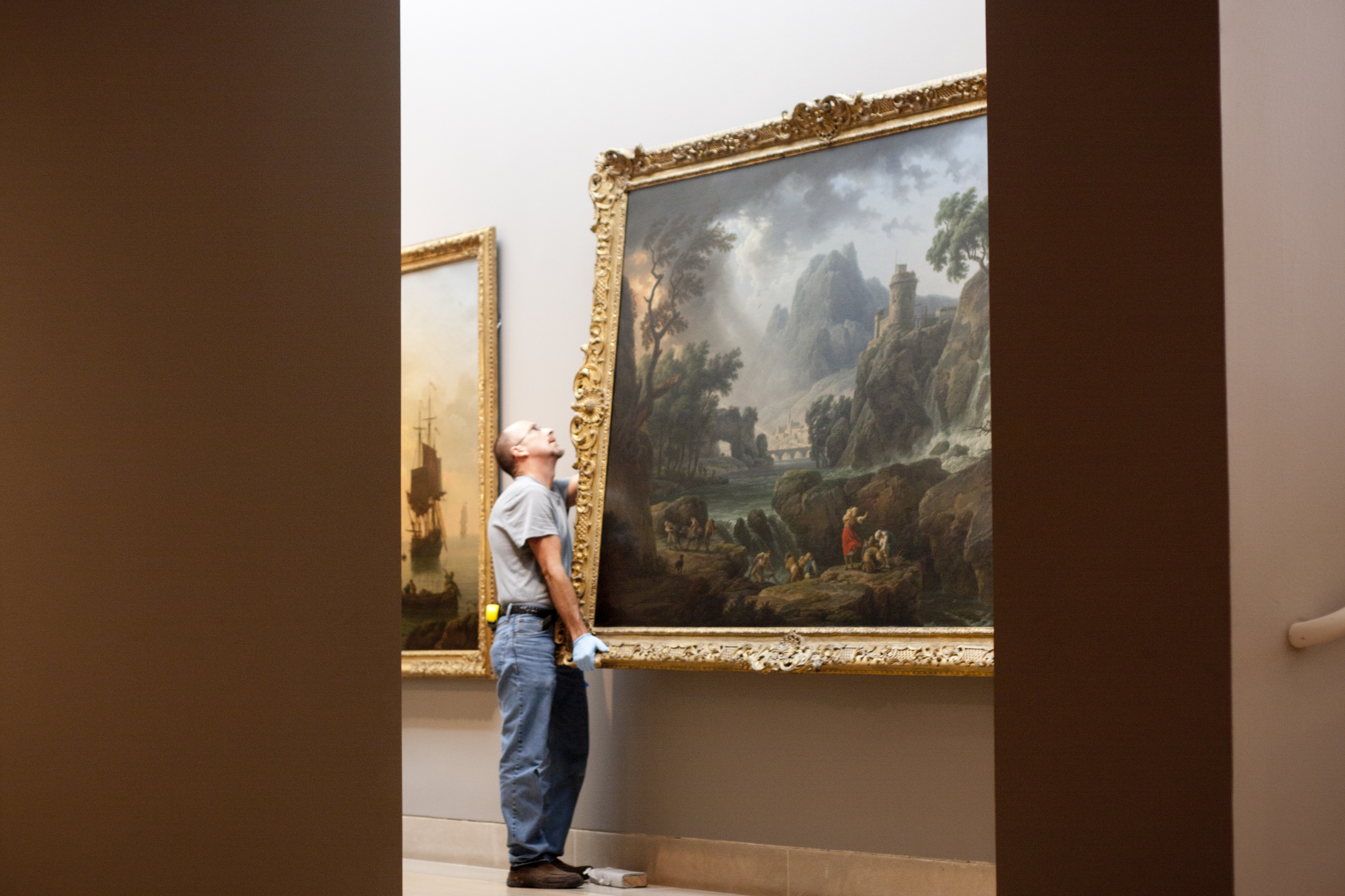
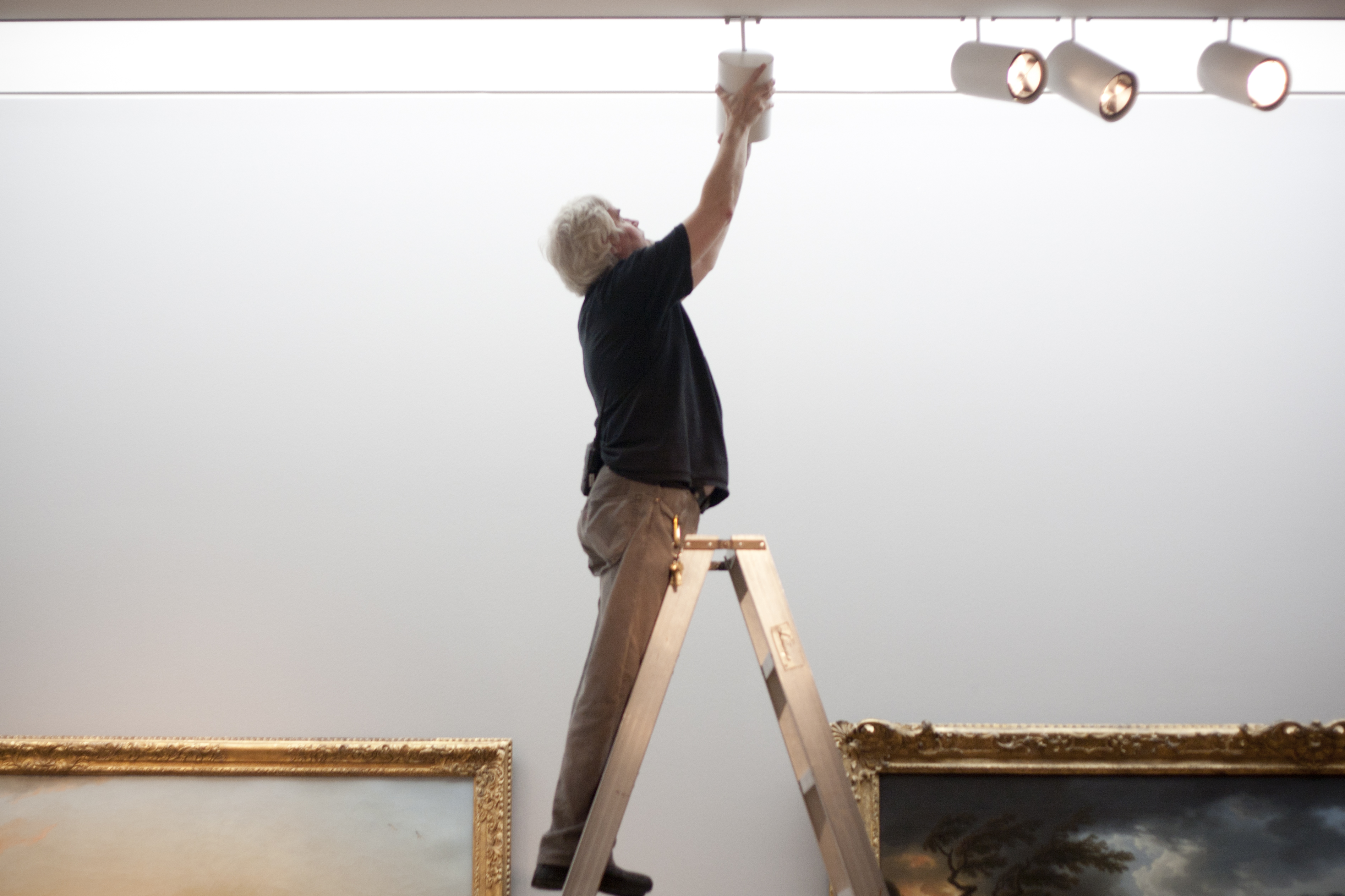
African Headwear: Beyond Fashion opened yesterday and will be on view through January 1, 2012. The exhibition celebrates the artistry of African decorative design and initiates us into the world of fashion a few months before we host Jean Paul Gaultier: From the Sidewalk to the Catwalk. Below are a few images showing the preparation that went into creating the African Headwear exhibition.

Live from the Red Carpet: Gaultier Opens in Montreal

An entry to the Montreal Museum of Fine Arts with exhibition banner above

An entry to the Montreal Museum of Fine Arts with exhibition banner above

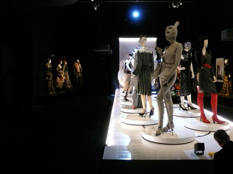
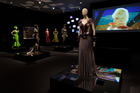
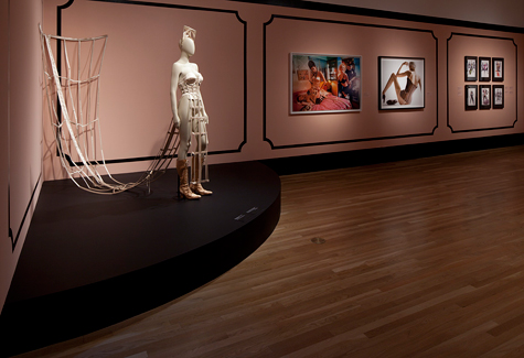
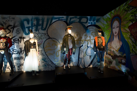
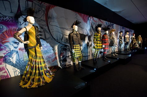
As the DMA’s curator for the forthcoming exhibition on Jean Paul Gaultier, I recently had the opportunity to travel with some of my colleagues to the Montreal Museum of Fine Art, where the exhibition had its international premiere. The Montreal Museum, which had organized the exhibition, did a tremendous job in presenting the works not simply as couture draped across mannequins, but as truly vibrant objects of art and design. The excitement was indeed palpable, as the red carpet was rolled down the front steps of the Museum and the crowds began to gather for opening night. Even for the second night’s reception, over 2,000 people gathered for a preview of the exhibition!

The crowds converge for one of the opening receptions

The crowds converge for one of the opening receptions

Gaultier arrived from Paris to join in the festivities and one could see he was enjoying himself as much as anyone else in attendance. One of the remarkable aspects of the installation was the creation of specially “animated mannequins” for the clothing which incorporated custom-molded heads to accommodate video projections of which made them appear to speak, sing, and scan the crowds (at the entry stood Gaultier’s own double—a mannequin welcoming those many visitors). Throughout the exhibition, Gaultier’s fashions reflected both his exceptional talents and sheer joy in life. As guests poured through the crowded galleries, they stopped to admire their new favorites—perhaps a dress of brilliant feathers making the wearer appear exotic and bird-like or a Can-Can dress with the repeated image of kicking legs on the interior?

Animated sailor mannequins with Gaultier's  fashions in his iconic marinière (sailor striped shirt) motif

Animated sailor mannequins with Gaultier's fashions in his iconic marinière (sailor striped shirt) motif

The Gaultier mannequin is programmed

The Gaultier mannequin is programmed

Crowds gather around the exhibition's moving catwalk

Crowds gather around the exhibition's moving catwalk

More crowds in the "Urban Jungle" section of the exhibition

More crowds in the "Urban Jungle" section of the exhibition

Come November, Dallas and DMA members will have the opportunity to enjoy their own welcoming party for The Fashion World of Jean Paul Gaultier!

Kevin W. Tucker is The Margot B. Perot Curator of Decorative Arts and Design at the Dallas Museum of Art

Designing Women (and the Cure for Mad Men Withdrawal)

In summers past, our reward for coping with insufferably hot temperatures and an endless parade of reruns on TV has been the return of a new season of Mad Men – the exploits of Don Draper and his cohorts at Sterling Cooper Draper Price Ad Agency offer an escape to the chic and sophisticated world of 1960s New York. Alas, this year the return of Don, Joan, Peggy, Roger, and company has been delayed until later this fall.

Never fear! The DMA has a cure for your Mad Men withdrawal. On Thursday we will kick off our summer film series, Pictureshow, with the classic 1959 romantic comedy Pillow Talk. Like Mad Men, the film takes place in Manhattan and is filled with stylish apartments and gorgeous clothes that would make Betty Draper swoon. The film is especially well known for its set design and is considered so “aesthetically significant” that it was added to the National Film Registry at the Library of Congress in 2009.

Cathy Whitlock will join us to introduce the film. Cathy is a Nashville-based interior designer, a journalist, and the author of Designs on Film: A Century of Hollywood Art Direction. Her blog Cinema Style explores the world of interior design and style in the movies. In preparation for her visit to Dallas, we asked Cathy about some of her favorite films and her own creative process.

You write about the intersection of design and film on your blog Cinema Style and in your most recent book, Designs on Film. What inspired your love of the movies? 

Ironically my first movie experience as a child was Pillow Talk and I was mesmerized with the interiors, fashion, and life in Manhattan. Apparently, the die was cast as I moved there years later and became an interior designer. I grew up in the sixties, which was such a ripe time for film – the Doris Day-Rock Hudson comedy “romps,” Cleopatra, 2001, The Graduate, and the James Bond franchise – and it left a huge imprint. Movies provide such an inspiration in so many areas as well as the ultimate two-hour escape!

Your blog and book cover films made recently as well as throughout the 20th century. Do you have a favorite era in the history of Hollywood?

Besides the sixties, I love the films of the thirties, as it was the time of big musicals (Fred Astaire and Ginger Rogers) and the “Big White Set” (such as Dinner at Eight). The decade ended with two of the biggest films of the century, The Wizard of Oz and Gone with the Wind.

The cast of Gone with the Wind on the grand staircase of Tara

Jean Harlow's bedroom in Dinner at Eight


 How can moviegoers be inspired by the sets they see on screen? How can we translate what we see on screen to our own homes?

Often it can be something as simple as a color or a feel that inspires us. I have literally had clients pull out a DVD where they marked a certain scene and wanted to get the look. Thanks to technology, we can do that. What audiences need to remember is the rooms are almost always shot on a soundstage and on a budget and often we are responding to the overall “feel” of the scene. That being said, it’s pretty easy to pick out a few elements of a movie interior for use in our own homes.

Doris Day's apartment in Pillow Talk

 Pillow Talk is a classic romantic comedy that stars Doris Day as an interior designer.  What makes this film so iconic from a design standpoint?

I think it’s the overall design of the film – the interiors, Doris Day’s wardrobe, and Manhattan is very clean and carefree. From a design standpoint, the film literally gave birth to the “bachelor pad” and I am not even sure the set decorators got credit for that. They introduced the first electronic apartment complete with buttons that turn on the stereo, turn the sofa into a bed, and dim the lights. Now we call that a “smart house” but in the sixties it was pretty radical!

Where do you find inspiration for your interior design work?

 I am a huge student of pop culture and find inspiration through a variety of places – music, museums, magazines, books – but, most importantly, film!

Join Cathy for Pillow Talk this Thursday at 7:00 p.m. She will sign copies of Designs on Film before the screening. Don’t miss the Museum’s collection of objects from the era of Mad Men and Pillow Talk – visit Form/Unformed: Design from 1960 to the Present in the Tower Gallery on Level 4.

Lisa Kays is the Manager of Adult Programming at the Dallas Museum of Art.
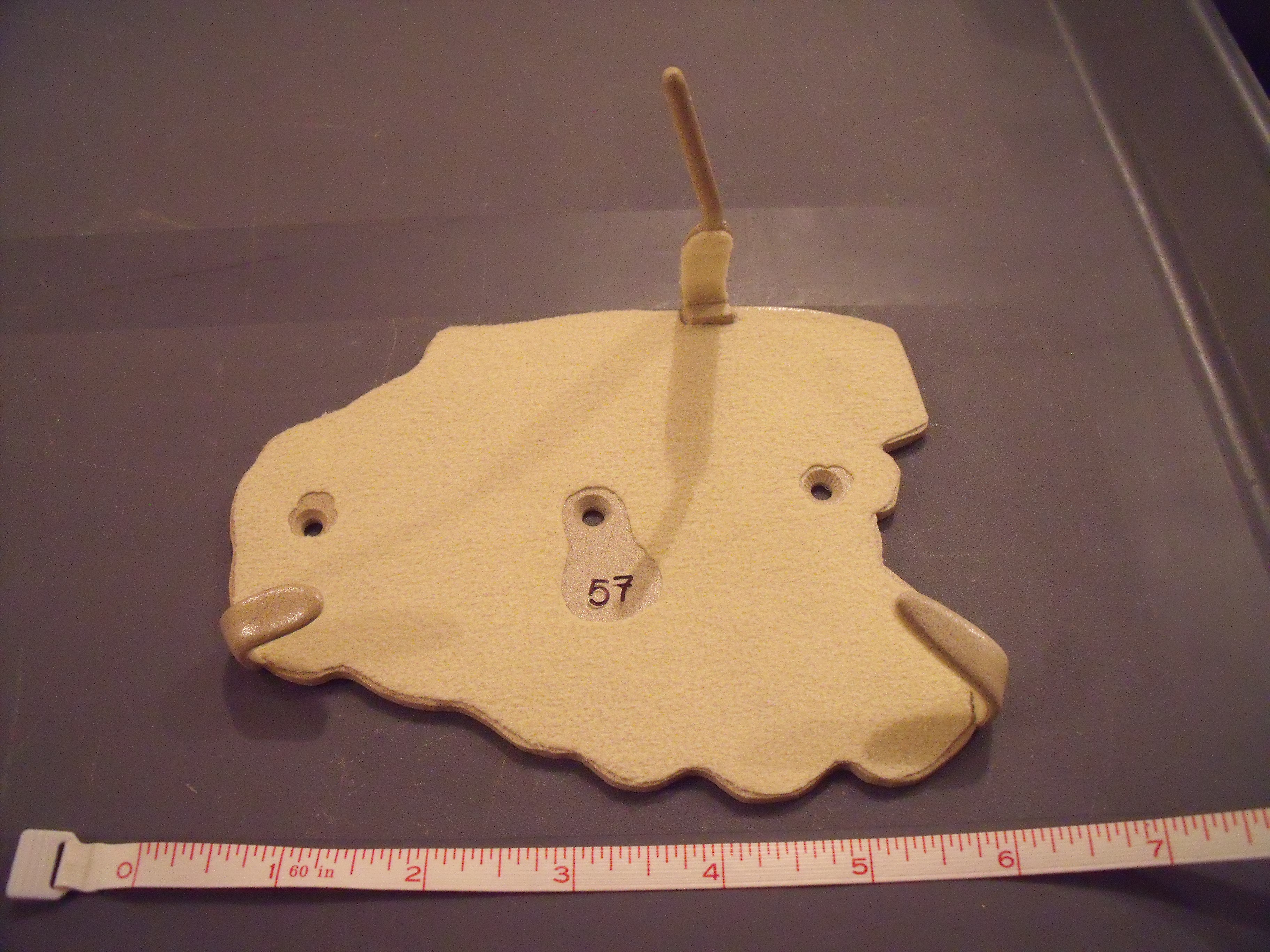
Two for the Road

Uncrated recently took a “field trip” to Fort Worth to visit the Kimbell Art Museum’s  presentation of Picasso and Braque: The Cubist Experiment, 1910–1912, for which the DMA loaned its 1912 Braque painting Still Life with Bottles and Glasses. Before the exhibition opened, the Kimbell’s director of conservation, Claire Barry, took a look at our “gem of a painting” and offered us this guest post on the experience.

Georges Braque, "Still Life with Bottles and Glasses", 1912, oil on canvas, Dallas Museum of Art, The Eugene and Margaret McDermott Art Fund, Inc., given in honor of Deedie Rose and J. E. R. Chilton

X-ray of George Braque's "Still Life with Bottles and Glasses"

I was delighted to have the opportunity to examine Braque’s Still Life with Bottles and Glasses from the DMA in the Kimbell conservation studio. Fortunately, this gem of a painting is unlined, which is rare for a cubist painting from this period. As a result, the impastoed (thickly textured) surface has never been flattened through lining. As one of my teachers wisely advised, think about a painting as a sculpture in low relief. If you look at the Braque in this way, you quickly begin to appreciate the rich variety in the artist’s application of paint—from thin areas where the paint is more fluid to thicker areas of impasto where he applied paint with a heavily loaded brush. Then, in the upper left, you might notice that the paint has a crusty texture that seems totally unrelated to the composition. With the permission of the DMA curators, I x-rayed the painting, which quickly revealed that Braque completely reworked the composition of Still Life with Bottles and Glasses during the course of painting. The texture of the underlying paint layers, later covered over, can still be seen on the surface. I was fascinated to discover this, because between Picasso and Braque, I always believed that Picasso had a greater tendency to radically rework his paintings (as he did with the Kimbell’s Man with a Pipe). Braque painted the Kimbell’s Girl with a Cross without making a single revision.

Pablo Picasso, Man with a Pipe, 1911, oil on canvas, Kimbell Art Museum. Photo © MegaVision. © 2011 Estate of Pablo Picasso / Artists Rights Society (ARS), New York

Georges Braque, Girl with a Cross, 1911, oil on canvas, Kimbell Art Museum. Photo © MegaVision. © 2011 Artists Rights Society (ARS), New York / ADAGP, Paris

I was fortunate to be able to examine the two Braques, the DMA’s and the Kimbell’s, side by side in the conservation studio. Like the DMA painting, the Kimbell’s Girl with a Cross is unlined and preserved in pristine condition. In fact, it has never been varnished and retains the matte surface that the cubists intended. Both Picasso and Braque were adamant that their paintings should never be varnished. The DMA’s Braque, however, had been varnished at some point, and the varnish layer imparted a glossier surface than Braque had in mind. The unifying effect of the varnish also masked the subtle differences in surface gloss and texture that Braque created. In preparation for the exhibition, the DMA gave me permission to remove the varnish layer from Still Life with Bottles and Glasses. The fact that visitors to the exhibition can now see two unlined, unvarnished cubist paintings by Braque is really something exceptional. When you see the surfaces of these paintings, you can feel confident that this is very close to how they appeared when they left Braque’s easel some one hundred years ago.

Braque’s Still Life with Bottles and Glasses (1912) was sent to the Kimbell for spectral-image photography during the early stages of planning the exhibition Picasso and Braque: The Cubist Experiment, 1910–1912. These photographs are among the many incredible high-resolution digital images that can be explored with the iPad application iCubist in the Kimbell exhibition. If you want to experience the details in cubist paintings, brushstroke for brushstroke (the way I examine paintings in my job as a paintings conservator), I really recommend that you check out the iPads at the Kimbell. To my knowledge, this is the first time such images have been made available to the public in such an interactive way in a museum exhibition. The goal is to enrich the experience of seeing the real paintings, for which there is absolutely no substitute. My hope is that the iPad application may encourage visitors to spend even more time in the exhibition. Unlike the Acoustiguide, you cannot look at a painting and the iPad app simultaneously. So perhaps this will encourage visitors to look at the paintings first, then explore the iPad, and then return to the paintings for a second look, with greater understanding and appreciation.

Guest blogger Claire Barry is the director of conservation at the Kimbell Art Museum.

This year’s Awards to Artists go to…

Every year my colleagues and I look forward to celebrating up-and-coming and established artists in our event wherein the year’s recipients discuss their work and goals. I anxiously anticipate it every year, and this year was no exception. We were lucky enough to have two representatives of the DeGolyer and Kimbrough families, and that’s always a delight for the winners to meet them and show their gratitude.

Recipients of both the The Clare Hart DeGolyer Memorial Fund and The Arch and Anne Giles Kimbrough Fund have gone on to lead immensely successful careers as The Otis and Velma Davis Dozier Travel Grant recipients have continued on securing exhibitions, commissions and accessioning of their works in major public and private collections. Awards to Artists grants have been presented to more than 235 artists. Over the course of the past 31 years in the case of the DeGolyer and Kimbrough Awards, and 21 years in the case of Dozier, the DMA has acquired works by many of the recipients. See for yourself!

This slideshow requires JavaScript.
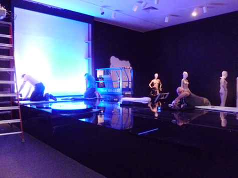
To all nine of the 2011 Awards to Artists recipients: Lindsey Allgood, Diedrick Brackens, Kasumi Chow, Sarah Zapata, Xxavier Edward Carter, Kerry Pacillio, Edward Setina, Joshua Goode, and Kevin Todora – CONGRATULATIONS!

Erin Murphy is the Curatorial Assistant for Contemporary Art at the Dallas Museum of Art

Seldom Scene’s Seldom Seen

Rarely on view, Henri Matisse’s Ivy in Flower—a full-scale maquette for a stained glass window made late in the artist’s career—will be installed for six months in the Concourse. Here are some photos from the large cutout’s installation.
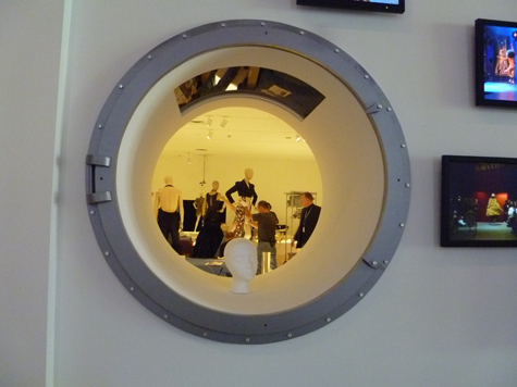
Henri Matisse, Ivy in Flower, 1953, colored paper, watercolor, pencil, and brown paper tape on paper mounted on canvas, Dallas Museum of Art, Foundation for the Arts Collection, gift of the Albert and Mary Lasker Foundation

Seldom Scene: Silence and Time

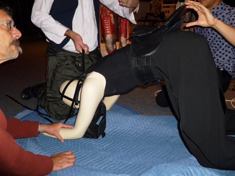
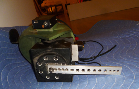
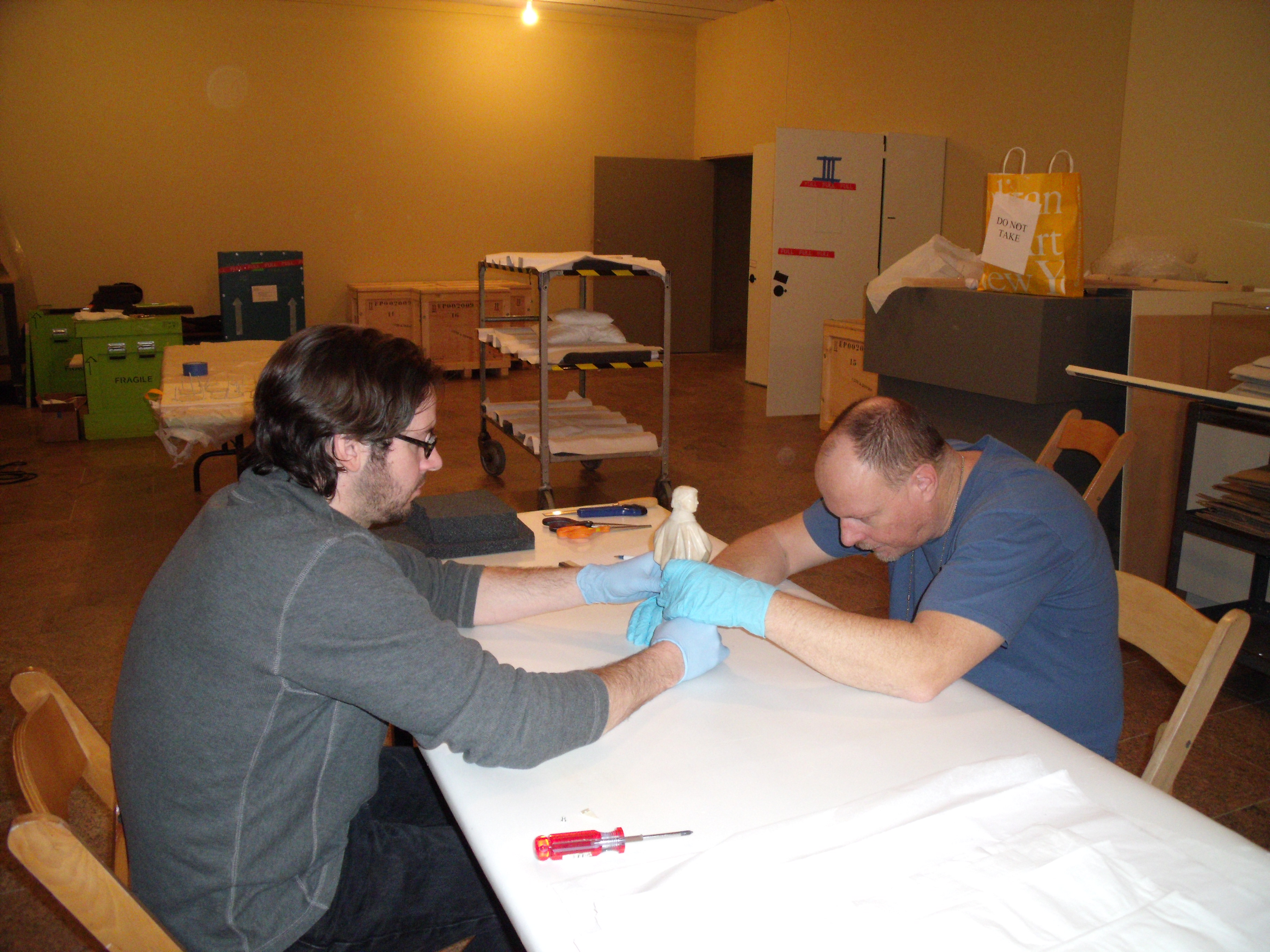
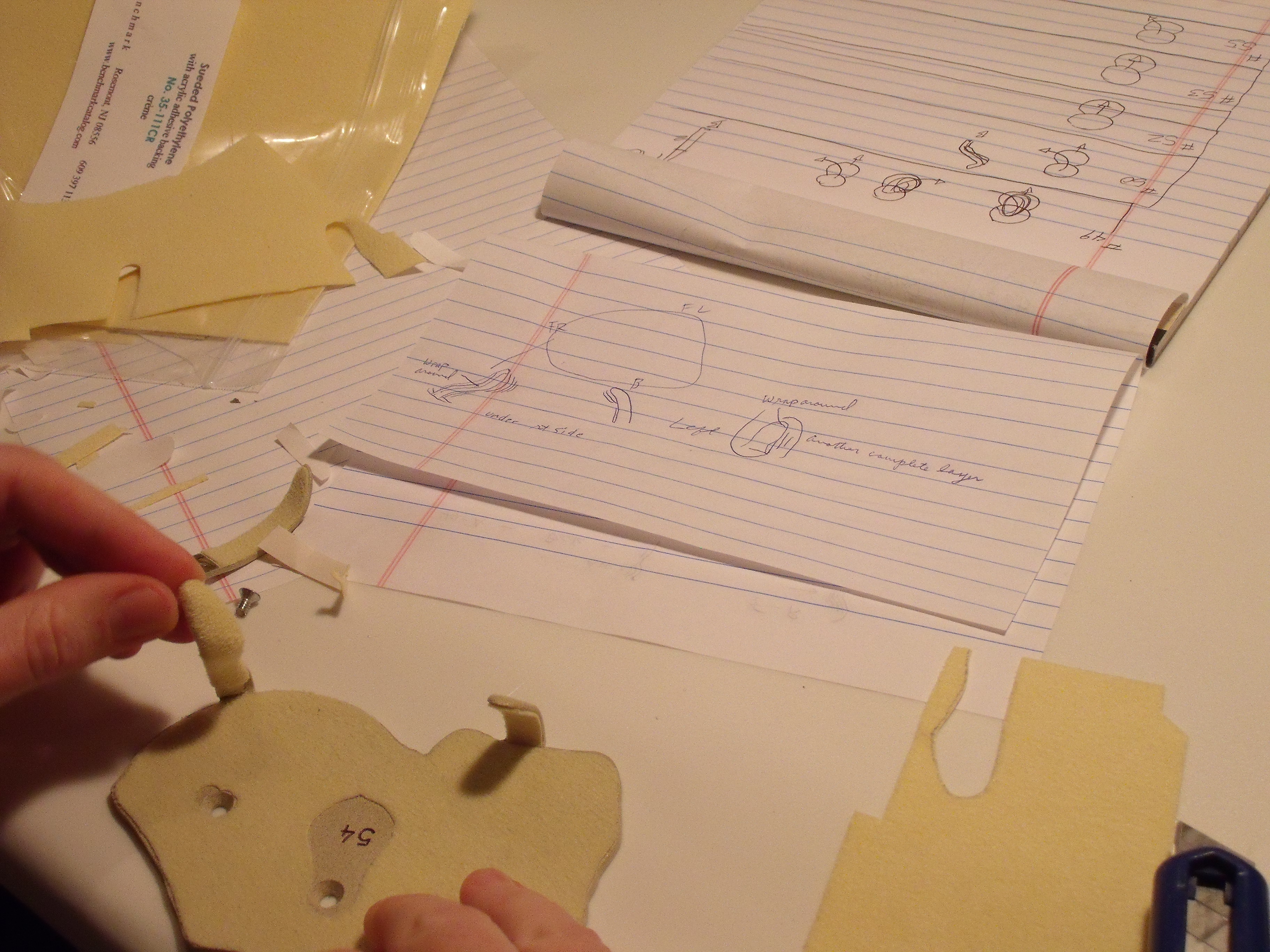
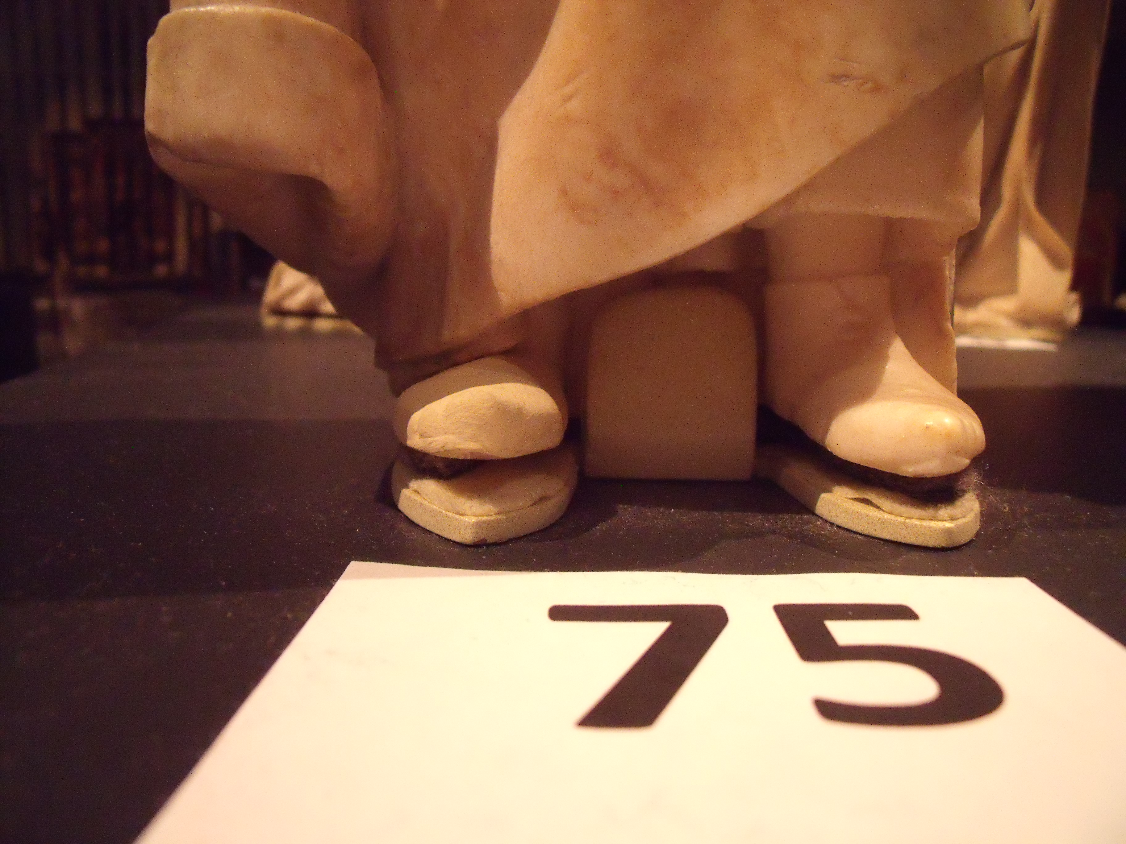
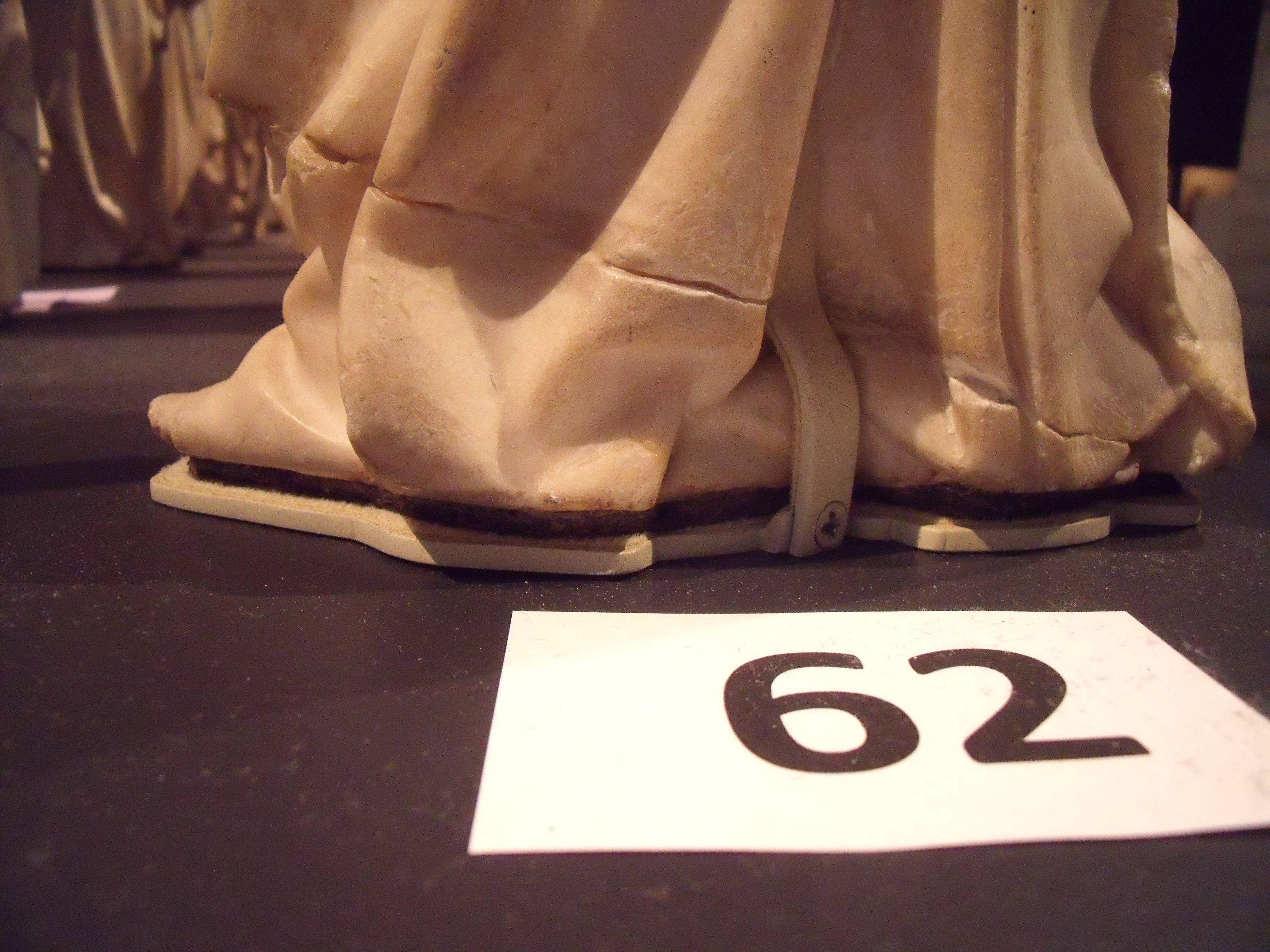
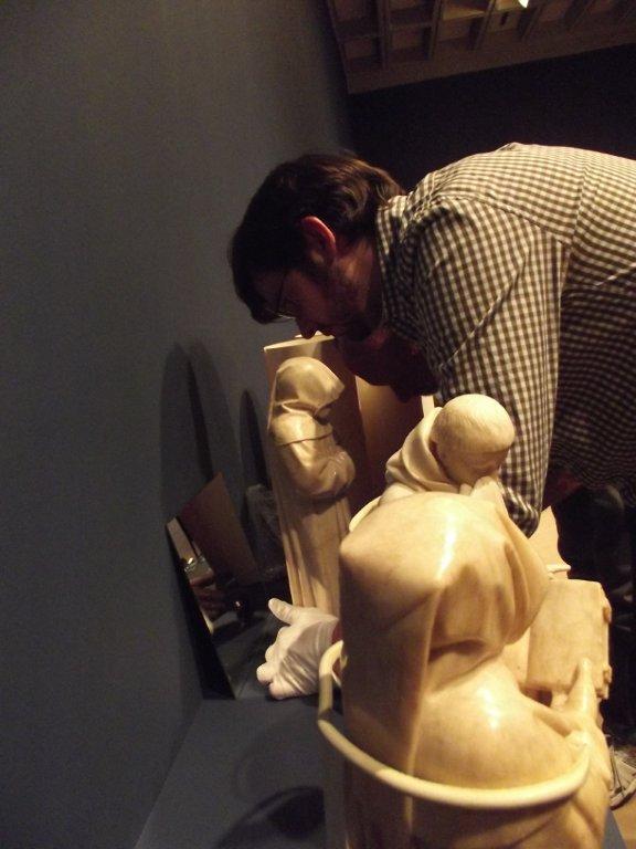
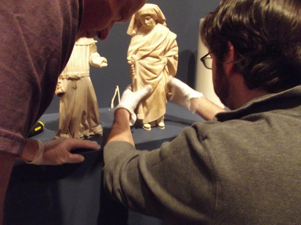
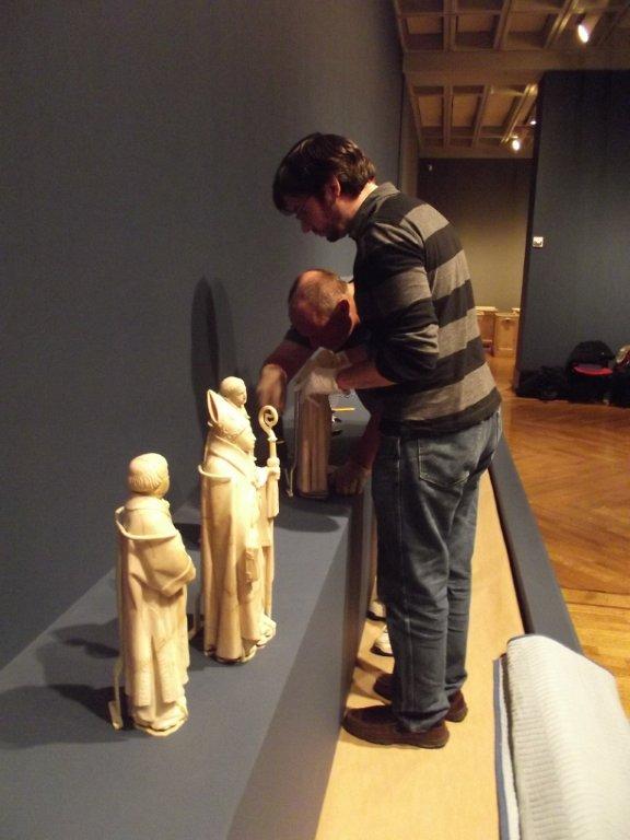
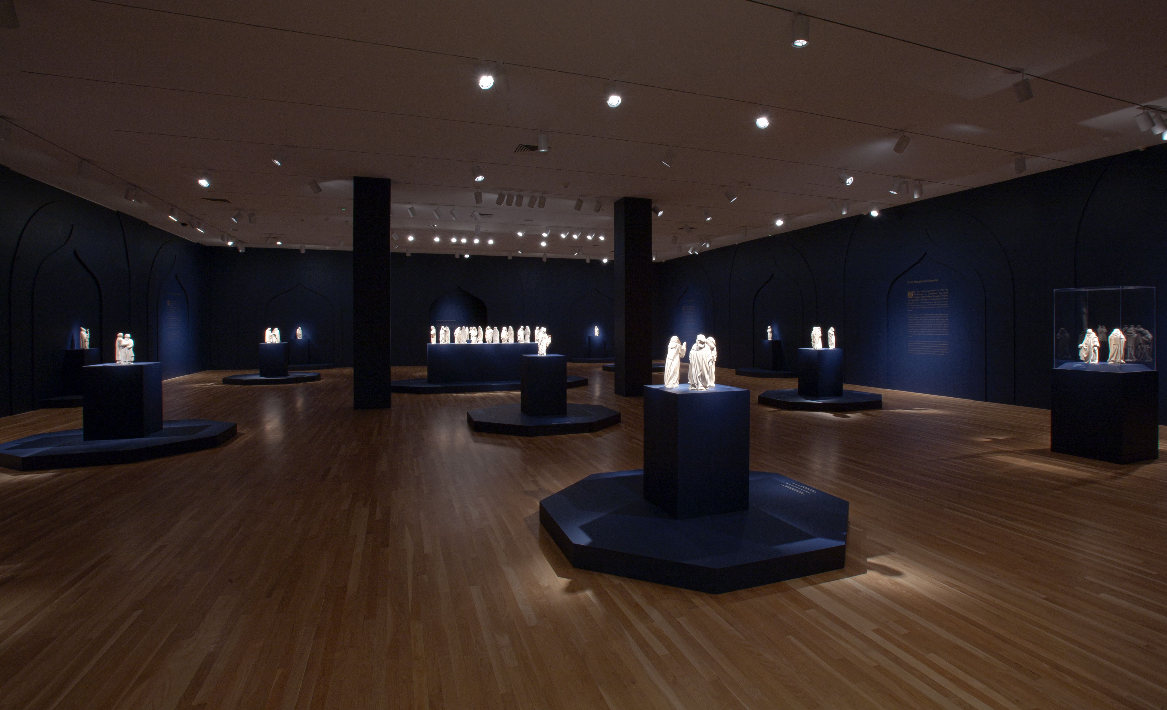
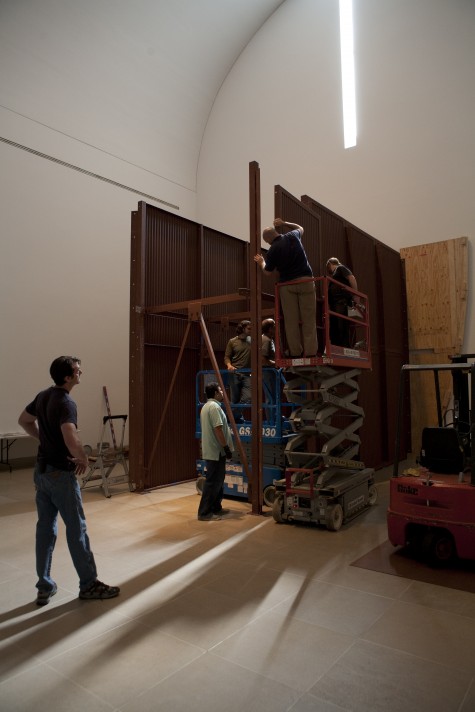
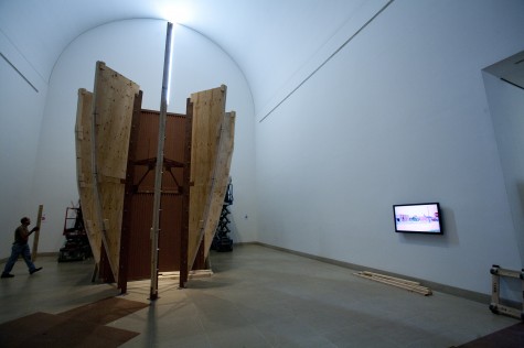
Below are photographs taken during the three-week installation of Silence and Time, which is on view through August 28.

This slideshow requires JavaScript.

How to Install a 27-Foot Sculpture

The installation of James Lee Byars’s Figure of Death was caught on camera last week in preparation for the exhibition, Silence and Time, which opens this Sunday, May 29, in the Barrel Vault and Quadrant Galleries.

James Lee Byars, The Figure of Death, 1986, basalt (ten pieces), Private Collection, Dallas, TX, © James Lee Byars

Video by Ted Forbes, Multimedia Producer at the Dallas Museum of Art


Archives

Flickr Photo Stream

Categories