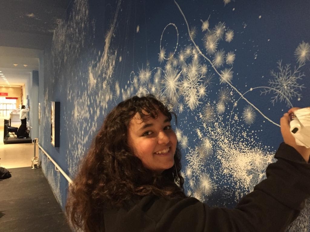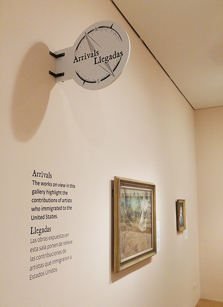
I was never the type of child to draw on the walls, but I’m sure if I had, my mom would not have responded with joy. Joy, however, is exactly what DMA’s Senior Graphic Designer Jaclyn Le was going for when she designed the floral pattern you can see on the walls in the DMA’s exhibition Flores Mexicanas: Women in Modern Mexican Art.
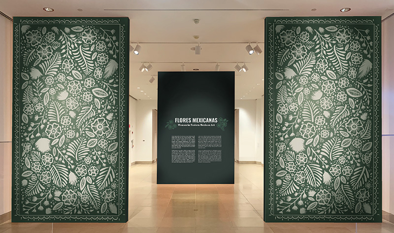
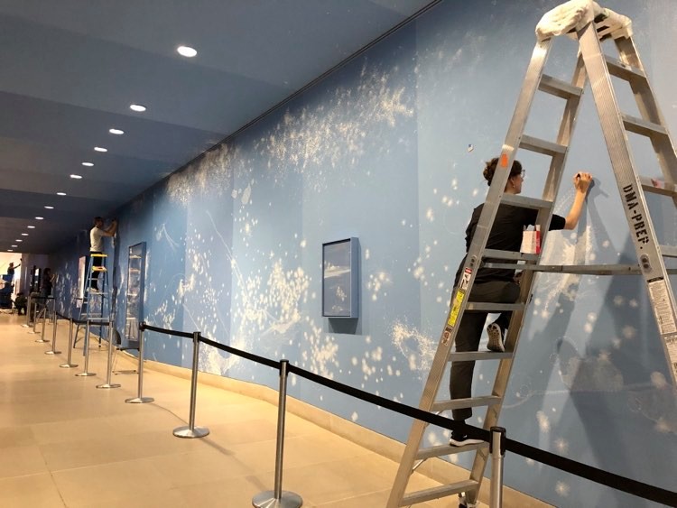
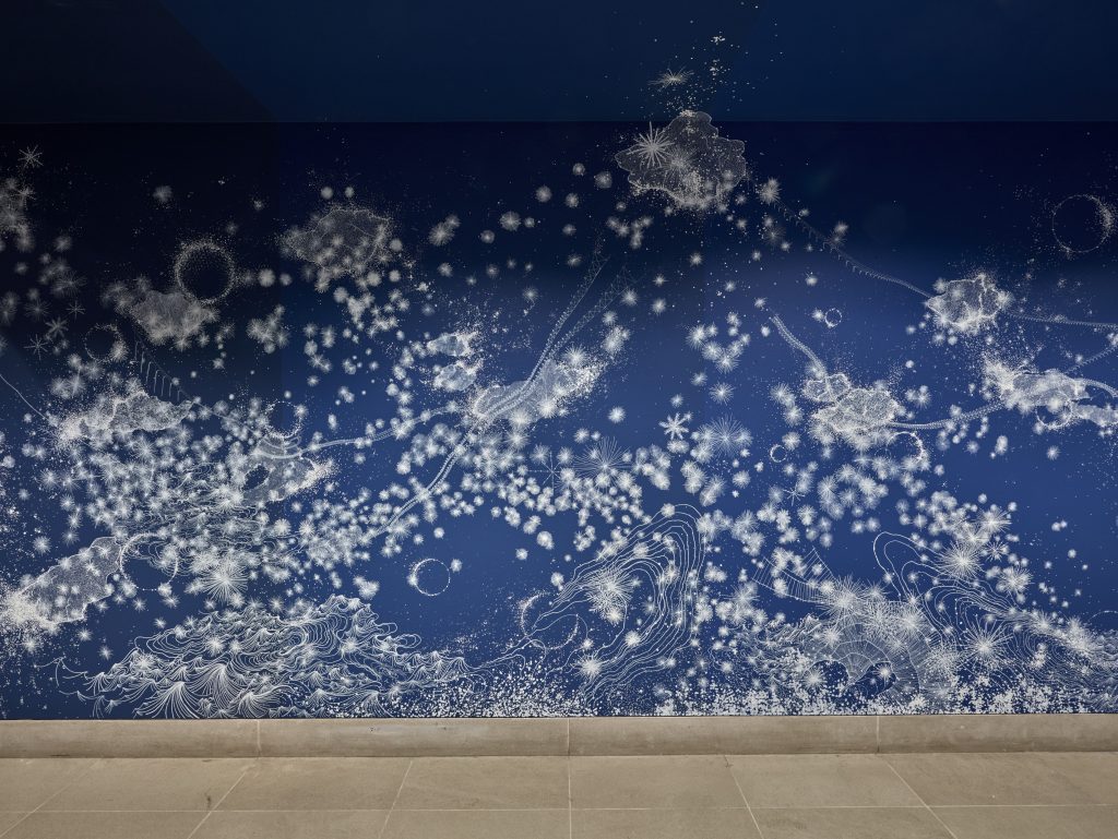
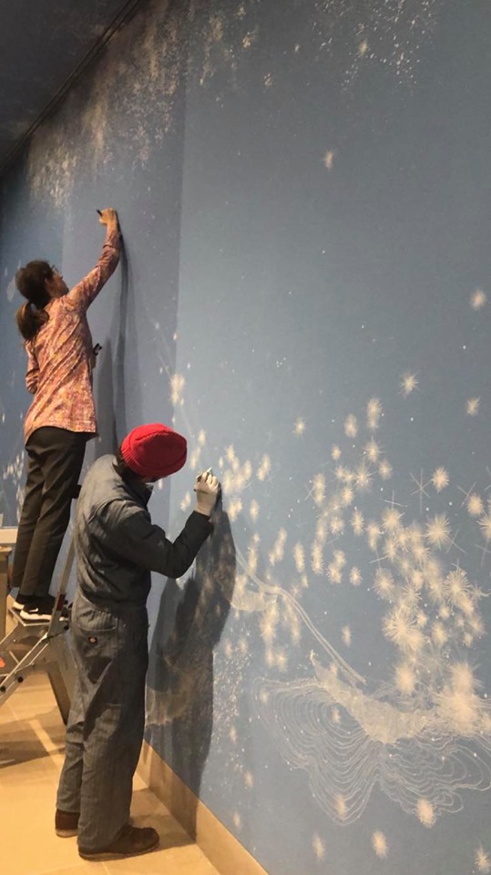
Jaclyn explains: “The hand-drawn floral pattern was inspired by Mexican lacquer ware from Olinalá. DMA Director, Agustín Arteaga, lent me a wonderful book full of different styles to look at, and I developed a monochromatic floral pattern illustrating common motifs I saw throughout the book. This floral pattern flanks both walls of the entrance to the exhibition and weaves its way up and over the ceiling in the space right before the monumental painting Flores Mexicanas by Alfredo Ramos Martínez.”
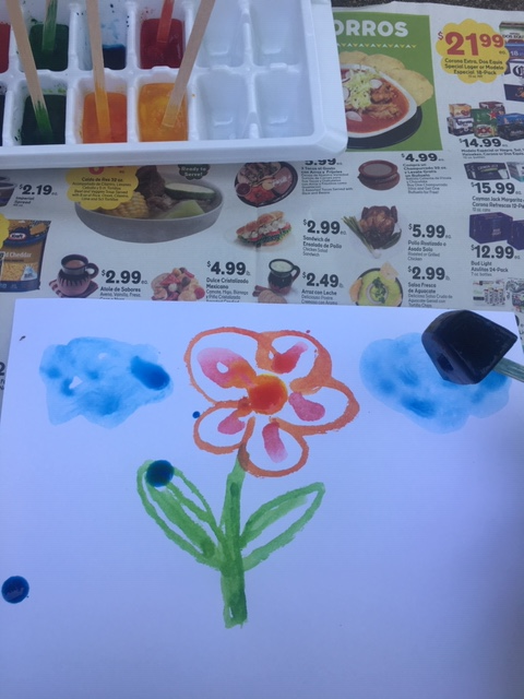
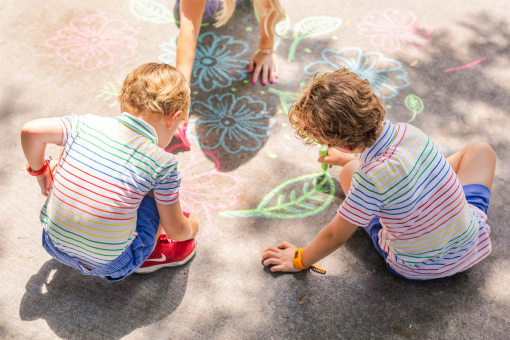
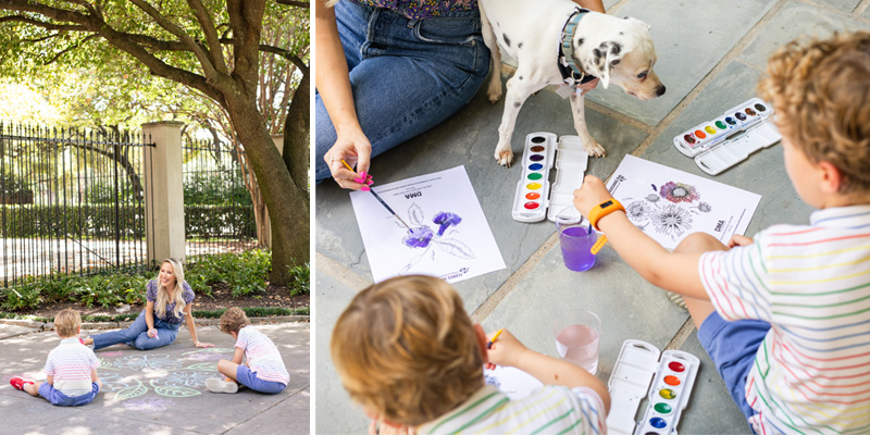
Now we aren’t advocating for your children to go crazy on the walls with a Sharpie, but Jaclyn’s process does offer another great way to engage your child with art. Sketching in the galleries is one of my favorite activities to do with kids because it encourages them to look closely, to engage their fine motor skills, and to be creative. In the classes I teach, sketching is never about reproducing an exact copy of the art on the walls—it’s about the process of connecting what a child sees and thinks with their pencil on paper, creating something new that wasn’t there before. Take a stroll through the virtual tour of Flores Mexicanas and challenge your child to find 3–4 different flowers in the paintings that they would like to draw in their own artful bouquet. Or, pull out a stack of favorite picture books or art books and have your child search for designs and patterns to incorporate into their own drawings.
ART ACTIVITY: MAKE A FLORAL PATTERN
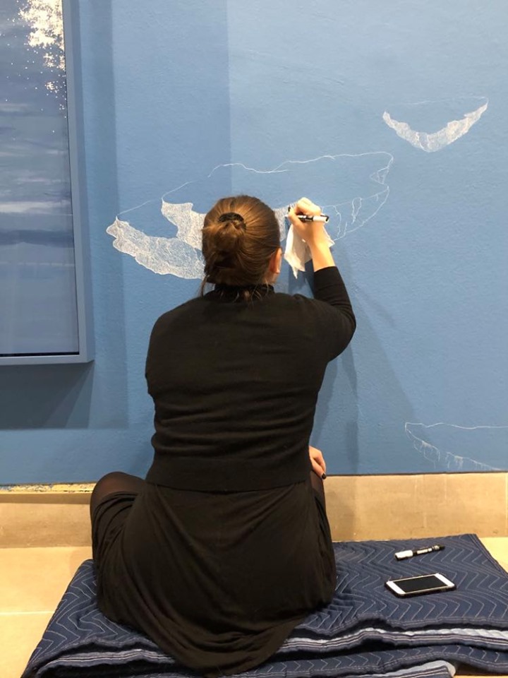
To make floral patterns like those in the exhibition, watch this video tutorial and follow along with Jaclyn as she draws. Use any marker, sidewalk chalk, or drawing tool you have to create this. Here, Jaclyn is using a Crayola Superfine tip marker.
- Start by plotting three dots that will be the center of your flowers. You want to plot them with enough space in between—a triangle shape would be perfect for this.
- Draw a ring around each of the three dots. These will be the bases of the flowers to draw petals around.
- Start drawing the petals around each ring, with about 5-6 petals per flower. It’s okay if they are not all equal in size—it will look better this way in the end!
- Once all the petals of your three flowers are complete, draw 2-3 lines coming from the center ring to about halfway across each petal. This will give your flowers more depth and interest.
- In the negative spaces between your three completed flowers, draw a few slightly curved lines. These will be the stems of your leaves.
- Starting with the longest curved stem line, create a teardrop shape around the stem center. You can make these as wide or narrow as you’d like. Draw diagonal lines out from it to create the lines in the leaves. Do this for the other curved line stems from step 5, but save one of the stems for a fuller palm leaf drawing (in the next step).
- For the palm leaf, create simple leaves by drawing small curved strokes of lines, starting from the top of the stem and working your way to the base. These curved leaf lines will gradually get bigger and bigger with each stroke, as you make your way to the base.
- Complete your floral set by dropping in dots or circles in the spaces between the three flowers and leaves. Show us your creation by taking a picture and tagging #DMAatHome!
Bonus: Download our five floral coloring sheets for the kids to enjoy, inspired by the Dallas Museum of Art’s current exhibit, Flores Mexicanas.
Leah Hanson is the Director of Family, Youth, and School Programs at the DMA.
DMA Family at Home is supported by DFWChild.