Our annual Museum Forum for Teachers has come and gone, and this year was another rousing success. Twenty-two teachers participated in the week-long program, and spent a full day at each of the following Museums: The Rachofsky House, the Nasher Sculpture Center, the Modern Art Museum of Fort Worth, the Kimbell Art Museum, and of course the DMA.
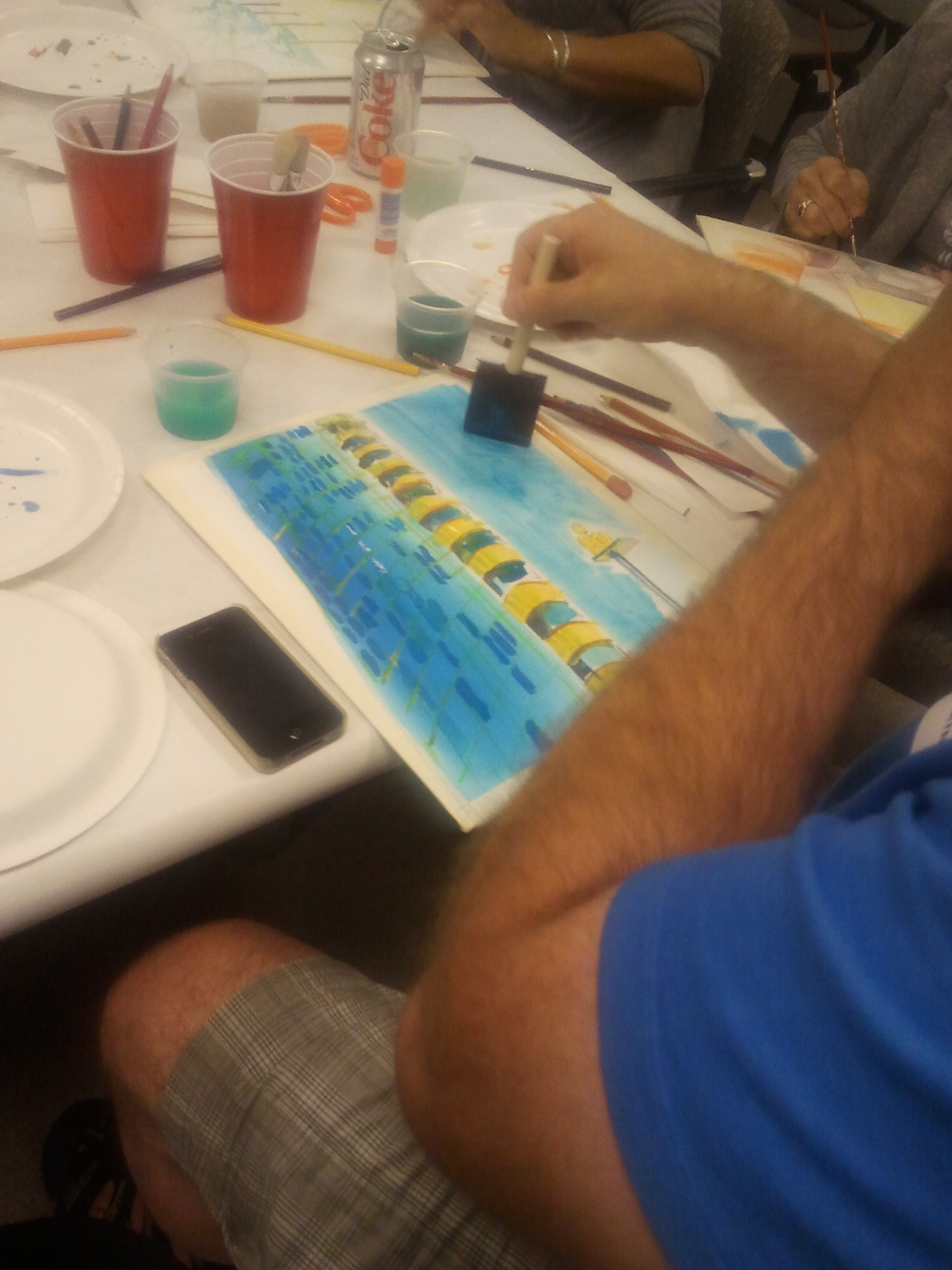
During their time at the DMA, the teachers went on a walking tour of the Arts District before spending time in Flower of the Prairie: George Grosz in Dallas. Both of these experiences led to their afternoon art project: creating a watercolor painting of their impression of Dallas.
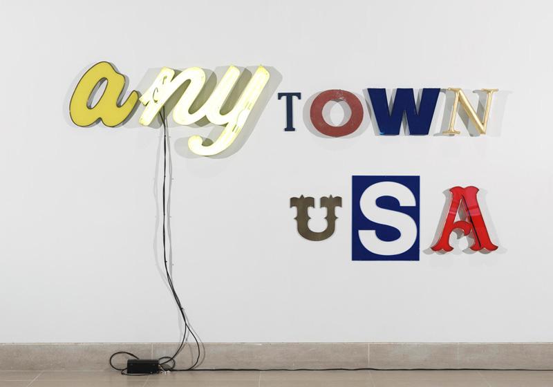
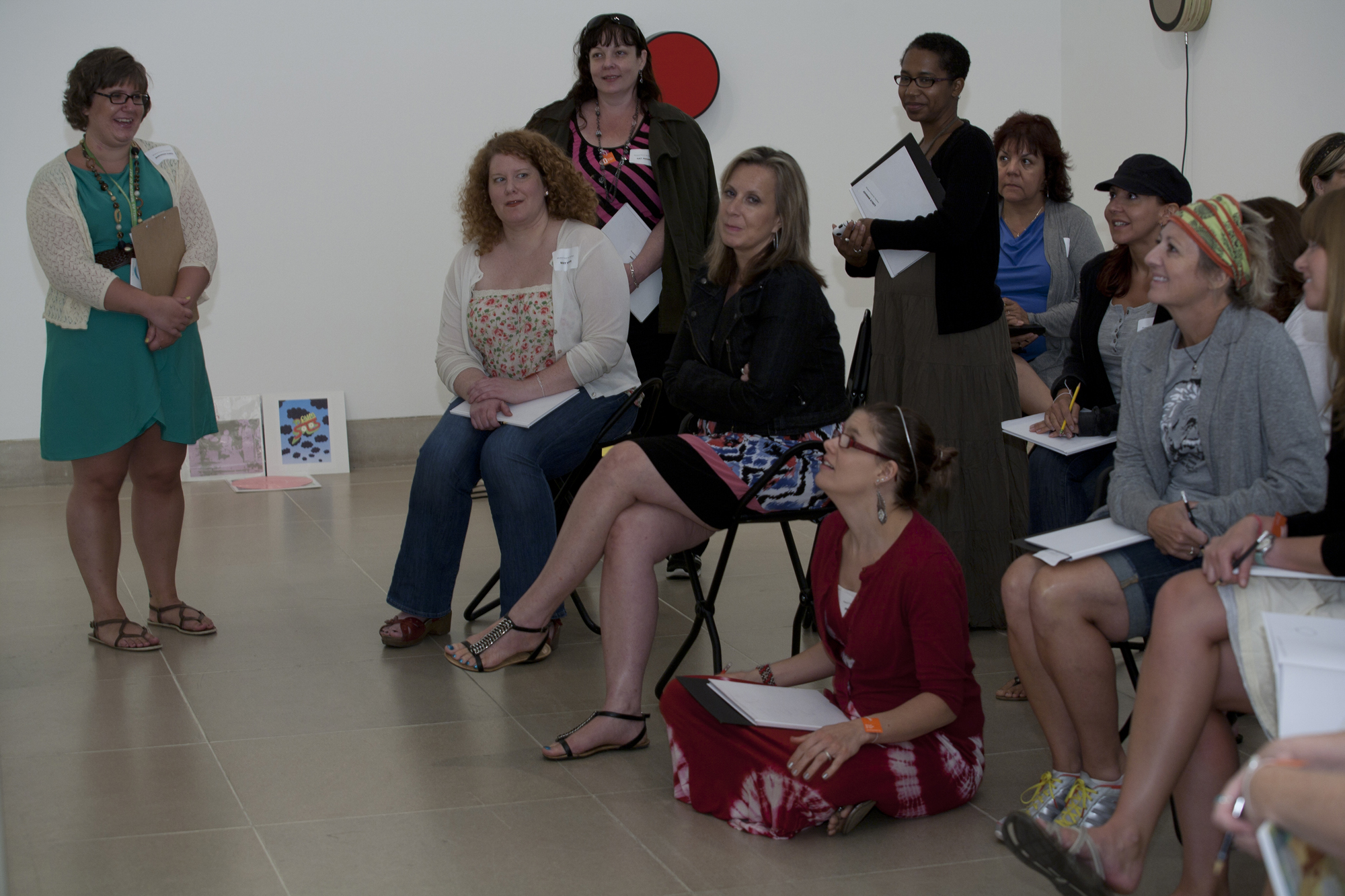
Teachers were also able to spend time in a brand new installation, Variations on Theme: Contemporary Art 1950s–Present. While we were in the exhibition, we focused on the themes of the figure, vanitas, and place. The idea of place was one of our key themes for the day, and we spent quite a bit of time looking at Jack Pierson’s Anytown USA.
I always love when Anytown USA is on view. There’s something nostalgic about it, and I always wonder just where “Anytown” might be. The general consensus among the teachers was that Anytown was a small town that probably looked a lot like Mayberry. As we looked at the artwork, the teachers were given the following prompt:
The letters that make up this sculpture come from a variety of places. Imagine that each of the letters came from signage on buildings in Anytown USA. Select one letter and write a description of the business you think used that letter in its signage. Remember, your response must be inspired by the look and feel of the font/letter you select.

Jack Pierson, Anytown USA, 2000, Dallas Museum of Art, gift of the Junior Associates, 2004.10.A-I, © Jack Pierson
Based on the teacher’s responses, it sounds like Anytown USA would be a wonderful place to live! Here are some of their ideas:
NY: A coffee shop where everyone goes to hang out. Every town has to have a coffee shop. Or, a deli run by a transplant from New York. All of the sandwiches are named after local celebrities.
T: An antique or curio store, and all of the employees are eclectic, just like the goods they sell.
O: A donut shop where grandparents spend weekend mornings with their grandkids. A city is defined by its donut shops. Or, it’s an old gas station that is practical, functional, but a little bit dirty. They don’t care about the aesthetics of their business, they just want to get the job done.
W: This W looks very commercial and slick, like it came from a Walden Books. Or, it could be from a Woolworth’s Five and Dime.
N: A feminine upscale hotel, or maybe a newspaper printing office. Or, maybe it’s for a fine art framing shop that has a Thomas Kinkade painting hanging in the window.
U: This belongs to a Western store called “Boot Country.”
S: This S looks universal and simple–it belongs to a store called Supermart that sells everything.
A: This could be part of the sign of a ball park. Or, it’s the sign for a bar called BAR that’s full of smoke and beer, but is a place to escape.
Surprisingly, none of the teachers selected to write about the first yellow A. What type of business do you think that A might represent? I would love to hear your ideas!
Shannon Karol
Manager of Docent Programs and Gallery Teaching


I think the yellow “a” might be part of a restaurant name. It’s a local, family-owned business — with yellow letters floating across a fake stone facade — and the family name is barely legible…something unique and the font is signature-like. But, even if you can’t read the name well, everybody knows this place because it has the best pancakes and the waitresses look like they’ve been there forever!
The organic curves combined with the lemon-yellow color make me think the yellow “a” is from an upscale cupcake bakery called, Cupcakeland. The cupcakes may be a little pricey, but the elegantly-swirled pile of decadent icing and gourmet sprinkles are worth every penny…and Cupcakeland offers 100 flavors!