Posts Tagged 'Anytown USA'

Re-visiting Anytown USA

Last month, I shared teacher responses to the following prompt for the artwork Anytown USA by Jack Pierson:

The letters that make up this sculpture come from a variety of places. Imagine that each of the letters came from signage on buildings in Anytown USA.  Select one letter and write a description of the business you think used that letter in its signage.  Remember, your response must be inspired by the look and feel of the font/letter you select.
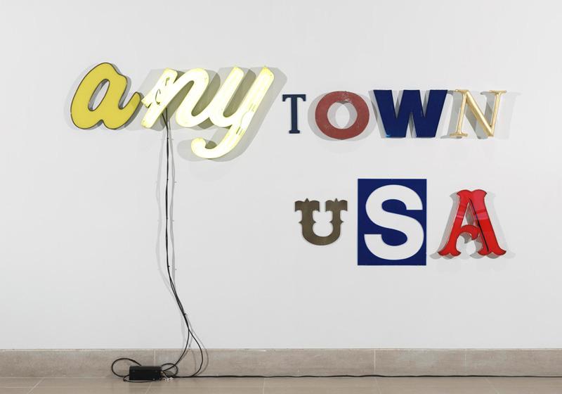
Anytown USA, Jack Pierson, 2000, Dallas Museum of Art, gift of the Junior Associates, 2004.10.a-i, © Jack Pierson

I repeated this same exercise with our docents this week, and their responses were equally as clever and creative.  Below are descriptions for some of the businesses that the DMA docents think populate Anytown USA.

A is for Nan’s Diner, which has been around since the 1950s.  The booths and stools are covered in yellow vinyl, and the diner is known for their breakfast menu.  The A may also be from a sign for Carvel’s Ice Cream Shop, whose interior is decorated in primary colors.  The whole store smells like hot fudge and cotton candy.
NY is for New York Bagels, a shop that’s open all night and is a favorite late night hangout.  NY may also represent the New York Pantyhose Company, because the NY in this work of art comes in a pair–just like pantyhose!
T is for the Small Town News, a local newspaper that reports on weddings, births, and everything that’s happening at the schools.  It might also stand for the Texaco gas station, which is still a full-service station.
O is from the sign of the John Silk Feed Store, which caters to farmers and ranchers.  The employees are “good ol’ boys” and the store smells like hay, fertilizer, and cedar shavings.  The O might also be from the sign of the Apothecary Shoppe, which had served the town for 60 years until it was forced to close because of a big chain store.
W may be from the sign of the family-owned Main Street Hardware Store.  The store is cluttered, but they carry specialized products that you can’t find at other stores.  The W might also belong to the Washateria, which is filled with the whir of washers and dryers.

U is for the Final Rest Undertakers, a quiet space decorated with muted colors.  Past customers might say, “He looks so natural, but it costs so much.”  On the other end of the spectrum, U might also be from the sign of a saloon/boarding house.  A loud and crude place, there’s a player piano in the corner and women wander the lobby wearing only their petticoats.
S is for the General Store, whose owners know everyone in town.  The stores sells everything you could ever need, and there’s also a large pickle barrel in the corner.  The S could also be part of the sign for a soda fountain, which is the favorite hangout of all of the teenagers in Anytown USA.
A is part of the sign for the local baseball stadium, which houses a minor league team.  It gives the town a sense of sophistication and makes it feel like maybe it’s a larger town than it actually is.  The A could also be from the local Anheuser-Busch distributor, the town’s largest employer.

Without a doubt, the answers for that final A were unanimous in all four groups of docents who participated in this exercise.  What is it about that font that screams baseball and/or beer?

Many of the docents commented on the sense of nostalgia that their responses held.  I’m looking forward to trying this activity with students to find out if Anytown becomes more modern when it’s examined from their point-of-view.

Shannon Karol
Manager of Docent Programs and Gallery Teaching
Destination: Anytown USA

Our annual Museum Forum for Teachers has come and gone, and this year was another rousing success.  Twenty-two teachers participated in the week-long program, and spent a full day at each of the following Museums: The Rachofsky House, the Nasher Sculpture Center, the Modern Art Museum of Fort Worth, the Kimbell Art Museum, and of course the DMA.

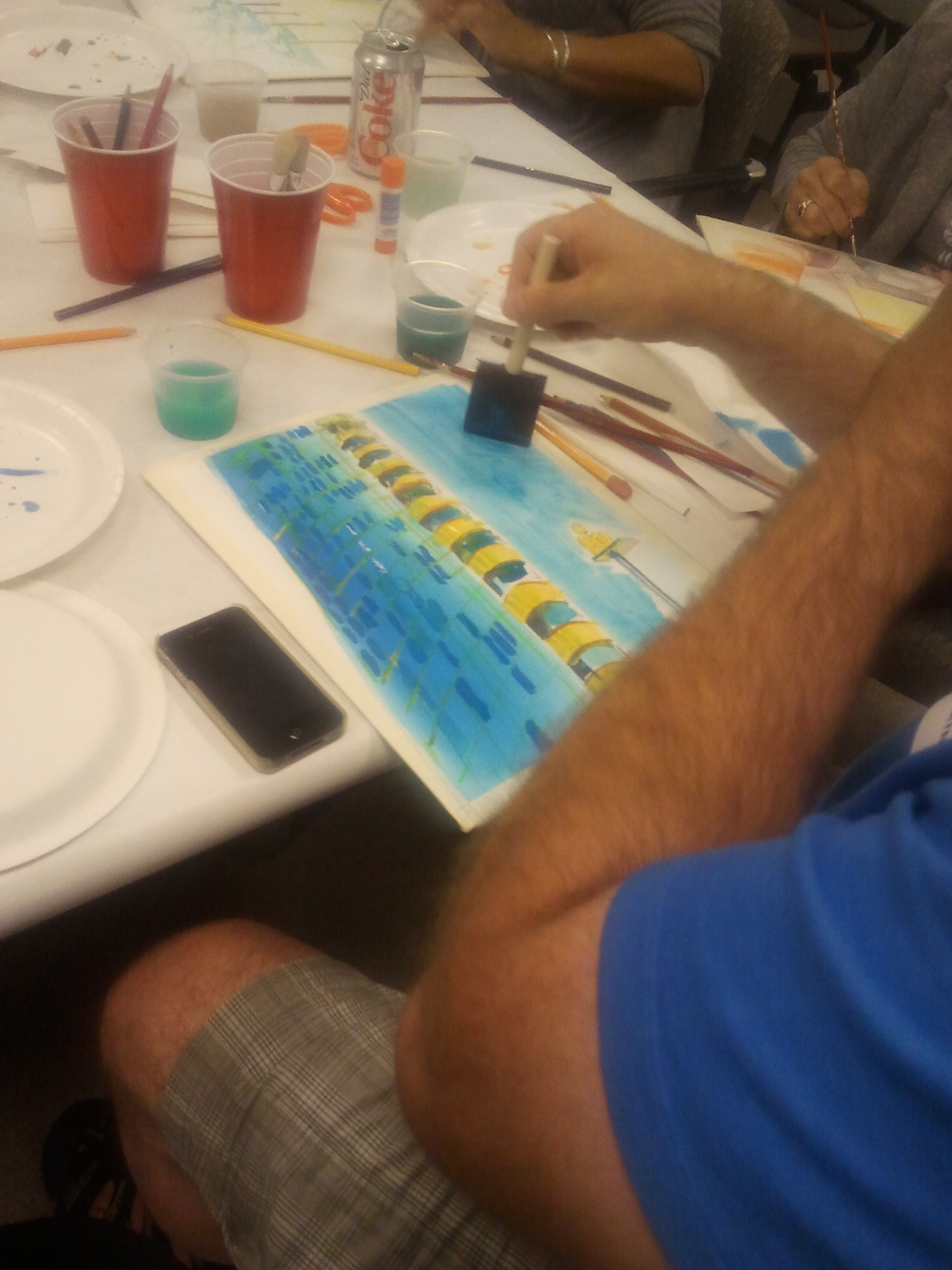
During their time at the DMA, the teachers went on a walking tour of the Arts District before spending time in Flower of the Prairie: George Grosz in Dallas.  Both of these experiences led to their afternoon art project: creating a watercolor painting of their impression of Dallas.

One teacher’s watercolor showed the Nasher Sculpture Center and Museum Tower.

Teachers were also able to spend time in a brand new installation, Variations on Theme: Contemporary Art 1950s–Present.  While we were in the exhibition, we focused on the themes of the figure, vanitas, and place.  The idea of place was one of our key themes for the day, and we spent quite a bit of time looking at Jack Pierson’s Anytown USA.

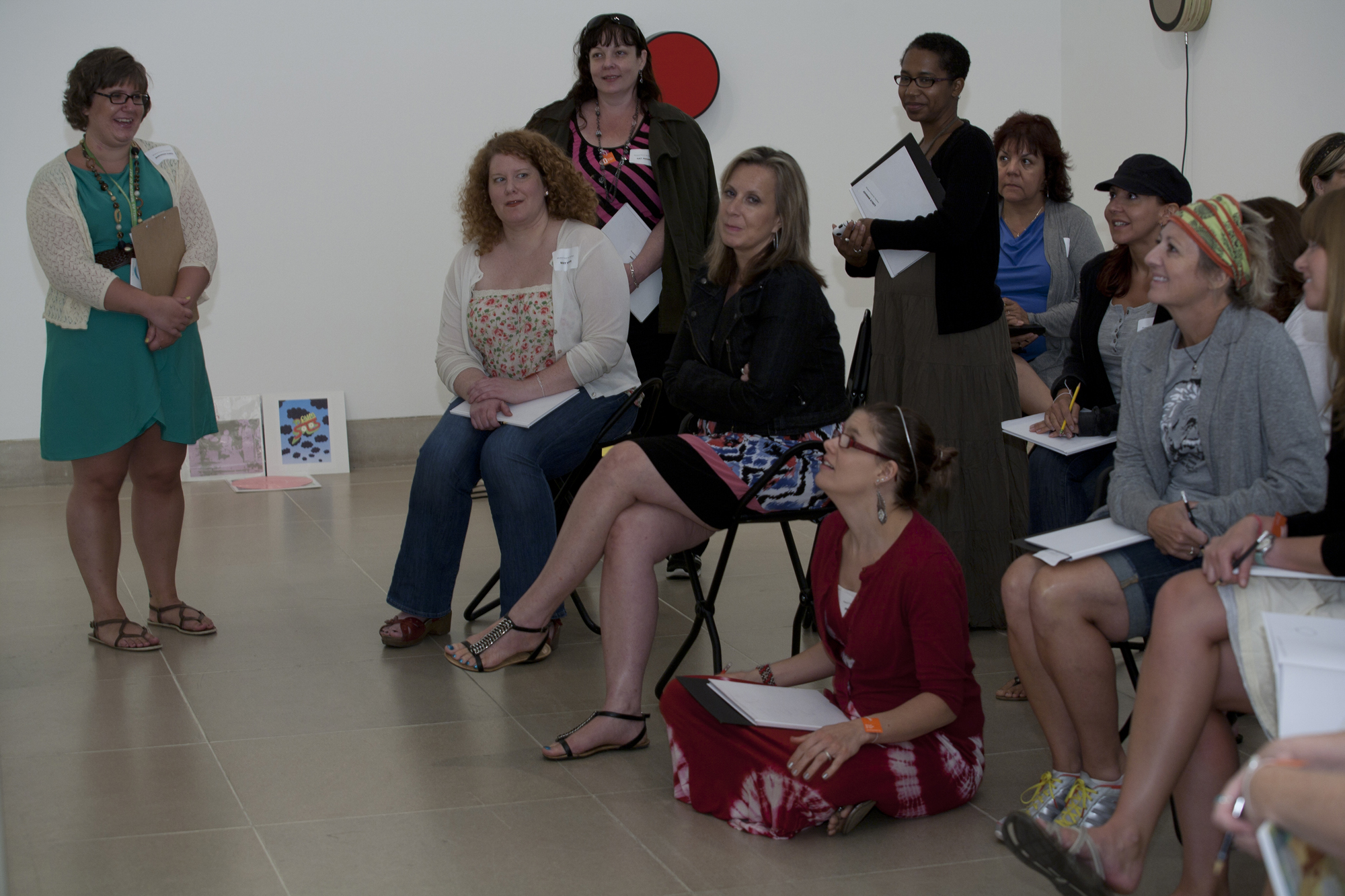
Talking with teachers during the 2012 Museum Forum for Teachers

I always love when Anytown USA is on view.  There’s something nostalgic about it, and I always wonder just where “Anytown” might be.  The general consensus among the teachers was that Anytown was a small town that probably looked a lot like Mayberry.  As we looked at the artwork, the teachers were given the following prompt:

The letters that make up this sculpture come from a variety of places. Imagine that each of the letters came from signage on buildings in Anytown USA.  Select one letter and write a description of the business you think used that letter in its signage.  Remember, your response must be inspired by the look and feel of the font/letter you select.

Jack Pierson, Anytown USA, 2000, Dallas Museum of Art, gift of the Junior Associates, 2004.10.A-I, © Jack Pierson

Based on the teacher’s responses, it sounds like Anytown USA would be a wonderful place to live!  Here are some of their ideas:

NY: A coffee shop where everyone goes to hang out.  Every town has to have a coffee shop.  Or,  a deli run by a transplant from New York.  All of the sandwiches are named after local celebrities.
T: An antique or curio store, and all of the employees are eclectic, just like the goods they sell.
O: A donut shop where grandparents spend weekend mornings with their grandkids.  A city is defined by its donut shops.  Or, it’s an old gas station that is practical, functional, but a little bit dirty.  They don’t care about the aesthetics of their business, they just want to get the job done.
W: This W looks very commercial and slick, like it came from a Walden Books.  Or, it could be from a Woolworth’s Five and Dime.
N: A feminine upscale hotel, or maybe a newspaper printing office.  Or, maybe it’s for a fine art framing shop that has a Thomas Kinkade painting hanging in the window.

U: This belongs to a Western store called “Boot Country.”
S: This S looks universal and simple–it belongs to a store called Supermart that sells everything.
A: This could be part of the sign of a ball park.  Or, it’s the sign for a bar called BAR that’s full of smoke and beer, but is a place to escape.

Surprisingly, none of the teachers selected to write about the first yellow A.  What type of business do you think that A might represent?  I would love to hear your ideas!

Shannon Karol
Manager of Docent Programs and Gallery Teaching

Archives

Flickr Photo Stream

Categories