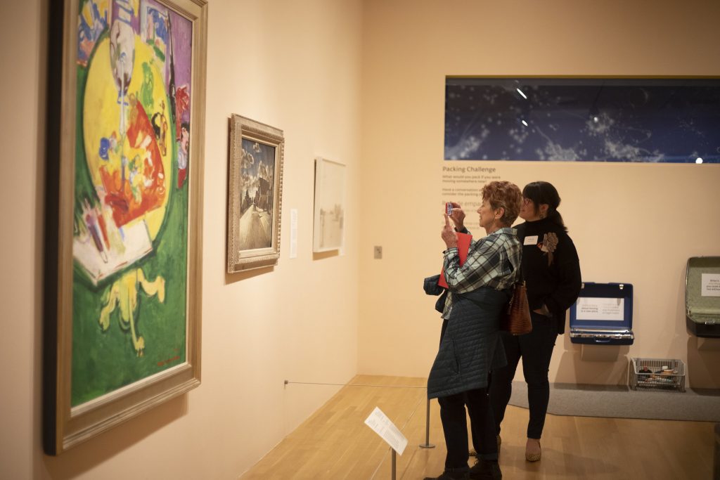
What items would you take with you if you had a few hours to prepare for a weeklong trip? If you’re like me, you might drag your suitcase down from the storage shelf in the garage and lay out a few outfit options with a pair of good walking shoes, the necessary toiletries, phone charger, and books. But let’s imagine for a moment that we didn’t have a few hours to prepare, and our weeklong trip was actually a permanent move. What items would you choose if you were leaving your home forever and you could only take what you could carry? What if your move wasn’t your decision, and it was forced upon you? Or maybe your move was your decision and you are hoping for a better life with more opportunities?
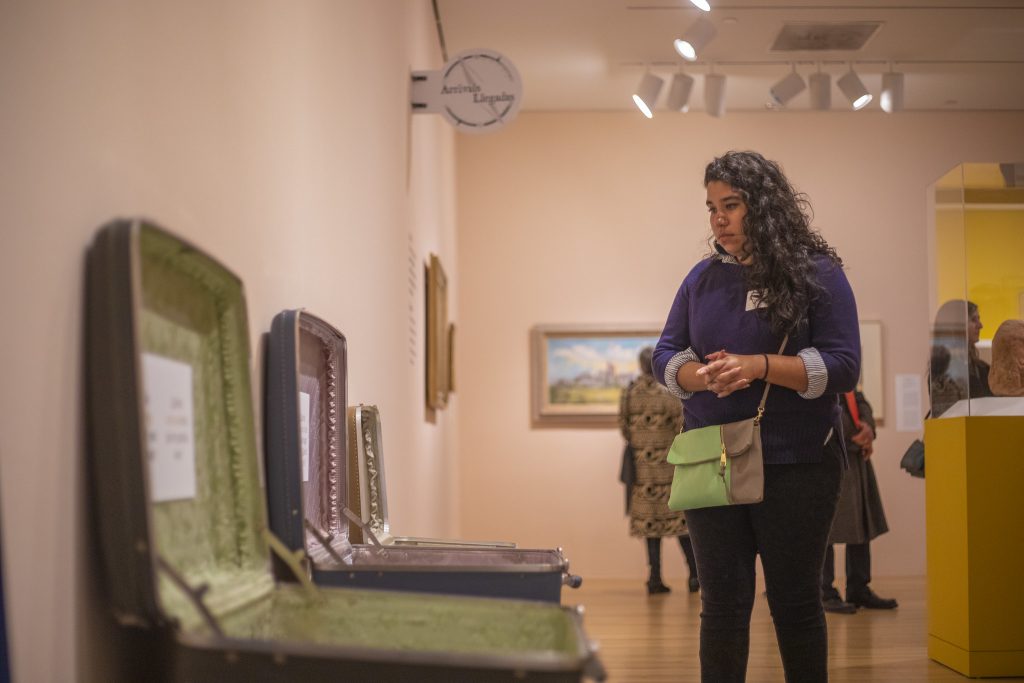
This is the heartbeat of the exhibition My|gration, which is a play on words describing the personal journey of migration experienced by our community and by artists throughout history. As a graphic designer at the Museum, I was very excited to have the opportunity to take the lead in designing the environmental graphics for this exhibition. Working closely with the Interpretation, Education, and Exhibition teams, we wanted to create an exhibition that encouraged the visitor to experience the world from another person’s perspective, and in particular how life and art are affected by immigration or displacement.
As we started designing, we thought about the natural journey of the earth as it travels around the sun, bringing us day and night, dusk and dawn. We mirrored that with the idea that many people take similar journeys throughout their lives, with periods of light and dark, clarity and ambiguity. These thoughts informed our earthy and atmospheric color palette.

I started to create graphic elements that would help tie this metaphorical journey with the physical journey of movement and migration. I illustrated a compass rose that represented the many directions life could take us, both
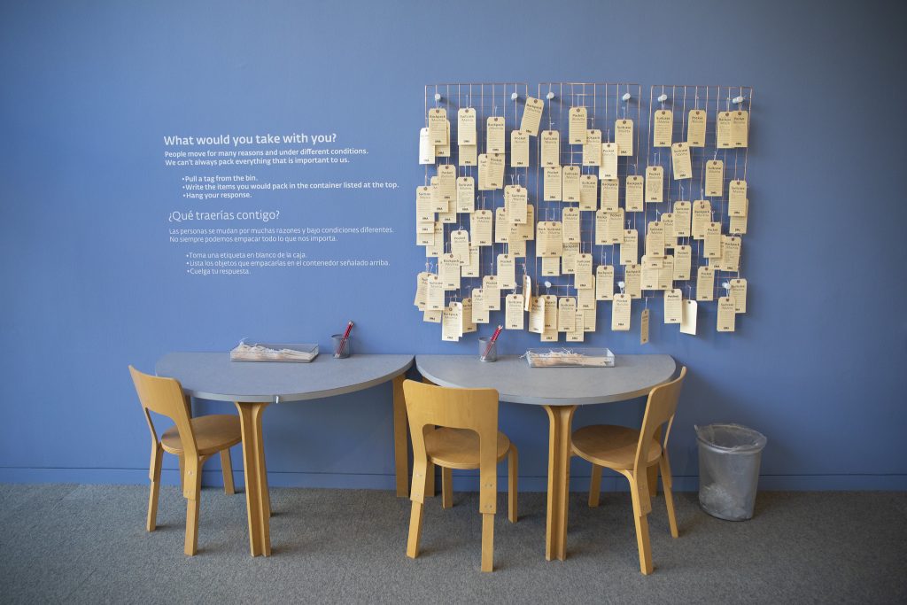
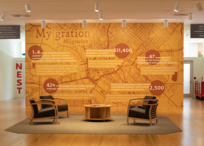
emotionally and physically. We used suitcases and luggage tags to suggest the idea of items you might journey with. Then I started working with an illustrated map of Dallas, zooming in and making it the color of earth—a rusty, warm bronze. I laid it out at the bottom of the entry walls with a sunset gradient fading into a starry night sky.
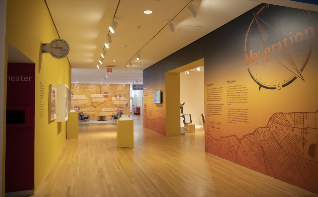
As a focal point of the exhibition, DMA Head of Interpretation Dr. Emily Schiller provided facts about Dallas’s immigrant population to highlight the diversity in our own community. I used the illustrated map of Dallas here as well in this bilingual infographic.
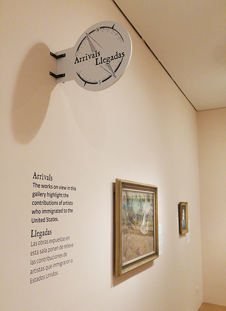
The exhibition space was organized into sections featuring artwork that fell into three categories: Arrivals (artists who immigrated to the US), Departures (artists who emigrated from the US), and In Transit (art reflecting our connected world). For these section headers, I designed circular blade signs that mimicked ones you might see on the road or at a train station while traveling.
The circle used for the blade signs repeats itself throughout the graphics in the space. I used it frequently to suggest multiple meanings: (1) the rose compass, (2) the “you are here” icon on a map, and (3) the metaphorical idea that circles are continuous, much like the personal journeys of our lives.
Brittany Lowe is a graphic designer at the DMA.
