This past December, the Kaleta A. Doolin Foundation donated the Reverend Isaac V. and Alicia C. Pérez Mola Collection to the DMA. The collection is composed of some 70 molas: hand-stitched textiles that form part of Guna women’s clothing in the Republic of Panama. The Guna occupy a territory called the Gunayala Comarca (Gunaland Province), formed by hundreds of tiny islands, as well as by the adjacent coastline. This attire was adapted from the ancient practice of women painting their bodies with complex geometric designs, later translated to textiles following the adoption of new fabrics and tools introduced by European settlers. Over the decades, molas have become the single most recognizable material element of Guna cultural identity.
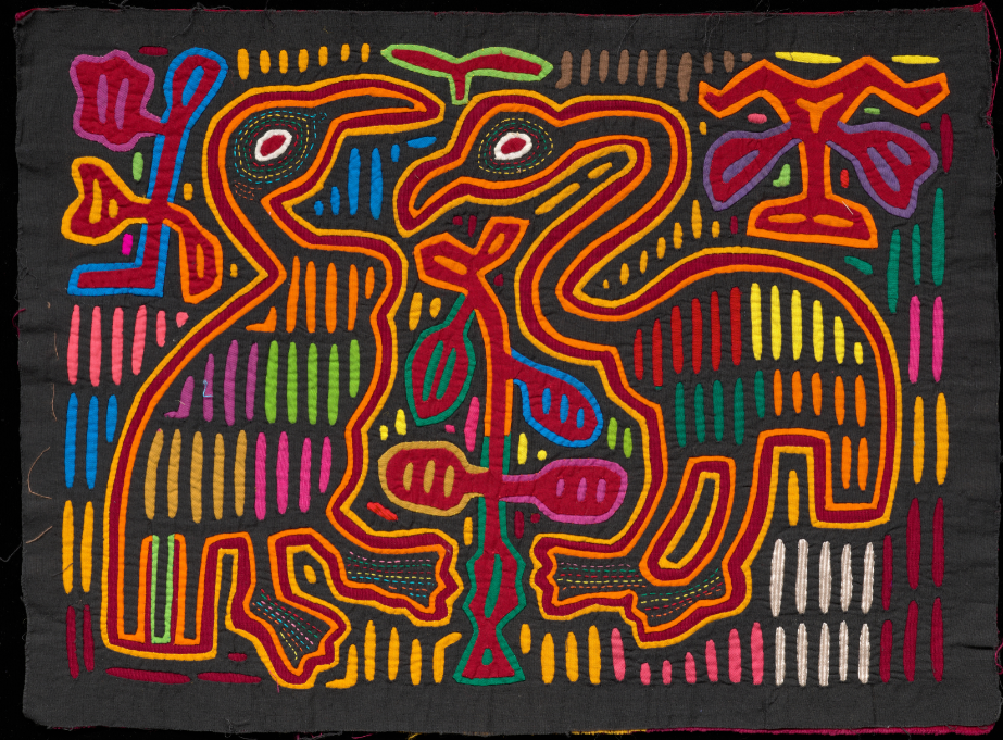
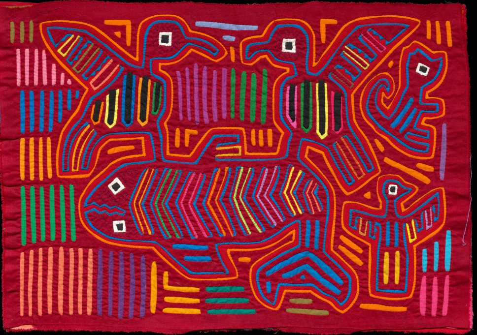
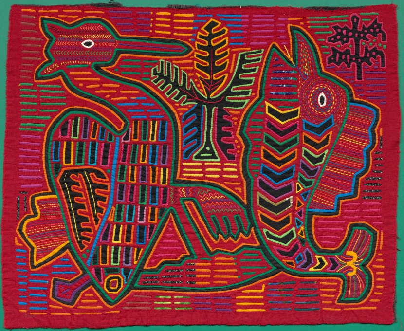
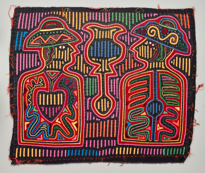
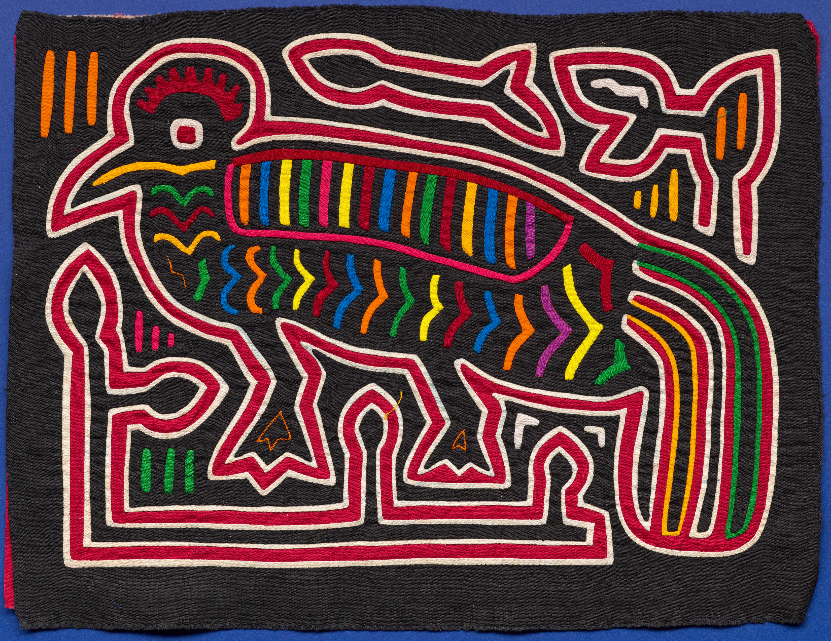
Molas: Two aquatic birds (T44205.43); Terrestrial birds, fish, and mammal (T44205.46); Aquatic bird and fish with spiny dorsal fin (T44205.15), Guna people, Gunayala Comarca, Panama, mid-20th century, cotton, Dallas Museum of Art, The Isaac V. and Alicia C. Pérez Mola Collection, gift of The Kaleta A. Doolin Foundation; Man and woman wearing hats, mid-twentieth century, Guna people, Gunayala Comarca, Panama, cotton, Dallas Museum of Art, gift of The Dozier Foundation, DS.1990.303
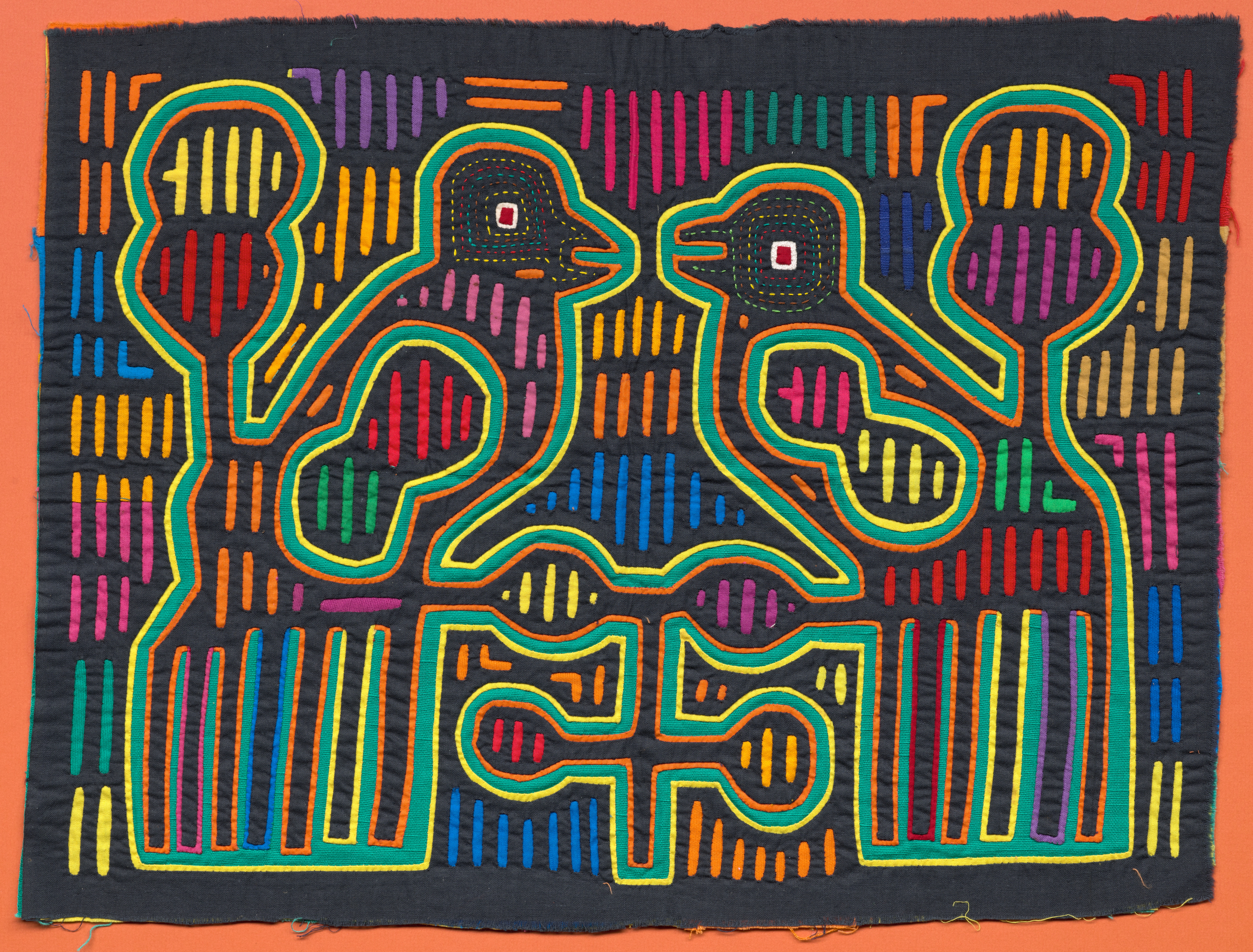
The arts in Guna society are strictly gendered, with men engaged in basket weaving and public oratory, reciting poems and stories. Women, including men who identify as women, design and fabricate molas. The molas are created using a complex reverse appliqué process. Two or three pieces of fabric are first basted together and then a design is hand cut into the top layer, with multiple layers of colorful, contrasting fabrics and appliques then sewn between the top and bottom layers. This elaborate technique is intensive, typically taking a maker three to five weeks to complete the 15 by 17-inch textile.
Care is taken to match the thread to the cloth and layer the fabrics in a way that gives the impression of a seamless and uniform composition. Mola designs incorporate elements such as flowers, birds, animals, and mythical creatures, but geometric patterning remains a crucial element.
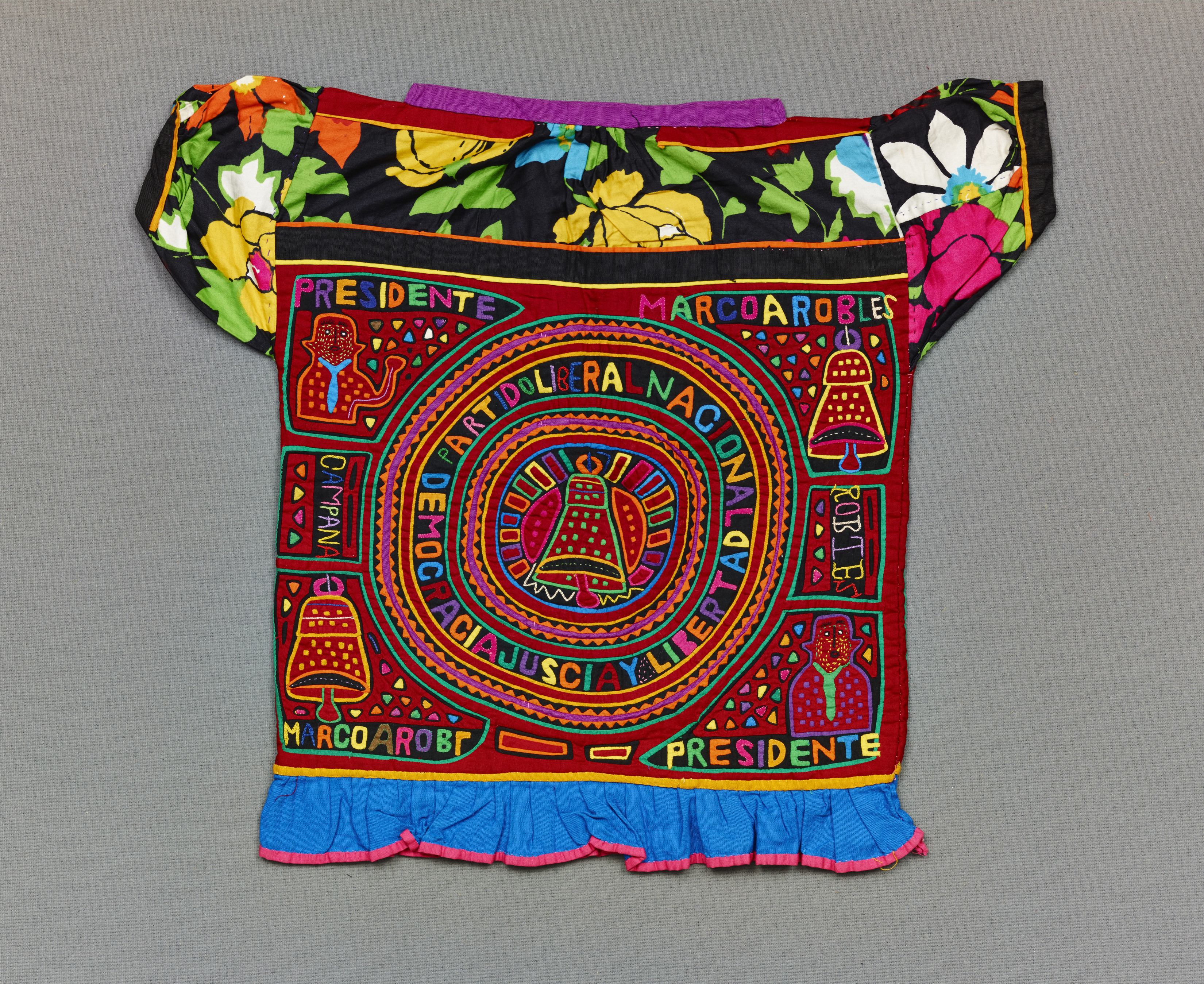
The mola has deep ties to Guna identity. In 1918 the Panamanian government began a campaign to subjugate and assimilate the Guna, which included banning traditional dress. The Guna resisted, and making and wearing molas became an act of political protest. In 1925 the two parties reached an agreement granting the Guna autonomy to govern their own affairs and sovereignty over their Indigenous identity and culture. To this day, Guna women still produce beautifully executed molas for their own use in clothing, as well as versions for tourist consumption.
Reverend Isaac V. Pérez, his wife, Alicia, and their daughter, Elva, moved to Panama in 1953 when Reverend Isaac accepted employment with a denomination-affiliated organization. Among his responsibilities was working with local Guna to create a new church. On one of his first visits to the islands, he was gifted a mola as a gesture of friendship. Alicia and Elva were fascinated by the complex and unusual qualities of the design, heightened by its vibrant colors.
The Pérezes remained in Panama for 22 years and amassed a stunning collection of molas. The family treasured them for their creativity, design, and imagery—but even more so as a reminder of the graciousness of the Guna people. Their collection joins 10 molas already stewarded by the DMA, and together they offer a testament to the creativity and resilience of the Guna people, and the critical role of women in preserving and adapting Guna culture.
Dr. Mark A. Castro, The Jorge Baldor Curator of Latin American Art
Dr. Michelle Rich, The Ellen and Harry S. Parker III Assistant Curator of the Arts of the Americas
Alyssa Wood, Curatorial Assistant