January marks a new year and new possibilities, and at this time almost 40 years ago, the DMA and the citizens of Dallas were looking forward to a brand-new museum and watching it grow from the ground up.
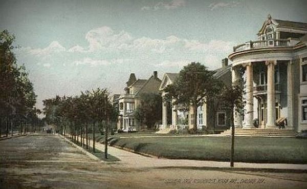
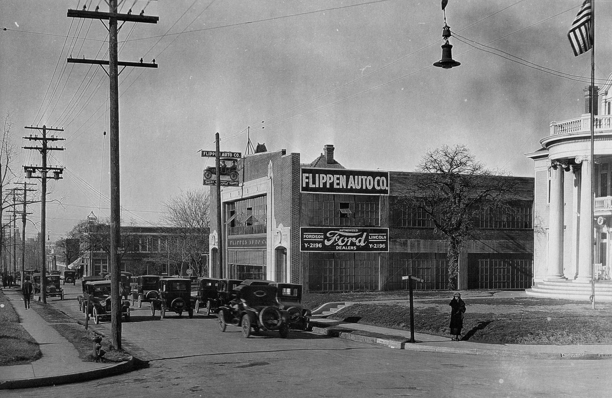
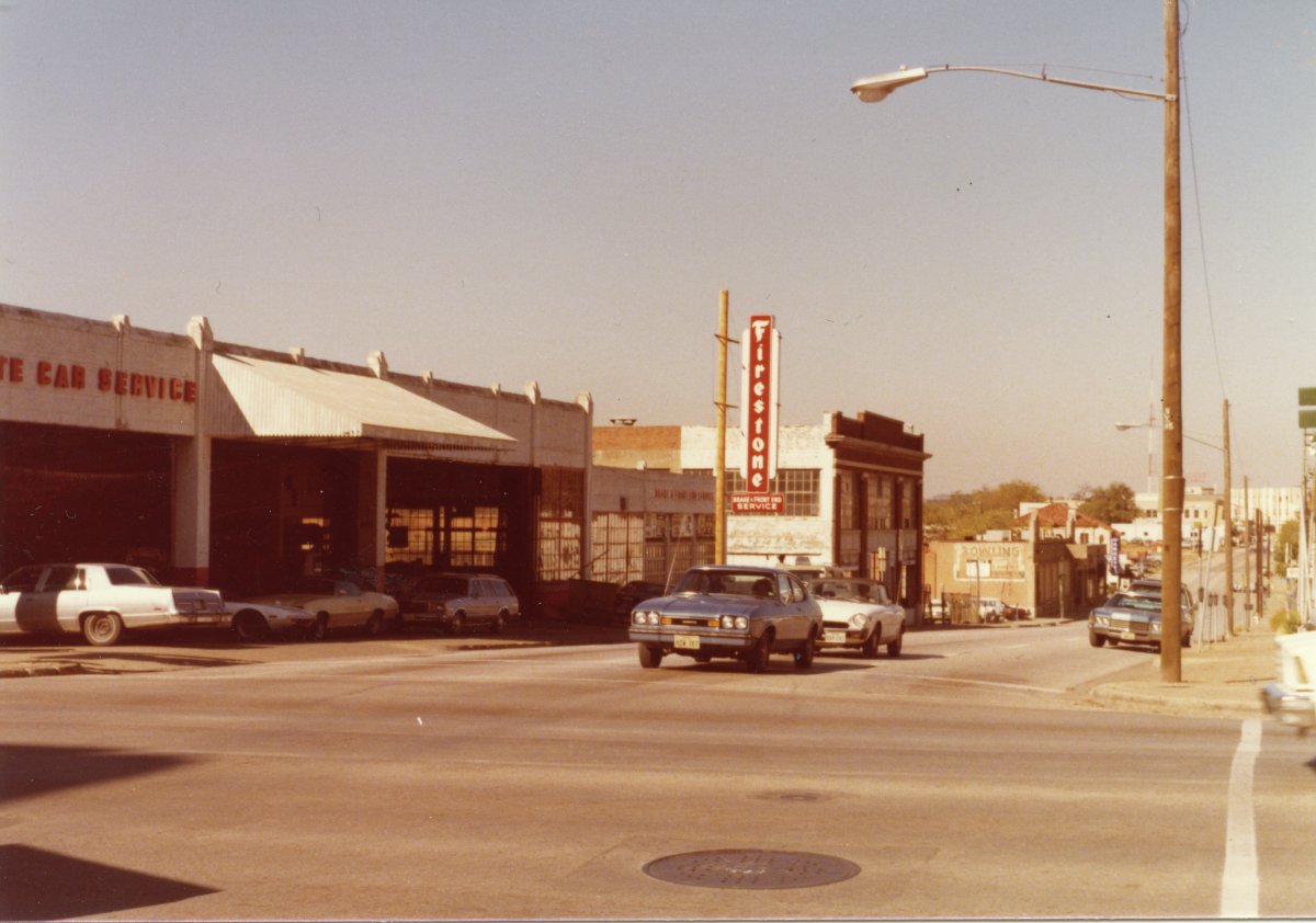
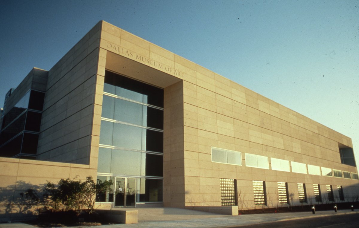
The site for the new museum, chosen in 1977, was in an area north of the Central Business District, where it would serve as the anchor of a new Arts District for the city. This location had once been home to grand mansions facing Ross Avenue at the turn of the 20th century, but by the 1930s and 1940s the area was dominated by car dealerships, tire and auto repair shops, and small machine shops.
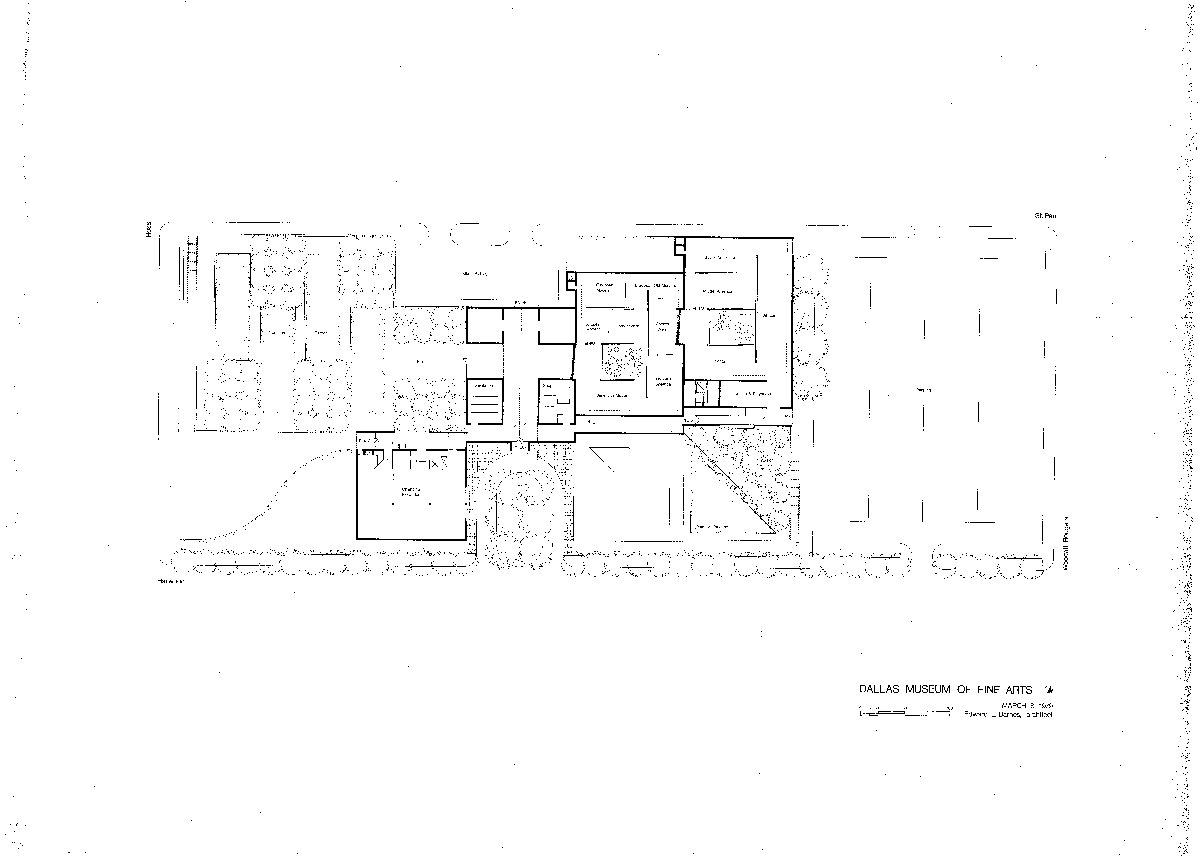
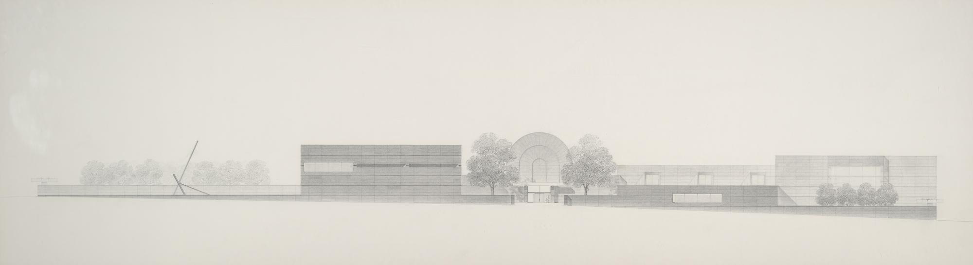
The design for the new museum building by architect Edward Larrabee Barnes was created in 1979. Barnes’s plan included a central concourse to connect museum functions, terraced galleries with internal courtyards and skylights for natural light, vaulted space for contemporary art, a sculpture garden, and a quiet, continuous background that lets the artworks shine.
Edward Larrabee Barnes’s original design for the new Dallas Museum of Art, March 1979. The layout stayed generally the same, but the concourse became straight instead of stepped.
The site chosen was not empty land, and the structures were still mainly automotive related, especially on the Ross and Harwood sides.
Northwest corner of Ross and Harwood, the current location of the DMA, looking north along Harwood Street with Ross Avenue in the foreground.
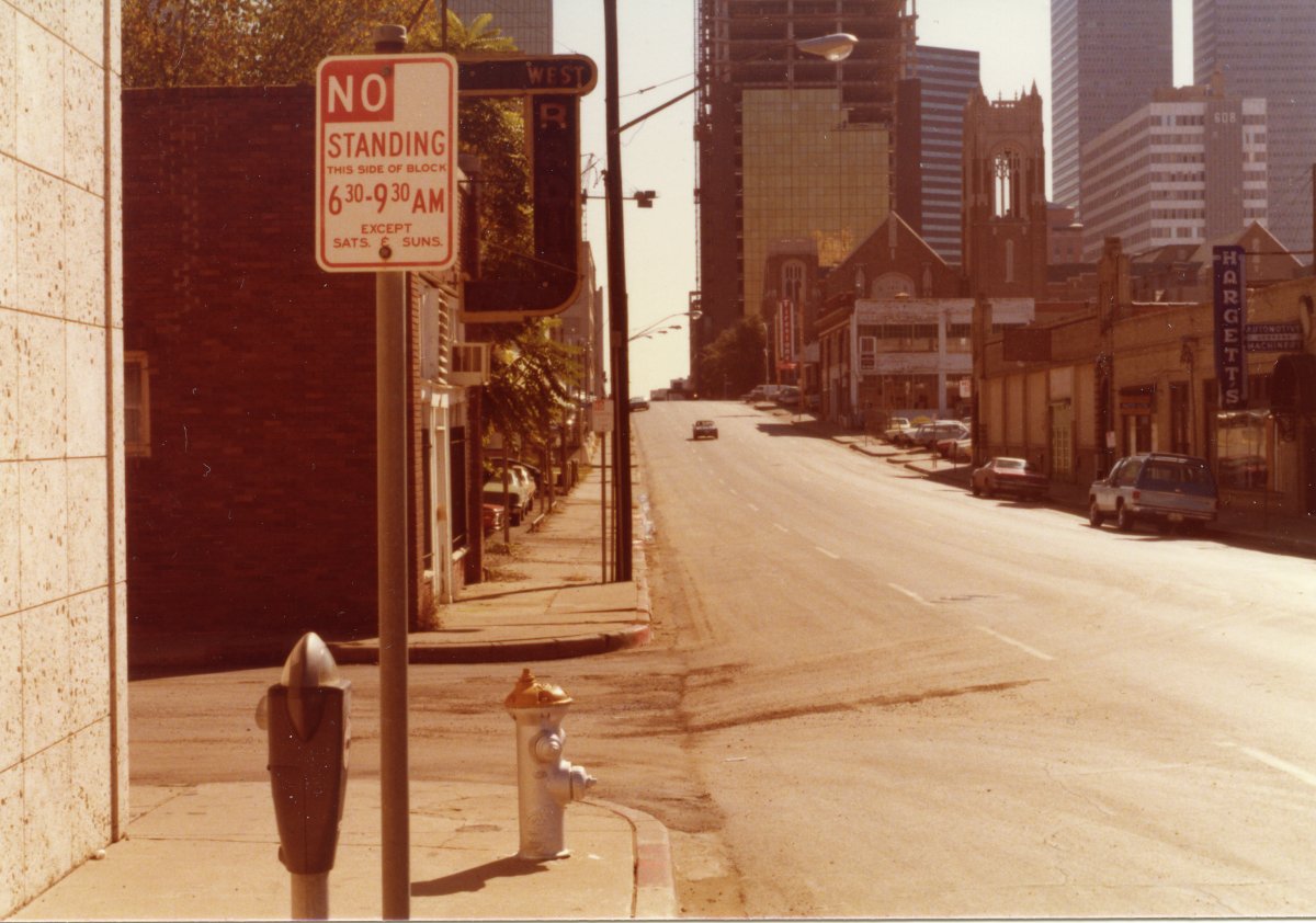
The DMA site is in the upper right corner of this image. The view is looking south down Harwood Street toward Ross Avenue.
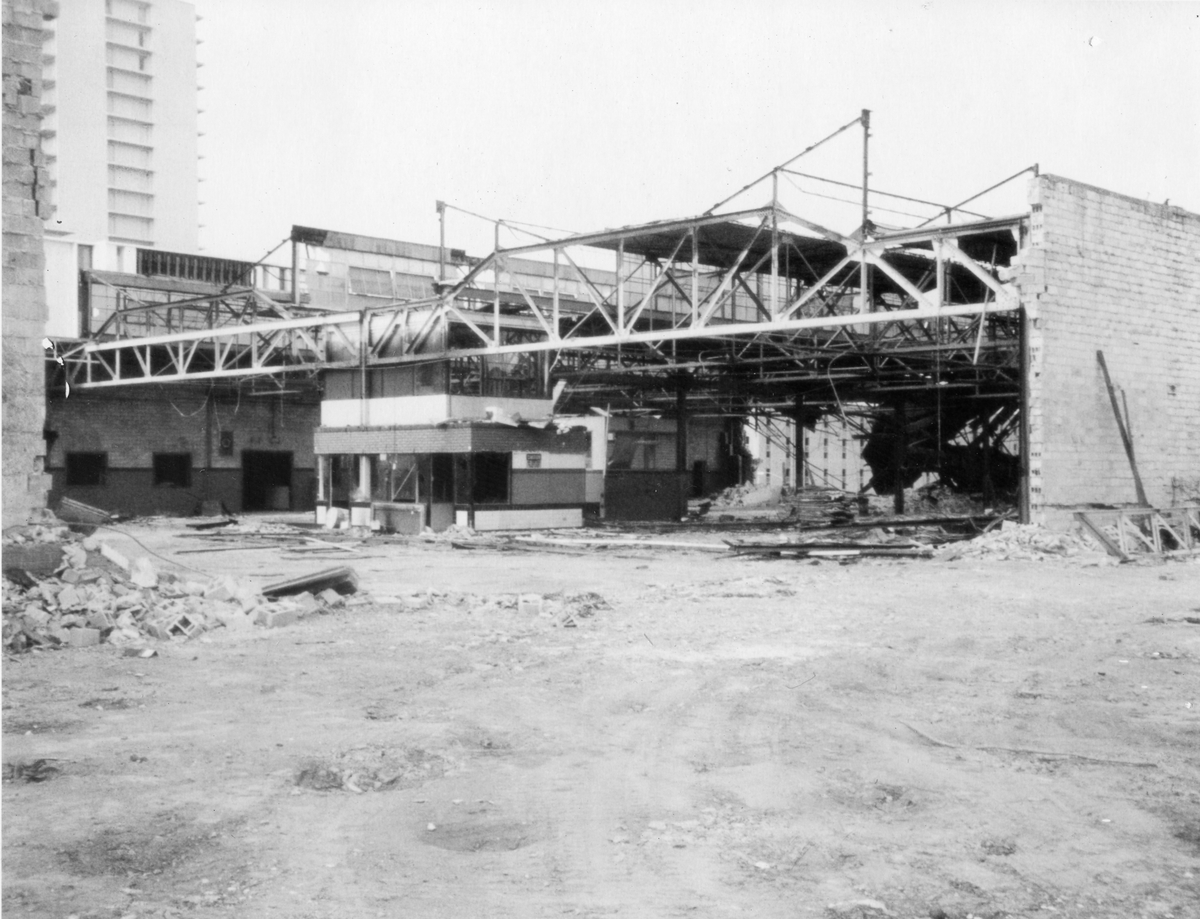
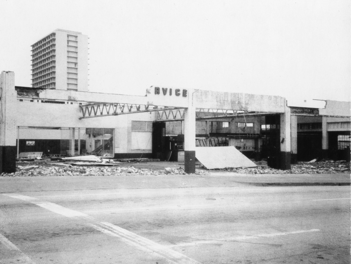
The demolition of the existing structures began in September 1980, but in keeping with the January theme, the following images are from January 29–30, 1981.
J. W. Bateson Construction, Paula Lawrence photographer. DMA Archives, New Museum Demolition and Construction Progress Photographs.
J. W. Bateson Construction, Paula Lawrence photographer. DMA Archives, New Museum Demolition and Construction Progress Photographs.
Construction in January 1982:
J. W. Bateson Construction, Photos by Mel Armand Assoc. DMA Archives, New Museum Demolition and Construction Progress Photographs.
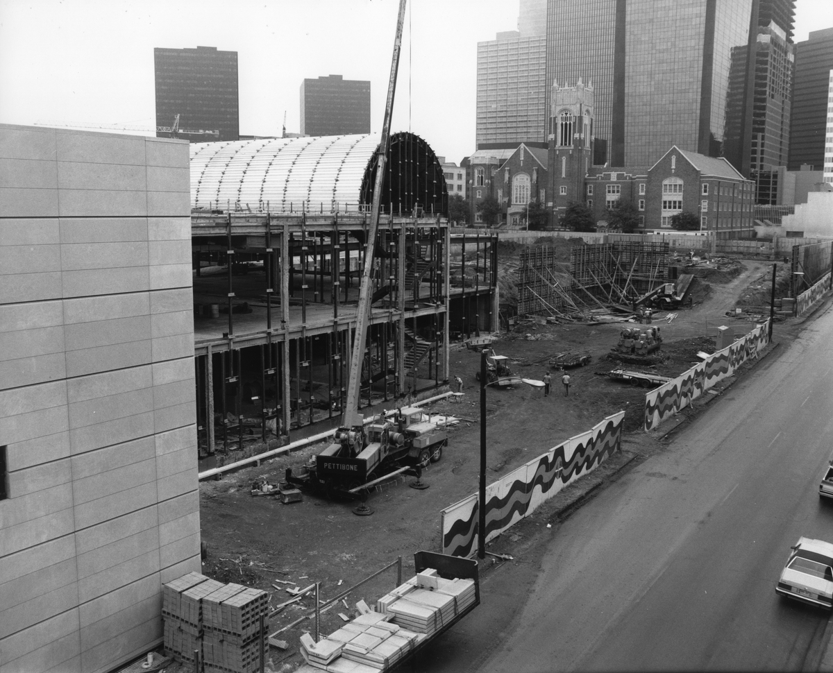
The photo above is of the back of the Museum and Barrel Vault from St. Paul Street, looking southeast. The First United Methodist Church of Dallas can be seen in the background.
J. W. Bateson Construction, Photos by Mel Armand Assoc. DMA Archives, New Museum Demolition and Construction Progress Photographs.
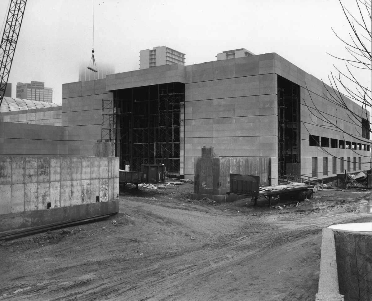
This photo is of the northeast corner of the Museum. The large set of doors and windows in the center of the image now lead out to the Fleischner Courtyard.
And circa January 1983—there weren’t process photos from January, so the interior view is from December 1982, and the aerial view is from February 1983:
J. W. Bateson Construction, photos by L. M. Dale. DMA Archives, New Museum Demolition and Construction Progress Photographs.
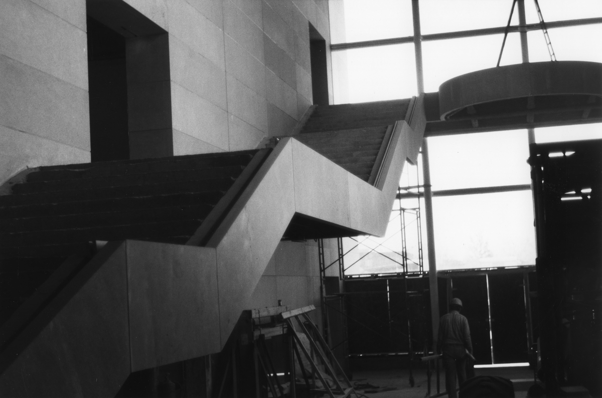
This staircase is in the center of the Concourse; the first doorway on the left goes to Museum offices; the second doorway in the top center of the image leads to what is now the Arts of the Pacific Islands Galleries on Level 3. The windows in the background are where the Hamon Building now stands.
J. W. Bateson Construction, photos by L. M. Dale. DMA Archives, New Museum Demolition and Construction Progress Photographs.
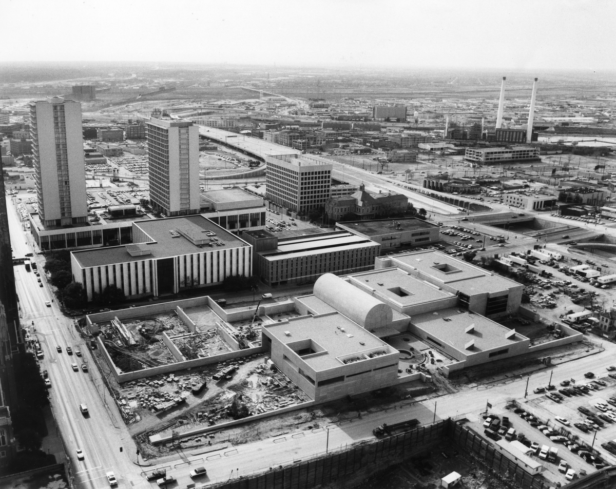
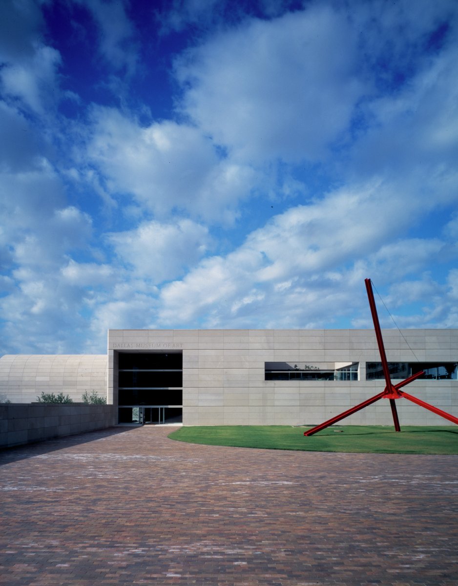
In this aerial view, the Sculpture Garden is still under construction on the left side of the image, and construction on the Reves and Decorative Arts galleries has not yet begun. If you look really closely at the top center, you can see Woodall Rodgers Freeway, which was still a few months away from completion.
North façade—This side was covered by the Hamon Building in 1993; but the stone-carved “Dallas Museum of Art” can still be seen on Level 4, at the top of the stairs from the Concourse.
South entrance on Ross Avenue Plaza
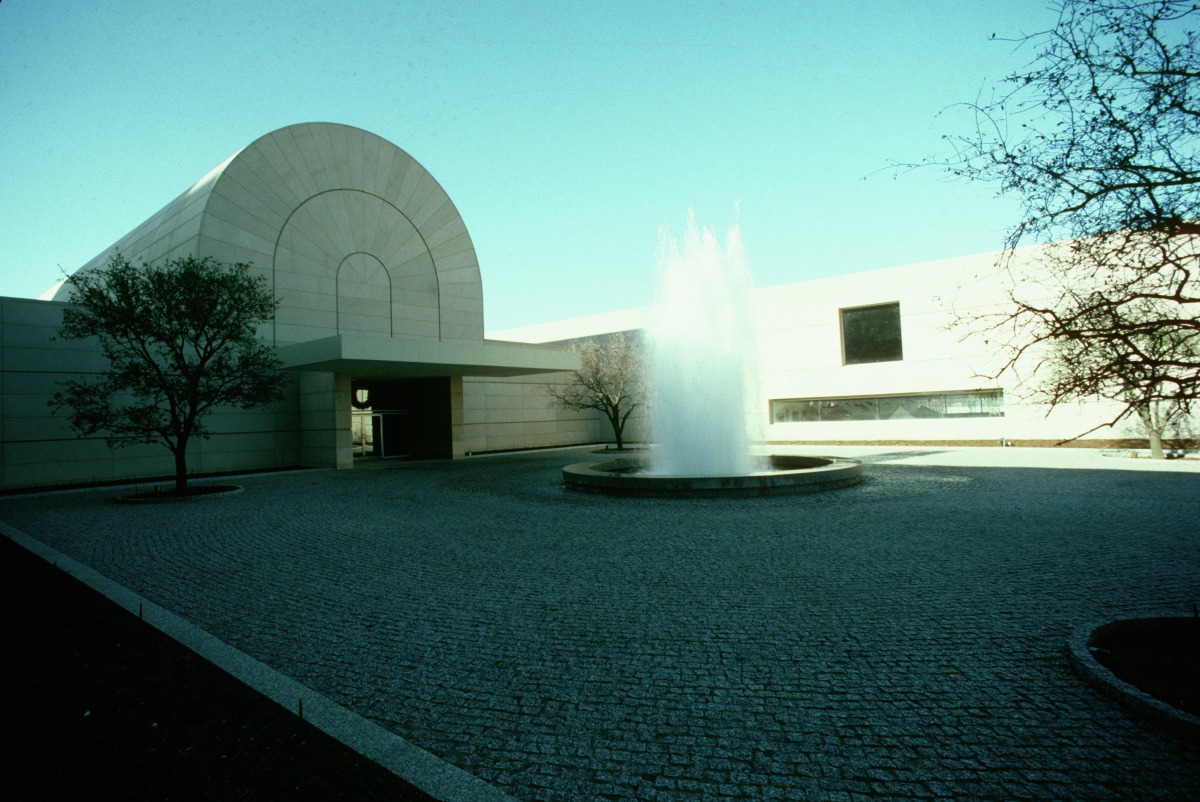
Flora Street Entrance (Ceremonial Entrance) at Harwood and Flora streets
I am looking forward to what the coming year and the future brings for the DMA.
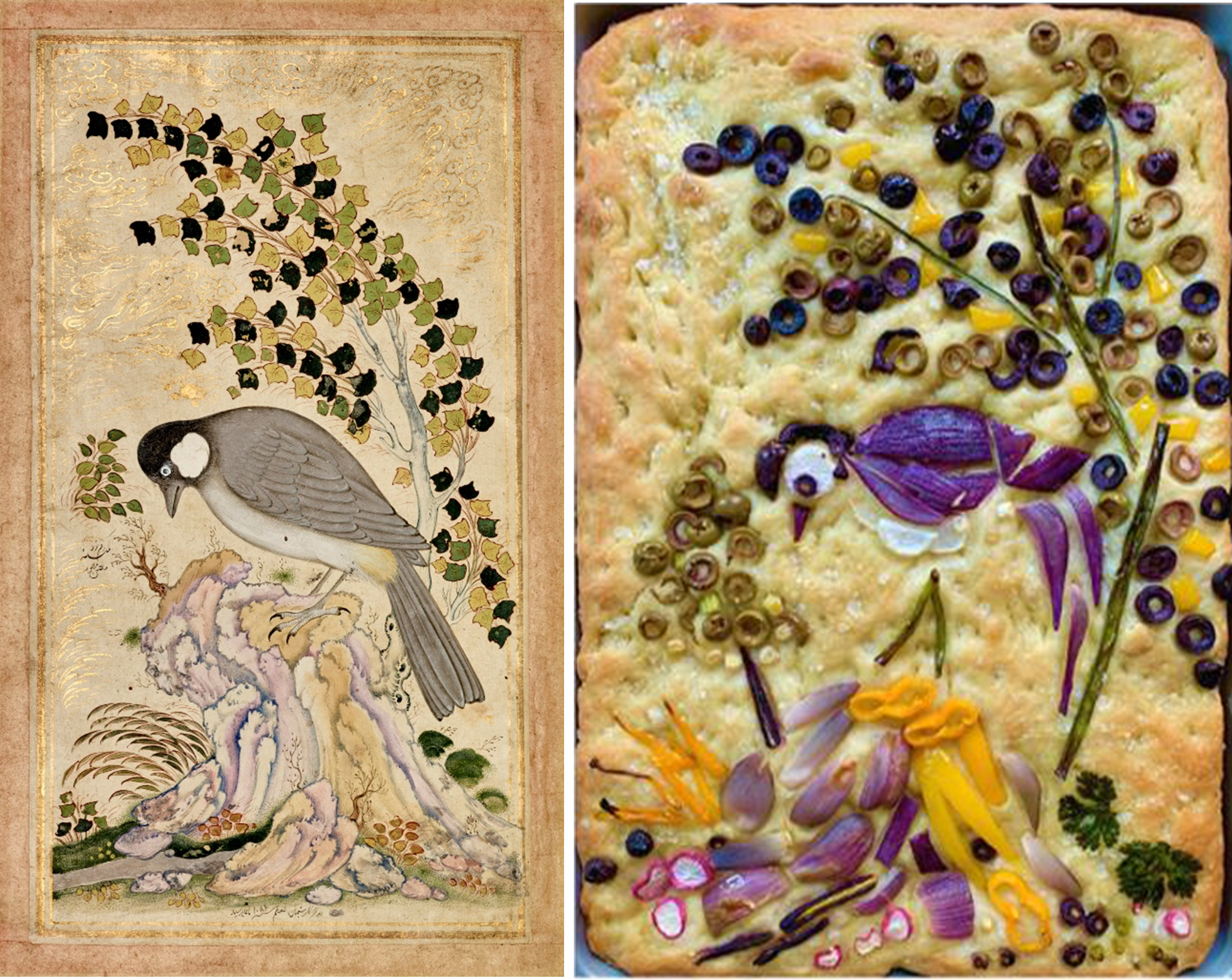
Hungry for some art? Get creative in your kitchen! Master the art of making beautiful focaccia bread inspired by works in our collection. We recommend Samin Nosrat’s recipe for focaccia, which you can find here. Remember to plan ahead! This bread requires up to 14 hours to proof before baking.
Tips for making your focaccia:
When activating yeast, make sure water is lukewarm (between 105°–115°F).
After adding the brine, let it soak for at least 5 minutes before adding herbs and vegetables on top of the focaccia.
When creating your design, keep in mind that most vegetables will shrink during baking.
Practice re-creating your image on a piece of wax paper first. When you are happy with your design, transfer it to the focaccia dough just before baking.
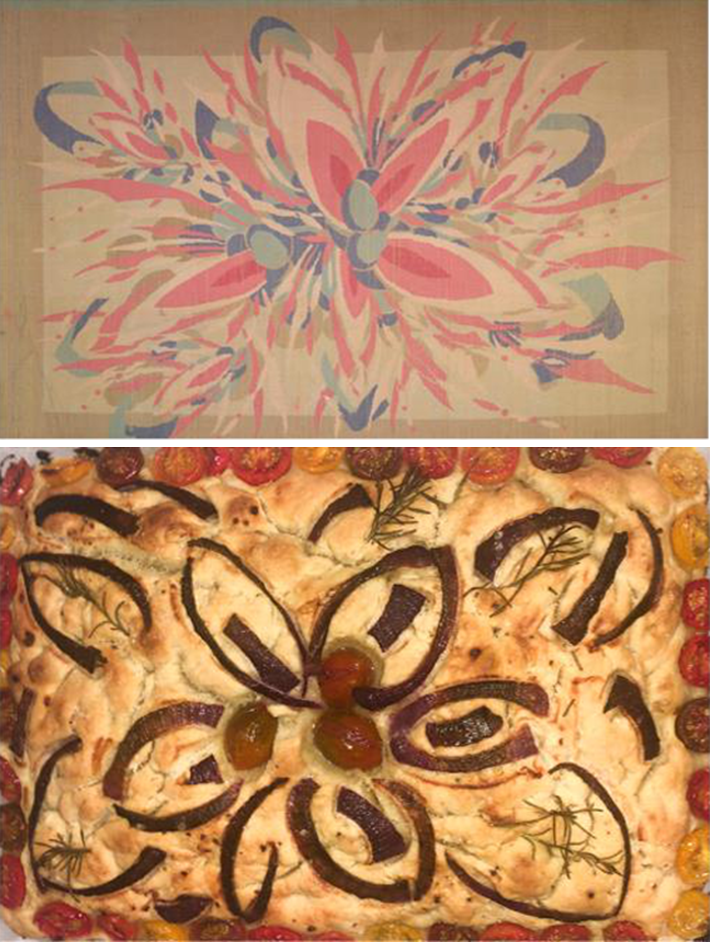
Miniature Painting – A White-Eared Bulbul (Pycnonotus Leucogenys) Perched on a Rock Under a Slender Tree, 1671, work on paper, The Keir Collection of Islamic Art on loan to the Dallas Museum of Art, K.1.2014.775
Food used to re-create the artwork:
2 baby yellow sweet peppers
2 shallots
2 baby purple carrots
1 white radish
1 pink radish
Half of a red onion
Half of a yellow bell pepper
Half a cup pitted green olives
Half a cup pitted kalamata olives
Scallions
Cilantro leaves
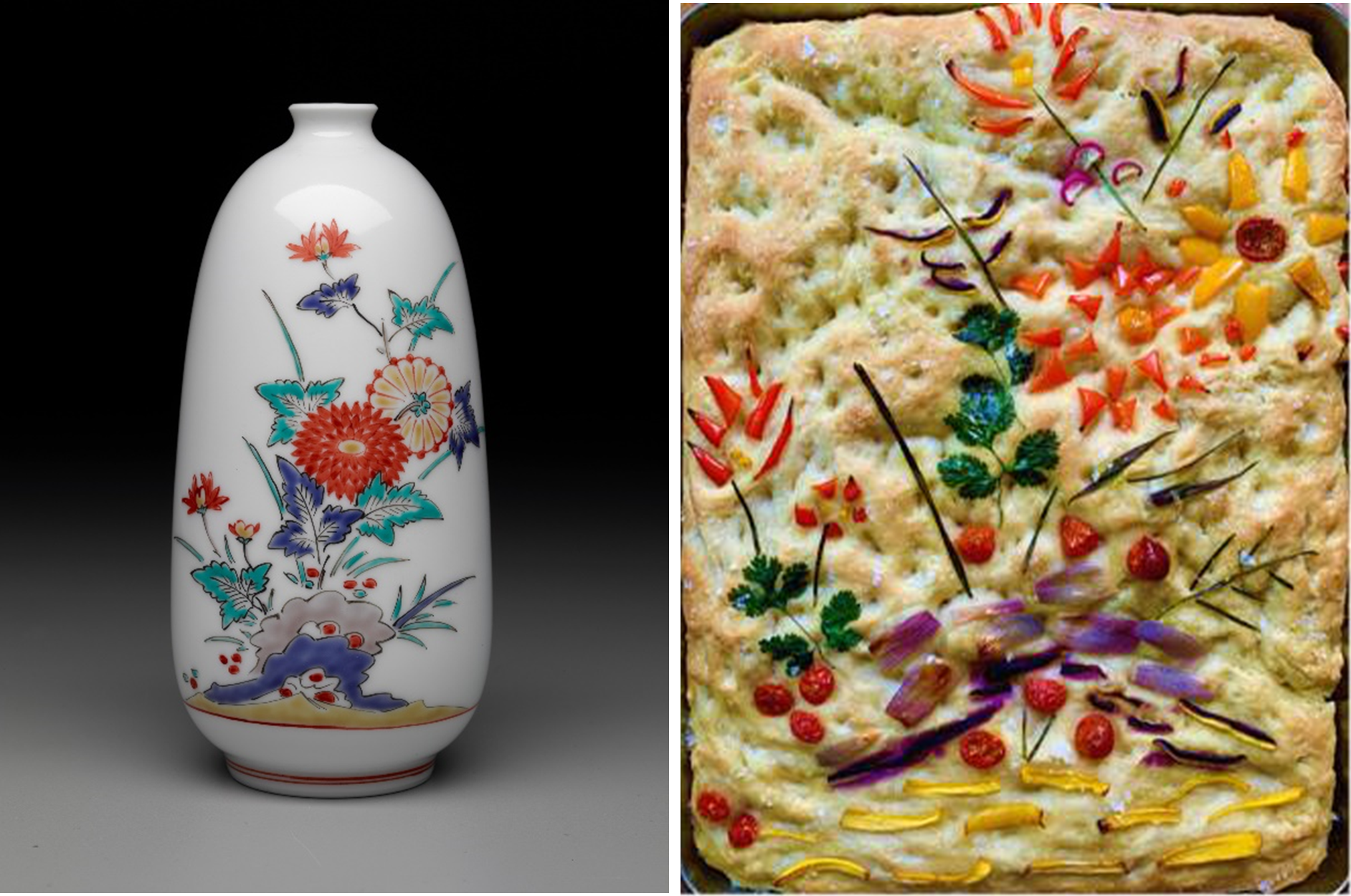
Manji Inoue, Amalmon Inaiz XIII, Vase, n.d., glazed porcelain, Dallas Museum of Art, gift of Edward Mattil, 2012.28
Food used to re-create the artwork:
6 cherry tomatoes
3 baby yellow carrots
3 baby purple carrots
1 red bell pepper
1 yellow bell pepper
1 shallot
Cilantro leaves
Chives
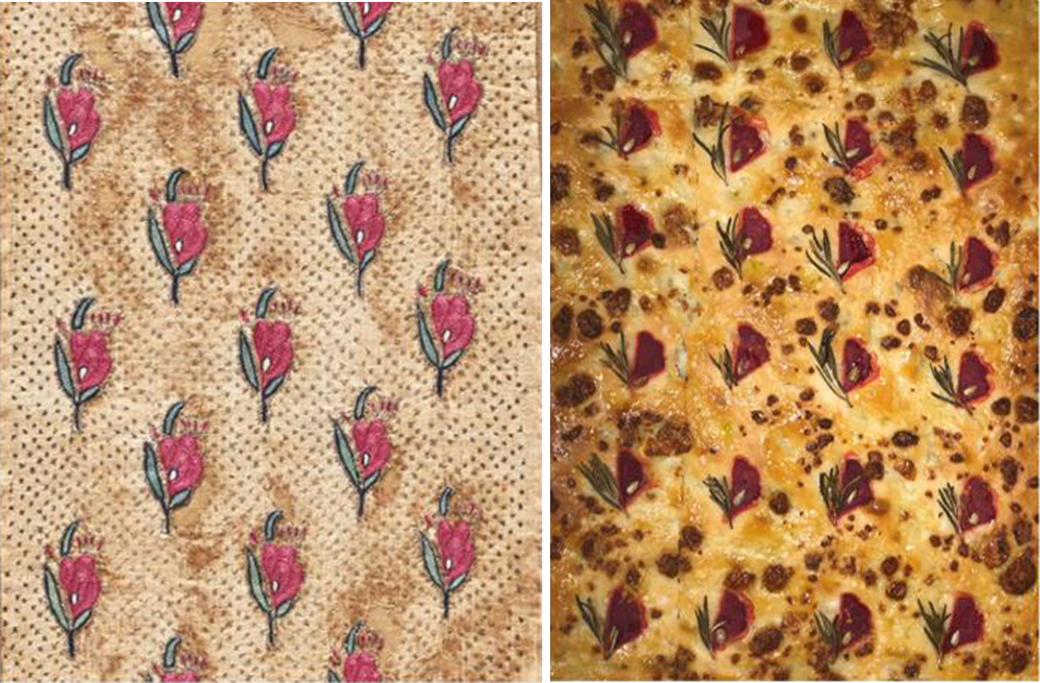
Mughal, Textile Fragment, 18th century, silk and metal embroidery, The Keir Collection of Islamic Art on loan to the Dallas Museum of Art, K.1.2014.1282
Museum exhibitions serve different purposes. Some do heavy lifting in the field of new scholarship about unknown or understudied artists or cultures. Others may capitalize on strengths in the museum’s collection and, thereby, present a richer, contextual understanding of an artistic movement. And yet others present to our visitors works by artists that address gaps in our own permanent collection—a role beautifully fulfilled by the present exhibition, Pursuit of Beauty: The May Family Collection. I would like to focus on a few works and what—besides their apparent beauty—makes them special to me.
William Merritt Chase, Weary, c. 1889, oil on panel, The Collection of Eleanor and C. Thomas May, Jr., 114.2019.17
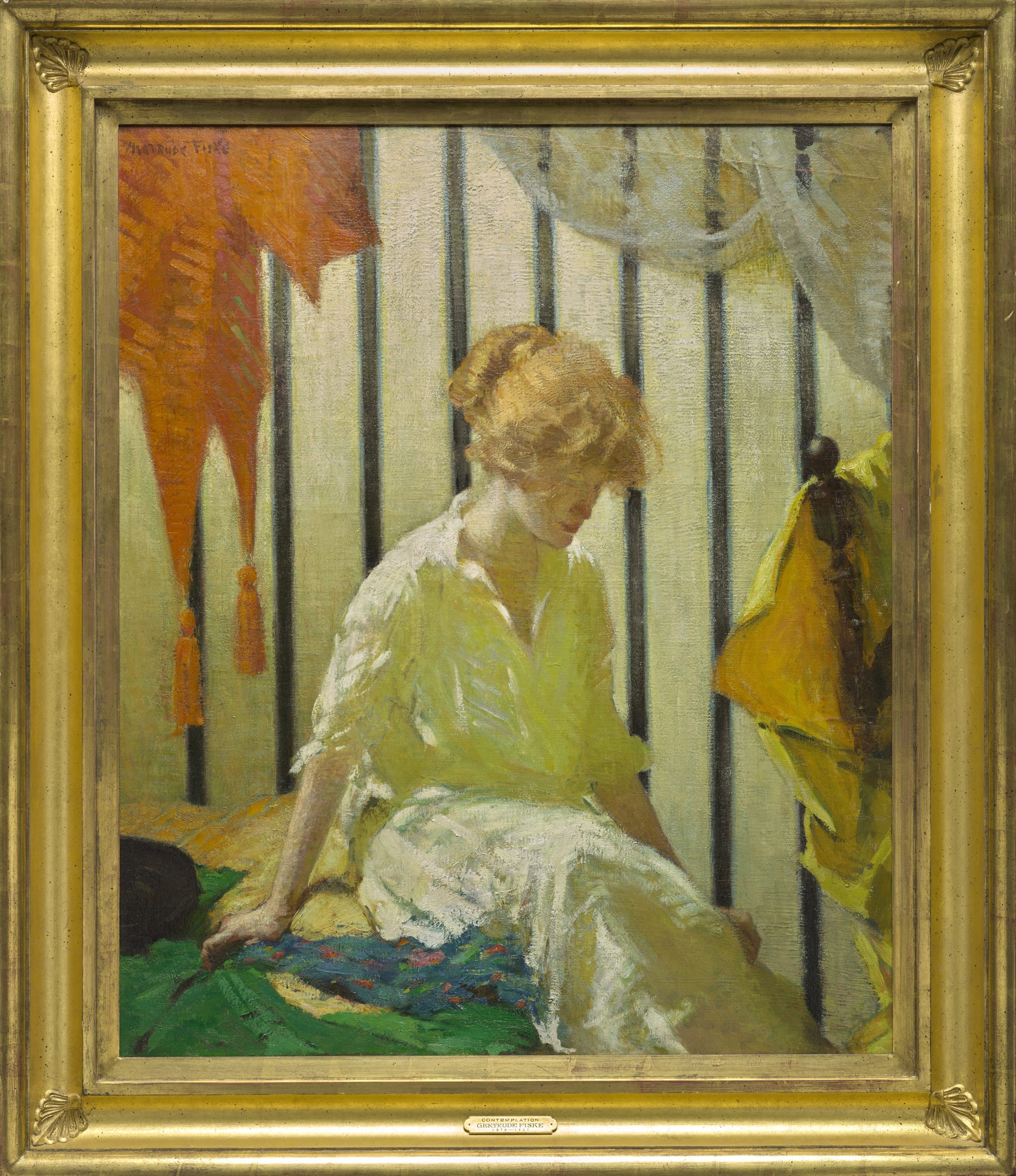
Gertrude Fiske, Contemplation, before 1916, oil on canvas, The Collection of Eleanor and C. Thomas May, Jr.
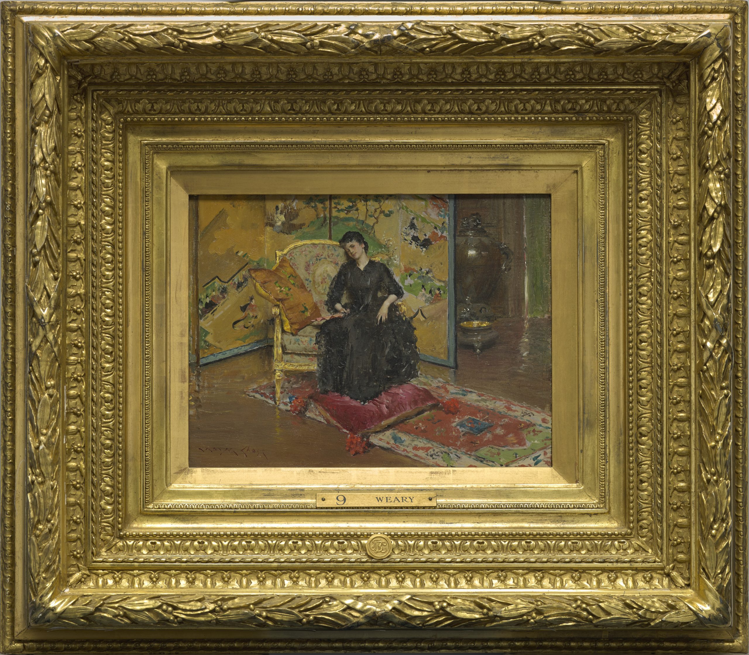
Weary (1889),a small interior scene by William Merritt Chase is a quintessential example of the artist’s skills of observation that also provides us a peek into his well-appointed studio in Manhattan. Chase was not striving to make a narrative here. The subject is beauty alone—of a sitter placed within a beautiful setting full of patterns and textures. The large Japanese screen in the background, the plush velvet of the cushion beneath her feet, the sparkle of gilding on the armature of the chair, and the gleam of light on the large vase in the background at right, are all effects that lure and please the eye. A wonderful counterpoint to Chase’s creation is Contemplation (1915) by Gertrude Fiske, an artist trained in Boston. While it too presents a contemplative woman set in an interior, the artist is presenting to us a modern woman for the new age. Using complimentary colors of orange and green to frame the sitter, the crisp striped wallpaper effectively foregrounds her. Fiske further illuminates her with light flooding in from the upper left, which simultaneously bathes her face and torso in yellow that reflects off the material at the right edge.
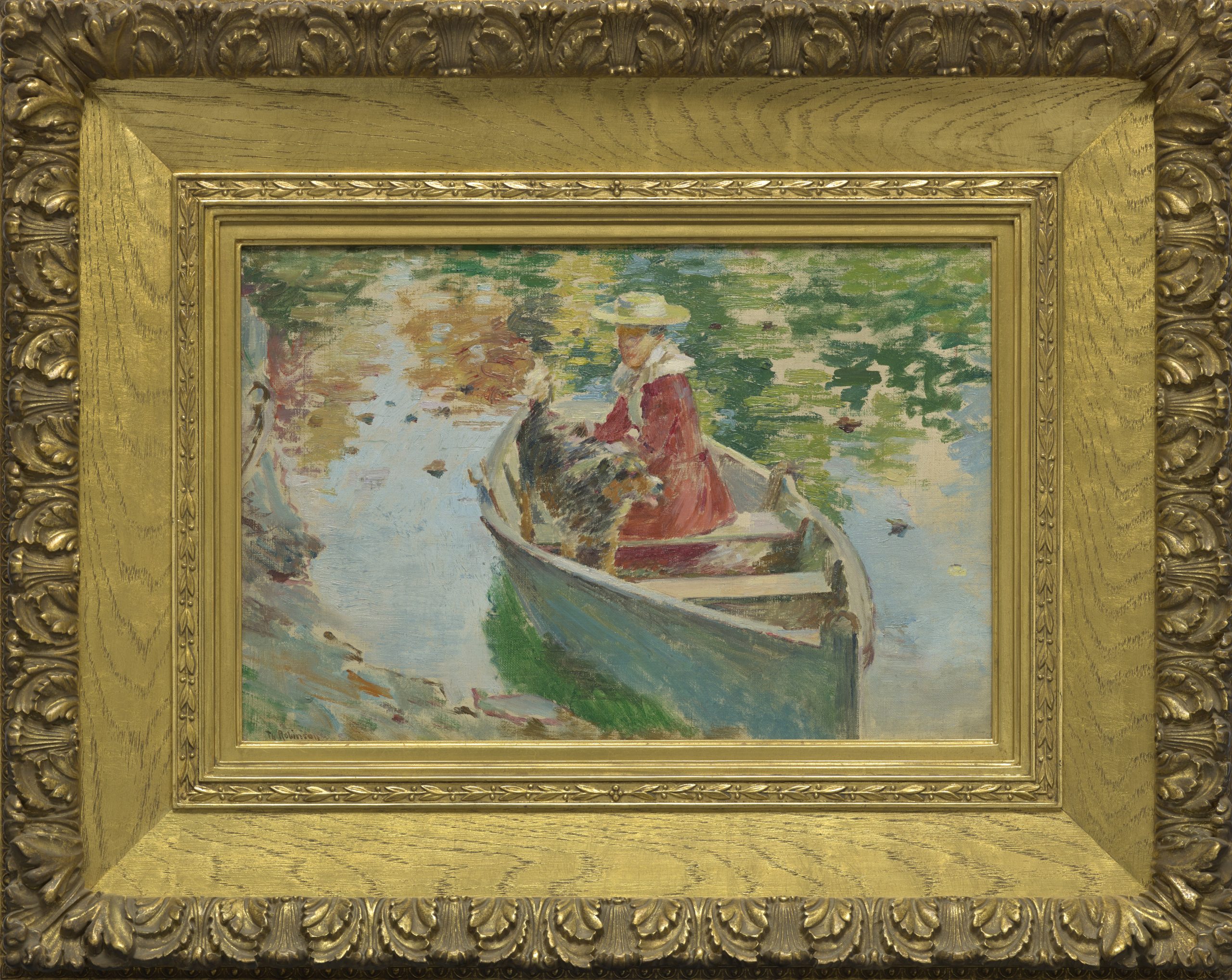
Theodore Robinson, Miss Motes and Her Dog Shep in a Boat, 1893, oil on canvas, The Collection of Eleanor and C. Thomas May, Jr.
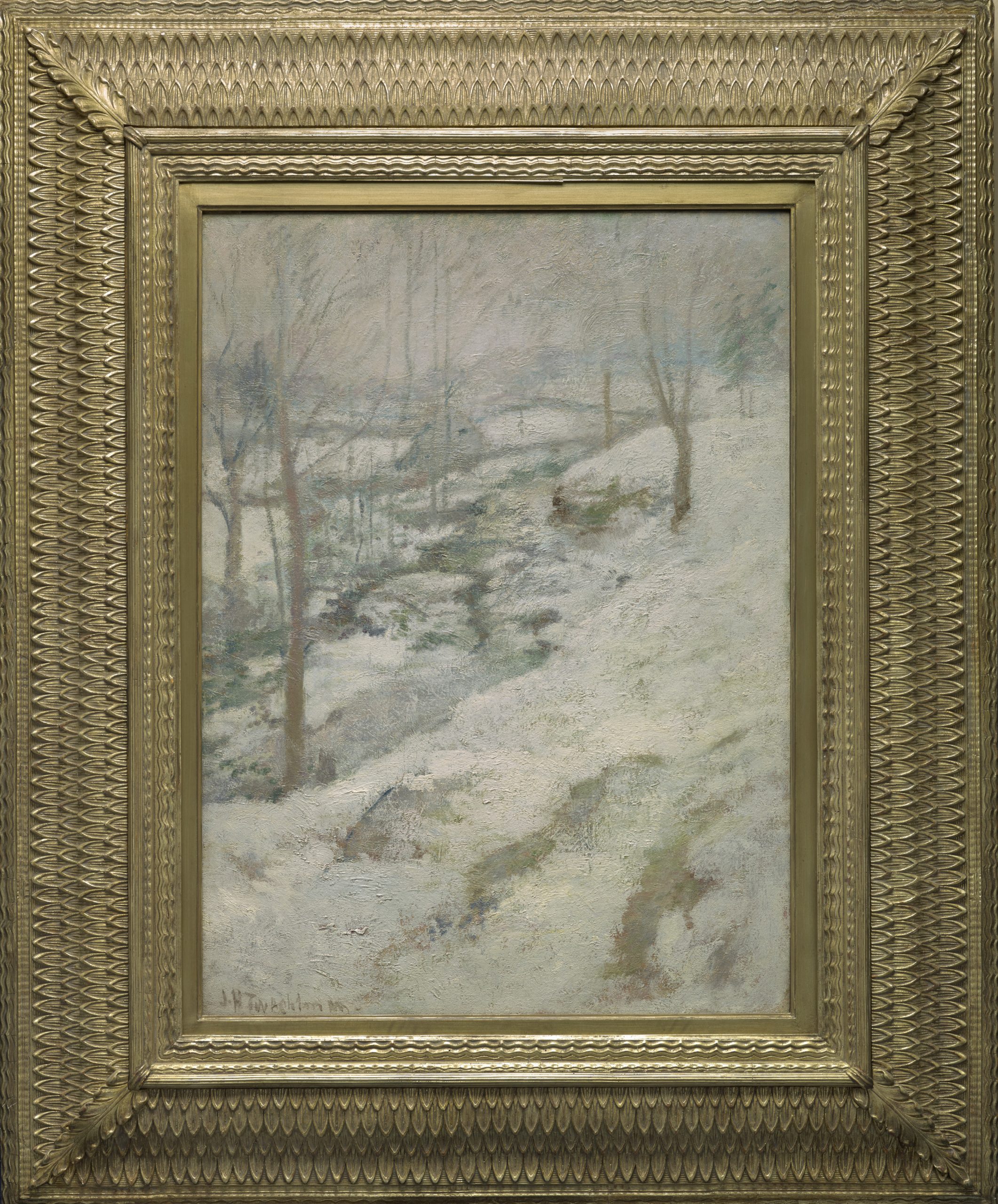
John Henry Twachtman, Frozen Brook, 1893, oil on canvas, The Collection of Eleanor and C. Thomas May, Jr., 114.2019.12
American Impressionism is underrepresented at the DMA and two works within the May Family Collection created in the exact same year offer comparison of two artists whose means (light & brushwork), achieved different ends. Theodore Robinson’s small canvas of Miss Motes and Her Dog Shep in a Boat (1893) is an oil sketch by the first and most important of the American Impressionists to paint alongside Monet at Giverny between 1886 and 1892. Robinson’s intent was to capture an individual in a fleeting moment and his quick touches of brushwork fix her at a point in time as well as evoking the optical effect of forms blurred in reflection on the dappled surface of the water. InFrozen Brook (1893), John Twachtman also endeavored to capture a particular moment, but his motivation was to capture the atmospheric and emotive effects of a winter’s day. His brushwork is more varied, complex, and labor intensive (daubed, scumbled, and dragged) to conjure the optical effect of heavy, wet snow on the cusp of spring, when all is blanketed in contemplative silence.
I do hope that you will come to the DMA to explore these five works for yourselves, along with the other twenty-three now on view.
Sue Canterbury is The Pauline Gill Sullivan Curator of American Art and Interim Allen and Kelli Questrom Curator of Works on Paper at the DMA.
Did you Gogh? We’d love to see! Be sure to tag your best Van Gogh and the Olive Groves photos on social media using #VanGoghDMA for a chance to get featured on our channels! Check out this roundup of visitor photos who have shared their exciting exhibition experiences on Instagram.
Museum exhibitions serve different purposes. Some do heavy lifting in the field of new scholarship about unknown or understudied artists or cultures. Others may capitalize on strengths in the museum’s collection and, thereby, present a richer, contextual understanding of an artistic movement. And yet others present to our visitors works by artists that address gaps in our own permanent collection—a role beautifully fulfilled by the present exhibition, Pursuit of Beauty: The May Family Collection. I would like to focus on a few works and what—besides their apparent beauty—makes them special to me.
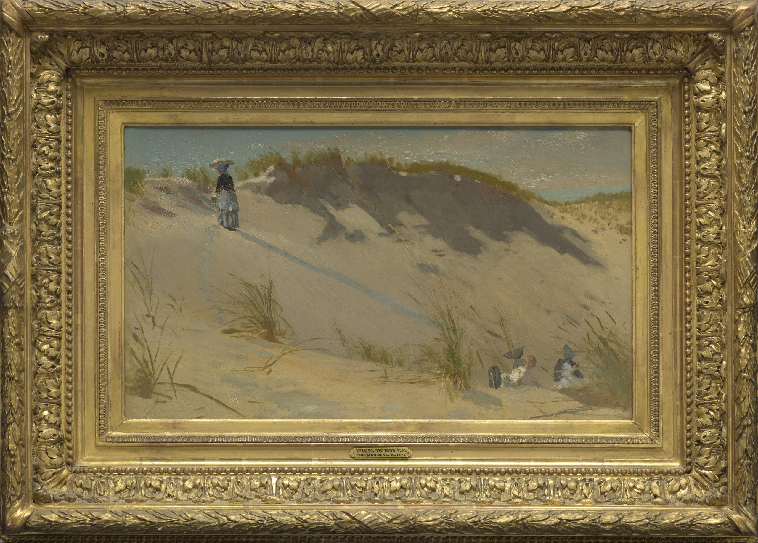
Winslow Homer, The Sand Dune, 1871-1872, oil on canvas, The Collection of Eleanor and C. Thomas May, Jr.
A small treasure of late 19th-century realism is a small seaside scene by Winslow Homer. The Sand Dune (1871)was created early in the artist’s career following the Civil War when tourism for the middle classes was becoming fashionable. Homer depicted tourists exploring the White Mountains as well enjoying the sea air at the beaches of New England. Here he depicts an immense dune on Coffin Beach at West Gloucester, Massachusetts being traversed by a lone woman, whose long blue shadow points us to seated figures at lower right. The painting is highly remarkable for its spontaneity and loose brushwork, which strongly suggests that Homer executed it on site and not from sketches back in his studio, as was his usual practice.
William Merritt Chase, Weary, c. 1889, oil on panel, The Collection of Eleanor and C. Thomas May, Jr., 114.2019.17
Gertrude Fiske, Contemplation, before 1916, oil on canvas, The Collection of Eleanor and C. Thomas May, Jr.
Weary (1889),a small interior scene by William Merritt Chase is a quintessential example of the artist’s skills of observation that also provides us a peek into his well-appointed studio in Manhattan. Chase was not striving to make a narrative here. The subject is beauty alone—of a sitter placed within a beautiful setting full of patterns and textures. The large Japanese screen in the background, the plush velvet of the cushion beneath her feet, the sparkle of gilding on the armature of the chair, and the gleam of light on the large vase in the background at right, are all effects that lure and please the eye. A wonderful counterpoint to Chase’s creation is Contemplation (1915) by Gertrude Fiske, an artist trained in Boston. While it too presents a contemplative woman set in an interior, the artist is presenting to us a modern woman for the new age. Using complimentary colors of orange and green to frame the sitter, the crisp striped wallpaper effectively foregrounds her. Fiske further illuminates her with light flooding in from the upper left, which simultaneously bathes her face and torso in yellow that reflects off the material at the right edge.
Theodore Robinson, Miss Motes and Her Dog Shep in a Boat, 1893, oil on canvas, The Collection of Eleanor and C. Thomas May, Jr.
John Henry Twachtman, Frozen Brook, 1893, oil on canvas, The Collection of Eleanor and C. Thomas May, Jr., 114.2019.12
American Impressionism is underrepresented at the DMA and two works within the May Family Collection created in the exact same year offer comparison of two artists whose means (light & brushwork), achieved different ends. Theodore Robinson’s small canvas of Miss Motes and Her Dog Shep in a Boat (1893) is an oil sketch by the first and most important of the American Impressionists to paint alongside Monet at Giverny between 1886 and 1892. Robinson’s intent was to capture an individual in a fleeting moment and his quick touches of brushwork fix her at a point in time as well as evoking the optical effect of forms blurred in reflection on the dappled surface of the water. InFrozen Brook (1893), John Twachtman also endeavored to capture a particular moment, but his motivation was to capture the atmospheric and emotive effects of a winter’s day. His brushwork is more varied, complex, and labor intensive (daubed, scumbled, and dragged) to conjure the optical effect of heavy, wet snow on the cusp of spring, when all is blanketed in contemplative silence.
I do hope that you will come to the DMA to explore these five works for yourselves, along with the other twenty-three now on view.
Sue Canterbury is The Pauline Gill Sullivan Curator of American Art and Interim Allen and Kelli Questrom Curator of Works on Paper at the DMA.
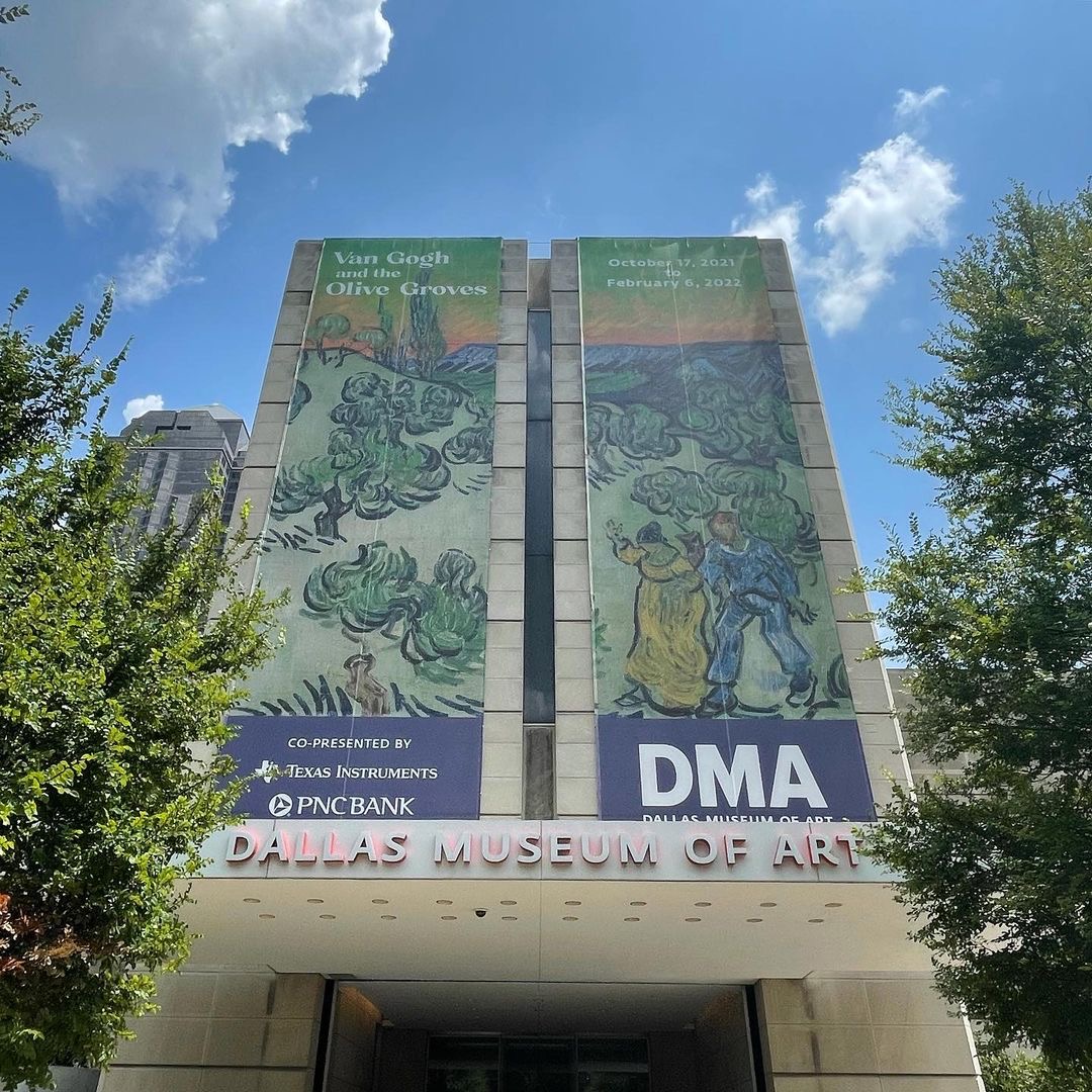
When you visit the DMA this fall, you’ll have the opportunity to see Van Gogh and the Olive Groves, the first exhibition dedicated to Vincent van Gogh’s series of olive grove paintings!
These paintings capture the abundant olive trees around the asylum of Saint-Rémy, where Van Gogh spent the final year of his life. But he was not the only artist who took inspiration from nature. There are many depictions of trees in our collection; take some time to see how many you can find!
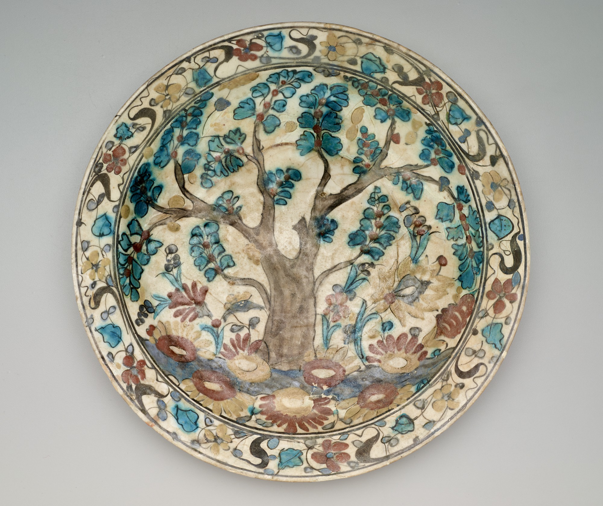
To help you, I’ve put together a tour of trees featuring 11 of my favorites currently on view. Starting on Level 1 in the Keir Collection of Islamic Art, look for this 17th-century dish from Iran among the many ceramics displayed in this gallery.
Dish, Iran, 17th century, fritware, underglaze-painted in black, blue, turquoise, and brown, with red and yellow slips, The Keir Collection of Islamic Art on loan to the Dallas Museum of Art, K.1.2014.653
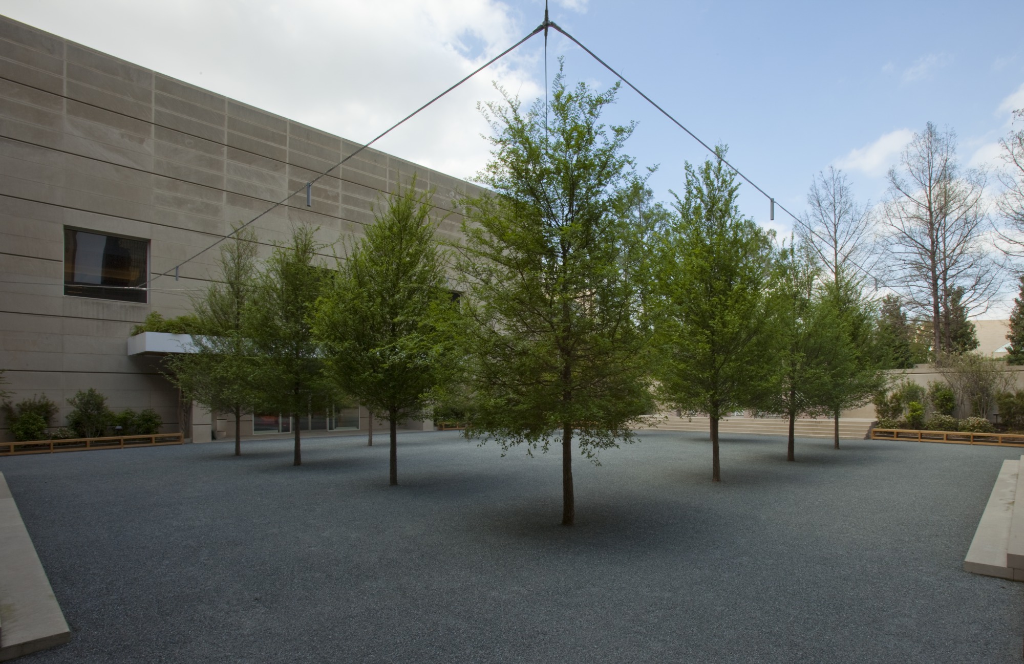
Across from the Keir Collection, step outside into the Fleischner Courtyard, named after the artist Richard Fleischner, who designed this space for the DMA’s move to this location in 1983. These are not the original trees, as the courtyard has been refurbished twice since the 1980s—in 1993 and 2009.
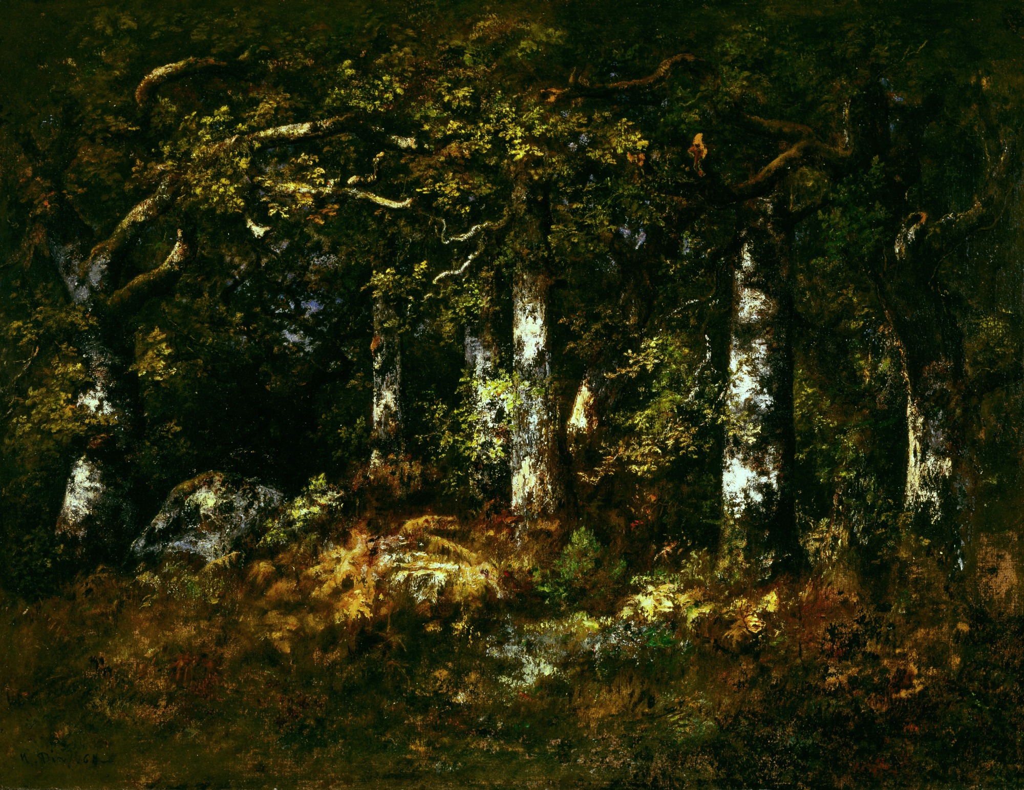
Next, head to Level 2 and our European Art Galleries to find the grove of oak trees in the Forest of Fontainebleau by Narcisse Diaz de la Peña. The artist was part of the Barbizon School of French painters, whose goal was to rediscover the magic of untouched nature.
Narcisse Diaz de la Peña, Forest of Fontainebleau, 1868, oil on canvas, Dallas Museum of Art, Munger Fund, 1991.14.M
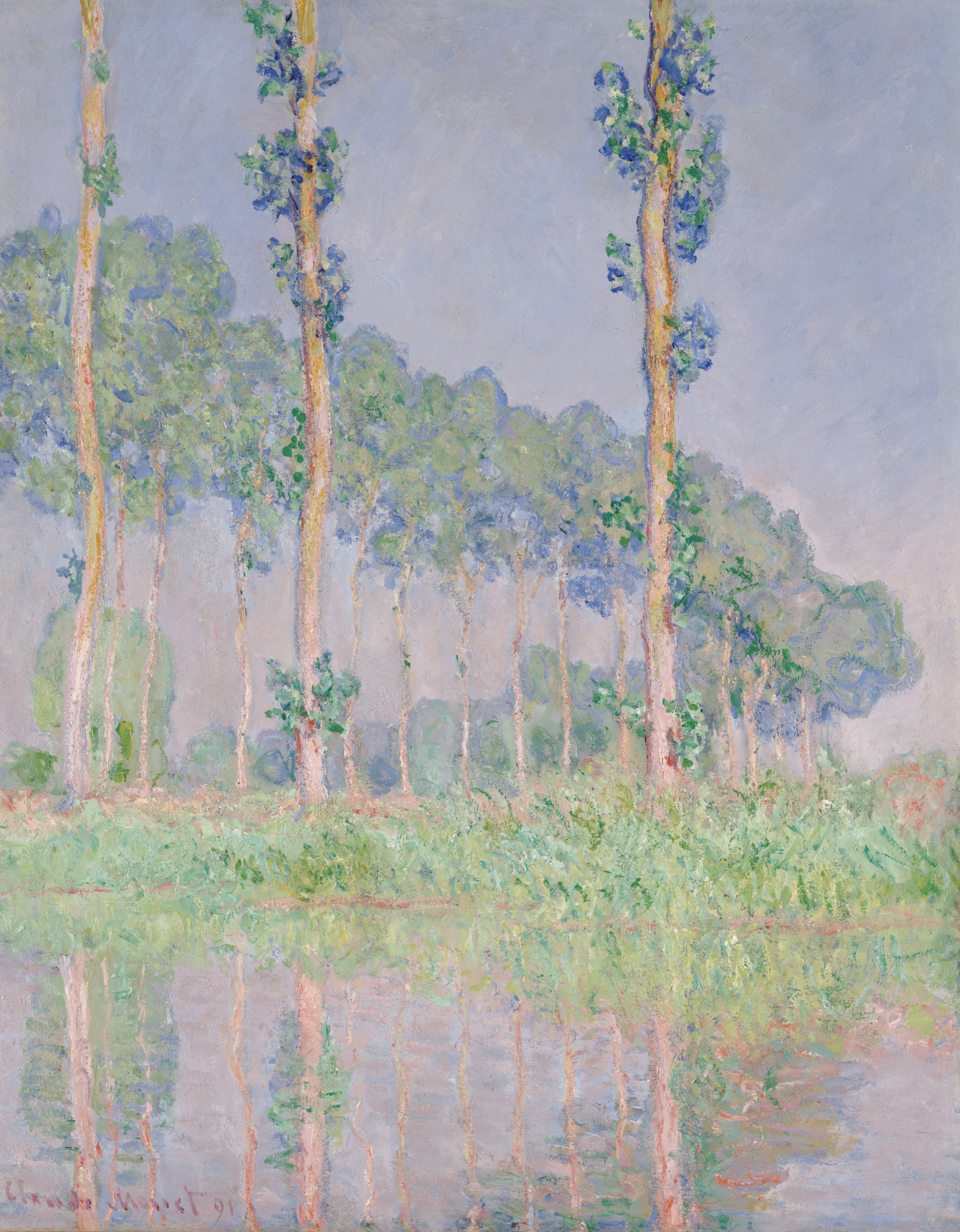
Leaving the dark forest behind, take in the bright colors of Claude Monet’s poplar trees. Poplars, Pink Effect belongs to a series of 24 paintings; like Van Gogh, Monet often revisited the same subject multiple times to capture varying light and weather conditions.
Claude Monet, Poplars, Pink Effect, 1891, oil on canvas, Dallas Museum of Art, The Eugene and Margaret McDermott Art Fund, Inc., bequest of Mrs. Eugene McDermott, 2019.67.14.McD
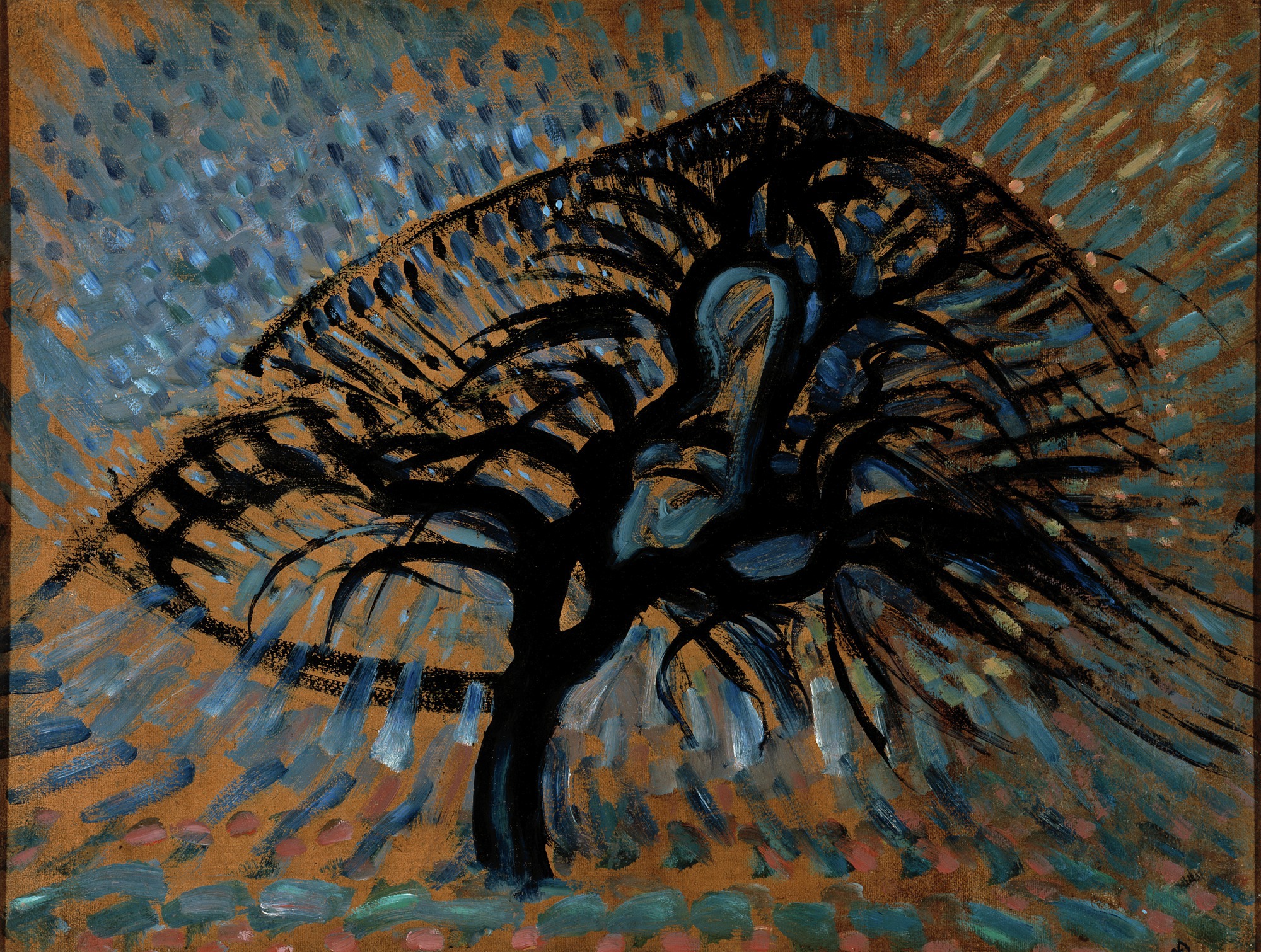
Before leaving Level 2, look for an apple tree painted by Piet Mondrian. Through his use of line and color, Mondrian conveyed nature’s dynamic energy.
Piet Mondrian, Apple Tree, Pointillist Version, 1908–09, oil on composition board, Dallas Museum of Art, Foundation for the Arts Collection, gift of the James H. and Lillian Clark Foundation, 1982.26.FA
Did you know Winston Churchill was also an artist? If you visit the Wendy and Emery Reves Collection on Level 3, you will find several paintings by Churchill, including Sea and Pine Trees, Cap d’Ail.
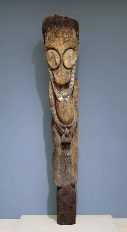
As you continue exploring Level 3, take a moment to stop and appreciate the standing male figure from Vanuatu. While not a literal depiction of a tree, it was carved from the lower part of a tree-fern stem and stands over 11 feet tall!
Standing male figure, Vanuatu, Ambrym Island, about 1930–50, tree fern and pigment, Dallas Museum of Art, anonymous gift, 1996.33
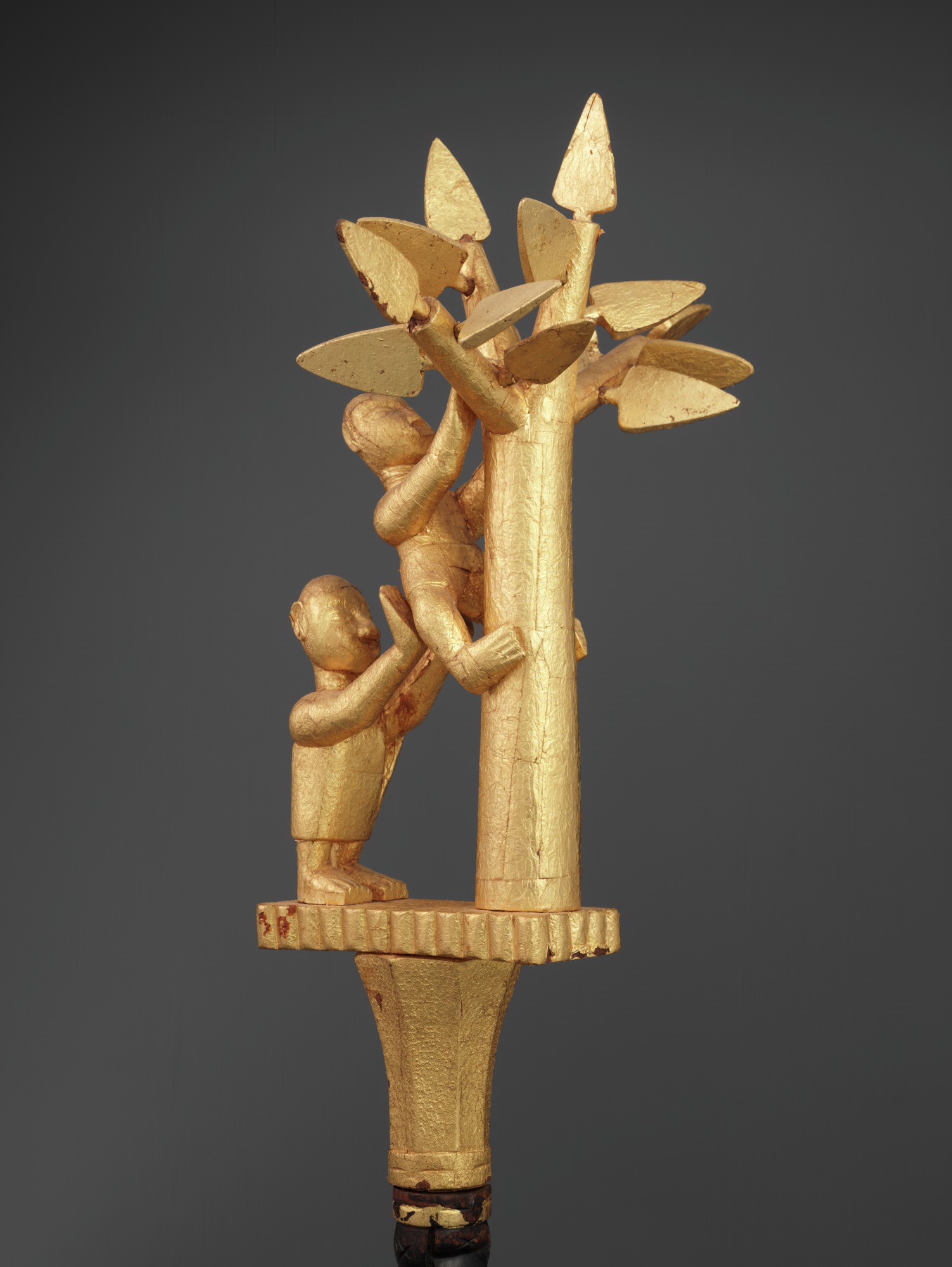
Now make your way to the Arts of Africa Galleries and look for the linguist staff(okyeame poma)from the Asante peoples of Ghana. The finial on this staff refers to an Asante proverb that states, “One who climbs a good tree always gets a push.”
Linguist staff (okyeame poma), Ghana, Asante peoples, 1900–50, wood and gold leaf, Dallas Museum of Art, The Eugene and Margaret McDermott Art Fund, Inc., 2010.1.McD
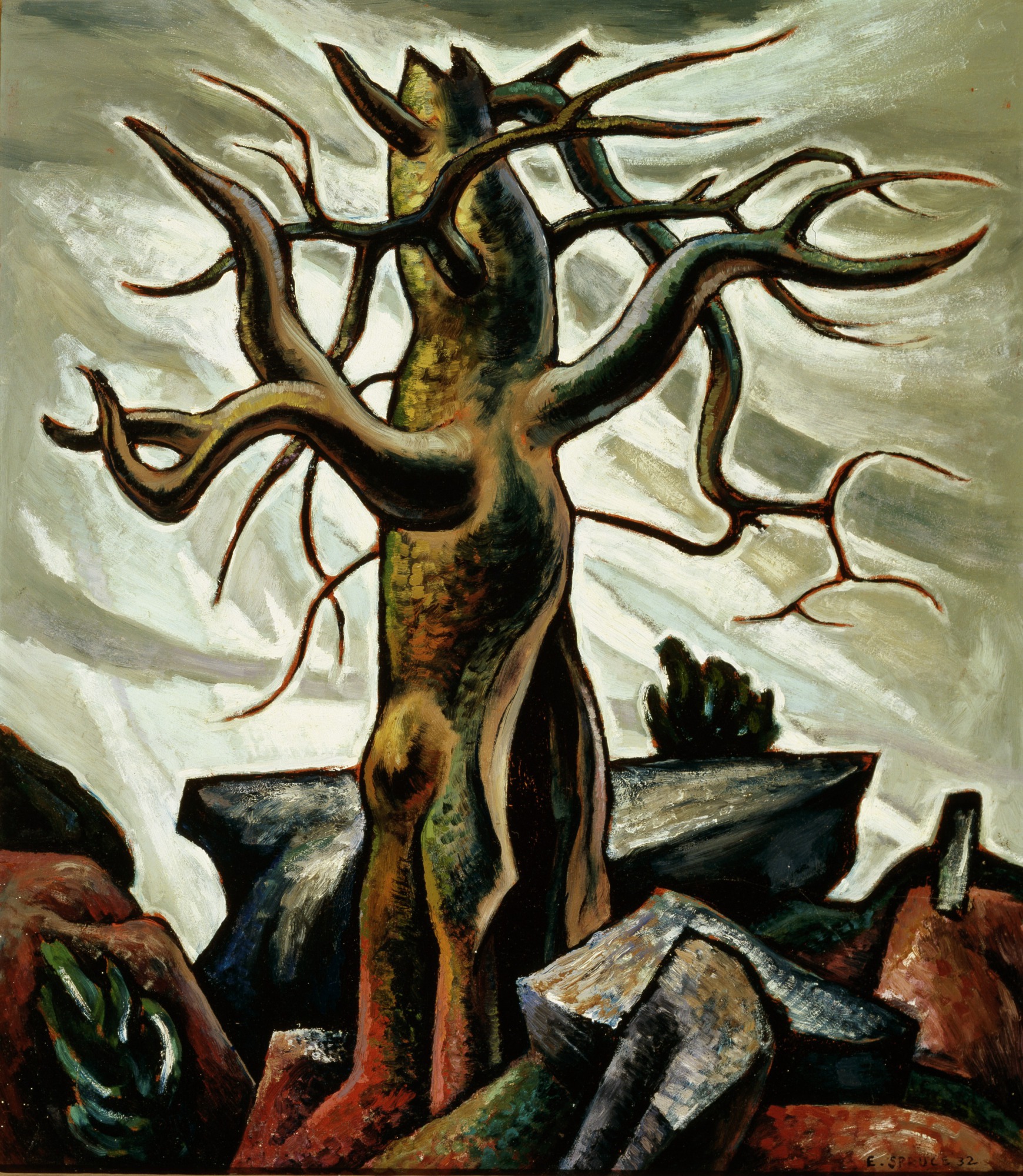
Head to Level 4 and find Veteran, a painting by Everett Spruce (bonus tree points!). The tree in this painting shows us the often uncompromising and inhospitable forces that shape the Texas landscape.
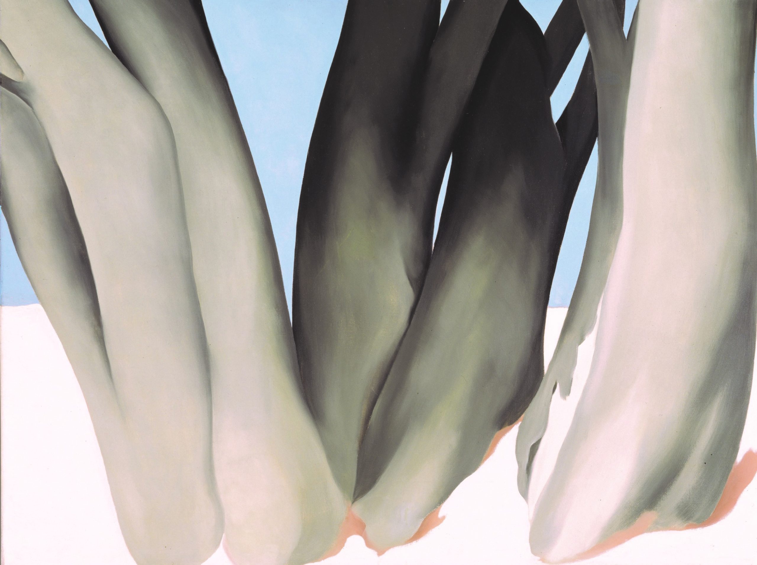
Around the corner from Veteran, Georgia O’Keeffe’s Bare Tree Trunks with Snow gives us a more minimalist and abstract version of trees. O’Keeffe would often simplify what she saw in nature, using descriptive titles to clarify things for the viewer.
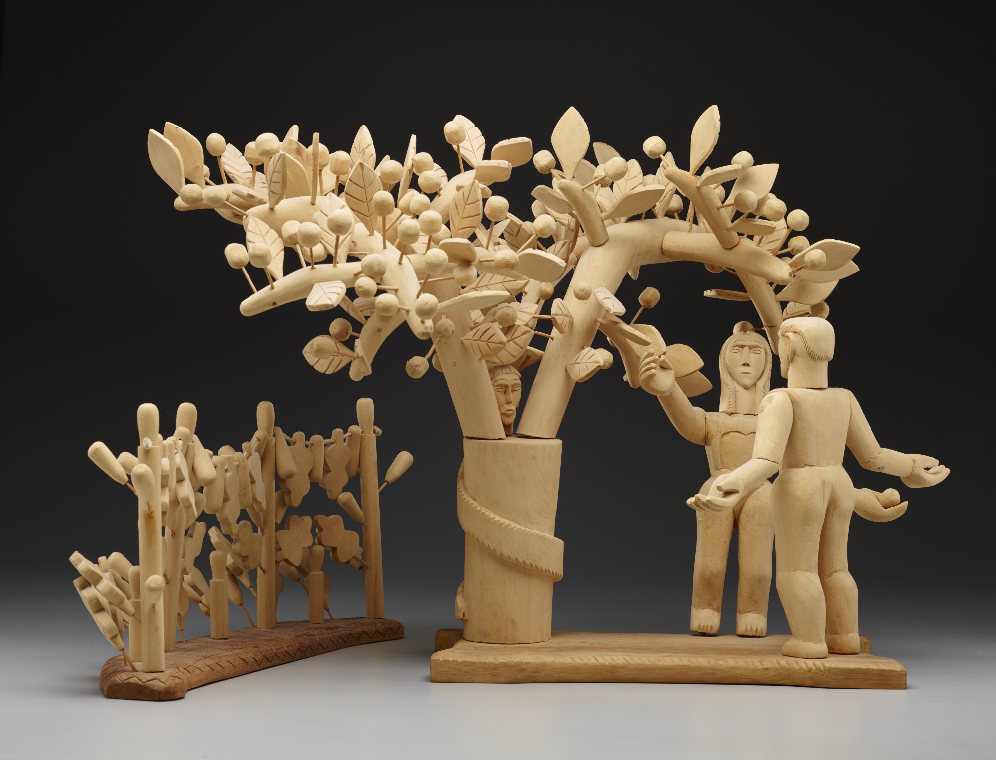
The final tree on this walk through the woods is in the free special exhibition Devoted: Art and Spirituality in Mexico and New Mexico. George López’s sculpture Adam and Eve and the Tree of Life shows the moment when Eve offers Adam an apple from the tree of knowledge—and it is made of wood from three different trees: cottonwood, pine, and cedar!
George López, Adam and Eve and the Tree of Life, 1956, cottonwood, pine, and cedar, Dallas Museum of Art, Dallas Art Association Purchase, 1956.100.1
Stacey Lizotte is the DMA League Director of Adult Programsat the DMA.
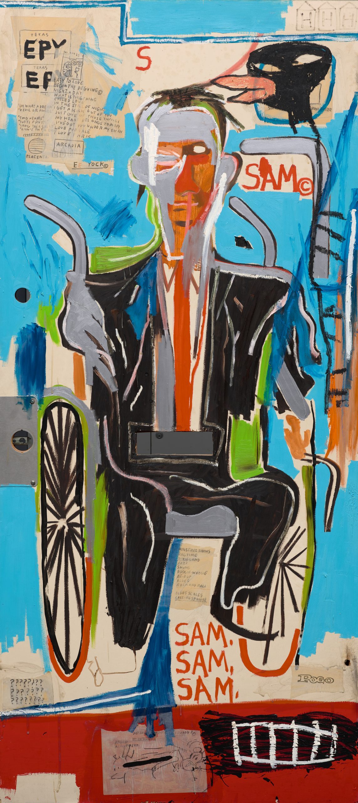
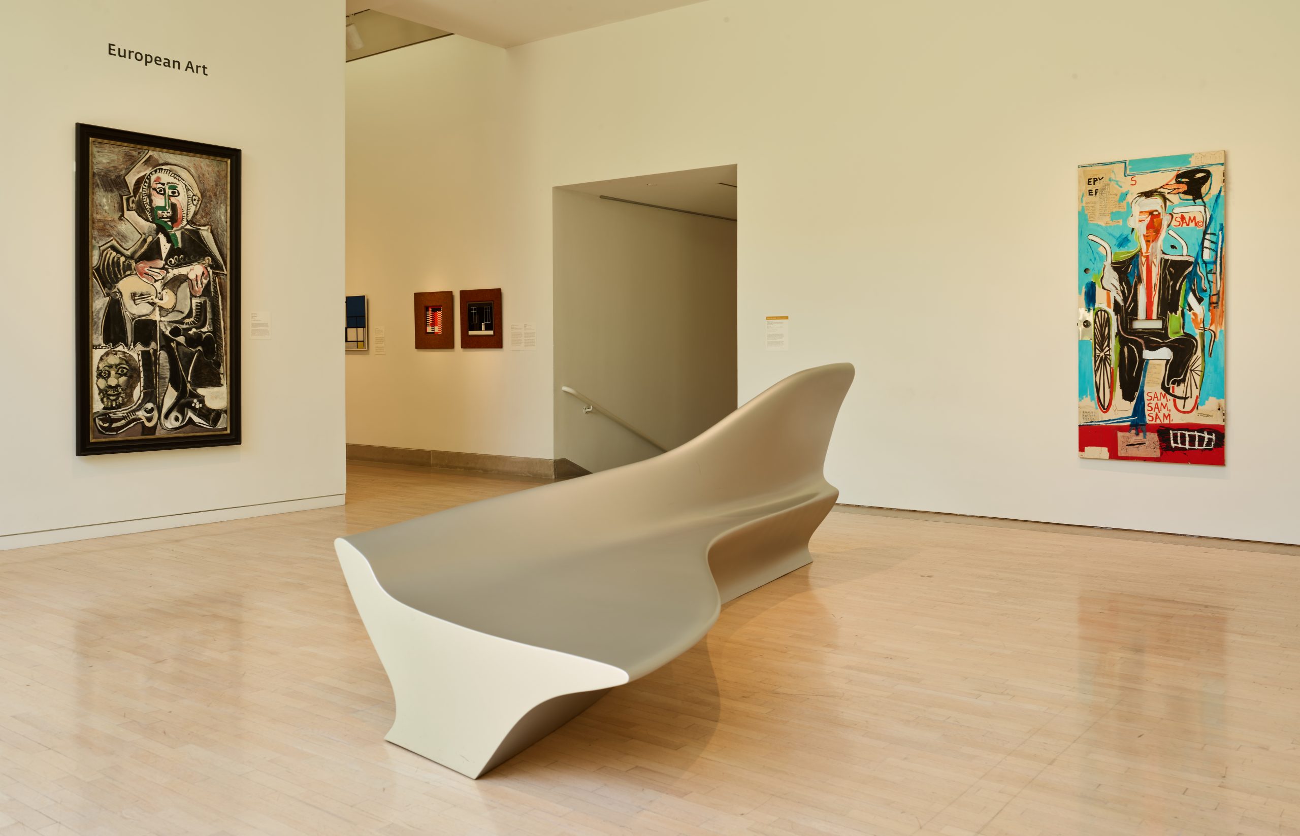
In 2017 we began conversations with Helga Feldman about a landmark gift to the institution of a work by the incomparably important US artist Jean-Michel Basquiat. The portrait, Sam F, painted right here in Dallas, is of Feldman’s late husband, who wanted the work to be given to his city’s museum to be enjoyed by the public. As was the wish of the Feldmans, the work entered the collection at the time of Mrs. Feldman’s death in spring 2021. Basquiat’s significance to the recent history of art is almost unparalleled, and when we received the painting, we got to work making immediate plans to get it on view. With this in mind, we adapted to certain considerations of time and space in order to share the work with our audiences without delay. Therefore, we decided to show it in our Concourse, which is the most public of the Museum spaces, and is traversed by all visitors to the DMA. We have often shown works in that space that we want to honor—the Basquiat hangs where the honored artist of our major annual fundraiser, TWO X TWO for AIDS and Art, is typically found. However, because of the very public nature of this space, our duties to care for the collection mandate that the work must be hung above visitor touch distance—an average viewer’s arm span—to keep the work safe. When Sam F went on view, we received the feedback that seeing the painting from this height was far from ideal. This work clearly struck a chord with viewers—for Basquiat was one of the most innovative figures in 20th-century art history. Moreover, as an artist of Puerto Rican and Haitian descent, his presence in the Museum’s collection signals the crucial contributions of Black and Latinx artists to the art historical canon, and the work contains a wealth of references to Afro-diasporic culture that are illuminated in the accompanying interpretive panel.
Jean-Michel Basquiat’s Sam F on view across from Pablo Picasso’s The Guitarist on Level 2
We heard this feedback, and we agree—it’s time to move the Basquiat so that the conditions of display can better facilitate the close looking the work merits. As of today, the work will be on view on Level 2, at the threshold between the European and contemporary galleries. The work’s neighbors include paintings by Pablo Picasso and sculptures by Henry Moore, Jacques Lipchitz, and Aristide Maillol. It also abuts our collection of classical art, providing a compelling survey of how artists have treated the human form over thousands of years. Basquiat’s portrait of Sam, who used a wheelchair, rejects the idealism first introduced in the classical period and depicts subjects that are typically excluded as subjects of the fine arts. His signature formal style combines expressive mark making taken from both his past as a graffiti artist and the Neo-Expressionism movement that dominated art in New York in the 1980s, while also pointing to a groundbreaking synthesis and reconfiguration of the art historical language that now surrounds it. We invite you to come and see the work, and to let us know what you think.
Dr. Anna Katherine Brodbeck is the Hoffman Family Senior Curator of Contemporary Art at the DMA.
Dr. Nicole R. Myers, Interim Chief Curator and The Barbara Thomas Lemmon Senior Curator of European Art, spent almost a decade working tirelessly on bringing Van Gogh and the Olive Grovesto life. Read about her perspective on making the magic of the exhibition happen in this Q&A excerpt from our DMA member magazine, Artifacts.
How does it feel to approach the exhibition opening after so many years in development?
I began developing the concept for this exhibition in 2012, while I was researching the incredible olive tree painting by Van Gogh in the collection of the Nelson-Atkins Museum of Art in Kansas City. Although I had worked a great deal on the artist, I was shocked to find that the painting belonged to a significant series about which I knew nothing. I set out to learn more, only to find that there had been no exhibition or book dedicated to the subject to date. Moreover, there were many unknowns about the series, such as the dates of some of the paintings, the sequence in which they were made over a six-month production period, and which paintings Van Gogh was describing in his letters—something unexpected given the incredibly saturated research field dedicated to this beloved world-famous artist. With that, I launched the exhibition and the unprecedented comparative study that involved an international team of curators, researchers, conservators, and scientists.
The exhibition planning took many twists and turns along the way. It’s never easy to borrow important artwork by heavily sought-after artists such as Van Gogh, and some of our loan negotiations took five years to secure. Just as the checklist was nearly finalized, the onset of the COVID-19 pandemic brought about new challenges and uncertainties. Rather poignantly, the exhibition catalogue, which takes as its subject the artistic production of a painter confined within an asylum—an experience Van Gogh described as a “necessary and salutary quarantine”—was written and produced in its entirety during the self-isolation and confinement imposed by the pandemic. It was with a mixture of trepidation and sadness that after all these years of working tirelessly to bring this project to fruition, I didn’t have access to a library or other resources when it finally came time to start the book. But the work forged ahead and I’m deeply grateful for what we accomplished under these exceptional circumstances.
As I worked at my dining room table turned remote office, I thought often of Van Gogh and his experience at the asylum. Never before had his enduring belief in the healing and consolatory power of art and of nature felt more relevant, his experience more relatable, his achievement more astounding. I hope that visitors to the show will take as much joy and comfort from the olive trees as I have over the last decade, and especially this last year.
Dr. Nicole R. Myers, Interim Chief Curator and The Barbara Thomas Lemmon Senior Curator of European Art, spent almost a decade working tirelessly on bringing Van Gogh and the Olive Grovesto life. Read about her perspective in making the magic of the exhibition happen.
This exhibition has never been done before, and yet Van Gogh is a legendary artist. How does it feel to premiere this exhibition in Dallas?
I’m incredibly excited to bring Van Gogh’s dazzling olive grove series to the DMA this fall. The paintings are not only beautiful but unique as well, and hold a special place in the artist’s life and production. Van Gogh and the Olive Groves is the very first exhibition to reunite this important, yet relatively unknown, series of paintings, and Dallas is the only place in the US to see them.
In addition to learning about Van Gogh’s olive groves—the fascinating story of their production, as well as their evolving styles and symbolism—I hope that visitors will leave with a deeper understanding and appreciation of the artist not as the mythic persona of popular culture, but as a hard-working artist and complex human being. Van Gogh painted the olive groves while he was grappling with serious mental illness at the asylum in Saint-Rémy-de-Provence. He was thoughtful and deliberate in his selection of the olive trees as a motif and the visual means he used to convey both their appearance and the deeply personal, often spiritual significance they held for him. Produced in isolation during this very difficult period of his life, the olive grove paintings were intended to provide us—the weary modern viewer—with feelings of solace, peace, and hope, something that resonates today more than ever.
What was your favorite part about working with the Van Gogh Museum in Amsterdam to make this exhibition possible?
When I first started this exhibition, I had the hope that the Van Gogh Museum (VGM) would join me on the endeavor. They have three out of the 15 paintings in the olive grove series, in addition to related drawings, so their support was tantamount to the project’s success. I initially approached my colleagues at the VGM to gauge their general interest and whether they would be willing to lend artwork to the show. Their enthusiastic response exceeded my expectations, and a wonderful partnership was born on the spot. I’m fortunate to work with such great colleagues in Dallas and Amsterdam to bring this once-in-a-lifetime show to fruition. And now, after almost a decade in the making, we’re ready to share our discoveries and passion for Van Gogh’s olive groves on both sides of the Atlantic!
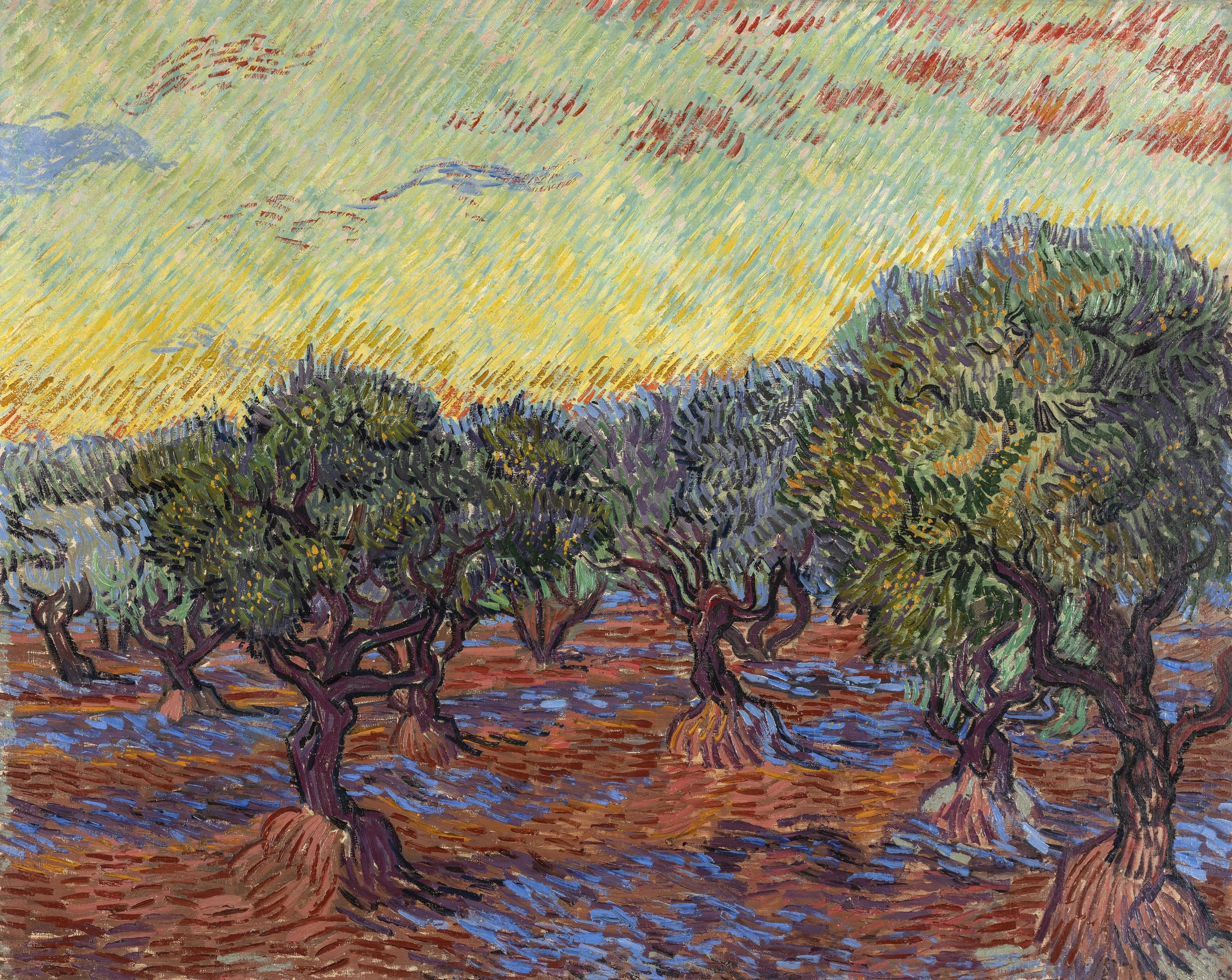
Vincent van Gogh, Olive Trees, June 1889, oil on canvas, The Nelson-Atkins Museum of Art, Kansas City, Missouri. Purchase: William Rockhill Nelson Trust, 32-2. Image courtesy of The Nelson-Atkins Museum of Art, Media Services/Photo: Gabe Hopkins
How does it feel to approach the exhibition opening after so many years in development?
I began developing the concept for this exhibition in 2012, while I was researching the incredible olive tree painting by Van Gogh in the collection of the Nelson-Atkins Museum of Art in Kansas City. Although I had worked a great deal on the artist, I was shocked to find that the painting belonged to a significant series about which I knew nothing. I set out to learn more, only to find that there had been no exhibition or book dedicated to the subject to date. Moreover, there were many unknowns about the series, such as the dates of some of the paintings, the sequence in which they were made over a six-month production period, and which paintings Van Gogh was describing in his letters—something unexpected given the incredibly saturated research field dedicated to this beloved world-famous artist. With that, I launched the exhibition and the unprecedented comparative study that involved an international team of curators, researchers, conservators, and scientists.
The exhibition planning took many twists and turns along the way. It’s never easy to borrow important artwork by heavily sought-after artists such as Van Gogh, and some of our loan negotiations took five years to secure. Just as the checklist was nearly finalized, the onset of the COVID-19 pandemic brought about new challenges and uncertainties. Rather poignantly, the exhibition catalogue, which takes as its subject the artistic production of a painter confined within an asylum—an experience Van Gogh described as a “necessary and salutary quarantine”—was written and produced in its entirety during the self-isolation and confinement imposed by the pandemic. It was with a mixture of trepidation and sadness that after all these years of working tirelessly to bring this project to fruition, I didn’t have access to a library or other resources when it finally came time to start the book. But the work forged ahead and I’m deeply grateful for what we accomplished under these exceptional circumstances.
As I worked at my dining room table turned remote office, I thought often of Van Gogh and his experience at the asylum. Never before had his enduring belief in the healing and consolatory power of art and of nature felt more relevant, his experience more relatable, his achievement more astounding. I hope that visitors to the show will take as much joy and comfort from the olive trees as I have over the last decade, and especially this last year.
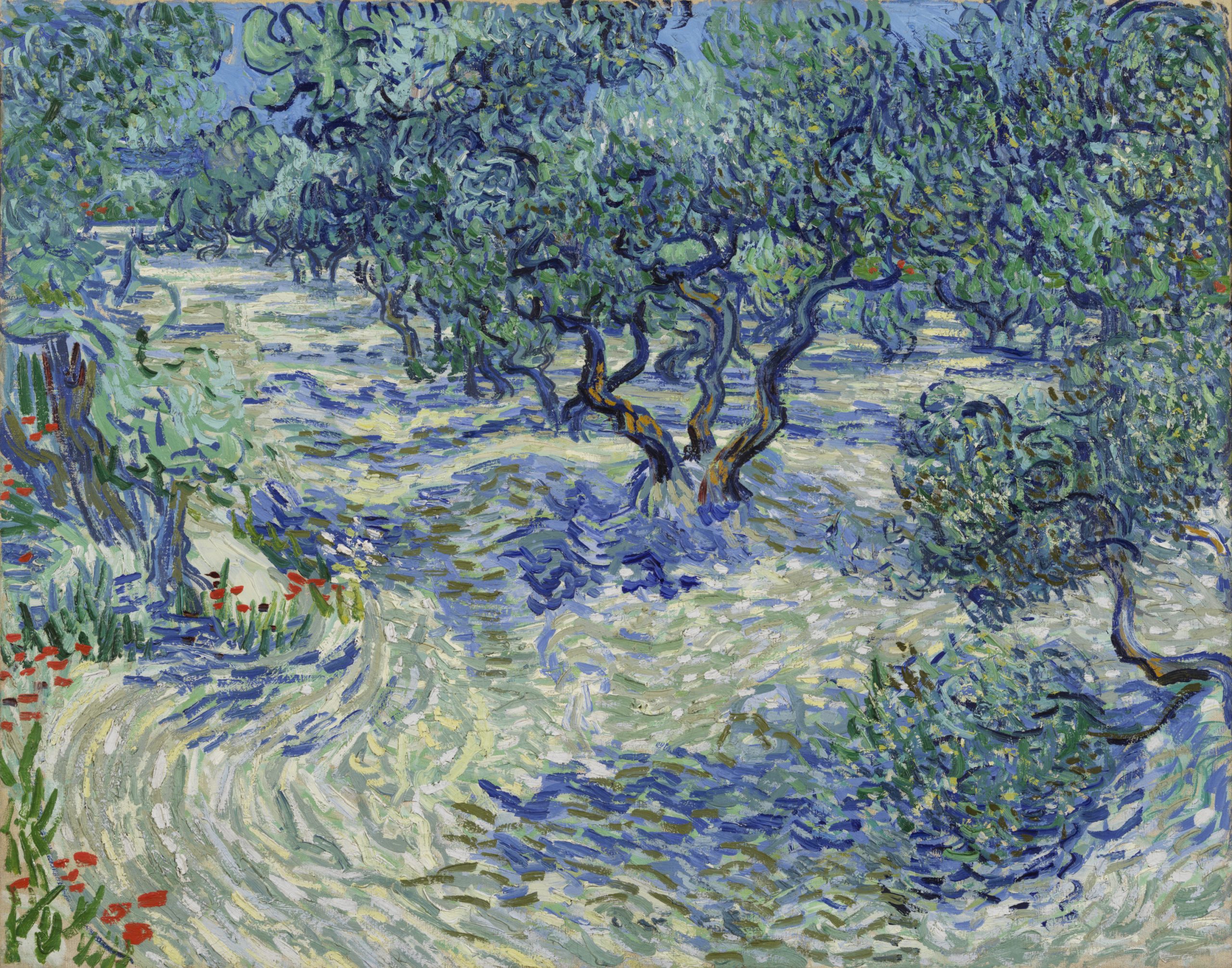
Vincent van Gogh, Olive Grove, Saint-Rémy, November 1889, oil on canvas, Gothenburg Museum of Art, Sweden. Photo: Hossein Sehatlou, Gothenburg Museum of Art
Describe some of the discoveries from the conservation study for the exhibition.
At the heart of the exhibition are the discoveries we made by studying all 15 olive grove paintings in the series. My original questions—what month did Van Gogh paint each work? In what order did he paint them? Can we connect individual paintings to specific mentions in his letters?—were explored in-depth by an international research team over the course of three years. Conservators and scientists analyzed every aspect of the olive tree paintings, from the materials used to how their appearance was altered by time. The exciting results of this three-year study make their debut in the exhibition in the chronological display of the olive groves, as well as in a dedicated gallery that will present the research team’s methods and discoveries. It’s the perfect demonstration of what’s possible when art meets science.
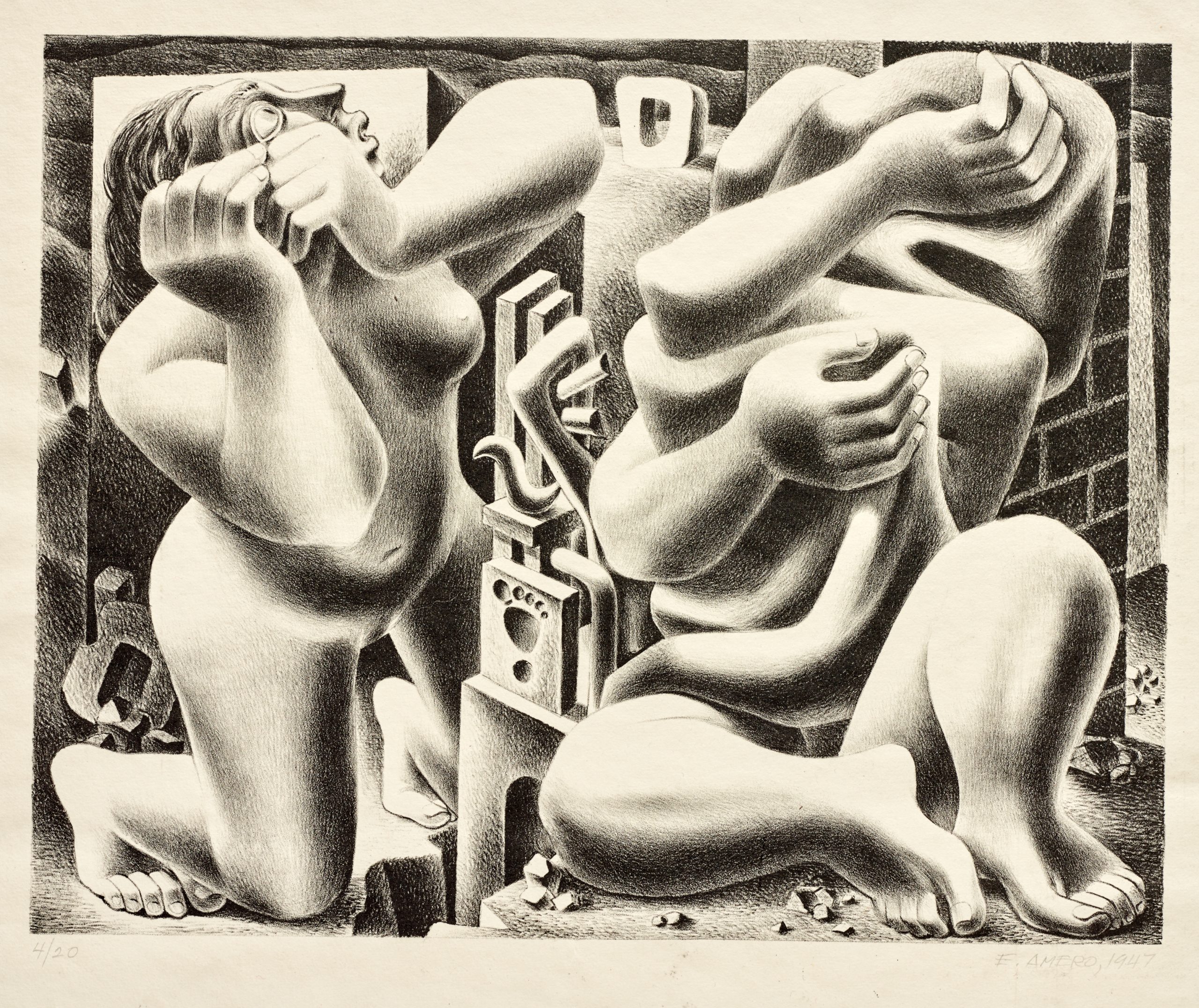
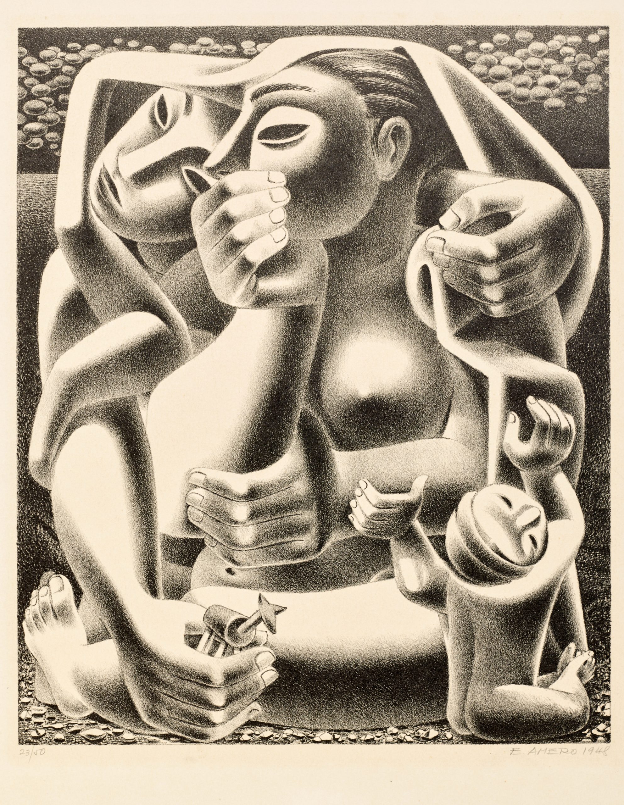
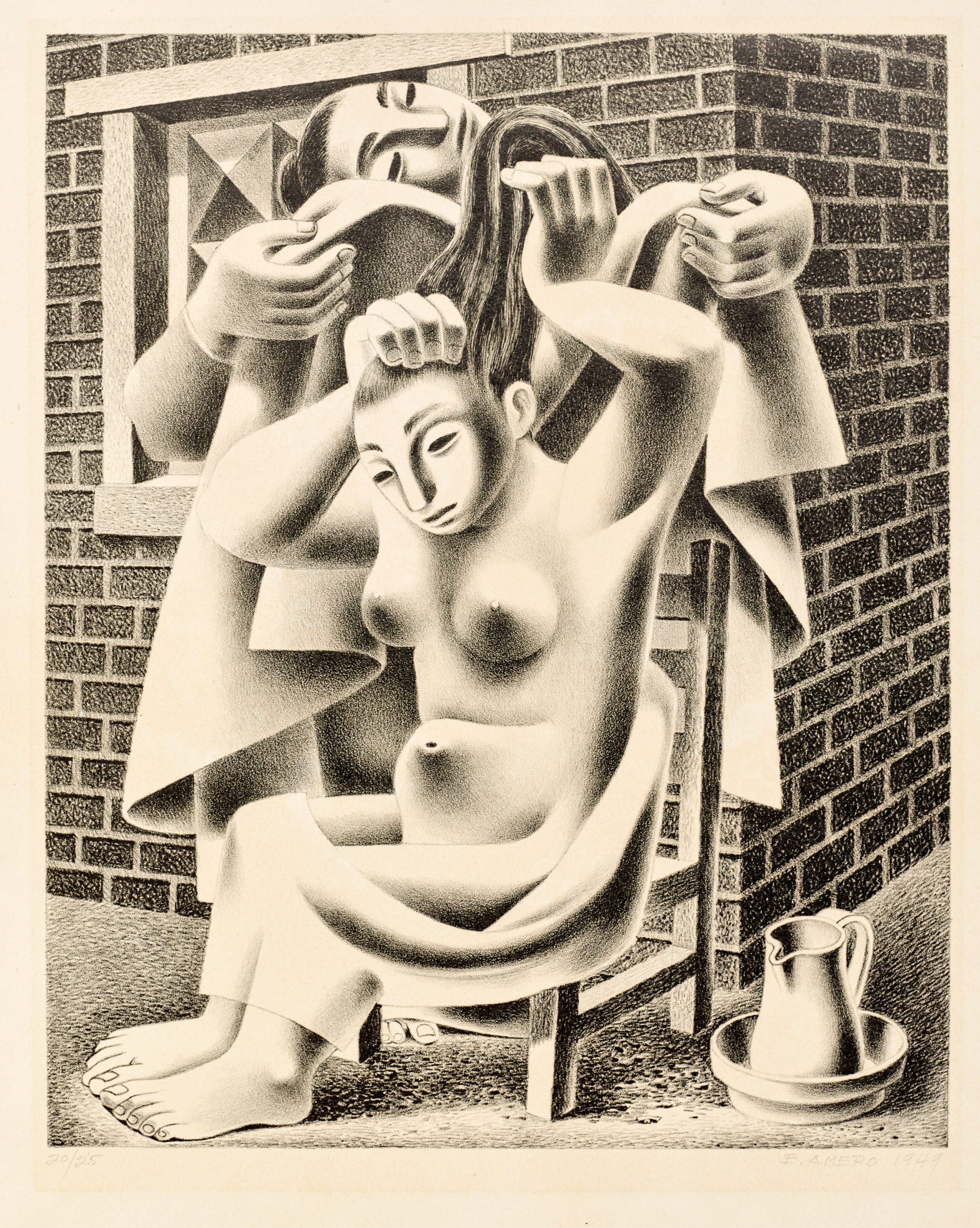
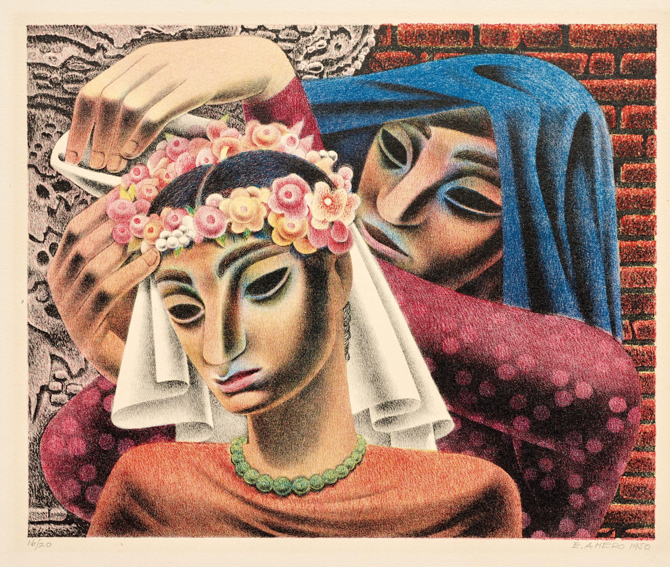
Modern Mexican art is dominated by artists with colossal reputations—Diego Rivera, Rufino Tamayo, Frida Kahlo, and many others. In my experience though, it is sometimes the artists who have garnered less attention that produced the most gripping works, charting unique artistic trajectories. One such figure, whose work I adore and have long wanted to write about, is Emilio Amero (1901–1976). Among the most versatile artists of his generation, Amero painted in fresco and on canvas, but was also a graphic designer, caricaturist, photographer, filmmaker, printmaker, gallery owner, and professor.
Born in Ixtlauaca, in the State of Mexico, Amero moved to the capital as a boy, eventually studying at the National School of Fine Arts. Although he was initially drawn to fresco painting and assisted on several important mural projects, Amero left Mexico in 1925 and settled in New York, where he worked as an illustrator for various publications, including the New Yorker and Life, and designed advertising campaigns for Saks Fifth Avenue. In New York, he explored new mediums, producing a short experimental film, 777, and trying his hand at photography. In his early photographs, he played with double exposures and other techniques for manipulating photographic negatives, but he eventually began working in a more documentary style.
Although Amero’s love for film and photography would continue when he returned to Mexico in 1930, he began working in the medium for which he appears to have had the greatest creative passion—printmaking. While teaching lithography at the National School of Fine Arts, Amero also opened a gallery, Galería Posada, where he exhibited the work of young artists, gave lectures, and held film screenings. In the mid-1930s, he returned to the United States, moving between the two countries for many years while completing various projects and teaching in New York, Mexico City, and Seattle. In 1946 Amero accepted a position at the University of Oklahoma in Norman, where he taught graphic arts until his retirement in 1967.
Emilio Amero, There is Fear, 1947, lithograph, Dallas Museum of Art, Neiman-Marcus Prize, First Southwestern Print Exhibition, 1948, 1948.12
Emilio Amero, Where?, 1948, lithograph, Dallas Museum of Art, Museum Zonne Memorial Prize, 2nd Southwestern Exhibition of Prints and Drawings, 1949, 1949.5
The DMA is fortunate to have four lithographs from Amero’s time in Norman, all of which speak to larger themes in the artist’s work. There is Fear and Where? show the artist’s propensity for contorting and compressing figures, their rigid bodies giving the impression of flesh that has turned to stone. This disquiet is enhanced by the dreamlike landscape in which the figures exist, filled with oddly shaped objects whose purpose seems unclear. In contrast, Dressing and Fiesta show more relatable scenes, their figures alive with movement, recalling some of Amero’s photographs of everyday life in rural Mexico.
Emilio Amero, Dressing, 1949, lithograph, Dallas Museum of Art, Museum Zonne Memorial Prize, 2nd Southwestern Exhibition of Prints and Drawings, 1949, 1949.4
Emilio Amero, Fiesta, 1950, color lithograph, Dallas Museum of Art, Dallas Art Association Purchase, 1954.27
Three of these prints entered the collection after winning prizes at DMA exhibitions celebrating printmaking in the Southwest during the mid-20th century. Together they are a testament to Amero’s impact on the arts of this region.
Dr. Mark A. Castro is The Jorge Baldor Curator of Latin American Art at the DMA.