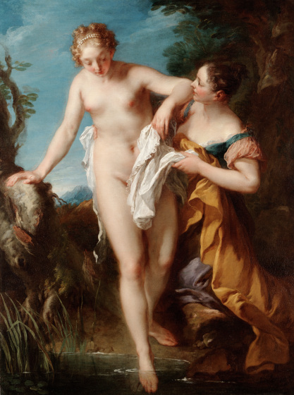
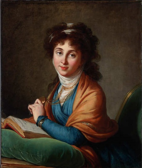
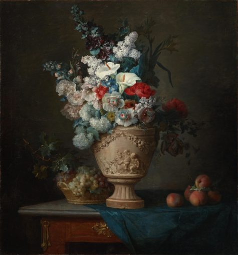
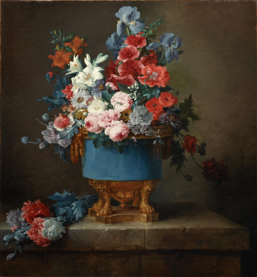
A recent study surveying the permanent collections of 18 prominent art museums in the United States (including the DMA) found that out of over 10,000 artists, 87% are male. Although history has produced fewer female artists than male, women artists have always existed, and their work is currently available on the art market.
In an effort to fix the gender discrepancy in the DMA’s collection, we continue to collect work produced by innovative women artists from past to present. In 2017–2018, for example, the DMA’s European Art Department acquired three masterworks by some of the most well known—yet still under-served—women artists in the history of French art: Adélaïde Labille Guiard (1749–1803), Eva Gonzalès (1849–1883), and Rosa Bonheur (1822–1899). All three works can be seen in the DMA’s current exhibition Women Artists in Europe from the Monarchy to Modernism alongside other works by women artists from the DMA’s permanent collection, private collectors, and nearby museums.
The show is free and open to the public through June 9, 2019. In honor of Women’s History Month, we’d like to introduce you to these newest arrivals!
Adélaïde Labille-Guiard

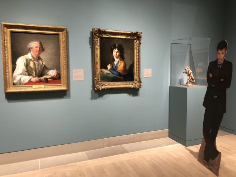
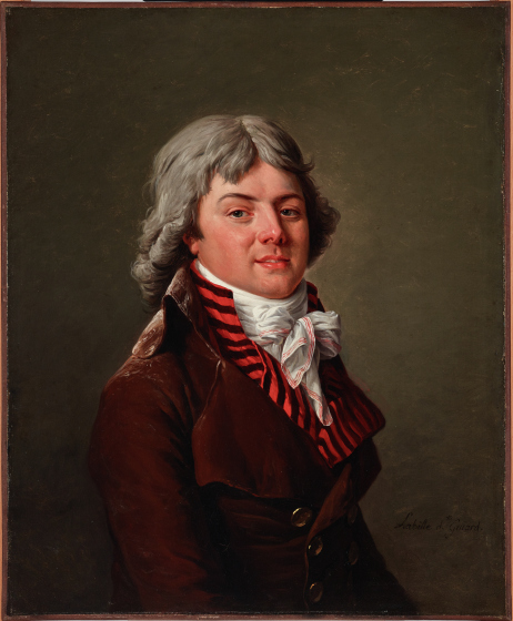
Adélaïde Labille-Guiard was one of four women artists accepted to the French Royal Academy of Painting and Sculpture in the latter half of the 18th century. Women were banned from training as students in the Royal Academy at the time, but were occasionally accepted as members (somewhat akin to modern-day professors) with limited privileges if they could demonstrate exceptional talent. After her acceptance as a portrait painter in 1783, Labille-Guiard exhibited consistently at the Academy’s Salon for the next nine years, received prestigious commissions, and was named the official painter of the “Mesdames de France” (King Louis XV’s daughters) in 1787.
During the French Revolution of 1789–99—a time when many members of the royal family fled France or were guillotined by revolutionaries—Labille-Guiard managed to distance herself from her aristocratic patrons. She adopted the revolutionary cause by exhibiting portraits of political leaders and government officials that featured the sober style associated with republican ideals. Portrait of a Man is from this period of Labille-Guiard’s artistic output. The stark background, lack of props or accessories, and the sitter’s expressive demeanor emphasize the man’s individuality and psychology over material wealth.
Eva Gonzalès
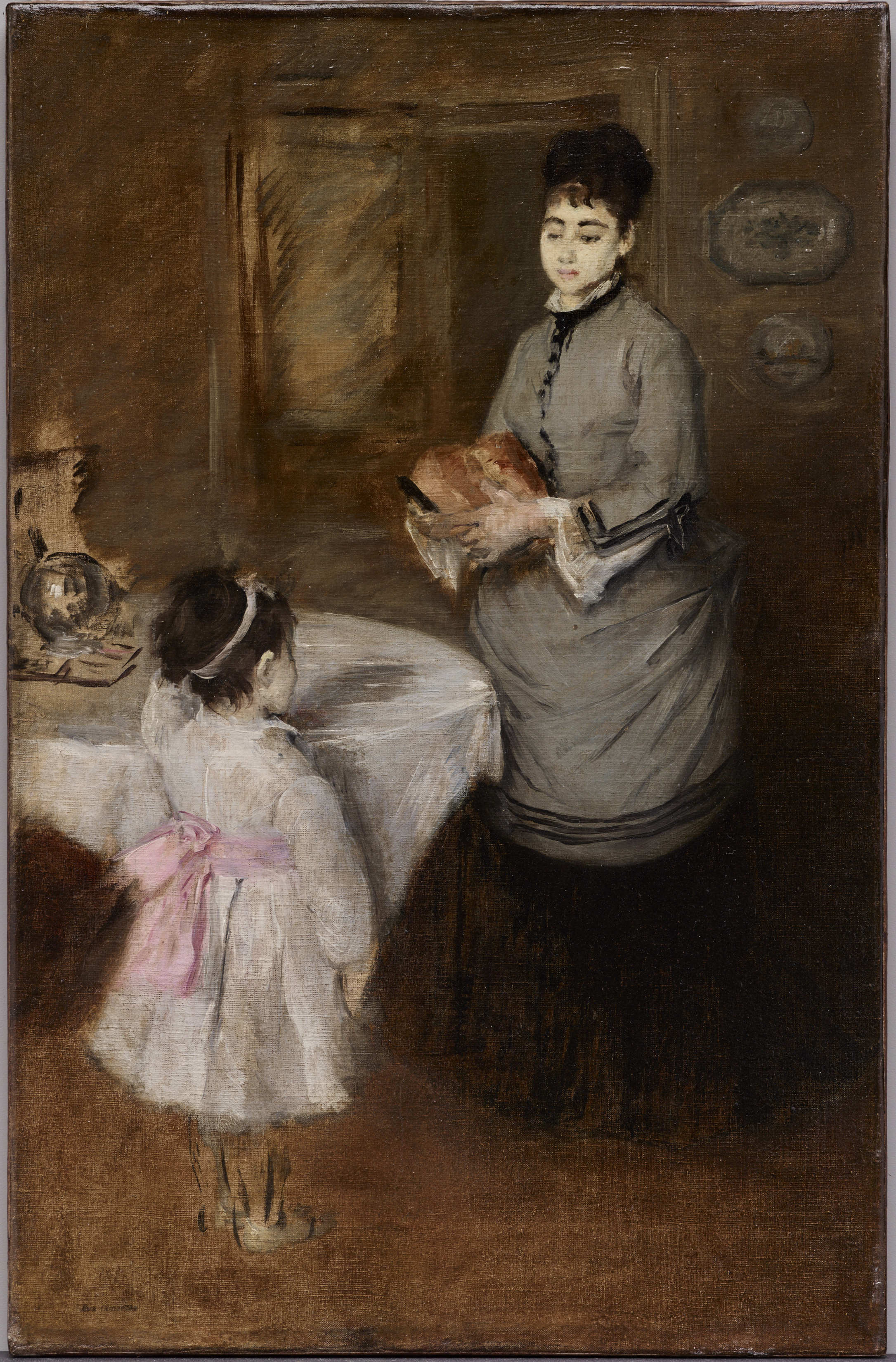
Like many of the artists in this exhibition, Eva Gonzalès came from an affluent family who could afford the cost of private education. The state-sponsored fine art school in Paris would not accept female students until 1897, so the precociously talented Gonzalès enrolled in Charles Chaplin’s private studio for women in 1866. Three years later, she became the only official student of avant-garde artist Edouard Manet. Eventually, she developed her own Impressionistic style characterized by a bright palette, broken brushwork, and the depiction of everyday subjects.
Like Berthe Morisot and Mary Cassatt—two of Gonzalès’s contemporaries, whose work also appears in this exhibition—Gonzalès was restricted by her sex and elevated social class from depicting most modern urban sites. She instead presented bourgeois femininity and family life, which were cutting-edge subjects in the second half of the 19th century. In this unfinished painting, a woman (likely a nanny) prepares an afternoon meal for the young girl in the foreground. Gonzalès’s use of oil paint—traditionally reserved for male artists—elevated her domestic subject matter to the level of high art.
Gonzalès’s life was tragically cut short in 1883 when she died from complications of childbirth at the age of 34, leaving behind only 124 paintings and pastels. Afternoon Tea is thus a rare example from the oeuvre of a young professional female artist who, though much admired by her contemporaries, remains relatively unknown in the history of art.
Rosa Bonheur
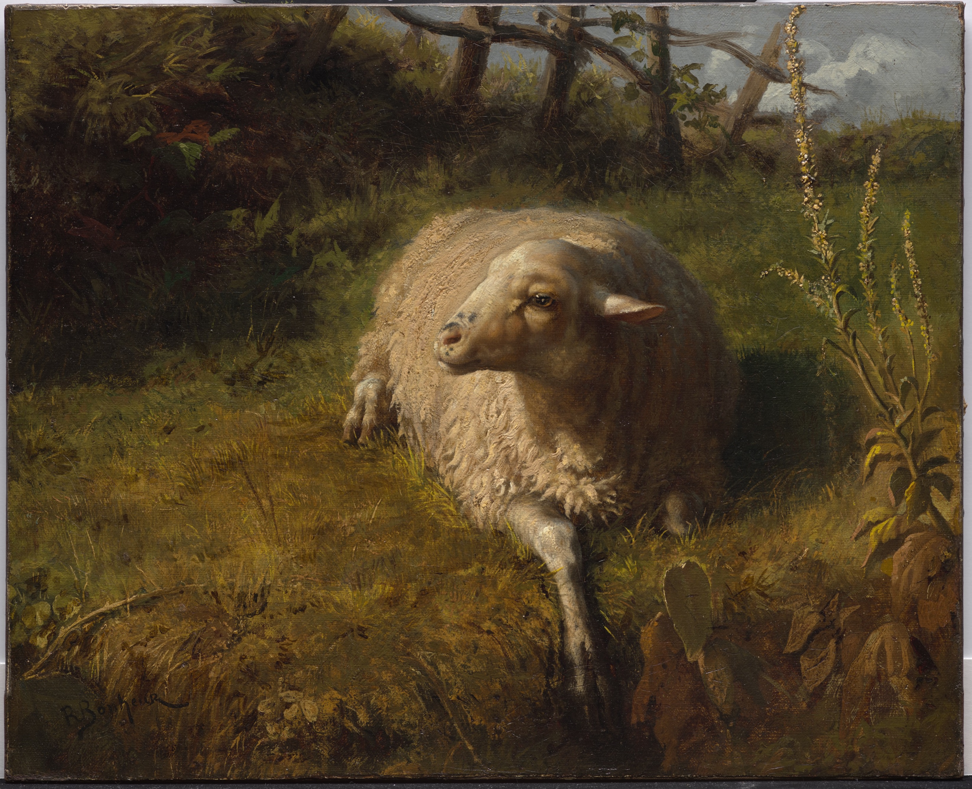
There are few artists, regardless of gender, who achieved the celebrity status and financial success of Rosa Bonheur. As a young girl, Bonheur was encouraged by her father, an artist, to sketch directly from life. She soon developed a profound talent and passion for the realistic portrayal of animals. This was a highly unconventional subject for women, who, like Labille-Guiard and Gonzalès before her, were encouraged to focus on portraiture, domestic genre scenes, or still lifes.
To further develop her talent for rendering the texture and movement of animal fur, Bonheur petitioned the police to allow her to wear pants in order to visit stockyards, horse fairs, and slaughterhouses. These locales were generally off limits to women, or at least difficult to traverse with the billowing skirts women wore in the 19th century. Bonheur eventually achieved great acclaim for her best-known work, The Horse Fair (Metropolitan Museum of Art), which was exhibited at the 1853 Salon. Her notoriety skyrocketed due to her unconventional lifestyle, which included cross-dressing, cigarette smoking, and speaking her mind.
Kelsey Martin is the Dedo and Barron Kidd McDermott Graduate Intern for European Art at the DMA.
