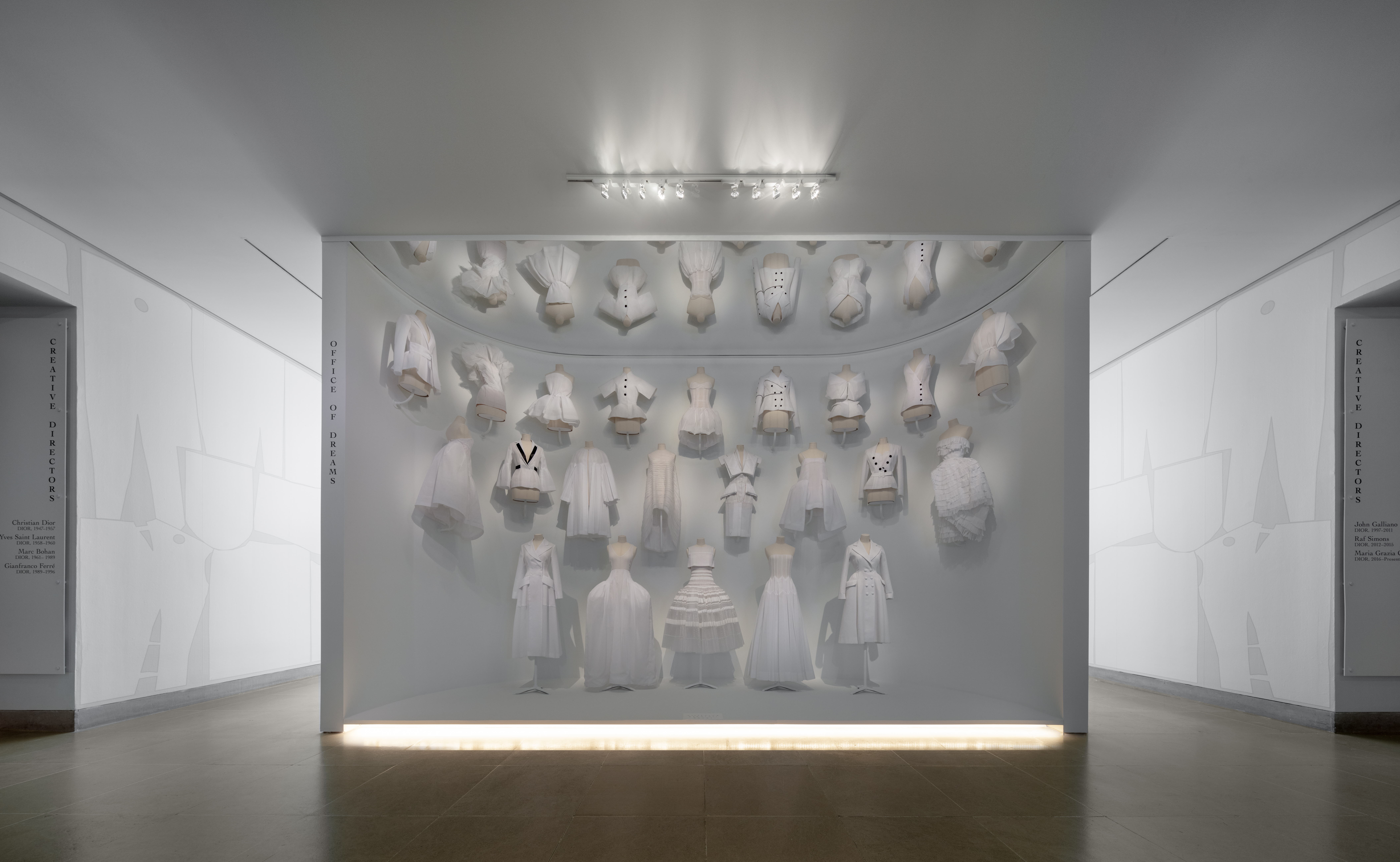
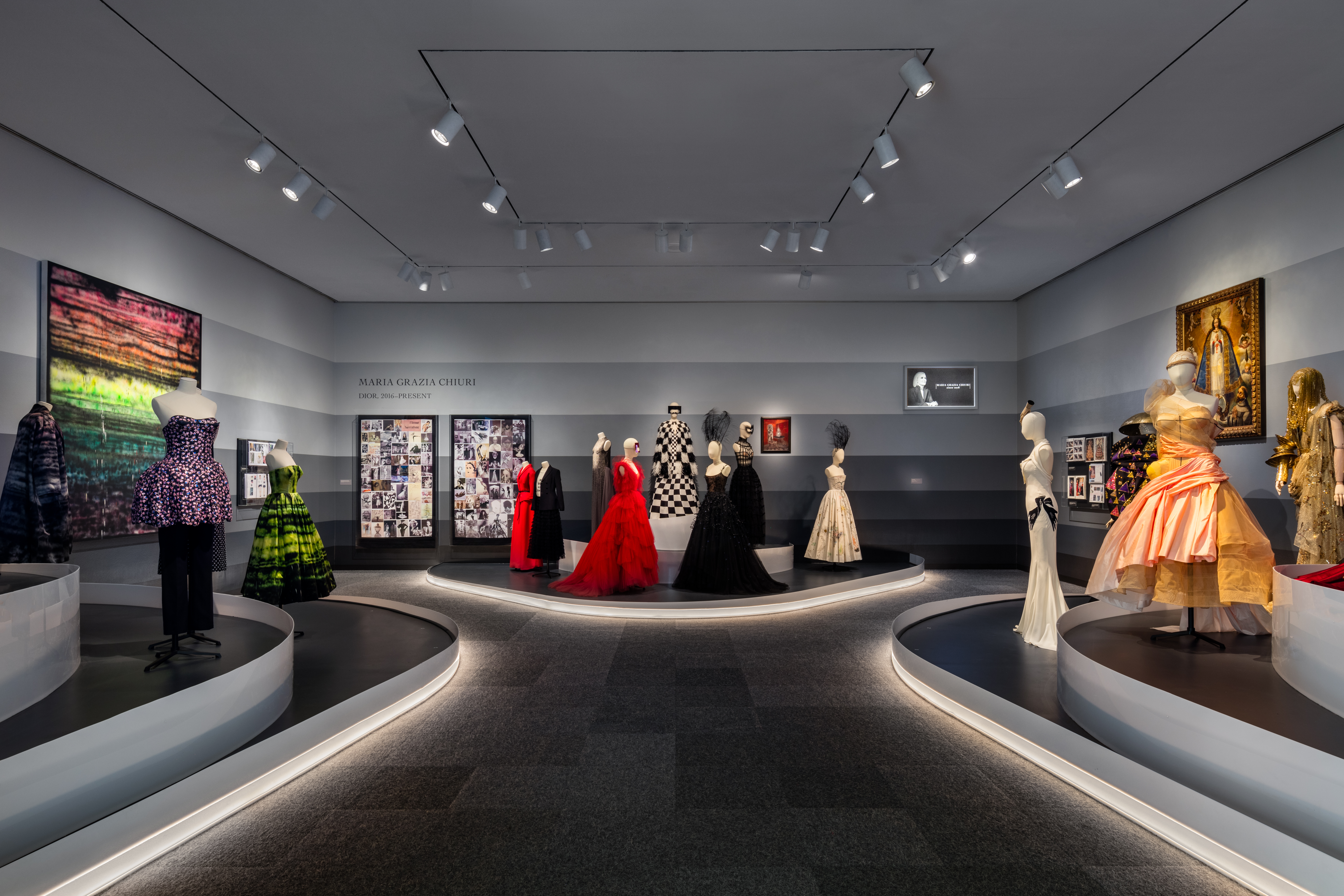
Haute couture heaven has arrived at the DMA, and it’s here for fashionistas to feast their eyes on throughout the summer. From the moment you enter Dior: From Paris to the World, there is no shortage of “wow” moments around every corner—luxurious vintage looks dating back to the 1940s, impeccably white toiles hanging high under a mirrored ceiling, a cathedral-like wall displaying dresses worn by iconic celebrities—all of which are made even more magnificent by the space in which they are presented.
If you’ve visited the Museum some months ago, you may remember the last presentation that was held in the Barrel Vault, An Enduring Legacy. From then to now, the space has completely transformed. See for yourself:
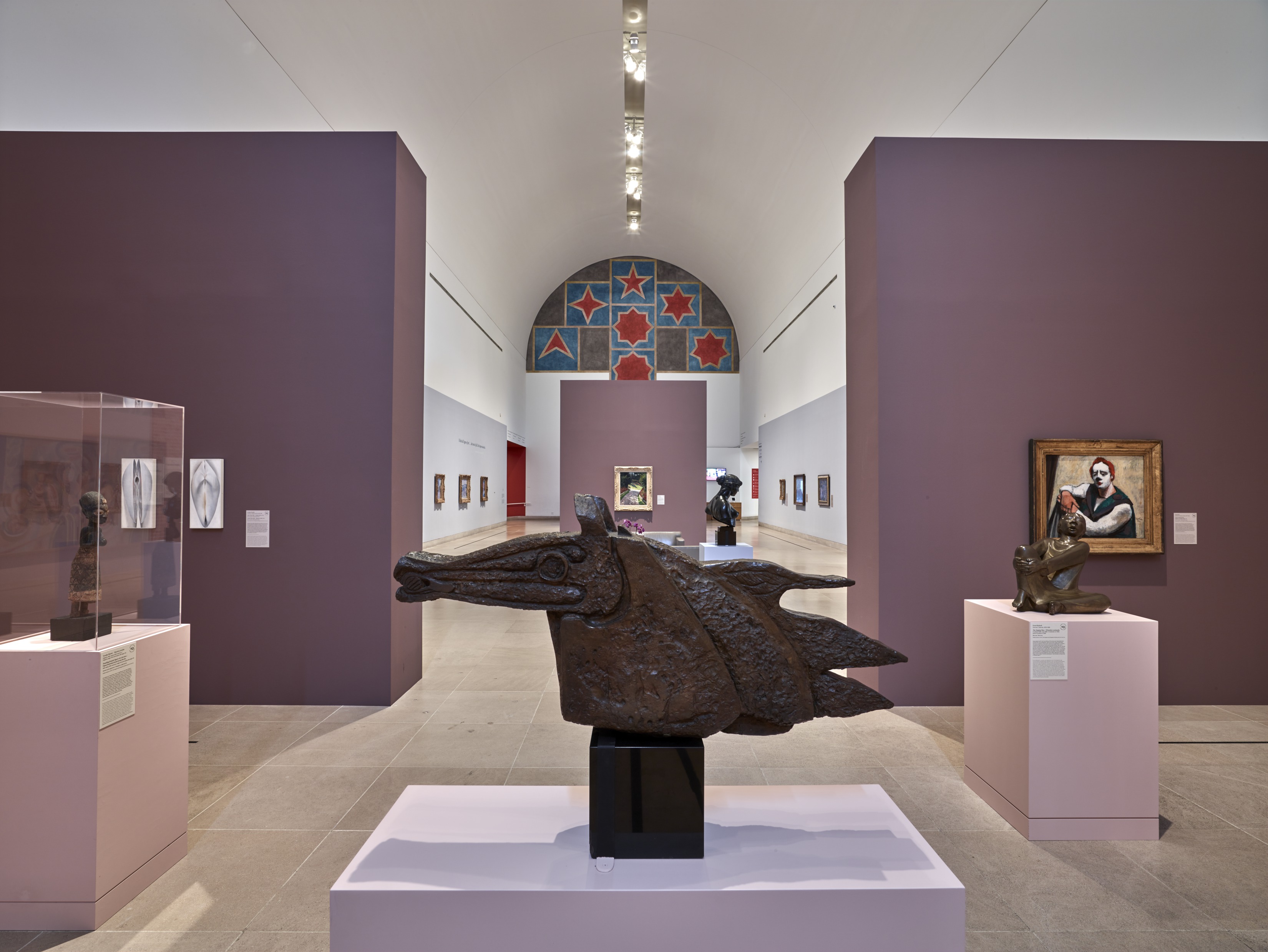
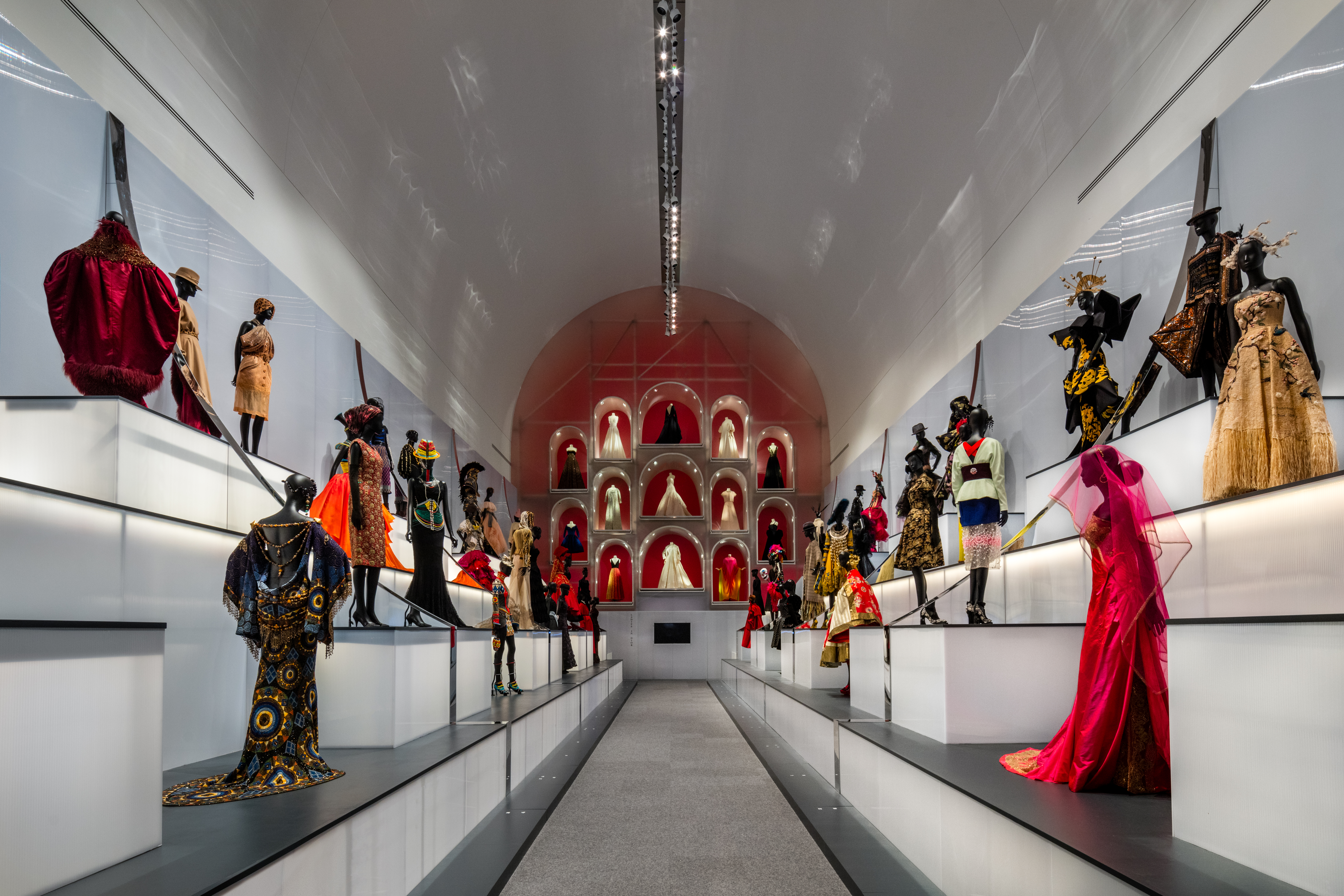
To gain some behind-the-scenes insights about the making of this exhibition, I asked Skye Malish-Olson, Exhibition Designer, and Jaclyn Le, Senior Graphic Designer, some questions about what it was like working on this show.
How does Dior compare to other DMA exhibitions you’ve worked on?
Skye: This was different from other exhibitions, where the whole team is DMA staff. In my role as designer, typically I work directly with representatives of each DMA department and with the curator to understand their vision in order to translate it to a physical exhibition presentation. In this case, designers from OMA (Office of Metropolitan Architecture) created the experience of the space in collaboration with Dior. OMA also designed the exhibition for the Denver Art Museum (DAM), the show’s previous venue, but they designed a very different experience for each institution because the architecture of the two museums is so different. One thing that was important was that visitors would move from one gallery to the next in a prescribed path, not the open-ended grid of galleries that our Barrel Vault and Quads typically provide. To create this pathway, while using the full height of the existing architecture, OMA totally changed the space with a full architectural intervention, re-imagining the physical possibilities of this gallery.
Jaclyn: I had to make sure that all environmental graphics and wayfinding were consistent throughout all locations of the exhibition. Dior is also different from other exhibitions I’ve worked on because I typically create the exhibition identity and environmental graphics for our exhibitions in collaboration with the curator and our internal team. In this case, I worked with Dior’s identity, OMA’s concept direction, and design assets from DAM, and many more stakeholders were involved in the approval of all the exhibition and interpretive graphics.
Were there any aspects of this exhibition that you worked on most?
Skye: I worked between OMA’s concept, our internal team, and external fabricators and contractors to help make this conceptual vision a physical reality. With our DMA team leading the planning process, it was a big challenge to pull this off with so many stakeholders in multiple locations. It was a truly ambitious design that required a lot of troubleshooting and multiple rounds of specifying materials.
Jaclyn: Following OMA’s concepts and some of the exhibition graphics from DAM, and working with our internal team, I was involved in all of the components of the exhibition environmental graphics and interpretation graphics. Everything from handling the Concourse mural of Christian Dior’s sketches, manipulating the façade design of Dior’s Atelier Design House to fit the arched entrance to our exhibition, and designing the headers for each gallery, the exhibition map, wayfinding, and labels and identification numbers. It took a lot of coordination between the various teams and vendors, and taking mock-ups of all the designs into the galleries to get a feel for how all the graphics would play in the space.
What was the biggest challenge in the exhibition graphic design or in transforming this space?
Skye: With all of the complex and impressive design elements, the biggest challenge actually turned out to be the lighting. Each piece needs to be properly lit from multiple angles, something that needed to be built in to the infrastructure, especially in places with high ceilings or in recessed areas.
Jaclyn: The biggest challenge was probably the Concourse mural of Christian Dior’s historic sketches. It was challenging because I was working with scans of his beautiful drawings, and I wanted to keep their organic quality when reproducing them as larger-than-life graphics. Our Concourse walls are long and angled, and I had to make sure that the layout of dresses fit nicely down the length of the Concourse.
Which is your favorite room or section of the show?
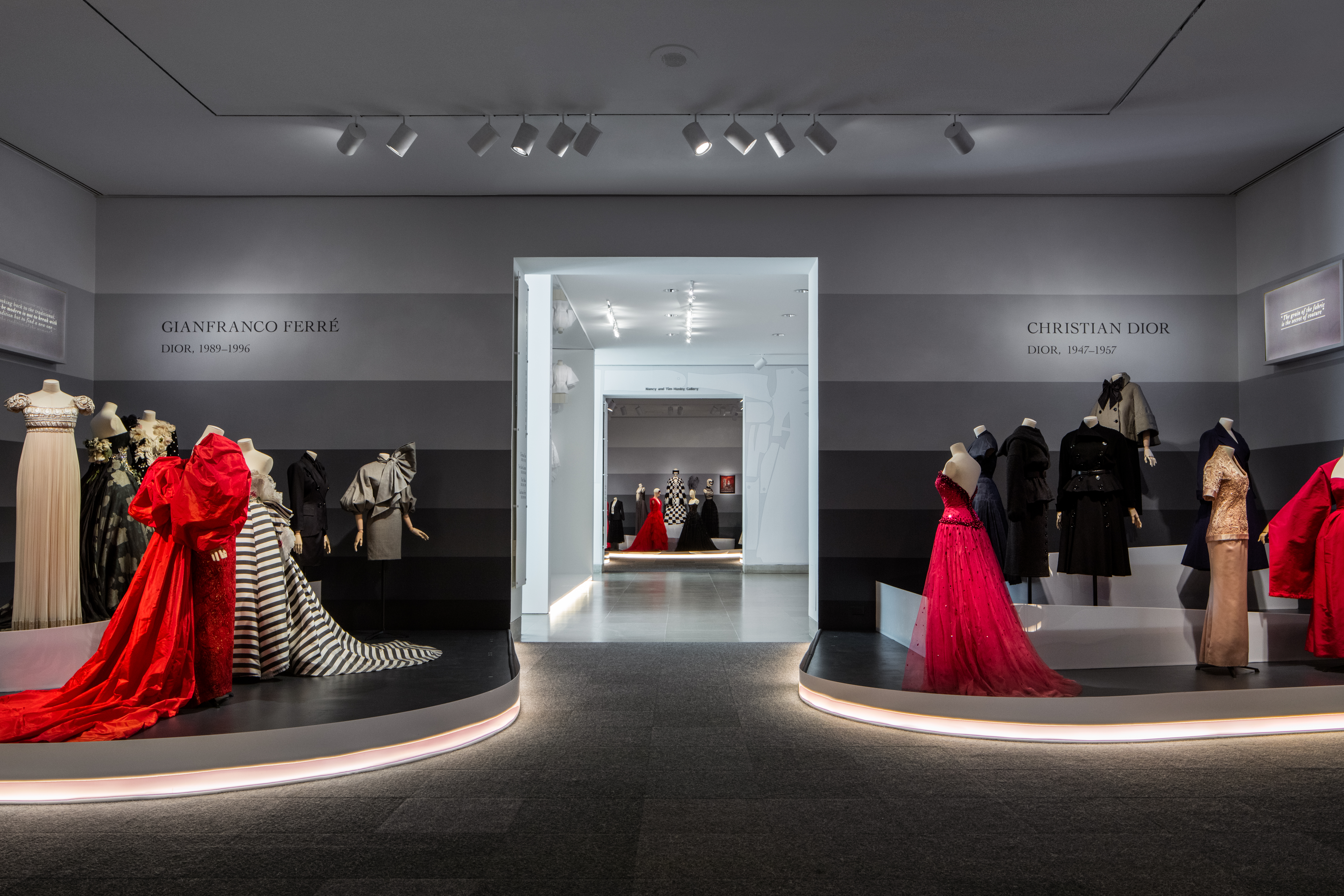
Jaclyn: I really love the Creative Director galleries. Each creative director had such a distinct vision and I enjoy seeing their inspirations, mood boards, sketches, and completed works all together and showcased in such a beautiful way.
Skye: My favorite space is the Office of Dreams. I love the simple, clean construction of the space, which mirrors the clean construction of the toiles. Seeing the handwork that designed these incredible garments in three dimensions creates such a direct connection to the artful process of their creation.
Images courtesy of James Florio
Any other hidden gems or interesting tidbits about this space?
Skye: The top 40 feet of mirror at the back of the Barrel Vault is actually a stretched mirror fabric that is incredibly lightweight.
Describe this space in three words.
Jaclyn: Innovative, magnificent, magical.
Skye: Transformed, complex, impressive.
Visitors can be dazzled by Dior: From Paris to the World at the DMA now through September 1. Timed tickets are required for all visitors and must be purchased or reserved in advance. Check out our FAQ page for more information, and we hope you enjoy the show!
Hayley Caldwell is the Copy and Content Marketing Writer at the DMA.
Impressive installation!
Thanks!