This week, we open the new and improved Arturo’s Nest in our Center for Creative Connections (C3)! The old play areas and design were so well loved that it was time to refresh and re-imagine this beloved play-learning space for our youngest visitors. The Exhibitions team and I had the pleasure of collaborating with the Education Department to come up with a fresh design that harmonizes with the updated Young Learner’s Gallery just around the corner in C3.
Some of the changes we made include installing new carpet (with giant polka-dots) to help with ambient sound, and applying a brand-new landscape to the walls, courtesy of our Exhibitions Graphic Designer, Kevin Parmer. We’ve added a nightscape to a previously plain wall, which adds to the calming and enveloping charm of this space. For our design team, this project was a playful departure from the many ongoing exhibition design projects in the Museum galleries.

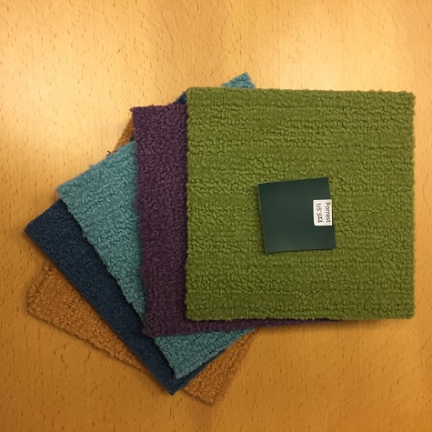
Material samples used in the Arturo’s Nest redesign
There will be a new “nest” structure (coming soon) that will also function as a reading nook, and the daytime landscape will be dotted with interactives that engage our youngest visitors’ budding aesthetic sensibilities. We invite you to explore Arturo’s Nest upon its reopening!

Arturo’s Nest space before

Arturo’s Nest space after
Skye Malish-Olson is the Exhibition Designer at the DMA.