This week we will open the doors to México 1900–1950: Diego Rivera, Frida Kahlo, José Clemente Orozco, and the Avant-Garde, but work on the exhibition began weeks ago. Exhibition designers Jessica Harden and Skye Malish-Olson shared insight into the process of creating the gallery spaces that serve as home for the works of art during special exhibitions.
Jessica Harden: A lot of the work that Skye and I do is to plan for movement of people and objects and really take into account the overall visitor experience and how people interact with and participate in the exhibition.
Skye Malish-Olson: The planning process definitely varies from project to project. I think the most fun for us is always the color and graphics and how that comes together with the objects.

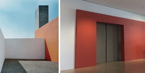
Image: Barragan House, Mexico City, 1948. Photo © Barragan Foundation, Birsfelden, Switzerland/ProLitteris, Zurich, Switzerland
JH: One of the first steps of working on an exhibition for us as designers is to talk through the checklist (the list of works of art that will be included in an exhibition) with the curators and to understand which objects are the most important. We can then take that information and use that to our benefit in the design.
SMO: We’re also typically working with a lot of different eras, and lots of times we’ll start with a kind of mood board or just different visual references to give us a starting place, for color, and for how to portray objects in a way that tells a story.

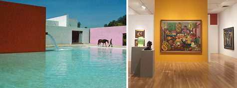
Image: Luis Barragán’s San Cristóbal stables in Mexico City, 1960s. Credit René Burri/Magnum Photos
JH: With México 1900–1950, we worked off of a lot of the plans and designs that were developed for the presentation in Paris. This informed in many ways how we wanted to treat the checklist and some of the spaces, but then we had to take into consideration or own space and our own audience, so we made a lot of adjustments. The 10,000-square-foot exhibition is showcased in two separate spaces, a first during my time at the DMA. The exhibition begins on Level 4 in what has typically showcased works from the DMA’s permanent collection, and then continues on Level 1 in one of our main temporary exhibition spaces.
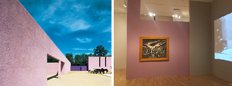
I met the challenge of a disconnected space with a visually strong and contextually relevant inspiration: the work of Mexican modernist architect Luis Barragán, known for his combination of strong, vivid color with clean, modernist forms. Applied in our México 1900-1950 galleries, these colors and forms, offset from the DMA’s existing architecture, assert the entrances and designated areas of the exhibition. The paint application and dynamic forms help lead visitors through a space that is dense with powerful works of art, without feeling claustrophobic. Bright colored panels of wall frame and highlight the sumptuous color of a number of paintings, while creating visually fresh and exciting lines of sight as one moves through the space. An additional benefit is the way these colors work with the existing architecture and wood and limestone finishes, as Barragán was also known for his use of raw materials. From the big picture down to the smallest detail, the exhibition designer’s task is to facilitate an aesthetic experience from the exhibition content that is greater than the sum of its parts.
SMO: I am really excited about the scale and color in the México 1900–1950 exhibition. It is definitely a rare treat and we’re using all of our space and multiple galleries to house these really large and amazing works. I think having our space activated in this way will be really exciting for our visitors.

Image: Cuadra San Cristobal, Mexico City, 1968. Photo © Barragan Foundation, Birsfelden, Switzerland/ProLitteris, Zurich, Switzerland
Jessica Harden is the Director of Exhibition and Museum Design and Skye Malish-Olson is the Exhibition Designer at the DMA.