Archive Page 2


The Artful Overlapping of Old and Modern Iran

A work by Houston-based Iranian-American artist Soody Sharifi is now on view in the Keir Collection of Islamic Art Gallery. Courtly Love, an archival inkjet print from 2007, is an adaptation of a 15th-century painting in the Keir Collection. The original painting is an illustration of a tale from the Khamsa of Nizami, a collection of five tragic love poems. It depicts a scene from the romance of the Iranian king Khusraw and Armenian princess Shirin. Drunk and guilty of an amorous tryst, Khusraw has arrived at Shirin’s palace on horseback. Shirin, peering out from a window, is counseled by an older woman and refuses him entry. The scene is witnessed by a variety of attendants, including three scribes holding poetic manuscripts below. A darker mood is also present; anxious angels who know the inevitable tragic outcome of the story hover at upper left, while two gardeners with golden shovels foreshadow the twin graves in which the lovers will lie for eternity.

Khusraw at Shirin’s Palace, painting from a manuscript of Nizami’s Khamsa, last quarter of the 15th century, ink, colors and gold on paper, The Keir Collection of Islamic Art on loan to the DMA, K.1.2014.738

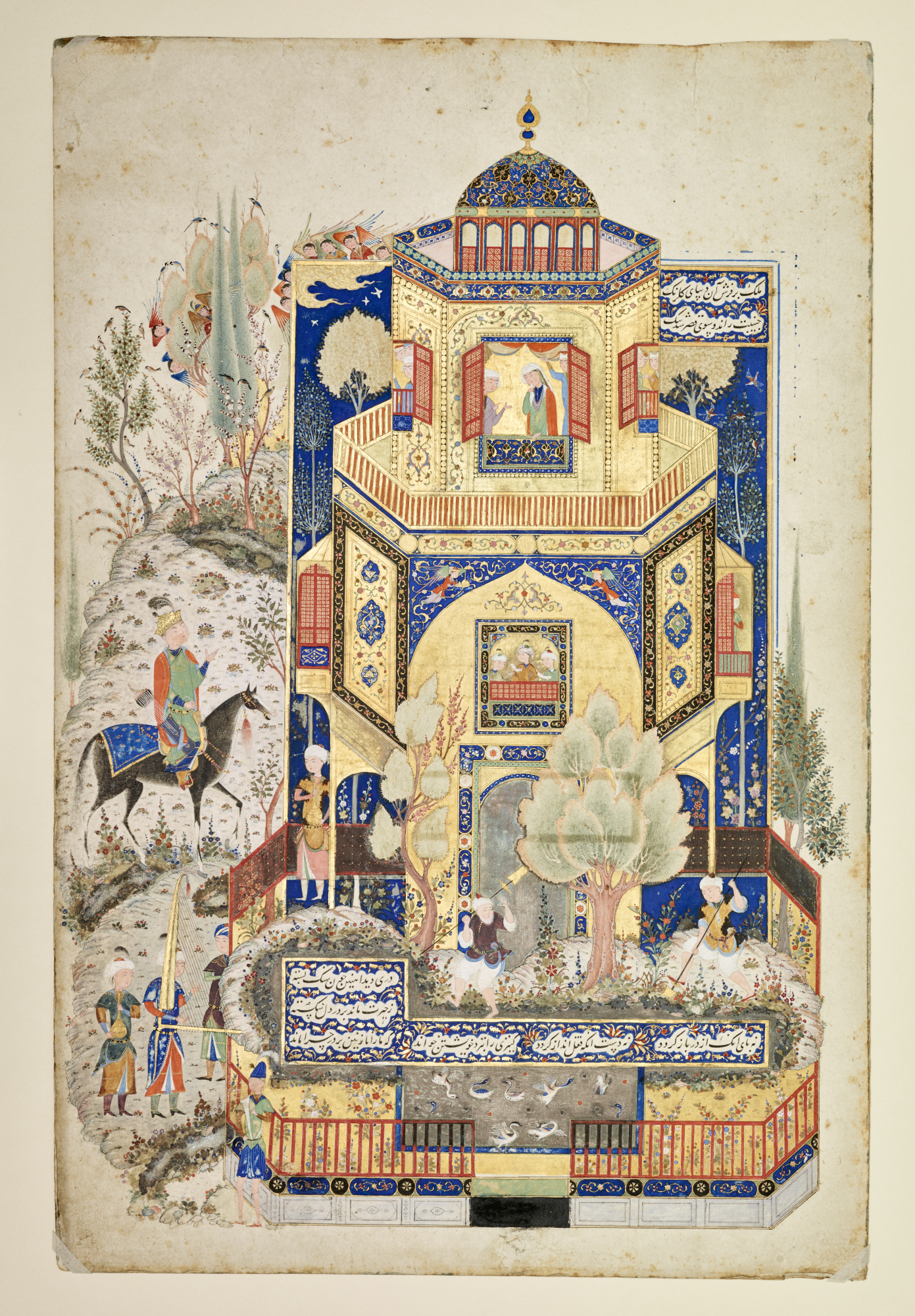
Courtly Love is one of a series of works that Sharifi has termed “Maxiatures,” a play on the term “miniatures” that is commonly used to describe the small format of Islamic book paintings. Sharifi’s works are large. For them, she has selected well-known examples of architectural paintings that illustrate Persian literary classics, such as the Khamsa, to serve as a basis for adaptation through the addition of new figures taken from photography. She also works with the architectural elements in the original image, changing their scale and contents. In this work, some of the original painted figures have vanished, and those that remain become unwitting bystanders to a new cast of figures inserted into the scene: contemporary, young Iranians, mainly women, going about daily tasks. These include making a call at a phone booth, jumping rope, playing with a hula-hoop, painting toenails, installing a satellite dish, and looking over the balustrades and through windows. Three young men speak to the women from outside the garden walls—the circumscribed formalities of courtly love referenced in the title of the work, and perhaps referring to the themes of the original painting.

Soody Sharifi, Courtly Love, 2007, archival inkjet print, Dallas Museum of Art, gift of Richard and Glen de Unger in gratitude to Walter Elcock for his attentiveness and support for the Keir Collection, 2018.40

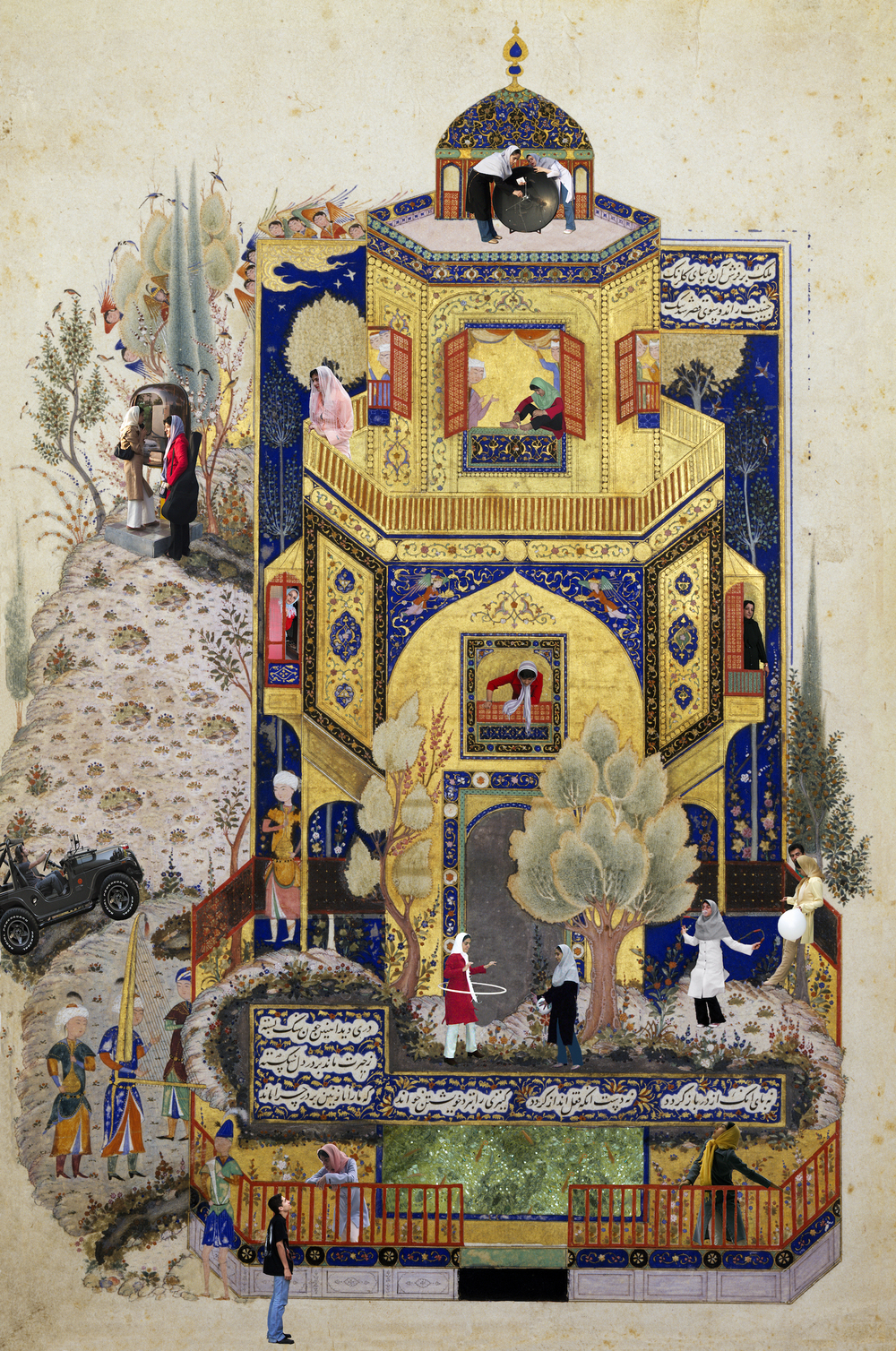
Sharifi’s work appears to be concerned with issues of dual identities, of a past and present that is especially acute for Iranians of her generation who were exiled by the revolution of 1979. Given that the figures in her works are young, this may represent the nostalgia of young Iranians today who still live in proximity to the elegant palaces and gardens depicted in historical paintings, perhaps inhabited now only by ghosts, like the figures in 15th-century paintings. Her concern with dualities—of language, of national identity, of traditions and contemporary technologies, of political tensions—seems to be present in this work, where contemporaneity hovers over a past that can no longer be reached. Certainly, there is also a sense of humor—it is clever and funny to see modern people in these poetical constructs.

Soody Sharifi’s work is displayed in the Keir Collection Gallery alongside the painting that inspired it so that the public can appreciate her interventions, decode her intentions, and enjoy the presence of both works of art at once. Join Sharifi in person as she shares insights into Courtly Love at our next Late Night on February 15.

Heather Ecker is The Marguerite S. Hoffman and Thomas W. Lentz Curator of Islamic and Medieval Art at the DMA.


Ruth Pershing Uhler: A Texas Woman Artist to Know

Why do some women artists become famous while others become footnotes in art history textbooks? That is the topic of discussion in The O’Keeffe Sisters and Women of American Modernism, a series of short talks at the DMA on February 2. Few art history scholars knew Georgia O’Keeffe had a younger sister named Ida who was also an artist, and whose work is now exhibited in Ida O’Keeffe: Escaping Georgia’s Shadow. Ahead of the talks, we thought we would take a look at another woman modernist in the DMA collection you probably haven’t heard of: Ruth Pershing Uhler.

Ruth Pershing Uhler was born in a small town in Pennsylvania in 1895. Uhler and her family moved to Houston in 1909, but she returned to Pennsylvania to study art. Receiving the proper training was the first hurdle women had to clear to become artists. Women were often encouraged to study “lesser” mediums like watercolor instead of oil, and art was seen as part of a woman’s aesthetic training to create a beautiful home rather than as a career. Uhler didn’t settle for these expectations. She studied at the Philadelphia School of Design for Women (and did learn to work in oil), and after graduating she obtained a fellowship that provided her with her own studio and the ability to paint and exhibit art in Philadelphia. She worked in Philadelphia for 11 years before returning to Houston in 1925 and exhibiting across Texas in the 1920s and 30s.

Ruth Pershing Uhler, Earth Rhythms, c. 1935, oil on canvas, Dallas Museum of Art, Texas Artists Fund, 2018.10, © Estate of Ruth Pershing Uhler

In 1935 Uhler went to Santa Fe with friend and fellow Texas artist Grace Spaulding John. The landscape of New Mexico inspired a series of nine paintings that Uhler completed after returning to Houston the next year. Earth Rhythms (c. 1935), recently acquired by the DMA, belongs to this series. While it is possible Uhler saw and responded to the work of Georgia O’Keeffe, Uhler’s paintings—with undulating forms that glow with an almost spiritual quality—are also reminiscent of Transcendentalists like Raymond Johnson and Agnes Pelton, who were working in New Mexico during the same period. Uhler’s series was exhibited in 1936 at the Twelfth Annual Exhibition of Houston Artists.

Uhler teaching in the MFAH galleries c. 1950. Courtesy of the Museum of Fine Arts, Houston Archives.

At the time, it was impossible for a woman to support herself as a full-time painter without a gallery to represent her and sell her art, so most women artists took second jobs. Uhler became a teacher at the Museum of Fine Arts, Houston (MFAH) in 1937, and in 1941 she became the MFAH’s first curator of education, a position she held until just before her death in 1967. In the same way that Ida O’Keeffe held nursing and teaching jobs on and off her entire life, being an art educator provided Uhler with financial stability, independence, and creative fulfillment. She was hugely influential in the growth of the MFAH’s education programs, but the demands of her job led her to abandon painting.

Curiously, one day in 1940 Uhler intentionally destroyed many of her paintings in a fire. She built the bonfire in the backyard of Grace Spaulding John’s house, which she had been house-sitting. John’s daughter saw her and asked what she was doing. Uhler officially ended her career as a painter that day, remarking, “Well, I only want my best work to survive.” Consequently, her works are few and difficult to find today.

As art historians reconsider the influence of women artists in modernist movements, and as Texas artists are given more serious attention, artists like Uhler will become more popular. It takes time and a conscious effort on the part of curators to shine a light on under-recognized women artists, but we get a fuller and more realistic view of art history when women’s work is recovered from the margins.

Lillian Michel is the Marketing and Communications Coordinator at the DMA.

Six Centuries Unabridged

Word & Image: Works on Paper from the 15th through 20 Centuries, on view in the DMA’s level 2 European Galleries, focuses on artists who blurred the boundaries between art and text, and uniquely explores this dynamic progression as it developed across Europe for over six centuries. Each of these works, selected from the DMA’s permanent collection, have a rich and diverse history. While many were originally intended as personal objects for private use, others were made for mass production on the open market or for a select group of art connoisseurs. Several of these pieces have not been on view for several years, if ever.

Here’s a close look at a few of the objects on display:

15th-Century German Artist, David and the Ark of the Covenant, page from the Cologne Bible, late 15th century, published in Cologne, Germany, printed by Heinrich Quentell and Bartholomäus von Unckel, hand-colored woodcut on paper, Gift of the Dallas Print Society. 1937.18

What is this page from?
This page was removed from a copy of the Cologne Bible, printed in Germany. The Cologne Bible was one of the most ground-breaking evolutions in book design. We take for granted today that a book may be produced with as many pictures as a writer or publisher desires, scattered however and wherever across the page. In this period, only the upper-class could afford elaborately designed manuscripts. Even these opulent books followed a traditional standard of production with images set either above or below the text, or separated completely on another page. The Cologne Bible shocked viewers with over 100 images that break directly through the text.

How was it made?
Johannes Gutenberg’s printing press lead book production out of the Middle Ages and into the Early Modern era. This page was assembled using individually cast letters and symbols covered with an oil based ink. Its woodcut illustration was created using a relief printing technique, in which a woodblock is carved with a chisel or gouge and inked with a roller. The sunken, cut-away areas received no ink and appeared white in the print. Color was added after the page dried. This addition of pigment also signals the wealth of the patron.

William Hogarth, The Five Orders of the Periwigs, 1761, etching on paper, Dallas Museum of Art, Foundation for the Arts Collection, gift of Mrs. Alfred L. Bromberg, 1984.194.FA

What inspired this work?
In 1748, the antiquarians James Stuart and Nicholas Revett announced that their important work The Antiquities of Athen Measured and Delineated was soon to be published. However, the first volume only made it to press in 1762, with the second appearing around 1789 or 1790. Nearly 40 years after their announcement! Here, Hogarth plays on the annticipation of the long wait for their work, with the opening line “In about Seventeen Years, will be completed” at the bottom. This may have been more lighthearted than really biting, as James Stuart was claimed to keep a copy of the print on a fire screen in his parlor to show visitors.

Who are we looking at?
This complex etching is organized by row based on the five classical orders: Doric, Tuscan, Iconic, Composite, and Corinthian. He arranges the wigs like a display in a shop window with each line corresponding to the five social classes who wore them. Notice at the bottom, there is a sixth additionial order for aristocratic women. The characters wearing the wigs were recognizable individuals, including William Warburton at the very top left turned in profile, Bubb Doginton below him, and the Queen Charlotte and Countess of Northumberland on the bottom line.

Olga Vladimirovna Rozanova, Authors: Alexei Kruchenykh, Velimir Khlebnikov, text and Illustration from A Game in Hell, 1914, Second Edition, published in St. Petersburg, Printed by Svet, Nevski Prospect, 136, lithograph on paper, Dallas Museum of Art, The Art Museum League Fund in honor of Mr. and Mrs. James H. Clark. 1978.75.4

What is it?
This second edition of the Futurist book A Game in Hell is quite different from the first in binding technique, lettering type, illustration, and its further additional 292 verses. A Game in Hell is an extended poem about a card game going on between devils and sinners in hell. Artists Olga Rozanova and Kazmir Malevich collaborated with writers Alexei Kruchenykh and Velimir Khlebnikov to create a completely new work filled with more lively devils and sinister characters. While Malevich did three drawings and the cover, Rozanova dominates the character of the book with over twenty compositions and marginal figures.

What influenced this piece?
During the early 20th century, there was a dominant Russian peasant population, influencing Futurist interests in handmade books and folk-like imagery. The poetics of play and chance manifested in the aesthetics of early Russian avant-garde as a rebellious method of making art without rules. Futurist books were the perfect marriage of physical object and literary expression, which created a true merging of art and word.

Beth CreMeens is the Dedo and Barron Kidd McDermott Graduate Intern for European Art at the DMA

Universal Languages – SOLUNA 2018

As part of the annual SOLUNA festival, on Sunday, May 13, experience a work of art combining visual and musical elements. Inspired by Beethoven’s Ninth Symphony, Argentinian artist Lihuel Gonzalez’s Las personas no van juntas (They Just Don’t Match) examines the efficacy of translation between languages and between language and music and features Dallas Symphony cellist Jeffrey Hood.

Lihuel Gonzalez, Las personas no van juntas (They Just Don’t Match), 2016, video installation and musical activation, 8 minutes. [image source: lihuelgonzalez.com].

In Las personas no van juntas, González gets at the heart of the difficulty of communication. This is true on a much broader, universal level, but it is particularly germane to the subject of González’s work: the arts and philosophy. This video installation and performance enacts how art is almost always experienced after being subjected to layers of translation. Films or literature or libretti are translated from one language to another so that audiences around the world can access them. And written or spoken interpretation often accompanies visual art or music (as is the case in this very text). In this work, monitors show a speech being simultaneously translated from one language to another, almost like a game of telephone, before a musical composition created of that speech by a computer is played on stage by a cellist. Whew, you might think, I’m lost. Luckily, as González shows us, gesticulations and facial expressions bridge cultures, as does art, which at the end of the day, is one of the true universal languages.

Las personas no van juntas (Activación N2) from Lihuel González on Vimeo

Anna Katherine Brodbeck is The Nancy and Tim Hanley Associate Curator of Contemporary Art at the DMA.

What’s next in the Quadrant Galleries?

We bid farewell to Edward Steichen’s In Exaltation of Flowers this week. The lavender walls and gold-leafed canvases will go off view on May 13 and the space will be prepped to hold a selection of newly acquired posters from the Guerrilla Girls Portfolio Compleat (opening May 26, more details provided in a future Uncrated post).

Fortunately, two new installations of contemporary art will open the same weekend the Steichen exhibition comes to a close. In the Stoffel Quadrant, eleven large sculptural works will adorn the walls and floor. Lynda Benglis’s Odalisque (Hey, Hey Frankenthaler), a colorful river of poured latex, is representative of the scale and non-traditional materials explored by this selection of artists. Elise Armani, the McDermott Intern for Contemporary Art, chose these works, all of which were created by women whose work resists the crisp geometries associated with the male-dominated Minimalist movement. Instead, Armani wants viewers to recognize the ways each piece interacts with its surrounding and raises questions about the relationship between works of art, physics, anatomy, and psychology. Contemporary culture, environmentalism, and daily routines are critiqued in works by Annette Lawrence and N.Dash. Lawrence draws attention to the proliferation of junk mail and wasted materials by transforming strips of paper into a wall relief. Dash’s blackened, folded paper sculpture is the result of her methodical handiwork aboard the New York subway.

Another group of works by women artists will be on view in the Stoffel Quadrant (formerly home to Yayoi Kusama’s Infinity Room). The installation, Soft Focus, will contain nearly thirty photographs drawn from the DMA’s permanent collection and local lenders. Some images, like Kunie Sugiura’s Central Park 3, broaden the traditional understanding of photography by relying on alternative applications of light sensitive materials. Also included will be an example of Diane Arbus’s iconic approach to portraiture. Other photographers whose works will be on view are women who participated in mainstream art movements but rarely received equal critical acclaim as their male counterparts.

images: Lynda Benglis, Odalisque (Hey, Hey Frankenthaler), 1969, poured pigmented latex, Dallas Museum of Art, TWO x TWO for AIDS and Art Fund, 2003.2 © Lynda Benglis / Licensed by VAGA, New York, NY; Annette Lawrence, Free Paper 12 / 05, 2006–2008, mixed media, Dallas Museum of Art, Charron and Peter Denker Contemporary Texas Art Fund 2008.100.A-E © Annette Lawrence; N. Dash, Commuter (New York, 2013), 2013, graphite and paper, Dallas Museum of Art, gift of Bonnie L. Pitman in honor of Deedie Rose and Catherine Rose 2016.63; Kunie Sugiura, Central Park 3, 1971, photo emulsion and acrylic on canvas, Dallas Museum of Art, Lay Family Acquisition Fund 2016.11.1; Diane Arbus, Untitled, 1968, gelatin silver print, Dallas Museum of Art, Polaroid Foundation grant 1975.82 © Estate of Diane Arbus

Emily Schiller is the Head of Interpretation at the DMA

In Search of Brandon Kirby and the Golden Spider

Earlier this month, the DMA’s exhibition The Power of Gold: Asante Royal Regalia from Ghana opened to the public. What you may not know is that the entire exhibition of more than 250 objects was inspired by a few works from the DMA’s collection. The DMA Member Magazine, Artifacts, explored two of these objects in the Winter 2018 issue. Discover more about the inspiration behind the exhibition and the history of these beautiful pieces:

In 2014, two finely crafted gold artworks joined the Dallas Museum of Art’s holdings of West African regalia. The cast gold spider and T-shaped bead arrived in an elegant velvet-lined display box bearing an inscription with the following information: the items came from the Asante kingdom, were once owned by the kings, and left their original home in 1883.

Sword ornament in the form of a spider, Ghana, Asante peoples, late 19th century, gold-copper-silver alloy, Dallas Museum of Art, McDermott African Art Acquisition Fund, 2014.26.1

Dr. Roslyn A. Walker, Senior Curator of the Arts of Africa, the Americas, and the Pacific, and The Margaret McDermott Curator of African Art at the DMA, began a multi-year investigation into the works’ journey from the Gold Coast (present-day Ghana) to Texas. This research inspired The Power of Gold: Asante Royal Regalia from Ghana, the first exhibition to focus on Asante royal regalia in over three decades. The Cree family were previous owners of the objects, and in their oral history detailing the objects’ relocation from Africa to England they mention a man named Robert L. Brandon Kirby. Who was Brandon Kirby and how did he come to own these ornate examples of gold craftsmanship? These questions drove Walker to dig through British Parliamentary Papers, correspond with international archivists and scholars, and trace census records throughout the US and Europe. Born in Australia in 1852 as Robert Low Kirby, and later recorded under the surname Brandon Kirby and then Brandon-Kirby, he traveled in 1881 to the British colony, where he served in the Gold Coast Constabulary, a police force. He earned the respect of the British governor of the Gold Coast, Sir Samuel Rowe, and during a mission in 1884 he was tasked with delivering letters from Sir Samuel to the kingdom’s various paramount chiefs regarding the pending selection of an heir to the Golden Stool (throne).

Walker’s reconstructed narrative identifies this tour through the Asante kingdom as the context for Brandon Kirby’s possession of the cast gold spider and T-shaped bead, which were probably bestowed upon him by Prince Agyeman Kofi, later known as Asantahene (king) Kwaku Dua II.

Pendant, Ghana, Asante peoples, late 19th century, gold-copper-silver alloy, Dallas Museum of Art, McDermott African Art Acquisition Fund, 2014.26.2

The following year, Brandon Kirby partnered with James Cree (d. 1891), a wealthy Scotsman, to buy cattle ranches in the Territory of New Mexico, thus the Asante spider and bead arrived in the US. According to Cree family lore, Brandon Kirby’s dramatic departure from New Mexico forced him to travel light, leaving behind his mementos of his time in the Gold Coast.

The intricate castings were then passed through generations of the Cree family, landing in Austin, Texas. From there, it was only a few hundred miles and years of research before their reintroduction at the DMA in The Power of Gold. A final historical resource soon joined the spider and bead at the DMA and recently entered the Museum’s collection—an album of photographs by Frederick Grant dated 1883–84 and featuring Brandon Kirby in Kumasi, the capital of the Asante kingdom.

Frederick Grant, Ashanti and West Central Africa, 1883-4 (cover), 1883–84, leather, copper alloy, and paper, Dallas Museum of Art, African Collection Fund, 2017.12

Frederick Grant, Ashanti and West Central Africa, 1883-4 (detail), 1883–84, leather, copper alloy, and paper, Dallas Museum of Art, African Collection Fund, 2017.12

Find out more about Brandon Kirby and the golden spider in the beautifully illustrated exhibition catalogue that accompanies the exhibition.

Dr. Emily Schiller is the Head of Interpretation at the DMA.

Contemporary Additions

With 93 exhibitors, the 2018 Dallas Art Fair left no dearth of fantastic work to purchase through the Dallas Art Fair Foundation Acquisition program. For the Dallas Art Fair’s 10th anniversary, and the third year the DMA has participated in this exciting partnership, the contemporary collection gained eight new works by seven artists. This year, perhaps more than ever, we are reminded how much representation matters. The curatorial team (Anna Katherine Brodbeck, me, and the McDermott Intern for Contemporary Art Elise Armani), under the leadership of our Director, Agustín Arteaga, used the funds this year to select works that further diversify the contemporary collection. The artists range in age and background as well as the variety of mediums that they use.

Brie Ruais’s large wall-based ceramic was created from the same amount of clay as the artist’s own body weight. In her process-driven practice, Ruais spreads and molds the clay with her hands and feet, marks still evident once the pieces are partially glazed and fired. The DMA’s holdings in contemporary ceramics do not quite reflect the multitude of ceramic work being produced today, and we felt that this work was a striking addition to demonstrate the use of the medium expanded beyond traditional forms.

Brie Ruais, Broken Ground Red (130 lbs of clay spread out from center), 2017. Courtesy of the artist and Albertz Benda [image source: brieruais.com].

In Sanford Biggers’s Sirroco from 2016, the artist repurposes an antique quilt to use as the substrate of this incredible painting. Interested in the inherent geometry and varying textures of the quilts, Biggers references a historical, though unproven, narrative that on the Underground Railroad quilts were used as signposts to guide escaping slaves. Sanford Biggers is a cousin of the painter John Biggers (1924-2001), who is already represented in the DMA’s collection. Acquiring Sanford Biggers’s work provides a great opportunity to explore artistic lineages and make connections between generations.

Sanford Biggers, Sirroco, 2016. Courtesy of Massimo De Carlo Milan | London |Hong Kong [image source: massimodecarlo.com].

This was also the first year we purchased from a local gallery, and we were pleased to select Alicia Henry’s mixed-media work Untitled, 2017, from Liliana Bloch Gallery here in Dallas. In this portrait of a man, Henry uses stitched thread and ink to comment on identity and notions of beauty. Some of the marks appear, hauntingly, like scars and allude to some form of violence previously endured. With this truly powerful work, we further expand our holdings by contemporary African American artists.

Alicia Henry, Untitled, 2017. Courtesy of the artist and Liliana Bloch Gallery [image source: lilianablochgallery.com].

In addition to the works above, we are pleased to have also acquired Matthew Ronay’s sculpture Condition, 2018; Tony Lewis’s drawing Nes, 2018; two gelatin silver prints from Geraldo de Barros’s series Fotoformas Sao Paulo, 1949/2008; and Shara Hughes’s painting Gusto, 2018. It is difficult not to write about every work since they all bring something unique to the conversation. I encourage anyone interested in these acquisitions to visit the gallery websites to learn more about the artists.

Thank you to the generous donors to the Dallas Art Fair Foundation Acquisition program for their time and enthusiasm in making these acquisitions happen!

Chelsea Pierce is the Curatorial Administrative Assistant for Contemporary Art at the DMA.

More than Meets the Eye

In just over a week the DMA will host the acclaimed exhibition Laura Owens which is organized by the Whitney Museum of American Art in New York. The exhibition explores the career and whimsical world created by contemporary artist Laura Owens. Prior to the arrival of the exhibition, the DMA Member magazine Artifacts was able to talk with Amy Baumann, Owens’ Studio Manager, about the process of creating the unique and exceptionally beautiful exhibition catalogs:

This spring, visitors will encounter paintings on a monumental scale in the mid-career survey of American painter Laura Owens. Owens is also known for her work on a much more intimate scale, as a book artist. Her Los Angeles art space and studio even hosts Ooga Booga, an independent art bookseller. She shares this love of books through her gorgeously crafted catalogue, a deep dive into her life and career, containing memorabilia from her artistic formation and essays from experts in diverse cultural fields.

What is most surprising is that every catalogue contains a unique cover, screen printed by hand in the artist’s studio—a mammoth undertaking that involved a crew of five studio assistants working for over three months.

I talked with Amy Baumann, Owens’ Studio Manager, about the process of fabricating over 8,500 unique books, each one functioning as a work of art that visitors can take home with them.

Anna Katherine Brodbeck:
Can you speak about the genesis of this ambitious project?

Amy Baumann: Screen printing has been a big part of Laura’s work in the last five years. When she first approached us with the idea for the covers, we said, “Great! How do you want to do this?” This resulted in the book covers being created by the build-up of layers upon layers of images, much like her paintings.

AKB: What is the source material for the diverse imagery?

AB: Laura started by selecting patterns used in her paintings, such as a bitmap made from a scan of crumpled paper and vintage wallpaper overlays. She also chose some basic shapes that we printed as vectors, and more complex images that we printed using CMYK process. We made a chart listing the various elements to make sure we maxed out the possible combinations. They had to be random and not repeat. We came up with a system to put all the covers in production simultaneously, organizing them in piles at various stages of production. Laura wanted the print crew to choose the layers and how they were used in order to promote more randomness, but she would change the way the layers were used during the process, sometimes requesting a different scale or image, or shifting the color palette.

Anna Katherine Brodbeck is The Nancy and Tim Hanley Assistant Curator of Contemporary Art at the DMA.

Artistic Equations

Mathematics and art, two subjects that are often thought of as an unlikely combination; however, for American artist Alfred Jensen these two subjects fit together exactly. One of Jensen’s geometric, mathematical paintings could be seen if you peeked into the Conservation Studioab this past fall. This painting may appear simple in design, but the process and the surface are very complicated and interesting. Jensen was fascinated by the Maya calendar, philosophy, mathematics, color theory, pre-Columbian culture, and Asian culture. All of these things influence the compositions he creates, and in this particular painting there is very likely a specific reason for the number and placement of each dot of paint throughout the work.

Jensen combines mathematical and philosophical theory with artistic practice in his works similar to the way the field of conservation combines science with art. This perfect comparison makes it all the more exciting to perform a conservation treatment on this painting. In this work, it appears that Jensen applied the paint straight from the tube by dotting it directly onto a primed canvas. The dots were clearly not added at random, but were planned out, as is evidenced by a grid applied in pencil that can be seen in the reserves between the dots, below the paint.

Due to the high impasto of each little dot of paint, little cups and horizontal platforms are created that are perfectly positioned for catching and gathering dust. The dust detracts from and changes the way the colors interact with each other, affecting the color theory aspect of Jensen’s technique. Additionally, since the surface is unvarnished, the dust has started to attach itself to the paint, which will make it increasingly difficult to remove in the future.

Removing the dust from the surface is no easy task. Each little dot of paint has pointed ends that are extremely fragile and sometimes very small and difficult to see without magnification. As the DMA’s conservation intern, I began cleaning this painting in September 2017. In the image below, I’m using an optivisor to be able to see the very tiny, vulnerable peaks of paint and a small, soft brush to carefully dust each daub of paint to reveal the intended color below without disturbing the peaks. A HEPA vacuum gathers the dust so it doesn’t settle back onto the paint below.

The removal of the dust is a very slow, careful process because each little dot essentially becomes its own painting, requiring individual attention. From the viewing window of the Conservation Studio, it may seem as if the painting has not changed very much; however, below you can see the difference between a cleaned (green) and uncleaned area (blue) of the painting. The area in the green square is no longer dull and gray, and the colors show their intended vibrancy. The cleaning, while slow and detailed, is a very satisfying process.

Caroline Hoover is the Conservation Intern at the DMA.

Artist Interview: Timothy Harding

Last month, our first C3 Visiting Artist of 2018, Timothy Harding, began his participatory installation in the Center for Creative Connections (C3). We’ve enjoyed watching the project grow as Harding adds new contributions to the installation biweekly. Learn more about the artist, his process, and his experiences at the DMA.

Tell us about yourself. (In 50 words or less)
I’m an artist based in Fort Worth, a die-hard Dallas Stars fan, and proud owner of a cat named Clyde. When not cheering on my team, I work in my studio and teach at Tarleton State University in Stephenville.

What motivated you to apply to the C3 Visiting Artist Project?
Recently my practice has been confined to the studio with no outside collaboration. I was interested in coming up with a project that would allow me to collaborate with others and open the opportunity to explore methods that I have not previously used. This is the first project I’ve done that is almost entirely digital in execution and produced with people who I never directly interact with. I’m excited to see how this might impact my practice moving forward.


Tell us about the installation you’ve created in the Center for Creative Connections.
The installation is a site-specific line drawing made up of hundreds of individual marks. This ongoing work is produced from scribbles and gestures left by Museum visitors on an iPad. Visitors leave their mark in a program and send it to me over the creative cloud. From there I make a couple of slight alterations to the file and cut them out via laser cutter in varieties of gray, black, and white paper. After cutting, I visit the Museum and add to the installation. The marks are layered in a manner that allows each to be noticeable while working together to produce an intricate whole.


Do you have any favorite visitor contributions you’d like to share?
I can’t say I have any specific favorite marks that have been sent yet. What I have found most interesting about this project is the number of unique marks I receive on a daily basis. Earlier projects have used my own scribbles, which are very familiar to me. It’s refreshing to find new marks and think about the decision making of that viewer without knowing who they are or anything about them.

What have you enjoyed most about this experience so far?
I’ve enjoyed interacting with Museum-goers. I had the opportunity to give a presentation to an engaged group of people about my work and this project. That was a very rewarding experience. Other interactions have been more casual and occur during installation. People of various ages, from children to adults, seem curious about the project and what is happening. It has been fun to have casual conversations with them and solicit their contributions.

C3 Visiting Artist Timothy Harding will lead a Teen Tour and a Teen Homeschool Workshop in April. Learn more about upcoming Teen Programs here.

Jessica Fuentes is the Manager of Gallery Interpretation and the Center for Creative Connections at the DMA.


Archives

Categories